A Shopify Plus custom-made bundle creator that boosted emma&noah's AOV by 61%
- Shopify
- Shopify custom app
- UX/UI Design
Launched
August, 2024
Overview
Emma & Noah is a brand known for its commitment to sustainability and quality in baby products. It distinguishes itself by rejecting fast fashion and short-lived trends in favor of timeless, modern designs crafted from sustainable, organic materials. Their believe in promoting a shift toward conscious consumption, encouraging not just the current generation, but also future ones, to prioritize the environment and quality over mass-produced, disposable goods. By emphasizing the use of renewable and organic resources, emma & noah creates products that not only last longer, benefiting customers financially, but also contribute positively to environmental preservation.
Challenge
Emma&Noah were exploring a way to increase their average order value in a way that benefitted their customers as well. They wanted people to be able to purchase products that don't include things you won't need for your baby but rather things that all newborns and their parents might need at some point of their journey.
Mix & Match bundler
They approached us with the idea of introducing a mix and match bundler. They had the rough outline and knew the minimal functionality they wanted to achieve and they did their research on merchants with similar solutions. We got together for an introductory meeting and we fleshed out those requirements. Following our first meeting we agreed upon an approach and we delivered the initial design by figma and after a few feedback iterations we were ready to dive in.
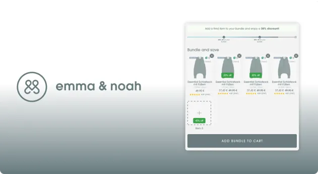
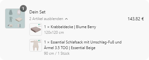
 An empty bundle widget on the merchant's storefront
The result is as you see above - a bundler that gives customer an option to get a discount but only once they've added a certain amount of items in a bundle. This approach incentives larger orders thus increasing the average order value for the store.
The functionality of the bundler includes the following separate parts:
- Admin panel that controls how much the discount is and when it gets triggered
- Highly configurable theme app block for the merchant to fine tune
- Customer facing UI tailored to match the parent theme
Admin panel
The admin panel of the application was necessary so that the merchant can change when the discount appears and how large the discount is.
Since the approach is a bundle we've made sure the merchant can change all the things connected to the bundle's operation. That includes:
- All thresholds in the bundle
- The image used as the bundle's wrapper
Configuring when the discount is applied
A threshold is composed of two things - when the discount happens and at which product it is applied.
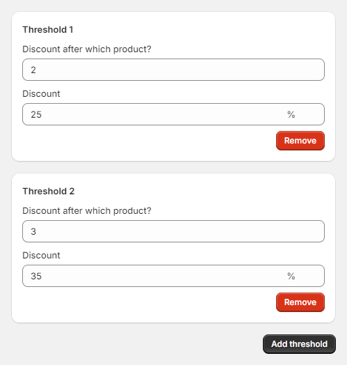 Configuring the bundle thresholds in the admin
As you can see above, the admin panel has an easy way of configuring new thresholds and editing the existing ones. All the merchant has to do is just change the numbers they see and add/remove any thresholds and those will get reflected on the customer facing app block immediately.
Changing the bundle image
The bundle image is used as the "parent" of the bundled items. Usually places like the cart drawer and the checkout have bundles displayed as one parent displayed as a dropdown that shows the bundled items when expanded. That's where the parent image is displayed. Here's how it looks in the merchant's drawer and their checkout as well.
You can see there's an image that is used to represent the drawer itself, as leaving it empty will make the instances look like they're lacking something. The configuration of the image is also covered by the admin with the following controller.
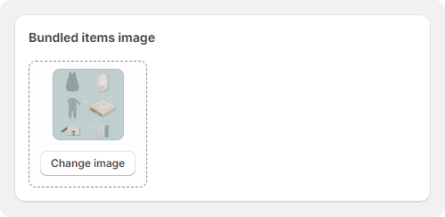 Changing the bundle image in the admin
App theme block
The bundle is added to the merchant's theme by an app block. This makes the addition/movement/removal of the bundle a breeze. No custom code is needed to control the most common styles/content of the bundle itself.
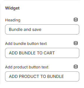
We start off with a few settings about the content of the bundle
- Heading - directly positioned above the added items, good for eye catching phrases to draw the customer's attention
- Both Add bundle button text & Add product button text are pretty standard button contents. The settings allow for merchant to A/B test and experiment with the CTA texts
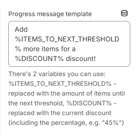
This is a setting used for a dynamic approach of giving the customer the push to go for the bigger incentive. It's pretty straightforward, it introduces the 2 variables that are injected automatically on the storefront depending on the current status of the widget:
- %ITEMS_TO_NEXT_THRESHOLD% - how many items the client needs to add to the bundle to get to the next threshold
- %DISCOUNT% - the discount the client will get when they get to the next threshold
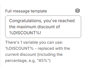
Similarly to the above approach we have this message when they client has reached the last threshold. It also includes a variable that we had in the previous section:
- %DISCOUNT% - the discount the client will get when they get to the next threshold
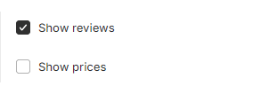
These 2 are pretty self explanatory - the merchant requested a way to enable/disable the tooltips for the reviews and prices so that they can A/B test them and experiment.
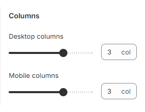
These were requested as the merchant wanted to be able to experiment with the columns of products displayed on the bundle widget.
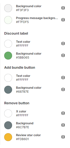
Pretty self explanatory, all the colors here were discussed with the merchant beforehand as they needed to be able to change them without needing to employ extra CSS changes.
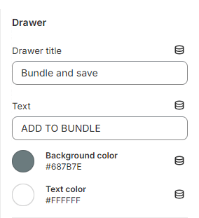
The drawer is responsible for letting the user select which product from which category they'd like to add. The settings to configure there aren't as many and are grouped under a single section.
The only things to configure there are the header and the add button's text and colors.
Customer facing UI
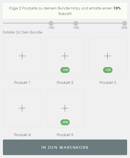
You've already seen an empty widget above, so let's take a look at how a widget with products looks like.
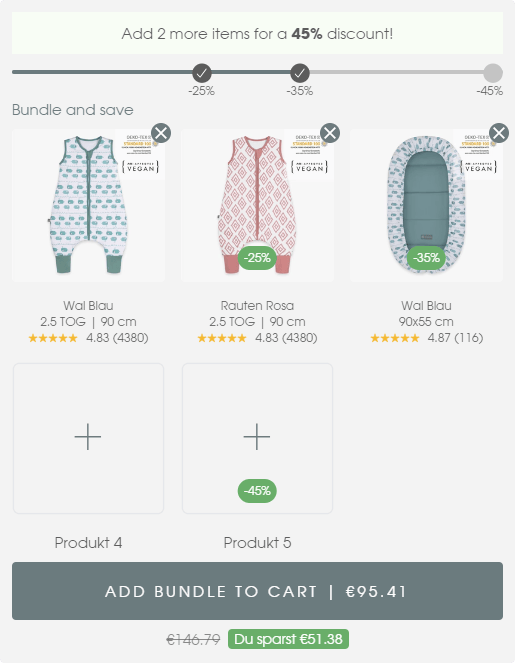 Bundle widget with some products already added
The widget is composed of 3 main parts with small additions to each, when necessary:
- Progress
- Content
- CTA
Progress
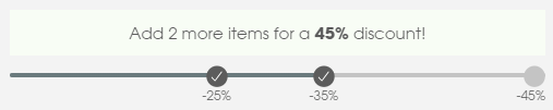
The progress section is an important part of the bundle widget as it gives the customer information on the remaining items until they get a certain discount. This is also a big conversion rate boost as it introduces a sense of FOMO or Fear Of Missing Out. It's a pretty common technique in conversion rate optimization.
 Progress section of the bundle widget
The message will change if the user makes it all the way to the full content of the bundle configured by the last threshold created in the admin.
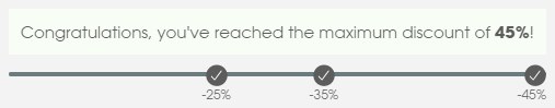 Progress section of the bundle widget when the last threshold has been reached
Content
We've crafted the product items to look informational, yet simple.
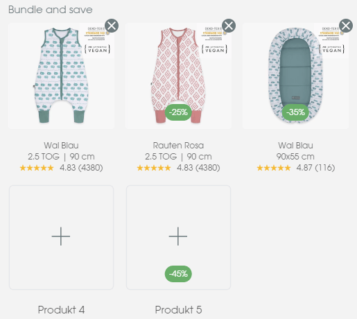 Content section of the bundle widget, represents all the items currently added in the bundle
Only the most crucial details have been added such as:
- Product image and title - can't go without these, they convey the content of the bundle at a glance
- Sizes - requested by merchant as it's one of the most commonly used ways by their customer base to distinguish variants
- Reviews - huge trust builder, staple in highly converting PDPs.
In order to keep the customer's options open and maximize order value, there will always be at least one + control for adding more products. In the image above you can see they go all the way up to the last threshold when there's less products, so that the places of the discounts could be told at a glance.
Call to action
The call to action is the last section in the widget. We've kept it simple as it always should be in order to keep the conversion rate high.
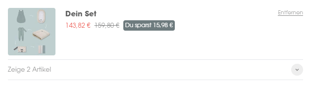
The only extra addition in close proximity is the amount of money saved, as it is an important aspect of the bundle. We also modify the CTA's text according to the current price of the bundle so that the customer knows how much they're spending.
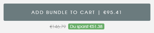 Call to action section of the bundle widget
Drawer
The last part I'd like to shed some light on is the drawer used for adding products to the bundle. It's a pretty important part of the customer journey as it requires us to shift the customer's focus from the current window. This is always a part where storefronts need to be extra careful not to change the experience too much for the customer.
This is why we decided to reuse the parent theme's drawer look and feel. That way the bundler feels like a part of the theme itself instead of, like most public apps on the Shopify store by default, looking and feeling like a 3rd party widget.
Category choice step
The first step that happens when you either click a + or the CTA when you don't have the minimum products added in the bundle is the category step. Since our merchant had many collections that they wanted to present to their customers (currently 18), we had to have a step for customers to choose a category. Taking many factors such as necessity and best selling, we came up with an order that would most likely never change and we went for the simplicity of not having them as a configurable setting.
 The category choice step in the bundle drawer
Product choice step
After the category choice the customer has to choose a product as well. This step is a bit more complex as some products have different variants. We've added filters and variant selectors for those.
The best selling categories had a couple of variant approaches as well so we had to do some extra processing to the data that came from Shopify. Many merchants have that problem - their shops have existed before Shopify added the more sophisticated variants and their modern quality of life features and have some old setups such as colors as different products, sizes as different products and many others all at the expense of not using the variants.They they end up needing a functionality to join said products under one and chaos ensues.
At Grumspot we're pretty used to dealing with that issue so what you'll see next is a few products joined under custom conditions. In this case we had to join them by a common tag.
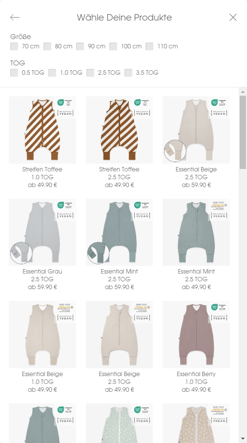 The products in the selected category
There's 2 logical parts in this drawer:
- Filters
- Products
Filters
The filters are used for the more complex categories like the one shared above. When there's a scroll that is way too big (2, 3 and more screens), it's a sign that there's a need for a way to filter the results, so we collaborated with the merchant to select the most important ones and use them to make the UX better.
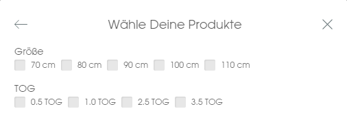 Product filters
Products
And of course for the products themselves we have a list of products that are selectable. As we mentioned above some products an extra step to select the exact variant needed. Adding too many of those would make the journey a bit too heavy on the customer though, so we limited them to one only and selected the most important one after consulting with the merchant, namely the size.
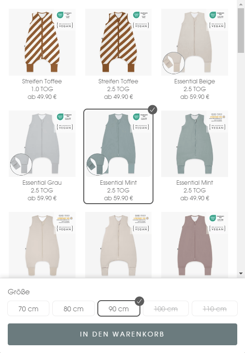 Product selection
As you can see there are some variants that are stricken. You might have already realized why - it's for the unavailable variants. Most of the inventory is stocked but we do need to make sure to strike out the unavailable items so that we do not harm the brand reputation. It's especially important for a brand such as Emma & Noah which strives to provide for arguably the most important thing in people's lives.
Closing words
The Mix&Match bundler for Emma & Noah was a project that proved to be bigger than you'd expect but working with the team to figure it out gave us an insight into the possibilities the Shopify ecosystem provides to its customers and partners. As we draw the curtains on this project, we believe that bundlers on Shopify are a must have for stores that are looking to increase AOV and revenue as a whole.
Testimonial
The bundler was just one of many custom projects we do here at Grumspot. Taking a look at the case studies would let you see the many other similar projects we did for our clients.
If you ever have a need for anything Shopify related - we're the right people for the job. But don't take our word for it - here's a message from Andy, the E-Commerce Manager at Emma & Noah, who we had the pleasure of working with, during this project.
Let's build something together
If you like what you saw, let's jump on a quick call and discuss your project
