Full redesign of Enibbana's Shopify storefront.
- Store Development
- UX/UI Design
Launched
March, 2024
Overview
Enibbana is an online retailer specialising in shoes, bags, and accessories, based in the United States. The company, recognized for its diverse product range, encountered significant challenges due to an outdated website infrastructure. Operating on an older version 4.5 of the Prestige theme on Shopify, Enibbana faced multiple operational hurdles, impacting their customer satisfaction and business efficiency. We were tasked with modernising their digital storefront, enhancing user experience, and implementing strategic upgrades without disrupting their unique custom features.
Challenge
Enibbana's legacy Prestige theme (version 4.5) was not only outdated but also the source of several technical and user experience issues. The primary challenge was to upgrade to the latest version 9.2.1, ensuring all custom implementations remained functional and intact. Additionally, Enibbana struggled with a one-size-fits-all approach to their sizing charts, leading to customer dissatisfaction, increased returns, and negative reviews. This sizing issue, particularly with European shoe brands, required a custom sophisticated solution.
Theme Upgrade and Customization
The upgrade process required meticulous planning and execution to preserve Enibbana's custom features. Our team conducted an in-depth analysis to identify all customizations, ensuring a seamless transition to Prestige 9.2.1. Through careful development and rigorous testing, we ensured that the upgrade maintained the integrity of Enibbana's functionality.
Advanced Size Chart Implementation
To address the sizing challenge, we leveraged Shopify's metafields to introduce a multi-tiered size chart system, which includes:
- Product-Specific Size Chart: Tailored size charts for individual products, ensuring precision and reducing sizing discrepancies.
- Vendor-Specific Size Chart: Customised sizing information for each brand, accommodating the nuances of European sizing variations.
- General Fallback Size Chart: A standard size chart that applies when specific charts are unavailable, maintaining a baseline for customer guidance.
This hierarchical approach ensures that customers receive the most accurate sizing information, enhancing their shopping experience and reducing return rates.
UX Audit and Design Overhaul
A comprehensive UX audit was essential to identify pain points and areas for enhancement. Our team evaluated Enibbana's website through various lenses, including usability, accessibility, and customer journey mapping. Based on our findings, we implemented targeted design changes on the new theme, focusing on intuitive navigation, improved UI design and sensible customer journey. These improvements aimed to elevate the overall user experience:
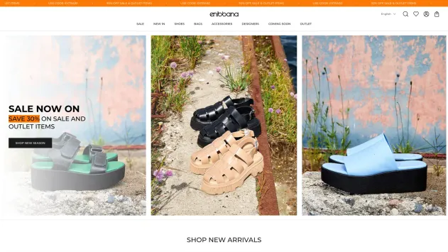
Homepage | Before
Homepage | After
- Hero module is just an image.
- No H1 tag on hero section, which is bad for SEO.
- No CTA
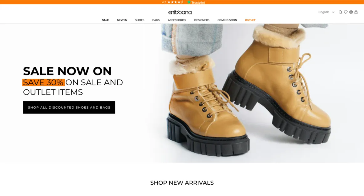
- Hero module with an H1 tag and a CTA
- Sections below hero module are off-grid
- White CTAs have low contrast
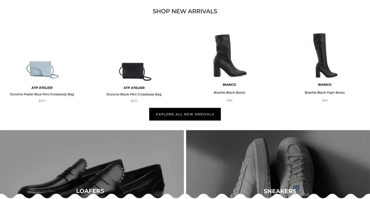
- Slightly adjusted product categories with light grey colour for prices. Shoes and bags are emotional purchases with low economic value. Pricing is not that important for the target customer.
- No indication that image is clickable and where the link leads
- Categories with links, larger images are for current season styles and smaller images are for style suitable for the previous season or the upcoming one.
- Copy on images is unreadable
- White CTAs have low contrast on light images
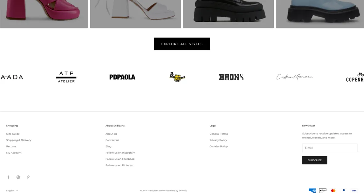
- Carousel for quick access to all brands sold on the storefront.
Product page | Before
Product page | After
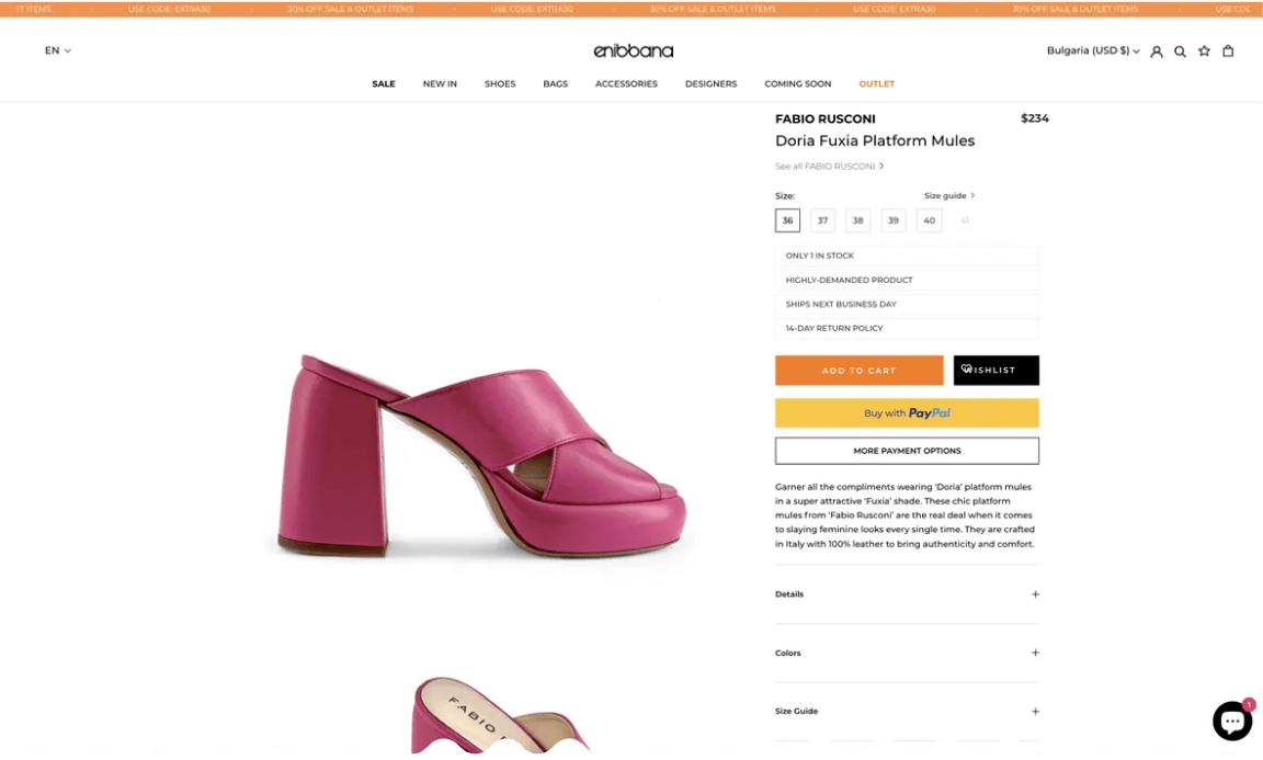
- Price too prominent for emotional purchases with low economic value like shoes and bags
- Product benefits look like buttons
- Too many CTAs with different colors
- Color variants nested in accordion
- Size guide too far away from the size cluster
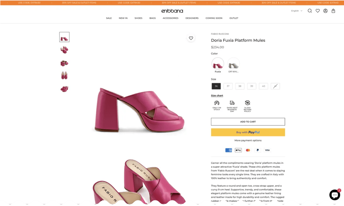
- Simplified CTAs
- Product benefits with icons, aligned horizontally so they take less real estate
- Less prominent price.
- Product variants shown with images and close to the top of the product content section
- Size guide moved closer to the size cluster
Homepage | Before
- Hero module is just an image.
- No H1 tag on hero section, which is bad for SEO.
- No CTA
- Sections below hero module are off-grid
- White CTAs have low contrast
- No indication that image is clickable and where the link leads
- Copy on images is unreadable
- White CTAs have low contrast on light images
Homepage | After
- Hero module with an H1 tag and a CTA
- Slightly adjusted product categories with light grey colour for prices. Shoes and bags are emotional purchases with low economic value. Pricing is not that important for the target customer.
- Categories with links, larger images are for current season styles and smaller images are for style suitable for the previous season or the upcoming one.
- Carousel for quick access to all brands sold on the storefront.
Product page | Before
- Price too prominent for emotional purchases with low economic value like shoes and bags
- Product benefits look like buttons
- Too many CTAs with different colors
- Color variants nested in accordion
- Size guide too far away from the size cluster
Product page | After
- Simplified CTAs
- Product benefits with icons, aligned horizontally so they take less real estate
- Less prominent price.
- Product variants shown with images and close to the top of the product content section
- Size guide moved closer to the size cluster
Results
The theme upgrade not only resolved existing technical issues but also positioned Enibbana for future scalability. The introduction of the advanced size chart system led to a noticeable decrease in return rates and an improvement in customer reviews, reflecting enhanced buyer satisfaction. Furthermore, the UX enhancements contributed to a more engaging and user-friendly website, fostering increased customer loyalty and sales.
Let's build something together
If you like what you saw, let's jump on a quick call and discuss your project
