Designing for dignity: How we built a Shopify experience for Better Health
- Shopify custom-built theme
- Shopify Plus Development
Launched
February, 2026
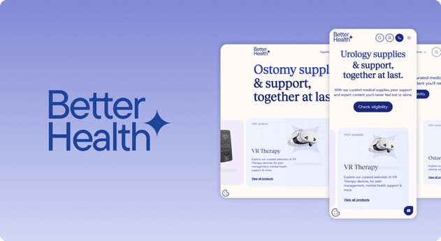
Designing for Dignity: How We Built a Shopify Experience for Better Health
Introduction: The "Clinical" Problem
In e-commerce, friction is usually the enemy. But in healthcare, friction is often a regulatory requirement.
When Better Health—a Y-Combinator backed startup revolutionizing the supply chain for chronic conditions—approached us, they faced a unique paradox. They weren't just selling products (ostomy bags, catheters, glucose monitors); they were selling care, insurance navigation, and peer support.
The standard Shopify blueprint is built for impulse buys: See product -> Add to Cart -> Checkout.
That flow fails in the medical space. You cannot impulse buy a colostomy bag. The purchase is high-stakes, deeply personal, and financially complex (often covered by insurance). The user isn't just a "shopper"; they are often a patient in a vulnerable state, overwhelmed by medical jargon and insurance bureaucracy.
Our mission was to redesign the Better Health storefront to bridge the gap between a sterile medical supply catalog and a warm, supportive consumer brand. We had to replace "Transaction" with "Trust."
Here is how we used behavioral psychology and custom Shopify architecture to build a site that sells by caring.
Part 1: The Design Philosophy – "Clinical Warmth"
The visual language of the medical industry is historically cold: sterile blues, stock photos of doctors in white coats, and dense tables of technical specs. This creates an emotional distance.
For the redesign, we adopted a strategy we call "Clinical Warmth."
We needed to balance Authority (We know our medical stuff) with Empathy (We understand what you are going through).
Visual Psychology
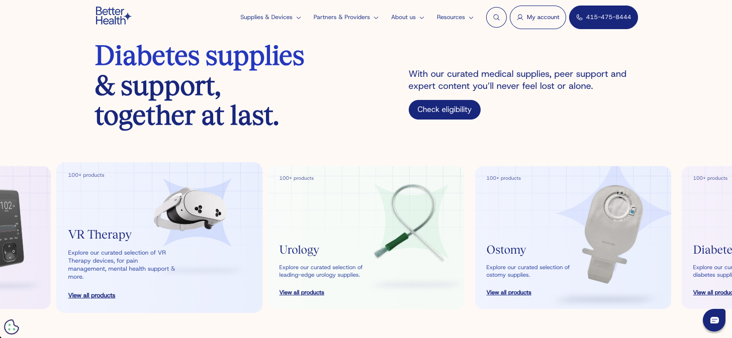
- Typography as Comfort: We moved away from the purely utilitarian sans-serif fonts typical of medical portals. Instead, we utilized a high-contrast serif typeface for headlines. This gives the site an editorial, magazine-quality feel. It signals to the user: This is a lifestyle brand that fits into your life, not just a medical warehouse.
- Softened Palette: While we kept the trustworthy "medical blue" for primary CTAs (capitalizing on color psychology where blue equals stability), we introduced soft creams and pastels for the backgrounds. This reduces visual eye strain and creates a calming atmosphere, crucial for users who may be browsing in a state of high anxiety.
Part 2: The "Price by Request" Architecture
The biggest technical and UX challenge on this project was the pricing model.
Because Better Health works directly with insurance providers (Medicare, Medicaid, Humana, etc.), the "price" of a product is variable. It depends on the patient's coverage. Showing a sticker price of $500 for a continuous glucose monitor would immediately scare off a user who might actually be able to get it for $0 with their insurance.
We had to break the standard Shopify product.liquid logic.
The "Foot-in-the-Door" Technique
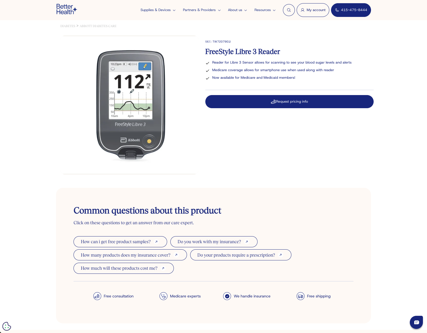
Instead of an "Add to Cart" button, we engineered a custom "Request Pricing Info" flow.
Psychologically, this utilizes the Foot-in-the-Door technique.
- High Friction (Bad): Asking a user to pay $200 immediately creates a high barrier to entry.
- Low Friction (Good): Asking a user to "Check Eligibility" or "Request Info" is a small, low-risk commitment.
By removing the dollar sign, we removed the "Sticker Shock." The primary Call to Action (CTA) on the homepage and product pages became "Check Eligibility" or "Request Pricing Info."
This changes the user's mental model from "I am spending money" to "I am seeing if I can save money." It turns a painful transaction into a potential gain.
The "Common Questions" Accordion
Beneath the CTA on product pages, we implemented a dynamic FAQ section addressing the four biggest blockers immediately:
- How can I get free product samples?
- Do you work with my insurance?
- How much will these products cost me?
- Do your products require a prescription?
This is Anxiety Reduction in action. By preemptively answering the fears that stop a user from clicking the CTA, we smooth the path to conversion.
Part 3: Navigating Complexity with Hick’s Law
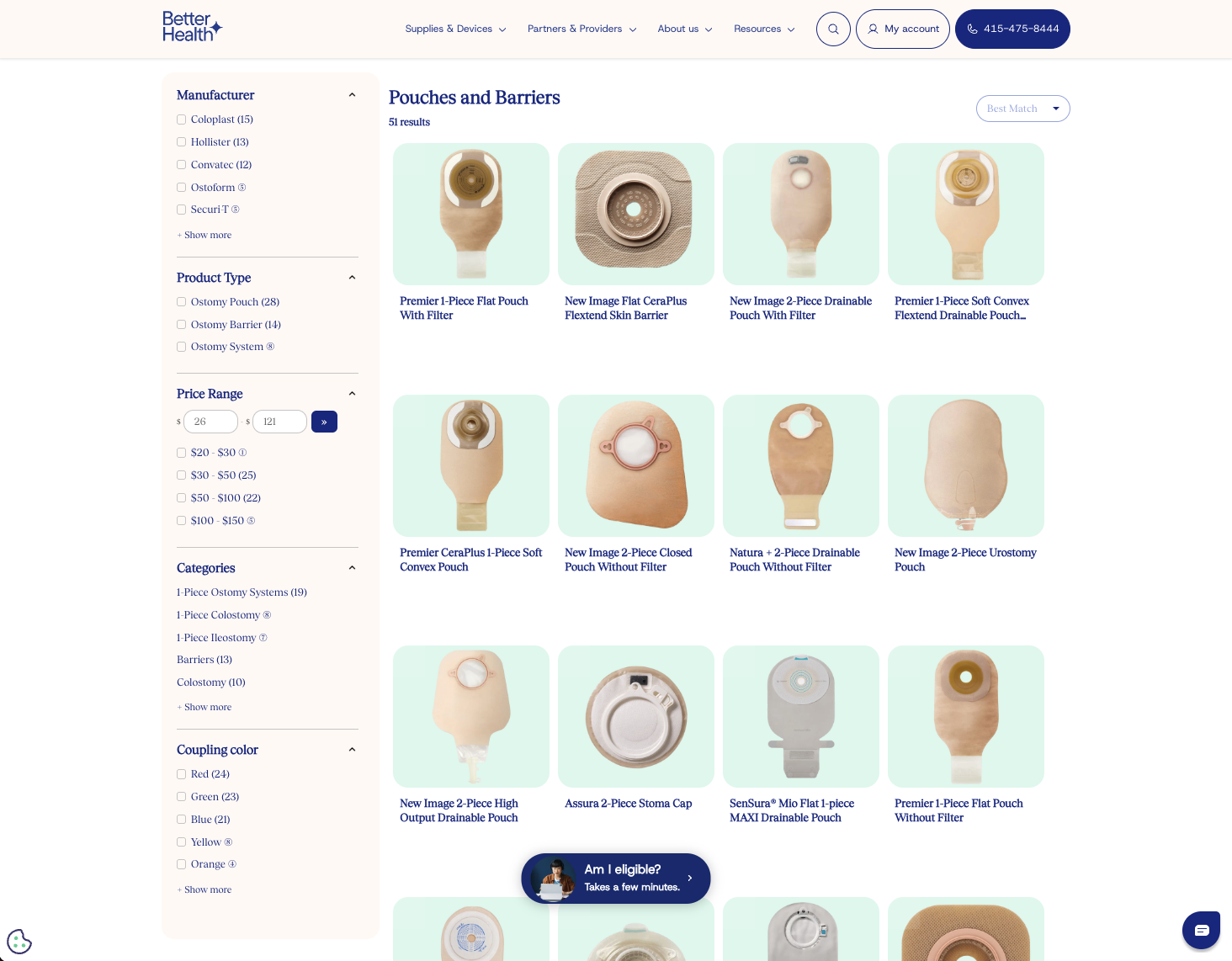
Medical supplies are terrifyingly specific. An ostomy pouch comes in 1-piece or 2-piece, flat or convex, drainable or closed, with varying flange sizes.
A user presented with 500 options will freeze. This is Hick’s Law: The time it takes to make a decision increases with the number and complexity of choices.
To combat Choice Paralysis, we built a rigorous faceted search system on the collection pages.
The Sidebar Logic
Instead of generic Shopify filters, we built medically relevant facets:
- Manufacturer: (Coloplast, Hollister, Convatec) – leveraging brand loyalty.
- Coupling Color: (Red, Green, Blue) – visually guiding users who might not know the size in millimeters but remember "the box with the green dot."
- System Type: (1-Piece vs. 2-Piece).
We also implemented "Best Match" sorting as the default, subtly guiding users toward the most commonly effective products rather than overwhelming them with alphabetical lists.
Part 4: Trust Signals and Authority Bias
In healthcare, trust is the currency. A user will not give their health insurance details to a site that looks sketchy. We saturated the design with Authority Bias triggers.
The "Trusted By" Block
On the homepage, immediately below the fold, we placed a prominent "Trusted by" section displaying logos of major insurers: Medicare, Medicaid, Humana, Aetna.
Placing these recognizable corporate logos next to the Better Health brand creates a Halo Effect. The trust users have for Medicare transfers to Better Health.
The "We Handle It" Promise
Throughout the site, we repeated a core value proposition triad:
- Free consultation
- Medicare experts
- We handle insurance
This creates Cognitive Ease. Dealing with insurance is hard; reading that someone else will "handle it" provides immediate psychological relief.
Social Proof
We integrated a "Hear From Our Members" section. Unlike standard product reviews ("Great shipping!"), these testimonials focus on the service and expertise ("Jessica was simply wonderful... makes you feel as if you're the most important person"). This humanizes the brand, proving that there are real people behind the website.
Conclusion: A Storefront That Listens
The Better Health redesign was not about flashy animations or trend-chasing. It was about empathy-driven design.
By understanding the mindset of a chronic care patient—someone who is likely stressed, budget-conscious, and overwhelmed—we were able to build a Shopify experience that feels less like a store and more like a support system.
We successfully transformed the technical constraints of "price-by-request" into a lead-generation asset, proving that with the right UX strategy, Shopify can handle even the most complex, regulated industries.
Let's build something together
If you like what you saw, let's jump on a quick call and discuss your project
