Engineering a seamless custom bundle experience for Ryzon
- custom shopify app
- shopify plus development
Launched
February, 2026
Introduction: The Friction of the Perfect Kit
In the world of high-performance cycling and triathlon, equipment is never just "stuff." It is a system. A rider does not simply buy a jersey; they build a kit. They need the jersey to match the bib shorts, the socks to complement the cap, and the arm warmers to function seamlessly with the base layer.
For Ryzon, a brand synonymous with minimalist aesthetics and maximum performance, the standard e-commerce shopping experience presented a subtle but significant friction point. Their products are designed to work together, yet the digital shelf isolated them.
Getting a customer to commit to a full cycling kit—which involves significant financial investment and multiple size/variant decisions—is tough. If a customer has to navigate back and forth between collection pages, remembering which size they selected for the bibs while looking at the jersey, the cognitive load becomes too heavy. The cart gets abandoned.
We knew that standard Shopify bundling apps were too rigid. They offered "Fixed Bundles" (take it or leave it) or simple "Buy X Get Y" logic. Ryzon needed something that mirrored the fluidity of a physical fitting room while leveraging the algorithmic power of digital sales.
We built a fully bespoke Shopify bundle app that introduces three distinct bundling logics: Theme Bundles, Mix & Match, and Fixed Combos. This case study explores how we used the Shopify Cart Transform API, behavioral psychology, and a rigorous UX approach to increase Units Per Transaction (UPT) and Average Order Value (AOV).
Part 1: The Architecture of Choice
The core challenge was versatility. A "one-size-fits-all" bundle logic would fail because users shop with different intents. Some want a quick deal on socks (Mix & Match), others want a curated look (Fixed), and the most valuable customers want to build a professional-grade outfit from scratch (Theme).
We developed a custom application that operates natively within Ryzon’s storefront, ensuring that the backend complexity never bleeds into the frontend elegance.
The Three Pillars of the Ryzon Bundle App
 1. The Fixed Combo Bundle
This is the entry-level tier of bundling, designed for decision simplicity. In the app administration, Ryzon can define a rigid set of products. For example, a "Winter Essentials" pack containing a specific beanie and specific gloves.
- The Logic: The products are pre-set. The customer cannot swap the beanie for a cap.
- The User Action: The customer only selects the relevant variants (e.g., Size M for gloves, Color Black for the beanie).
- The Commercial Lever: A fixed percentage discount applies to the total price. This serves customers who want expert curation without the fatigue of choice.
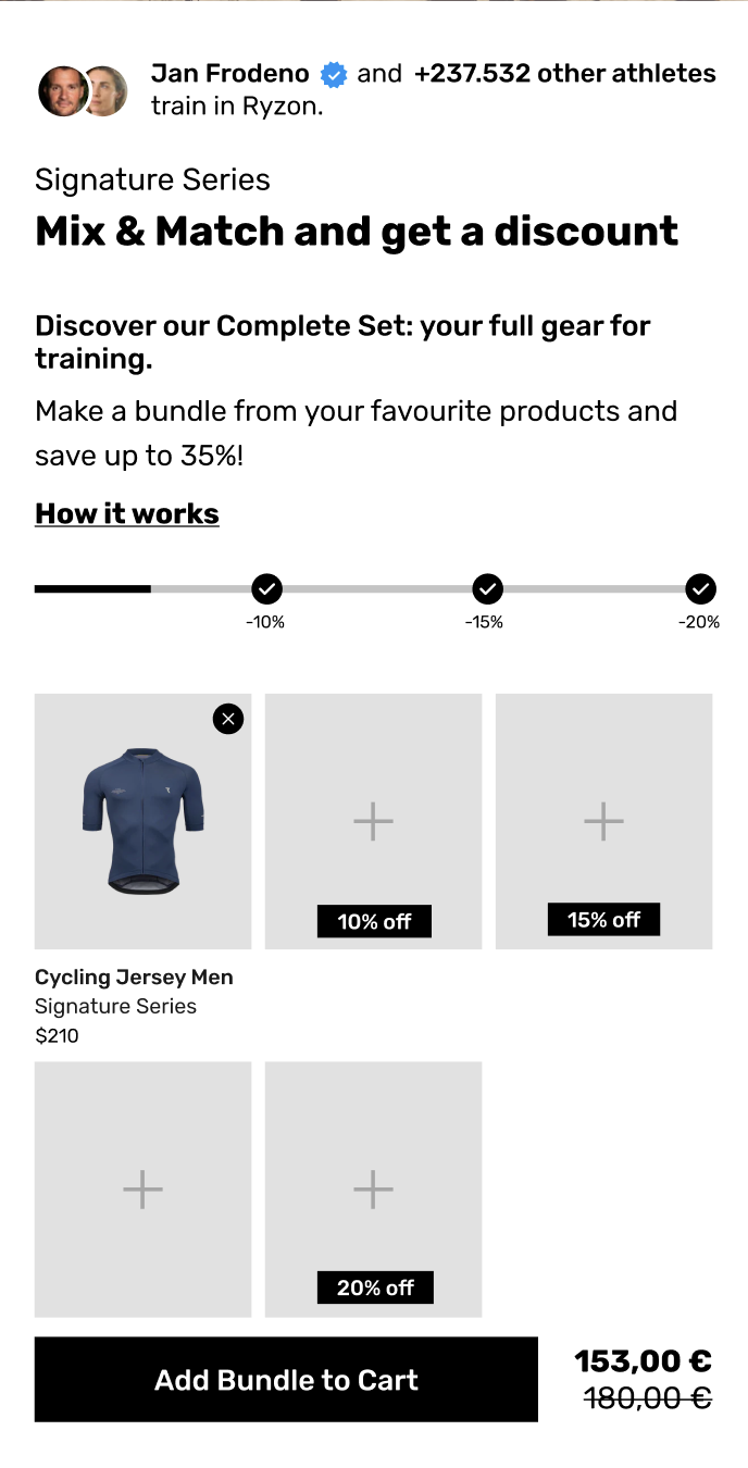 2. The Mix & Match Bundle
This logic targets the volume shopper. It replicates the "stock up and save" mentality. We built this to allow customers to freely combine selected products from across the entire store catalog.
- The Logic: Total freedom within a selection.
- The Commercial Lever: Tiered pricing. This is where the engine drives AOV. We implemented a configurable threshold system in the admin.
- Buy 2 items: Get 10% off.
- Buy 3 items: Get 15% off.
- Buy 5 items: Get 20% off.
- The Psychology: This utilizes a mechanic known as hyperbolic discounting combined with loss aversion. As the customer adds a second item, the app signals that a third item would unlock a steeper discount. The customer feels they are "losing money" by not adding that third pair of socks. It transforms the shopping experience from a transaction into a game of value optimization.
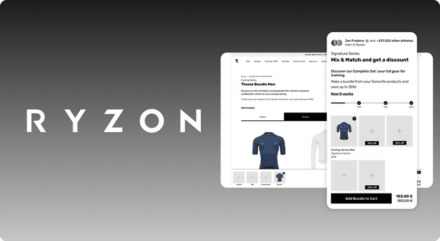
 3. The Theme Bundle (The Flagship Feature)
This is the crown jewel of the project. It is designed to solve the specific problem of selling a full "look" or "outfit."
- The Logic: Segment-based assembly. The admin defines slots, such as "Top," "Bottom," and "Accessory." The customer must fill these slots to validate the bundle.
- The Commercial Lever: Like the Mix & Match, this supports tiered discounts based on volume, but it enforces a structural harmony (you can't just buy 5 pairs of socks; you must build an outfit).
Part 2: The Theme Bundle – A UX Deep Dive
The Theme Bundle required the most rigorous design thinking. We needed to guide the user through categories without forcing them into a funnel they couldn't escape. The goal was to make the process feel like building, not just buying.
The Problem: The Infinite Scroll & Loss of Context
In early testing, we identified a critical flaw in standard bundle builders. When a user is presented with a long list of jerseys, they scroll down. As they scroll, the header disappears. They select a jersey. Then they scroll further to find bibs. By the time they are looking at socks, they have mentally forgotten which color jersey they picked.
They have lost context. To check, they have to scroll back up. This breaks the "flow state" of shopping. Friction kills conversion.
The Solution: The "Sticky Bar" Workbench
To solve this, we introduced a persistent, sticky bar at the bottom of the screen. This bar acts as a visual workbench. It is the single source of truth for the user's progress.
As the user explores the "Jersey" options and scrolls deep into the page, the bar remains. It serves three critical functions:
1. Context Retention & Navigation
The sticky bar displays the slots available in the bundle (Jacket, Jersey, Bib, Accessories). Crucially, it doubles as a navigation tool. If a user is looking at Jackets but wants to skip to Socks, they don't need to scroll the main page. They simply tap "Accessories" on the bottom bar, and the page creates a smooth anchor scroll to that section. This keeps the user in control and eliminates the frustration of "hunting" for the next step.
2. The Interactive Dashboard
We designed the bar to be fully interactive, not just a static display.
- One-Click Removal: If a user changes their mind, they can tap a small "X" on the product thumbnail directly in the bar. The item is removed instantly. This is a deliberate "low-friction" action. We did not want the user to have to go to the cart or find the original product card to deselect it.
- Horizontal Scalability: The bar is horizontally scrollable. This allows the user to add 5, 7, or 10 items without cluttering the UI. The design remains clean regardless of how enthusiastic the shopper becomes.
3. Clear Item Separation
A subtle but vital UX decision was how we handle quantity. In many e-commerce apps, adding two of the same item results in a badge that says "2x." We rejected this.
If a Ryzon customer adds two pairs of the same socks, they appear as two separate icons in the sticky bar. Why? Because it makes editing intuitive. If the user wants to remove one of those pairs, they simply click the X on one of the icons. If we used a "2x" badge, the user would likely have to open a modal or a dropdown to adjust the quantity to "1." By separating them visually, we made the "edit" action instantaneous.
The Psychology: The Zeigarnik Effect
The design of the Theme Bundle taps into a powerful psychological motivator known as the Zeigarnik Effect.
This psychological principle states that people remember uncompleted or interrupted tasks better than completed ones. It creates a state of cognitive tension—a mental "itch"—that can only be scratched by finishing the task.
When a user opens the Theme Bundle, they see empty slots in the sticky bar: An empty Jersey slot. An empty Bib slot. An empty Accessory slot.
This visualization creates a subtle sense of incompleteness. The user is not just browsing products; they are on a mission to "fill the slots." Seeing the empty Socks slot creates a motivating drive to complete the set. This bias directly increases the average number of items added to the bundle. The user feels a sense of reward and closure only when the slots are full and the "Add to Cart" button lights up.
Part 3: Technical Integrity and The "Invisible" Logic
A beautiful frontend is useless without a robust backend. The complexity of inventory management in bundling is notorious for causing overselling issues. We needed to ensure that the app was as smart as it was pretty.
The Shopify Cart Transform API
We utilized Shopify's official Cart Transform API to manage the bundle logic. This is a significant upgrade from older methods that relied on script editor hacks or simple line-item properties.
By using the Cart Transform API, we ensure that the bundle is recognized as a single logical unit within the checkout, while still tracking inventory at the child-item level.
- Parent/Child Display: In the Cart Notification, the Cart Page, and the Checkout, the bundle is displayed as a single "Parent" item with an expandable dropdown showing the individual "Child" items inside. This mirrors the behavior of leading DTC brands like emma & noah. It keeps the cart looking clean. The user sees "Ryzon Cycling Bundle" rather than a messy list of 5 disparate items.
- Inventory Synchronization: When a bundle is purchased, the API correctly deducts stock for the specific size of the jersey and the specific color of the socks.
Auto-Hiding Sold-Out Variants
Nothing frustrates a user more than building a perfect bundle only to be told at checkout that one item is out of stock.
We implemented real-time logic that automatically filters the UI. If a specific size of a jersey is sold out, it is removed from the variant selector options within the bundle builder. If a product is entirely sold out, it is hidden from the selection grid. The path to purchase is always clear of obstacles.
Consistent User Journey
We ensured that the bundle flow mimics the standard Ryzon product flow.
- Selection: User builds the bundle.
- Notification: The "Added to Cart" drawer slides out (showing the Parent/Child structure).
- Checkout: The user proceeds to the standard Shopify checkout.
There are no redirects to separate checkout domains or "app-specific" cart pages. The experience is seamless, maintaining brand trust throughout the transaction.
Error Handling with Empathy
Errors happen. A user might try to add a bundle without selecting a size for the bibs. We replaced generic browser alerts with clear, friendly error messages. If a selection fails, the app tells the user exactly what is missing and where to find it, using the same typographic voice as the rest of the site.
Part 4: The Mix & Match Logic – Incentivizing Volume
While the Theme Bundle focuses on curation, the Mix & Match bundle focuses on pure mathematical value.
We designed this section to be the engine of Upselling. The interface is cleaner here, focusing less on "outfit building" and more on "collection."
The power of this bundle type lies in the dynamic feedback loop. As the user adds products, a progress bar (or similar visual indicator) highlights how close they are to the next discount tier.
- "You have 2 items (10% off). Add 1 more to unlock 15% off!"
This is a classic implementation of Goal Gradient Theory. As users get closer to a goal (the 15% discount), their efforts to reach it increase. By visualizing the gap between their current cart and the next reward, we prompt users to add "just one more thing"—usually a high-margin accessory like socks or a water bottle—to bridge the gap.
Conclusion: Results and Impact
The Ryzon custom bundle app represents a shift from "transactional" e-commerce to "experiential" e-commerce.
By moving away from rigid, pre-boxed sets and embracing a flexible, user-centric architecture, we solved the primary friction points of selling complex cycling gear.
The Wins:
- Reduced Cognitive Load: The "Sticky Bar" workbench allows users to manage complex combinations without memory fatigue.
- Increased AOV: The tiered discount structure and the Zeigarnik Effect drive users to add more items per session.
- Operational Clarity: The Cart Transform API ensures that inventory is accurate and fulfillment teams see exactly what needs to be packed.
- Brand Elevation: The smooth, custom-coded interactions reinforce Ryzon’s position as a premium technology-driven brand.
This case study proves that when you treat a bundle not just as a discount mechanism, but as a guided user journey, you don't just sell more products. You sell a better way to buy.
