Odd Bunch - a Shopify Plus storefront redesign
- Shopify Plus
- CRO
- UX/UI Design
Odd Bunch gathers quirky‑looking produce from local farms and delivers it to Canadian households for up to 50% less than a typical grocery bill. We redesigned their Shopify Plus storefront to turn casual visitors into subscription customers.
- 18%
- higher CTR for the headline that includes the fifty percent savings stat
- 9.2 s
- cut from average time to product view, with anchor buttons to the product grid
- 22%
- more click depth on mobile from a sticky Add to cart button
- 50%
- up to, off a typical grocery bill: the promise the store leads with
- Client
- Odd Bunch, Canada
- Platform
- Shopify Plus
- The work
- Storefront redesign, CRO
- Built with
- Replo and a custom app
Project Overview
They had strong traction on TikTok but their original storefront was not up to par with the brand they developed. Our mission was clear: give Odd Bunch a faster, easier and more persuasive shopping experience that would turn casual visitors into subscription customers.
Goals
- Lift site‑wide conversion rate by at least 10% within three months.
- Surface social proof and brand story earlier in the journey to build trust.
Our Approach
We rebuilt the storefront using Replo and custom app for the weekly produce module and postcode checker. The redesign leaned on human‑centered messaging, bold color blocks and snackable metrics that reinforce value. Each template was driven by a single primary action to remove decision fatigue.
Home Page Highlights
Design Decisions
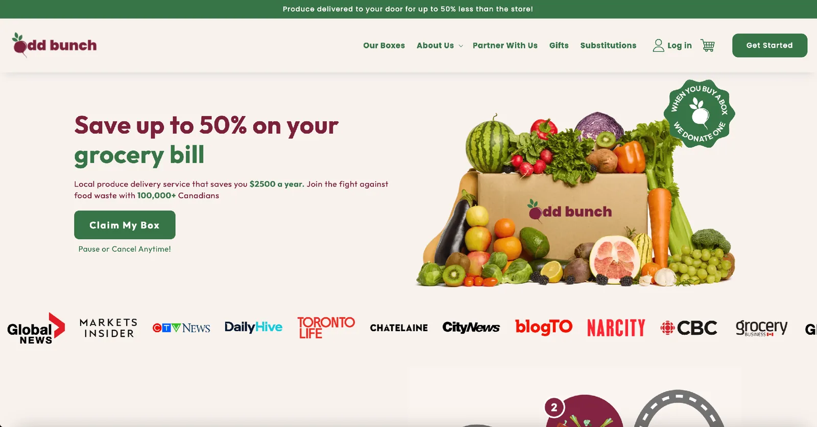
- Value first headline: We led with an explicit savings figure to match the search intent of cost‑conscious shoppers.
- Singular CTA: One green Claim My Box button reduces cognitive load.
- Trust carousel: Media logos give social proof without pushing the hero down.
- Animated process path: We converted a static infographic into a scroll‑triggered vector path which visually explains how the service works in under six seconds.
- Dynamic UGC strip: Embedded TikTok clips auto‑rotate and preload off‑screen to preserve performance while showing authentic unpacking experiences.
CRO Tactics Applied
- 18% higher CTR with the fifty percent stat in the headlineA/B tested headline variants with and without it. The version with the numeric promise won.
- 9.2 seconds cut from average time to product viewAnchor link buttons that auto‑scroll to the product grid.
- A FAQ accordion at the bottomTo deflect support questions and capture SEO rich‑snippet visibility.
Collection Page Highlights
Design Decisions
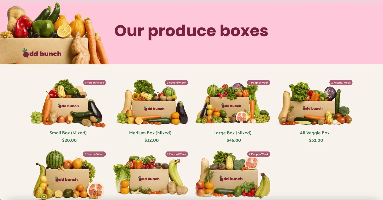
- Product density balance: Seven SKUs shown above the fold on desktop and four on mobile following heat‑map data that indicated most users decide between Small, Medium and Large.
- People per week label: We added a subtle two‑people‑per‑week tag to each card to help shoppers self‑segment without reading the full description.
CRO Tactics Applied
- Price harmony: whole numbers ending in 00To avoid analysis paralysis. A strikethrough comparator price is reserved for promotional windows only.
Product Page Highlights
Design Decisions
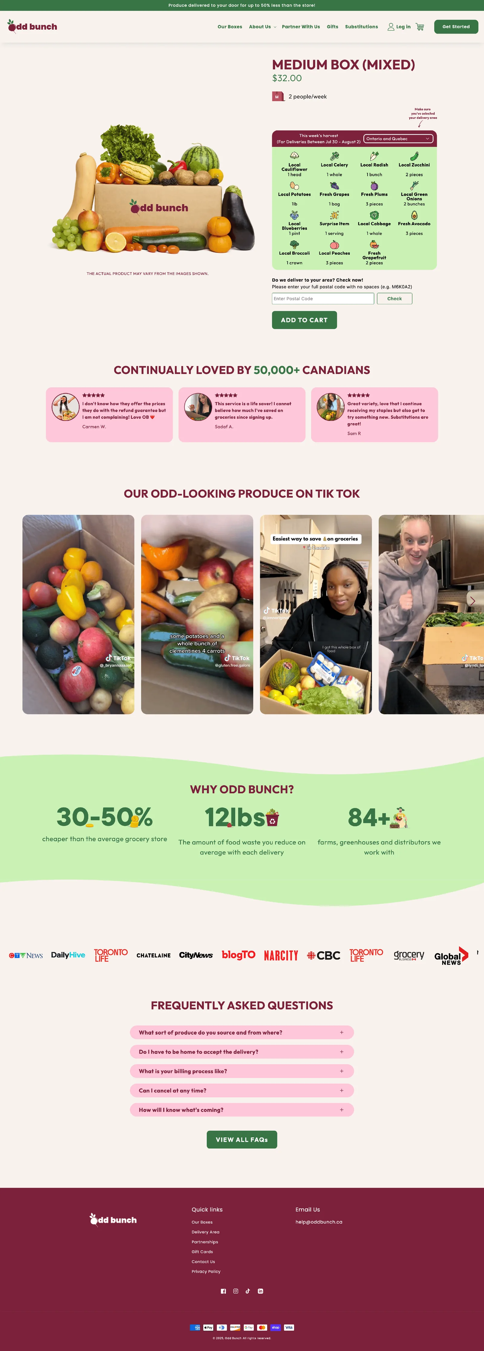
- Harvest table component: A tabbed matrix lists week‑specific contents in plain text for screen reader compatibility and SEO relevance.
- Size guidance pill: A small badge reads 2 people per week to reduce sizing doubts.
- Postal code checker: Before Add to cart, users can confirm delivery eligibility.
- Reassurance banner: Three key metrics (30‑50 percent savings, 12 lbs food waste reduced, 84 farm partners) sit directly under UGC to reinforce credibility.
What happens when a postal code is not eligible:
- 01The code is checkedBefore Add to cart, the user confirms delivery eligibility.
- 02Not eligible? Details are keptTheir contact details are stored in the customer list, with a special tag.
- 03The tag feeds KlaviyoUsers with the tag get pulled into a Klaviyo mail list, so they can be informed later on when their area becomes servicable.
CRO Tactics Applied
- 22% more click depth on mobileA persistent sticky Add to cart button.
Key Takeaways
By leading with clear quantified value, reducing friction and backing claims with real social proof we transformed Odd Bunch from a viral curiosity into a scalable subscription business. The project showcases how smart content hierarchy, Shopify 2.0 flexibility and targeted CRO testing can pay dividends even in low‑margin grocery.
- Shopify Plus
- Replo pages and sections
- Custom produce tracker
- Postcode eligibility checker
- Metaobjects and metafields
- Klaviyo
Want this kind of work on your store?
Send us the URL and what is slowing it down. We look at the store before we reply.