Build Shopify Store: Your 2026 UK Guide
- build shopify store
- shopify guide
- ecommerce uk
- shopify setup
- shopify 2.0
Launched
March, 2026

You’ve got a product idea, a few suppliers lined up, maybe a logo draft in Canva, and one open tab that says “Start free trial”. That’s usually the moment when building an ecommerce brand starts to feel less exciting and more expensive. Not because Shopify is hard to use, but because the wrong early decisions create problems you only notice once traffic arrives.
A lot of new merchants think the hard part is getting a store live. It isn’t. The hard part is building a store that can take a first order cleanly, explain the product well, load fast, rank properly, and still be flexible enough to grow when you need subscriptions, bundles, international pricing, or a redesign. That’s the difference between a website and a sales system.
Shopify matters because it’s no longer a niche tool for side projects. There are approximately 6.9 million live Shopify stores worldwide as of April 2026, and the platform grew from under 2 million stores to nearly 7 million in six years, a 250% expansion according to Craftberry’s Shopify store data. That scale tells you two things. First, Shopify is a serious platform. Second, competition is strong enough that “good enough” setup work won’t carry a store very far.
Your Journey from Idea to Online Store
Most merchants don’t need more motivation. They need a clearer sequence.
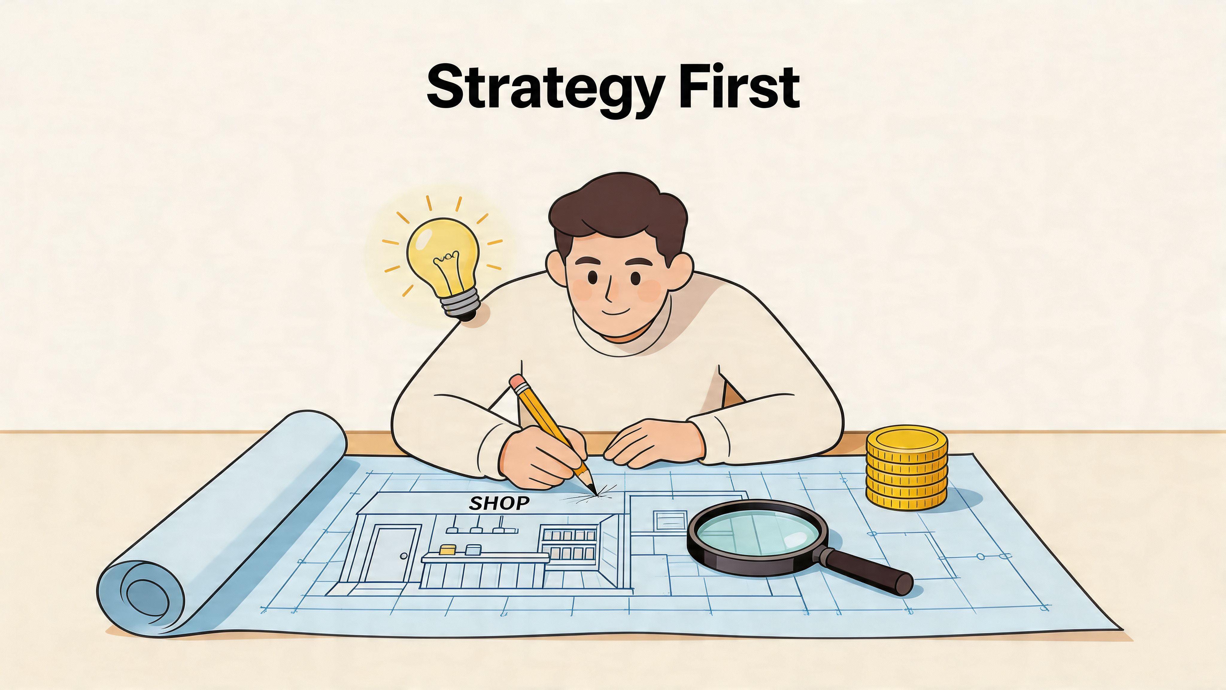
If you want to build shopify store properly, start by treating the project like retail infrastructure, not a creative exercise. The logo matters. The homepage matters. But the bigger wins come from choosing the right catalogue structure, payment setup, theme architecture, and launch process before you spend hours adjusting button colours.
That’s especially true if your business starts offline and moves online at the same time. If you’re building a physical concept as well, something like this guide to starting a coffee shop in the UK is useful because it forces the same foundational thinking you need for ecommerce: margins, operations, customer type, and brand position. Shopify doesn’t replace that work. It exposes whether you’ve done it.
A practical build follows this order:
- Define the commercial model. Decide what you’re selling, how often customers buy it, and whether your average order depends on bundles, variants, or repeat purchase.
- Map the store structure. Collections, filters, product templates, policy pages, and navigation should come before design tweaks.
- Set up operations. Payments, tax, fulfilment, returns, and customer emails need to work before ads or SEO matter.
- Design for conversion. A clean storefront beats a clever one that hides key information.
- Launch with tracking. If you can’t see where users drop off, you can’t improve anything after launch.
Practical rule: build for the second version of the business, not just the first launch. If you expect to add subscriptions, wholesale, bundles, or multiple markets later, make decisions now that won’t force a rebuild.
Platform choice still matters at this stage. If you’re comparing Shopify with alternatives before committing, this breakdown of ecommerce platforms for small business is worth reviewing because platform limitations usually show up after the catalogue grows, not on day one.
Laying the Foundations for a Profitable Store
Merchants often rush into theme selection because it feels productive. It isn’t the first job. Profit starts with sharper planning.
Choose the business model before the branding
A store selling one hero product needs a different build from a store selling fifty SKUs across multiple categories. The homepage layout, navigation depth, collection logic, and upsell strategy all change based on that.
Ask these questions before you open Shopify:
- How do people buy this product? One-off purchase, replenishment, gifting, or comparison shopping.
- What creates margin? Single item sales, bundles, add-ons, or repeat orders.
- What causes hesitation? Sizing, ingredients, fit, delivery speed, compatibility, or trust.
- What content closes the sale? Reviews, demos, technical specs, FAQs, or before-and-after proof.
If you skip this step, you’ll build generic pages and try to fix weak conversion later with apps.
Build a brand system, not just a logo
A profitable brand isn’t “premium” because the font looks expensive. It feels coherent because the decisions match.
Your basic brand system should include:
- Name and positioning. Short enough to remember, clear enough to say out loud, and distinct enough to avoid blending into every other direct-to-consumer brand.
- Colour palette. One primary, one secondary, one accent, and neutral tones for backgrounds and text.
- Typography rules. Headings and body text should support readability first. Decorative typefaces rarely help product pages.
- Image style. Decide whether the brand relies on clean packshots, lifestyle photography, user-generated content, or a mix.
A useful test is this: can someone look at your homepage, product page, packaging insert, and order email and recognise the same brand? If not, tighten the system before you design the site.
Stores don’t usually underperform because the shade of blue is wrong. They underperform because the brand promise, product page, and offer don’t line up.
Plan your catalogue like a merchandiser
Navigation is one of the first places new stores go wrong. Merchants organise products the way they think about inventory. Customers shop by need, use case, size, price point, or problem.
A better approach is to sketch your collections before build:
| Store element | Bad approach | Better approach |
|---|---|---|
| Main menu | Every category listed at once | Fewer top-level paths based on how customers browse |
| Collections | Internal stock groupings | Intent-led categories such as gifting, new arrivals, best sellers |
| Product variants | Split into separate products unnecessarily | Keep logical options together where comparison helps |
| Filters | Missing or inconsistent | Built around attributes customers actually use |
If you expect complex filtering later, note that now. Theme and app decisions will depend on it.
Pick the right Shopify plan for your stage
You don’t need the highest plan to look credible. You need the plan that matches operational reality.
A simple way to think about it:
- Basic suits early stores validating demand.
- Shopify usually fits brands that need more reporting and smoother day-to-day operations.
- Advanced starts to make sense when complexity increases across fulfilment, team access, and reporting needs.
Don’t overbuy because you’ve read an enterprise case study. But don’t underbuy if weak reporting or workflow limits create manual work every week. The cheapest monthly plan can become the expensive choice if it slows decisions.
Decide what gets custom work and what doesn’t
Custom development is powerful, but not every problem deserves it.
Use native Shopify features where they’re strong. Buy an app when the requirement is proven and the app is stable. Build custom when the store needs a workflow, interface, or integration that generic tools can’t handle cleanly.
That trade-off matters early. Merchants often spend budget on decorative custom sections, then leave no room for the work that affects revenue: product templates, bundle logic, mobile UX, or review integration.
A sensible planning stack looks like this:
- Native where possible for products, collections, policies, and core merchandising
- Apps where practical for reviews, email capture, consent, and search enhancements
- Custom work where necessary for unique buying flows, ERP connections, subscription logic, or customized landing pages
If your blueprint is clear at this point, the actual store build becomes faster, cheaper, and more stable.
Configuring Your Shopify Account for the UK Market
The admin setup is where a store becomes operational. It’s also where rushed merchants create tax problems, checkout friction, and avoidable support tickets.
The UK matters here because Shopify adoption is strong at scale. The country hosts approximately 5,804 Shopify Plus stores as of 2026, making it Shopify’s second-largest enterprise market, and active UK Shopify stores grew by over 14% year-over-year in late 2025 according to Style Factory’s Shopify statistics. That matters because UK shoppers are already used to polished Shopify checkouts. Your store doesn’t get a pass for clunky setup.
Start with the business settings that affect compliance
Before design, fill in the business details properly:
- Legal business name and address
- Customer-facing contact details
- Store currency in GBP
- VAT information if applicable
- Order notification sender details
These settings feed into invoices, taxes, shipping logic, and customer trust. If they’re wrong, the problem spreads through the whole store.
One source notes that VAT setup errors can create immediate tax misconfiguration issues for UK stores, so don’t treat tax settings as admin housekeeping. They affect real money and reporting.
Payment setup should reduce friction, not add options for the sake of it
Most stores need one primary payment route, a couple of trusted accelerated options, and clean checkout messaging. They don’t need every badge under the sun.
In the UK, I’d usually prioritise:
- Shopify Payments, where available and suitable
- PayPal, because many shoppers still expect it
- Apple Pay and Google Pay, because fast mobile checkout matters
- One strong backup gateway if there’s a business reason for it
Too many gateways can complicate reconciliation and customer support. Too few can lose legitimate orders.
If you’re weighing the trade-offs between different providers, this guide to payment gateways for ecommerce is a practical comparison point.
Operational note: payment setup isn’t just about approval rates. It affects refunds, reporting, fraud review, and how easily your team can reconcile payouts later.
Shipping setup needs commercial logic
A lot of new stores either overcomplicate shipping or hide it until checkout. Both hurt conversion.
Build your shipping rules around what customers need to know quickly:
- Where you ship
- How long it takes
- What it costs
- When free shipping applies
- Who handles tracked or express options
For a UK store, that often means setting clear domestic shipping zones first, then deciding whether Northern Ireland, EU destinations, or the rest of world need separate handling. Royal Mail, DPD, Evri, and specialist fulfilment partners all have different operational implications. Choose the workflow your business can maintain.
This visual is useful if you’re mapping rates and zones inside Shopify.
Taxes, markets, and customer expectations
Tax display should be clear from the first product page view. Surprises at checkout damage trust quickly.
A solid UK setup includes:
- Correct tax rules for your products and regions
- Clear pricing display so customers understand whether VAT is included
- Returns and delivery pages that answer common questions before support gets involved
- Market settings only if you’re genuinely ready to support other countries operationally
Some merchants enable international selling too early because Shopify makes it look simple. The admin can support it. Operations still need to catch up. If your shipping, duties communication, returns process, and customer support aren’t ready, keep the launch scope tighter.
Admin choices that save time later
A few backend habits help from day one:
| Area | Good setup | Common mistake |
|---|---|---|
| Products | Consistent titles, handles, tags, and metafields | Ad hoc naming that breaks filtering |
| Orders | Clear fulfilment statuses and notifications | Manual workarounds for every edge case |
| Staff access | Role-based permissions | Shared logins or over-permissioned users |
| Policies | Published and easy to find | Added late or copied without review |
The cleanest Shopify stores aren’t always the most customised. They’re the ones where the admin reflects how the business operates.
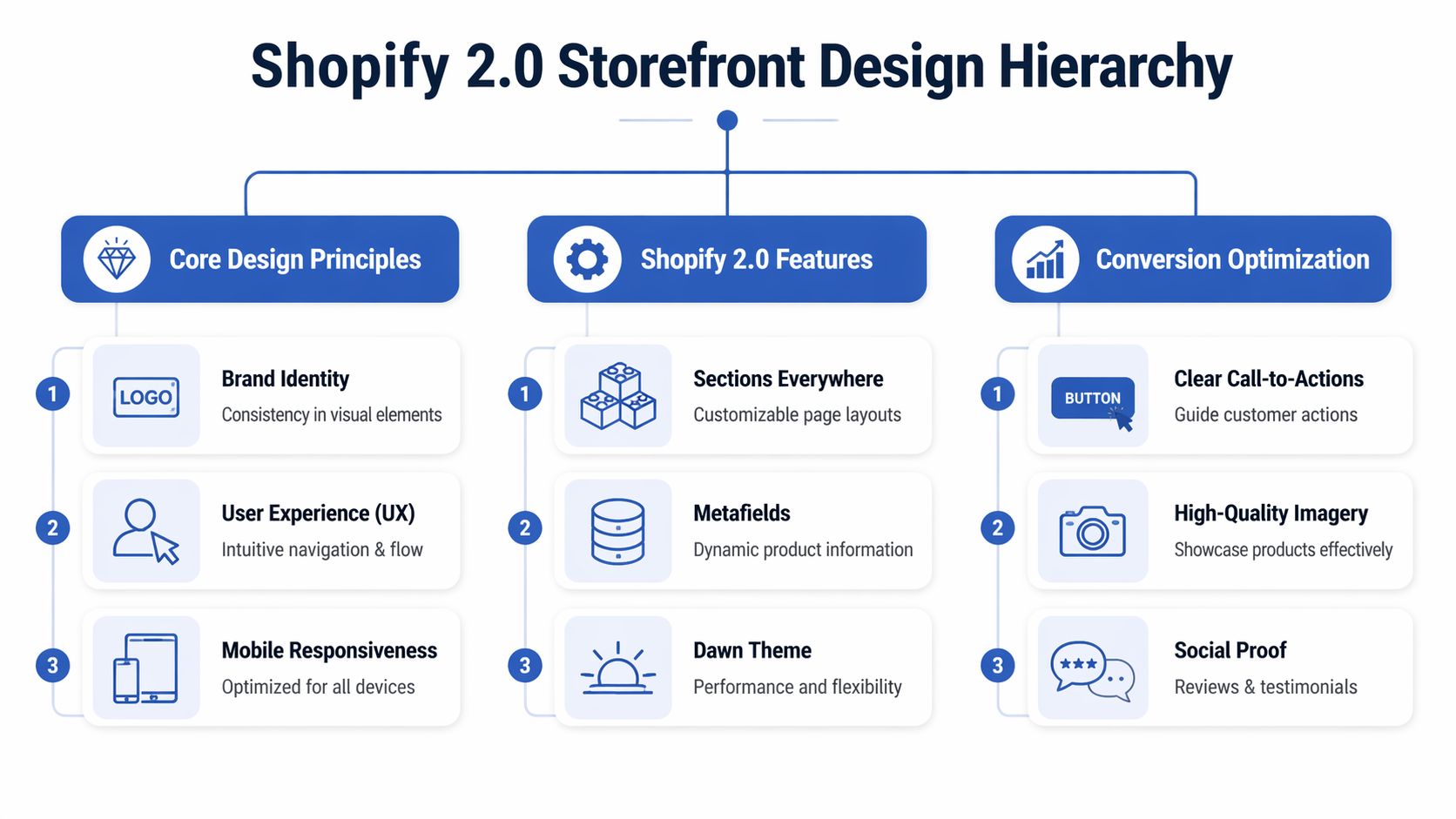
Designing a High-Converting Storefront with Shopify 2.0
Most stores don’t need more design. They need better merchandising decisions inside the design.
Shopify 2.0 gives you far more flexibility than older theme setups, but flexibility can create clutter if you treat every page like a blank canvas. The objective isn’t to fill sections. It’s to guide a customer from landing to purchase with as little friction as possible.
Free theme or paid theme
This is one of the first real trade-offs in any build shopify store project.
A free theme such as Dawn is often the right starting point when:
- the catalogue is straightforward
- the budget is limited
- speed and clean code matter more than visual novelty
- you’re willing to keep the design disciplined
A paid theme makes sense when you need stronger built-in merchandising features, more polished collection layouts, or design options that would otherwise require extra apps or development.
Here’s the candid version. A paid theme can save time, but it can also tempt merchants into using every slider, badge, hotspot, and animation it includes. That usually makes the store worse. A free theme with considered customisation often outperforms an overloaded premium theme.
Use Shopify 2.0 as a system
The best part of Online Store 2.0 isn’t novelty. It’s maintainability.
You can build with:
- Sections and blocks for modular page layouts
- JSON templates for page-specific structure
- Metafields for structured product or page content
- App blocks so app content sits more cleanly inside the theme editor
That changes how a store should be built. Instead of hardcoding every campaign page or forcing product information into long body copy, you can create reusable templates that keep the store consistent.
According to Successive’s Shopify development guide, UK stores should optimise with Shopify 2.0 JSON templates and target an LCP under 2.5 seconds. The same source notes that slower stores can see bounce rates up to 32% higher, and that high-resolution images can boost conversion by as much as 61%. That’s why theme decisions should be tied to speed and product presentation, not just aesthetics.
A homepage doesn’t need to explain everything. It needs to direct people efficiently to the right products, the right proof, and the right next click.
What a strong homepage actually needs
A homepage has one job: orient the visitor and move them into the catalogue or a buying path.
For most brands, that means including:
- A clear hero section with one message, not three competing claims
- Featured categories or collections based on shopper intent
- A best seller or featured product block
- Trust signals such as reviews, press mentions, or guarantees
- A short brand story, if it helps justify the product
- An email capture, but only if the offer is credible
What doesn’t help: giant intro paragraphs, vague slogans, autoplay videos, and carousels that rotate before someone can read them.
Product pages do the real sales work
Most conversion wins happen on the product page, not the homepage.
A product page should answer, in order:
- What is it?
- Why is it better or more suitable?
- What options can I choose?
- How soon can I get it?
- What happens if it isn’t right?
Use the page structure to support those answers. Don’t bury delivery info beneath five image galleries. Don’t place returns details only in the footer. And don’t write descriptions that sound like packaging copy.
A practical product page usually includes:
- concise opening copy
- variant selectors that are easy to understand
- visible delivery and returns messaging
- supporting content lower down such as FAQs, care details, ingredients, or specifications
- reviews or social proof where they help decision-making
Image quality matters here, but so does consistency. If you need a useful reference for aspect ratios and practical implementation, this guide on mastering Shopify image sizes is worth reviewing before you upload hundreds of mismatched assets.
Navigation, collections, and legal pages
Stores often lose clarity when merchants focus only on the front page.
Your collections should do more than group products. They should support how shoppers compare and decide. If someone lands on a collection page, they need sorting, filtering, strong thumbnails, and clear product titles.
Your essential pages also need attention:
| Page | What it should do |
|---|---|
| About | Build trust without writing a biography |
| Contact | Make support feel accessible and credible |
| Shipping | Answer timing and cost questions early |
| Returns | Reduce purchase hesitation |
| Privacy and terms | Meet legal requirements and set expectations |
Design for mobile first, not mobile later
A store can look excellent on desktop and still fail commercially because the mobile version asks too much of the user. Long stacked sections, awkward sticky elements, oversized pop-ups, and slow-loading media all create friction where most users are least patient.
That’s why conversion-focused layout decisions matter more than decorative ones. If you want a useful benchmark for what that looks like in practice, this piece on conversion-focused web design gives a good framing for design choices that support revenue rather than just appearance.
The strongest storefronts feel easy because someone removed what wasn’t needed.
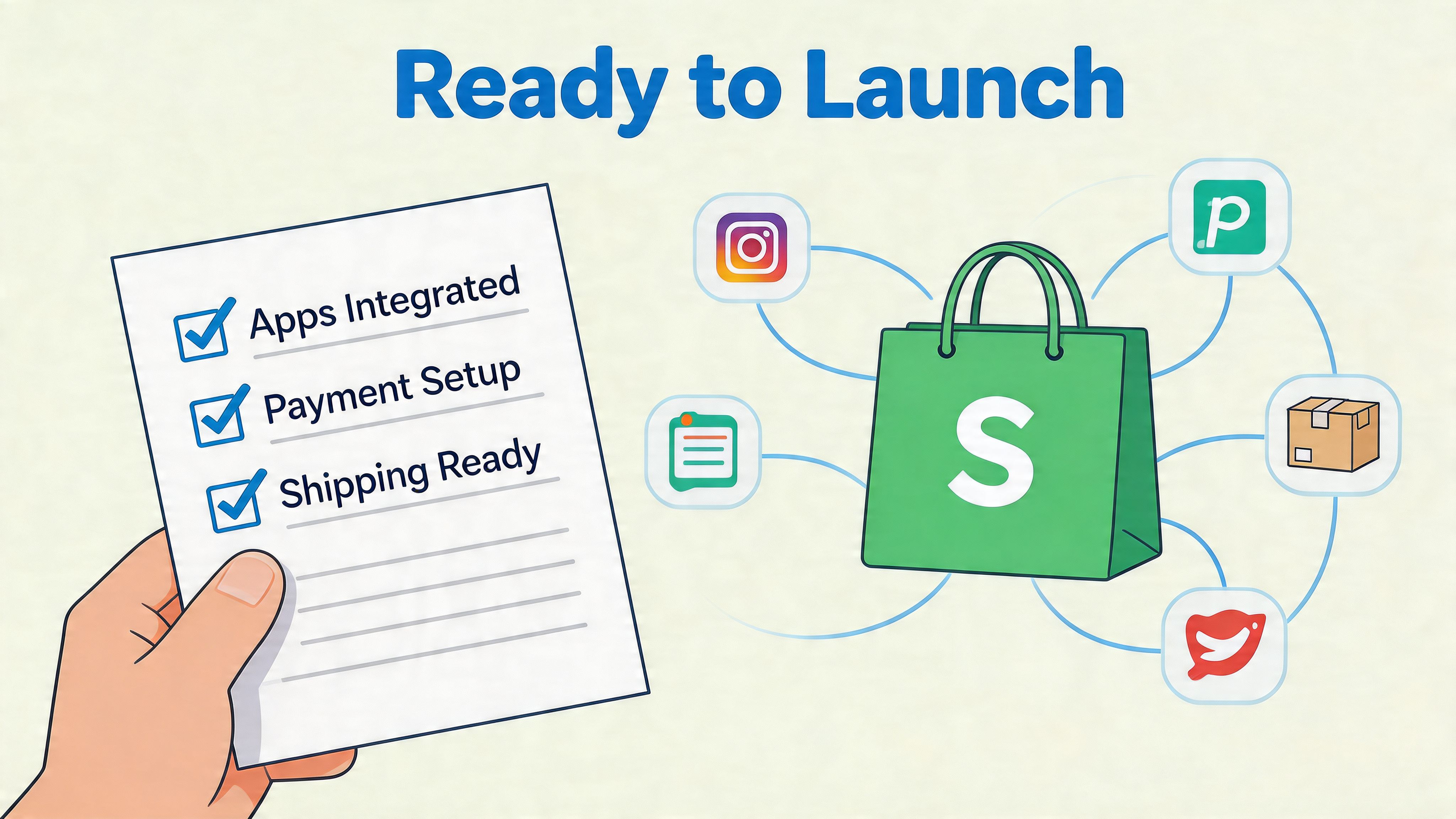
Integrating Apps and Finalising Your Pre-Launch Checklist
A Shopify store without the right app stack and proper testing isn’t finished. It’s exposed.
That sounds harsh, but it’s the reality of launch week. If payments work inconsistently, consent is missing, mobile layouts break, or your review widget conflicts with the theme, customers will find those issues faster than you do. The store may still be technically live. Commercially, it’s not ready.
The app categories that actually matter
New merchants often install too many apps too early. That creates theme bloat, duplicate features, and troubleshooting headaches. Start with categories, not brand names.
The core app stack usually covers:
- Reviews so product pages have social proof and user-generated trust signals
- Email and SMS marketing for welcome flows, abandoned checkout, and post-purchase communication
- SEO support where it improves metadata, schema handling, or content control
- Consent management for UK GDPR requirements
- Search and merchandising if your catalogue needs stronger discovery
- Subscriptions, bundles, or loyalty only if the business model requires them from launch
You don’t need every app on day one. You need the smallest set that solves real operational or conversion problems.
Launch rule: every installed app should have a job you can describe in one sentence. If you can’t explain why it’s there, remove it.
UK compliance and domain choices aren’t optional details
A polished storefront can still create risk if the legal layer is weak.
According to Silver Webbuzz’s Shopify guide, UK GDPR cookie consent is mandatory, a .co.uk domain can see 14% higher conversion, and unverified mobile responsiveness can cause a 25% drop in sales. Those aren’t edge-case details. They affect trust, discoverability, and basic usability.
That means your launch setup should include:
- a live consent solution that matches your tracking setup
- a final decision on whether your brand should use a .co.uk domain
- mobile checks on actual devices, not just browser resize testing
- published policy pages with accurate language for your business
If your store depends on analytics or ad platforms, cookie consent needs to be implemented carefully. Half-configured tracking produces bad reporting, which leads to bad decisions later.
What to test before you remove the password
The right pre-launch routine is repetitive on purpose. You’re trying to catch boring failures before customers do.
Use this checklist:
- Place test orders using each active payment method.
- Check transactional emails for branding, links, and wording.
- Review shipping logic across products and destinations you support.
- Test discount codes if you plan to launch with an offer.
- Check every main navigation link and footer link.
- Open product pages on mobile and test variant selection, image galleries, sticky add-to-cart, and reviews.
- Verify policy pages are linked in the footer and checkout where appropriate.
- Connect analytics and ad tracking only after consent behaviour is working properly.
- Point the live domain and confirm redirects resolve cleanly.
- Remove the storefront password only when the above is done.
A short comparison that saves trouble
| Area | Good enough for launch | Not good enough |
|---|---|---|
| Apps | Lean stack with clear roles | App overload with overlapping features |
| Theme | Stable, tested, and edited carefully | Last-minute code changes before launch |
| Mobile UX | Checked on real devices | Assumed fine because desktop looks good |
| Tracking | Events reviewed after consent setup | Tags added without validation |
| Policies | Written for your store | Copied from another business |
Who should handle the final QA
If you’re launching solo, do the checklist twice. Once as the merchant, once pretending you’re a first-time customer who doesn’t know how the site is supposed to work.
If you have support, use it where it matters. For stores with custom sections, app-heavy builds, or complex integrations, agencies and specialist teams can help with launch audits and issue triage. That can include developers, CRO specialists, and teams such as Grumspot, which works on Shopify design, development, audits, and optimisation. The value isn’t “having experts”. It’s reducing the chance that a preventable issue blocks sales in the first week.
Launch confidence doesn’t come from enthusiasm. It comes from testing everything that can break.
Beyond the Launch Scaling with SEO and CRO
A live store is only proof that the build phase ended. It doesn’t tell you whether the business is improving.
The merchants who grow after launch usually get one thing right early. They stop asking, “How do I finish the website?” and start asking, “Where is the store leaking demand?” That shift changes everything. It pushes attention toward search visibility, merchandising, repeat purchase, and checkout behaviour rather than endless design tweaks.
SEO starts with structure, not blog volume
Search performance usually reflects the work you already did during build. Clear collection architecture, clean URLs, useful product copy, internal linking, and well-structured metadata all matter more than publishing filler articles every week.
After launch, review:
- Collection intent. Are category pages built around real search and shopping behaviour?
- Product titles and descriptions. Do they use language customers search for?
- Internal linking. Can users and search engines move naturally between products, collections, and supporting pages?
- Technical basics. Are pages indexable, crawlable, and free from avoidable duplication?
Content can help, but only when it supports actual customer questions. A strong guide, comparison page, or use-case article often does more than generic “top trends” posts.
CRO is where established stores usually unlock growth
A lot of merchants treat conversion rate optimisation like a final polish. It’s closer to ongoing product development.
According to Convert’s article on Shopify A/B testing, systematic post-launch CRO can increase Average Order Value by 40% to 60% or more. That’s why stores plateau when they stop at launch. The site works, but nobody is testing what message, layout, offer, or buying angle persuades customers.
Useful CRO work often includes:
- testing product page order and content emphasis
- changing bundle presentation
- simplifying add-to-cart areas
- refining shipping threshold messaging
- improving collection page filtering and merchandising
- tightening mobile checkout flows
Most stores don’t need a full redesign when conversion stalls. They need a clearer testing cadence and stronger hypotheses.
Traffic quality matters as much as traffic volume
More visitors won’t fix a weak store. Better-matched visitors often will.
That’s one reason partnerships and channel strategy matter after launch. If you’re exploring lower-risk acquisition channels beyond paid ads, something like this primer on affiliate marketing for beginners can help frame how external partners, creators, or publishers might drive more qualified traffic into the store.
The key is alignment. Don’t add channels because they sound scalable. Add them when the offer, margin, and audience fit.
Know when the business is outgrowing the current setup
Not every brand needs Shopify Plus. Some do, but only when complexity justifies it.
The signs are usually operational before they’re visual:
- you need deeper custom checkout or B2B workflows
- multiple markets create serious merchandising complexity
- custom apps and integrations are becoming core infrastructure
- the team needs more control over automation and scale-specific processes
That decision should come from business pressure, not status. The right time to upgrade is when the current setup starts limiting growth, not when the brand wants to look bigger.
Growth after launch is rarely dramatic at first. It’s usually a sequence of cleaner pages, better testing, stronger search visibility, and smarter traffic sources. Done consistently, that’s what turns a functioning Shopify store into a serious revenue channel.
If you’re building a new store or trying to fix one that launched without a solid conversion and technical foundation, Grumspot can help with Shopify design, development, audits, migrations to Shopify 2.0, and ongoing CRO support. The practical goal is simple: build a store that works on launch day and keeps improving after it.
Let's build something together
If you like what you saw, let's jump on a quick call and discuss your project

Related posts
Check out some similar posts.
- how to set up an ecommerce business
Ready to launch your online store? Learn how to set up an ecommerce business with our end-to-end 202...
Read more