Shopify Accessibility Audit A Complete Guide for 2026
- shopify accessibility audit
- wcag compliance
- ecommerce accessibility
- ada compliance shopify
- grumspot
Launched
May, 2026

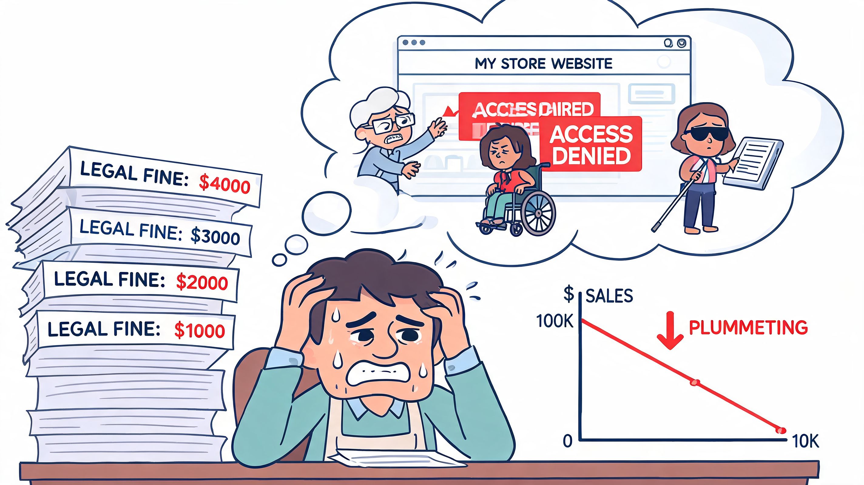
Most store owners think about accessibility when a complaint lands, a legal email arrives, or a redesign starts breaking basic interactions. That’s too late. A Shopify accessibility audit is most useful when you treat it like a serious operational check, not a box-ticking exercise. It tells you where customers are getting blocked, which issues carry the most risk, and what your team needs to fix first.
The key point is simple. An audit is not the finish line. It’s the handover from uncertainty to a concrete remediation plan.
Your Digital Storefront Has a Blind Spot
Shopify powers millions of storefronts, yet accessibility failures still show up on the stores customers use every day. That gap is the problem. A store can look polished in a launch review and still block basic actions for shoppers using a keyboard, screen reader, switch device, or zoomed interface.
I see this in audits constantly. The homepage looks fine, collections load, product imagery is strong, and paid traffic is landing where it should. Then a keyboard user cannot open the cart drawer, a screen reader user gets no useful feedback from a variant picker, or an error message appears visually but is never announced in checkout-adjacent forms. The store is open, but part of the entrance is effectively blocked.
That blind spot matters because it hides in plain sight. Internal teams test with a mouse on a modern laptop. Customers use very different setups, and they hit parts of the theme, apps, and custom code that were never tested together. Accessibility issues usually sit in those joins between components, where a theme update, third-party widget, or design decision breaks a buying task.
A proper Shopify accessibility audit finds those breaks and turns them into a practical delivery plan. The useful output is not a vague list of WCAG failures. It is a set of findings tied to templates, components, and user journeys, plus clear next steps. What sits in the theme. What comes from an app. What can be fixed quickly. What needs design input. What should be prioritised first because it affects product discovery, cart interaction, or form completion.
That is also why legal standards need to connect to implementation. If your team is working through WCAG 2.2 and European Accessibility Act compliance for Shopify stores, the audit should translate those requirements into tickets, acceptance criteria, and release priorities, not just policy language.
Practical rule: If a customer can browse your store but cannot reliably choose a variant, change quantity, open the cart, or submit a form without a mouse, the issue is commercial, not cosmetic.
A strong audit gives you the handoff after discovery. The report should show severity, affected templates, code ownership, recommended fixes, and what to test again after remediation. That is the point where accessibility work starts producing business value, because your team can stop guessing and start fixing the blockers that affect revenue and risk first.
The Financial and Legal Costs of Ignoring Web Accessibility
Accessibility issues create two kinds of cost. One shows up in legal complaints, rushed fixes, and expensive rework. The other shows up in abandoned carts, failed form submissions, and support tickets that never get labelled as accessibility problems.
For ecommerce brands, that legal risk is not theoretical. As noted earlier, ecommerce made up a large share of digital accessibility lawsuits in 2023, and the merchant carries the responsibility for the live storefront, not the platform vendor.
Shopify provides the platform. Your team owns the storefront
This is a common misunderstanding. A merchant picks a reputable Shopify theme, installs a few conversion apps, customises the PDP, adds a slide-out cart, and assumes the store is covered. It is not.
Shopify can give you a better starting point than a badly built custom platform. It does not review your theme edits, app UI, scripts, overlays, content choices, or checkout-adjacent interactions against WCAG. Once your team changes templates, injects third-party code, or swaps native controls for custom ones, accessibility risk shifts to your implementation.
That matters for legal exposure, but it also matters for planning. If your team is working toward WCAG 2.2 and European Accessibility Act compliance for Shopify stores, the audit should tell you exactly what needs fixing, who owns it, and what should be retested after release.
The financial trade-off is usually straightforward
An audit costs less than reactive remediation under pressure. That is the practical decision store owners need to make.
When accessibility gets ignored, teams usually pay in the worst possible way. They stop planned work, pull developers into urgent fixes, involve legal counsel, and patch symptoms without addressing the underlying pattern in the theme or app stack. The invoice is only part of the cost. The bigger problem is disrupted roadmaps, risky hotfixes, and lost confidence in the storefront.
A proper audit changes what happens next. Instead of a vague list of failures, you get a report tied to templates, components, and customer journeys. You also get a remediation plan. What should be fixed first. What can be handled by theme development. What needs design input. What belongs with an app vendor. What should go back through QA with keyboard and screen reader testing.
Here is how that usually plays out:
| Scenario | What usually happens |
|---|---|
| No audit | Teams rely on theme assumptions, app vendor claims, and automated scans. Critical barriers stay hidden until a customer complains or a legal notice arrives. |
| Cheap scan-only audit | You get a surface-level error list. The harder failures, such as broken focus order, inaccessible drawers, or custom controls that do not announce state, stay in production. |
| Professional audit with remediation planning | You get prioritised findings, implementation guidance, ownership by component or template, and a clear path to re-testing after fixes ship. |
That last option is where the business value starts. It gives stakeholders something they can act on, not just something to worry about.
Better accessibility usually improves conversion paths too
The legal case gets attention first. In practice, many merchants feel the operational gains sooner.
Accessible stores tend to be easier to use because the same fixes support clearer interaction patterns. A properly labelled form helps screen reader users complete checkout fields, and it also reduces errors for shoppers on mobile. Visible focus states help keyboard users track where they are, and they also make busy interfaces easier to use during quick browsing. Cleaner heading structure supports assistive technology, and it also helps every shopper scan a collection page faster.
Curb cuts are a good comparison. They exist for wheelchair access, but they also help parents with prams, travellers with suitcases, and delivery staff with trolleys. Good storefront accessibility works the same way.
Common gains look like this:
- Clearer forms: Better labels, instructions, and error handling reduce friction during account creation, newsletter signup, and checkout steps.
- Better navigation: Predictable menus, usable filters, and stable focus behaviour help shoppers find products faster.
- Stronger content structure: Semantic HTML makes product pages, collection grids, and policy content easier to scan and maintain.
- More resilient builds: Accessibility fixes often remove fragile JavaScript behaviour and reduce regressions after theme updates or app changes.
Accessibility often looks like compliance on a spreadsheet and quality control in the codebase.
If a shopper cannot select a variant, open the cart, apply a discount code, or submit a form without friction, the problem is already affecting revenue. The cost is not only legal. It is sitting inside day-to-day conversion loss until someone audits the store and turns those failures into a fixable plan.
Anatomy of a Professional Shopify Audit
Most merchants have already run an automated checker at some point. That’s useful, but it’s the beginning, not the audit.
A professional Shopify accessibility audit works more like a home inspection. A moisture meter can tell you something is off near a wall. It can’t tell you whether the cause is a cracked pipe, failed flashing, or a leak from the roofline. You still need someone who knows where to look, how to test it, and how serious it is.
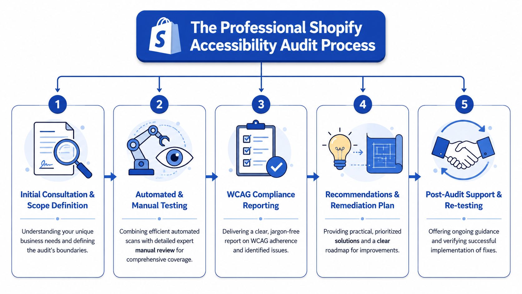
Automated tools find patterns, not the whole truth
According to Accessibility Works on Shopify audit limitations, automated tools typically catch only 30% to 40% of WCAG issues, which means 60% to 70% require manual expert testing and assistive technology validation.
That gap explains why scan-only reports are often misleading. They may flag missing alt text, empty buttons, colour contrast issues, or heading errors. They usually won’t tell you whether a screen reader can understand a variant selector, whether focus disappears in a drawer cart, or whether a dynamic price update gets announced properly.
Manual testing is where the serious issues show up
A strong audit includes hands-on testing with keyboard-only navigation and real assistive technology behaviour. That’s where the hidden faults emerge, especially on custom themes and stores with several app integrations.
Typical examples include:
- Keyboard traps: A user opens a cart drawer or promotional modal and can’t move focus out cleanly.
- Broken announcements: Price changes, stock changes, or cart updates happen visually but aren’t conveyed to screen readers.
- ARIA misuse: Third-party apps add attributes that look accessible in code reviews but create confusing output for assistive tech.
- Focus management failures: Product galleries, filter panels, and quick-view components move the user visually but not programmatically.
- Heading hierarchy drift: Theme customisations create pages that look organised but read like a jumble to screen readers.
If you want a parallel quality process for customer journeys more broadly, a Shopify UX audit often complements accessibility work because many checkout and navigation failures overlap.
What gets tested on a Shopify store
A proper audit doesn’t stop at the homepage. It follows the paths customers use.
That usually includes:
Core templates
Homepage, collection pages, product pages, cart, search, account areas, and informational content.Theme components
Header, menus, drawers, accordions, tabs, sliders, filters, pagination, forms, and notification patterns.Third-party apps
Reviews, bundles, subscriptions, pop-ups, search layers, wishlists, chat widgets, and upsell tools.Custom features
Anything your team or agency has built on top of the theme, especially AJAX interactions and bespoke selectors.Checkout-adjacent flow
Even where checkout is managed, the route into checkout still needs testing, including cart behaviour and pre-checkout forms.
What separates a defensible audit from a superficial one
The difference usually comes down to deliverables and judgement.
A weak audit gives you screenshots and a list of errors. A strong audit tells you:
| Audit output | Why it matters |
|---|---|
| Issue severity | Helps teams fix blockers before polishing minor defects |
| Affected templates or components | Prevents duplicate work and makes scope clear |
| WCAG mapping | Gives legal and technical teams a shared reference point |
| Reproduction steps | Lets developers replicate the issue quickly |
| Recommended fix direction | Speeds up implementation and avoids bad patches |
| Re-test criteria | Confirms whether the fix actually worked |
What works: auditing the components customers use most, then tracing each issue back to theme code, app code, or content operations.
What doesn’t: relying on a plugin report and assuming the worst problems have been found.
The outcome should be practical. By the end of the audit, your team should know what to fix first, what can wait, and what needs specialist development rather than superficial patching.
Common Accessibility Barriers on Shopify Stores
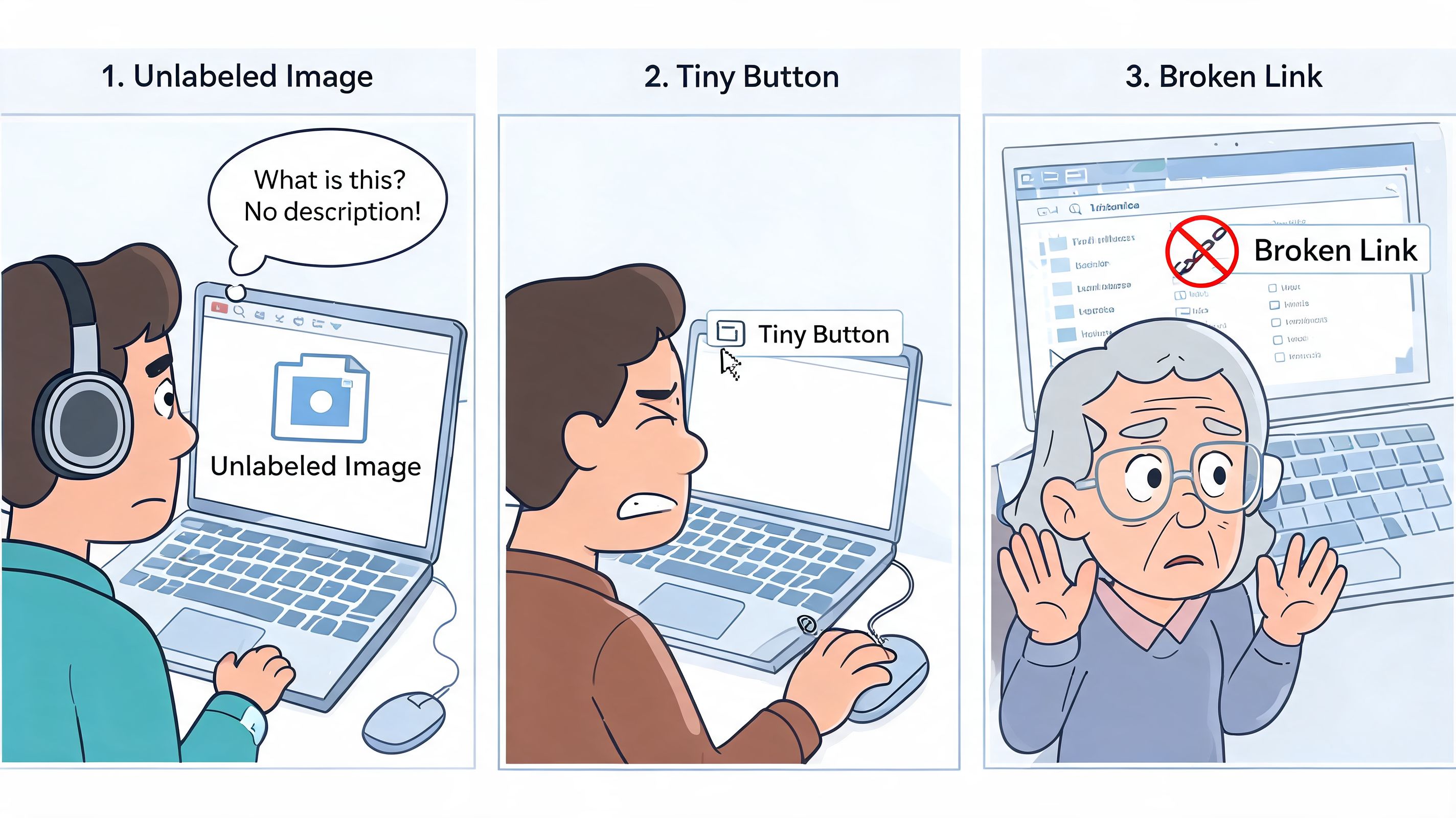
Many accessibility issues sound abstract until you watch a customer hit one. Then they become painfully clear.
A shopper lands on your homepage using a keyboard. They tab into the navigation, open a menu, and lose track of focus. They reach a collection page and the filter opens but doesn’t announce itself properly. On the product page, the colour swatches have no meaningful labels. In the cart drawer, focus gets trapped. The customer isn’t confused because they’re inexperienced. The interface is failing to communicate.
Critical barriers that block buying
These are the issues that can stop a transaction altogether.
Cart drawer traps focus
A keyboard user opens the cart and can’t reach the close button, the checkout button, or the page behind the drawer in a predictable way.Product options are only visual
Swatches show colour or material, but there’s no accessible name. A screen reader user hears a row of vague controls with no useful context.Search or filter overlays break navigation
The panel appears on screen, but focus doesn’t move into it correctly, or it vanishes unexpectedly.Form submission errors are visual only
A user fills in a field incorrectly and the page highlights an error in red, but no screen reader announcement explains what needs changing.
High-impact barriers that create confusion
These issues may not block the purchase outright, but they make the path harder than it should be.
| Severity | Example on Shopify stores | User impact |
|---|---|---|
| High | Unclear button labels on icon-only controls | Users don’t know what action will happen |
| High | Product gallery controls without proper names | Users can’t tell which image or media item is active |
| High | Heading structure broken by theme customisation | Screen reader users can’t skim content logically |
| High | App-injected pop-ups with weak focus behaviour | Users lose orientation and dismissing the modal becomes difficult |
A common one is the “quick add” pattern on collection pages. It looks efficient, but if the button opens a mini product selector without proper focus handling or labels, it becomes a maze.
A polished UI can still be inaccessible. Visual finish and functional access are not the same thing.
Medium and low issues still matter
These are often dismissed as minor because they don’t look dramatic during demos. In aggregate, they still wear users down.
- Vague link text such as “read more” or “click here” repeated across content blocks
- Low contrast footer text that becomes hard to read on smaller screens or in bright environments
- Decorative icons treated as meaningful content which creates noise for screen reader users
- Inconsistent focus styles where some links show a visible state and others don’t
This short demonstration helps non-technical teams understand why these details matter in day-to-day browsing:
Shopify-specific sources of trouble
In practice, the most stubborn issues often come from the same places:
Third-party apps
Pop-ups, reviews, subscriptions, chat, and loyalty widgets frequently inject inaccessible controls or odd tab order.Theme edits made over time
The original theme may have started in decent shape, but multiple customisations gradually break headings, landmarks, button names, and state announcements.Content operations
Missing alt text, unclear page structure, and visually driven merchandising decisions introduce barriers without touching code.
A store rarely becomes inaccessible because of one dramatic mistake. It usually happens through dozens of small decisions that looked harmless in isolation.
Turning Audit Findings into an Actionable Plan
An audit report on its own can be overwhelming. Merchants open the file, see dozens of issues mapped to WCAG criteria, and don’t know where to start. Developers often have the opposite problem. They know how to fix code, but the report doesn’t tell them what matters first, what can be bundled, or how to verify the fix.
That’s why the remediation plan matters more than the issue count.
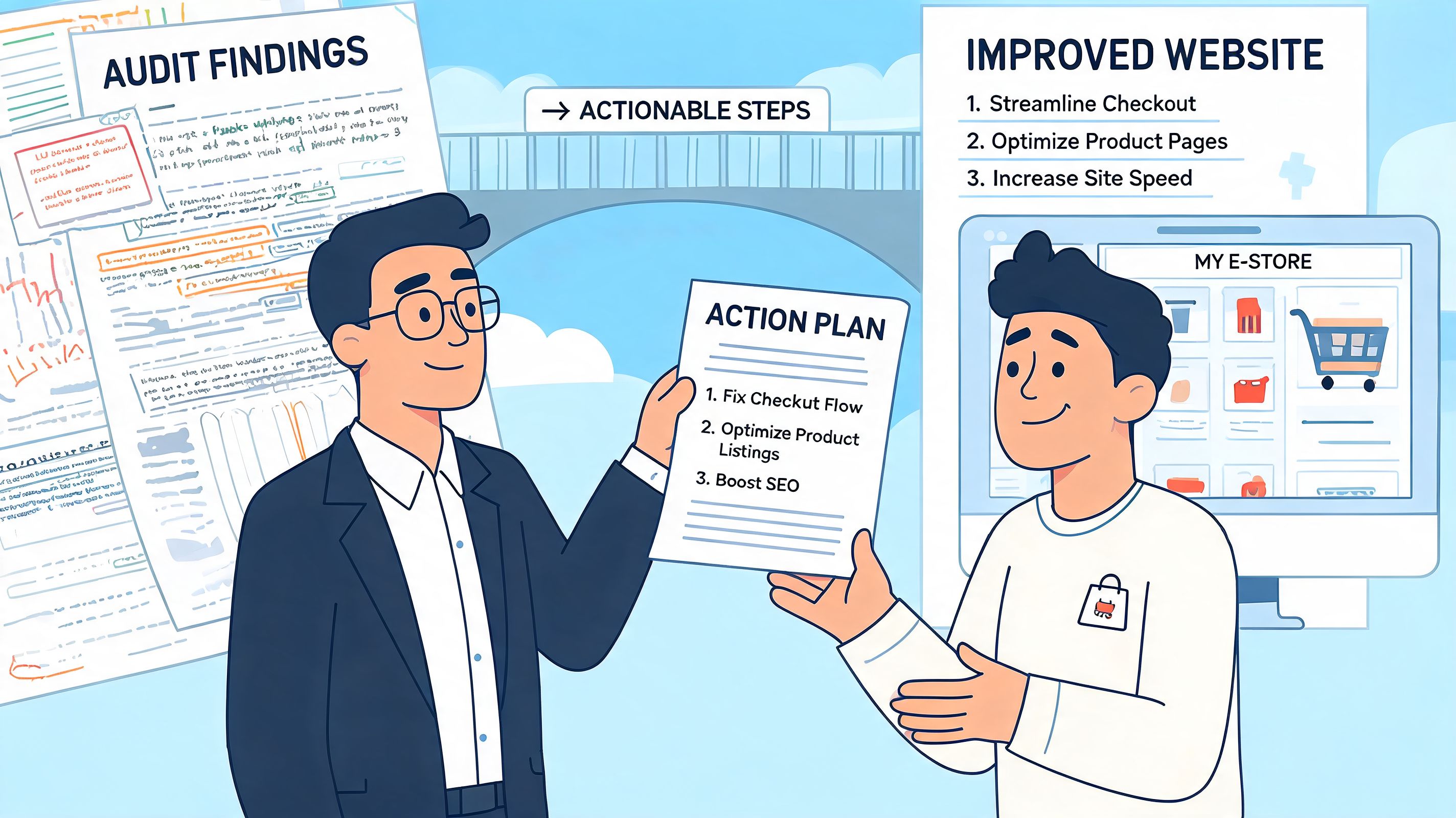
A useful plan turns defects into workstreams
The best remediation plans translate findings into real delivery tasks. Instead of one long spreadsheet with mixed severity and no structure, the issues are grouped into implementation buckets your team can act on.
Typical buckets include:
Theme-level fixes
Global problems such as heading logic, focus styles, button naming, form patterns, and landmark structure.Template-specific fixes
Product page galleries, collection filters, search results, cart drawers, account forms, and blog layouts.App-related fixes
Decide whether to reconfigure, replace, isolate, or custom-style an app that introduces barriers.Content fixes
Alt text, descriptive link text, transcript needs, and merchandising copy that depends too heavily on visual cues.
This is the point where strategy matters. If five issues all stem from the same component, you don’t fix them as five unrelated tickets. You redesign or rebuild the component once.
What teams should expect from the deliverables
A professional post-audit handover should be readable by stakeholders and usable by developers.
A solid pack usually includes:
| Deliverable | What it should contain |
|---|---|
| Prioritised issue log | Severity, affected page or component, user impact, and WCAG reference |
| Developer guidance | Clear reproduction steps, code-level direction, and implementation notes |
| Business priority view | Which issues affect buying journeys, support burden, and high-traffic templates |
| Re-test checklist | The exact behaviour to validate once fixes are deployed |
| Decision notes | Guidance on whether to patch, replace, or redesign a feature |
One of the most underrated parts is plain-language user impact. A ticket that says “2.4.3 focus order failure” is technically correct. A ticket that says “keyboard users land behind the open drawer and can’t reach checkout predictably” is something a product manager can prioritise.
Delivery mindset: The report should tell a developer what to build, a merchant what to approve, and a tester what to verify.
Prioritisation is where the value shows up
Not every issue deserves the same urgency. A remediation roadmap should sort findings by a mix of severity, implementation complexity, and business impact.
That often produces a sequence like this:
Fix blockers on revenue paths first
Product selection, add-to-cart, cart interaction, forms, and navigation.Resolve reusable component issues next
Buttons, headings, accordions, modals, and cards that appear across many templates.Clean up lower-risk issues in batches
Content formatting, descriptive labels, and contrast refinements.
Good project planning mirrors broader operational advice on turning goals into reality. The useful shift is from “we have many problems” to “we have a sequenced plan with owners, dependencies, and validation criteria”.
What works after the audit
What tends to work best is simple and disciplined:
- Assign ownership early: Decide whether each fix belongs to design, development, QA, content, or app operations.
- Bundle related issues: Rebuild patterns once rather than patching the same component across many templates.
- Re-test every fix: Accessibility bugs are easy to partially fix and accidentally reintroduce later.
- Document exceptions: If a third-party tool can’t be fully remediated, record the decision and the alternative path.
What doesn’t work is parking the audit in a backlog and treating it as future housekeeping. Accessibility improvements need the same delivery rigour as checkout optimisation or a theme migration.
DIY Audit vs Hiring a Shopify Expert Agency
Some stores can start with a DIY pass. Some shouldn’t. The right choice depends on complexity, risk tolerance, and how much confidence your team has in manual testing.
A small catalogue on a lightly customised theme with few apps can learn a lot from a self-run review. A high-growth store with subscriptions, bundles, loyalty tools, custom sections, and international complexity usually needs specialist help.
Where DIY makes sense
DIY works best when your goal is discovery, not sign-off.
You can review your store with a browser extension, test keyboard navigation manually, check whether forms have visible labels, and inspect whether modals, menus, and sliders behave consistently. That gives you a useful first pass and often exposes obvious issues quickly.
DIY is a sensible starting point if:
- Your store is simple: Few templates, low app dependency, and limited custom interaction.
- Your team wants baseline awareness: Designers, marketers, and merchants can learn where common barriers show up.
- You need a triage pass: You want to spot likely problem areas before commissioning deeper remediation.
Where DIY falls short
The problem arrives when teams mistake “we ran a scan” for “we understand our risk”.
UK merchants face a specific version of this problem. As noted in the Magebit discussion of UK-focused Shopify accessibility questions, existing guidance rarely explains how merchants should reconcile WCAG 2.1 or 2.2 AA conformance with the Equality Act 2010, and many store owners are left guessing whether a generic WCAG audit is enough for their legal position.
That gap matters. Legal exposure is not just about technical rules. It’s also about how those rules are interpreted in a specific market and how defensible your remediation process is.
If your team is comparing internal effort against external support, this guide on hiring a Shopify expert is useful for understanding when specialist capability saves time and reduces implementation risk.
Side-by-side comparison
| Decision factor | DIY audit | Specialist agency audit |
|---|---|---|
| Initial cost | Lower | Higher |
| Speed to first findings | Fast for obvious issues | Fast, but with deeper scoping |
| Manual assistive tech testing | Usually limited | Core part of the process |
| App and custom theme diagnosis | Harder | Much stronger |
| Legal context and documentation | Usually weak | More robust |
| Developer-ready remediation plan | Often incomplete | Typically clearer and more actionable |
A practical decision rule
Choose DIY if you want to learn, triage, and clean up obvious issues on a low-complexity store.
Choose an expert agency if you need confidence in the findings, clarity on remediation, and a process that stands up to scrutiny. That’s especially true when the store has custom features, multiple third-party apps, or region-specific legal concerns.
Building a More Inclusive and Profitable Store
A Shopify accessibility audit matters because it changes the conversation inside the business. Instead of vague concern, you get evidence. Instead of a generic compliance goal, you get a list of concrete fixes. Instead of one big intimidating problem, you get workstreams your team can deliver.
The stores that handle accessibility well usually treat it as part of operational quality. They review app choices more carefully. They build more resilient components. They make content decisions that don’t depend on sight, precision clicking, or perfect device conditions. Those habits improve the storefront for more than one audience.
Accessibility also fits neatly into wider optimisation work. Many of the same practices that improve inclusive access also improve clarity, trust, and ease of use. If you’re reviewing the bigger picture, these CX optimization strategies are a useful complement because accessibility and customer experience often fail in the same places: confusing journeys, poor feedback, weak interaction design, and avoidable friction.
Two sensible next steps
If you’re ready to act, start with a proper review of your storefront’s most important customer journeys. Focus on navigation, product discovery, variant selection, cart behaviour, and form handling. That gives you the clearest picture of actual risk and actual commercial impact.
If you’re still early in the process, run a short health check with your own team. Test the store without a mouse. Tab through the header, menus, filters, product page, cart, and any pop-up or app-driven element. You’ll learn a lot very quickly.
Accessibility is rarely solved by a single fix. It improves when teams build, test, and maintain the store with access in mind.
The good news is that this is manageable. Most stores don’t need panic. They need a reliable audit, a prioritised remediation plan, and disciplined follow-through.
If you want an expert view of your store’s accessibility gaps and a practical roadmap for fixing them, Grumspot can help. You can book a no-obligation conversation about your Shopify store, or ask for a simple accessibility health check to understand where the biggest issues are likely to sit before you commit to a full audit.
Let's build something together
If you like what you saw, let's jump on a quick call and discuss your project

Related posts
Check out some similar posts.

- conversion rate optimisation case studies
Explore 7 in-depth conversion rate optimization case studies. Learn from Grumspot, VWO, & more to fi...
Read more