Shopify UX Audit: A Guide to Boosting Conversions
- Shopify UX audit
- Shopify CRO
- ecommerce UX
- conversion rate optimisation
- Shopify guide
Launched
April, 2026

Traffic is holding up. Paid spend is going out. Your brand looks fine. Yet sales don’t move the way they should.
That’s the point where merchants start adding things. A new app. A redesigned homepage. A different upsell block. Another carousel. In practice, a Shopify UX audit is the better next move. It shows where customers are getting stuck, what’s undermining confidence, and which fixes are worth shipping.
A good audit doesn’t judge whether the site feels modern. It measures whether the buying journey feels easy. That’s the difference between a store that gets browsed and a store that gets bought from.
Why Your Shopify Store Needs a UX Audit
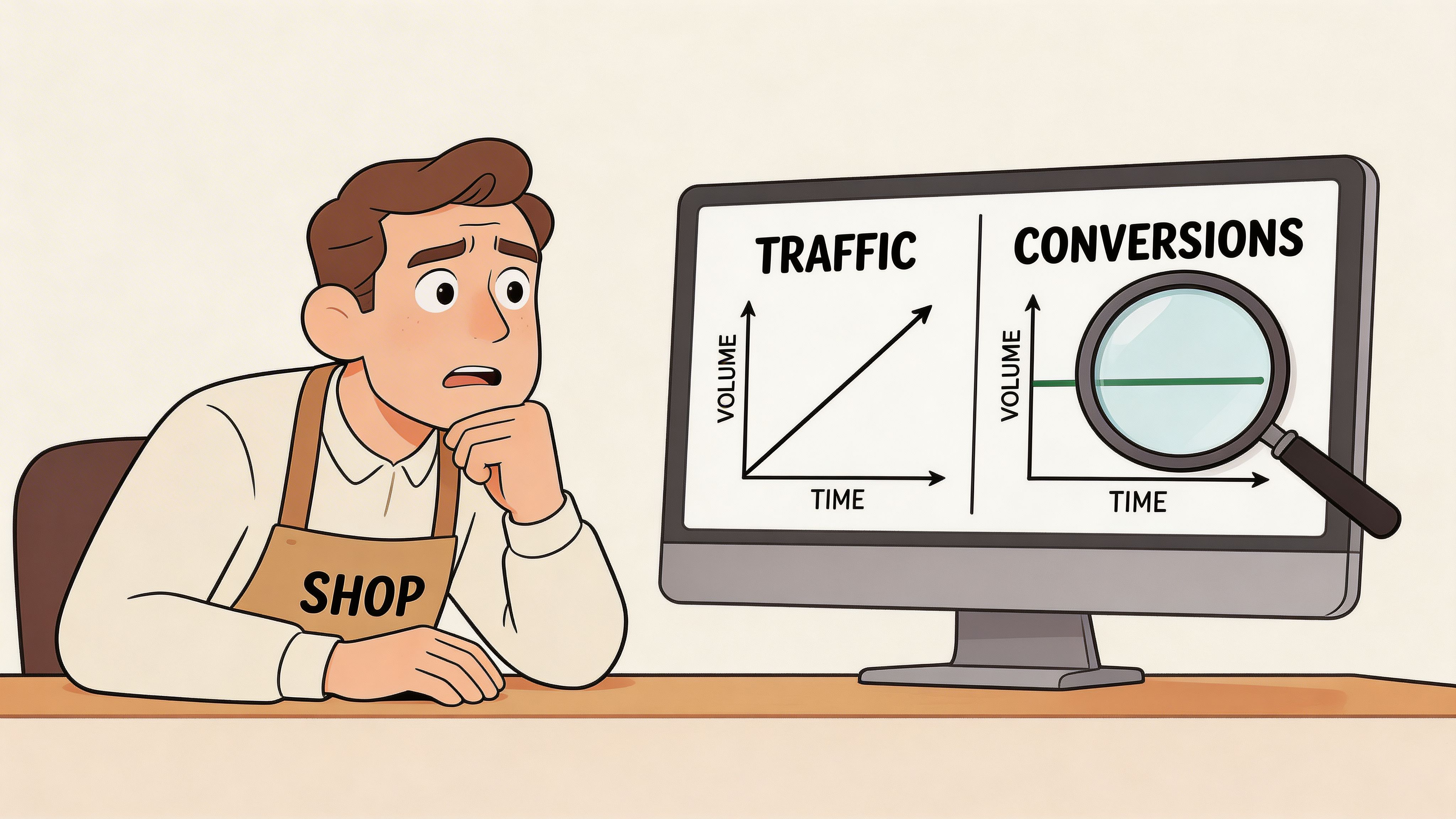
If your traffic is steady but conversion rate is flat, the issue isn’t reach. It’s friction.
Most Shopify stores don’t fail because of one dramatic mistake. They leak revenue through smaller issues that stack up. Navigation that makes sense to your team but not to first-time visitors. Product pages that answer key questions too late. A checkout that feels uncertain on mobile.
That’s why the business case for a UX audit is so strong. In the UK, a significant majority of consumers are less likely to return after a poor user experience, and stores that run quarterly UX audits have seen a 25 to 35% uplift in conversion rates according to wecanflyagency’s Shopify UX audit analysis.
It’s a revenue diagnostic, not a design exercise
A lot of teams treat UX as visual polish. That’s too narrow.
A proper Shopify UX audit connects experience directly to commercial outcomes:
- Conversion rate: Can shoppers find products, understand value, and move to checkout without hesitation?
- Average order value: Does the site surface bundles, cross-sells, and variant options at the right point in the journey?
- Customer lifetime value: Does the first purchase feel smooth enough that people will come back?
Consider a physical shop. If aisles are confusing, signs are unclear, and the card machine fails at the till, the issue isn’t interior style. The issue is that customers can’t buy easily.
Practical rule: If a shopper has to stop and think about how to use your store, the UX is already hurting revenue.
That’s why broad advice on how to improve ecommerce conversion rates is useful as context, but an audit is what tells you which specific blockers exist on your store, in your theme, with your product mix and your audience.
The hidden cost of familiarity
Internal teams are too close to the site. They know where everything is. They know the product range. They understand your internal category logic.
Customers don’t.
A merchant might think the menu is clear because they’ve used it for months. A new visitor may not know whether “Essentials”, “Core”, and “Performance” are collections, product types, or marketing labels. That confusion shows up in lower product discovery, weaker add-to-cart behaviour, and abandoned sessions.
An audit earns its keep by replacing opinion with evidence.
Useful evidence includes:
- Analytics patterns that show where users drop out.
- Heatmaps and recordings that reveal hesitation or repeated misclicks.
- Heuristic review that identifies friction against proven usability principles.
- Journey testing across mobile, desktop, and edge cases like discount codes, variant-heavy products, or international checkout flows.
A store can look credible and still underperform. That’s normal.
Why this matters more for mature stores
Early-stage brands can grow despite a rough experience because novelty, product-market fit, or aggressive acquisition carries them. More established stores don’t get that luxury. Once traffic quality stabilises, UX becomes one of the clearest levers for profitable growth.
If repeat purchase matters to your business, poor UX becomes more expensive. A customer who has one frustrating purchase journey won’t abandon that session. They may never return.
For a deeper look at the commercial side of this work, Grumspot’s perspective on ecommerce conversion optimisation is useful because it frames UX as part of a wider conversion system, not as a standalone design task.
The best Shopify UX audits don’t produce a prettier site. They produce a clearer path to purchase.
The Seven Pillars of a High-Converting Store
A strong Shopify UX audit works best when you review the store as a system. One weak area can drag down the rest. Speed won’t save a confusing checkout. A polished homepage won’t fix poor product discovery.
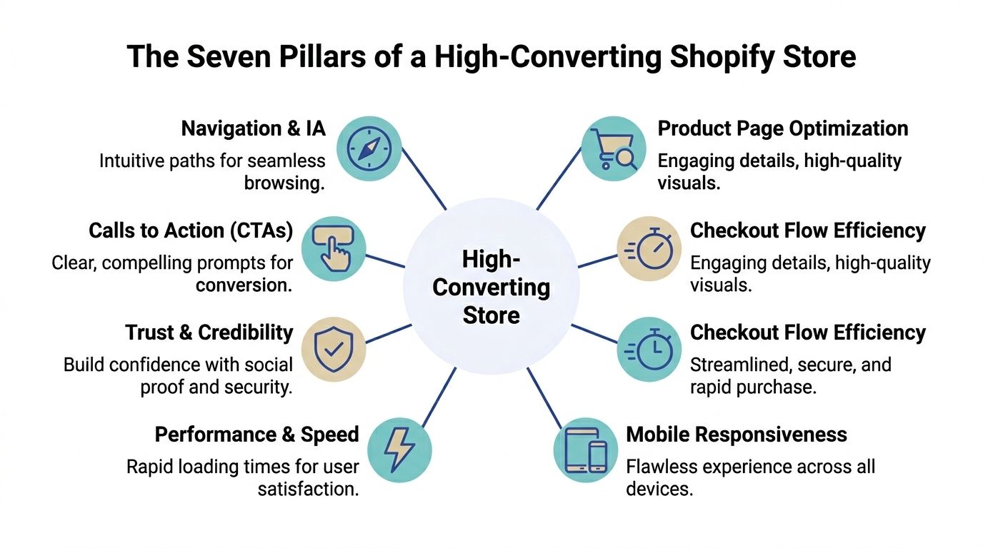
Design and brand clarity
Start with visual hierarchy, not taste.
The audit question isn’t whether the site looks expensive. It’s whether shoppers can immediately tell what you sell, why it matters, and what they should do next. Headlines, spacing, contrast, image quality, and CTA prominence all affect comprehension.
Check for:
- Message clarity: Does the first screen explain the offer without relying on brand familiarity?
- Visual hierarchy: Are headlines, pricing, variant options, and key trust cues clearly prioritised?
- Consistency: Do badges, buttons, card layouts, and icon styles behave consistently across templates?
If every section competes for attention, nothing stands out. Merchants overfill pages with promotional blocks and app widgets. The result is noise, not persuasion.
Navigation and information architecture
Navigation is where many stores lose intent.
Your menu structure should mirror how customers shop, not how your stock file is organised. That matters even more when you have broad catalogues, technical products, or variant-heavy ranges.
A useful audit looks at:
| Area | What to check | Revenue implication |
|---|---|---|
| Main navigation | Category labels, order, depth | Better product discovery |
| Collection pages | Filters, sorting, scan-ability | Faster path to relevant products |
| Search | Query handling, zero-result behaviour, relevance | Higher intent capture |
| Internal links | Pathways from content to product | More assisted conversions |
Stores that need a stronger framework for this can also review Grumspot’s take on Shopify UX design principles, especially around hierarchy and interaction patterns.
Checkout and trust signals
Checkout friction isn’t only about form fields. Confidence is part of conversion.
Shoppers want to know delivery terms, returns, payment options, and who they’re buying from before they commit. If that information appears too late, the user pauses. That pause is where abandonment starts.
Look closely at these trust checkpoints:
- Cart clarity: Shipping expectations, returns messaging, and promo code handling.
- Product page reassurance: Delivery windows, review visibility, and contact options.
- Checkout confidence: Consistent branding, payment trust marks, and no surprise costs.
A lot of stores bury reassurance in footer links. That doesn’t help when someone is deciding whether to add to basket.
Mobile experience
Mobile deserves its own pillar because many stores treat it as a compressed desktop layout.
This approach overlooks the practical aspects of thumb reach, tap target sizing, sticky actions, and how much less forgiving users are on smaller screens. Product galleries, filters, quantity controls, and add-to-cart actions need to work one-handed and without precision tapping.
On many audits, the highest-impact mobile fixes are simple. Sticky add-to-cart. Cleaner filter drawers. Shorter content blocks before the buying controls. Better spacing around buttons.
Accessibility
Accessibility improves conversion because it improves clarity.
Readable text, clear focus states, proper heading structure, labelled controls, and predictable interactions help everyone. They matter for keyboard users and screen reader users, but they also reduce cognitive load for shoppers who are distracted, tired, or comparing products quickly.
Audit this area with practical checks:
- Keyboard flow: Can you move through menus, filters, forms, and carts without a mouse?
- Contrast and readability: Are text and UI elements easy to read across devices?
- Form behaviour: Are errors explained clearly and surfaced where users need them?
Performance and Core Web Vitals
Speed is not a technical vanity metric. It shapes whether users stay long enough to buy.
According to Eleven’s Shopify audit benchmarks, 68% of UK Shopify stores exceed the 2.5-second Largest Contentful Paint threshold, and that’s linked to a 15 to 22% drop in conversion rates as users abandon during initial page load.
Fast stores don’t win because speed is impressive. They win because shoppers reach the decision point before irritation sets in.
In practice, audits should review image payloads, app scripts, render-blocking assets, heavy theme customisations, and unstable layout shifts on product pages.
On-page SEO that supports UX
SEO and UX aren’t separate workstreams on Shopify. They overlap heavily.
A page that’s hard to scan is bad for users and search visibility. Weak category copy, duplicated headings, thin product detail, and poor internal linking all hurt discovery. The same goes for unhelpful search snippets and unclear metadata that lower click quality before a user even lands.
A good audit checks whether pages are built for the search intent they attract. Ranking for the wrong term can send traffic that was never likely to convert.
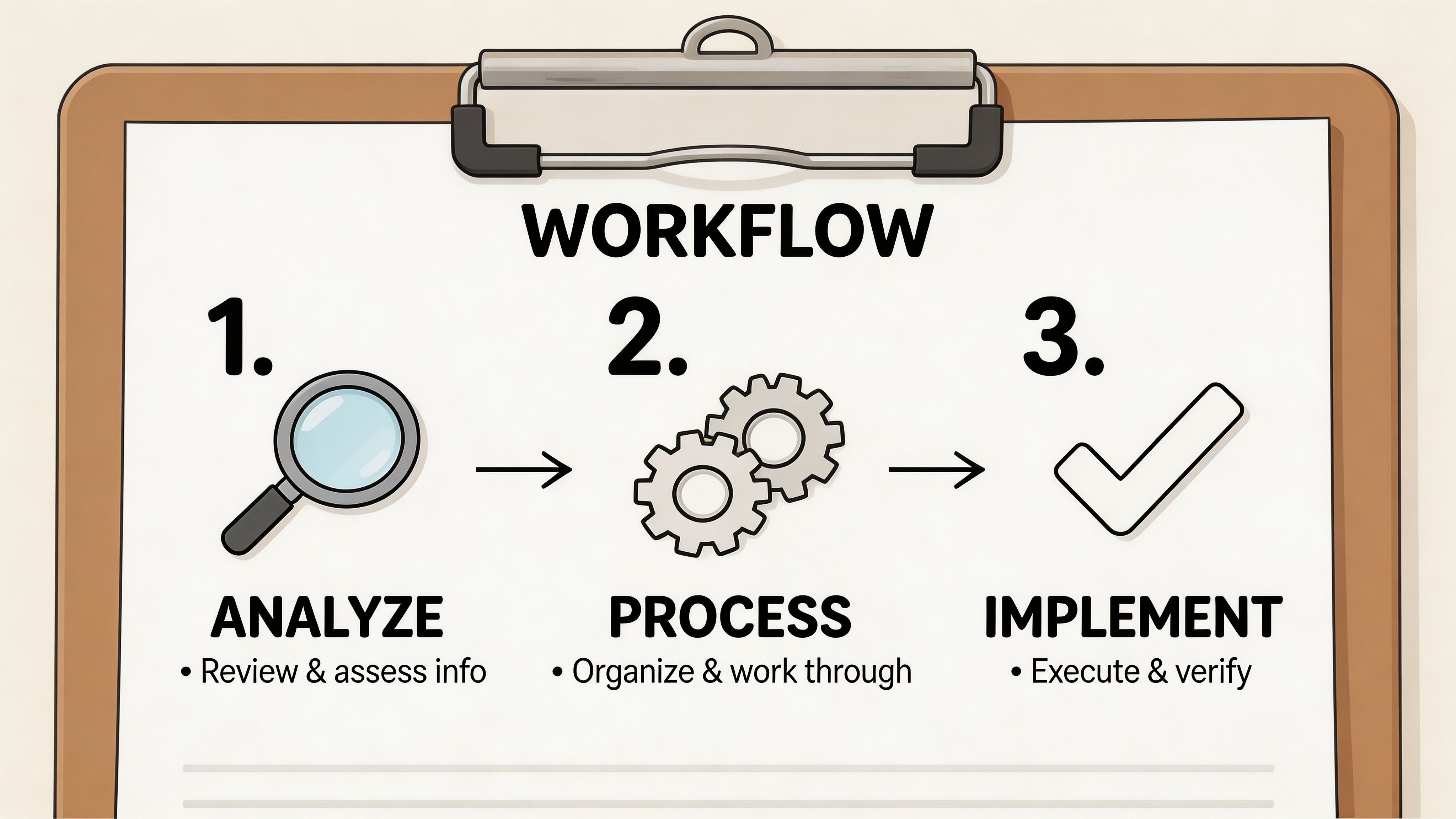
Your Practical Shopify Audit Process
Most merchants make UX audits feel bigger than they are. The work gets manageable once you run it as a sequence rather than a loose list of observations.
Start with evidence. Then pressure-test the journeys. Then prioritise what to fix.
Step one: Gather behavioural and commercial data
Begin with Shopify Analytics and GA4. You’re looking for patterns, not isolated anomalies.
Focus on the parts of the journey where revenue is won or lost:
- Landing pages: Which pages bring in traffic but fail to move users deeper?
- Collection pages: Where do users browse but fail to click through?
- Product pages: Which templates have weak add-to-cart behaviour?
- Cart and checkout: Where does intent drop sharply?
Then bring in heatmaps and session recordings. Hidden friction becomes visible here. Repeated taps on non-clickable elements, users skipping over critical content, and hesitation around shipping or returns all show up quickly.
For mobile, this step matters even more. Swanky’s UK audit findings show mobile navigation friction in 74% of Shopify stores, with poor thumb-zone alignment directly causing 32% of cart abandonment during the checkout funnel.
That single point changes how you prioritise. If mobile navigation is awkward, don’t spend your first sprint debating desktop banner layouts.
Step two: Run a heuristic review on core journeys
Once the data tells you where issues sit, inspect the store manually.
Experienced reviewers move through the site like a first-time customer. Search for a product. Compare variants. Check delivery details. Add to cart. Try to edit quantities. Apply a discount. Complete checkout on a phone.
Use a checklist so the review stays objective. A practical version should cover:
- Homepage: Value proposition, category entry points, trust cues
- Navigation: Menu labels, hierarchy, search relevance, filter usability
- Collection pages: Sorting, filtering, product card clarity, pagination or infinite scroll behaviour
- Product pages: Media, pricing clarity, variant logic, delivery and returns visibility, CTA placement
- Cart and checkout: Friction, reassurance, speed, error handling
- Post-purchase: Confirmation clarity, next-step guidance, account prompts
If you need a structure to work from, this ecommerce audit checklist is a useful reference for how teams organise findings across design, UX, and conversion layers.
Audit the customer journey in realistic conditions. Logged out. On mobile. On average connection quality. With no internal knowledge.
Step three: Test with real users
A heuristic review catches a lot. It doesn’t catch everything.
User testing is where assumptions get challenged. Ask people to complete a defined task, then watch where they hesitate. Don’t guide them. Don’t explain labels. Let the interface do the work.
Useful tasks include:
- Find a product for a specific use case
- Compare two variants and choose one
- Check delivery and returns before buying
- Apply a discount or gift card
- Complete checkout on mobile
When several users stumble in the same place, you’ve found a systemic issue, not a one-off preference.
A practical walkthrough can help teams see what that process looks like in motion:
Step four: Turn findings into a prioritised roadmap
Raw observations don’t create growth. Prioritised actions do.
Group findings by impact, effort, and dependency. Some fixes are quick wins. Others need design, development, and QA. The key is to stop treating every issue as equally urgent.
A simple prioritisation model works well:
| Priority | Typical issue | Action |
|---|---|---|
| High | Broken mobile CTA visibility, confusing shipping messaging | Fix first |
| Medium | Weak collection page filters, inconsistent product media layout | Plan into next sprint |
| Lower | Minor copy polish, low-traffic template refinements | Batch later |
The strongest UX audit outputs are boring in the best way. They’re specific, sequenced, and tied to KPI impact. No vague “improve usability” notes. Just a clear list of what to change and why it matters.
Essential Tools for Your UX Audit Toolkit
The right audit stack doesn’t need to be huge. It needs to answer four questions clearly: what users do, where they struggle, how fast the site loads, and whether the experience is trustworthy for UK shoppers.
Analytics and behavioural tools
Use Shopify Analytics and GA4 to find drop-off points, entry pages, and weak product or collection performance. They tell you where the problem lives.
Then layer in Hotjar or Microsoft Clarity for heatmaps and session recordings. These tools show the behaviour behind the metrics. You’ll spot rage clicks, repeated taps, abandoned scroll paths, and confusion around forms or navigation.
If you want to extend testing beyond live user sessions, synthetic journey tooling can help pressure-test flows at scale. This round-up of the 12 best synthetic users tools for smarter testing is a useful reference point when you need broader scenario coverage.
Performance and technical checks
For speed and rendering issues, start with Google PageSpeed Insights. It gives you a practical view of loading behaviour and Core Web Vitals.
Pair that with Chrome DevTools for deeper investigation into scripts, layout shifts, image payloads, and third-party app overhead. On Shopify stores, app bloat and theme-level customisations are common reasons pages feel slower than the merchant expects.
If implementation support is part of the process, some teams also use Grumspot for structured Shopify audits that combine UX, technical review, and conversion analysis in one workflow.
Tool choice matters less than interpretation. A recording only becomes useful when someone can explain why the user hesitated and what fix removes that hesitation.
Accessibility and privacy checks
Accessibility tools such as WAVE and axe DevTools are good for catching contrast issues, missing labels, heading problems, and form errors. They won’t replace manual review, but they’ll speed up the basics.
For UK stores, privacy UX needs its own checks. Generic audit guides can miss this entirely. According to Webselect’s Shopify UX and CRO audit analysis, 68% of UK consumers have abandoned carts over privacy concerns, and poorly optimised cookie banners can increase load times by 15 to 20%.
That creates a specific UK trade-off. You need compliant consent handling without making the site feel intrusive or slow. Audit your consent banner for timing, prominence, language, and script impact. If it blocks the screen, loads slowly, or feels untrustworthy, it can damage both compliance perception and conversion.
A lean toolkit that works
A practical setup for most stores looks like this:
- Analytics: Shopify Analytics, GA4
- Behaviour: Hotjar or Clarity
- Performance: PageSpeed Insights, Chrome DevTools
- Accessibility: WAVE, axe DevTools
- Privacy review: Manual audit of cookie banner and consent flow
That stack is enough to produce useful findings without drowning the team in dashboards.
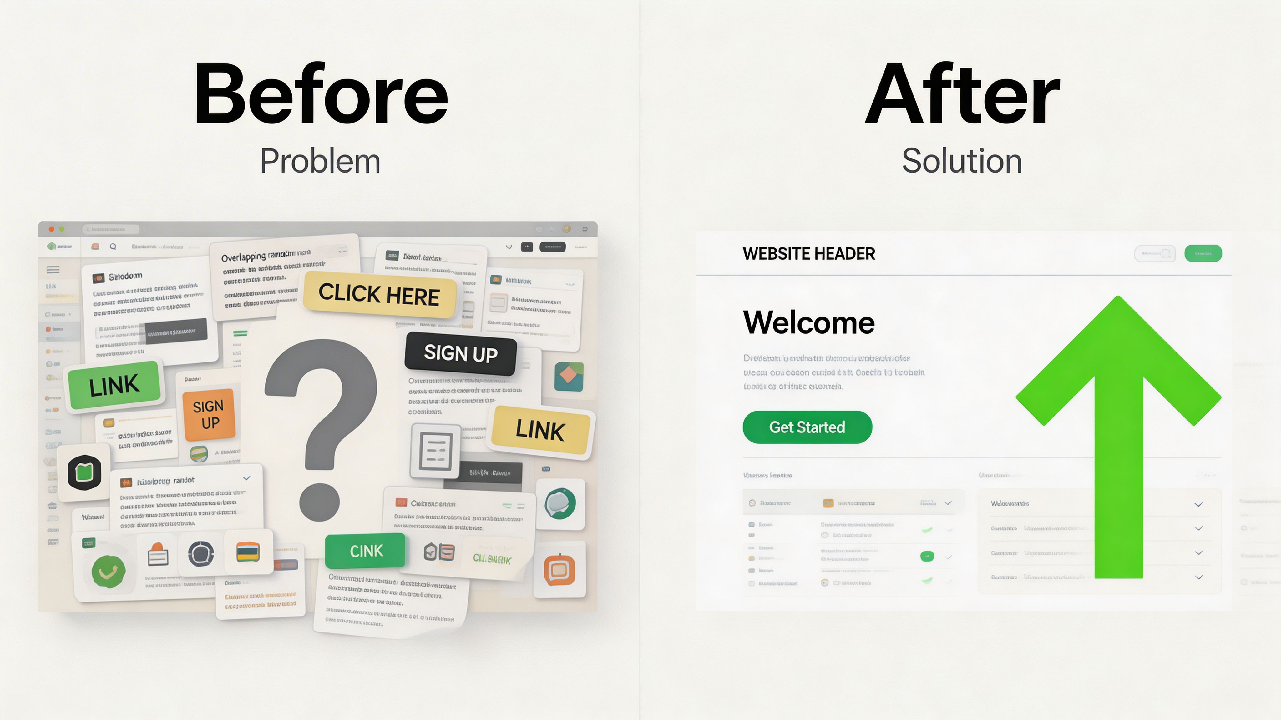
From Findings to Fixes Real-World Examples
Audit reports become valuable when each finding maps to a concrete change. The pattern is simple. Identify the friction. Remove it. Measure what happens next.
Example one: the product page answers too much, too late
A common finding is a product page packed with information but ordered badly.
The user lands on the page and sees image galleries, feature tabs, badges, size guidance, review widgets, subscription options, and promotional messaging. The critical questions are there, but they’re buried. Delivery timing might sit below the fold. Returns might sit inside an accordion. Variant guidance may appear after the user is expected to choose.
The fix is structural, not cosmetic.
Reorder the page so the buying decision gets supported in sequence. Put pricing, variants, fulfilment reassurance, and the primary CTA in a tighter block. Move secondary storytelling lower. Keep supplementary content available, but stop forcing it to compete with the decision layer.
Good product pages don’t dump information. They sequence it.
Example two: users treat decorative elements like controls
Heatmaps show users clicking banners, badges, or image areas that don’t do anything.
That tells you the interface is signalling interactivity where none exists. In most cases, there are two workable fixes. Either make the element clickable if that behaviour makes sense, or redesign it so it no longer looks actionable.
This is one of those small issues teams ignore because nothing is technically broken. But repeated dead clicks are a trust problem. They teach users that your interface is unreliable.
Example three: mobile collection browsing feels harder than it should
On some stores, the collection page is where momentum dies. Filters are hidden behind weak labels. Product cards are too tall. Swatch choices are fiddly. The sticky filter or add-to-cart behaviour doesn’t support one-handed browsing.
The audit finding sounds mundane. The commercial effect isn’t.
A cleaner mobile collection layout means fewer competing badges, simpler filter groups, and product cards that make the next action obvious. You’re not redesigning the whole storefront. You’re removing decisions that don’t help buying.
Example four: localisation friction on cross-border storefronts
International UX has become more fragile for scaling brands using newer Shopify tooling. According to Easy Apps Ecom’s guide on Shopify user experience audits, after the rollout of Shopify Magic 2.0 in late 2025, 42% of scaling UK merchants reported localisation failures, with unoptimised dynamic currency switching for GBP and EUR causing friction and cart abandonment for cross-border sales.
In practice, the issue tends to look like this. A shopper lands on a UK-facing experience, sees pricing update late, gets unclear tax or currency presentation, and loses confidence before checkout.
The fix is part UX and part implementation. Currency behaviour needs to be fast and predictable. Localised messaging must appear consistently across collection pages, product pages, cart, and checkout handoff. If the storefront switches context mid-journey, the user starts questioning the order total.
Example five: trust content sits in the wrong place
Another frequent audit result is that stores have the right reassurance, but surface it too late.
Delivery promises, returns policies, and contact options are hidden in footer pages or secondary tabs. That works for support. It doesn’t work for conversion. Buyers need reassurance near the point of decision.
A stronger pattern is to place short, scannable trust content beside the CTA and reserve detailed policy pages for those who want to dig deeper.
That’s how audit findings should work. Not as abstract UX theory, but as practical changes that remove doubt from the buying journey.
Choosing Your Path DIY Audit vs Hiring an Agency
There isn’t one right route for every store. The choice depends on stage, team capacity, and the kind of problems you need to solve.
A DIY Shopify UX audit can work well when you want to catch obvious issues and your store is relatively simple. Hiring an agency makes more sense when the site has grown messy, performance and conversion problems overlap, or the internal team doesn’t have the time to separate symptoms from causes.
Where DIY works
DIY is a sensible starting point if you can review your store objectively and act quickly on what you find.
It’s useful for things like:
- Basic journey checks: Broken links, weak CTA placement, unclear messaging
- Simple mobile issues: Oversized banners, awkward spacing, cluttered product pages
- Low-effort trust fixes: Surfacing delivery, returns, and payment information earlier
The limitation is familiarity. Internal teams know too much. They skip over confusion because they already understand the site. Agencies add value here.
Where agencies add value
An agency earns its fee when problems are layered.
That might mean performance issues mixed with UX issues. Or international storefront complexity. Or consent and privacy friction in a UK context. Or a site with multiple apps, custom logic, and years of incremental changes.
External specialists also bring pattern recognition. They’ve seen the same classes of problem across many Shopify stores, so they can spot root causes faster and prioritise more cleanly.
A strong agency deliverable isn’t a long deck of screenshots. It’s a roadmap with clear priorities, implementation notes, and expected commercial impact.
Side-by-side comparison
| Factor | DIY Audit | Hiring an Agency (like Grumspot) |
|---|---|---|
| Time | Cheaper in cash terms, expensive in team time | Faster if you need answers and execution support |
| Expertise | Good for obvious usability issues | Better for layered UX, technical, and conversion problems |
| Objectivity | Hard to avoid internal bias | External perspective is usually sharper |
| Tool access | Often limited to free or existing tools | Access to broader tooling and deeper interpretation |
| Implementation depth | Best for low-risk content and layout fixes | Better for theme, app, checkout, and systems-level changes |
| Best fit | Early-stage stores or first-pass reviews | Scaling brands, Shopify Plus stores, and complex builds |
A practical decision rule
Choose DIY if your team can audit the site, interpret the findings, and implement changes without stalling the roadmap.
Choose an agency if one or more of these is true:
- Traffic is healthy but conversion won’t improve
- Mobile performance and UX problems are mixed together
- The store has grown through patches and app additions
- International, subscription, or custom logic complicates the journey
- Nobody internally owns both diagnosis and implementation
The right decision isn’t about pride. It’s about speed to clarity.
If your Shopify store feels “fine” but underperforms, Grumspot can help audit the customer journey, identify where friction is suppressing conversion, and turn the findings into a prioritised action plan your team can implement.
Let's build something together
If you like what you saw, let's jump on a quick call and discuss your project

Related posts
Check out some similar posts.

- conversion rate optimisation
Looking for a conversion rate optimization consultant? This 2026 guide covers their role, process, K...
Read more
- ecommerce website design Shopify
Ecommerce website design Shopify - Master ecommerce website design Shopify with our 2026 playbook. G...
Read more
- reduce Shopify cart abandonment
Diagnose & reduce Shopify cart abandonment with our 2026 playbook. Get actionable strategies for UI,...
Read more
- Shopify A/B testing services
Explore Shopify A/B testing services. Learn how agencies increase conversions, navigate UK complianc...
Read more