Conversion Rate Optimization Shopify A Practical Guide
- conversion rate optimization shopify
- shopify cro
- ecommerce conversion
- shopify optimization
- increase shopify sales
Launched
February, 2026
Conversion rate optimisation for Shopify isn't about throwing more money at ads to get more traffic. It's about making every visitor count. The real goal is to refine your store's user experience so that the traffic you already have is more likely to buy from you. It’s a systematic approach of digging into data, figuring out what might be holding customers back, and testing smart changes to increase sales.
What Is a Good Shopify Conversion Rate?
This is always the first question, isn't it? But there’s no single magic number. What's "good" for a store selling £2,000 bespoke furniture will be completely different from one selling £15 phone cases. Context is everything – your industry, price point, and even where your traffic comes from all play a huge role.
That said, we need a starting point. Let's look at some UK-specific benchmarks.
UK Shopify Conversion Rate Benchmarks
This table gives you a rough idea of where you stand compared to other Shopify merchants in the UK. Think of it as a guide, not a strict rule.
| Performance Tier | Average Conversion Rate | What This Means |
|---|---|---|
| Top 10% | 4.7% or higher | You're in an elite group. Your store is a well-oiled machine, and customers find it incredibly easy and compelling to buy from you. |
| Top 20% | 3.2% or higher | This is a strong performance. Your store is doing most things right, but there are likely still opportunities to refine the experience further. |
| Average | Around 1.4% | You're on par with most Shopify stores. This is a solid foundation, but there's significant room for growth through optimisation. |
| Below Average | Below 1.4% | Don't panic. This just means there are clear friction points in your user journey that, once identified, can lead to substantial improvements. |
These numbers, based on data from thousands of stores, help you gauge your performance. If you want to dive deeper into the numbers behind online retail, you can explore more e-commerce statistics in our comprehensive guide: https://grumspot.com/blog/top-shopify-and-ecommerce-statistics-of-2024-and-beyond.
Looking Beyond the Conversion Rate
A high conversion rate is great, but it doesn't tell the whole story. To get a true sense of your store's health, you need to keep an eye on two other crucial metrics.
- Average Order Value (AOV): Simply put, this is how much the average customer spends in a single transaction. A healthy AOV can make a business with a modest conversion rate incredibly profitable.
- Customer Lifetime Value (CLV): This is the big one. It's the total amount of money you expect to make from a single customer over their entire relationship with your brand. A high CLV is a sign of great products and strong customer loyalty.
When you focus on optimising all three—Conversion Rate, AOV, and CLV—you shift your strategy from just chasing individual sales to building a sustainable, long-term business. This holistic view is the bedrock of any successful CRO programme.
Adopting a Continuous Improvement Mindset
One of the biggest mistakes I see merchants make is treating conversion rate optimisation for Shopify as a one-off project. The brands that truly pull ahead are the ones that see it as an ongoing cycle. It’s a constant loop: analyse, hypothesise, test, learn, repeat.
For example, maybe you spot in your analytics that a ton of mobile visitors drop off at the payment step. A good hypothesis might be that your form fields are clunky and hard to use on a small screen. So, you design a test: implement a sleeker, mobile-first checkout flow and measure if cart abandonment drops.
Everything starts with your store's foundation. A huge part of this is understanding Shopify themes and their conversion impact, because your theme is the canvas for every single customer interaction. It's this mindset of constantly questioning, testing, and learning that separates the stores that grow from the ones that stagnate.
Running A Data-Driven Shopify Store Audit
Jumping straight into A/B testing without a plan is a bit like trying to navigate a new city without a map. You'll wander around, but you probably won't get where you want to go. Any effective conversion rate optimisation for Shopify has to start with a thorough store audit. Before you can fix the leaks in your conversion funnel, you need to find them first.
This isn't about guesswork; it's about putting on your detective hat. The mission is to blend the hard numbers (quantitative data) with real human behaviour (qualitative data) to get the full story of your store's performance. The numbers tell you what is happening, and the human insights tell you why.
Uncovering the 'What' with Quantitative Data
Your first stop should always be the data that tracks user actions numerically. This is where you’ll spot the biggest drop-off points in your customer journey. I always recommend starting with these two core sources.
- Google Analytics 4 (GA4): Dive into the Funnel exploration report. Map out the critical steps a user takes, from landing on a product page all the way to completing a purchase. This will immediately highlight where people are bailing. For instance, you might see that 40% of users who add an item to their cart never even start the checkout process. That’s a massive red flag.
- Shopify Analytics: Don't sleep on your native Shopify dashboard; it’s a goldmine. Pay close attention to the Online store conversion rate report. A great trick here is to filter by device type. It's incredibly common to discover your mobile conversion rate is half your desktop rate, which points directly to a major user experience problem on smaller screens.
By digging into your quantitative data first, you can pinpoint the exact pages or stages in your funnel that are bleeding revenue. Instead of optimising blindly, you now have a clear target for your investigation.
This structured approach is the very foundation of the CRO cycle—a continuous loop of analysis, forming a hypothesis, and then testing it.
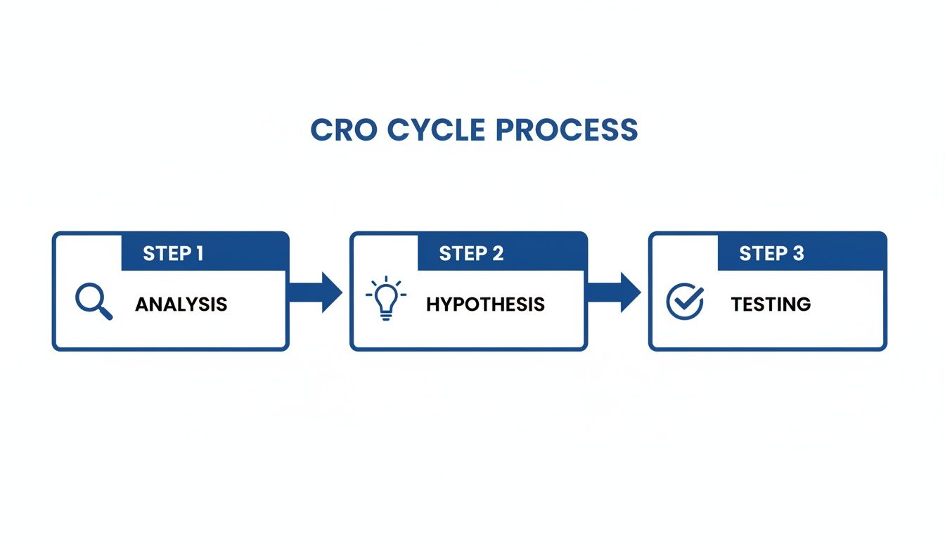
As you can see, solid data analysis is what feeds into making an educated guess (your hypothesis), which you then go on to validate through proper testing.
Finding the 'Why' with Qualitative Insights
Okay, so you know where the problems are. Now it's time to figure out why they're happening. This means you need to step into your customers' shoes and see your site through their eyes. Qualitative tools are perfect for this part of the job.
Heatmaps are fantastic. They give you a visual overlay showing where users click, how they move their mouse, and how far down the page they actually scroll. A heatmap might reveal that dozens of people are clicking on a beautiful lifestyle image, expecting it to be a link. That’s a classic sign of a design flaw that's causing frustration.
Session recordings are even more powerful, in my experience. It’s like looking over a real user's shoulder as they navigate your store. You could watch five different recordings and see every single person hesitate on the shipping options page. That's no coincidence; it’s a clear signal that something about your shipping information is confusing, unclear, or just plain off-putting.
Prioritising Your Optimisation Efforts
After your audit, you’ll probably be staring at a long list of potential issues. Don't panic. Trying to fix everything at once is a recipe for disaster. The key is to prioritise based on potential impact versus the effort required.
I find a simple impact-versus-effort matrix is the most effective tool here.
| Priority Level | Description | Example |
|---|---|---|
| High Impact, Low Effort | These are your quick wins. They need minimal resources but can deliver significant gains. | Changing your "Add to Cart" button colour for better contrast, which data shows is often overlooked. |
| High Impact, High Effort | These are bigger projects that can produce game-changing results but require proper planning. | Redesigning your entire mobile checkout flow to tackle a high abandonment rate you’ve identified. |
| Low Impact, Low Effort | These are small tweaks. Nice to have, but they won't move the needle much. Do them when you have downtime. | Adjusting the font size in your footer. |
| Low Impact, High Effort | Avoid these like the plague. They eat up valuable resources for very little return. | A complete rebranding project that isn't backed by any specific user feedback or performance data. |
By tackling the high-impact, low-effort tasks first, you build momentum and can start seeing positive results fast. This data-driven audit process transforms your conversion rate optimisation for Shopify from a series of random guesses into a strategic, measurable plan for real growth.
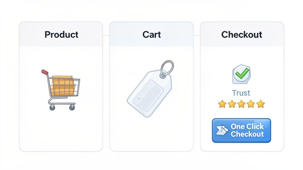
Optimizing Your Core Customer Journey
With your audit done and priorities mapped out, it’s time to get our hands dirty. The customer journey on your Shopify store isn't just one big event; it's a series of small but crucial steps—micro-conversions—that all lead up to that final sale. We're going to focus our attention on the three most pivotal stages: the Product Detail Page (PDP), the Cart, and the Checkout.
Nailing these three areas is where you’ll see the biggest returns in conversion rate optimisation for Shopify. Each stage has its own unique hurdles and opportunities to smooth out friction and build the momentum that carries a customer all the way to purchase.
Polishing Your Product Pages to Persuade
Think of your Product Detail Page (PDP) as your digital salesperson. Its one and only job is to convince a casual browser that your product is the one for them. If your PDP falls flat, the rest of your funnel doesn't stand a chance.
First things first: visuals are king. This isn't just about one good photo; you need high-resolution images from every conceivable angle, lifestyle shots showing the product in its natural habitat, and short videos demonstrating it in use. For a clothing brand, that might be a clip of a model walking in a dress to show how the fabric drapes and moves. Great visuals answer questions that words can't and create genuine desire.
Next up is your product copy. It needs to sell the benefit, not just rattle off a list of features. Instead of just saying "100% cotton t-shirt," reframe it: "Stay cool and comfortable all day in our breathable, 100% organic cotton tee." It's a subtle tweak, but it helps customers picture the value in their own lives.
Finally, you have to build trust right there on the page. A few elements are simply non-negotiable:
- Customer Reviews: Don't hide them. Display star ratings prominently near the product title and then showcase the full reviews further down the page.
- A Clear Returns Policy: A simple, reassuring line like "Easy 30-day returns" can melt away a huge amount of buying anxiety.
- Trust Badges: Those little secure payment icons (Visa, Mastercard, PayPal) are visual shorthand telling customers their information is safe with you.
Your PDP should answer every question and squash every objection before it even pops into the customer's head. You're pre-emptively solving their problems to make that "Add to Cart" click an easy, confident decision.
Transforming Your Cart from a Holding Bay into a Deal Closer
Too many merchants treat the cart page like a simple waiting room before checkout. That’s a massive missed opportunity. A well-optimised cart should do three things: confirm the customer's excellent choice, build excitement for their purchase, and nudge them to increase their Average Order Value (AOV).
One of the biggest conversion killers at this stage is surprise costs. Be radically transparent about shipping. Don't make people wait until the final checkout step to find out what delivery will cost. Pop a shipping calculator directly in the cart or, even better, display a clear, motivating message like "Free shipping on orders over £50." This simple tactic encourages customers to add just one more thing to hit that threshold.
The cart is also the perfect spot for a strategic upsell or cross-sell. If someone has a camera in their cart, offer a memory card or a camera bag—not another, more expensive camera. Relevance is everything. Many Shopify apps can automate this, suggesting complementary items that genuinely make the original purchase better.
Streamlining the Checkout for Effortless Conversions
You’ve brought them this far. The checkout is the final hurdle, and it’s where a shocking number of sales are lost. The goal here is simple: make it as fast and frictionless as humanly possible. Every extra field to fill out, every unnecessary click, is another reason for someone to get frustrated and leave.
For Shopify merchants, especially in the UK, one of the most powerful weapons in your arsenal is accelerated checkouts. In a market where Shopify's average conversion rate of 1.4% lags behind the general e-commerce average of 2.5-3%, you need every advantage you can get. UK merchants can use tools like Shop Pay, which can boost conversions by up to a staggering 50% compared to a guest checkout, outperforming competitors by at least 10%. That single feature can have a monumental impact on your bottom line. You can dig into the numbers yourself in Shopify's detailed report on CRO.
Beyond the express options, you need to be ruthless about simplifying your form fields. Do you really need their phone number? Can you use an address lookup tool to auto-complete their details? For those on Shopify Plus, the checkout is customisable, opening the door to a one-page checkout experience that drastically cuts down the number of steps.
Implementing these checkout best practices is a fundamental part of improving user experience. To see how these ideas fit into the bigger picture, you might be interested in exploring the 8 UX design principles that can directly boost your Shopify store sales. By optimising these three core stages, you create a smooth, persuasive journey that guides customers from initial interest to a completed order with almost no friction.
Using Personalisation And Site Speed To Win
Once you've tightened up the core user journey, it's time to pull two of the most powerful levers in modern conversion rate optimisation for Shopify: speed and personalisation. These aren't just trendy buzzwords; they're fundamental to how customers experience your brand.
A fast, responsive site feels professional and respectful of a customer's time. A personalised experience makes them feel seen and understood. Getting these two right creates a formidable advantage—one refines the technical experience, while the other builds a genuine emotional connection.
Making Every Experience Personal
Today's shoppers expect more than just a catalogue of products; they want to feel a connection. The days of generic, one-size-fits-all storefronts are numbered. Personalisation is all about showing the right person the right product at the right moment, making their shopping journey feel effortless and intuitive.
This is especially true for UK-based Shopify stores. A massive 71% of consumers now expect tailored interactions, and it’s no wonder—brands using AI-powered tools for this can see conversions lift by over 30%.
Think about it: the average Shopify store in the UK converts at a modest 1.4%, but the top performers are hitting over 3.2%. Personalisation is one of the clearest paths into that upper tier. If you want to see how leading brands are doing it, check out Yotpo's guide to ecommerce optimisation.
Here are a few practical ways I've seen this work wonders:
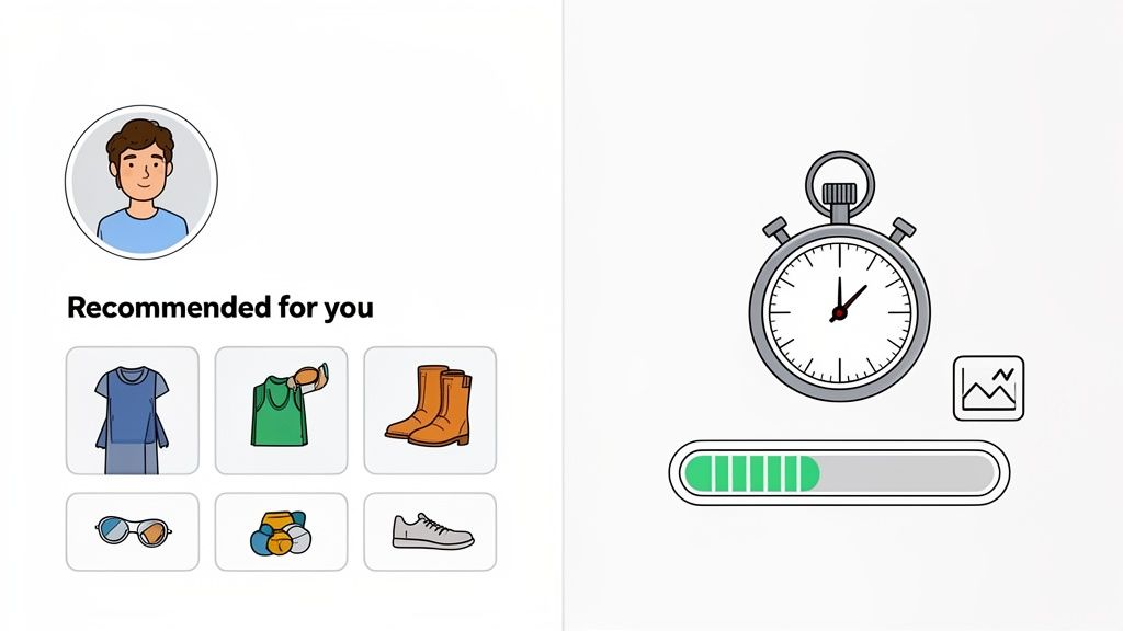
- Dynamic Product Recommendations: Go beyond generic "best-sellers". Use an app to create "You Might Also Like" sections based on a user's actual browsing history or what's in their cart. If they're looking at a specific running shoe, recommend high-performance socks, not another pair of trainers.
- Geotargeted Promotions: Show a banner offering free next-day delivery to visitors from London. Promote your best raincoats to shoppers in Manchester on a wet day. It's a small touch, but it makes your marketing feel incredibly relevant.
- Behaviour-Based Pop-ups: Ditch the generic "10% off for new visitors" pop-up. Instead, if a returning customer has viewed a particular product three times, hit them with a specific, time-sensitive discount on that very item.
Personalisation works because it reduces choice paralysis. By curating the experience, you guide customers towards products they're genuinely likely to love, making the path to purchase smoother and more enjoyable.
The Undeniable Impact Of Site Speed
Nothing kills conversions faster than a slow website. Every extra second a customer has to wait for a page to load is another opportunity for them to get frustrated and click away. The link between speed and sales is direct and unforgiving.
A solid conversion strategy has to include the technical side of things, which means running a Shopify page speed test. This gives you a clear benchmark of your current performance and shines a light on the biggest bottlenecks holding you back. From there, you can focus your efforts where they'll have the most impact.
To get started, work through this practical speed checklist:
- Compress Your Images: This is the lowest-hanging fruit. Seriously. Use a Shopify app like Crush.pics to automatically compress all your product and theme images without sacrificing quality. Large, unoptimised images are the number one cause of slow stores.
- Implement Lazy Loading: This clever technique only loads images as a user scrolls down the page, meaning the initial, above-the-fold content loads much faster. Most modern Shopify 2.0 themes have this feature built-in, so check your theme settings.
- Conduct an App Audit: Be ruthless. Every app you install adds code to your store, potentially slowing it down. If you're not actively using an app or if its value is minimal, get rid of it.
- Minimise Redirects: Having too many redirects (e.g., from old, deleted product pages) can add precious milliseconds to your load time. Use a redirect manager app to clean up any unnecessary chains.
For a more exhaustive list of actions, take a look at our complete Shopify store speed optimisation checklist.
Shopify App vs Custom Development Trade-offs
When it comes to implementing features for speed or personalisation, you’ll inevitably face a common dilemma: use an off-the-shelf app from the Shopify App Store, or invest in custom development? Each has its place, and knowing when to use which is key.
Here’s a breakdown to help you decide.
Shopify App vs Custom Development Trade-offs
| Consideration | Shopify App Store | Custom Development |
|---|---|---|
| Speed & Cost | Faster to implement and typically a lower upfront cost, often a monthly subscription. | Slower to build and more expensive initially due to developer hours. |
| Performance | Can add code bloat and slow down your site if not well-coded. | Can be built lean and optimised specifically for your theme and needs. |
| Functionality | Limited to the features the app developer provides; you have to work within their box. | Fully tailored to your exact business needs and can be designed for your unique workflow. |
| Maintenance | Managed by the app developer, who handles updates and bug fixes (usually). | You are responsible for all ongoing maintenance, updates, and troubleshooting. |
For most stores just starting out, apps are the perfect solution. They let you test new ideas and features quickly without a huge investment. However, as your store scales and your needs become more specific, custom development often becomes the smarter long-term choice for building a faster, more unique user experience that your competitors can't easily replicate.
Building A Scalable A/B Testing Program
Relying on guesswork is the fastest way to stall your store's growth. The most successful brands don’t just implement changes based on gut feelings; they build a structured A/B testing programme to prove what actually works.
A scalable system for testing turns conversion rate optimisation for Shopify from a series of one-off tactics into a reliable engine for continuous improvement.
This isn't about changing a button colour on a whim. It’s a disciplined cycle: you start with a data-backed hypothesis, run a clean experiment, measure the results with confidence, and then scale your learnings across the business.
From Educated Guess to Testable Hypothesis
Every meaningful A/B test begins with a strong hypothesis. A weak hypothesis is just a guess, like "Changing the homepage banner will increase sales." It's vague, and crucially, it doesn't explain the 'why'.
A powerful hypothesis, on the other hand, is a clear, testable statement that connects a proposed change to an expected outcome, all grounded in a specific observation. It follows a simple but incredibly effective structure.
[Observation] From our heatmaps, we see that only 20% of mobile users scroll far enough to see our customer testimonials on product pages.
[Proposed Change] We believe that moving the testimonial section directly below the product image…
[Expected Outcome] …will increase add-to-cart clicks by 5% because it exposes more visitors to crucial social proof earlier in their journey.
See the difference? This structure forces you to justify why you're running the test. It connects a real user behaviour problem with a specific solution and a measurable goal. That clarity is essential for a focused testing programme.
Running a Clean and Reliable Experiment
Once your hypothesis is locked in, you need to run the experiment correctly. Sloppy execution can invalidate your results, leading you to make the wrong business decisions. There are a few non-negotiable rules for running a clean test.
The most critical factor is reaching statistical significance. This is a measure of confidence, usually set at 95%, that the results you're seeing aren't just down to random chance. So many merchants make the classic mistake of ending a test the moment they see one version pulling ahead.
Ending a test too early is one of the most common and costly mistakes in CRO. You might be acting on a false positive. Let the test run its full course—typically at least one full buying cycle, or two weeks—to ensure your data is reliable.
It's also vital to test one thing at a time. If you change the headline, the button colour, and the main product image all in one go, you'll have no idea which element was actually responsible for the change in conversions. That's a multivariate test, which demands far more traffic and complexity. For most stores, sticking to simple A/B tests (one change at a time) delivers clearer, more actionable insights.
Analysing Results and Scaling Your Wins
When the test concludes, it's time to dig into the data. Did the new version win? Did it lose? Or was there no significant difference? All three outcomes are valuable learning experiences, not just the wins.
A Clear Win: If your variation produced a statistically significant lift, congratulations! The next step is to roll out the winning change to 100% of your traffic. But don't stop there. Ask what this win teaches you about your customers. If a benefit-led headline won, that suggests your audience responds well to value-driven messaging. This insight can inform your email campaigns, ad copy, and future tests.
A Clear Loss: A losing test isn't a failure; it's a new piece of information. It tells you that your initial assumption about your customers was wrong, which is incredibly useful. Document the result and the hypothesis it disproved. This prevents you and your team from making the same incorrect assumption in the future.
Inconclusive: Sometimes, a test shows no meaningful difference between the two versions. This often means the change you tested simply wasn't impactful enough to influence user behaviour. This is a signal to think bigger and test more substantial changes next time.
The final, and most important, step is to build an optimisation roadmap. This is a living document—a simple spreadsheet will do—that tracks every test you run.
Your Test Roadmap Should Include
- Hypothesis: The full "If we do X, then Y will happen because of Z" statement.
- Results: The final conversion rates for each version and the statistical significance level.
- Learnings: A one-sentence summary of what you discovered about your customers.
- Next Steps: What action you'll take based on the results, and what test you'll run next.
This roadmap transforms A/B testing from a series of disconnected experiments into a cumulative knowledge base. Over time, it creates a powerful feedback loop, allowing you to build on each learning and make progressively smarter decisions that drive sustainable growth for your Shopify store.
Common Questions About Shopify CRO
Diving into conversion rate optimisation for Shopify can feel a bit like opening a can of worms. It’s a world of data, jargon, and nuance, and it’s completely normal to have more questions than answers at the start.
Let's cut through the noise and tackle some of the most common questions I hear from Shopify merchants every day. These are the practical, in-the-trenches queries that pop up when you move from high-level strategy to the reality of running tests and making smart decisions for your store.
How Much Traffic Do I Need for A/B Testing?
This is the big one, and unfortunately, there's no magic number. The right amount of traffic really depends on two things: your store's current conversion rate and how big of an improvement you're hoping to see. For instance, testing a change you think will cause a huge 25% lift needs far less traffic than a subtle tweak that might only nudge conversions by 5%.
As a general rule of thumb, you want to aim for at least 1,000 visitors and 100 conversions per variation (so, for the original and your new version). You should be able to hit this within a reasonable window, like two to four weeks. If your traffic numbers are below this, you risk getting results that aren't statistically significant—meaning the winner could have been decided by pure chance.
If you're running a lower-traffic store, don't sweat it. Just focus your energy on high-impact changes. Forget about testing a button colour and instead, test a completely redesigned product page or a bold new value proposition. Bigger swings are much more likely to give you a clear winner, even with less data.
How Long Should I Run an A/B Test?
In CRO, patience is everything. It's incredibly tempting to end a test the second one version starts winning, but that's a rookie mistake. You should let a test run for at least one full business cycle, which for most online stores is one to two weeks.
Why? Because it smooths out the daily ups and downs. Your weekend shoppers might behave completely differently from your weekday office browsers, and you need to capture all of that behaviour to get a true picture.
The real goal is to run the test until you hit statistical significance, which is typically a 95% confidence level. Any good A/B testing tool will alert you when you've reached this point. Never, ever stop a test early based on a gut feeling.
What Are the Best CRO Tools for a Shopify Store?
The Shopify app store is brimming with tools, and the right "CRO stack" for you will come down to your budget and how hands-on you want to be.
Here’s a quick look at the essential tool categories:
- Analytics Platform: You absolutely need Google Analytics 4. It’s the foundation for understanding how people are using your site and tracking your goals.
- Behavioural Insights: Tools like Hotjar or Microsoft Clarity are goldmines. Their heatmaps and session recordings let you actually see why people are leaving, not just that they are.
- A/B Testing: For running experiments directly on Shopify, VWO and Convert.com are solid, professional choices. Some theme customisation apps also come with basic A/B testing features built-in. (Sadly, the old favourite, Google Optimize, is being retired).
- Personalisation: If you're ready to get more advanced, apps like Dynamic Yield or Nosto let you show different content to different users. This is a powerful way to lift conversions.
My advice? Start small. Get really good with one tool first—maybe heatmaps—to find genuine insights. Once you're using that data to make better decisions, then you can think about investing in a full-blown testing platform. This way, you ensure you're not just collecting data for the sake of it.
Ready to stop guessing and start growing? At Grumspot, we specialise in data-driven conversion rate optimisation for Shopify, turning your existing traffic into a powerful revenue engine. We'll audit your store, identify critical friction points, and build a testing programme that delivers measurable results. Learn more and book your free consultation at https://grumspot.com.
Let's build something together
If you like what you saw, let's jump on a quick call and discuss your project

Related posts
Check out some similar posts.
- conversion rate optimisation australia
Boost sales in 2026 with our definitive guide to conversion rate optimisation australia. Learn local...
Read more
- website conversion rate optimisation
Master website conversion rate optimisation with our 2026 e-commerce playbook. Audit, test, measure,...
Read more
- customer review management
Master customer review management on Shopify with our UK playbook. Get step-by-step workflows for co...
Read more
- conversion rate optimisation
Looking for a conversion rate optimization consultant? This 2026 guide covers their role, process, K...
Read more