How to Improve Ecommerce Conversion Rate and Boost Sales
- how to improve ecommerce conversion rate
Launched
February, 2026
Before you can even think about improving your e-commerce conversion rate, you need to know exactly where you stand right now. The first, non-negotiable step is to figure out your current performance. This isn't just a number—it's your baseline, the starting line from which all your optimisation efforts will be measured.
Setting Your Ecommerce Conversion Rate Baseline
Trying to boost conversions without a clear baseline is like trying to navigate without a map. You're just guessing. Establishing this starting point gives you the context you need to set realistic goals and, just as importantly, to see if the changes you're making are actually working.
Think of it less as number-crunching and more as a health check for your Shopify store. It tells you how you stack up against the competition and shines a light on the gap between where you are and where the top players are.
What Is A Good Conversion Rate?
So, what's a "good" number to aim for? In the UK, a solid e-commerce conversion rate typically lands somewhere between 2.5% and 3.5%. The real top performers, however, are pushing past 5%.
That means for every 100 people who visit your site, you should be turning at least two or three into customers. Knowing these benchmarks is vital for setting goals that are ambitious but achievable.
Your conversion rate is one of the most honest metrics you have. It cuts through the noise and tells you exactly how effective your online store is at persuading people to buy. If your rate is low, don't see it as a failure—see it as a clear roadmap for what to fix.
To work out your own rate, the formula is straightforward: (Total Number of Sales / Total Number of Visitors) x 100. For instance, if your store had 5,000 visitors last month and made 150 sales, your conversion rate would be 3%.
This chart gives you a quick visual on where different UK e-commerce stores sit, from the average right up to the top 10%.
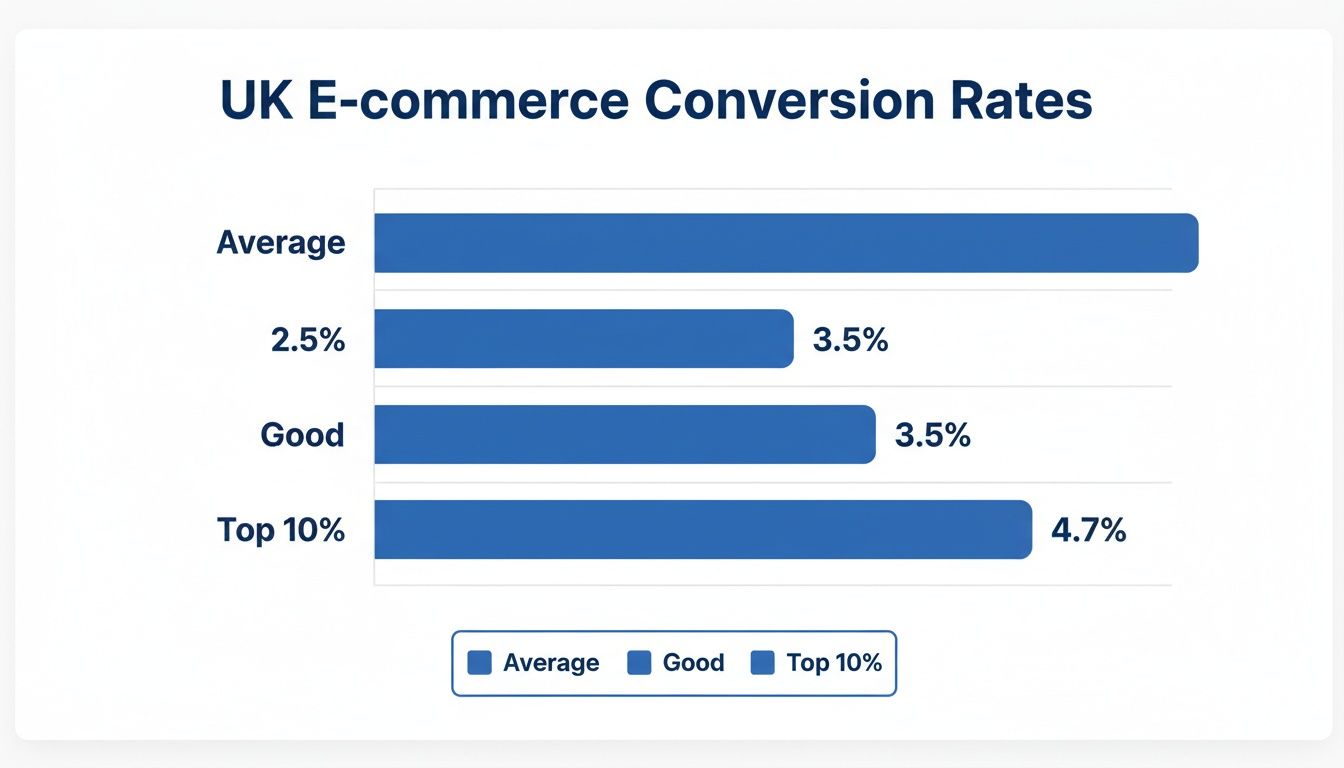
What's immediately obvious is the huge difference between average and elite performance. The best stores are converting nearly twice as many visitors. Getting this right starts with proper setup, so make sure you have reliable ecommerce tracking in Google Analytics in place.
While a 3% rate is a great target, the top 10% of Shopify stores are consistently hitting 4.7% or even higher. Finding the gap between your current rate and that top-tier benchmark is where you'll uncover your biggest growth opportunities.
This whole process is the foundation for everything else we'll cover. If you want to go a bit deeper, you can find out more about conversion rate optimisation here: https://grumspot.com/blog/what-is-conversion-rate-optimization.
UK Ecommerce Conversion Rate Benchmarks by Channel
It’s also incredibly useful to break down your conversion rate by where your traffic is coming from. A visitor from a paid ad often behaves very differently to one from an organic search. This table gives you a summary of average UK conversion rates based on the traffic source, helping you see which of your channels are pulling their weight.
| Traffic Channel | Average Conversion Rate |
|---|---|
| Email Marketing | 6.25% |
| Referral | 5.45% |
| Organic Search | 3.22% |
| Direct | 2.22% |
| Paid Search | 1.96% |
| Social Media | 1.05% |
By comparing your own channel performance against these benchmarks, you can quickly spot which areas need the most attention. If your email conversion rate is languishing at 2%, for example, you know there’s a massive opportunity for improvement right there.
Finding and Fixing Hidden Conversion Blockers
Every abandoned cart tells a story, and it's usually not a happy one. To figure out why would-be customers are bouncing, you need to put on your detective hat. The aim here is to move past guesswork and pinpoint the exact roadblocks killing your sales. These are the hidden points of friction that frustrate users and stop a purchase dead in its tracks.
Understanding where these blockers are is the first real step toward improving your e-commerce conversion rate. It means stepping into your customers' shoes and seeing your store through their eyes, not just as the owner.
Seeing Your Store Through Your Customer's Eyes
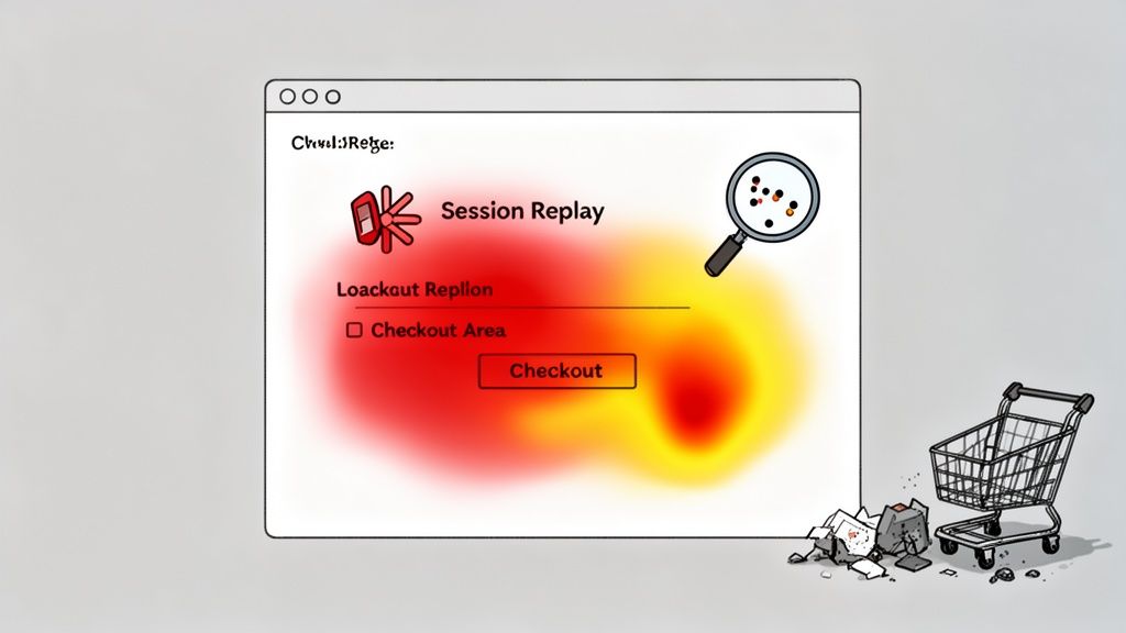
The single best way to find problems is to watch what real people do on your site. Analytics data tells you what is happening (like a high bounce rate on a product page), but it can't tell you why. That’s where qualitative tools come in.
Heatmaps: Tools like Hotjar or Microsoft Clarity are brilliant for this. They generate visual maps showing where users click, move their mouse, and scroll. Are people trying to click on elements that aren't actually links? Are they completely ignoring your main call-to-action? Heatmaps give you immediate visual feedback on what’s grabbing—or losing—attention.
Session Recordings: Think of these as CCTV for your website. Session recordings let you watch anonymised playbacks of actual user visits. You can see precisely where they get stuck, hesitate, or hit an error. It’s undeniable proof of a user experience problem.
Honestly, watching just a handful of session recordings can be an eye-opening experience. I’ve seen clients discover a confusing navigation link or a broken product filter that was quietly costing them sales every single day.
Conducting a Quick Technical Health Check
Technical gremlins are silent conversion killers. A customer won't email you to say they left because your page took an age to load—they just leave. A quick audit can uncover some major issues that are holding you back.
First up, check your site speed. A mere one-second delay in mobile load times can slash conversion rates by up to 20%. Use a tool like Google PageSpeed Insights to analyse your core pages. It will spit out a performance score and, more importantly, a list of specific recommendations, like compressing images or improving server response times.
Next, make sure your store is genuinely mobile-friendly. With over 70% of UK e-commerce traffic now coming from mobile devices, a poor experience on a small screen is a dealbreaker. Go through the entire purchase journey on your own phone, from landing page to checkout confirmation. Is it easy to navigate? Are the buttons big enough to tap? Can you complete a purchase without getting frustrated?
Don't just check if your site works on mobile; check if it's genuinely enjoyable to use. A clunky, frustrating mobile experience is one of the fastest ways to lose a customer to a competitor with a slicker setup.
Auditing Your Design and User Experience
Finally, do a quick audit of your design and UX, focusing on two things: clarity and trust. You’re looking for inconsistencies and friction points that create doubt or confusion in a buyer's mind.
Start with your calls-to-action (CTAs). Are they clear, compelling, and consistent across the site? A vague "Submit" button just doesn't have the same punch as an action-oriented "Get My 10% Off Now". Make sure your main CTAs stand out with a contrasting colour that naturally draws the eye.
Then, have a look at your trust signals. Are customer reviews and ratings clearly visible on product pages? Do you display security badges in the checkout? Is your returns policy easy to find before someone adds to their cart? These small elements reassure customers that they are making a safe purchase from a reputable business.
By building this hit list of fixes, you can start prioritising them by impact and create an actionable roadmap to genuinely boosting your conversions.
Designing a Seamless Customer Shopping Journey
A great user experience should feel completely invisible. It guides your customers from the moment they land on your site right through to purchase, all without them having to think too hard. On the flip side, a clunky, confusing website is one of the fastest ways to lose a sale and send someone straight to your competitors. This is where smart design stops being about aesthetics and starts being your most powerful sales tool.
The aim is to build a storefront that doesn't just look the part, but actively works to convert visitors into customers. It's about creating the path of least resistance, where every single element—from your navigation bar down to the layout of your product pages—is deliberately placed to remove friction, build trust, and nudge people towards a purchase.
Crafting High-Impact Product Pages
Let's be honest, your product page is the real moment of truth. This is where the final purchase decision happens. It needs to do more than just list a few features; it has to sell the dream, answer any lingering doubts, and create a genuine sense of desire. Think of it as your best salesperson, working 24/7.
First things first: top-notch visuals are non-negotiable. Your customers can't physically touch or try your products, so your images and videos have to do all the heavy lifting.
- Show Every Angle: Don't be shy. A gallery of high-resolution images showing the product from all sides is essential. If it’s clothing, show it on a model and laid flat. If it’s a gadget, get close-ups of the important bits.
- Bring it to Life with Video: A short video showing your product in action can work wonders for conversion rates. It instantly answers questions and helps shoppers imagine the product in their own lives.
- Use Contextual Photos: Show your products in their natural habitat. A backpack on a hiker's back or a piece of furniture in a beautifully styled living room makes the item far more relatable and appealing.
Of course, killer copy is just as vital. It needs to answer the one question on every customer's mind: "What's in it for me?" Focus relentlessly on the benefits, not just the technical specs. How is this product going to solve a problem or make their life better?
A product page isn’t a catalogue entry; it's a sales pitch. It must tackle objections head-on, build confidence, and make the value so clear that clicking ‘Add to Basket’ feels like the most obvious thing in the world to do.
Finally, don't forget the power of social proof. You need to build trust, and fast. Get those customer reviews and star ratings front and centre. Remember, an average rating from hundreds of reviews often feels more authentic and trustworthy than a perfect five-star score from just a handful of people.
Making Your Store Easy to Navigate
It’s a simple truth: if customers can’t find what they’re looking for, they can’t buy it. Intuitive navigation is the bedrock of a store that actually converts. Your goal is to make discovering products feel effortless and logical, never like a chore.
Keep your main menu clean, using clear, predictable categories. Now is not the time for jargon or overly creative labels. A customer looking for trousers shouldn't have to guess whether you've filed them under "Legwear" or "Bottoms." Stick to the terms people actually use.
A powerful site search is your other secret weapon. A lot of shoppers, especially those who know what they want, will head straight for that search bar. Make sure your search function is smart enough to handle typos, understand synonyms, and offer helpful auto-suggestions. A "No results found" page is a digital dead end that often leads to a visitor bouncing for good.
Tweaking your store's usability has a direct, measurable impact on your sales. For a deeper dive, check out our guide on the 8 UX design principles to boost Shopify store sales.
The Connection Between UX and Conversion Rates
When it comes down to it, every UX improvement you make is a step towards a better conversion rate. Every point of frustration you remove, every question you pre-emptively answer, and every moment of doubt you soothe all contribute to a smoother, more profitable customer journey.
The numbers tell the story. While the average UK e-commerce conversion rate sits at a respectable 3.4%, we often see standard Shopify stores hovering around 1.4%. The top-tier stores? They're hitting 4.7% and beyond. That gap isn't just luck; it's the direct result of a relentless focus on conversion rate optimisation and superior user experience. This is exactly what bespoke Shopify Plus designs, like those we build at Grumspot, are engineered to achieve.
Ultimately, the goal is to boost your ecommerce customer experience, turning casual browsers into confident buyers, and eventually, into loyal fans of your brand. A seamless shopping journey is what makes that transformation happen.
Winning the Sale on Mobile and at Checkout
Your customer is ready to buy. They’ve found the perfect product, added it to their basket, and are moments away from becoming a paying customer. This is the final, most critical stage of the whole journey, yet it’s precisely where an astonishing number of sales simply fall apart—especially on mobile.
If your Shopify store isn’t built with a mobile-first mindset, you’re not just offering a clunky experience; you’re actively leaking revenue. With most UK ecommerce traffic now coming from smartphones, a fiddly mobile checkout is no longer a minor inconvenience. It’s a deal-breaker.
Optimising for the Mobile Majority
It's one thing for your site to work on a phone; it's another thing entirely for it to be genuinely enjoyable to use. True mobile optimisation is about more than just a responsive design. It demands a fundamental shift in how you think, catering for smaller screens, shorter attention spans, and the reality of navigating with your thumbs.
The data paints a pretty stark picture of the mobile conversion gap. Boosting UK ecommerce conversion rates hinges on getting mobile right, where rates often lag at a mere 2.9% compared to desktop's more respectable 4.8%. This is despite mobile driving a massive 73% of all traffic, with abandonment rates predicted to soar to 77.2%. You can explore more data on these ecommerce benchmarks to see the full scope of the challenge.
To close this gap, you need to get ruthless about simplifying the experience. Start here:
- Thumb-Friendly Design: Can someone holding their phone with one hand easily tap all your key buttons? Your "Add to Basket" and "Proceed to Checkout" buttons should be big, bold, and impossible to miss.
- Simplified Navigation: Use a clean, collapsible "hamburger" menu and keep your categories concise and to the point. On mobile, less is always more. A customer should be able to find what they need in three taps or fewer.
- Lightning-Fast Pages: Mobile users are notoriously impatient. Every second of loading time is another reason to leave. Compress your images, minify code, and make sure your hosting can keep up. Pages need to snap into view, not crawl onto the screen.
Think of your mobile site as an express lane. It needs to be faster, simpler, and more direct than the desktop version. Every extra tap, every unnecessary field, and every moment of waiting is an invitation for your customer to get distracted and head elsewhere.
The Problem with Mobile vs. Desktop Performance
When you dig into the numbers, the difference in user behaviour between desktop and mobile becomes crystal clear. It's not just about traffic; it's about how users interact with each step of your funnel. The table below highlights some typical averages in the UK, showing exactly where the biggest drop-offs happen.
Desktop vs. Mobile Conversion Funnel Comparison
| Metric | UK Desktop Average | UK Mobile Average |
|---|---|---|
| Adds to Cart Rate | 9.1% | 7.5% |
| Reached Checkout Rate | 6.6% | 4.9% |
| Ecommerce Conversion Rate | 4.8% | 2.9% |
As you can see, the gap widens significantly as users move closer to purchase. While desktop users are more likely to add items to their cart and proceed to checkout, mobile users drop off at a much higher rate at each stage. This data screams that the path to purchase on mobile is often too cumbersome, leading directly to lost sales.
Creating a Frictionless Checkout Experience
The checkout is where your most committed buyers give up. It sounds crazy, but the average cart abandonment rate is shockingly high. The culprits are almost always friction and unexpected surprises. Your goal is to make paying for a product so seamless and straightforward that the customer barely has to think about it.
This is your final chance to build trust and deliver on the promise of an easy shopping experience. A confusing, lengthy, or dodgy-looking checkout process will undo all the hard work you’ve put into your product pages and marketing.
A Practical Checklist for a High-Converting Checkout
To systematically hunt down and eliminate friction, work through this checklist. Each point tackles a common reason customers abandon their carts right at the finish line.
- Offer Guest Checkout: Forcing someone to create an account before they can buy is one of the biggest conversion killers out there. Always provide a prominent "Checkout as a Guest" option. You can always ask them to create an account on the thank-you page after you’ve secured the sale.
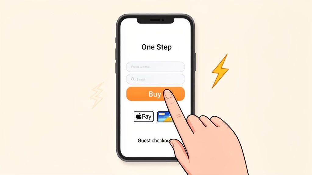
- Embrace One-Click Payments: Get accelerated payment options like Shop Pay, Apple Pay, and Google Pay set up. These tools pull saved shipping and payment details, letting customers buy with a single tap. It's the closest thing to a frictionless purchase you can get.
- Show All Costs Upfront: Nobody likes surprises when it comes to money. Display shipping costs, taxes, and any other fees clearly on the product page or in the cart summary—long before the customer starts entering their card details. Unexpected shipping fees are the number one reason for cart abandonment.
- Keep Forms Minimal: Only ask for what you absolutely need to fulfil the order. Do you really need their phone number? Can you auto-fill their address as they type? Each field you remove makes the process feel faster and less like a chore.
- Display Trust Signals: Reassure customers their details are safe. Make sure security badges (like your SSL certificate) and accepted payment logos (Visa, Mastercard, etc.) are clearly visible. This simple visual reinforcement builds confidence at the exact moment it matters most.
Using Advanced CRO Strategies to Fuel Growth
Once you’ve nailed the fundamentals and your store is running smoothly, it’s time to switch gears. The focus moves from plugging leaks and fixing obvious problems to actively hunting for new growth opportunities. This is where you graduate from the basics and start building a proper, data-driven system for continuous improvement. The aim is no longer just to maintain, but to systematically boost your ecommerce engine's performance.
This next level of conversion rate optimisation (CRO) is all about cultivating a culture of experimentation. It means questioning every assumption you hold about your customers and letting hard data provide the real answers. This is precisely how you unlock sustainable, long-term growth and stay ahead of the pack.
Building a Continuous Experimentation Habit
Guesswork is one of the most expensive habits in ecommerce. The brands that consistently win don't rely on gut feelings; they build a rigorous process of testing, learning, and iterating. This is where A/B testing, or split testing, becomes your most powerful tool. The idea itself is straightforward: you create two variants of a page (version 'A' and 'B'), show them to different segments of your traffic, and see which one performs better.
The secret is to think small and test often. You really don't need a massive site redesign to see impressive results. In my experience, it's the small, incremental changes that often deliver the most significant and sustainable lifts in conversion.
So, what should you be testing? Pretty much everything.
- Calls-to-Action (CTAs): Play with the wording, colour, size, and placement of your main buttons. Does "Buy Now" actually convert better than "Add to Basket"? A tiny text change can have a surprisingly big impact on your click-through rates.
- Headlines and Product Copy: Try pitting benefit-driven headlines against feature-focused ones. Does talking up a product’s durability resonate more with your audience than listing its technical materials?
- Images and Videos: Test different product imagery. Does a lifestyle shot of the product in a real-world setting outperform a clean studio shot on a plain white background?
- Pricing and Offers: This is a huge one. Test different discount formats, like a straight 20% Off versus a fixed £10 Off. You can also experiment with shipping thresholds, like offering free shipping on orders over £50 versus £75.
The real magic of A/B testing isn't just about finding one 'winning' version. It's about the cumulative wisdom you gather about your customers' motivations and preferences over time. Every single test, whether it wins or loses, teaches you something valuable.
Leveraging Data for Powerful Personalisation
In such a crowded marketplace, a generic, one-size-fits-all experience simply gets ignored. Personalisation is your chance to make each customer feel like you're speaking directly to them. It’s about creating a shopping journey that intelligently adapts to their individual behaviours and preferences. Done right, a personalised experience can dramatically increase both conversion rates and average order value (AOV).
A great starting point is to segment your audience based on their behaviour. You can then craft different experiences for each group:
- New vs. Returning Visitors: Greet first-timers with a welcome offer or guide them towards your best-selling products. For your loyal returning customers, you could showcase new arrivals or highlight items related to their past purchases.
- Geographic Location: Tailor your messaging and offers based on a visitor's location. This could be as simple as displaying prices in their local currency or promoting products suited to their local climate.
- Purchase History: If a customer has previously bought from a specific category, make sure to show them complementary products or new items from that same category when they come back to your site.
Driving Growth with Upsells and Subscriptions
Beyond optimising that first purchase, advanced CRO is about maximising the lifetime value of every customer. Two of the most effective strategies for this are smart upselling and rolling out subscription models.
- Strategic Upselling: An upsell encourages a customer to buy a more expensive item or add relevant products to their basket. The trick is to make these offers feel genuinely helpful, not just a pushy sales tactic. For instance, when a customer adds a camera to their cart, you could suggest a bundle that includes a memory card and a case for a small discount.
- Subscription Models: For any consumable products, a 'subscribe and save' model can be a complete game-changer. It generates predictable, recurring revenue and builds incredible customer loyalty. Offering a small discount for subscribing is often a powerful enough incentive to lock in those future sales.
For more practical tools and ideas, you can learn about 10 essential Shopify apps for higher conversion rates, as many of them are designed to help you implement these more advanced strategies.
Answering Your Top Ecommerce Conversion Questions
Diving into conversion rate optimisation always brings up a few common questions. Let's walk through some of the most frequent queries we hear from Shopify store owners, cutting through the jargon to give you practical answers you can use right away.
What Is a Good Ecommerce Conversion Rate?
It's the classic question, but the answer isn't as straightforward as you'd think. A “good” rate is a moving target and can vary wildly depending on what you sell.
That said, a solid benchmark for most UK ecommerce stores hovers somewhere between 2% and 4%. The top-tier brands we see often push well beyond 5%, sometimes even hitting double digits.
But don't get too hung up on industry averages. The only benchmark that truly matters is your own. Your real goal should be consistent, incremental improvement. Are you doing better this month than last?
Also, remember to segment your data. Traffic from an email campaign will almost always convert at a higher rate than visitors from a new social media ad. Looking at a blended average can be misleading, so dig into where your best customers are coming from.
How Do I Prioritise Which Changes to Make?
When you’ve got a long list of potential improvements, it’s easy to get stuck trying to figure out where to start. The best way to cut through the noise is to weigh potential impact against the effort required to make the change. We often call this an ICE score (Impact, Confidence, Ease).
Always begin with the low-hanging fruit. These are the quick wins – fixes that are relatively simple to implement but could have a big payoff. More often than not, these are lurking in your checkout process or on mobile devices.
Fixing a broken 'apply discount code' button in your checkout will deliver a far better return on your time than spending weeks A/B testing a button colour. Focus on eliminating the obvious points of friction first before you move on to finer optimisations.
Once you've plugged the biggest leaks, you can start tackling the more strategic projects, like running bigger experiments or rolling out personalisation.
How Often Should I Be A/B Testing?
There's no magic number here. The aim is to build a consistent rhythm of experimentation. If you’re getting a healthy amount of traffic—say, thousands of transactions a month—you should probably have at least one or two tests running at all times.
For smaller stores, traffic can be a real constraint. It can take weeks to get a statistically significant result from a small A/B test. In this situation, your time is better spent on bigger, more impactful changes based on user feedback and analytics data, rather than getting bogged down in minor tests.
Ultimately, it’s not about the frequency of your tests, but the quality of your ideas. A single, well-researched test based on a solid hypothesis will always beat a dozen random guesses.
Can Small Tweaks Really Make a Big Difference?
Absolutely. This is one of the biggest myths in CRO – the idea that you need a massive, expensive site overhaul to see real results. While a full redesign has its place, it's the small, iterative changes that often produce the most significant gains over time.
Think about it: just removing one clunky field from a checkout form can have a massive impact. Expedia famously boosted profits by $12 million simply by taking out one non-essential field from their booking form.
Here are a few other small-but-mighty changes to consider:
- Make your calls-to-action clearer. Swapping a generic "Submit" for "Get My 10% Discount" instantly communicates value.
- Add trust badges to your checkout. Displaying logos for PayPal, Visa, and security seals can be just the reassurance a nervous buyer needs.
- Improve your on-site search. A smart search function that delivers relevant results helps motivated customers find exactly what they’re looking for, fast.
These tweaks might feel minor on their own, but their cumulative effect can completely transform your store’s performance. It's solid proof that you don't always need a grand project to get a better conversion rate.
Ready to stop guessing and start converting? The expert team at Grumspot specialises in turning underperforming Shopify stores into high-velocity revenue engines. Get in touch today to see how we can help you scale.
Let's build something together
If you like what you saw, let's jump on a quick call and discuss your project

Related posts
Check out some similar posts.