Shopify Conversion Rate Optimization Playbook 2026
- shopify conversion rate optimization
- ecommerce cro
- increase shopify sales
- shopify audit
Launched
April, 2026
At its core, Shopify conversion rate optimisation is about one thing: turning more of the visitors you already have into paying customers.
It's the art and science of methodically improving your online store, not through guesswork, but by understanding how real people shop. By analysing user behaviour, you can pinpoint the exact moments of friction that cause them to leave and test smart solutions to smooth out the path to purchase. The real win? More revenue without a bigger ad spend.
Auditing Your Shopify Conversion Rate
Before you start tweaking buttons or rewriting product descriptions, you need a clear picture of where you stand right now. A thorough audit is the only way to establish a proper baseline, turning vague goals like "increase sales" into concrete, measurable targets.
It all boils down to one critical question: what is our current conversion rate, and how does it stack up against everyone else?
I've seen far too many store owners fly blind, making changes without knowing their starting numbers. This makes it impossible to know what’s actually working. A proper Shopify conversion rate optimisation strategy always begins by benchmarking your performance against real-world data, grounding your entire plan in reality.
Finding Your Performance Baseline
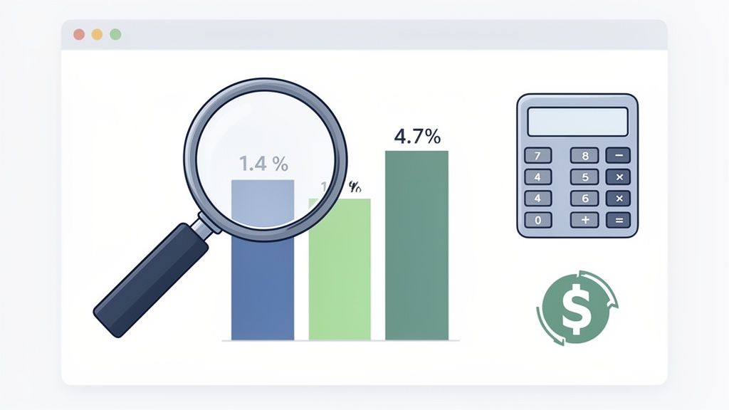
So, what does a "good" number even look like? The honest truth is that for most Shopify merchants, the average store conversion rate has been stubbornly hovering between 1.4% and 1.8% through 2026. This is the median across millions of stores, meaning half of all retailers convert fewer than two out of every 100 visitors.
But here’s where it gets interesting. Stores that manage to push their conversion rate above 3.2% join the top 20% of all merchants. And those hitting 4.7% or higher are in the elite top 10%.
Think about what that means in real terms. For a store with 10,000 monthly visitors, jumping from an average 1.4% to a very achievable 5% isn't just a small bump. It's the difference between 140 and 500 orders per month—a massive 257% revenue increase from the exact same traffic.
This initial audit gives you the context you need to set ambitious but realistic goals. You’re no longer just aiming for "more"; you're targeting a specific percentage that will elevate your store into a new performance tier.
Key Takeaway: Your audit isn't just about finding a number. It's about translating that number into tangible business outcomes—like monthly orders and revenue—to create a powerful case for investing in a structured optimisation process.
Understanding Your Store's Performance Tiers
To help you see exactly where your store fits into the bigger picture, we can break down performance into a few distinct tiers. This simple framework helps you pinpoint your current position and map out a clear path for growth. It changes the conversation from "our conversion rate feels low" to "we're in the bottom 50%, and our next goal is to reach the top 20%."
As you dig into your store's data, a detailed conversion rate optimization checklist can be an incredibly useful guide. It gives you a structured way to look at every part of your store, from site speed to user experience.
To see where you land, compare your current conversion rate to the benchmarks below.
Shopify Conversion Rate Performance Tiers
This table shows where your store's conversion rate places you among all Shopify merchants, highlighting the gap between average and top performers.
| Performance Tier | Conversion Rate | What This Means |
|---|---|---|
| Elite Performers | 4.7%+ | You are in the top 10% of all Shopify stores. Your focus shifts to advanced personalisation and micro-optimisations. |
| High Performers | 3.2% - 4.6% | You are in the top 20%. You have a solid foundation but can still find significant wins in user flow and checkout. |
| Average Performers | 1.4% - 3.1% | You are in the middle 30%. This is where most stores sit, with huge opportunities for improvement in core areas. |
| Underperformers | Below 1.4% | You are in the bottom 50%. Critical issues are likely hurting your sales, and foundational fixes will have a high impact. |
Getting this foundational audit right is the most important step in any successful Shopify conversion rate optimisation strategy. It swaps assumptions for hard data, giving you the clarity needed to prioritise your efforts where they'll make the biggest difference.
For a deeper dive into this process, check out our guide on how to conduct a comprehensive eCommerce audit.
Right, let's get down to brass tacks. You can have the most stunning product photography and persuasive copy in the world, but if your site takes forever to load, none of it matters. Before you can even think about optimising your design or checkout flow, you have to nail the technical foundations.
A slow, clunky experience is the quickest way to lose a sale before a shopper even gets a chance to see what you're selling. When we talk about Shopify conversion rate optimisation, this is ground zero.
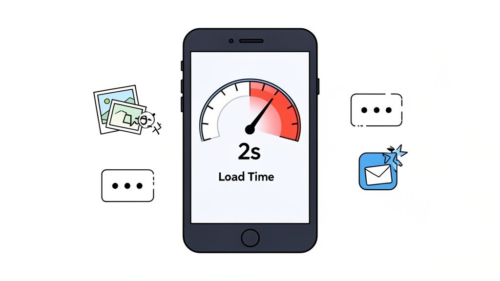
The numbers don't lie. Just a one-second delay in how fast your page loads can tank conversions by a staggering 7% to 10%. On mobile, where users are even less patient, the damage is worse. Sorting out these performance issues isn't just a box-ticking exercise; the data shows an expected conversion lift of +0.4 to +0.7 percentage points for stores that get this right. The connection is so direct that it’s been studied extensively; you can see more findings on how site speed affects Shopify conversions on thails.com.
The goal here isn't just to get a good score on a speed test. It's about creating a smooth, frustration-free journey that actually encourages people to browse and, ultimately, to buy.
Aim for a Sub-Two-Second Load Time
In ecommerce, every millisecond genuinely counts. Through years of analysing store data, we've found the magic number for load time is under two seconds. Once you creep past that mark, you can literally watch the engagement fall off a cliff. Bounce rates shoot up, and potential customers just give up and go elsewhere.
This two-second rule isn't arbitrary—it’s rooted in user perception. A site that loads in under two seconds feels instant. It keeps the shopper in that "buying bubble," focused on your products instead of staring at a loading spinner.
Our Pro Tip: Don't just obsess over your homepage speed. Run speed audits on your most valuable pages: high-traffic collection pages, your best-selling product pages, and especially the cart and checkout. A speedy homepage means nothing if the checkout chugs along.
Smart Image Optimisation and Lazy Loading
So, what's usually grinding a Shopify store to a halt? Nine times out of ten, it’s images. You absolutely need crisp, high-quality product photos, but they can't come at the expense of site speed. This is where you need to get clever with image optimisation.
Here are the two non-negotiables we implement for every client:
- Image Compression: Run your images through a tool like TinyPNG or use Shopify's built-in image handling to shrink the file size. There's rarely a good reason for a product photo to be over 100KB. This simple step makes a huge difference.
- Lazy Loading: This is a brilliant technique that tells the browser to only load the images a user can actually see. As they scroll down, the rest of the images load just in time. For image-heavy pages like collections or lookbooks, this is a game-changer for initial load speed.
Just getting these two things right can shave precious seconds off your load time and give your conversion rate a direct, measurable boost. For a more technical walkthrough, you can learn more about how to improve website loading speed in our comprehensive article.
Taming Your Shopify App Overload
We get it. The Shopify App Store is like a sweet shop for merchants. But every app you install adds its own code (JavaScript and CSS) to your theme, and all that code has to be loaded by your visitors' browsers. It’s incredibly easy to end up with a graveyard of old, unused, or just plain inefficient apps that are quietly killing your performance.
A bloated app library is one of the most common—and fixable—problems we see. Doing a regular app audit is a seriously high-impact activity.
Here’s a quick process to follow:
- Map it all out. Go to your Shopify admin and make a simple list of every single app you have installed.
- Justify its existence. Go down the list and ask the tough question for each one: "Does this app directly make us money or make the customer's experience significantly better?"
- Check its footprint. You can use your browser's developer tools (or have a developer help) to see which apps are loading heavy scripts.
- Be ruthless. If an app isn't pulling its weight or is a major drag on performance, get rid of it.
A lean, fast-loading store will always convert better than one bogged down by dozens of "nice-to-have" features. By fixing these technical roadblocks first, you’re giving all your other Shopify conversion rate optimisation efforts a real chance to succeed.
Designing a High-Trust Shopping Experience
So, you’ve got a speedy site. That’s half the battle. A fast store gets people through the virtual door, but it's trust that persuades them to look around and actually buy something. This is where your Shopify conversion rate optimisation efforts really pay off.
This isn't about chasing the latest flashy design trends. It's about building a user experience (UX) that feels secure, straightforward, and completely natural from the second someone lands on your site. Every single element, from your menu to your call-to-action buttons, needs to feel right to the user, reducing hesitation and building confidence.
Think of it this way: even the smallest doubt can be enough to make a shopper leave. Your job is to get ahead of those doubts. You need to address potential questions with thoughtful design and clear communication, making your store feel as reliable as a favourite high-street shop.
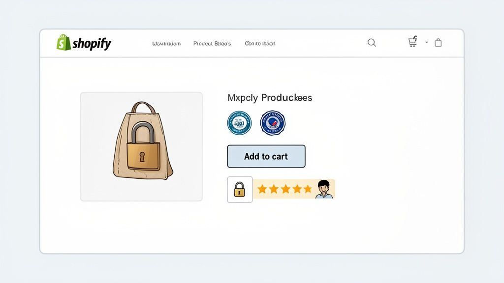
Building Credibility Above the Fold
You’ve got about five seconds. That’s the window you have to convince a new visitor that you’re a legitimate business, not a dodgy website. What they see first—what we call "above the fold"—is everything.
Your value proposition has to hit them immediately. It must instantly answer three simple questions:
- What are you selling?
- Who is it for?
- Why should they get it from you?
Don't bury this vital information. Put it front and centre on your homepage and key landing pages with a clear headline and sub-headline. This isn't the time for fluffy marketing-speak; just be direct and spell out the benefits. Pair that message with immediate trust signals, like a "Free UK Delivery" banner or logos from publications that have featured you.
Crafting Compelling Product Pages
Your product pages do the real selling. They have the tough job of convincing someone to add an item to their cart without ever seeing or touching it. That’s where incredible visuals and persuasive copy become non-negotiable.
Invest in professional photos that show your product from all angles, in use, and with a zoom function. It's a fact that 75% of online shoppers depend on product photos to make a buying decision. Go one better by adding a short video that shows the product in action.
And the description? It needs to be more than just a dry list of specifications. Use a mix of scannable bullet points for the quick facts and a short, engaging story about the benefits. Pre-empt the questions you know customers will have: What’s it made of? What are the dimensions? How does it fit?
Real-World Example: We worked with a fashion brand that saw a major jump in ‘Add to Cart’ clicks from one tiny change. They simply added the line, "Model is 175cm and wears a size M" to their descriptions. That one specific detail removed a huge point of uncertainty for shoppers.
Using Social Proof and Transparency
Nothing builds trust faster than showing that other people have bought from you and loved the experience. This "social proof" is a powerful psychological nudge that makes shoppers feel more confident in their decision. As you focus on user experience and clear copy, you can implement proven tactics to improve ecommerce conversion rates and cultivate that high-trust feeling.
Place different kinds of social proof where they'll have the most impact:
- Star Ratings & Reviews: Put these right under the product title. They can’t be missed.
- Customer Photos: Use a Shopify app to pull in user-generated content (UGC) and create a gallery on your product pages.
- Testimonials: Weave specific, benefit-focused quotes onto your homepage and even your checkout page.
Being transparent is just as important. One of the single biggest conversion killers is a surprise shipping cost at checkout. Be upfront about delivery fees and estimated times. A simple banner at the top of your site or a clear line on the product page can stop people from abandoning their carts right at the finish line.
Nailing this high-trust environment is a cornerstone of Shopify conversion rate optimisation. By obsessing over these details, you turn your shop from a simple website into a place people genuinely want to buy from. To dig deeper into this, check out our complete guide to conversion-focused web design.
Make It Personal: The Smart Way to Boost Shopify Sales
Think about your own shopping habits. Do you enjoy sifting through irrelevant products, or do you prefer a store that seems to know exactly what you’re looking for? A one-size-fits-all storefront pretty much guarantees one thing: average results. To break through that ceiling, you have to make the shopping experience feel unique to every person who lands on your site.
This is where smart personalisation becomes your most powerful tool for Shopify conversion rate optimisation. Instead of hitting every visitor with the same homepage, the same offers, and the same product grid, you adapt the experience based on what they actually do. Your store stops being a static catalogue and becomes a dynamic, responsive guide that feels like it was built just for them.
Shifting from a Shout to a Conversation
At its heart, the idea is simple: use what you know about a visitor to show them what they're most likely to want. You don't need a huge data science team for this, either. Plenty of powerful personalisation tactics can be set up right within Shopify, often with clever app integrations and by making better use of the customer data you already have.
The whole point is to make the journey from discovery to checkout feel more intuitive and genuinely helpful for every single user.
My Take: Personalisation isn't just a shiny feature. It’s a fundamental shift in how you communicate. You're moving from a one-way broadcast to a two-way conversation, where your store actually listens and responds to a shopper's clicks and actions in real time.
We’ve seen it time and again—stores that implement even basic personalisation often see conversion rates jump by 15% to 20% compared to their generic counterparts. It’s one of the most effective levers you can pull for quick, meaningful gains. The data really backs this up, and you can see how dynamic content impacts Shopify sales for a deeper dive. This is precisely why making your store more responsive to individual users should be a top priority.
High-Impact Personalisation Tactics to Try First
Getting started doesn't have to be a massive project. You can begin with a few high-impact strategies that deliver immediate value and build from there. These tactics are all about meeting shopper expectations and removing friction.
Here are a few of the most effective methods we implement for clients:
Dynamic Product Recommendations: This is the easiest win and a great starting point. Based on a user's browsing history, what they’ve bought before, or items currently in their cart, you can show a curated "You Might Also Like" section. This tactic alone can lift conversion rates by +0.2 to +0.4 percentage points. It just works.
Geo-Targeted Content: If you sell internationally, this is non-negotiable. Automatically showing prices in the local currency and displaying relevant shipping info based on the visitor's location removes huge barriers. A simple banner saying, "Good news! We ship to the United Kingdom," can instantly reassure a potential customer.
Returning Customer Recognition: Make your loyal customers feel seen. Welcome them back with exclusive offers or a personalised homepage section that highlights products related to their past purchases. A simple, "Welcome back, Sarah!" goes a long way in making someone feel valued.
Using Customer Data and Behaviour as Your Guide
The fuel for all of this is data. But you can start small. Segmenting your audience and tailoring your messaging for each group is a fantastic first step.
Here are a couple of practical ways to put this into action:
Match Your Landing Page to Your Ad: If a visitor clicks a TikTok ad for a specific dress, they should land on a page that features that exact dress, front and centre, along with related accessories—not your generic homepage. The experience should feel like a seamless continuation of the ad.
Smarter, Behaviour-Triggered Pop-ups: Notice a user is about to leave a product page (their cursor is heading for the exit)? Trigger a pop-up offering a small, time-sensitive discount on that specific item. It's worlds more effective than a generic "10% off your first order" pop-up that everyone sees.
By weaving these kinds of smart personalisation strategies into your store, you create an experience that feels less like a cold transaction and more like a helpful, guided journey. This is a cornerstone of modern Shopify conversion rate optimisation that turns casual browsers into happy, repeat customers.
Building a Repeatable CRO Testing Framework
Real Shopify conversion rate optimisation isn’t about one-off projects or a lucky guess. It's a continuous programme of improvement. While a single change might give you a temporary boost, building a structured testing framework is what turns random tweaks into a reliable engine for growth.
This is how you graduate from acting on gut feelings to making decisions based on cold, hard data. Without a repeatable process, you're stuck in endless debates. Your designer loves the new green button, but your developer is convinced blue is better. A proper testing framework ends those arguments by showing you exactly what your customers respond to, ensuring every change is a proven step forward.
Ultimately, the goal is to build a system you can rely on to generate and validate new ideas, turning small, compounding wins into serious, long-term revenue.
From Data to a Testable Hypothesis
Every great A/B test starts with a solid hypothesis. And a hypothesis isn't just a vague idea like, "Let's make the product page better." It's a specific, testable statement that predicts a clear outcome, and it should always be rooted in data.
So, where do you find this data? Start by digging into your analytics and user behaviour tools (like heatmaps or session recordings). Look for the friction.
- Where are people dropping off in the funnel?
- Are they clicking on things that aren't actually links?
- What questions keep popping up in your customer service tickets or live chat?
These observations are the raw materials for your test ideas. Once you have an observation, frame it using this structure: "If we change [X], then [Y] will happen, because [Z]."
- The Change [X]: "If we add customer-submitted photos below the main product image..."
- The Outcome [Y]: "...then our 'add to cart' rate will increase..."
- The 'Why' [Z]: "...because it gives shoppers powerful social proof and helps them picture the product in a real-world setting."
This format forces you to be specific and measurable. It connects your proposed change directly to a user behaviour you want to influence. A backlog full of these well-formed hypotheses is the fuel for any successful testing programme.
Prioritising Your Tests for Maximum Impact
You'll quickly find you have more ideas than you can possibly test at once. That's a good problem to have! But you need a system to decide what to work on first. A simple and incredibly effective method is the PIE framework. It helps you score each test idea based on three key factors:
- Potential: How big of an impact could this change really have? Fixing a broken checkout button has far more potential than changing the colour of a footer link.
- Importance: How valuable is the traffic on the page you're changing? An improvement on your best-selling product page is much more important than a tweak to your 'About Us' page.
- Ease: How difficult is this test to build and launch? Swapping out button text is easy. A complete redesign of your navigation is a major project.
Score each of these on a scale of 1 to 10 and find the average. The ideas with the highest PIE scores are your best bets—they represent the intersection of high impact and reasonable effort. This stops you from just guessing and makes sure your team is always focused on what matters most.
A common mistake I see is teams focusing almost entirely on 'Ease'. Quick wins feel great, but 'Importance' and 'Potential' are what ensure you’re making genuinely impactful changes, not just easy ones.
Running and Analysing Your A/B Tests
With a prioritised hypothesis in hand, you're ready to start testing. The gold standard here is the A/B test, where you show the original page (the "control") to one group of visitors and a new version (the "variation") to another.
As you start testing, remember the goal is to create a more intuitive and persuasive experience. Thoughtful changes, like adding personalisation, can have a massive impact on your store's bottom line.
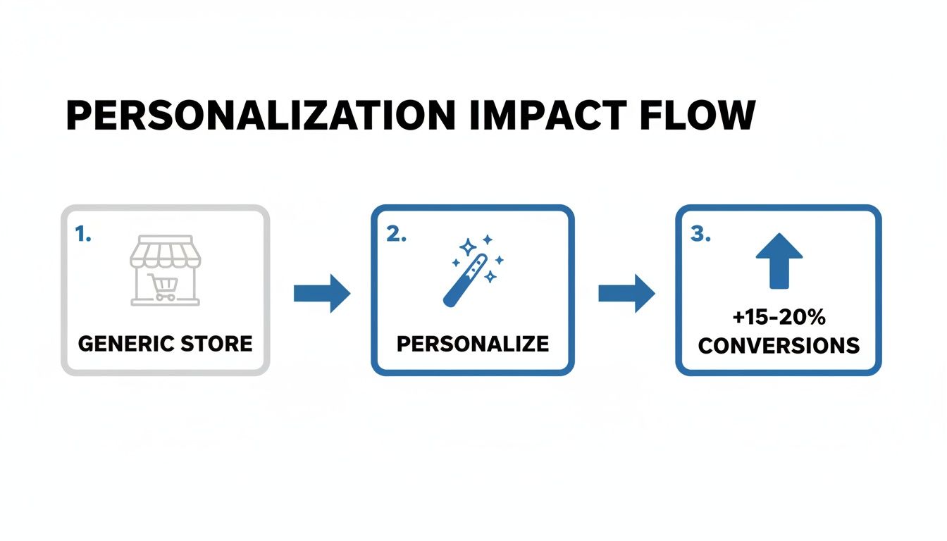
This flow shows just how powerful it is to move from a generic, one-size-fits-all store to an experience that feels tailored to the shopper. We've seen this kind of thoughtful optimisation lift conversions by 15-20%.
When you launch a test, you need to let it run long enough to reach statistical significance—usually a confidence level of at least 95%. This confirms your result is due to the change you made, not just random chance. Most A/B testing tools like Google Optimize or VWO handle this calculation for you. Resist the temptation to end a test early just because one version is pulling ahead; you need sufficient data to trust the outcome.
After the test, you'll have one of three results:
- A win: Your variation clearly beat the control.
- A loss: The original page performed better.
- Inconclusive: There was no meaningful difference.
Don't be discouraged by losses or inconclusive results! They are just as valuable as wins. They teach you what doesn't work for your audience, preventing you from rolling out a change that would have hurt sales. Document every single result—the wins, the losses, and the insights—to build an internal knowledge base about what makes your customers tick.
Answering Your Top Shopify CRO Questions
Even with the best playbook in hand, getting started with Shopify conversion rate optimisation often sparks a few tricky questions. We get it. Whether you're trying to fix a store that’s just not performing or aiming to push a successful one even further, specific concerns always come up.
Here are the direct, no-fluff answers to the questions we hear most often from merchants just like you.
How Long Does It Take to See Results From Shopify CRO?
That’s a great question, and the honest answer is: it depends. Some fixes deliver results almost immediately. If you spot and repair a broken link in your checkout flow or clarify a confusing call-to-action button, you could see a measurable lift in just a couple of weeks. These are the quick wins we love to find.
But the real, game-changing results? They come from a disciplined, ongoing testing programme. A single A/B test typically needs to run for at least two to four weeks to gather enough clean, statistically significant data. For a full-scale CRO strategy involving multiple experiments and site-wide changes, you should start seeing a noticeable, sustainable bump in your overall conversion rate within the first three to six months. It's a marathon, not a sprint.
What Are the Most Important Metrics to Track for CRO?
Your overall conversion rate is the headline number, of course. But focusing only on that final figure is like looking at the final score of a football match without watching the game—you miss all the crucial plays that decided the outcome.
To really understand what’s happening on your site, you need to dig a bit deeper. Think of these secondary metrics as your diagnostic tools:
- Add to Cart Rate: Are your product pages actually creating desire and getting people to take that first step? This tells you.
- Checkout Abandonment Rate: If this number is high, you know there’s friction, doubt, or a technical snag in the most critical part of the journey.
- Average Order Value (AOV): Good CRO isn't just about getting more orders; it’s about getting more profitable orders through strategic upsells and cross-sells.
- Site Speed Metrics: How fast your site feels is a huge part of the user experience. Core Web Vitals directly influence whether people stick around or bounce.
Tracking these KPIs helps you pinpoint exactly where visitors are dropping off. This means you can stop guessing and start forming sharp, accurate hypotheses for your A/B tests.
My Conversion Rate Is Already 3%. Do I Still Need CRO?
Absolutely. And here’s why. First off, hitting a 3% conversion rate is brilliant—it puts you in the top 20% of all Shopify stores. You should be proud of that. But it's a milestone, not the finish line. CRO isn't just a tool for fixing "bad" stores; it's a growth discipline for ambitious ones.
The strategies that got you from 1.5% to 3% are rarely the same ones that will push you into the elite 4% or 5% club. At this level, optimisation becomes more sophisticated. We start looking at advanced personalisation, testing entire user flows instead of just single elements, and zeroing in on customer lifetime value (LTV). For a store that's already performing well, there is always another layer of profit to unlock.
Ready to move beyond guesswork and build a data-driven growth engine for your Shopify store? The team at Grumspot specialises in turning underperforming sites into high-velocity revenue machines through rigorous CRO and bespoke development. Book a call with us today to find out how we can help you scale.
Let's build something together
If you like what you saw, let's jump on a quick call and discuss your project

Related posts
Check out some similar posts.
- conversion rate optimisation case studies
Explore 7 in-depth conversion rate optimization case studies. Learn from Grumspot, VWO, & more to fi...
Read more
- conversion rate optimisation ux
Learn our conversion rate optimization ux playbook. Transform your ecommerce store with expert strat...
Read more
- increase shopify sales
Struggling to increase Shopify sales? Our 2026 playbook offers a prioritised, data-driven roadmap fo...
Read more
- ecommerce audit checklist
Discover the ecommerce audit checklist to fix issues, boost performance, and scale your online store...
Read more