How to Increase Ecommerce Conversion Rate for UK Stores
- increase ecommerce conversion rate
- ecommerce CRO
Launched
February, 2026
Improving your ecommerce conversion rate isn't about guesswork; it's a methodical process of finding and fixing the friction that stops people from buying. It means looking at everything—from your product pages and site speed to the final checkout click—and optimising it all based on what your customers need to feel confident enough to place an order.
Why Your Current Conversion Rate Is Not Good Enough
Before we jump into specific tactics, we need to talk about where you are right now. I see so many UK merchants get hung up on some universal "good" conversion rate, but that's a trap. A figure that's fantastic for a bespoke furniture shop could be a disaster for a fast-fashion brand.
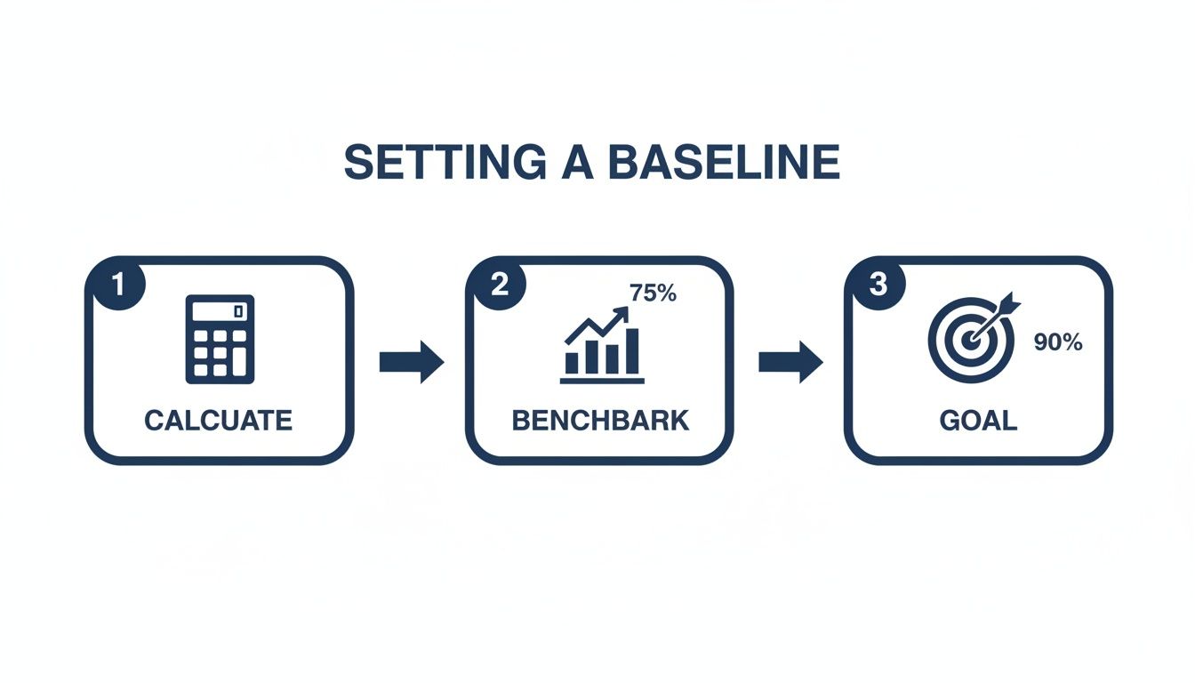
The goal here isn't to chase some generic number. It's to unlock your own store's potential. Your first job is to establish your baseline. This isn't just about a percentage; it's the foundation for every decision you'll make from here on out. Without that starting line, you have no way to measure growth, spot opportunities, or prove that your hard work is paying off.
Setting a Realistic Benchmark
So, what should you be aiming for? While it really does depend, industry data gives us a helpful frame of reference. For UK ecommerce in 2025, a solid conversion rate hovers between 2.5% to 3.5%. But the really well-oiled sites, the ones that have truly dialled in their experience, can push past 5%. That gap shows you just how much room there is to grow.
Research from Priority Pixels highlights this reality: most people who visit your site are just browsing. That's why even tiny percentage lifts are so powerful. Think about it: turning 1,000 visitors into 35 sales instead of just 25 is a huge win.
Even a seemingly small improvement can have a massive impact on your revenue. Moving from a 2% to a 3% conversion rate doesn't sound dramatic, but it's a 50% increase in sales from the exact same amount of traffic. That, right there, is the magic of conversion rate optimisation.
The most dangerous number in ecommerce is a "good enough" conversion rate. Complacency is the enemy of growth. Your baseline isn't a finish line; it's the starting block for continuous, data-driven improvement.
Moving Beyond Averages
Industry averages are great for a bit of context, but honestly, the only competitor that truly matters is your past self. Your real goal should be to consistently beat your own historical performance. To do that, you need to dig into your store's unique situation.
A few key factors will always influence your conversion potential:
- Product Price Point: Higher-ticket items almost always have longer consideration phases and, naturally, lower conversion rates.
- Traffic Source: A visitor from a highly targeted email campaign is worlds away from someone who clicked a broad social media ad. They'll convert differently.
- Device Type: Mobile conversion rates still tend to lag behind desktop. The mix of devices your customers use is a critical piece of the puzzle.
- Industry Niche: A shop selling essential, repeat-purchase items will behave very differently from one selling one-off luxury goods.
To give you a better idea of where your store might fit, here's a look at some typical conversion rates across different UK ecommerce sectors. Use this to get a feel for your industry's landscape, but remember, your own data is what matters most.
UK Ecommerce Conversion Rate Benchmarks by Industry
| Industry | Average Conversion Rate (%) |
|---|---|
| Fashion & Apparel | 2.4% |
| Health & Beauty | 3.1% |
| Home & Garden | 1.9% |
| Electronics | 1.7% |
| Food & Drink | 4.2% |
| Sports & Outdoor | 2.1% |
Source: A compilation of industry reports and platform data for 2024/2025.
Seeing these numbers helps put your own performance into perspective. If you're in the Food & Drink space, a 2.5% conversion rate might signal an issue, whereas in Electronics, it could be above average.
Getting a firm grip on these nuances is fundamental. Once you understand your numbers and the context behind them, you can set realistic goals and start building a smart, prioritised roadmap for improvement. If this is all new to you, it's worth reading our guide on what conversion rate optimisation is and why it matters. This knowledge is your true starting point for turning more of those casual browsers into loyal, paying customers.
Pinpointing Conversion Killers in Your Store
A solid CRO strategy always starts with a proper diagnosis. You have to stop guessing what’s wrong and start gathering cold, hard evidence. This means putting yourself in your customers’ shoes and methodically auditing your entire store, from their first impression on the homepage right through to that final click at the checkout.
Before you can fix anything, you need to find the friction. I call these "conversion killers"—those small, often overlooked issues that create frustration, sow seeds of doubt, or just make buying from you harder than it needs to be. This isn't about a massive, expensive redesign; it’s about making targeted, data-backed improvements that actually move the needle.
Your Diagnostic Toolkit
You don't need a huge budget to start seeing your store through your customers' eyes. In fact, a couple of simple yet powerful tools can show you exactly where people are getting stuck, confused, or just plain frustrated. This is where qualitative data becomes your best friend.
I always recommend starting with these two essentials:
- Heatmaps: These tools, like those from Hotjar or Crazy Egg, create a visual map of where users click, move their mouse, and scroll. They’re brilliant for seeing what grabs attention and what gets completely ignored. You might discover that your main call-to-action is being overlooked or that people are furiously clicking on something that isn't even a link.
- Session Recordings: Think of these as a 'shoulder-cam' for your website. You get to watch anonymous recordings of real user sessions, seeing every mouse movement, hesitation, and rage-click. Honestly, it’s one of the most direct ways to uncover specific user experience (UX) problems.
A key insight we often find during audits is that what a business thinks is important on a page is rarely what the customer actually interacts with. Session recordings don't lie; they expose the unfiltered truth about your user experience.
Building Your Audit Checklist
Once your tools are in place, it's time to conduct a methodical audit. This isn't a random browse; it's a structured review designed to spot the most common issues that tank conversions. To keep things organised, I break the audit down by key areas of the customer journey.
Your initial sweep should focus on these four critical zones:
- Homepage & Navigation: Is your value proposition crystal clear from the second someone lands? Can people easily find what they're looking for? A confusing menu or a cluttered homepage will stop a journey before it even starts. In fact, a surprising 38% of people will stop engaging with a website if the layout is unattractive.
- Product Pages: Do your product pages inspire confidence? Look for high-quality images from multiple angles, crystal-clear pricing, detailed descriptions, and plenty of social proof like reviews. Missing information here is a massive cause of abandonment.
- Cart & Checkout: Is the process genuinely seamless? Hunt for surprise shipping costs, mandatory account creation, or confusing forms. This is where your most motivated buyers are, so any friction at this stage is incredibly costly.
- Technical Performance: How fast is your site, especially on mobile? A slow-loading site is a guaranteed conversion killer. Even a one-second delay can cause a major drop in conversions. Test your page speed and root out any technical glitches or broken links.
This process of calculating your baseline, benchmarking performance, and setting clear goals is foundational to any successful CRO project.
Thinking about the journey this way helps reinforce that optimising your store is a logical progression, not just a series of random fixes.
From Diagnosis to Action Plan
After the audit, you'll be staring at a list of potential issues. Don't panic and try to fix everything at once. The next step is all about prioritisation. Rank each issue based on its potential impact versus the effort required to fix it.
A simple framework I use is to ask:
- How many users does this actually affect?
- How severe is the problem for those users?
- How difficult is the fix to implement?
Zero in on the high-impact, low-effort fixes first. This "quick win" approach builds momentum and can start improving your numbers almost immediately. This prioritised list becomes your strategic roadmap, turning a simple list of problems into a powerful, growth-focused action plan.
Crafting Product Pages That Actually Sell
Think of your product page as the final, critical conversation with a customer before they decide to buy. It's the moment a casual browser becomes a paying customer, and every single element on that page either builds their confidence or creates a flicker of doubt. Of course, high-quality images are a must, but a page that genuinely converts goes so much deeper.
A great product page doesn't just list specs; it tells a story. It understands the customer's problem and presents your product as the only logical solution, making the decision to buy feel both smart and effortless.
Go Beyond Basic Product Descriptions
Let's be honest, a product description should do more than just describe—it needs to persuade. It has to speak directly to what's bothering your customer and frame your product as the perfect fix.
So, instead of just listing technical features, translate them into real-world benefits. For instance, don't just say "water-resistant coating." You'll connect better with something like, "Built with a water-resistant coating so you can stay dry and comfortable, no matter what the British weather throws at you." See the difference? One is a feature; the other is a solution.
To make your copy even easier to absorb, break it up. Use short paragraphs and punchy bullet points. This helps shoppers quickly scan and find the key information they need to make a decision, which is a simple but powerful way to improve your conversion rate.
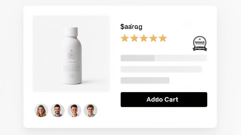
Build Instant Trust with Social Proof
In e-commerce, trust is your currency. Since shoppers can't physically touch or test your product, they look for clues from others to validate their choice. This is where social proof becomes your most powerful tool.
Authentic customer reviews are one of the most significant drivers of conversion. A product with even a handful of positive reviews will almost always outperform a similar product with none. It’s the digital equivalent of a friend's recommendation.
Here’s how to put social proof to work effectively on your pages:
- Display Star Ratings Prominently: Put the star rating right under the product title. It should be one of the first things a visitor sees.
- Showcase Customer Reviews: Don't just show the 5-star ones. A good mix of detailed reviews highlighting different benefits and use cases feels much more genuine.
- Incorporate User-Generated Content (UGC): Encourage customers to share photos of themselves using your product. Featuring these on the page adds a layer of authenticity that slick, professional shots just can't match. It helps new shoppers visualise the product in their own lives.
Once your descriptions and images are solid, nailing social proof is the next big win. It's well worth learning the art of generating positive product reviews to build that crucial buyer confidence.
Ethically Use Urgency and Scarcity
Urgency and scarcity are powerful psychological nudges that can push a hesitant buyer over the line. The trick is to use them ethically and honestly, creating a gentle prompt rather than a sleazy, high-pressure tactic.
A few tactics I've seen work well include:
- Low Stock Alerts: Simple messages like "Only 3 left in stock!" can create a powerful fear of missing out.
- Limited-Time Offers: A countdown timer for a sale creates a clear, unmissable deadline.
- Next-Day Delivery Cut-Offs: A timer showing "Order within 2 hours for next-day delivery" is a fantastic way to encourage immediate action.
The golden rule here is to always be truthful. Fake scarcity is a fast track to eroding customer trust and doing long-term damage to your brand.
Boost Order Value with Smart Bundles
Sometimes the best way to improve conversions is to offer more value in a single purchase. By creating product bundles or "build your own box" options, you can often lift not just your conversion rate but your average order value (AOV) too.
At Grumspot, we've seen first-hand how a well-designed bundle builder can transform a store's performance. When you give customers the power to create their own custom packages, you’re not just selling products; you’re offering a personalised experience. It's a brilliant strategy, especially in industries where people often buy multiple related items. If you're looking for more tools to help with this, you might find our guide on 10 essential Shopify apps for higher conversion rates useful.
All these optimisations are crucial because performance varies so much. In the UK, average e-commerce conversion rates hover around 3.4%, but they can swing wildly between sectors. Grocery, for example, hits an impressive 11.1%, while health and wellbeing sits much lower at 1.87-4.20%. This just goes to show that a one-size-fits-all approach doesn't work.
To help you get started, I've put together a prioritised checklist. It's designed to help you audit your own product pages and focus on the changes that will make the biggest difference first.
Product Page Optimisation Checklist
| Element | Action Item | Impact Level (High/Medium/Low) |
|---|---|---|
| Product Title | Ensure it's clear, descriptive, and contains primary keywords. | High |
| Product Images/Video | Use high-resolution, multi-angle shots, lifestyle photos, and a product video. | High |
| Social Proof | Display star ratings prominently and feature at least 5-10 detailed customer reviews. | High |
| Call-to-Action (CTA) | Make the 'Add to Cart' button stand out with a contrasting colour and clear text. | High |
| Product Description | Rewrite copy to focus on benefits over features; use bullet points for scannability. | Medium |
| Price & Promotions | Clearly display the price, any discounts, and shipping costs. | Medium |
| Trust Badges | Add payment provider logos and security seals near the CTA. | Medium |
| Urgency/Scarcity | Implement genuine low-stock alerts or countdown timers for offers. | Medium |
| Product Bundles | Offer relevant cross-sells or 'frequently bought together' options. | Low |
| Returns Policy | Make your returns policy easy to find and understand. | Low |
Work your way through this list, starting with the high-impact items. Even small improvements in these key areas can lead to a significant uplift in your product page conversions.
Designing a Frictionless Checkout Experience
The checkout is the final, crucial step. You've done all the hard work to get a shopper this far, but this is where the sale is truly won or lost. A clunky, confusing, or just plain frustrating process can undo everything, even for the most motivated buyer.
Studies consistently point to a complicated checkout as one of the biggest reasons for cart abandonment. Every extra click, every unnecessary form field, every moment of hesitation adds friction. It gives the customer a reason to pause, rethink, and ultimately, leave. Your goal is to make giving you their money as simple and reassuring as humanly possible.
Trim the Fat: Ditch Unnecessary Steps and Fields
Your checkout form should be a minimalist masterpiece. Only ask for what you absolutely need to fulfil the order. I've audited countless checkouts that ask for a title (Mr/Mrs), a second address line that's rarely needed, or a mandatory phone number without explaining why they need it. Each one is a tiny roadblock.
The biggest conversion killer I see? Mandatory account creation. Forcing a new customer to stop and invent a password before they can buy is a massive source of friction.
Always, always offer a guest checkout. It respects the customer's time and removes a huge psychological barrier. You can gently nudge them to create an account on the order confirmation page—after you’ve secured the sale.
Aim for a single-page checkout or a streamlined, multi-step process with a clear progress bar. Visual cues like this manage expectations brilliantly, showing customers exactly where they are and how close they are to the finish line.
Offer Payment Methods People Actually Use
When it's time to pay, trust is non-negotiable. Failing to offer a customer's preferred payment method is a surefire way to lose them. In the UK market, this means looking far beyond just standard credit and debit cards.
Make sure your payment gateway is equipped with:
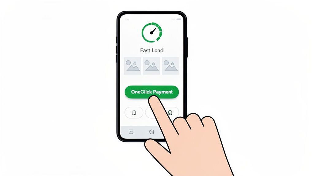
- Digital Wallets: Think Apple Pay, Google Pay, and PayPal. These enable one-click payments, a game-changer for mobile shoppers.
- Buy Now, Pay Later (BNPL): Services like Klarna and Clearpay are no longer a niche option; they're an expectation for many. Offering them can give conversions a serious lift, especially on bigger ticket items.
- The Classics: Visa, Mastercard, and American Express are the absolute baseline.
Simply displaying the logos for these payment providers is a powerful trust signal in itself. It shows you're a professional operation integrated with secure, well-known services. For a deep dive into optimising your payment stack, it's often worth consulting with dedicated payments experts who live and breathe this stuff.
Instil Confidence with Trust Signals and Total Transparency
Throughout the entire checkout flow, your job is to constantly reassure the customer. You need to show them their details are safe and that there won't be any nasty surprises waiting at the end. In fact, unexpected costs are the number one killer of conversions at this stage.
Be upfront and crystal clear about all costs, right from the start.
- Shipping Costs: Don't hide these until the final step. Display them clearly in the basket.
- Taxes: If applicable, make sure VAT is clearly itemised so there are no questions.
Beyond cost transparency, sprinkle visual trust signals across the page. Security badges (like SSL certificates), icons for your money-back guarantee, and prominent links to your returns policy all work together to ease anxiety. They build the confidence a customer needs to hit that "Pay Now" button, turning a potential point of failure into a smooth final step that closes the deal.
Winning the Mobile Commerce Battle
Here’s a paradox every UK ecommerce owner knows all too well: most of your traffic is on mobile, but your conversions probably aren't. If you've ever stared at your analytics, puzzled by the chasm between mobile visitors and mobile sales, you're not alone. This is the costly disconnect where countless shops leak revenue every single day.
Closing this gap isn't just a good idea—it's essential for survival. Winning on mobile demands a two-pronged attack: you need blazing-fast performance combined with an intuitive, thumb-friendly user experience. Nail these two, and you’ll start capturing the revenue your competitors are leaving on the table.
Speed Is Not a Feature—It’s a Requirement
On a mobile device, patience is a resource that runs out in seconds. Every fraction of a second a user has to wait for your page to load is a tiny crack in their confidence and a fantastic reason to hit the back button. The data is brutal: even a one-second delay in mobile load times can slash conversion rates by up to 20%.
So, what's the biggest culprit for a slow mobile site? Almost always, it's unoptimised images. Those gorgeous, high-resolution product shots look fantastic on a desktop but can absolutely cripple performance on a mobile connection.
To get this sorted, you need to:
- Compress Your Images: Use tools to shrink file sizes without turning your beautiful photos into pixelated messes.
- Implement Lazy Loading: This clever technique only loads images as the user actually scrolls down the page, which makes the initial load time feel instantaneous.
- Leverage Browser Caching: This tells a visitor's browser to store static parts of your site, like the logo and navigation, so it doesn't have to reload everything every time they visit.
Getting these technical bits right is your first and most important job. For a much deeper dive, our complete Shopify store speed optimisation checklist is the perfect place to start.
Designing for Thumbs, Not Cursors
Once your site is lightning-fast, you have to make it easy to use. Mobile-first UX is about so much more than just having a site that shrinks to fit a smaller screen. It requires a complete rethink of how people interact with your store when they’re holding it in one hand.
Think about how you use your own phone. You're probably scrolling and tapping with your thumb, right? Your design must cater to this reality.
The core principle of mobile UX is to make every action as simple as possible. Assume your user is distracted, on the move, and using one hand. Your job is to remove every possible point of friction between them and the checkout.
This means designing for a "thumb-friendly" experience. Key navigation elements and calls-to-action should be placed within easy reach of the thumb, which usually means the bottom or centre of the screen. Tiny, hard-to-tap links and cluttered menus are absolute conversion killers on mobile.
Streamlining the Mobile Checkout
Nowhere is a frictionless experience more critical than at the mobile checkout. This is the final hurdle, where the smallest bit of hassle can lead to instant cart abandonment. Let's face it, typing out long addresses and credit card numbers on a tiny screen is a pain.
This is where one-click payment options become your most powerful tool. Integrating digital wallets like Apple Pay, Google Pay, and PayPal is simply non-negotiable for a modern mobile store. They let customers bypass all those tedious forms and complete their purchase with a single tap, transforming the checkout from a chore into a seamless transaction.
The data backs this up emphatically. In the UK, mobile drives 73% of traffic yet limps along at a 2.9% conversion rate, while desktop sits at a much healthier 4.8%. The friction is real—abandonment on mobile devices spikes to a staggering 77.2%.
By prioritising speed, adopting a thumb-friendly design, and offering one-click payments, you can finally bridge that conversion gap. This isn't just about small tweaks; it's about fundamentally rebuilding the experience to meet mobile users where they are, turning that huge volume of traffic into a powerful engine for growth.
Common Questions About Ecommerce Conversion Rates
When you're in the thick of running an online shop, it's easy to drown in all the metrics and advice flying around. To help cut through the noise, we've put together some straight answers to the questions we hear most often from UK merchants. This is all based on our real-world experience helping businesses like yours get their conversion rates moving in the right direction.
What Is a Realistic Conversion Rate Increase to Aim For?
This is the big one, but the answer isn't a single magic number. For a store that’s already got its fundamentals in place, a 10-20% uplift from a well-planned optimisation programme is a fantastic and achievable initial goal. So, if you’re converting at 2%, aiming to get that to 2.2% or 2.4% in the first few months is a solid target.
But context is everything. If your current rate is stuck below 1%, that's often a sign of bigger issues—maybe some fundamental flaws in your user experience or technical performance. In those cases, fixing the most glaring problems, like a painfully slow mobile site or a broken checkout, could lead to a much bigger jump. We've seen rates double by simply addressing these core blockers.
The most productive goal isn't just hitting a specific percentage. It's about building a system for continuous, iterative improvement. Focus on making small, measurable gains each month. Those wins compound over time and deliver serious growth.
How Long Does It Take to See CRO Results?
The timeline really depends on what you change. Some fixes can make an impact almost overnight, while others need a bit more patience.
It helps to think about results in two buckets:
- Quick Wins: Simple, high-impact changes can show an uplift within days. Fixing broken links, making your shipping costs crystal clear on the product page, or boosting site speed are classic examples. These tackle major points of frustration and can quickly improve a shopper's confidence.
- Strategic Growth: True, sustainable growth comes from a longer-term strategy. For instance, gathering enough data to run a statistically significant A/B test on a new product page layout can take several weeks, or even a couple of months, depending on your traffic levels.
Think of conversion optimisation as a marathon of small, intelligent sprints. It's not a desperate hunt for a single silver bullet that will fix everything overnight.
What Single Change Has the Biggest Impact on Conversions?
Every merchant dreams of that one easy fix that will transform their sales. The truth is, it doesn't exist. The most impactful change is always the one that solves the biggest point of friction for your specific customers. What works wonders for one store might do absolutely nothing for another.
For a fashion brand whose customers are mostly young and on mobile, the biggest win might be adding Apple Pay and Google Pay for one-click checkouts. But for a retailer selling complex, high-value electronics, the game-changer could be adding detailed customer reviews and Q&A sections to build trust.
The only way to find your unique leverage point is to do a proper audit of your store. Using tools like heatmaps and session recordings to diagnose your specific problems is far more valuable than blindly copying tactics you've seen somewhere else.
Do I Need a Lot of Traffic to Start Optimising?
This is a common myth that holds a lot of smaller stores back. While you definitely need high traffic to run A/B tests quickly and get statistically significant results, you absolutely do not need huge numbers to get started with conversion optimisation.
Even with lower traffic, you can gather incredibly powerful qualitative insights. This is where you shift your focus from what users are doing to why they're doing it.
Here’s what you can do, no matter your traffic volume:
- Watch Session Recordings: See exactly where individual users get stuck, confused, or frustrated.
- Analyse Heatmaps: Discover which parts of your key pages are being completely ignored.
- Run Customer Surveys: Just ask visitors what’s stopping them from buying. You'd be amazed what they'll tell you.
Focus on implementing best practices and gathering this kind of qualitative feedback first. These insights will help you identify and fix the most obvious problems, which perfectly sets you up for more advanced testing as your traffic grows.
At Grumspot, we specialise in turning these insights into action. We conduct deep technical and user experience audits to find your store's unique conversion killers and build a prioritised roadmap for growth. Discover how our conversion-first approach can scale your Shopify store.
Let's build something together
If you like what you saw, let's jump on a quick call and discuss your project

Related posts
Check out some similar posts.
- customer satisfaction
Find actionable insights with customer satisfaction measurement. Covers CSAT, NPS, CES & linking dat...
Read more
- Shopify AOV optimization
Boost your revenue with our Shopify AOV optimization guide. Discover actionable tactics, Plus-specif...
Read more
- Shopify CRO audit
Unlock higher conversions with our complete Shopify CRO audit framework. A step-by-step guide for da...
Read more
- conversion rate optimization for ecommerce
Unlock higher revenue with our guide to conversion rate optimization for ecommerce. Learn to audit, ...
Read more