Ecommerce Conversion Optimization: Boost Your Sales Now
- ecommerce conversion optimization
- shopify cro
- conversion rate
- shopify plus
- cro playbook
Launched
April, 2026

Traffic is healthy. Orders are not.
That is where most Shopify CRO work starts. A brand is paying for clicks, email is driving sessions, organic rankings are improving, and the store still feels harder to grow than it should. The problem is rarely “more traffic”. It is usually friction inside the buying journey.
Ecommerce conversion optimization is the discipline of finding that friction, proving it exists, and removing it in the right order. On Shopify and Shopify Plus, that means looking at the whole system. Theme UX, mobile behaviour, product page clarity, cart logic, checkout structure, speed, trust signals, and how merchandising changes by audience.
A common mistake is treating CRO like a list of isolated tricks. Change a button colour. Add a badge. Launch a popup. Those can matter, but only when they sit inside a repeatable process. The playbook below is the one agency teams use when the brief is not “tidy up the site” but “make the store convert better without wasting dev time”.
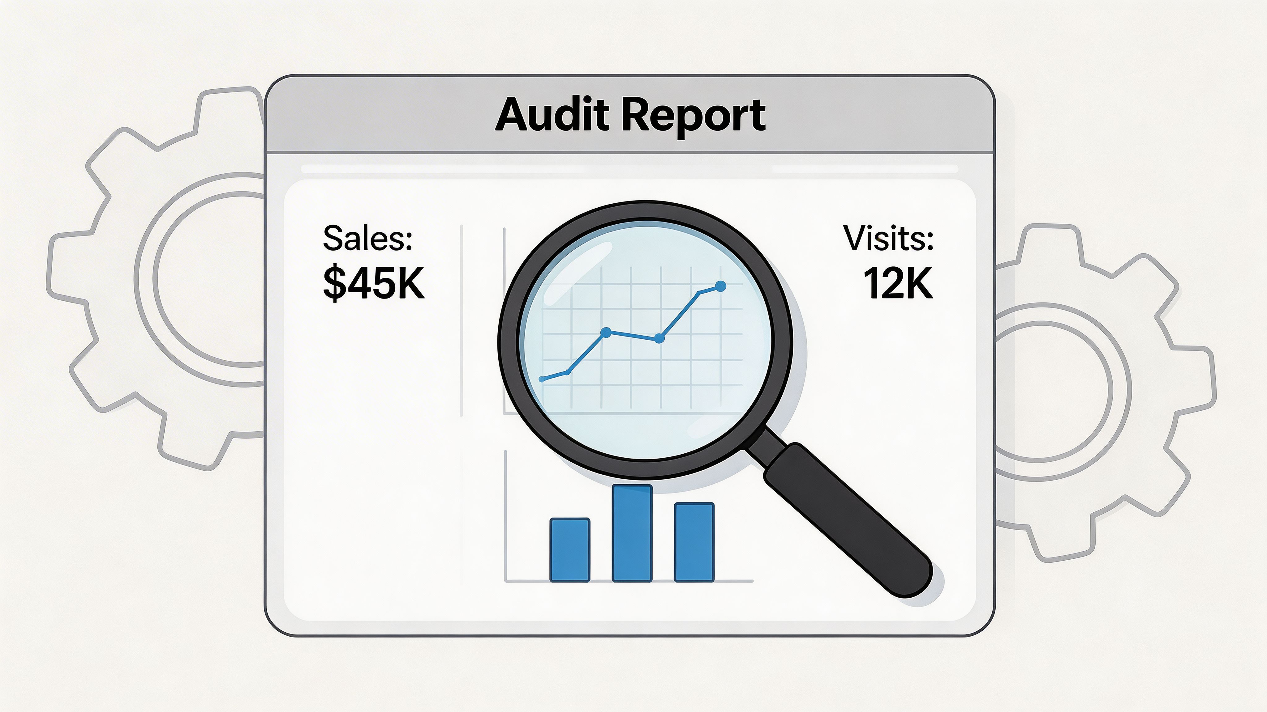
Conducting a Data-Driven Conversion Audit
A proper CRO audit starts with one rule. Do not diagnose from the homepage alone.
Most stores that “look fine” still leak revenue in the middle and bottom of the funnel. In the UK, average ecommerce conversion rates for online retail sites show differences across devices. Desktop performance often surpasses mobile, despite mobile accounting for a significant portion of traffic. That gap is why unoptimised stores can leave 97% of visitors unconverted, according to Smart Insights’ ecommerce conversion rate benchmarks.
Start with the funnel, not opinions
When a merchant says, “customers just are not converting”, that is too broad to act on. Break the journey into checkpoints you can inspect:
- Landing engagement: Are visitors staying, scrolling, and moving deeper into the site?
- Product engagement: Are users reaching PDPs and interacting with variant selectors, images, and add to cart?
- Cart progression: Are they adding products, then stalling in cart?
- Checkout movement: Are they starting checkout, then dropping before payment?
- Revenue quality: Are the orders that do come through large enough, or is AOV dragging down profitability?
Shopify Analytics gives you the commercial view. GA4 gives you segmentation by channel, device, landing page, and returning status. Heatmap and session tools such as Hotjar or Microsoft Clarity supply the behavioural layer that tells you why users hesitate.
That combination matters because each tool answers a different question.
| Audit layer | Primary tool | What it tells you |
|---|---|---|
| Commercial outcomes | Shopify Analytics | Orders, AOV, top products, channel contribution |
| Journey analysis | GA4 | Drop-off by page type, traffic source, device, new vs returning |
| Behavioural evidence | Hotjar or Microsoft Clarity | Click patterns, scroll depth, hesitation, dead clicks, form struggle |
Audit the pages that decide revenue
A conversion audit is not a full-site design critique. Focus first on the pages with the highest influence on buying intent.
Homepage and landing pages
These pages need to answer basic questions fast. What do you sell? Who is it for? Why trust you? Where should I go next?
Common problems include weak category paths, hero sections that push brand language over product clarity, and promotional blocks that compete with each other. On Shopify stores, this often happens after teams keep adding sections over time without reworking page hierarchy.
What to inspect:
- Above-the-fold clarity: Is the value proposition visible without interpretation?
- Navigation intent: Can new visitors find category paths quickly?
- Mobile stacking: Do promotional sections bury the first meaningful action?
- Scroll behaviour: Are users reaching featured collections or dropping before them?
Collection pages
Collection pages do more selling than many teams realise. If filters are confusing, product cards are weak, or sort order hides hero products, users never reach the PDPs that convert.
Review:
- Filter usage and abandonment after filter interaction
- Whether product cards show enough price and product context
- How merchandising differs on mobile versus desktop
- Internal search terms that signal missing navigation clarity
Product detail pages
PDPs carry the heaviest conversion burden. A strong product can underperform because the page creates doubt at the wrong moment.
Look for friction around:
- Variant selection
- Delivery and shipping visibility
- Product image interaction
- Size, material, or compatibility concerns
- Trust content placement such as reviews and returns information
Many “low conversion” PDPs are often “high uncertainty” PDPs.
Tip: Watch session recordings of users who spend time on a PDP but never add to cart. You will usually spot one of three things: unanswered questions, weak CTA visibility, or poor mobile interaction around variants and media.
Cart and checkout entry
The cart tells you whether demand exists. If add to cart behaviour is healthy but sessions collapse at cart or checkout start, the issue is usually friction, not offer quality.
Review the cart for:
- Hidden or late shipping surprises
- Promo code box behaviour
- Distracting upsells
- Poor quantity editing
- Lack of trust reinforcement before checkout click
A detailed workflow for this stage is easier to manage when teams use a structured Shopify CRO audit process instead of reviewing pages ad hoc.
Segment before you conclude
Blended conversion rates hide useful truths.
A store can look average overall while one traffic source performs well and another destroys efficiency. The same is true for device splits. Many Shopify stores are judged off one headline conversion number when the issue sits inside mobile paid traffic, first-time visitors, or a small set of underperforming landing pages.
Useful audit cuts include:
- Device type
- Traffic source
- New versus returning customers
- Top landing pages
- Top-selling versus high-traffic low-converting products
Turn findings into evidence-backed hypotheses
The audit is not finished when you have a list of issues. It is finished when every issue is phrased in a way that can be tested or implemented.
Bad finding: “PDP needs improvement.”
Better finding: “Mobile users on high-traffic PDPs appear to miss delivery and returns details before add to cart, creating hesitation around purchase commitment.”
That gives your team something operational. It also stops the project becoming a design preference exercise.
Prioritising Your CRO Efforts for Maximum Impact
A strong audit usually creates too many ideas. That is a good problem, but it becomes expensive if the team tries to fix everything at once.
The practical question is not “what could improve conversion?” It is “what should we do first with the people and time available?” That is where prioritisation frameworks help.
ICE versus RICE in real store work
Both frameworks are useful. The difference is how much precision you need.
| Factor | ICE Framework | RICE Framework | When to Use |
|---|---|---|---|
| Factor | Impact, Confidence, Ease | Reach, Impact, Confidence, Effort | Use ICE for fast internal triage. Use RICE when multiple teams need a clearer roadmap. |
| Scoring style | Simpler, quicker | More structured | ICE works well early in an audit backlog. RICE is better when dev capacity is tight. |
| Main strength | Speed | Better prioritisation across competing tasks | RICE is stronger when one change affects far more users than another. |
| Main weakness | Can oversimplify | Takes longer to score well | ICE can overrate easy tasks that do not move revenue. |
| Best fit on Shopify | Small batch improvements | Cross-functional roadmap | RICE is usually better for theme changes, app decisions, and checkout work. |
ICE works when you need momentum. RICE works when stakeholders want a reasoned sequence.
For agency work, RICE tends to be more useful because Shopify projects often involve trade-offs between design, development, app changes, and merchandising. Reach forces a useful question: how many sessions does this issue affect?
A practical scoring example
Take three common findings from a Shopify audit:
- Slow mobile product pages
- Confusing navigation in the main menu
- No visible product reviews on key PDPs
These are all valid problems. They should not receive equal urgency.
Slow mobile product pages
This usually scores high because it affects broad traffic volumes and touches every stage of the funnel. If your best-selling products load slowly on mobile, the issue is not local. It is systemic.
RICE often puts this near the top because:
- Reach is wide
- Impact is broad
- Confidence is usually strong if speed data and recordings align
- Effort can be moderate to high, but still justified
Confusing navigation
Navigation issues can create serious waste at the top of the funnel, especially for first-time visitors. The challenge is confidence. Sometimes poor movement into collections is caused by weak messaging or poor merchandising, not the nav itself.
This often sits in the middle unless data clearly shows users missing intended category paths.
Missing reviews on key PDPs
This can rise quickly in the queue because the implementation is often simpler than a technical rebuild, while impact can be high on purchase confidence. On some stores, this becomes a fast win because it affects high-intent traffic close to purchase.
What teams get wrong when prioritising
The biggest mistake is favouring what is easiest to ship. Easy does not mean meaningful.
A close second is favouring what is loudest internally. Founders often fixate on homepage tweaks because they see the homepage every day. Customers may be failing much later, on mobile PDPs or in cart.
A third mistake is lumping all ideas into one list. Split them into groups:
- Research required: promising, but not proven
- Test candidates: suited to A/B validation
- Implementation fixes: obvious friction that should be corrected directly
- Strategic projects: bigger changes requiring design and dev planning
That split gives the team pace. It also stops low-risk fixes getting trapped behind larger roadmap items.
Key takeaway: Prioritisation is about commercial advantage, not fairness. Some issues deserve immediate action because they affect high-intent users. Others can wait, even if they are visually annoying.
If you want another perspective on choosing where to focus first, this practical guide to improving ecommerce conversion rates is useful because it frames improvements around buyer friction rather than surface-level design changes.
Use prioritisation to protect developer time
Shopify teams often burn development hours on changes that are visible but weak. New homepage modules, animation effects, and cosmetic content rearrangements can absorb a sprint without moving the core funnel.
A better sequence usually looks like this:
- Fix broad friction first
- Test high-intent page improvements next
- Roll out merchandising and personalisation changes after the funnel is stable
- Save larger redesign work for problems supported by enough evidence
That order keeps ecommerce conversion optimization tied to revenue, not internal preference.
High-Impact Design and UX Interventions
Most Shopify UX problems do not announce themselves as UX problems. They show up as hesitation.
A visitor lands on a product page, scrolls, taps the gallery, opens size options, pauses, goes back to the collection, returns again, then leaves. The page did not “break”. It failed to help someone decide.
That is the lens to use when improving design for conversion.
The before and after of a weak PDP
Before optimisation, many Shopify product pages look complete. They have images, a title, a price, a description, and an add to cart button. Yet the hierarchy is wrong.
The most common pattern looks like this:
- Product images are decent, but not persuasive
- Copy lists features without answering objections
- Delivery and returns are buried lower down
- Reviews exist, but sit too far from the decision point
- Variant selectors are small or unclear on mobile
After optimisation, the page does less decoration and more selling. The product title, pricing, trust signals, variant logic, delivery clarity, and add to cart flow are easier to parse on the first pass.
That matters because in UK ecommerce, cart abandonment averaged 69-70% in 2025 benchmarks, and 55% of UK abandoners cited unexpected shipping costs as the primary driver. Reviews also matter near the decision point. Implementing customer reviews can lift conversions by up to 270%, and 98% of UK buyers read them before purchase. Guest checkout can reduce abandonment by 45%, according to Yotpo’s ecommerce conversion optimisation analysis.
What changes tend to work on product pages
Move trust closer to action
Trust should not live in a tab graveyard. If people need reassurance before they buy, place the reassurance near the CTA.
Useful trust elements include:
- Review summaries near the product title or buy box
- Delivery and returns summaries beside price and CTA
- Clear stock or availability messaging where relevant
- Payment and checkout confidence cues near add to cart
Write for decisions, not brand tone
Good product copy answers “is this right for me?” before it tries to sound distinctive. On high-converting PDPs, copy often does three jobs in sequence:
- Clarifies what the product is
- Explains who it helps or suits
- Resolves practical objections
That structure beats long brand-heavy intros almost every time.
Fix mobile interaction first
On mobile, variant selectors, sticky add to cart bars, image swipe behaviour, and accordion order matter more than desktop aesthetics. Many teams still review PDPs on large screens and miss the primary friction points.
Cart UX is where revenue gets lost
Carts fail when they create surprise or doubt. A cart should confirm a buying decision, not reopen it.
Weak carts usually share the same traits:
- Hidden shipping thresholds
- Promo code boxes that distract from checkout
- Upsells that overwhelm the page
- Poor editing controls
- No clear reason to trust the final step
Stronger carts do the opposite. They simplify. They explain. They reduce anxiety.
A better checkout entry experience
On Shopify, the cart and the handoff into checkout deserve separate review. Many stores optimise one and ignore the other.
A cleaner handoff often includes:
- Transparent shipping messaging before checkout
- Visible checkout CTA hierarchy
- Guest checkout where possible
- Fewer visual distractions
- Reinforcement of returns, payment security, and support availability
Tip: If customers repeatedly ask support about shipping timing, returns, or payment security, those answers belong higher in the cart and PDP flow. Support tickets often expose conversion friction faster than analytics dashboards.
Feedback sharpens UX decisions
Behavioural tools show what visitors do. Direct feedback often explains why they are uneasy.
That is why teams working on UX changes should pair recordings with on-page feedback prompts, post-purchase surveys, and support log review. If you need a practical model for collecting and using those signals, this guide on how to boost UX with feedback for a website to convert more is a useful companion to behavioural analysis.
For design teams working inside Shopify themes, a conversion-focused design process matters more than aesthetic taste. A useful reference point is conversion-focused web design, especially when the issue is not “make it prettier” but “make the buying path more legible”.
What usually does not work
Some UX changes look productive and rarely pay off:
- Rewriting everything at once without page-level evidence
- Adding too many urgency elements
- Stuffing PDPs with badges, icons, and microcopy
- Running large visual redesigns before fixing structural friction
- Copying enterprise brand patterns that do not fit the catalogue or price point
The best-performing Shopify UX work is usually restrained. It reduces ambiguity, tightens hierarchy, and makes the next step obvious.
Technical Performance and Personalisation Strategies
Speed problems are easy to underestimate because teams get used to their own store. Customers do not. They land cold, on varied devices, with less patience than internal teams assume.
For UK ecommerce, 73% of shoppers abandon a site with slow load times. A useful technical benchmark is Largest Contentful Paint under 2.5 seconds, and each additional second of load time can reduce conversions by up to 20%. On Shopify, implementing Progressive Web Apps has been shown to lift mobile conversion rates by as much as 32%, according to Convertibles’ analysis of ecommerce conversion rate improvements.

What to fix first in technical performance
Shopify stores usually slow down for predictable reasons. Too many apps. Heavy media. Script bloat. Third-party widgets that nobody re-evaluated after install.
Focus on the parts that affect perceived load and interaction readiness.
LCP
Largest Contentful Paint is usually your main hero image, banner, or product media block. If that loads slowly, users feel the whole page is slow.
Common fixes include:
- Compressing large images
- Serving properly sized media
- Reducing oversized hero sections
- Reviewing whether above-the-fold video is worth the cost
FID and interaction delay
If users tap filters, variant selectors, or navigation and the page hesitates, the issue is often script-related. Shopify themes can become sluggish when apps inject multiple scripts into collection and product templates.
Audit:
- App scripts that run globally
- Redundant tracking tools
- Widgets with low usage but high load cost
- Features that could be theme-native instead of app-dependent
CLS
Layout shift damages trust because the interface moves while people try to interact. That is especially harmful on mobile product pages and carts.
Check:
- Image placeholders
- Dynamic announcement bars
- Lazy-loaded elements pushing content downward
- Review widgets that load late and shift the buy box
Speed work should be commercial, not academic
Teams sometimes chase perfect scores while ignoring user-facing gains. The better question is not “did we improve a diagnostic report?” It is “did we reduce the friction users experience?”
A useful performance pass on Shopify often covers:
- Image control: compress, resize, and remove duplicates
- App hygiene: uninstall what is not earning its place
- Theme cleanup: reduce unused sections and scripts
- Template discipline: avoid loading heavy assets everywhere
- Mobile-first QA: test on real devices, not only desktop previews
If your store needs a more structured process for this, how to improve website loading speed breaks down the practical issues that usually drag Shopify performance down.
Personalisation after the basics
Personalisation is valuable, but it works best when the core UX is already stable. If the store is slow, unclear, or confusing, personalised content just personalises a weak experience.
Once the fundamentals are in place, use personalisation in layers.
Layer one is behavioural relevance
This is the simple tier:
- Recently viewed products
- Related products
- Cart recommendations
- Returning visitor reminders
These are low-risk because they support shopping behaviour without changing the whole site.
Layer two is audience-aware merchandising
At this stage, Shopify teams begin to segment:
- New versus returning visitors
- First purchase versus repeat purchase behaviour
- Collection-specific recommendation rules
- Different content blocks based on landing context
This layer tends to work best when merchandising and CRM data are aligned.
A short explainer helps here:
Layer three is dynamic offer logic
More advanced stores personalise:
- Bundles based on cart composition
- Threshold messaging based on basket value
- Product recommendations tied to previous purchase behaviour
- Region-specific content and checkout flows
This tier can be powerful, but it creates more QA work. If the underlying data is messy or the app stack is overloaded, it can create as much friction as value.
Key takeaway: Personalisation should increase relevance without reducing clarity. If a visitor needs to think harder because content changes unpredictably, the tactic is hurting more than helping.
The primary trade-off
Speed and personalisation often pull against each other. More scripts, more logic, and more widgets can make pages more relevant while also making them slower. Senior CRO work is deciding where that trade is worth it.
The rule is simple. Keep what earns its cost. Remove what does not.
Testing Measuring and Rolling Out Winning Changes
Good CRO teams do not ship major changes because they sound persuasive in a meeting. They ship because the evidence is strong enough, or because a structured test proved the case.
That distinction matters. It is the difference between improvement and churn.
Start with a real hypothesis
A hypothesis needs three parts:
- The change
- The expected behaviour shift
- The metric that will confirm or reject it
Weak hypothesis: “A stronger cart page will improve sales.”
Useful hypothesis: “Making shipping information visible before checkout on the cart page will reduce exits from cart and improve progression into checkout.”
That wording forces discipline. It ties the idea to observed friction and gives the team a measurement plan.
According to CRO Benchmark’s ecommerce conversion rate benchmarks, a rigorous CRO methodology relies on hypothesis formation followed by A/B testing. The same source notes that simple CTA colour changes have yielded 34% lifts in conversion, while testing fixed-pound discounts over percentage discounts in popups increased AOV by 21%, adding £45,000 in one UK case study. It also notes that up to 70% of A/B tests may fail to produce a positive result.
That last point is important. Failed tests are not a sign the programme is broken. They are normal.
Choose the right things to test
Not everything should go into an A/B test.
Test when uncertainty is high
Use testing for changes where:
- There is a strong theory but not enough certainty to ship widely
- Multiple variants are plausible
- The change affects an important part of the funnel
- Rollout risk is meaningful
Examples include:
- CTA wording and prominence
- PDP layout variations
- Cart messaging order
- Popup offer structure
- Recommendation placement
Implement directly when friction is obvious
Some issues do not need a split test. If the mobile variant selector is broken, fix it. If key shipping information is hidden, surface it. If an app is slowing down pages and adding little value, remove it.
Testing is not a substitute for basic competence.
A practical testing workflow on Shopify
Different stores use different stacks, but the workflow stays broadly similar.
Step one
Pull a focused test candidate from your prioritised backlog. Keep the scope narrow enough that you can isolate the effect.
Step two
Define one primary metric and a few guardrails. For ecommerce conversion optimization, primary metrics often sit close to the affected step in the funnel. Guardrails catch unintended damage elsewhere.
Step three
Build variants cleanly. That means no mixed changes and no hidden variables. If you are testing a cart layout, do not also alter offer logic and copy tone at the same time unless the test is designed around a bundled concept.
Step four
Run the test long enough to gather a trustworthy read. Do not stop early because the first few days look promising or worrying. Early noise wastes months.
Step five
Read the result in context. A winning variant that harms order quality, support burden, or downstream UX may not be a real win.
Measuring beyond the headline metric
One of the most common CRO mistakes is celebrating a local lift while missing broader damage.
A popup might improve one step and hurt another. A promotional change might increase conversion while weakening AOV quality. A redesigned PDP might produce more add to carts but confuse repeat customers.
Use a measurement set that reflects the core commercial question.
| Test type | Primary metric | Supporting checks |
|---|---|---|
| PDP change | Add to cart behaviour | Bounce behaviour, variant interaction, downstream checkout entry |
| Cart change | Checkout initiation | Cart exits, AOV quality, discount usage |
| Popup offer change | Offer uptake or AOV | Conversion quality, margin impact, user annoyance signals |
| Navigation change | Product discovery movement | Collection depth, search usage, bounce behaviour |
Tip: Keep a testing log that records the hypothesis, screenshots, dates, metrics, audience conditions, result, and what the team learned. The learning archive becomes more valuable than any single test.
Rolling out winners without breaking the store
A winning variant still needs careful implementation.
Use a rollout checklist:
- Confirm the final build matches the tested variant
- QA on mobile and desktop
- Check app interactions and theme dependencies
- Validate analytics after launch
- Monitor support feedback in the first days after release
For larger changes, staged rollout is safer. Release to a limited percentage or a controlled segment first if your tooling allows it. That reduces risk, especially on Shopify Plus stores with complex integrations.
The compounding advantage
The value of testing is not one isolated lift. It is the operating rhythm it creates.
A team that audits, forms hypotheses, tests selectively, and documents outcomes gets sharper over time. They stop debating abstractly. They recognise patterns faster. They build a store around observed customer behaviour instead of assumptions.
That is what makes ecommerce conversion optimization sustainable.
From Plan to Profit Sustaining Conversion Growth
The stores that grow through CRO do not treat it as a cleanup exercise. They treat it as an operating habit.
That matters because customer expectations keep moving. Traffic mix changes. New products shift merchandising priorities. App stacks become messy. Shipping logic evolves. International buyers bring different friction points than domestic ones. A store that converted well six months ago can decay.
The strongest long-term pattern is simple:
- Audit regularly
- Prioritise ruthlessly
- Fix obvious friction
- Test uncertain ideas
- Roll out winners carefully
- Repeat without drama
A few quick wins appear in audit after audit on Shopify stores:
- Surface shipping and returns information earlier
- Strengthen review visibility on product pages
- Simplify cart layout and reduce distractions
- Clean up mobile variant interaction
- Remove apps that add load but little value
- Align page messaging with buyer intent, not internal brand language
Some gains come from bigger strategic moves. One example from agency work is product bundling. A bundle creator implementation lifted AOV by 61% in a documented Grumspot case study from the publisher background. That is not a reason to copy bundling everywhere. It is a reminder that CRO is not only about reducing friction. It is also about structuring the offer more effectively.
For UK Shopify Plus merchants, one of the most overlooked areas is internationalisation and compliance-led conversion work. An underserved angle highlighted by Invesp’s review of effective conversion optimisation techniques is post-Brexit checkout friction. It notes that the 2025 VAT registration threshold dropped to £90,000, that unexpected tax prompts caused 22% cart abandonment spikes in some cases, and that stores with automated VAT-inclusive pricing and localised checkout flows saw 18% higher conversions.
That is a useful final reminder. Conversion growth does not only come from prettier pages and cleaner buttons. Sometimes it comes from operational detail that removes buyer uncertainty at exactly the right moment.
The merchants who win at ecommerce conversion optimization are usually not the ones chasing tricks. They are the ones building a calmer, sharper system for learning what blocks purchases and fixing it before the next wave of traffic arrives.
If your Shopify store has traffic but too much friction in the funnel, Grumspot helps merchants audit, redesign, test, and implement conversion improvements across UX, speed, and Shopify Plus build work without turning the process into a bloated replatforming project.
Let's build something together
If you like what you saw, let's jump on a quick call and discuss your project

Related posts
Check out some similar posts.
- b2b cro
Learn proven B2B conversion rate optimization strategies to turn more leads into customers and maxim...
Read more
- retention marketing strategies
Boost ecommerce repeat purchases with 10 actionable retention marketing strategies. Implement on Sho...
Read more
- affiliate program management
Master affiliate program management for Shopify Plus stores. Plan, launch, scale, and prevent fraud ...
Read more
- product information management
Unlock growth with product information management (PIM). Learn its e-commerce benefits and how to ch...
Read more