Shopify CRO Audit: The Complete Framework for 2026
- Shopify CRO audit
- Shopify conversion rate
- ecommerce CRO
- Shopify optimisation
- Shopify Plus
Launched
April, 2026

You are probably looking at a familiar dashboard right now. Sessions are healthy. Paid traffic is landing. Organic traffic is not the problem. Yet sales are flat, checkout completion feels weak, and every team meeting ends with a different opinion about what should be fixed first.
That is usually the moment a proper Shopify CRO audit becomes useful.
Not because the store needs more random tweaks. It needs diagnosis. A good audit shows where buyers stall, what is making them hesitate, and which changes are worth development time. On UK Shopify stores, that diagnosis also has to account for details many generic CRO guides skip, including GDPR trust signals, VAT clarity, and payment methods that match how UK shoppers buy.
When Traffic Is High But Sales Are Not
A merchant sees thousands of visitors hitting product pages every week. The team assumes the problem must be traffic quality, so they rewrite ad copy, add more campaigns, and test new audiences. Revenue barely moves.
Then someone finally watches session replays.
Buyers scroll, pause on the price, hunt for delivery details, open the cart, back out, and disappear. On mobile, they tap product images expecting to zoom and nothing happens. On checkout, trust weakens because key reassurance is missing or buried. The traffic was never the only issue. The store was asking too much effort from people who were ready to buy.
That is the gap between visits and purchases. Analytics can show the drop-off. A Shopify CRO audit explains the reason behind it.
Vanity metrics hide commercial friction
A lot of stores look fine from a distance. Sessions are rising. Page views are rising. Add-to-cart volume looks decent in isolation. None of that tells you whether users understand the offer, trust the store, or can complete the journey without friction.
What matters is whether the path from product discovery to payment feels obvious and safe.
Common examples include:
- A strong landing page with a weak product page: Traffic arrives with intent, then leaves once product value becomes unclear.
- A healthy add-to-cart rate with a weak cart: Buyers want the item, but shipping, tax, delivery or payment friction stops them.
- A checkout leak on mobile: The offer works, but the buying flow breaks under thumb-level usability.
If bounce is part of the picture, it helps to diagnose that separately too. Grumspot’s guide on how to reduce website bounce rate is useful when the issue starts before users even engage with the buying journey.
A CRO audit is not a design critique. It is a revenue investigation.
Why people hesitate
Most underperforming stores do not have one dramatic issue. They have a stack of smaller leaks. Weak hierarchy on product pages. Cart links that are easy to miss. VAT presented in a way that creates doubt. Cookie consent handled badly. Payment options that do not reflect UK expectations.
Individually, each issue can look minor. Together, they suppress conversion.
That is why surface-level review is rarely enough. You need funnel data, behaviour data, and an expert review of the storefront itself. When those line up, the next steps become much clearer.
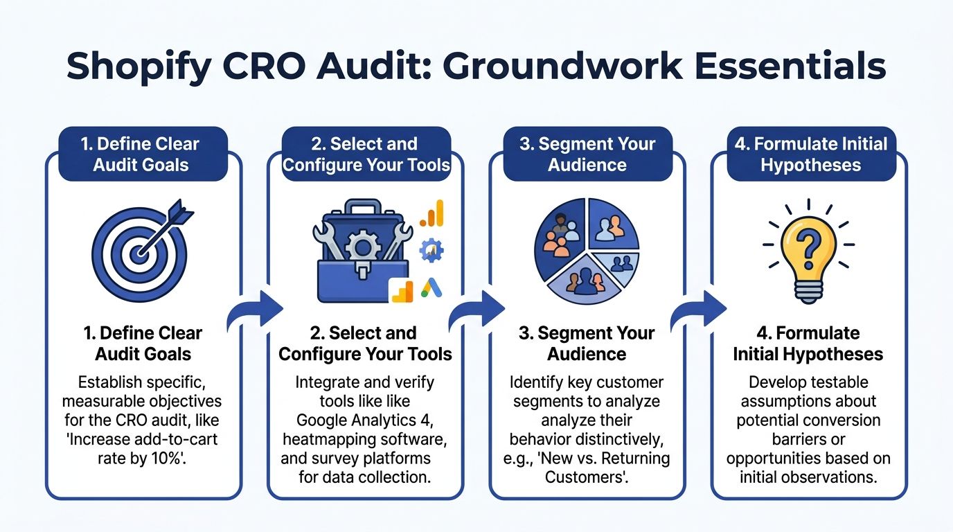
Laying the Groundwork for Your Audit
A UK Shopify audit goes wrong early when the setup is loose. Teams pull a few recordings, spot obvious friction, then start rewriting PDPs before they have clean funnel tracking, a clear commercial goal, or any agreement on which audience matters most.
Set those three things first.
For Shopify stores selling in the UK, the groundwork starts with reliable GA4 ecommerce events across the funnel: view_item, add_to_cart, begin_checkout, and purchase. If those events are incomplete, duplicated, or firing in the wrong place, fix that before reviewing behaviour tools. I have seen stores spend weeks debating page design when the core issue was broken event tracking on mobile PDPs or a checkout step that was not being recorded properly.
This matters even more for UK brands because the friction is often local, not generic. VAT presentation, delivery messaging, cookie consent behaviour, and payment method mix can all distort conversion if they are handled badly. A store can look healthy in aggregate and still lose revenue from UK users who hit uncertainty at the cart or checkout.
Start with scope, not software
The fastest way to dilute an audit is to make it about the whole store.
Choose the commercial pressure first. In practice, that usually means one primary objective and one secondary objective. Anything broader becomes hard to prioritise and even harder to action.
Common starting points include:
- Conversion rate pressure: Product pages, cart, checkout flow, trust cues, and reassurance content.
- Average order value pressure: Bundles, cross-sells, quantity breaks, subscriptions, and cart merchandising.
- Channel mismatch: Paid traffic landing on generic pages, email journeys with weak continuation, or SEO pages attracting the wrong intent.
That framing keeps the audit tied to revenue. It also stops teams from treating CRO as a general UX tidy-up.
Build an audit stack you can trust
A useful Shopify CRO audit combines platform data, behaviour evidence, and one place to manage findings. If one of those is missing, conclusions get shaky.
Core tools
- Google Analytics 4: Funnel events, segment comparison, channel analysis, and page-level drop-off.
- Google Tag Manager: Event deployment and tracking control, where the Shopify setup requires it.
- Shopify Analytics: Sales trends, product-level performance, discount usage, and store-specific context.
Behaviour tools
- Hotjar or Microsoft Clarity: Heatmaps, scroll behaviour, click maps, and session recordings.
- On-site surveys or post-abandonment surveys: Direct buyer objections in the customer’s own words.
Workflow and testing
- A/B testing platform: Use the tool your team can run cleanly without creating reporting confusion.
- Issue tracker: Notion, Linear, Jira, or Trello. The tool matters less than having a single place for findings, hypotheses, owners, and status.
Stores that need a wider conversion framework alongside the audit can use this guide to Shopify conversion rate optimisation as a reference point.
One trade-off matters here. Behaviour tools are helpful, but they do not rescue weak analytics. If GA4 is patchy, recordings tend to create confident opinions rather than reliable diagnosis.
Define success in commercial terms
Audit goals should describe a measurable buyer action, not a vague quality standard.
Good examples:
- Increase add-to-cart rate on top-selling PDPs
- Reduce cart exits linked to delivery or VAT uncertainty
- Improve mobile progression from PDP to checkout
- Increase take-up of subscriptions on replenishable products
- Lift checkout completion for UK users by improving payment method fit
That last point gets missed often. For UK audiences, payment choice is part of conversion strategy. A store serving younger fashion buyers may need Clearpay prominence. A homeware brand with higher basket values may see stronger response from PayPal or Shop Pay positioning. The right mix depends on audience, margin, and average order value, not on what another store is doing.
Segment before you diagnose
Sitewide averages hide useful detail.
Segment early by the factors that change buyer behaviour:
- Mobile vs desktop
- New vs returning visitors
- Organic vs paid traffic
- High-intent landing pages vs informational landing pages
- UK users vs international users if the store sells across markets
For UK audits, I also check whether key friction points differ by region and regulatory context. Post-Brexit cross-border selling has made delivery expectations, duties, and tax transparency more sensitive for buyers. If the store serves both UK and EU customers, one set of averages can mask two very different checkout experiences.
If the audit cannot identify which audience struggles on which page type, it is still too broad.
Write a few early hypotheses
Early hypotheses keep the audit focused. They should be specific enough to test and easy to discard if the evidence does not support them.
Examples:
- Mobile users are reaching the PDP but missing delivery and returns reassurance.
- Product pages push proof lower than expected, especially on long templates.
- Cart abandonment is rising when VAT or shipping information appears late.
- Cookie consent is interrupting product browsing too aggressively on mobile.
- UK shoppers are not seeing the payment methods they expect at the right stage.
These are working assumptions, not findings. The point is to give the audit a direction before the analysis starts, while leaving room for the evidence to prove you wrong.
The Data-Driven Deep Dive
Once the groundwork is in place, start with behaviour you can measure. First identify where the funnel breaks. Then investigate why.
The easiest mistake here is to jump straight into recordings and make the audit anecdotal. Session replays are valuable, but only after quantitative data tells you where to look.
Use funnel data to isolate the break
Open GA4 and map the buying journey using the tracked ecommerce events. The objective is not just to see that users drop off. It is to locate the exact stage where intent weakens.
Look at:
- view_item to add_to_cart
- add_to_cart to begin_checkout
- begin_checkout to purchase
That sequence tells you whether the issue sits in product evaluation, cart friction, or checkout completion.
For many teams, the biggest surprise is that traffic quality is not the main issue. Product pages may be getting attention, but key elements are not doing enough work. Or checkout may be carrying friction that no campaign optimisation can solve.
After reviewing analytics, this walkthrough can help frame the next layer of diagnosis:
Segment the data before drawing conclusions
Averages flatten reality. Segment every major funnel step.
Mobile and desktop
UK audits often expose stronger friction on mobile, especially where PDP layouts are long, sticky actions are missing, or cart access is easy to overlook.
New and returning users
Returning users tolerate more friction because they already trust the store. New users rarely do. If a journey only works for people already familiar with the brand, trust-building is likely underpowered.
Channel intent
Organic visitors, paid visitors, and email visitors arrive with different expectations. If paid traffic lands cold on a product page, the page has to sell harder and reassure faster than a page serving branded repeat traffic.
For stores improving acquisition and on-site performance together, Grumspot’s article on Shopify conversion rate optimization is a helpful companion to the audit process.
Use heatmaps to inspect page-level behaviour
Heatmaps answer a different question from GA4. They show whether users are engaging with what you want them to notice.
On product pages, inspect:
- Clicks around image galleries
- Engagement with delivery and returns information
- Interaction with size guides, FAQs, ingredients, or specifications
- Whether users click non-clickable elements because the design implies interactivity
On collection pages, watch for weak filtering behaviour or signs that sorting and product discovery are doing too little.
On carts, look for frantic back-and-forth movement. That often signals uncertainty rather than decisiveness.
Watch session replays with a pattern mindset
Session replay analysis goes wrong when teams cherry-pick dramatic recordings. One strange journey proves nothing.
Watch groups of sessions tied to a specific problem. For example:
- Users who viewed a PDP and left without adding to cart
- Users who reached cart and did not start checkout
- Users who started checkout on mobile and disappeared
Then look for repeated moments of friction.
What repeated friction looks like
- Buyers scroll back up because they missed key value points.
- Users tap around the page header trying to find the cart.
- People open shipping details late in the journey, then leave.
- Visitors pause on checkout when payment expectations are not met.
That repeated behaviour becomes far more useful than a generic note like “UX could be cleaner”.
One replay is a story. Twenty similar replays are evidence.
Use qualitative input to understand objections
Analytics tells you what happened. Replays show the motion. Neither tells you what the customer was thinking unless you gather direct feedback.
Useful inputs include:
- Exit surveys on product pages
- Abandonment surveys after cart or checkout exits
- Support tickets and live chat transcripts
- Reviews mentioning confusion, delivery, sizing, returns, or payment concerns
For UK stores, localisation issues often surface clearly at this point. Buyers do not phrase objections as “your VAT display lacks transparency”. They say things like “I wasn’t sure what I’d pay” or “I couldn’t see the payment option I wanted”.
Distinguish noise from decision-stage friction
Some issues are cosmetic. Others interrupt buying decisions.
A crowded homepage hero may look messy but have limited revenue effect. A missing delivery message near the add-to-cart button can stop purchasing momentum directly.
A useful filter is this. Ask whether the issue affects one of these moments:
| Journey moment | What to inspect |
|---|---|
| Product evaluation | Clarity of benefits, proof, delivery, returns, pricing context |
| Commitment | Add-to-cart visibility, variant selection, reassurance near action points |
| Cart review | Shipping expectations, editability, totals clarity, payment reassurance |
| Checkout confidence | Trust, payment fit, legal clarity, mobile usability |
That keeps the audit commercially grounded instead of turning into a broad UX tidy-up exercise.
Heuristic and Technical Site Review
A common Shopify pattern looks like this. Paid traffic reaches the store, product pages get views, carts start, then revenue stalls because the site asks shoppers to work too hard for confidence.
A heuristic and technical review checks that friction directly. The goal is to inspect how the storefront sells, reassures, and performs at the exact moments that affect revenue.
I review templates in revenue order, not in design-file order.
Homepage and landing pages
Homepage and campaign landing pages need a clear next step. UK stores often lose that clarity by stacking promotional banners, vague headlines, and category routes that make sense internally but not to first-time visitors.
The review starts with three questions:
- Value clarity: Can a new visitor understand what the store sells, who it is for, and why it is different within a few seconds?
- Journey direction: Is the next click obvious for a shopper arriving from paid search, Meta, email, or branded traffic?
- Message discipline: Do headlines, imagery, offers, and calls to action support one decision rather than competing with each other?
If acquisition depends on paid traffic, landing page structure matters more than homepage aesthetics. The same principles used in landing page conversion rate optimization apply here. Message match, clear hierarchy, and low-friction progression usually outperform visually busy layouts.
Product detail pages
PDPs carry the commercial load. They need to answer "Why this product?", "Why buy now?", and "Can I trust this store?" without forcing shoppers to scroll, guess, or open five tabs.
I check the buying sequence, not just the components on the page.
- Promise above the fold: Does the headline, imagery, price, and first supporting copy explain the offer clearly?
- Proof placement: Do reviews, UGC, press mentions, or guarantees appear before hesitation sets in?
- Decision support: Are size, variant, delivery, returns, and payment details available where the shopper needs them?
- Mobile order: Does the stacking order help commitment, or bury key reassurance below image galleries, app widgets, and promo blocks?
On UK stores, this is also where local trust gaps show up fast. If VAT treatment is unclear, if delivery timing feels vague, or if shoppers cannot see a familiar payment option such as Clearpay until late in the journey, hesitation increases. Those are conversion issues, not just merchandising details.
Cart and checkout entry points
Cart friction usually comes from uncertainty. Shoppers want to confirm totals, delivery expectations, payment fit, and the next step without hunting around the interface.
The review focuses on practical points:
- Cart access: Is the basket easy to reopen on mobile and desktop?
- Totals clarity: Are discounts, shipping expectations, and taxes explained cleanly?
- Editability: Can shoppers change quantity, variants, or remove items without awkward interactions?
- Checkout reassurance: Are accepted payment methods, returns, and delivery timings visible early enough?
For UK and cross-border brands, post-Brexit expectations need special attention. If shoppers in Northern Ireland, the EU, or the wider UK market are unsure about duties, delivery delays, or what is included in the final price, conversion drops for a predictable reason. People do not like avoidable surprises at checkout.
Audit trust through a UK lens
Generic CRO checklists miss local buying concerns all the time. That is one reason international advice often underperforms on UK Shopify stores.
The trust review should cover:
- GDPR consent setup: Is cookie consent explicit, correctly implemented, and consistent with how tracking fires?
- Privacy visibility: Can users find privacy, returns, and contact information without digging through the footer?
- VAT transparency: Do prices, tax treatment, and business details reduce doubt instead of creating it?
- Regional payment methods: Are relevant options, including Clearpay where appropriate, visible before checkout?
- Shipping and cross-border clarity: Are delivery windows, restrictions, duties, and returns policies easy to understand for the regions you serve?
These checks matter because trust is rarely lost through one dramatic failure. It is usually weakened by several small ambiguities that accumulate around pricing, privacy, and fulfilment.
Review technical friction, not just visual polish
A store can look good in a design review and still perform badly on real devices.
I test live templates on current phones, different connection speeds, and common browsers. I want to see whether sticky add-to-cart bars overlap content, whether variant selectors fail under thumb use, whether app scripts delay interaction, and whether the checkout path stays stable when the session gets messy.
Speed is part of that review, but only in commercial context. A slower page matters because it delays product evaluation, interrupts interaction, and increases abandonment on mobile. For a practical reference, this Shopify store speed optimization checklist is useful when the audit points to theme bloat, oversized media, or app-heavy templates.
Technical review points I prioritise
- Mobile responsiveness: Does the layout reflow cleanly across common screen sizes?
- Interaction reliability: Do selectors, drawers, accordions, sticky bars, and carts work consistently?
- Theme and app weight: Are third-party scripts adding visible delay to key templates?
- Accessibility basics: Are labels, contrast, tap targets, focus states, and error messages good enough to support conversion?
- Template-specific issues: Does performance break down on collection pages, PDPs, or cart, rather than across the whole site?
One practical note on delivery. Stores can handle this work internally, through specialist tools, or with agency support. Grumspot is one example of a Shopify Plus agency that combines design, development, and CRO audit work in one workflow, which helps when the fix involves both UX changes and technical debt.
From Insights to Actionable Hypotheses
A CRO audit only creates value when findings turn into actions a Shopify team can ship, test, and measure. Vague comments such as “trust is weak” or “users seem confused” do not help a designer, developer, or retention manager decide what to do on Monday.
The job at this stage is to convert evidence into a clear commercial bet.
Turn findings into testable cause-and-effect statements
I use a simple rule. Every hypothesis should explain what is going wrong, who it affects, what should change, and how success will be measured.
A usable hypothesis looks like this:
- Mobile visitors on UK product pages hesitate before adding to cart
- Replays and on-page behaviour show repeated searching for delivery, returns, and payment information
- Move delivery timing, returns terms, and Clearpay availability closer to the add-to-cart block
- Measure add-to-cart rate, checkout starts, and completed orders
That level of detail matters because it gives each team a clear brief. Design can change hierarchy. Development knows where the change sits. Analytics knows which events and segments to validate.
For UK stores, this often means writing hypotheses around local friction that generic CRO audits miss. Examples include unclear post-Brexit VAT messaging for EU shoppers, weak GDPR consent handling that corrupts attribution, or payment options that match US expectations better than UK buying behaviour.
Build hypotheses from aligned evidence
Good hypotheses rarely come from one screenshot, one replay, or one dashboard. They get stronger when several inputs point to the same problem.
I look for overlap across:
- GA4 funnel breaks between product view, add-to-cart, and checkout
- Heatmap behaviour around delivery, returns, sizing, and payment messaging
- Session replay patterns such as repeated scrolling, hesitation, or failed taps
- Customer service logs, reviews, and survey responses
- Regional segments, including UK mobile traffic, Scotland versus England delivery expectations, or EU visitors affected by duties and VAT questions
That combination reduces opinion-led prioritisation. It also stops teams from spending a sprint on a cosmetic issue that has no measurable effect on revenue.
If your team needs a sharper analytics process for this stage, Trackingplan’s guide on how to increase conversion rates using analytics is a useful reference.
Prioritise with a model the team will use
The scoring model does not need to be clever. It needs to help the team choose.
I usually score each hypothesis on three factors:
- Impact: How likely is this to improve revenue or progression to checkout?
- Effort: How much design, development, QA, and tracking work is involved?
- Confidence: How strong is the evidence behind the recommendation?
That gives enough structure to sort quick wins from bigger projects without turning the audit into spreadsheet theatre.
Hypothesis Prioritisation Matrix
| Hypothesis Example | Potential Impact (1-5) | Implementation Effort (1-5) | Quadrant |
|---|---|---|---|
| Move shipping and returns summary closer to add-to-cart on PDP | 4 | 2 | Quick win |
| Make cart icon and cart access more prominent on mobile | 4 | 2 | Quick win |
| Add UK-specific payment method visibility earlier in the journey | 4 | 3 | High priority |
| Rebuild product media gallery for better mobile evaluation | 3 | 4 | Strategic project |
| Redesign collection filtering and sorting behaviour | 3 | 4 | Strategic project |
| Rewrite value proposition on top landing pages to match channel intent | 3 | 2 | Quick win |
Simple models get used. Overbuilt scoring frameworks usually disappear after the audit workshop.
Separate fast fixes from structural changes
A good roadmap contains both.
Quick wins
These are changes with clear evidence, modest effort, and a direct path to revenue. Common examples include:
- Showing delivery thresholds and returns policy near the buying decision
- Bringing Klarna or Clearpay messaging into the product page rather than leaving it buried in checkout
- Tightening mobile hierarchy so price, variant choice, and add-to-cart stay visible sooner
- Clarifying VAT, duties, or dispatch timing for UK and cross-border shoppers
Structural projects
These need more planning and usually involve design, engineering, QA, and analytics together. Common examples include:
- Reworking collection navigation and filter logic
- Simplifying a crowded product template with too many competing blocks
- Fixing market-specific UX problems across UK and EU storefront experiences
- Cleaning up tracking and consent implementation where GDPR choices distort reporting and testing confidence
There is always a trade-off. Quick wins can unlock revenue fast, but they do not replace foundational work on navigation, merchandising, or measurement quality.
Write hypotheses in a format teams can execute
Each recommendation in the audit should be written so nobody has to reinterpret it later. I include:
- Observed issue
- Evidence
- Recommended change
- Expected behavioural effect
- Primary KPI
- Secondary KPI
- Effort level
- Dependencies
That format keeps the audit operational. It also makes stakeholder conversations easier because commercial teams can see which changes are likely to affect conversion rate, average order value, or checkout completion, and which ones tidy up the interface without moving sales.
Building Your Audit Report and Roadmap
A useful audit report helps a team decide what to do this quarter, who owns it, and what result to expect.
I keep the document tight, but not vague. Senior stakeholders need a clear commercial summary. Ecommerce managers, designers, and developers need enough detail to implement changes without reopening the diagnosis.
Structure the report for decisions
Use a format that matches how Shopify teams work.
Executive summary
State the main revenue leaks first. Call out the highest-impact fixes, the likely upside, and the commercial risk of leaving them unresolved. For UK stores, this often includes avoidable friction around VAT visibility, delivery promises, returns clarity, consent-related tracking gaps, and payment method fit.
Methodology
List the tools used, the date range reviewed, the customer segments checked, and any limits in the data. If GDPR consent settings suppress part of the journey data, say so clearly. If a store trades in both the UK and EU, separate those experiences so stakeholders do not treat two different problems as one.
Findings by journey stage
Organise recommendations by the point in the funnel they affect. That keeps the report tied to buying behaviour rather than internal team silos.
Typical sections include:
- Product discovery
- Product evaluation
- Cart progression
- Checkout confidence
- Average order value and merchandising
Prioritised action list
This is the part teams return to every week. Each recommendation should already have a priority score, owner, expected KPI impact, effort level, and dependencies.
Build the roadmap around commercial reality
A roadmap should reflect trading conditions, platform constraints, and internal capacity. A fashion brand on Shopify Plus with heavy mobile traffic, seasonal promotions, and Clearpay uptake needs a different sequence from a B2B parts supplier with low traffic and long consideration cycles.
I usually sort the next 90 days into three tracks.
The first track covers revenue protection. Fix anything that creates hesitation at scale, such as weak product page hierarchy, unclear dispatch messaging, poor mobile add-to-cart visibility, or missing payment reassurance for UK shoppers who expect Apple Pay, PayPal, Klarna, or Clearpay.
The second track covers market-specific friction. Here, UK-focused audits often outperform generic CRO work. Review how VAT is shown, whether post-Brexit duties are explained for cross-border orders, how delivery estimates vary by region, and whether consent design is harming both user trust and reporting quality.
The third track covers growth tests. That includes bundling, subscription logic where the category supports it, upsell placement, and merchandising changes that can raise average order value without making the path to checkout slower.
Turn priorities into a delivery plan
A report is only useful if it can survive contact with real teams, release cycles, and budget limits.
I recommend a simple roadmap structure:
| Priority | Change | Why it matters | Owner | Effort | Dependency | KPI |
|---|---|---|---|---|---|---|
| P1 | Fix delivery and VAT messaging on PDP and cart | Reduces purchase hesitation and support queries | Ecommerce manager + designer | Low | Copy approval | Conversion rate |
| P1 | Surface Clearpay earlier on mobile PDP | Improves affordability visibility before checkout | Designer + developer | Medium | Theme updates | Add-to-cart rate |
| P2 | Correct consent and analytics setup | Improves reporting confidence and test read quality | Analytics + developer | Medium | CMP review | Funnel visibility |
| P2 | Simplify collection filters for mobile | Helps shoppers find products faster | UX + developer | Medium | QA | Collection-to-PDP click-through |
| P3 | Test bundles on high-volume SKUs | Increases basket size where margin allows | Merchandising + CRO | Medium | Offer setup | Average order value |
That level of detail prevents the usual failure point. Teams agree with the audit, then stall because nobody turned it into delivery work.
Make trade-offs explicit
Every roadmap needs sequencing logic.
If tracking is broken, testing should not lead the plan. If mobile product pages hide core buying information, a new upsell widget can wait. If a brand has strong conversion but weak margin, average order value work may deserve higher priority than another checkout polish round.
Say that plainly in the report. Good audit work does not treat every issue as equal.
The strongest audit reports get used in weekly trading meetings, sprint planning, and stakeholder reviews. They give the business a ranked list of changes tied to revenue, confidence, and implementation reality.
Shopify CRO Audit FAQs
How long should a proper Shopify CRO audit take
Long enough to review data, behaviour, and the site itself without rushing to assumptions.
For a straightforward store, an internal team can complete a focused audit in days if tracking is already in good shape. For more complex Shopify Plus setups, especially with international markets, subscriptions, custom apps, or multiple funnels, expect a longer process because validation takes time.
What tools do I need
At minimum, use:
- GA4
- Google Tag Manager
- Shopify Analytics
- A session replay and heatmap tool
Beyond that, add surveys and an experimentation setup if the team is ready to act on findings. Fancy tooling is less important than disciplined use of the basics.
Should I do the audit in-house or hire an agency
Do it in-house if your team can cover analytics, UX review, technical diagnosis, and prioritisation without internal bias slowing things down.
Bring in an agency when:
- tracking is unreliable
- the team lacks CRO expertise
- disagreements are blocking action
- design and development debt are tangled together
- localisation and UK compliance issues need specialist review
The right external partner should give you a clear roadmap, not just a polished presentation.
How often should a store run a Shopify CRO audit
Run a full audit when performance stalls, traffic mix changes, a redesign is planned, or new markets and payment methods are introduced.
Between full audits, review key journeys regularly. Stores change constantly. New apps, new merchandising, new campaigns, and new economic pressure can all create fresh friction.
What usually gets missed on UK Shopify stores
The most common blind spots are not always visual design problems.
Teams often miss:
- GDPR trust signals
- VAT clarity
- region-specific payment expectations
- mobile cart visibility
- the way economic pressure changes AOV behaviour
Those are not side issues in the UK market. They often shape whether a buyer completes the purchase at all.
If your Shopify store has traffic but too much hesitation between product view and purchase, Grumspot can help audit the journey, prioritise the leaks, and turn the findings into a practical implementation roadmap. See how the team approaches Shopify design, development, and CRO at Grumspot.
Let's build something together
If you like what you saw, let's jump on a quick call and discuss your project

Related posts
Check out some similar posts.

- customer satisfaction
Find actionable insights with customer satisfaction measurement. Covers CSAT, NPS, CES & linking dat...
Read more
- outsource Shopify development
Ready to outsource Shopify development? Our 2026 playbook covers finding partners, vetting, pricing,...
Read more
- API-first ecommerce
Explore API-first ecommerce architecture. A practical guide for UK merchants on benefits, costs, Sho...
Read more
- composable commerce Shopify Plus
Unlock growth with composable commerce Shopify Plus. Learn architecture patterns and migration steps...
Read more