Conversion Rate Optimisation Australia: Your 2026 Guide
- conversion rate optimisation australia
- cro australia
- ecommerce optimisation
- shopify cro
- increase conversion rate
Launched
June, 2026

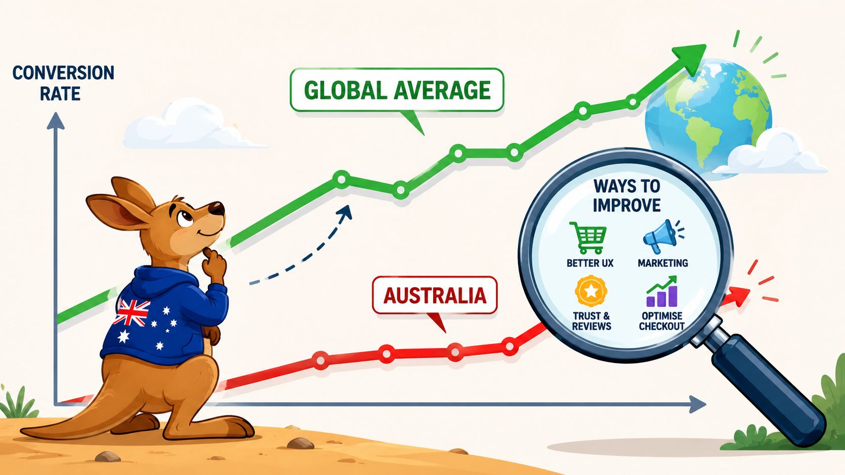
Australia's average ecommerce conversion rate sits between 1.5% and 2.5%, below the global average of 2.0% to 3.0% according to the Australia-focused benchmark summary. That gap changes how I look at store growth. For most local Shopify brands, the problem isn't always traffic. It's what happens after the click, especially on mobile.
A lot of conversion advice still comes from a desktop-first playbook. That's a mismatch for Australia. Local shoppers browse on phones, compare options quickly, and lose patience fast when forms drag, shipping feels vague, or checkout asks for more than it should. Good conversion rate optimisation in Australia starts there, not with cosmetic tests.
What Is Conversion Rate Optimisation and Why It Matters in Australia
Australian ecommerce conversion rates still trail stronger markets, and that gap is why CRO matters. For local Shopify brands, conversion rate optimisation is the process of increasing the percentage of visitors who take a commercially useful action, whether that is buying, starting checkout, joining your email list, or submitting an enquiry.
The practical point is simple. More traffic is expensive. Better conversion makes the traffic you already paid for work harder.
In Australia, that work needs to be grounded in how people shop. A lot of stores are still reviewed, designed, and approved on desktop, while a large share of buying journeys start on mobile. That disconnect is expensive. I see it in Shopify audits every week. Product pages that look polished on a laptop become hard to scan on a phone. Cart drawers hide shipping clarity. Checkouts ask for too much before the shopper is ready.
CRO fixes those friction points in a structured way. It combines analytics, user behaviour, testing, and merchandising judgment to answer a commercial question. Where are shoppers hesitating, and which changes are most likely to raise revenue without hurting average order value, margin, or returning customer rate?
That matters well beyond the site team. Better conversion improves paid media efficiency, lifts revenue from the same email list, and gives merchandising and retention channels a stronger base to work from. For Australian brands dealing with higher acquisition costs and tighter market scale, those gains are often more reliable than chasing another burst of traffic.
If you want a practical outside perspective, Skup ecommerce conversion strategies connects testing ideas to ecommerce execution. For a plain-English definition of the discipline, Grumspot's guide to the fundamentals of conversion rate optimization is a useful reference.
Practical rule: If your team spends more on acquiring traffic than on fixing the friction after the click, profitability gets harder than it needs to be.
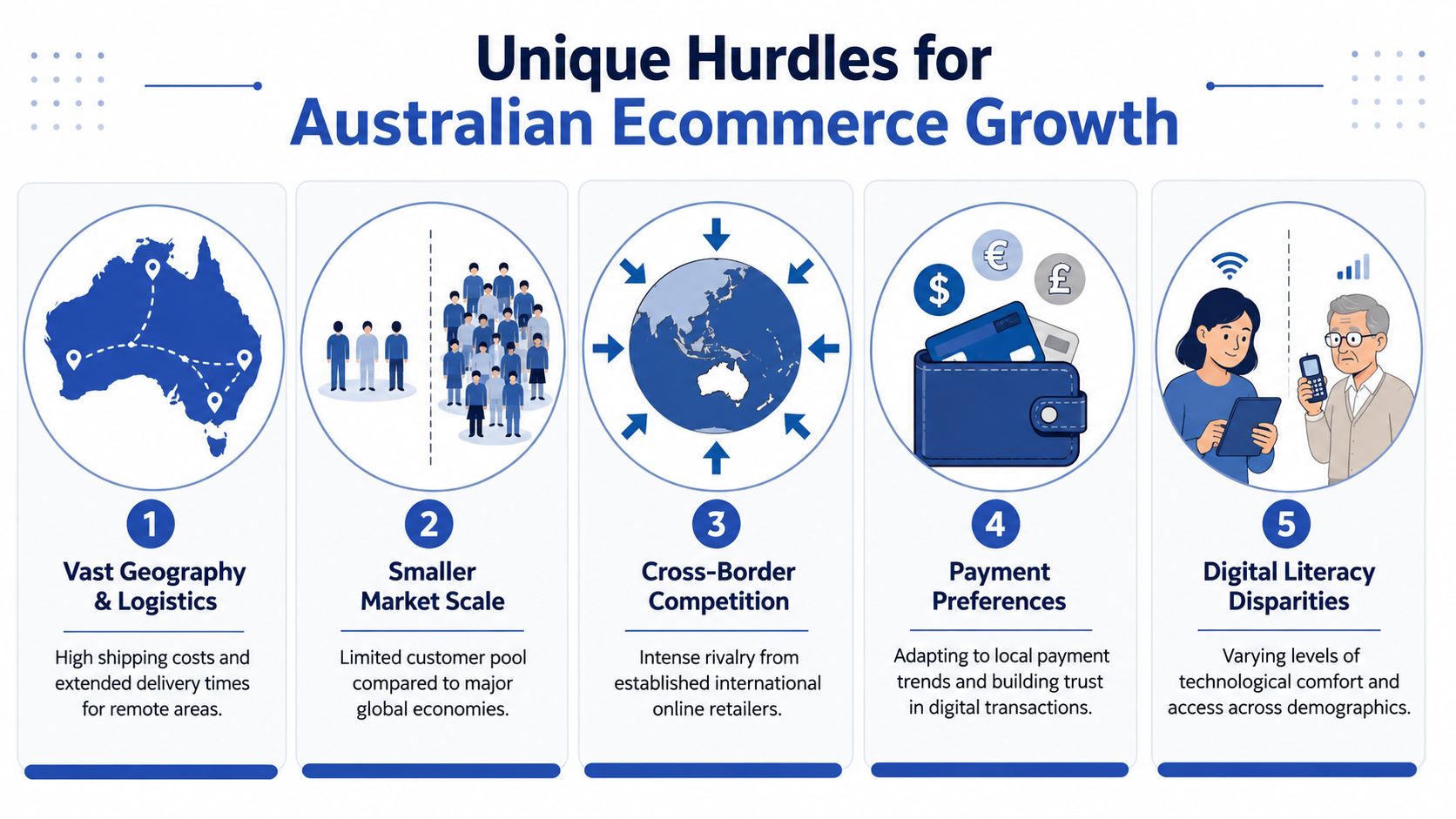
The Unique Challenges of Australian Ecommerce
Generic CRO advice usually breaks the job into familiar pieces: improve headlines, shorten forms, test buttons, add trust. That's fine as a baseline. It's not enough for Australia.
The local challenge is more specific. Shoppers are mobile-heavy, payment expectations are different, and logistics create doubt much earlier in the journey than many brands realise.
Mobile is where most stores leak revenue
This is the biggest disconnect I see in conversion rate optimisation Australia work. Teams review the site on a large screen, approve the experience, then wonder why paid traffic underperforms.
With 72% of the population shopping via mobile, Australia is a mobile-first market, yet mobile ecommerce conversion rates are 18% lower than desktop averages, according to the Australian Communications and Media Authority reference. The same verified data points to poor form UX and slow load times as the main causes.
That gap shows up in familiar ways:
- Forms ask for too much too early. On mobile, long checkout fields feel heavier than they do on desktop.
- Buttons sit in the wrong place. A product page can look polished and still bury the buying action below too much content.
- Pages feel unstable. Elements shift, galleries jump, and shoppers lose confidence.
- Navigation asks users to think too hard. Too many taps before product discovery kills intent.
Payment expectations are local, not generic
Australian ecommerce shoppers expect flexibility. If a store only offers a narrow set of payment methods, conversion suffers. That's especially true when customers are comparing several retailers and want the lowest-friction checkout.
The high-impact tactics identified in the verified Australian benchmark include expanding payment methods, including BNPL options, alongside mobile checkout optimisation and reducing form fields in checkout. In other words, payment setup isn't an operations detail. It's a conversion lever.
Stores don't lose conversions only because the product is wrong. They lose them because the purchase path feels harder than the next option in the browser.
Shipping and cross-border friction hit harder here
Australia's geography changes buyer behaviour. Delivery expectations vary by location, shipping can feel unpredictable, and cross-border purchases add another layer of uncertainty.
A key overlooked issue is cross-border friction. 34% of Australian ecommerce shoppers abandon carts when shipping costs from international retailers exceed AUD $20, based on the verified government-backed summary provided in your brief. Even when you aren't an international retailer, that behaviour matters. Local shoppers have been trained to look for shipping clarity, delivery confidence, and upfront costs.
Here's where many stores get it wrong:
| Friction point | What shoppers experience | Better CRO response |
|---|---|---|
| Shipping hidden until checkout | Surprise and hesitation | Show delivery costs or logic earlier |
| Vague fulfilment messaging | Uncertainty about arrival | Give clear dispatch and delivery expectations |
| Currency confusion on cross-border stores | Trust drops fast | Localise currency and pricing presentation |
| Checkout field overload | Mobile abandonment | Remove non-essential inputs |
Why desktop-first thinking keeps failing
Desktop testing still dominates agency output because it's easier to design, easier to review, and easier to present in meetings. It's also the wrong priority for many Australian stores.
If your traffic, ad clicks, and product discovery are happening on phones, your CRO process has to start with thumb reach, mobile page weight, address entry, payment wallets, and checkout speed. Desktop still matters. It just shouldn't be driving the roadmap.
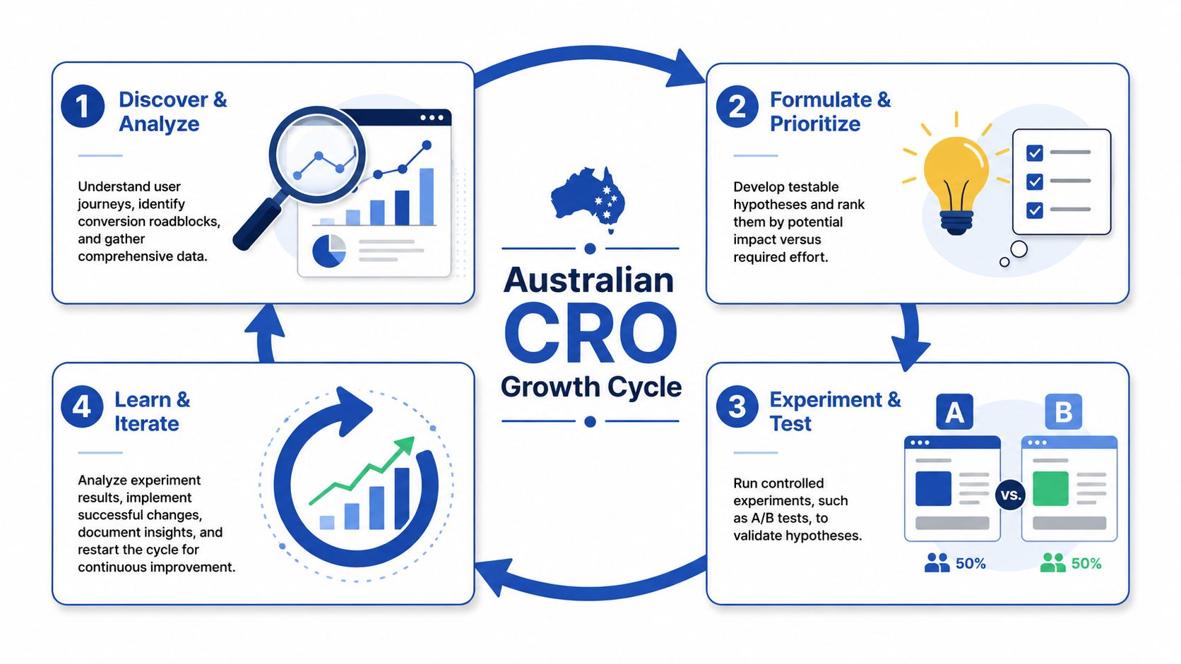
A Practical CRO Framework for Sustainable Growth
The best CRO programs don't run on opinions. They run on evidence, ranked by commercial impact, then tested cleanly.
I use a simple cycle for this. Research what's broken. Form a hypothesis about why. Test one meaningful change. Measure the result without forcing a win. Then repeat.
Research before redesign
The starting point is never “what should we try?” It's “where are users struggling, and why?”
For Australian ecommerce brands, the useful research stack usually includes:
- GA4 funnel analysis to find drop-offs between product page, cart, checkout, and purchase
- Session recordings from Hotjar or Microsoft Clarity to see rage clicks, hesitations, repeat taps, and abandoned flows
- Heatmaps to check whether users even reach key content on mobile
- Customer support tickets and live chat logs to uncover recurring objections
- On-site surveys for questions around shipping, sizing, returns, or payment trust
A common mistake is jumping from analytics straight into design changes. Data tells you where the leak is. It rarely tells you why by itself.
Build a hypothesis that can actually be tested
A weak hypothesis sounds like this: “Let's simplify the page.”
A useful hypothesis sounds like this: “Mobile users are abandoning checkout because address entry and form length create too much friction. If we reduce fields, enable autocomplete, and keep express payment visible, more users should complete purchase.”
That structure matters because it forces clarity. You're identifying a user problem, a proposed fix, and a measurable outcome.
Here's a simple version of the workflow:
Find the leak
Look for drop-offs in the funnel that cost the store meaningful revenue.Explain the behaviour
Use recordings, support data, and page reviews to isolate likely causes.Prioritise by impact
Test the issue that affects the most users or the most commercial value first.Define success properly
Don't just ask whether a button got more clicks. Ask whether the business outcome improved.
A more detailed breakdown of that process is available in Grumspot's guide to website conversion rate optimisation.
This overview is also useful if you want a visual explanation of the testing loop:
Test cleanly, then measure honestly
A/B testing only works when the experiment is disciplined. If you change too many variables at once, stop early, or judge a test on gut feel, you don't learn much.
What works better:
- One clear test focus so the result is interpretable
- Consistent tracking before launch, especially for Shopify checkout events
- Device-specific review because mobile and desktop users often behave differently
- Documented outcomes including losses and inconclusive tests
Operator's note: A losing test can still be valuable if it tells you which objection didn't matter. That's better than shipping permanent design changes based on opinion.
Essential KPIs and Tools for Australian CRO
Over half of ecommerce traffic in Australia now comes from mobile. A lot of KPI setups still report performance as if desktop is the main buying environment. That gap leads teams to miss the main source of lost revenue.
For Australian CRO work on Shopify, the useful question is simple. Which metrics help you spot where mobile shoppers hesitate, drop off, or buy with lower confidence? If a KPI cannot answer that, it usually does not belong on the main dashboard.
The KPIs That Matter
Conversion rate still matters, but only when it is segmented properly. Reviewing one blended sitewide number hides too much. Mobile and desktop users behave differently, paid and returning traffic behave differently, and category benchmarks vary widely across Australian retail. Bambrick's sector benchmark summary is a good reminder that a healthy conversion rate for one niche can be weak or unrealistic in another.
The KPI set should stay tight and commercial:
Mobile conversion rate by landing page type
Product pages, collection pages, and campaign landing pages usually fail for different reasons. Break them out.Add-to-cart rate
Useful for separating product interest problems from checkout problems.Checkout completion rate by device
This is one of the fastest ways to catch mobile friction that a blended conversion rate hides.Average order value
Important when bundles, thresholds, and upsells change the economics of a test.Revenue per session
A stronger metric than raw conversion rate when one variant produces fewer orders but higher-value carts.Returning customer rate
Relevant for Australian brands with replenishment cycles, subscriptions, or heavy promotion calendars.
One more metric deserves more attention than it gets. Express payment usage by device. If Shop Pay, Apple Pay, or PayPal usage is low on mobile, the issue is often placement, trust, or checkout friction rather than lack of buyer intent.
Match the tool to the question
Tool sprawl is common. Teams install GA4, Hotjar, Clarity, app reports, Shopify analytics, and a testing platform, then still cannot explain why mobile traffic converts poorly.
Use a smaller stack with clear jobs.
| Question | Better tool choice | What it helps you see |
|---|---|---|
| Where do users exit the funnel? | GA4 | Session flow, landing page drop-off, checkout abandonment by device |
| Where are mobile users hesitating? | Hotjar or Microsoft Clarity | Rage taps, dead taps, scroll behaviour, form hesitation |
| Which variant performs better? | VWO | Test results across templates, offers, or flows |
| What is happening at store level? | Shopify analytics | Revenue trends, product performance, checkout behaviour |
For teams that need implementation as well as analysis, Grumspot works across Shopify design, development, audits, and CRO delivery. That matters because many conversion problems are not reporting problems. They are execution problems.
Track intent, not just movement
High traffic can hide weak buying conditions. A store may generate plenty of mobile sessions, healthy add-to-cart volume, and steady product engagement, then still lose margin because checkout completion lags badly on phones.
That is why I prefer a decision dashboard over a reporting dashboard. It should help the team answer a short list of questions quickly:
- Which device is underperforming?
- Which step loses the most commercial value?
- Is the issue product confidence, shipping friction, payment friction, or speed?
- Did the test improve revenue, not just clicks?
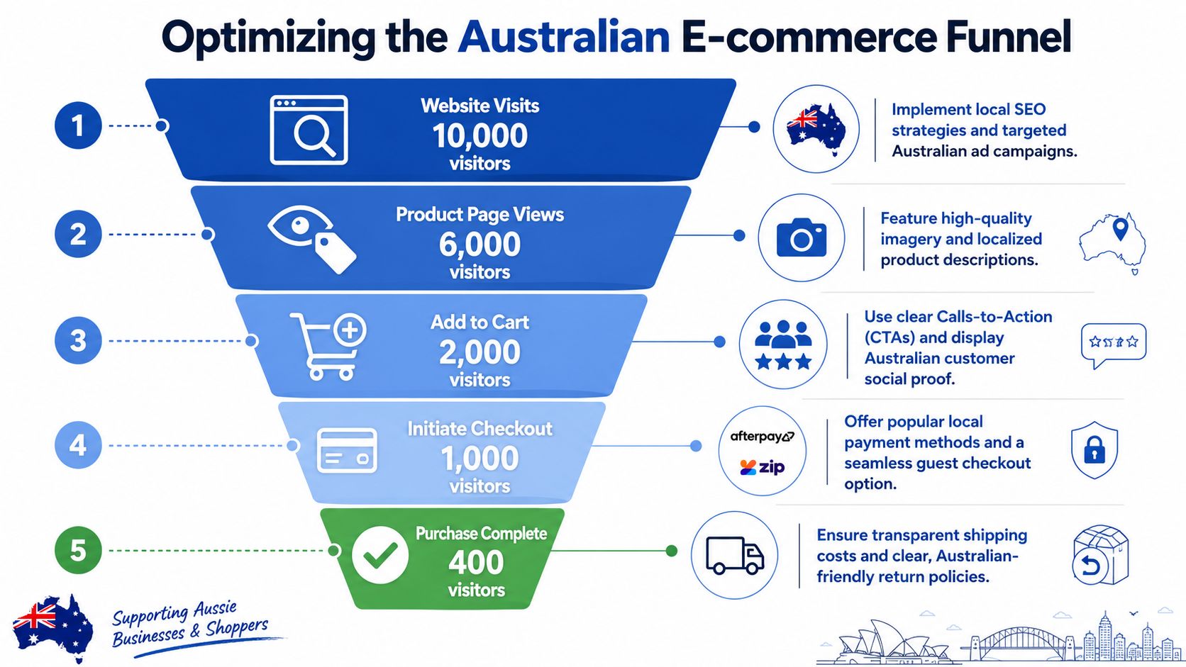
A practical example. If mobile add-to-cart rate is solid but checkout completion falls away after shipping is revealed, the next move is not a homepage redesign. It is usually a checkout, delivery, or offer clarity fix. If price-sensitive shoppers are comparing options before purchase, promotions can help, but they need to be controlled carefully so margin does not erode. For some brands, value framing through bundles performs better than broad discounting. For others, external deal discovery matters, especially when shoppers use sites that unlock massive savings before they commit.
Good KPI setups make those trade-offs easier to see. Bad ones produce more charts.
High-Impact CRO Tactics for the Local Market
The most effective CRO tactics in Australia aren't usually dramatic redesigns. They're sharp fixes to predictable friction. A shopper lands on a product page from Meta or Google, likes the item, taps through, and then the store asks them to work too hard.
That's where revenue disappears.
Fix the mobile checkout first
A common scenario looks like this. The customer is on a phone, already convinced enough to buy, but the checkout opens with too many fields, weak autofill support, and payment options buried too low. They don't leave because they changed their mind about the product. They leave because the task became annoying.
The practical fixes are straightforward:
- Keep guest checkout visible so users aren't forced into account creation
- Reduce form fields to the minimum required for fulfilment
- Use address autocomplete where the stack allows it
- Surface express payment methods early instead of hiding them below long forms
- Preserve cart context on mobile so users can edit without losing confidence
Treat speed as a conversion feature
Page speed discussions often get trapped in technical language. Shoppers find the experience less technical. The page either feels solid and responsive, or it doesn't.
According to Adobe's ecommerce CRO guidance, optimising Core Web Vitals, particularly Cumulative Layout Shift and Time to Interactive, reduces bounce rates and increases conversion rates in the Adobe overview of ecommerce conversion optimisation. For mobile shoppers, this is even more important because unstable pages make the buying process feel risky.
A few fixes usually matter more than heavy redesign work:
- Compress oversized media on collection and product pages
- Delay non-essential scripts that slow interaction
- Stop layout shift caused by banners, pop-ups, or image containers without fixed dimensions
- Trim app bloat in Shopify themes where too many installed features load on every page
A fast page doesn't just rank better. It lets shoppers keep momentum from interest to checkout.
Use localisation where it removes doubt
Local conversion work isn't just about layout. It's about relevance.
That includes:
- Clear delivery language for Australian destinations
- Transparent returns messaging near the buy decision
- Payment methods that local users recognise
- Content that matches ad or search intent, especially on landing pages
- Visible reviews and user-generated content on product pages where trust is still forming
If your audience is price-sensitive, promotional intent matters too. For discount-led shoppers comparing offers before purchase, resources that help them unlock massive savings can shape what they expect to see onsite. That doesn't mean every brand should lead with codes. It means your promotion strategy, offer framing, and checkout confidence need to be clear enough to compete with discount discovery behaviour.
What usually doesn't move the needle
Some tactics are overrated because they're easy to debate in meetings:
- Minor colour tests without a research basis
- Homepage redesigns when checkout is the primary leak
- Desktop-only improvements for mobile-heavy stores
- Pop-ups added everywhere without regard for page speed or UX
The pattern is simple. If a tactic doesn't reduce friction, increase trust, or match intent more closely, it's unlikely to matter much.
How to Choose the Right CRO Agency in Australia
Most brands ask the wrong question when hiring a CRO partner. They ask for case studies, screenshots, and general process slides. That's not enough.
A better question is whether the agency understands the actual reasons Australian shoppers fail to convert.
Ask about local friction, not just testing volume
If an agency talks about button tests before it talks about mobile checkout, payment setup, or shipping clarity, I'd keep looking.
A serious partner should be able to answer questions like these:
- How do you handle mobile-first CRO for Shopify stores with high phone traffic?
- What do you review first in checkout friction for Australian users?
- How do you approach payment method coverage, including BNPL expectations?
- What's your process for shipping transparency and delivery messaging?
- How do you test cross-border friction for brands selling internationally into Australia?
That last point matters more than many brands think. 34% of Australian ecommerce shoppers abandon carts when shipping costs from international retailers exceed AUD $20, based on the verified data in your brief. A CRO agency that can't speak clearly about shipping transparency, pricing confidence, and localisation gaps is missing a real conversion issue.
Watch for generic answers
You're not hiring an agency to recite best practices. You're hiring them to identify the most expensive source of friction on your store and fix it in the right order.
Here's a quick evaluation table:
| Weak agency signal | Strong agency signal |
|---|---|
| Talks mostly about design taste | Talks about funnel leaks and buyer hesitation |
| Shows desktop mock-ups first | Reviews mobile journeys first |
| Focuses on isolated tests | Connects CRO to paid traffic, merchandising, and checkout |
| Gives generic recommendations | Explains how it adapts for Australian buyer behaviour |
If you're comparing partners, Grumspot's overview of what a conversion optimization agency does is a useful benchmark for the questions you should ask before signing anything.
The right agency should make your problem feel clearer within the first conversation, not more complicated.
Start Optimising Your Australian Store Today
The stores that win with conversion rate optimisation in Australia don't rely on one trick. They build a disciplined process around local buyer behaviour.
That means starting with mobile, not desktop. It means treating payment flexibility, shipping clarity, and checkout simplicity as core conversion work, not secondary tasks. It also means testing changes in a structured way so the team learns what improves the buying journey.
If you're looking for the first move, don't redesign the whole site. Review one key mobile path instead. Open your product page, cart, and checkout on a real phone. Try to buy like a customer would. The friction usually shows itself fast.
If you want help diagnosing where your Shopify store is leaking conversions, Grumspot works on CRO audits, Shopify UX fixes, development, and conversion-focused store improvements for Australian ecommerce brands that need practical execution, not just recommendations.
Let's build something together
If you like what you saw, let's jump on a quick call and discuss your project

Related posts
Check out some similar posts.
- website conversion rate optimisation
Master website conversion rate optimisation with our 2026 e-commerce playbook. Audit, test, measure,...
Read more
- conversion optimization agency
Hiring a conversion optimization agency? This guide explains their services, process, pricing, and K...
Read more
- customer review management
Master customer review management on Shopify with our UK playbook. Get step-by-step workflows for co...
Read more
- customer journey mapping
Master customer journey mapping for your Shopify store. Research touchpoints, use insights for CRO &...
Read more