Ecommerce Website Design Shopify: Your 2026 Playbook
- ecommerce website design Shopify
- Shopify design
- Shopify CRO
- Shopify 2.0
- Shopify UK
Launched
April, 2026

Most advice about Shopify design starts in the wrong place. It starts with themes, fonts, animations, and homepage inspiration.
That’s backwards.
In practice, ecommerce website design Shopify work succeeds when the commercial model is clear before a single section is styled. A store doesn’t underperform because the button radius was wrong. It underperforms because the navigation fights the catalogue, the product pages hide the buying argument, the checkout creates doubt, or the store ignores UK operational realities that surface after launch.
Shopify is now the default platform for a huge share of UK commerce, with over 150,000 live ecommerce stores in the UK as of 2026 according to BuiltWith trend data on Shopify usage in the UK. That scale creates a false sense that launching is easy. Launching is easy. Building a store that converts, scales, and stays compliant is harder.
The playbook below treats design as revenue infrastructure. That means strategy first, UX second, build quality third, integrations fourth, and optimisation forever.
The Blueprint Before the Build
A conversion-first blueprint is the document that settles three questions early.
Who is buying. Why they buy. What has to happen in the store for that purchase to feel obvious.
That sounds simple, but many teams still jump straight to visual references. They collect screenshots, choose a premium theme, then try to force the business into the design. That usually creates expensive rework, especially once merchandising, subscriptions, bundles, or operational tools enter the picture.

A better route is to write a brief that joins commercial intent, customer behaviour, and technical constraints. If you’re reviewing professional ecommerce website design services for Shopify stores, that brief is the part that prevents attractive mistakes.
Define the buying job
Demographics are useful, but they don’t explain conversion friction. Age and location won’t tell you why one customer needs reassurance on ingredients, why another cares about delivery windows, or why a third won’t commit without a clear returns path.
The sharper approach is to define buying jobs such as:
- Problem solving purchases where shoppers need fast proof, clear specs, and easy comparison
- Replenishment purchases where speed, account convenience, and subscription logic matter more than storytelling
- Gift purchases where timing, packaging, and confidence signals do more work than technical details
- Considered purchases where rich product education and layered trust have to carry the sale
When teams skip this step, they often overdesign the wrong pages. They put energy into the homepage while the product page, collection filters, and cart perform the essential commercial functions.
Practical rule: If the brief can’t state why a customer buys this product instead of delaying the decision, the design phase has started too early.
Analyse competitors functionally
A proper competitor review isn’t a mood board exercise. It’s a teardown.
Open rival stores and audit the mechanics. How many taps from landing page to cart. Whether product variants are easy to understand. Whether delivery and returns are visible before commitment. Whether filtering supports how people shop. Whether the mini-cart helps the sale or distracts from it.
Use a simple review table:
| Area | What to inspect | What usually goes wrong |
|---|---|---|
| Navigation | Menu depth, collection labels, search behaviour | Category names reflect internal teams, not shopper language |
| PDP | Media order, variant selection, CTA placement, trust content | Benefits are buried below the fold |
| Cart | Upsells, shipping clarity, editability | Cart becomes a dead end instead of a decision aid |
| Checkout | Step count, payment clarity, distraction level | Too many fields and too much uncertainty |
This kind of analysis gives you useful decisions. You might learn that a competitor has a polished visual style but poor filtering, or that a plain-looking store wins because it makes product selection effortless.
Lock the stack before design starts
A lot of Shopify pain is self-inflicted by choosing apps after designs are approved.
If the business needs subscriptions, reviews, bundles, ERP sync, CRM flows, loyalty, or advanced search, define those early. Each tool changes page structure, data requirements, and user flow. A store built without those realities often ends up with patched layouts, duplicated functions, and a slower front end.
Start with a shortlist of essentials:
- Core trading tools such as subscriptions, reviews, search, bundling, and upsell logic
- Operational integrations such as ERP, fulfilment, or customer support systems
- Marketing systems such as CRM, email platforms, and tracking setup
- Governance tools such as accessibility checks, consent handling, and VAT-related workflow needs
The blueprint isn’t glamorous. It also saves projects.
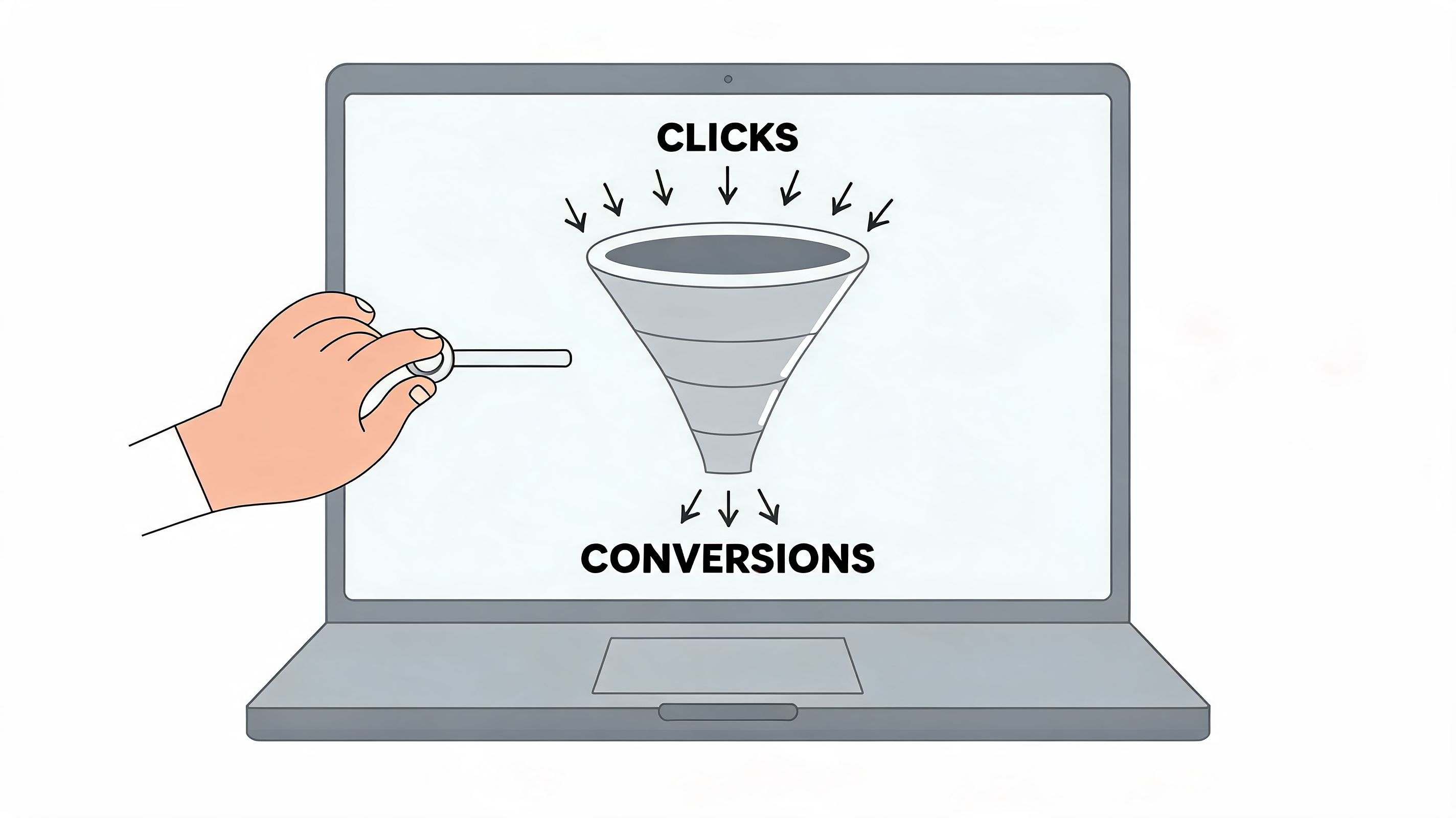
Designing for Conversions Not Just Clicks
The visual layer matters, but only when it serves the buying journey. A clean interface that doesn’t help product discovery, reduce doubt, or shorten checkout isn’t good ecommerce design. It’s decoration.
For UK merchants, the biggest design mistake is still treating mobile as a responsive afterthought. Over 75% of Shopify traffic in the UK originates from mobile devices in 2026, and poor mobile design can push bounce rates up to 50% higher on non-optimised sites, as noted in this Shopify mobile design best-practice summary. That changes everything about layout priorities, interaction design, and content hierarchy.
A strong conversion-focused web design approach for ecommerce stores starts with thumbs, not cursors.
Design the journey screen by screen
Don’t design pages in isolation. Design paths.
A visitor rarely experiences your store as a neat set of approved templates. They land from search, social, email, or paid traffic. They enter through a collection page, a product page, or sometimes a blog or campaign page. From there, the job is to remove hesitation at every step.
Map the path like this:
Entry page
Does the page immediately explain what’s being sold, who it’s for, and what action to take next?Discovery layer
Can the shopper browse categories, search, and filter without confusion?Product evaluation
Are benefits, proof, options, pricing, delivery, and returns easy to understand on a small screen?Commitment moment
Does the add-to-cart action feel obvious and low risk?Checkout flow
Are distractions reduced once the user is ready to buy?
That sequence sounds basic, but most weak stores break at one of those transitions.
Build mobile layouts around hand behaviour
Desktop design encourages width. Mobile conversion depends on vertical sequencing.
That means the first screen on a product page should usually prioritise the product identity, key value proposition, price context, variant selection, and purchase action. Long brand stories, oversized lifestyle imagery, and decorative content can wait.
On mobile, good design usually includes:
- Thumb-friendly controls with tappable filters, variant selectors, and quantity controls
- Sticky purchase actions so users don’t have to scroll back to buy
- Compressed but clear copy that explains benefits without forcing long reads
- Predictable spacing so important content isn’t crowded or hidden beneath accordions
If a shopper has to pinch, zoom, hunt, or re-read, the design is asking them to work harder than they should.
Make the product page do the selling
The product detail page carries more commercial weight than most homepages. It’s where curiosity turns into intent or collapses into abandonment.
The best PDPs tend to be disciplined rather than flashy. They sequence information well. They answer objections before the customer forms them. They make variant choice feel safe.
A practical PDP structure often looks like this:
- Top section with clear product name, concise value message, pricing, and immediate CTA
- Media gallery that prioritises understanding over visual theatre
- Variant logic that avoids ambiguous labels
- Trust content such as reviews, shipping clarity, returns, and payment reassurance
- Support content below, including FAQs, sizing, ingredients, materials, or usage guidance
Trust markers matter here, but they need context. A wall of badges rarely helps. Relevant reassurance placed close to the buying decision does.
Keep navigation commercially honest
Menus often reveal internal politics. Teams want every collection visible, every campaign promoted, and every content area represented.
Customers want the fastest route to a product.
That means fewer top-level choices, cleaner naming, stronger search, and filtering that reflects shopping behaviour. If people buy by use case, lead with use case. If they buy by need state, don’t force them through brand-led category labels that only make sense internally.
Use visual restraint where it helps action. A store doesn’t need to look empty. It needs to make choice easier.
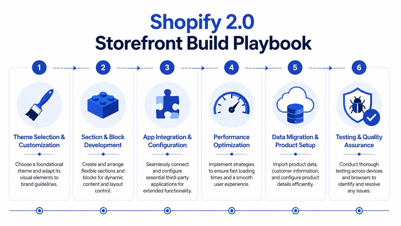
Building a Scalable Shopify 2.0 Storefront
Build quality decides how well the store sells six months after launch, not how polished it looks in the design file. A Shopify build has to hold up under merchandising changes, campaign pressure, app sprawl, and the small operational decisions that slowly make a store harder to manage.
The key architectural choice comes early. Use a premium theme, commission a custom Shopify 2.0 build, or move to headless.
That decision should come from trading reality, not preference. Catalogue depth, merchandising logic, content requirements, internal team capability, and expected rate of change matter more than visual ambition.
Theme, custom, or headless
A premium theme suits brands that need to launch quickly, control cost, and keep day-to-day editing straightforward. It starts to strain when the store needs unusual bundling rules, complex product relationships, subscription logic, or custom content layouts that rely on repeated app workarounds.
A custom Shopify 2.0 build gives more control while keeping Shopify’s native editing model intact. For many growing brands, that is the right middle ground. Developers can shape the front end around conversion priorities, and commercial teams can still update landing pages, collection content, and campaign sections without raising tickets for every change.
Headless has valid use cases. Large content estates, unusual customer journeys, and multi-system experience layers can justify it. But headless also adds more QA, more maintenance, and more ways to slow down iteration. I usually advise against it unless the business can point to a clear operational or revenue case.
| Approach | Best fit | Main risk |
|---|---|---|
| Premium theme | Faster launch, lower build cost, standard catalogues | Friction appears once business rules become more complex |
| Custom Shopify 2.0 | Greater UX control, cleaner extensibility, flexible content editing | Needs stronger technical governance |
| Headless | Advanced experience requirements and wider architectural control | Higher build complexity and ongoing overhead |
For brands weighing those options, custom Shopify 2.0 theme development often gives the strongest balance of control, speed, and long-term manageability.
Build around reusable sections and strict guardrails
Shopify 2.0 earns its keep through sections on every page. That feature is valuable because it lets merchandising teams react faster. It also creates risk if the build turns the theme editor into a free-for-all.
Good section architecture keeps flexibility inside a clear system. Poor section architecture gives every page its own logic, duplicates near-identical modules, and leaves teams guessing which settings are safe to touch.
A well-structured build usually includes:
- Reusable sections with clear naming, limited settings, and obvious use cases
- Shared content rules so landing pages, collection templates, and editorial layouts follow the same logic
- Minimal app dependence to reduce front-end conflicts, script weight, and support issues
- Editor guardrails that protect layout integrity and stop accidental breakage
This matters commercially, not just technically. If campaign pages take too long to update, teams miss trading windows. If apps inject conflicting scripts, page speed drops and conversion often follows. If every template is custom, simple changes become expensive.
A lot of underperforming Shopify stores do not fail because of one dramatic mistake. They slow down through accumulation. One app for reviews, one for upsells, one for badges, one for filters, one for tracking. Then the theme carries the cost.
A quick technical walkthrough helps visualise what a cleaner implementation process looks like.
Treat UK compliance as build work, not launch admin
UK-specific requirements shape storefront decisions earlier than many teams expect. Post-Brexit VAT affects how prices, duties, invoices, and delivery messaging should appear, especially for brands selling across borders. If that logic is unclear, customers hesitate at exactly the point where trust needs to be strongest.
Accessibility has the same practical impact. Forms need usable labels and error handling. Colour contrast needs checking before brand styling is signed off. Keyboard navigation, focus states, semantic structure, and screen-reader behaviour should be built into components from the start.
That is why compliance belongs inside ecommerce website design Shopify work, not in a final QA checklist. Teams that leave VAT handling and accessibility until pre-launch usually end up patching templates, rewriting interface copy, and retesting core journeys under deadline pressure.
Integrating Your Business Ecosystem
A Shopify store starts to break when growth exposes everything around it.
A brand launches with manageable order volume, a small catalogue, and a customer service team that can patch issues manually. Then operations get busier. Inventory mismatches appear. Marketing can’t segment customers properly. Subscription users struggle to manage accounts. Support teams answer the same cancellation and fulfilment questions every day. The storefront still looks fine, but the business feels messy.
That’s usually the point where Shopify stops being just a storefront and becomes the operating layer that has to connect sales, fulfilment, retention, and reporting.
What changes when a brand scales
Consider a typical scaling setup. Orders are flowing through Shopify, stock lives in an ERP, lifecycle campaigns run through a CRM, and customer service needs order context without chasing multiple systems. None of those connections are cosmetic, but each one changes how the store should behave.
When ERP syncing is weak, product availability becomes a trust problem on the front end. When CRM data is fragmented, on-site messaging and retention flows lose relevance. When support systems don’t share context, customers get slower answers and lower confidence.
That’s why integration planning belongs inside ecommerce website design Shopify work, not after it.
Subscription UX is a design problem, not just an app choice
Subscriptions are a good example of this. Many teams install a subscription app, place the recurring purchase toggle on the product page, and assume the system is complete.
It isn’t.
UK subscription businesses need to design around the 2025 Subscription Traders Code, which requires clear cancellation flows. Poor design in this area contributes to 32% of churn for UK subscription businesses on Shopify, as discussed in this UK Shopify guide covering subscription setup considerations.
That has practical implications:
- Account design matters because customers need a clear path to manage, pause, or cancel
- Product page messaging matters because recurring terms must be understandable before purchase
- Notification design matters because renewal and account communications shape trust
- Support visibility matters because hidden help options increase frustration
A subscription journey only works when the front end, account area, customer data, and workflow automations are aligned.
Use automation where human work adds no value
Not every task deserves a person in the middle.
Shopify Flow can route repetitive actions that would otherwise create delay or inconsistency. Tags, internal alerts, customer segmentation triggers, exception handling, and operational handoffs can all be automated. The key is designing those workflows around real business rules rather than building automation for its own sake.
A useful ecosystem often includes:
- ERP integration for inventory, purchasing, and order status consistency
- CRM connection for segmentation, service context, and lifecycle messaging
- Subscription tooling with compliant customer account flows
- Flow automations to reduce manual handling across fulfilment and retention processes
This is one place where specialist implementation support can be practical rather than promotional. Grumspot, for example, builds Shopify integrations with ERPs, CRMs, fulfilment systems, and custom apps when standard app-layer connections don’t cover the business logic.
The principle is simple. The best storefronts don’t just look coherent. They behave coherently because the systems behind them are connected.
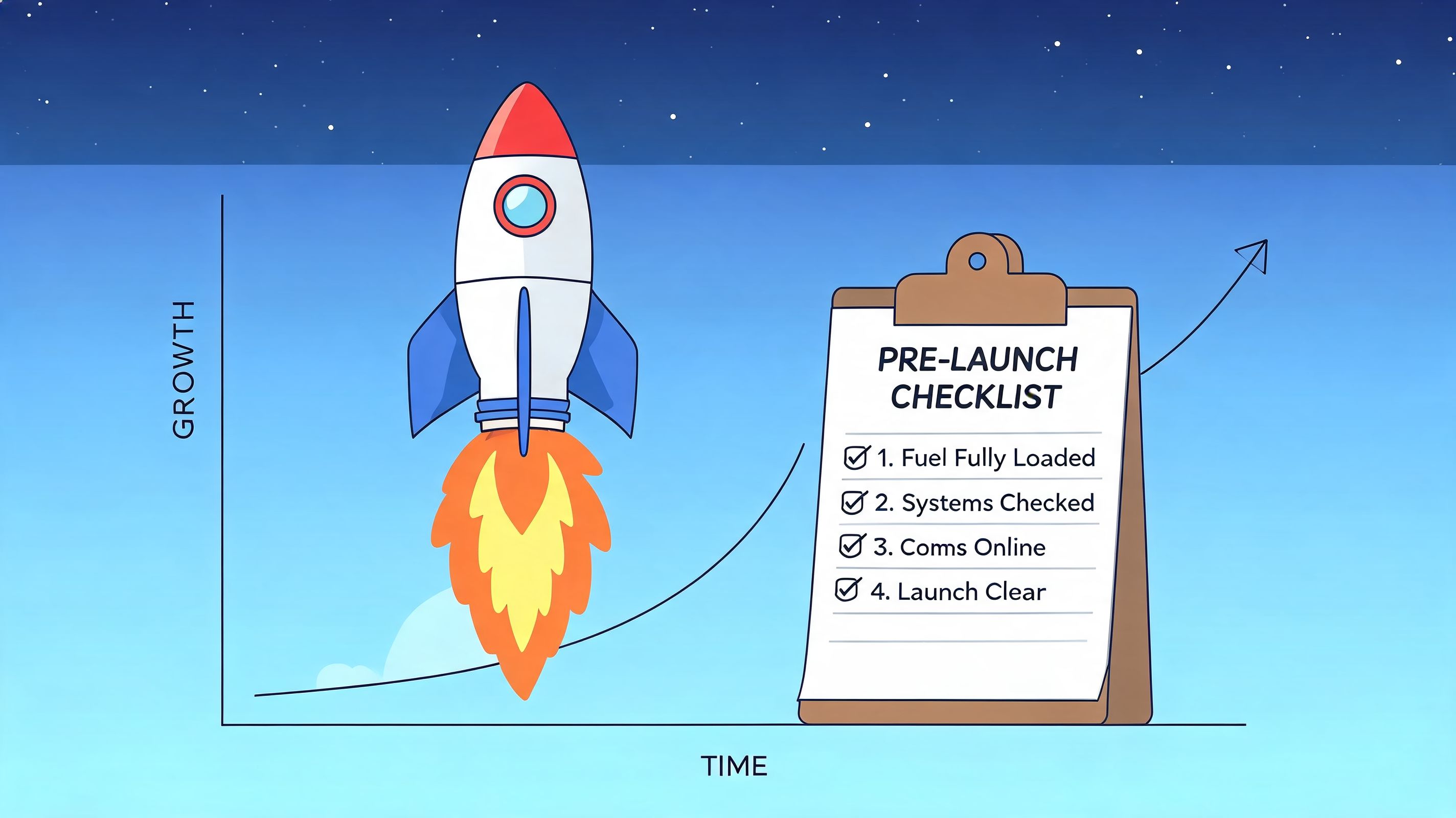
Launching Testing and Driving Growth
Launch day shouldn’t be treated like the finish line. It’s the handover from controlled build work to real customer behaviour.
A store can pass internal reviews and still fail in the market because live traffic exposes blind spots that staging never reveals. Search terms differ from expectations. Mobile users miss key controls. Returning customers behave differently from first-time buyers. A flow that looked clean in QA produces hesitation when real money is involved.
That’s why launch needs discipline before and after the switch.
What to test before going live
Pre-launch QA should focus on commercial risk, not just bug counting.
Review the full customer journey on current devices and browsers. Test every route into checkout. Validate product variants, discount logic, account creation, transactional emails, form handling, search behaviour, and tracking setup. If the store supports subscriptions, test account management and recurring purchase communication with the same seriousness as checkout.
Use a simple launch checklist:
- Front-end checks including layout consistency, responsive behaviour, navigation logic, and search results
- Trading checks including variants, pricing display, shipping rules, taxes, and promotions
- Checkout checks including payment methods, error handling, field clarity, and order confirmation
- Operational checks including fulfilment routing, notifications, support visibility, and reporting
Launch confidence comes from testing the money paths first. A minor content bug matters less than a broken variant selector or a confusing delivery message.
Run CRO like an operating rhythm
Once the store is live, optimisation has to become routine. Otherwise teams default back to opinion-based changes.
A strong framework starts with the facts that matter most. UK cart abandonment is nearly 70%, and a structured method that maps user journeys, implements one-page checkouts, and adds trust signals can produce conversion gains of 25% to 40% from a typical 2.1% baseline, according to Shopify’s ecommerce UX guidance.
The practical workflow is straightforward:
Find the drop-off Use Shopify analytics, Google Analytics, and heatmap tools such as Hotjar to identify where users stall or exit.
Write a specific hypothesis Don’t say “improve the PDP”. Say “move delivery and returns reassurance closer to the CTA because users may be hesitating before adding to cart”.
Change one meaningful variable Test layout, CTA copy, variant presentation, trust placement, or checkout simplification. Avoid changing multiple major elements at once.
Measure commercial impact Judge tests by conversion, AOV trend, progression to checkout, and revenue quality, not just click behaviour.
Focus tests where money is made
Not every page deserves equal attention. Most gains come from a short list of high-impact surfaces.
Prioritise:
- Product pages where trust, offer clarity, and option selection influence intent
- Collection pages where filtering, sorting, and product-card information shape discovery
- Cart and checkout where uncertainty or complexity kills momentum
- On-site search where high-intent users reveal what the navigation may be failing to do
Some changes will be visual. Many won’t. They’ll be changes to sequence, wording, defaults, or reassurance.
Better CRO usually looks less dramatic than a redesign. It’s often a series of small decisions that reduce uncertainty at the exact moment a customer is deciding whether to continue.
Answering Your Key Shopify Design Questions
Most Shopify design questions are commercial questions in disguise. The underlying issue is usually fit. Can Shopify support the way you sell, the way your team works, and the operational constraints that affect margin after launch?
Should you choose Shopify for a UK brand
For many UK brands, yes. Shopify is a strong fit when the business wants a platform with solid checkout infrastructure, a large app ecosystem, and a content editor that marketing teams can use without filing a developer ticket for every change.
The caveat is that platform choice does not fix weak architecture. A UK store still needs the right setup for VAT handling, shipping logic, returns communication, accessibility, and any post-Brexit friction that affects cross-border fulfilment. Those details shape conversion far more than the platform logo in the footer.
If the catalogue, fulfilment model, and reporting needs are unusually complex, the decision needs a closer review. Shopify can handle a lot. It still needs the right implementation choices around products, markets, apps, and data flow.
Theme or custom build
A theme is the right call when the catalogue is straightforward, the team needs speed, and the business can work within proven ecommerce patterns. That often gets a store live faster and keeps admin editing simple.
A custom Shopify 2.0 build makes more sense when the brand needs tighter control over merchandising, stronger storytelling, or UX patterns a theme will always fight against. I usually advise clients to look at the cost of compromise, not just the cost of build. If a team spends months forcing a theme to support bundled logic, unusual product education, or a more considered purchase journey, the cheaper option on paper often becomes the expensive one in practice.
| Business situation | Better fit |
|---|---|
| Standard catalogue, quicker launch, controlled requirements | Theme |
| More distinct brand experience, more complex UX, ongoing iteration planned | Custom Shopify 2.0 |
What’s involved in a migration
Migration work is rarely about importing products and customers. The harder part is deciding what deserves to move at all.
A good migration usually includes redirect mapping, collection and navigation clean-up, content review, app replacement, search setup, and QA across tax, shipping, notifications, and tracking. For UK merchants, it should also include a proper check on VAT logic, invoice requirements, and any accessibility gaps that could create legal or conversion problems later.
Copying the old store too closely is a common mistake. Legacy categories, bloated filters, duplicated apps, and outdated PDP content should be questioned before they are rebuilt on Shopify.
How long does a serious project take
Project length depends less on Figma screens and more on decision quality. Teams lose time when product data is messy, content owners are unclear, app choices are delayed, or compliance review happens at the end instead of the start.
A serious build moves faster when scope is settled early, stakeholders know who signs off what, and the team is honest about technical constraints. “We’ll sort it later” is one of the more expensive phrases in ecommerce.
What should you budget for
Budget should follow complexity and revenue risk. A theme setup for a smaller catalogue is one type of project. A custom storefront tied into subscriptions, ERP, 3PL workflows, or international trading rules is another.
The better question is this. What does the business need in order to sell well, operate cleanly, and avoid paying twice for rushed decisions?
Cheap builds often defer the hard work. They skip content modelling, performance discipline, accessibility checks, systems integration planning, and post-launch testing. That keeps the proposal tidy and pushes the actual cost into rework.
If you’re planning a new Shopify build, redesign, migration, or CRO programme, Grumspot handles bespoke storefront design, Shopify 2.0 development, audits, integrations, and ongoing optimisation for UK ecommerce teams that need a store built around conversion rather than surface-level aesthetics.
Let's build something together
If you like what you saw, let's jump on a quick call and discuss your project

Related posts
Check out some similar posts.

- DTC brand Shopify store
Build a high-velocity DTC brand Shopify store. This practitioner's guide covers strategy, Shopify Pl...
Read more
- Shopify Plus store build
Get expert guidance for your Shopify Plus store build. Master planning, migration, launch, and scali...
Read more
- reduce Shopify cart abandonment
Diagnose & reduce Shopify cart abandonment with our 2026 playbook. Get actionable strategies for UI,...
Read more
- Shopify A/B testing services
Explore Shopify A/B testing services. Learn how agencies increase conversions, navigate UK complianc...
Read more