Reduce Shopify Cart Abandonment: 2026 Playbook
- reduce Shopify cart abandonment
- Shopify CRO
- checkout optimisation
- ecommerce conversion
- Shopify Plus
Launched
April, 2026
62% of UK shoppers abandon carts because of hidden international fees. For UK brands selling across borders, that single point explains a lot of lost revenue. Post-Brexit VAT confusion, customs duties, and weak landed-cost visibility still derail purchases late in the journey, especially on mobile and especially for first-time buyers.
Cart abandonment usually comes from fixable friction. Sometimes it is obvious, like delivery costs appearing too late. Sometimes it sits in the implementation, like slow cart refreshes, inconsistent payment messaging, or the limits of standard Shopify checkout customisation. On Shopify Plus, teams can address more of this directly through Checkout UI Extensions and server-side improvements. On standard plans, the fixes are narrower, so prioritisation matters more.
Buyers who abandon are still high-intent shoppers. They found the product, added it to cart, and got close to purchase. For many scaling brands, the fastest path to growth is often to fix this leak before pouring more budget into acquisition.
This playbook reflects how experienced CRO teams approach Shopify and Shopify Plus accounts. Diagnose the drop-off points first. Then fix the obvious issues, tighten checkout and payment UX, build recovery flows that match buyer intent, and use Plus-only tools when the commercial case is there.
The Silent Killer of Shopify Sales
Most brands treat abandoned carts as background noise. That’s the mistake.
An abandoned cart is a buyer signalling intent, then hitting friction hard enough to stop. When that happens at scale, even a healthy traffic programme can hide a weak conversion engine. Paid media teams push harder. Merch teams refresh offers. Email teams chase more sends. Meanwhile, the same checkout leak keeps draining revenue.
Why this problem matters more than most teams admit
The cart is where ecommerce stops being theoretical. Product-market fit, merchandising, pricing, trust, UX, performance, fulfilment clarity, and payment setup all collide in one short journey.
If a buyer abandons after adding to cart, they’ve already told you something useful:
- The product wasn’t the main problem. They saw enough value to continue.
- The barrier appeared later. Cost shock, checkout friction, weak trust signals, or poor payment options usually show up near the finish line.
- Revenue is sitting close to conversion. This is why abandonment work often beats top-of-funnel tweaks for near-term gains.
Practical rule: If your team can’t explain the top three reasons people drop between cart and purchase, you don’t have a traffic problem yet. You have a diagnosis problem.
The real opportunity
Reducing abandonment isn’t about chasing perfection. It’s about removing enough friction that more buyers complete the purchase they already intended to make.
For standard Shopify stores, that means sharper cart UX, clearer cost presentation, and cleaner recovery automation. For Shopify Plus brands, it also means using checkout extensibility properly, improving performance at the checkout layer, and solving operational issues like customs and VAT visibility before buyers have to guess.
The brands that win don’t assume abandonment is inevitable. They treat it as a conversion system that can be measured, prioritised, and improved continuously.
First Find the Leaks in Your Sales Funnel
Many teams start with tactics. They add a popup, send more reminders, or install another app. That’s backwards.
If you want to reduce Shopify cart abandonment, first isolate where intent breaks. Cart abandonment is only one symptom. Sometimes the issue starts earlier on product pages. Sometimes it starts after cart when checkout introduces friction the storefront never prepared buyers for.
Read the funnel before touching the design
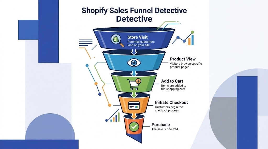
Start in Shopify Analytics and map the full path:
- Store visit
- Product view
- Add to cart
- Initiate checkout
- Purchase
You’re looking for the stage with the sharpest drop relative to the previous step. That tells you where to investigate, not what to fix yet.
A few common patterns show up quickly:
| Funnel pattern | Likely issue |
|---|---|
| Strong product views, weak add-to-cart | Product page trust, price communication, unclear variant selection |
| Strong add-to-cart, weak checkout starts | Cart UX, shipping anxiety, hidden costs, weak CTA hierarchy |
| Strong checkout starts, weak purchase completion | Payment friction, trust concerns, field overload, mobile checkout pain |
This is also where many teams benefit from a structured process for fixing the leaks in your sales funnel. The useful part isn’t the buzzword. It’s the discipline of matching each drop-off to a specific hypothesis instead of redesigning everything at once.
Use behavioural tools to see friction, not guess it
Analytics shows where buyers leave. Heatmaps and session recordings help explain why.
Tools like Hotjar or Microsoft Clarity are useful for three specific jobs:
- Heatmaps show whether shoppers interact with the elements you expect them to use.
- Scroll maps reveal if important content sits too low on mobile.
- Session recordings expose hesitation, rage clicks, repeated field edits, and dead ends.
Watch recordings by segment, not randomly. Split sessions by:
- Mobile vs desktop
- Paid traffic vs returning visitors
- UK shoppers vs international traffic
- Cart abandoners vs converters
That’s where patterns become obvious. Mobile users might struggle with a sticky footer covering the checkout CTA. Paid traffic may bounce after seeing shipping uncertainty. Returning customers may move smoothly until a payment option disappears.
Buyers rarely tell you “the AJAX cart lagged after I updated quantity and the delivery estimate looked unreliable.” Session replay does.
Build hypotheses that can actually be tested
Good diagnosis produces narrow hypotheses. Weak diagnosis produces broad redesign requests.
Write them like this:
- If we show delivery cost earlier in the cart, then more users will start checkout because the price shock moves forward in the journey.
- If we simplify variant selection on mobile, then add-to-cart rate should improve because users won’t stall on unclear options.
- If we remove non-essential fields and promote express payments, then checkout completion should improve because effort drops.
One practical shortcut is to pair analytics with a proper UX review. A specialist Shopify UX audit often catches the issues teams miss internally because they’ve become too familiar with the store.
What not to do during diagnosis
Don’t jump straight to discounting. Don’t blame traffic quality before checking the funnel. Don’t treat one anecdotal support ticket as a conversion truth.
Do the slower, better work first:
- Review funnel stages
- Watch real sessions
- Compare device behaviour
- Segment by market
- Form hypotheses you can test
That’s how you stop patching symptoms and start fixing causes.
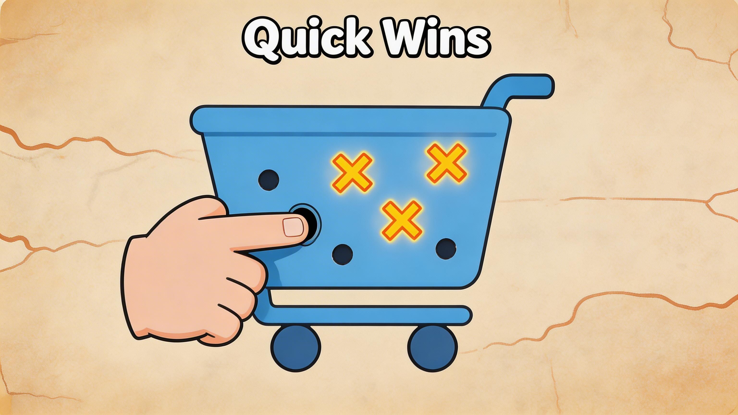
Implement Quick Wins for Immediate Impact
The fastest gains usually come from one job. Make the cart easier to understand.
For Shopify brands, especially those selling across UK and EU markets, abandonment often starts when the cart introduces uncertainty that did not exist on the product page. Delivery cost appears late. VAT treatment looks ambiguous. Customs or duties are left unanswered. On Shopify Plus, these problems are fixable without a full redesign, but the fix has to be precise.
Fix shipping transparency first
Shipping clarity usually beats visual polish as a first test.
If buyers cannot tell what delivery will cost, whether they qualify for free shipping, or whether cross-border charges may apply, many will pause before checkout. In UK ecommerce, that problem gets worse after Brexit because customers are alert to the risk of unexpected VAT or customs charges. Even if your rates are competitive, uncertainty alone is enough to suppress conversion.
For Shopify Plus stores, this is one of the best places to use platform-specific tooling well. A cart-level estimator can help, but the higher-confidence version is to carry that clarity into checkout with Checkout UI Extensions, clear tax messaging, and a fallback when live rate calls fail. For scaling brands, I would take a plain, reliable estimate over a clever widget that breaks under load every time.
A practical implementation path
Use a short implementation sequence:
- Set up shipping zones and rate logic properly in Shopify Admin. Check postcode rules, exclusions, and any UK region-specific exceptions.
- Add a shipping estimator in the cart where shoppers will see it without hunting. If you’re using a theme cart, the Liquid insertion can be as simple as
{% render 'shipping-calculator' %}. - Show free shipping progress clearly and update it on cart changes via
/cart/update.js. - Add explicit VAT and duties messaging for UK and international visitors. If duties are not included, say so. If they are included, make that visible.
- Create a fallback state so a timeout or API failure still shows a useful estimate rather than a blank module.
Placement matters as much as the feature. If the estimator sits under promo clutter or below an aggressive upsell stack, shoppers treat it as decoration instead of trusted pricing information.
Handle the UK pricing details buyers notice immediately
VAT display changes how honest your pricing feels.
A cart that forces a UK customer to work out whether tax is included creates hesitation before checkout starts. The same applies to cross-border orders where duties are unclear. Many teams treat this as a policy issue. It is a conversion issue.
For UK-focused brands, the cart should answer three questions without friction:
- Is VAT included?
- What will delivery cost?
- Will I face customs or duties after purchase?
If your setup cannot answer those cleanly in the cart, answer them with clear microcopy beside totals and shipping messaging. A static explanation is better than a dynamic tool that loads slowly or fails on mobile.
If a customer has to calculate the real total themselves, the cart is doing extra work for them.
Other same-day fixes worth shipping
Not every improvement needs a sprint.
Clean up cart hierarchy
The cart should make the next action obvious. Product summary, final price context, and checkout CTA should dominate the page. Promo fields, gift notes, and upsell modules can stay, but they should not compete with the primary action.
I regularly see carts where the checkout button is pushed below a stack of expandable widgets. That usually hurts more than it helps.
Reduce visual doubt on mobile
Mobile abandonment often comes from small friction points that stack together:
- Buttons placed too closely lead to mis-taps
- Sticky bars covering totals make pricing feel unstable
- Overbuilt cart drawers often lag on lower-powered devices
- Auto-opening upsells interrupt users who are ready to pay
If your drawer is slow, test a simpler cart page. The trade-off is straightforward. Drawers can feel fast when they are light. Heavy ones often fail where conversion intent is highest.
Improve performance where purchase intent is strongest
Cart, mini-cart, and checkout-adjacent pages deserve the same scrutiny as your homepage. Slow AJAX updates, bloated third-party scripts, and client-side shipping tools are common sources of friction.
For practical fixes, this guide on how to improve website loading speed is useful for reducing script weight, improving render order, and trimming app bloat on revenue-critical pages.
Sharpen product presentation before cart hesitation starts
Weak product imagery often shows up as a cart problem later. A buyer who still feels unsure about colour accuracy, texture, scale, or finish is more likely to abandon once totals appear.
For catalogues with large SKU counts, these AI product photography tools can help standardise imagery faster. Better creative will not fix checkout friction on its own, but it does reduce the uncertainty that pushes shoppers into delay mode.
What usually doesn’t work as a quick win
Some tactics look attractive because they are easy to launch, not because they solve the problem.
| Tactic | Why it often disappoints |
|---|---|
| Blanket discounts | Cuts margin before fixing shipping clarity, tax messaging, or UX friction |
| Exit popups on every session | Adds interruption when the real issue is trust or total-cost uncertainty |
| More cart upsells | Increases distraction when the shopper is trying to validate the order |
| Heavy animation effects | Slows mobile interaction and can make the cart feel less reliable |
Quick wins should reduce effort, clarify cost, and remove doubt. If the cart becomes faster, clearer, and more trustworthy, conversion usually improves.
Optimise Your Checkout and Payment Experience
Once the cart is cleaner, checkout becomes the next bottleneck. Here, many brands lose buyers through friction that feels minor internally but heavy to a customer trying to finish fast.
Checkout optimisation is less about visual polish and more about reducing effort while increasing trust.
Put the fastest payment paths first
Express payment methods work because they shorten decision time and form effort.
If your audience uses Shop Pay, Apple Pay, or Google Pay, surface those options early and clearly. They’re not just payment methods. They’re shortcuts that remove typing, address entry, and payment hesitation.
A practical rule is simple:
- Put the most familiar express options near the top
- Keep card payments available without forcing account creation
- Avoid visual clutter around payment selection
If a customer arrives ready to buy on mobile, every extra field feels heavier than it does on desktop.
Guest checkout is not optional
Requiring account creation introduces friction at the worst possible moment. First-time buyers don’t want a relationship milestone before they’ve even placed an order.
Make guest checkout obvious. Don’t bury it as a quiet text link under a dominant login prompt. If a returning-customer benefit matters, present it after purchase or as an optional convenience.
Buyers tolerate very little friction once they’ve decided to pay. That’s why “nice to have” account logic often behaves like a conversion tax.
Trust signals should reassure, not clutter
Security badges, return policy links, delivery messaging, and support access can all help. Used badly, they create visual noise.
The right placement is usually close to the point of doubt:
- Near payment fields for security reassurance
- Near order summary for delivery and returns clarity
- Near the final CTA for support availability if something goes wrong
Keep the wording plain. “Free returns policy” is clearer than clever copy. “Need help?” with an obvious support route works better than a paragraph about customer care.
A simple trust checklist
- Return policy is visible
- Delivery expectations are easy to find
- Support contact exists without leaving checkout
- Security reassurance appears near payment, not scattered everywhere
Offer payment breadth without overcomplicating the page
More payment choice helps when it reflects real customer preference. It hurts when the interface turns into a wall of logos.
For higher-consideration products, “Buy Now, Pay Later” options such as Klarna can reduce affordability friction. But they need disciplined presentation. If instalment messaging overwhelms the total cost or confuses the next step, it can distract more than it helps.
The trade-off is straightforward:
| Checkout choice | Main advantage | Main risk |
|---|---|---|
| Express wallets | Faster completion | Can be underused if buried |
| Standard cards | Broad familiarity | More typing and form friction |
| BNPL options | Helps budget-sensitive buyers | Can clutter messaging if over-promoted |
Remove anything that doesn’t help the purchase
A checkout should feel calmer than the rest of the site. That means stripping out unnecessary asks.
Audit every field, message, and interaction. Ask one question for each. Does this help the customer complete the purchase right now?
If the answer is no, remove it, defer it, or make it optional.
The best checkout experiences don’t feel clever. They feel easy.
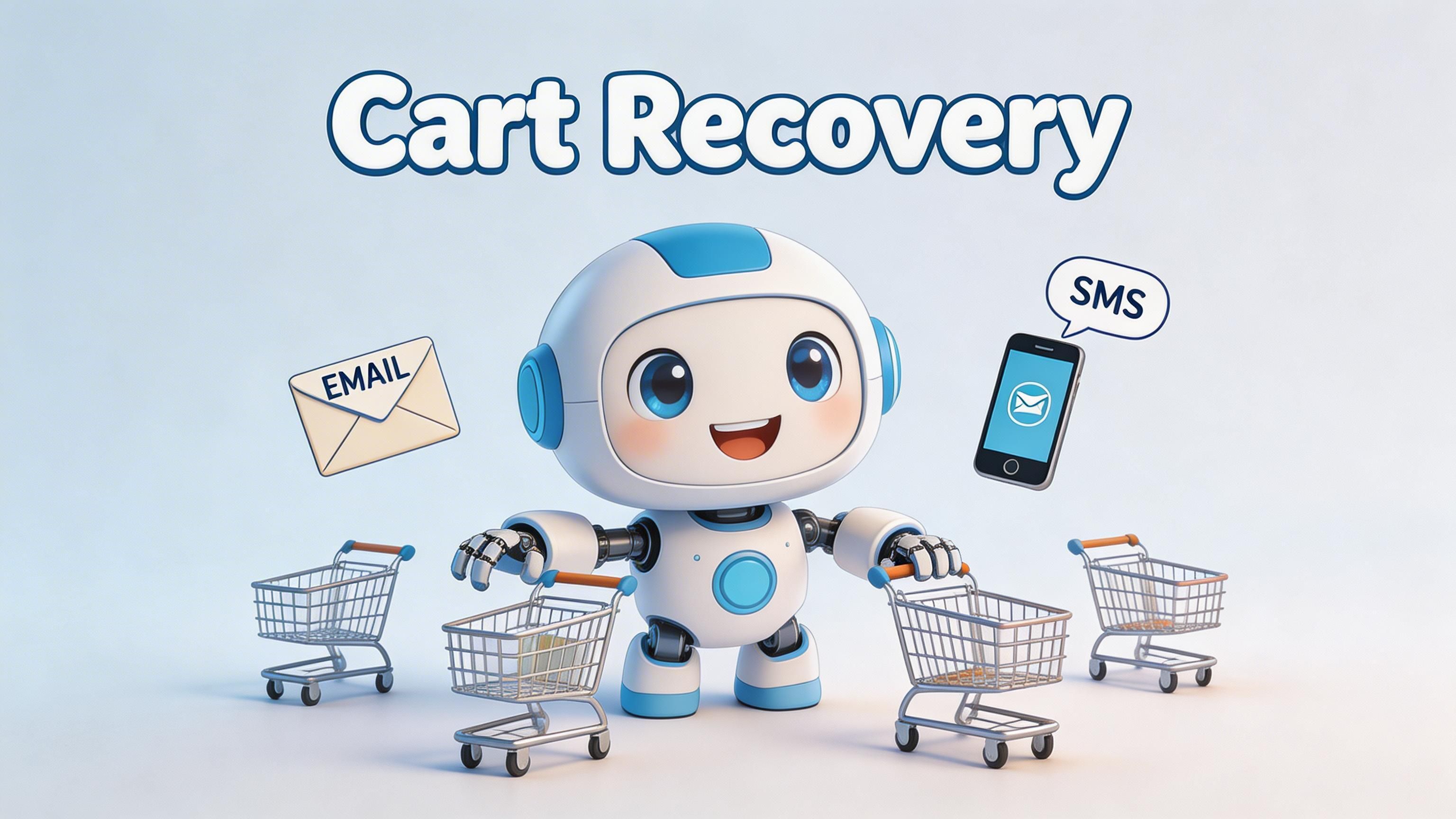
Build a Powerful Abandoned Cart Recovery Sequence
For many Shopify stores, abandoned cart emails drive a meaningful share of recovered revenue. The gap is not whether a brand sends them. It is whether the sequence matches buyer intent, margin reality, and the operational limits of the platform.
A recovery sequence should do one thing well. Get high-intent shoppers back to checkout before the purchase goes cold.
Start with the first hour
The first send usually does the heaviest lifting. Delay it too long and the customer has already switched context, compared alternatives, or forgotten why they added the item in the first place.
For most brands, a three-touch sequence is enough. More messages can work, but only if the catalogue has a longer consideration cycle or the average order value justifies the extra pressure. Otherwise, extra touches often add noise, unsubscribe risk, and discount dependency.
Recommended cadence
Use a three-touch sequence:
Email one within 30 to 60 minutes
Show the abandoned items, keep the design clean, and use the direct restore link via{{ checkout_url }}.Email two at 24 hours
Resolve hesitation. Use product-specific reassurance, delivery clarity, or proof that the item is worth buying.Email three at 72 hours
Introduce an incentive only if the earlier emails did not convert, and only if margin allows it.
That pattern keeps the first message close to the moment of intent, gives the second message a trust role, and reserves the offer for buyers who need a final push. It also protects margin better than opening with a discount, as noted in Chakril’s guidance on reducing cart abandonment for UK merchants.
What each message should actually do
Recovery emails fail when they try to behave like campaigns. They need to behave like continuation.
Email one should restore momentum
Keep the tone practical. The shopper already showed intent. They need a reminder, clear product context, and one obvious route back.
Include:
- Product image
- Variant details
- Clear restore-cart CTA
- Short delivery or returns reassurance
Keep the page light. Long copy, secondary promotions, and unrelated product blocks usually reduce click-through.
Email two should resolve hesitation
This is the message that earns trust. For UK brands, that often means answering the operational questions buyers hesitate on late in the journey. Delivery timing, returns, VAT treatment, and any post-Brexit customs exposure for cross-border orders all belong here if they are relevant.
Good themes for this message:
- Delivery certainty
- Popular product reassurance
- Returns or exchange clarity
- VAT or duties clarity for affected orders
- Product benefit reminder
That last point matters more than many teams expect. If a UK customer suspects extra charges after checkout, the recovery email needs to remove that doubt directly. A generic “complete your purchase” message will not do it.
Here’s a useful walkthrough on recovery setup and sequencing:
Email three is where offers need discipline
Discounting can recover revenue. It can also train customers to wait.
A better pattern is progressive discounting:
- No discount in the first touch
- Reassurance in the second
- Incentive in the third, only if needed
This approach works best when the incentive is controlled. Exclude low-margin SKUs, suppress repeat discount hunters where possible, and review whether recovered orders stay profitable after the offer.
For higher-volume stores, this is also where platform choice starts to matter. Brands evaluating Shopify Plus capabilities for checkout control and automation can build more detailed recovery logic around customer tags, basket value, geography, and previous purchase behaviour without stacking brittle app workarounds.
Recovery automation should feel like a continuation of the shopping journey, not a separate marketing campaign.
Add SMS carefully
SMS can outperform email on speed and visibility, but it is less forgiving. If timing is off or the message feels intrusive, the channel burns goodwill fast.
Use it for:
- A short reminder
- A delivery-related nudge
- A final limited recovery prompt
Use SMS only where consent is clear and the value is obvious. For UK merchants, compliance is part of conversion performance, not a legal footnote.
Measure the sequence the right way
Do not judge the flow on recovered revenue alone. That hides whether the sequence is improving conversion or just buying it with margin.
Track:
| Metric | Why it matters |
|---|---|
| First email performance | Shows whether timing, subject line, and message match buyer intent |
| Recovery by touchpoint | Shows which step is doing the real work |
| Discount dependence | Reveals whether margin is being protected or eroded |
| UK vs non-UK segments | Helps isolate regional friction, including VAT and customs concerns |
| SMS opt-in and unsubscribe rate | Shows whether the extra channel is helping or causing fatigue |
The best recovery sequences do more than bring carts back. They expose which objections still exist in the buying journey, and which ones need a platform-level fix rather than another email.
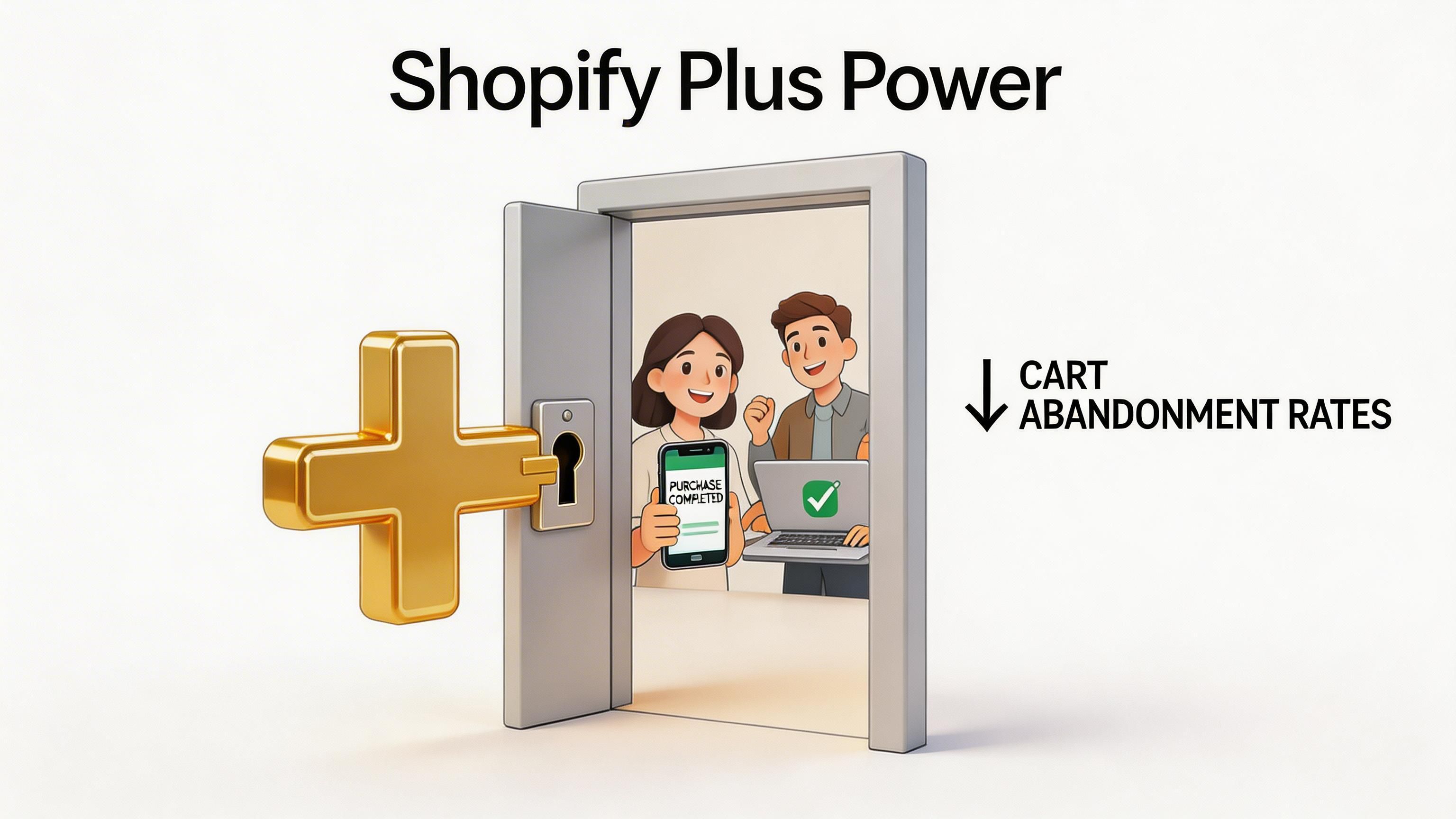
Gain an Edge with Shopify Plus Exclusives
Standard Shopify covers a lot of ground. For scaling brands, the constraint usually is not traffic. It is control.
Once a store needs checkout logic by market, cleaner integrations with tax or ERP systems, or fewer app-layer workarounds, Shopify Plus becomes a conversion tool rather than a platform upgrade. That matters most in the last mile of checkout, where a small amount of friction can wipe out paid acquisition efficiency.
Checkout extensibility matters more at scale
App stacks tend to hold up until they do not. A brand adds one tool for payments, another for subscriptions, another for cross-border messaging, then discovers checkout behaviour is being shaped by brittle dependencies and slow release cycles.
Shopify Plus gives teams better options:
- Checkout UI Extensions for native checkout components
- Shopify Flow for automation across customer, order, and operational events
- Custom integrations that bring tax, fulfilment, inventory, or account data into the buying journey
The practical benefit is stability. Native extensibility is easier to govern than a patchwork of apps, and it usually creates fewer regressions when teams test or iterate. For brands weighing that trade-off, this breakdown of the benefits of Shopify Plus is a useful starting point.
UK VAT and customs friction is a checkout problem
Generic abandonment advice often ignores the UK-specific issues that show up after Brexit. Buyers get to checkout, see costs they did not expect, and hesitate. In many cases, the problem is not price alone. It is uncertainty about VAT, duties, and what happens at delivery.
That is why cross-border clarity belongs inside the purchase journey, not buried in a shipping policy or left for support to explain later.
What Plus changes in practice
On Shopify Plus, teams can set up cleaner solutions for VAT and customs visibility before the buyer reaches payment:
- Real-time duty or tax estimators using ERP, tax, or market data
- Checkout components that explain import-related costs earlier
- Market-specific messaging based on shipping destination
- Fallback rules when a third-party data source fails, so the buyer still gets a clear explanation
These fixes are not glamorous. They work because they remove uncertainty at the exact point where trust is most fragile.
Flow helps teams handle different abandonment patterns
Shopify Flow is often treated as an ops tool. It is also useful for conversion work, especially when one-size-fits-all recovery logic starts to break down.
Plus brands can use Flow to:
- Route high-value abandoned checkouts into a different follow-up path
- Trigger internal alerts for repeat failed payments or suspicious patterns
- Adjust actions by product type, region, or order condition
- Coordinate email and SMS logic without adding unnecessary app complexity
That matters for larger stores because abandonment is rarely one problem. Subscription buyers, international shoppers, and high-AOV customers do not all need the same treatment.
Applying the same checkout logic and the same recovery path to every shopper is a common reason scaling stores stall.
When Shopify Plus makes sense for CRO
Shopify Plus is not the right answer for every merchant. If the store has low complexity and the current checkout setup is stable, the ROI may not be there yet.
It tends to make sense when the conversion issue is tied to platform limits rather than merchandising or traffic quality.
| Situation | Why Plus helps |
|---|---|
| Checkout needs market-specific logic | Native extensibility is more stable than app-heavy workarounds |
| Cross-border pricing causes hesitation | Custom integrations can surface duty and VAT costs earlier |
| Recovery flows need branching logic | Flow allows for more complex branching logic |
| Technical debt slows testing and iteration | Centralised tooling reduces reliance on fragile fixes |
The goal is not to add more moving parts. It is to remove the ones customers can feel.
Create a Culture of Continuous Optimisation
Abandonment work fails when teams treat it like a one-off project. They fix the cart page, launch a recovery flow, then move on. A month later, app changes, merchandising updates, new market launches, or payment tweaks introduce fresh friction.
The stores that keep improving build a system around observation, testing, and iteration.
Track the right KPIs, then segment them properly
A top-line abandonment number won’t tell you enough on its own. You need a small KPI set with useful segmentation behind it.
Start with:
- Cart abandonment rate
- Checkout abandonment rate
- Recovery rate
- Conversion rate by device
- Conversion rate by market
- Performance by traffic source
The important part is segmentation. A blended average hides too much.
Look at the same KPI set through multiple lenses:
| Segment | What it can reveal |
|---|---|
| Mobile vs desktop | Whether friction is usability or layout-specific |
| UK vs other markets | Whether pricing, VAT, or delivery expectations differ |
| Paid vs direct traffic | Whether intent quality changes how much friction buyers tolerate |
| New vs returning customers | Whether trust and familiarity are doing enough work |
If one segment underperforms badly, don’t redesign the whole journey yet. Isolate the issue and test there first.
Build hypotheses, not opinions
A/B testing only helps when the team knows what it’s trying to prove.
Weak test idea: “Let’s try a better cart.”
Strong test idea: “If we move delivery cost visibility above the primary CTA on mobile carts, more users will start checkout because the key pricing question gets answered earlier.”
That structure matters. It forces the team to connect a change to an expected behaviour.
A practical testing workflow
- Observe the behaviour in analytics and recordings.
- Write one hypothesis tied to a specific friction point.
- Choose one meaningful change instead of a bundle of edits.
- Run the test long enough to gather directional confidence.
- Review by segment, not just in aggregate.
- Document the result so the learning compounds.
Prioritise tests by effort and likely impact
Not every idea deserves the same urgency. Some produce measurable movement with minimal engineering effort. Others are expensive and speculative.
Use a simple decision model:
- High impact, low effort goes first
- High impact, high effort gets planned carefully
- Low impact, low effort fits into housekeeping
- Low impact, high effort usually waits
Experienced ecommerce teams save time here. They don’t spend two weeks debating button colour while hidden fees, slow cart interactions, or broken payment hierarchy remain untouched.
A mature CRO process doesn’t test random ideas. It tests the most believable explanations for lost revenue.
Create a feedback loop between teams
Cart abandonment isn’t owned by one department.
Merchandising influences pricing perception. Design affects hierarchy and clarity. Development affects speed and reliability. CRM affects recovery. Operations affect shipping and customs trust. Support often hears objections first.
The best process is cross-functional and simple:
- Weekly review of funnel movement
- Shared list of friction points
- Clear owners for fixes
- Documented test backlog
- Regular review of wins and failed experiments
That rhythm matters more than any single tactic. It keeps the store improving even as catalogue, channels, and customer expectations change.
What sustained optimisation looks like
It doesn’t look glamorous. It looks organised.
One week, the team fixes cart totals on mobile. Another week, it rewrites delivery messaging for UK buyers. Then it tests express payment placement. Then it rewires recovery logic for high-intent abandoners. Small, disciplined changes stack.
That’s how brands reduce Shopify cart abandonment over time. Not through one dramatic redesign, but through repeated removal of friction buyers feel.
If your store has strong traffic but too many buyers dropping before purchase, Grumspot can help you diagnose the friction, improve checkout performance, and build the Shopify or Shopify Plus experience your conversion rate has been waiting for. Explore Grumspot if you want senior Shopify specialists to fix the leaks fast and keep optimising with you.
Let's build something together
If you like what you saw, let's jump on a quick call and discuss your project

Related posts
Check out some similar posts.

- conversion rate optimisation
Looking for a conversion rate optimization consultant? This 2026 guide covers their role, process, K...
Read more
- outsource Shopify development
Ready to outsource Shopify development? Our 2026 playbook covers finding partners, vetting, pricing,...
Read more
- API-first ecommerce
Explore API-first ecommerce architecture. A practical guide for UK merchants on benefits, costs, Sho...
Read more
- composable commerce Shopify Plus
Unlock growth with composable commerce Shopify Plus. Learn architecture patterns and migration steps...
Read more