Shopify Polaris App Design: Build Review-Ready Apps
- Shopify Polaris app design
- Shopify app development
- Polaris React
- Built for Shopify
- Shopify UI/UX
Launched
April, 2026
You’ve probably been here already. The app logic is fine, auth works, the data model makes sense, and then the actual friction begins: the UI doesn’t feel like Shopify admin, review feedback gets vague, and every “small” styling change turns into another round of rework.
That’s why Shopify Polaris app design matters much earlier than is commonly assumed. It isn’t the polish you add near launch. It’s the system that decides whether your app feels native, whether merchants trust it quickly, and whether review sees a product that belongs in the Shopify ecosystem or one that merely runs inside it.
The teams that move fastest usually make one decision upfront. They stop treating the interface as a custom front end problem and start treating it as a Shopify product problem.
Why Your Shopify App Needs a Native Look and Feel
A merchant installs your app, lands in Shopify admin, and tries to complete one task in the first few minutes. If the layout, actions, and feedback patterns feel unfamiliar, confidence drops fast. That friction shows up before anyone files a support ticket or leaves a review.
A native look matters because merchants are already trained on Shopify's interface. They know where to look for the primary action, how settings pages are usually structured, and what destructive actions should look like. When your app follows those conventions, the product feels easier to trust and easier to use on first contact.
That is the value of Polaris. It gives your app the same visual and interaction language merchants already use elsewhere in admin.
Trust shows up in behavior, not just visuals
Teams often treat visual consistency as a branding question. In embedded Shopify apps, it is a product adoption question. A familiar interface lowers hesitation during setup, reduces second-guessing around important actions, and cuts the amount of explanation your UI needs to carry.
I have seen this in review cycles and post-launch support. Apps that stick close to Polaris patterns usually need fewer clarifying tooltips, fewer "what happens if I click this?" answers from support, and fewer last-minute design corrections before submission. Merchants move through them with less friction because the interface does not ask them to learn a new operating model.
A good rule is simple. If users need to study your UI before they can get value from your feature, the UI is getting in the way.
Custom UI often costs more than it saves
A fully custom interface sounds appealing early on. It promises freedom. In practice, that freedom usually turns into extra design QA, more accessibility edge cases, and more time spent rebuilding patterns Shopify has already solved.
You do not only build screens. You take on responsibility for spacing systems, form hierarchy, loading states, error handling, keyboard support, responsive behavior, and embedded app expectations inside admin. Then you still need the result to feel close enough to Shopify that review does not flag it as inconsistent or awkward.
The trade-off is usually straightforward:
| Approach | What usually happens |
|---|---|
| Custom UI from scratch | More room for visual deviation, but more implementation drift, more QA debt, and more review feedback |
| Polaris-first UI | Faster alignment with Shopify admin patterns, fewer design debates, and a cleaner path to approval |
For agency teams and in-house teams alike, that operational benefit matters. Designers, developers, and QA are working from the same system instead of negotiating basic interface decisions screen by screen.
Native apps get approved faster because they look expected
The Built for Shopify review does not reward novelty in core admin workflows. It rewards clarity, consistency, accessibility, and an interface that feels at home inside Shopify. Apps with strong feature logic still get slowed down when page structure is inconsistent, action hierarchy is muddy, or custom components behave differently from the rest of admin.
The fastest approvals I have seen came from teams that made one decision early. Use Polaris as the default, customise only where the product needs it, and check every deviation against merchant clarity and review risk.
That is the practical angle many guides miss. Polaris is not just a component library. It is the shortest route from design tokens to an app that merchants trust and reviewers can approve without a long list of UI corrections.
Laying the Groundwork with Polaris Design Principles
Polaris works best when you treat it as a system, not a parts bin. If you start by grabbing random components from Storybook and wiring them together, the app may be functional but still feel off. That usually happens because the interface has no governing logic behind spacing, hierarchy, and action patterns.
The fix starts below the component layer.
Think in tokens before components
Design tokens are the foundation. They define the reusable values for colour, spacing, typography, radii, and interaction states. If components are the walls and doors, tokens are the measurements that keep the whole building square.
That matters because approval issues often start with tiny inconsistencies, not dramatic mistakes. A custom alert with off-brand spacing. A form group with cramped vertical rhythm. A badge colour that weakens contrast. Each issue is minor in isolation. Together they make the app feel ungoverned.
Use tokens as your single source of truth for:
- Spacing rhythm so cards, sections, and forms breathe the same way across screens
- Typography hierarchy so page titles, support text, and labels don’t compete
- Colour application so emphasis, status, and destructive actions remain predictable
- Interaction states so hover, focus, disabled, and loading behaviours stay coherent
If you’re building custom wrappers around Polaris components, keep those wrappers token-driven. That’s the difference between sensible extension and visual drift.
The principles behind the interface
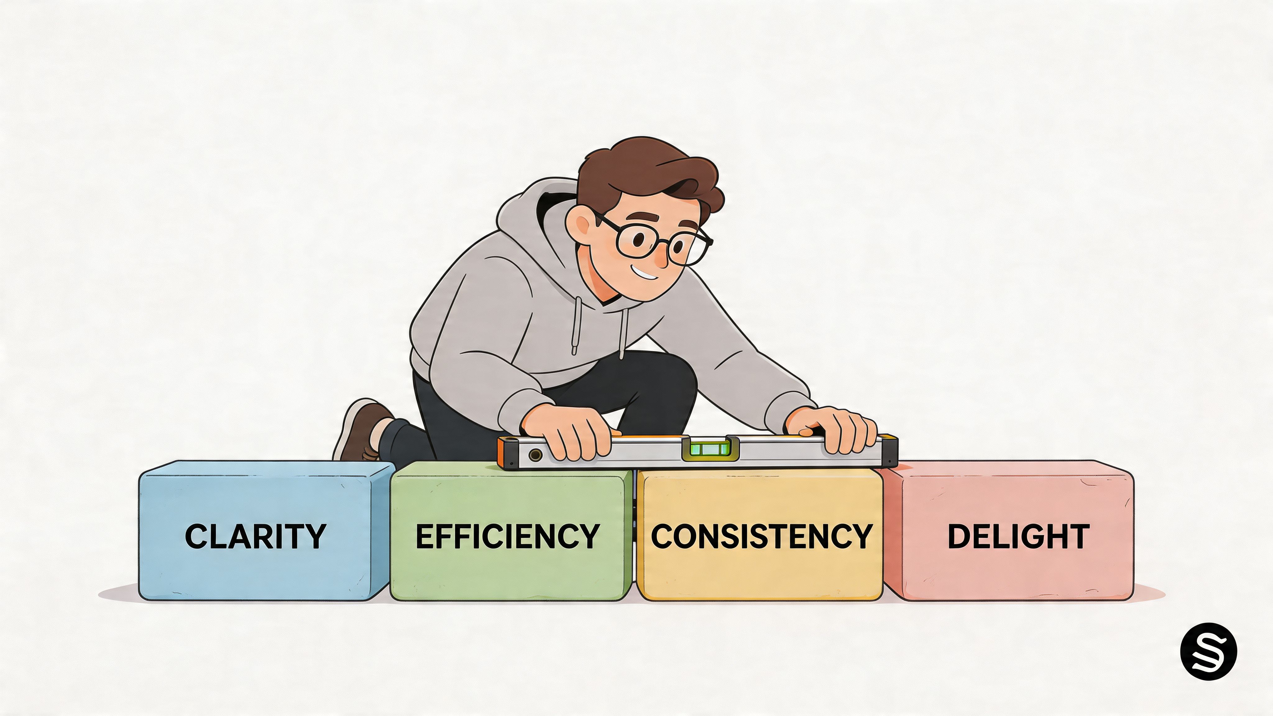
Good Shopify Polaris app design usually reflects three habits.
First, it stays consistent. The same kind of action should look and behave the same way throughout the app. Don’t make “Save” primary on one page, then bury it in a secondary footer elsewhere.
Second, it stays considered. Every field, banner, and modal needs a reason to exist. Admin surfaces get crowded fast. The best Polaris apps remove interface noise instead of adding more “helpful” UI.
Third, it remains control-oriented. Merchants should feel in control. Use clear labels, visible consequences, and predictable navigation. Hidden rules and surprising side effects create support load.
Don’t choose a component because it exists. Choose it because it matches the decision the merchant is trying to make.
Build around the app frame merchants already know
Before you style a settings page, define the screen’s overall structure. Embedded Shopify apps work best when their top-level frame feels familiar. That means predictable page headers, sensible sectioning, and actions placed where merchants expect them.
A useful way to decide structure is to classify the page first:
| Screen type | Best pattern |
|---|---|
| Configuration page | Page header, grouped cards, persistent save behaviour |
| Data view | Strong title, filters first, table or resource list second |
| Guided setup | One clear path, fewer side actions, progress cues |
| Critical action flow | Short layout, explicit copy, guarded confirmations |
Many teams over-design at this stage. They add sidebars, nested tabs, and local patterns that make sense in isolation but compete with Shopify admin itself. Embedded apps don’t need to look empty, but they do need to respect the surrounding shell.
Content design matters more than developers expect
A technically correct Polaris interface can still fail if the copy is weak. Button labels like “Submit”, “Apply”, or “Continue” often hide what the action does. Generic helper text creates uncertainty. Ambiguous empty states make the product feel unfinished.
Use plain, direct language:
Good: Save shipping rule
Weak: Confirm settings
Good: Sync products now
Weak: Run action
Good: Customers won’t see this internal tag
Weak: Optional metadata field
The cleanest apps I’ve shipped usually had fewer components than expected and tighter wording than the first draft. Polaris gives you the skeleton. Your job is to make the interface legible.
Building Your UI with Polaris React Components
A lot of review problems start the same way. The app works in local development, a few screens are wired up fast, then QA hits the embedded version and the UI feels inconsistent, actions drift, and basic Polaris behaviour breaks in ways that are expensive to clean up late. The teams that get through review faster usually follow a stricter build order from day one.
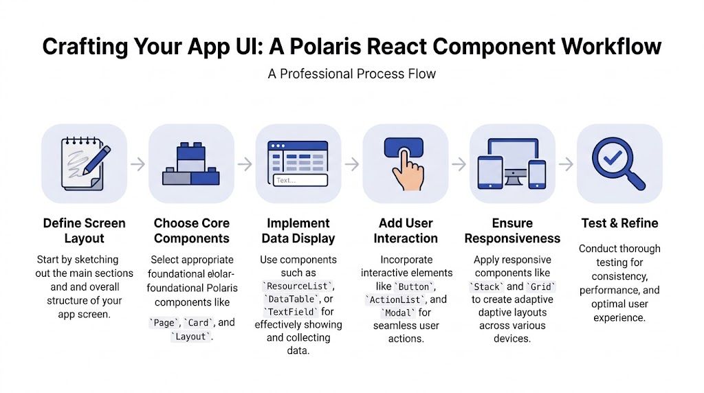
Start with the app shell
For a React embedded app, I start with Shopify App CLI, install Polaris, and wrap the root in AppProvider. Skipping that setup step causes predictable problems. Styles load inconsistently, translations are missing, and some components behave differently from what the team expects.
The basic setup looks like this:
import React from 'react';
import ReactDOM from 'react-dom/client';
import {AppProvider} from '@shopify/polaris';
import '@shopify/polaris/build/esm/styles.css';
import enTranslations from '@shopify/polaris/locales/en.json';
import App from './App';

const root = ReactDOM.createRoot(document.getElementById('root'));

root.render(
  <AppProvider i18n={enTranslations}>
    <App />
  </AppProvider>
);
Install the package first:
npm install @shopify/polaris
AppProvider is part of the foundation, not a cleanup task for later. If it is missing, the app may still render, but it will not behave like a production-ready Shopify admin experience.
If your team needs extra frontend capacity, bringing in experienced react developers can save time, especially when the work includes Polaris conventions, embedded app constraints, and review preparation at the same time.
Build one review-safe page pattern first
The fastest way to ship a stable UI is to build one page pattern that can survive review, then reuse it across the app. I use this approach for settings pages, onboarding steps, and operational screens because it keeps structure predictable and cuts design drift between routes.
import {Page, Layout, Card, TextField, Checkbox, Select, Button, Form, FormLayout} from '@shopify/polaris';
import {useState, useCallback} from 'react';

export default function SettingsPage() {
  const [storeLabel, setStoreLabel] = useState('');
  const [enableSync, setEnableSync] = useState(true);
  const [syncMode, setSyncMode] = useState('manual');

  const handleSubmit = useCallback(() => {
    console.log({storeLabel, enableSync, syncMode});
  }, [storeLabel, enableSync, syncMode]);

  return (
    <Page
      title="Channel settings"
      primaryAction={{content: 'Save', onAction: handleSubmit}}
    >
      <Layout>
        <Layout.Section>
          <Card>
            <Form onSubmit={handleSubmit}>
              <FormLayout>
                <TextField
                  label="Internal store label"
                  value={storeLabel}
                  onChange={setStoreLabel}
                  autoComplete="off"
                  helpText="Used inside the app only"
                />

                <Checkbox
                  label="Enable product sync"
                  checked={enableSync}
                  onChange={setEnableSync}
                />

                <Select
                  label="Sync mode"
                  options={[
                    {label: 'Manual', value: 'manual'},
                    {label: 'Automatic', value: 'automatic'},
                  ]}
                  value={syncMode}
                  onChange={setSyncMode}
                />

                <Button submit variant="primary">
                  Save settings
                </Button>
              </FormLayout>
            </Form>
          </Card>
        </Layout.Section>
      </Layout>
    </Page>
  );
}
This works because it handles the boring parts well. The title is clear. Related fields sit together. The save action is easy to find. Reviewers and merchants both benefit from that consistency.
One pattern is enough at the start.
A useful rule in production is simple. If a screen needs multiple competing primary actions, the problem is usually the page architecture, not the button placement. Split the workflow before you add more controls.
Add data display without overbuilding it
Many Shopify apps need to show operational data next to configuration. Sync logs, rule results, import history, and record lists all show up quickly once the app is in use. In this scenario, teams often make a good settings screen harder to scan.
Keep display components separate from the form area:
import {Page, Layout, Card, DataTable} from '@shopify/polaris';

export default function OrdersPage() {
  const rows = [
    ['Order #1001', 'Queued', 'Standard'],
    ['Order #1002', 'Synced', 'Express'],
    ['Order #1003', 'Failed', 'Standard'],
  ];

  return (
    <Page title="Recent sync activity">
      <Layout>
        <Layout.Section>
          <Card>
            <DataTable
              columnContentTypes={['text', 'text', 'text']}
              headings={['Order', 'Status', 'Method']}
              rows={rows}
            />
          </Card>
        </Layout.Section>
      </Layout>
    </Page>
  );
}
A few habits help keep these screens clean:
- Keep the table focused on one job. If merchants are checking sync state, show sync state. Don’t turn the page into a mini dashboard.
- Limit row actions. Too many inline controls make scanning slower and increase accidental clicks.
- Standardise status labels early. “Queued”, “Synced”, and “Failed” are easier to support than custom terms that vary across screens.
I have seen teams lose a week polishing a page that should have been split into two routes. If the top half edits settings and the bottom half needs filters, pagination, and bulk actions, separate them.
Use modals carefully
Modals are useful, but they break down fast in embedded apps when teams try to fit full workflows into them. They work best for confirmations, short forms, and decisions with one clear consequence.
Here’s a safe baseline:
import {useState, useCallback} from 'react';
import {Page, Card, Button, Modal, TextContainer} from '@shopify/polaris';

export default function DeleteRuleExample() {
  const [active, setActive] = useState(false);

  const toggleModal = useCallback(() => setActive((open) => !open), []);

  return (
    <Page title="Rules">
      <Card>
        <Button tone="critical" onClick={toggleModal}>
          Delete rule
        </Button>

        <Modal
          open={active}
          onClose={toggleModal}
          title="Delete this rule"
          primaryAction={{
            content: 'Delete',
            tone: 'critical',
            onAction: toggleModal,
          }}
          secondaryActions={[
            {
              content: 'Cancel',
              onAction: toggleModal,
            },
          ]}
        >
          <Modal.Section>
            <TextContainer>
              <p>This removes the rule from future order processing.</p>
            </TextContainer>
          </Modal.Section>
        </Modal>
      </Card>
    </Page>
  );
}
Good modal patterns share a few traits:
- Short, explicit titles
- Clear consequences
- One destructive action
- One obvious exit path
Poor modal patterns are also predictable:
- Multi-step flows
- Long explanatory copy
- Hidden warnings
- Generic labels like “Proceed” or “Continue”
If users need to compare information, review multiple fields, or recover from mistakes, keep the workflow on the page.
App Bridge is part of the UI, not an integration detail
A Polaris screen can look correct and still feel off inside Shopify admin if embedded behaviour is poorly handled. App Bridge closes that gap. It keeps navigation, actions, and feedback aligned with the host admin experience instead of forcing the app to behave like a standalone SaaS product.
At minimum, embedded apps should handle these cases well:
- Top-level navigation that matches the app’s actual structure
- Save states and feedback that are easy to understand
- Modals and actions that behave predictably inside admin
- A clear return path when merchants switch context
For teams that want help with that layer as well as review readiness, Shopify public app development services can be a practical option.
The workflow that scales
The mistake is trying to use all of Polaris at once. Approval-friendly apps usually come from a narrower system. Build a base page. Add your core form controls. Add one repeatable table or list pattern. Leave advanced interaction work until the common paths are stable.
This is the build order I trust:
- Scaffold the app correctly
- Wrap the root in
AppProvider - Create one base page template
- Add your highest-frequency form controls
- Add one table or list pattern
- Introduce modal handling last
That sequence reflects how successful public apps are usually reviewed in practice. First the structure holds together. Then the copy and actions make sense. Then the smaller interaction details get polished. That order gets apps approved faster than screen-by-screen improvisation.
Customising Themes and Ensuring Accessibility
A merchant opens your app from Shopify admin, lands on a settings screen, and pauses for half a second because the buttons, spacing, and form behaviour feel slightly off. That hesitation is the problem. Apps get approved faster when they feel native from the first interaction, and theme customisation is where teams often drift away from that standard.
A polished Shopify app usually uses brand expression in small, controlled places. The workflow we use in agency builds is simple. Start with Polaris tokens and defaults, ship the core screens, then add brand touches only where they do not interfere with familiar admin patterns.
Theme the app without breaking its native feel
Branding inside admin works best when it is restrained and intentional. Merchants already know how Shopify surfaces actions, forms, validation, and page structure. Rewriting those patterns to satisfy a brand guideline usually creates more friction than value.
The safest customisation points are the ones that add personality without changing expected behaviour:
- Illustrations and empty states
- Tone of voice in headings, helper text, and banners
- Accent colour use in charts or secondary surfaces
- Custom data visualisations placed inside standard Polaris layouts
The risky areas are the ones review notices quickly:
- Primary action styling that no longer looks or behaves like Shopify
- Custom form controls that replace Polaris inputs
- Spacing changes that make screens feel inconsistent
- Embedded navigation patterns that clash with admin conventions
I use a blunt rule here. If a merchant has already learned the pattern in Shopify admin, keep it familiar in your app.
Teams that handle both storefront and app delivery often blur the line between the two. Storefront theme work has more room for visual expression. Admin app UI does not. If you are managing both tracks, this guide to Shopify custom theme development helps separate storefront decisions from embedded app decisions.
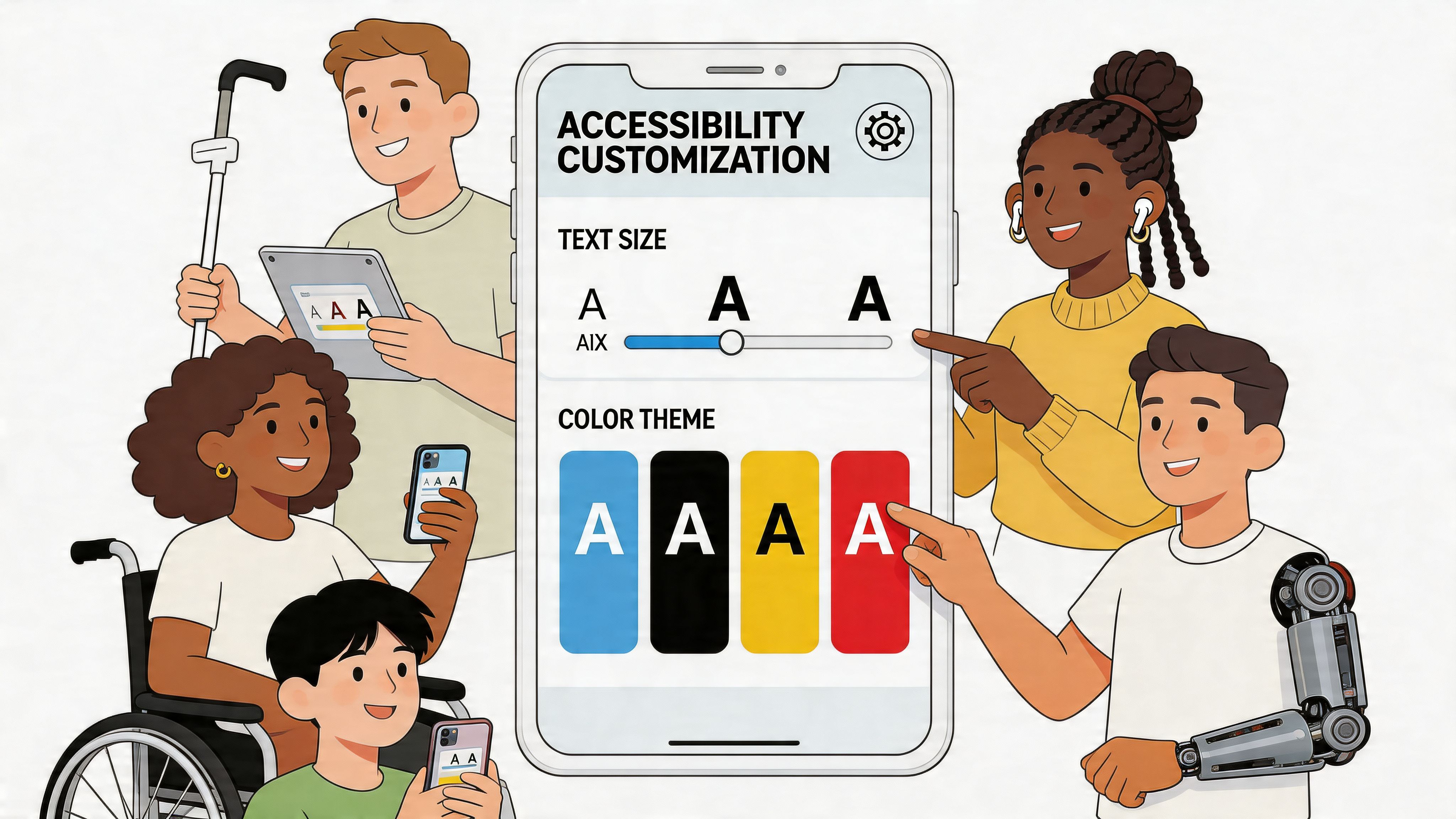
Accessibility starts at the system level
Accessibility problems usually come from layered implementation choices, not one dramatic mistake. A field loses its visible label. A custom wrapper removes focus styling. An error state relies on colour alone. A modal opens, but keyboard focus lands somewhere behind it.
Polaris gives you a strong base, but it does not cover poor implementation. Teams still need to choose the right component, write clear labels, connect help text properly, and test keyboard behaviour on real screens.
This is the part many teams leave too late. They build the happy path first, then patch accessibility near submission. That slows review and usually creates rework in forms, overlays, and validation states. The faster route is to treat accessibility as part of the same workflow as theming. Use the default Polaris structure first. Add custom styling second. Test keyboard and screen reader behaviour before the design spreads across the app.
Accessibility problems in embedded Shopify apps usually show up in keyboard testing before they show up in visual QA.
A practical accessibility checklist
Before I put an app forward for review, I check the screens merchants use most and the screens that fail most often under pressure, such as onboarding, settings, and save flows.
- Form labelling: Every input has a clear visible label. Helper text adds context instead of repeating the field name.
- Keyboard order: Tabbing follows the visual and logical flow of the page.
- Focus visibility: Focus states stay obvious, including inside branded wrappers or custom containers.
- Status messaging: Success, warning, and error states still make sense without relying only on colour.
- Modal behaviour: Focus moves into the modal on open and returns to a sensible trigger on close.
- Responsive readability: Content remains understandable on narrower admin widths, with no hidden critical actions.
This is a useful point to pause and watch Polaris accessibility patterns in practice:
Responsive design still matters in admin apps
Desktop-first assumptions cause avoidable issues in Shopify admin. Merchants use smaller laptops, split-screen layouts, and tablets more often than app teams expect. A page that looks fine on a large monitor can become hard to scan once cards stack badly, tables compress, and inline actions wrap into clutter.
The fix is usually structural, not decorative. Keep sections stackable. Avoid dense two-column forms unless both columns need to be read together. Break large settings cards into smaller task-based groups. Move low-priority actions out of crowded rows.
A quick pattern check helps:
| Layout decision | Better choice |
|---|---|
| Two equal columns by default | Stack unless both columns are necessary together |
| Wide settings cards with many fields | Split into smaller cards by task |
| Inline actions in crowded rows | Move less-used actions into menus |
Accessibility and responsive design reinforce each other. Simpler layouts produce cleaner focus order, clearer hierarchy, and fewer merchant errors. That is also the version of the app that tends to get through review with less back-and-forth.
Passing the 'Built for Shopify' Design Review
Most review failures I see aren’t caused by one huge flaw. They come from a pattern of avoidable shortcuts. A custom banner here, awkward navigation there, a modal that feels detached from Shopify admin, inconsistent wording across settings pages. None of it looks catastrophic in isolation. Together it signals that the app isn’t fully aligned.
That’s why review readiness is less about one final checklist and more about whether your design system discipline held up through delivery.

App Bridge is part of design quality
If Polaris gives you the visual language, App Bridge gives you the embedded behaviour that makes the app feel at home in Shopify admin. Review notices when that layer is missing.
Use App Bridge for the parts of the experience that should integrate with the host environment rather than pretending your app is a standalone dashboard. That includes navigation patterns, contextual actions, and native-feeling UI feedback.
A practical test is simple: if your app feels like a mini SaaS product wedged inside an iframe, it probably needs App Bridge work.
The review checklist I use before submission
I don’t treat review prep as a generic QA pass. I use a focused design and embedded experience checklist:
Page hierarchy is obvious
Titles, sectioning, and primary actions make sense without reading every word.Action priority is consistent
There’s one dominant next step per screen. Secondary actions don’t compete with it.Polaris patterns are used as intended
No home-grown substitutes for core controls unless there’s a strong product reason.Embedded behaviour feels native
Navigation, modals, and feedback align with Shopify admin expectations.Accessibility basics are covered
Keyboard flow, labels, contrast, and focus states are all verified.States are complete
Empty, loading, success, error, and destructive flows all look deliberate.
Reviewers often flag the seams. The seams are where your custom decisions stop looking like Shopify.
Common reasons apps get bounced
These are the recurring issues that slow otherwise solid apps:
| Problem | Why it gets flagged |
|---|---|
| Over-customised controls | The app stops feeling native |
| Inconsistent spacing and typography | The UI looks assembled, not designed |
| Weak empty states | The product feels unfinished |
| Standalone-style navigation | Embedded experience conflicts with admin expectations |
| Incomplete destructive flows | Risk isn’t communicated clearly |
Most of these aren’t hard to fix. They’re hard to notice when the same team built the app and got used to its quirks.
QA needs realistic task testing
Review-safe UI doesn’t come from clicking around randomly. Test real merchant tasks from start to finish.
Run scenarios like:
- install and reach first meaningful value
- connect settings and save
- trigger a sync or core action
- recover from a validation or API failure
- return later and edit an existing configuration
That style of QA catches the gaps static screen review misses. It also exposes where copy is too vague, where feedback is delayed, and where navigation feels heavier than it should.
If you want a more formal benchmark for design and product requirements, this guide to Built for Shopify app development is a useful reference point for submission planning.
Shopify Polaris Design FAQs
Can you use Polaris without React
Yes. We have shipped review-ready embedded apps with stacks other than React, but the margin for error is smaller.
The practical issue is maintenance. Polaris React gives you a lot of behavior for free, including focus management, keyboard support, predictable states, and interaction patterns that already feel right inside Shopify admin. Once you rebuild those pieces in Angular, Vue, or a custom frontend, your team owns every detail. Small misses add up fast, especially in forms, modals, popovers, and tables.
Treat Polaris as a product standard, not a styling kit. Match structure, spacing, copy patterns, loading states, and interaction behavior closely enough that a reviewer never has to stop and ask why one screen feels different from the rest of admin.
How do you build custom components without breaking Polaris consistency
Start from the merchant task, then wrap custom logic in familiar Polaris structure. That approach gets approved faster than designing a fully bespoke surface and trying to make it look native afterward.
A good pattern is to keep the surrounding frame standard. Use Polaris page layout, section hierarchy, labels, actions, validation, and feedback states. Put your custom scheduling grid, rules builder, or data visualisation inside that frame. The merchant gets a UI that feels native, and your team keeps room for product-specific functionality.
A few checks catch most problems:
- use Polaris spacing and typography tokens consistently
- keep field labels, helper text, and status language aligned with the rest of the app
- preserve keyboard flow and visible focus states
- keep custom visuals restrained unless the feature itself needs visual emphasis
If the custom component becomes the loudest thing on the page, it usually needs another pass.
What usually hurts performance in Polaris apps
Heavy screens do. Polaris is rarely the root cause.
The slowdowns we see in audits usually come from rendering too much data at once, stacking setup and reporting into one view, or wiring forms so broadly that every keystroke rerenders half the page. Embedded apps feel better when each screen has one clear job.
The fixes are usually straightforward:
- paginate or virtualise long lists
- split complex views by task
- isolate form state to reduce rerenders
- load secondary panels after the primary action is usable
- mount overlays only when needed
Fast apps are often simpler apps.
How much should you customise for brand
Keep branding selective. Merchants are already inside Shopify admin, so they value consistency more than brand theatre.
Use brand in tone, illustrations, onboarding moments, and a few accent choices. Leave core controls alone unless there is a strong product reason to change them. Reworked buttons, inputs, and navigation rarely improve usability, and they create extra review risk.
For teams planning around current review expectations, Built for Shopify 2025 changes and their impact on app growth gives useful context on how stricter standards affect distribution and growth.
What’s the simplest path to a review-ready Polaris app
Start with default Polaris components and tokens. Keep information architecture plain. Use App Bridge correctly. Test with realistic merchant flows before final polish. Fix accessibility issues while the UI is still easy to change, not after design sign-off.
That workflow is the fastest route we have found in agency delivery. Teams that begin with tokens, compose with standard components, and review every custom pattern against approval criteria spend less time reworking screens late in the cycle.
If you need a team to fix an existing app UI, align a new embedded product with Polaris, or prepare a public app for review, Grumspot handles Shopify design and development work including custom and public apps built to meet Shopify’s approval expectations.
Let's build something together
If you like what you saw, let's jump on a quick call and discuss your project

Related posts
Check out some similar posts.

- Shopify public app development
Your expert guide to Shopify public app development. Learn to build, secure, and launch a successful...
Read more
- Shopify embedded app development
Master Shopify embedded app development. Build, authenticate, deploy, & submit 'Built for Shopify' a...
Read more
- built for Shopify app development
Your complete guide to Built for Shopify app development. Learn to plan, build, test, and launch a c...
Read more
- Shopify custom app developer
Guide to hiring a Shopify custom app developer. Learn about costs, timelines, hiring checklists, and...
Read more