Conversion Rate Optimization UX: An Ecommerce Playbook 2026
- conversion rate optimisation ux
- ecommerce cro
- shopify conversion
- ux design for sales
- a/b testing guide
Launched
June, 2026
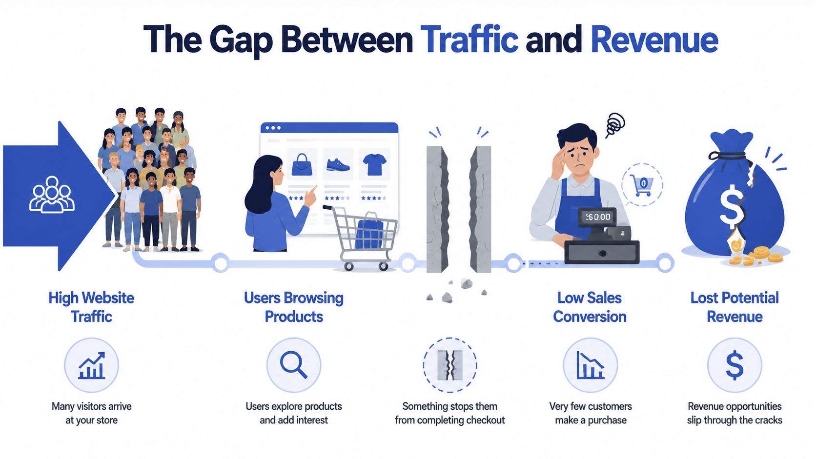
You're probably looking at a familiar dashboard. Traffic is healthy. Paid campaigns are driving visits. Organic is holding up. Your Shopify store isn't empty. People browse, click into products, even add items to cart. Revenue, though, hasn't moved the way it should.
That gap usually isn't a traffic problem. It's a UX problem.
Most stores don't need more random “CRO tactics”. They need a working system for conversion rate optimization UX. That means finding friction with evidence, turning that evidence into hypotheses, testing changes in a controlled way, reading results properly, and deciding what to do next without defaulting to whoever has the strongest opinion in Slack.
The Gap Between Traffic and Revenue
A lot of ecommerce teams get trapped in surface-level optimisation. They change button colours, move trust badges, rewrite headings, or install another app because a competitor uses it. Sometimes something improves. Often it doesn't. The bigger issue is that the process itself is weak.
Healthy traffic with flat sales usually means users are interested enough to arrive, but something in the experience stops them from progressing. On Shopify stores, that often shows up in places like collection page filtering, product page clarity, variant selection, shipping transparency, cart friction, or mobile checkout flow.
What a proper CRO UX process looks like
The playbook that works isn't linear in practice. It loops.
- Audit the journey to find where users hesitate, abandon, or get confused.
- Build hypotheses tied to observed behaviour, not internal assumptions.
- Run experiments with clear controls, meaningful goals, and clean implementation.
- Analyse the result beyond “won” or “lost”.
- Prioritise the next cycle so the backlog stays tied to impact.
Practical rule: If you can't explain which user problem a test is meant to solve, don't run the test.
That mindset changes everything. You stop asking, “What should we tweak next?” and start asking, “Where is the experience failing, for whom, and why?” That's where conversion gains become repeatable instead of accidental.
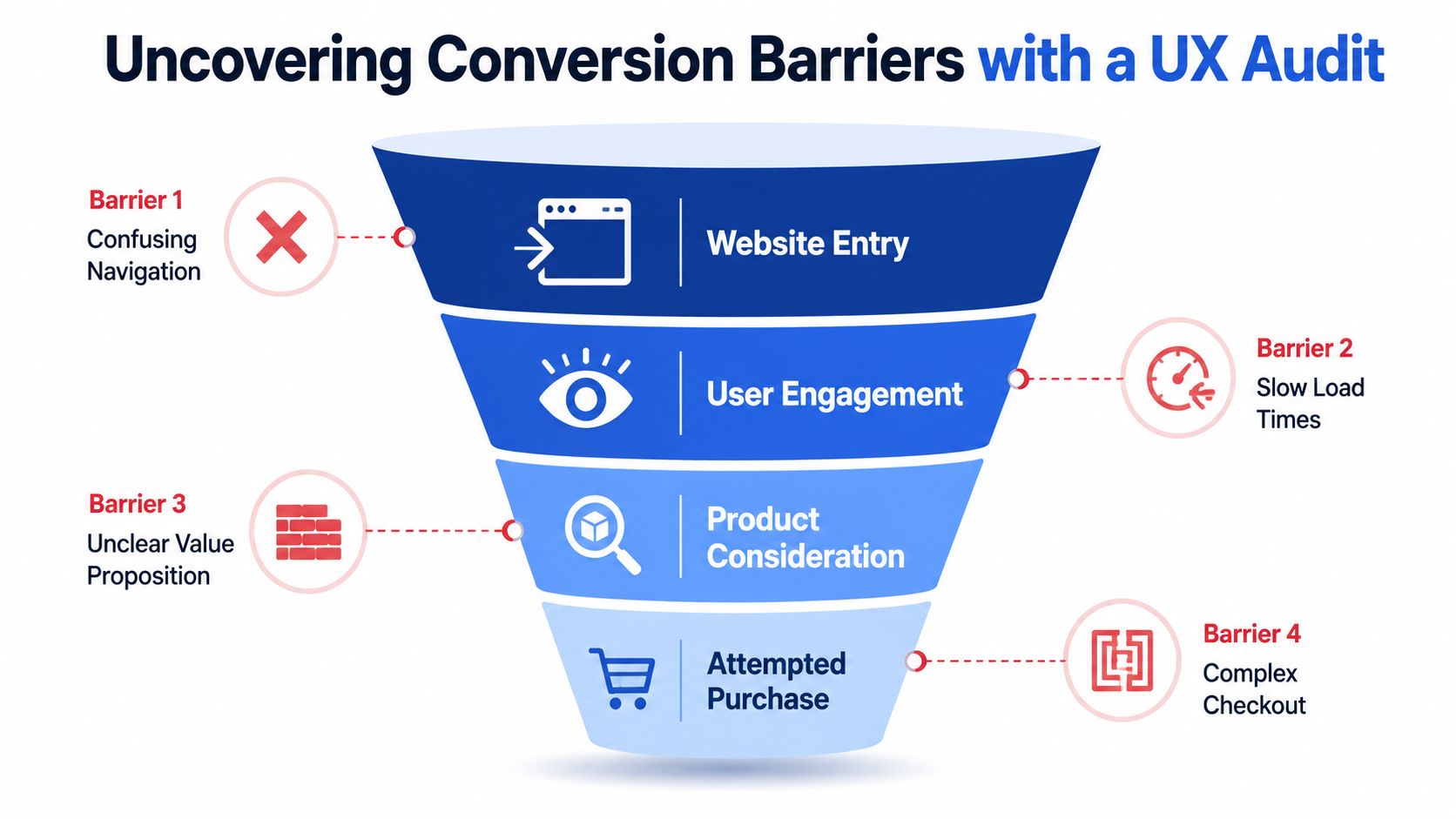
Uncovering Conversion Barriers with a UX Audit
A good UX audit doesn't begin with opinions about design quality. It begins with evidence. On ecommerce projects, I want three views of the same problem: what users are doing, why they seem to be doing it, and where the interface itself is likely creating friction.
Early in the audit, visualising the funnel helps teams stop treating the site as one big blob of performance data.
Quantitative analysis shows what is happening
Start with analytics. On Shopify, that usually means reviewing GA4, Shopify analytics, and whichever attribution layer the brand trusts for decision-making. The point isn't to stare at aggregate conversion rate. It's to isolate the pages and steps with obvious leakage.
Look at behaviour by template and funnel step:
- Collection pages: Are users landing but not clicking into products?
- Product pages: Are strong traffic sources underperforming once users arrive?
- Cart: Are users dropping after seeing shipping or promo code fields?
- Checkout: Are mobile users abandoning at a specific step?
A quantitative pass helps narrow the search area. If a women's footwear collection drives engaged traffic but specific product pages fail to convert browsing into cart activity, the issue likely isn't ad targeting. It's the on-page experience.
Qualitative research reveals why users are struggling
Numbers tell you where to look. Session recordings, on-site polls, support tickets, and user feedback show what the numbers can't, allowing many teams to finally see the friction they've been arguing about internally for months.
For example, on a Shopify product page you might notice users:
- repeatedly tapping size guides but never opening useful information
- scrolling up and down to re-check delivery details
- hovering around variant selectors that don't clearly show availability
- opening product images but failing to spot material or fit details
That's why qualitative work matters. Ecommerce stores conducting regular qualitative user research, such as analysing session recordings, are able to identify conversion-blocking friction points up to 75% faster than stores relying solely on quantitative data according to research on UX research impact.
A strong audit process in ecommerce overlaps with broader digital product practice. If you want a useful cross-discipline reference, this UX audit guide for AI SaaS founders is worth reading because the underlying audit logic carries over well, even though the conversion events differ.
Here's a practical walkthrough of the type of review teams often use before changes go live:
Heuristic review catches obvious friction fast
A heuristic audit is the fastest way to flag experience issues without waiting for a full research cycle. During this process, a senior CRO strategist or UX lead reviews the site against known usability principles.
On Shopify stores, common heuristic failures include:
| Area | What often goes wrong | Why it hurts conversion |
|---|---|---|
| Navigation | Menus are overcrowded or labels are vague | Users can't find the right path quickly |
| Product detail | Benefits, shipping, returns, and sizing are buried | Buyers delay decisions or leave to “check later” |
| Mobile UX | Sticky elements cover content or CTAs sit too low | Users lose momentum on smaller screens |
| Cart and checkout | Promo field, upsells, and account prompts create noise | Intent gets disrupted near purchase |
A UX audit should leave you with specific friction points, not a list of aesthetic preferences.
That distinction matters. “The product page feels weak” is useless. “Mobile users repeatedly open the shipping accordion before adding to cart, which suggests delivery information is too hidden” is actionable.
Building Strong Hypotheses from User Insights
Weak hypotheses sound like design suggestions. Strong hypotheses sound like business logic tied to user behaviour.
The difference is simple. A weak version says, “Let's redesign the product page hero.” A strong version says, “Because users aren't seeing the details they need to buy, we believe repositioning key decision information closer to the primary CTA will increase add-to-cart intent for mobile visitors.”
Use a rigid hypothesis format
The format I prefer is:
Because we observed [data or insight], we believe that [change] for [user segment] will cause [impact].
That structure forces discipline. It stops teams from treating preference as insight. It also makes test readouts much cleaner later because everyone knows what the expected behavioural shift was supposed to be.
A good hypothesis should include:
- Observed evidence: session replay pattern, funnel drop-off, support complaint, poll response
- Specific change: not “improve UX”, but “move delivery and returns summary below Add to Cart”
- Defined audience: all users, mobile users, first-time visitors, paid social traffic
- Expected impact: higher add-to-cart intent, fewer exits, smoother checkout progression
Two ecommerce examples that are actually testable
Here's a realistic product page example.
Because session recordings show users ignoring tabbed descriptions and repeatedly scrolling to find shipping information, we believe that replacing hidden tabs with a short bulleted summary beneath the Add to Cart button for mobile users will increase add-to-cart intent.
And here's a checkout-side example.
Because funnel review shows users pausing at account creation and abandoning the flow, we believe that reducing the prominence of account-first messaging and making guest progression more obvious for first-time buyers will reduce checkout abandonment.
Notice what these do well. They don't jump straight to “redesign everything”. They isolate a user problem, tie it to one change, and define the audience that matters.
Working advice: If a hypothesis includes three or four major changes, it isn't a hypothesis. It's a redesign request.
Anchor hypotheses to the customer journey
Journey mapping helps teams. If your team doesn't think in journeys, it usually tests pages in isolation and misses intent shifts between collection, product, cart, and checkout. A shopper arriving from Google search behaves differently from someone returning via email or clicking an Instagram ad. Their objections differ too.
A good primer on that thinking is this guide to customer journey mapping. It's especially useful when your store has multiple entry points and the same template performs differently by traffic source.
For Shopify brands, hypothesis quality improves when you group insights by journey stage rather than by page type alone:
- Discovery problems: collection filters, category clarity, sorting logic
- Evaluation problems: images, social proof, delivery clarity, comparison information
- Commitment problems: cart distractions, checkout friction, policy uncertainty
That framing keeps your CRO UX programme focused on buyer progress, not isolated interface tweaks.
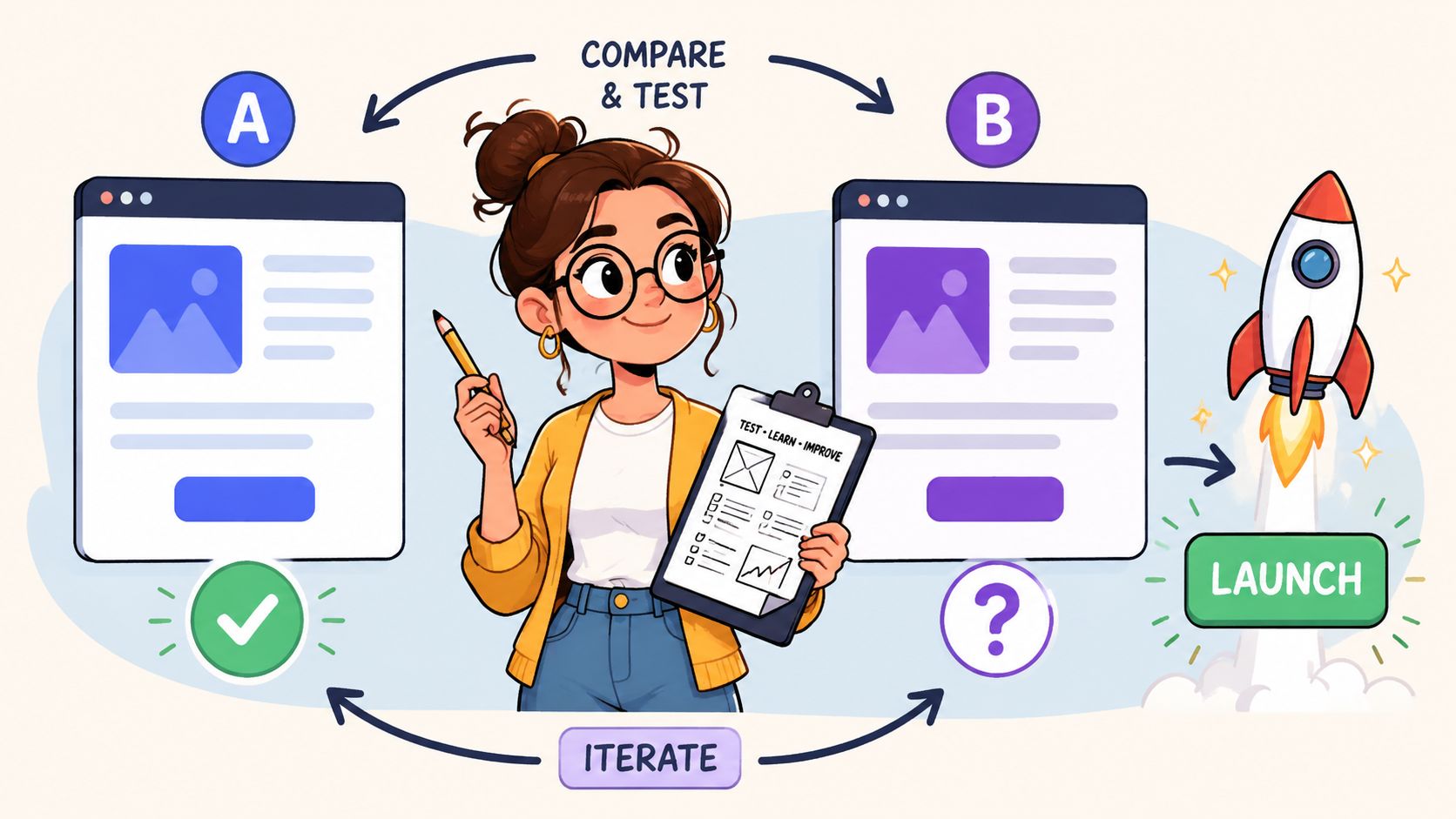
Designing and Launching Meaningful UX Experiments
Testing failures seldom stem from a deficiency in tools. Instead, such failures often arise from flawed execution. This involves bundling too many changes into one variation, ending experiments based on impatience, or choosing metrics that don't reflect buying intent.
The split-testing setup needs to be as disciplined as the hypothesis that created it.
Pick the right test type
Not every UX change belongs in a standard A/B test.
| Test type | Best use case | Common ecommerce example |
|---|---|---|
| A/B test | One focused change against a control | Original product gallery versus revised gallery layout |
| Multivariate test | Multiple element combinations on a stable page | Testing headline, CTA copy, and trust icon placement together |
| Split URL test | Bigger structural differences | Two distinct landing page templates for campaign traffic |
For most Shopify stores, A/B testing is the right place to start. It's easier to interpret, easier to QA, and less likely to produce muddy learning.
A practical Shopify test setup
Take a common scenario. A product page gets traffic, but users don't engage enough with the image gallery to feel confident buying. The hypothesis is that a revised gallery layout with clearer thumbnails and stronger image sequencing will improve product understanding and increase Add to Cart clicks.
The setup should look like this:
Define the control
Keep the current product page experience unchanged.Define the variation
Introduce the revised gallery only. Don't also change the title treatment, review placement, and delivery messaging in the same test.Choose the primary metric
For this example, a sensible primary goal is Add to Cart clicks on the tested product template.Choose guardrail metrics
Watch for changes in bounce behaviour, cart progression, and downstream checkout quality. A variation that increases clicks but sends lower-intent traffic into the cart isn't automatically a win.Target the right audience
If the issue appears mostly on mobile PDPs, target mobile traffic. Don't dilute the result by forcing a universal rollout in the experiment.
If you need a technical overview of implementation options, this resource on Shopify A/B testing services gives a useful breakdown of how stores approach test delivery on the platform.
Tool choice matters less than process quality
Teams often overthink the platform. VWO, Shopify-compatible testing tools, feature flag systems, and custom implementations can all work if setup and QA are solid. What matters more is whether your stack can control audience allocation, preserve site performance, and track the event you care about.
One reason process matters so much is that test success rates are lower than commonly assumed. A study by VWO found that only about one in every eight A/B tests produces a statistically significant positive result, which is why disciplined experimentation beats random guesswork, as noted in VWO A/B testing research.
That isn't discouraging. It's useful. It tells you to build a pipeline where learning matters, not just wins.
What usually breaks an otherwise good test
I see the same mistakes repeatedly:
- Too many changes at once: You can't tell what caused the effect.
- Poor QA on mobile: Variant bugs contaminate the result.
- Bad audience selection: Returning customers may behave very differently from cold traffic.
- Stopping early: Stakeholders get excited or nervous before the test has enough evidence.
- Conflicting experiments: Two tests touch the same experience and pollute each other.
The test isn't just the variation. The test is also the targeting, tracking, QA, and patience.
If your team gets those parts right, the quality of your conversion rate optimization UX programme improves quickly.
Measuring Real Impact Beyond Conversion Rates
A test result isn't useful just because a dashboard shows a winner. The important work starts after the experiment finishes. You need to know whether the result is reliable, whether it holds across segments, and whether it improved the business outcome that matters to you.
The cleanest teams treat test analysis as interpretation, not scoreboard watching.
Read the result before you celebrate it
Statistical significance matters because it helps separate signal from noise. If a variation appears to outperform the control but the evidence is still weak, shipping it across the store can lock in the wrong lesson.
That's why teams should understand the basics of statistical significance testing before making rollout calls. You don't need everyone to become a data scientist. You do need them to stop mistaking early movement for a proven outcome.
A dashboard can help anchor the analysis in more than one metric.
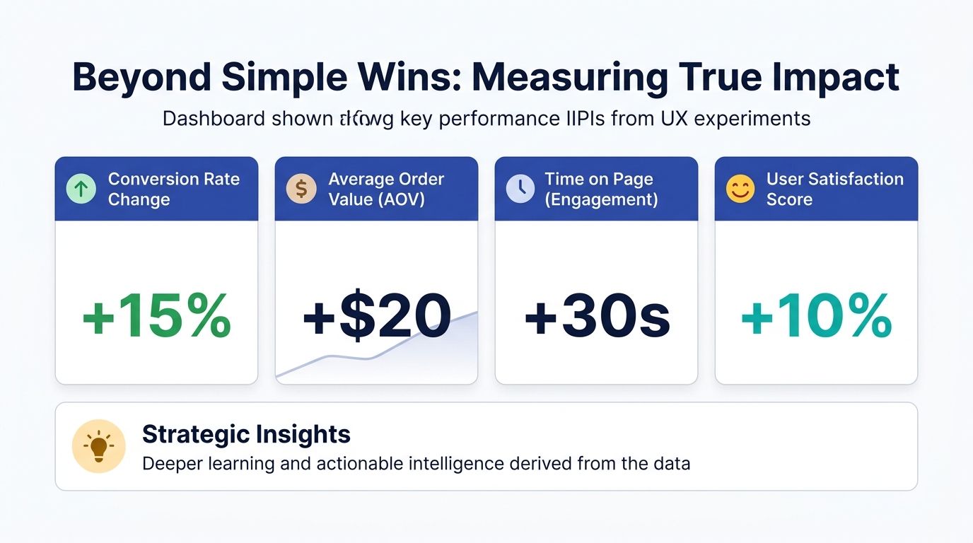
Check secondary metrics and segment behaviour
An ecommerce experiment can “win” on its main metric while creating damage elsewhere. That's especially common on Shopify stores with aggressive merchandising or promotional overlays.
Look at the result from several angles:
- Device type: Did mobile improve while desktop stayed flat or declined?
- Traffic source: Did paid social users respond differently from branded search visitors?
- User type: Did first-time buyers benefit while returning customers were unaffected?
- Down-funnel quality: Did more users click Add to Cart but fewer completed checkout cleanly?
If you tested a more prominent bundle module on a product page, for example, the variation might increase product interaction while also distracting users from the primary purchase path. Without reading downstream metrics, you could ship a change that looks good at the top of the funnel but underperforms later.
Extract the lesson, not just the outcome
The strongest readouts answer three questions:
| Question | What you're trying to learn |
|---|---|
| What happened? | Whether the variation outperformed, underperformed, or stayed inconclusive |
| Why did it happen? | Which user objection or behavioural pattern appears to explain the result |
| What should change next? | Whether to roll out, refine, segment further, or reject the idea |
Don't write test summaries like “Variation B won”. Write them like “Users responded to earlier delivery clarity, but only on mobile PDP traffic”.
That level of interpretation helps your next round of hypotheses improve. Over time, your testing programme becomes less about isolated wins and more about building an evidence base for how your customers buy.
Prioritising Your Next Optimisation Cycle
Once a store starts auditing properly and testing with discipline, the backlog fills up fast. That's a good problem, but it still needs control. Without a prioritisation model, the roadmap gets hijacked by redesign impulses, stakeholder preference, or whichever bug was mentioned most recently in a meeting.
A simple framework works best. I like ICE because it's easy for cross-functional teams to use without turning prioritisation into a spreadsheet hobby.
Use ICE to sort signal from noise
ICE stands for Impact, Confidence, Ease.
- Impact: If this works, how meaningful is the business effect likely to be?
- Confidence: How strong is the supporting evidence from audit findings, behaviour patterns, or prior tests?
- Ease: How difficult is it to design, build, QA, and launch cleanly on the current Shopify setup?
A change to make delivery and returns messaging clearer on high-intent product pages may score well across all three. A full navigation rebuild might have potential impact, but lower ease and lower confidence if your evidence is still thin.
Prioritisation should reward clarity
Good prioritisation doesn't just rank ideas. It filters out poor ones.
When reviewing a CRO UX backlog, I'd move anything vague or politically driven to the bottom. “Refresh the homepage” isn't a strong candidate. “Test surfacing collection-specific filters earlier on mobile because users struggle to narrow large assortments” is.
A healthy optimisation cycle usually includes a mix of work:
- Fast fixes: broken hierarchy, hidden information, poor CTA placement
- Focused tests: hypothesis-driven experiments on key templates
- Strategic bets: bigger ideas with stronger implementation effort
The stores that improve steadily aren't the ones with the most ideas. They're the ones that choose the next idea well.
That's the part many teams miss. Conversion rate optimization UX isn't a one-off project you complete and file away. It's an operating rhythm. Audit, hypothesise, test, analyse, prioritise, then repeat. When that rhythm becomes part of how your ecommerce team works, growth stops depending on lucky guesses.
If your Shopify store has traffic but too much friction between product discovery and purchase, Grumspot can help you tighten the experience with conversion-focused UX, experimentation, and development that's built for fast-moving ecommerce teams.
Let's build something together
If you like what you saw, let's jump on a quick call and discuss your project

Related posts
Check out some similar posts.
- conversion rate optimisation case studies
Explore 7 in-depth conversion rate optimization case studies. Learn from Grumspot, VWO, & more to fi...
Read more
- shopify conversion rate optimization
Unlock growth with our 2026 Shopify conversion rate optimization playbook. Learn data-driven strateg...
Read more
- ecommerce website development agency
Partner with an ecommerce website development agency to build scalable stores, boost conversions, an...
Read more