Learn How to Improve Conversion Rate Optimization
- how to improve conversion rate optimization
- cro framework
- ecommerce cro
- shopify conversion rate
- cro for shopify
Launched
July, 2026

You're looking at the dashboard, the traffic is there, the ads are spending, the product pages are getting visits, and the sales line still feels stuck. That's the point where most store owners start hunting for more tactics, when the actual problem is usually a missing diagnosis. How to improve conversion rate optimization starts with finding the one place where your store is leaking revenue, then fixing that first instead of scattering effort across a long checklist.
A good benchmark helps you avoid chasing a fantasy target. UK-focused Shopify guidance says a conversion rate between 2.5% and 3.5% is generally ideal for Shopify stores, while broader market data sits at 1.82% as of April 2023, so the gap between “average” and “strong” is real and commercially meaningful (Shopify UK CRO statistics). That means the job is not to copy someone else's site, it's to understand where your own funnel is underperforming.
If you want a practical companion to this approach, Chase McGowan's CRO advice is a useful read because it reinforces the same principle, keep the work grounded in actual behaviour, not random page tweaks. Grumspot's own conversion rate optimisation case studies also show how performance changes when the fix matches the problem, rather than when a team merely adds more “best practices” to the mix.
Moving Beyond Generic CRO Checklists
Many in-house ecommerce teams do not lack ideas. They lack a clear way to decide which idea deserves attention first. That is why conversion work often turns into a pile of disconnected tweaks, a new badge here, a different button there, a rewritten headline somewhere else, with no clear line to revenue.
A better starting point is to compare your store against a realistic baseline, then identify where the gap sits. If your store is close to the market average, a modest improvement can change the economics of a page quickly, especially on high-traffic product or category pages. UK guidance also recommends prioritising the pages that already receive the most traffic and convert the least, because that is where small wins create the most absolute revenue.
Start with the right benchmark
A benchmark only helps when it changes decisions. The ideal range of 2.5% to 3.5% from Shopify UK gives you context, but it does not tell you where to act. If you are below that range, the fix may be structural, not cosmetic.
That is where the usual checklist approach falls apart. Faster pages, clearer copy, and stronger CTAs matter, but they are not equally relevant to every store. A Plus merchant with strong traffic and weak checkout completion needs a different answer from a smaller store with poor product-page engagement.
Practical rule: Do not start with tactics. Start with the largest measurable gap between visits and purchases.
Useful inspiration still comes from broader CRO work, but it should stay subordinate to your data. For a diagnosis-led example, see Chase McGowan's CRO advice, which keeps the focus on behaviour rather than random page tweaks. For another practical reference point, Grumspot's Shopify CRO audit approach shows how an audit changes when the diagnosis comes first.
A better question is to identify where revenue disappears
A long checklist can make teams feel busy while the main leak stays untouched. A better question is to identify where revenue disappears, then work out which part of the journey is losing the most money. Once you know that, you can decide whether the issue is traffic quality, product page clarity, cart friction, or checkout abandonment.
That shift matters because CRO is not about improving the site in the abstract. It is about changing the part of the buying journey that stops shoppers from completing the action they already intended to take. Stores that grow consistently treat CRO as a prioritisation problem first and a design problem second.
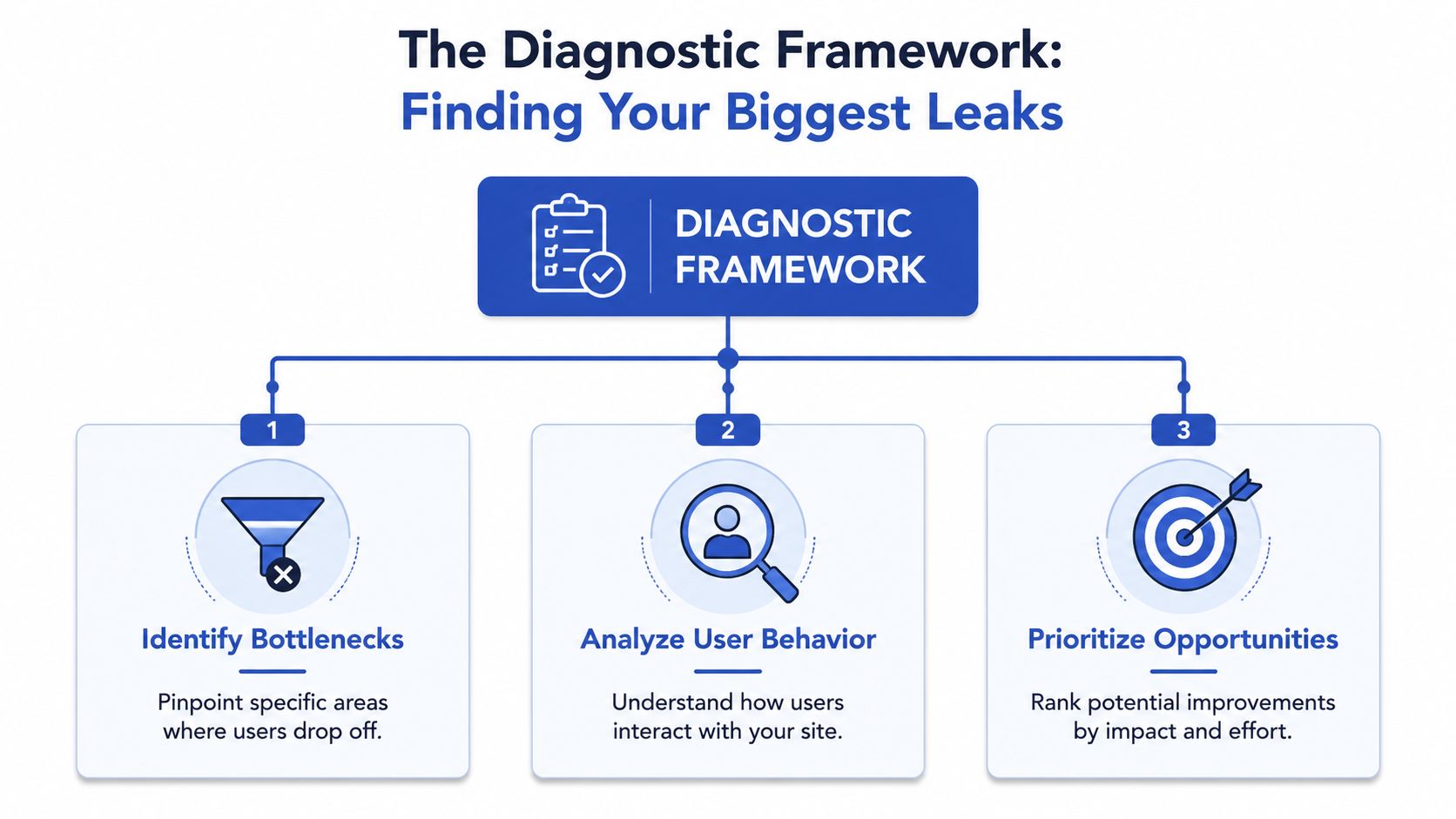
The Diagnostic Framework Finding Your Biggest Leaks
A useful diagnostic process starts with the funnel, not the homepage. In ecommerce, revenue usually leaks somewhere between product discovery and completed purchase, and the fastest way to find it is to inspect each stage in sequence. UK-focused guidance recommends segmenting the journey into product view → add to cart → begin checkout → complete purchase, then identifying the stage with the largest drop-off before changing anything (Shopify UK ecommerce conversion rate).
Quantitative analysis first
GA4 should show where shoppers fall out of the funnel. Track movement between product view, add to cart, begin checkout, and completed purchase, then break those steps down by device and traffic source. That split matters because a blended number can hide a mobile issue, a paid traffic issue, or a landing page mismatch.
The point is not to stare at one overall conversion metric. The point is to find the stage where abandonment is most concentrated, then ask whether the problem is visibility, trust, friction, or a technical failure. If the drop is largest on product pages, checkout is probably not the first place to look. If the decline happens after checkout begins, the issue is often payment friction or a missing trust signal.
Qualitative analysis explains the behaviour
Numbers show where people left. Behaviour tools show what they were doing before they left. Heatmaps, scrollmaps, and session recordings let you see whether visitors miss the CTA, get distracted by competing elements, or hesitate on fields that look harmless in a spreadsheet.
Use that evidence to check for patterns rather than one-off oddities. If users repeatedly click non-interactive elements, the page is communicating badly. If mobile visitors rage-click or abandon after zooming in on a form, the issue may be layout, spacing, or tap-target design. The value here is not novelty, it is confirmation of a pattern strong enough to justify a change.
Technical and SEO issues still kill conversion
Speed and usability are part of CRO. UK conversion guidance says a 1-second improvement in load time can increase conversions by 7%. That makes performance work part of the diagnostic phase, not an afterthought. Image compression, script reduction, and Core Web Vitals fixes often beat cosmetic redesigns because they remove friction before shoppers even evaluate the offer.
If a page is slow, confusing, or hard to use on mobile, you don't have a persuasion problem yet. You have a usability problem.
A quick audit can also check navigation clarity, mobile stacking, and whether the store creates dead ends for search-driven visitors. If the page experience is weak, even strong traffic will underperform, and A quick audit can help you spot the biggest structural leaks before you touch the design.
From Problems to Prioritised Hypotheses
A diagnosis without a decision framework just creates a longer list of issues. The next step is to turn each problem into a hypothesis you can test, then rank those hypotheses by expected impact. That is where many CRO programmes get stuck, because teams know what's wrong but not what to do first.
A strong hypothesis names the change, the expected effect, and the reason the effect should happen. For example, if checkout abandonment is high, a hypothesis might be that reducing friction around payment increases completion because shoppers no longer hit unnecessary interruption at the final step. The exact wording matters less than the logic, the change must be testable and tied to a measurable outcome.
The prioritisation method can stay simple. A PIE-style score, Potential, Importance, Ease, helps separate meaningful work from convenient work. Potential asks how much improvement the idea could generate, Importance asks how much of the revenue funnel it touches, and Ease asks how quickly it can be implemented and tested.
| Example Hypothesis Prioritisation using PIE | |||||
|---|---|---|---|---|---|
| Hypothesis | Potential | Importance | Ease | Total Score (P+I+E) | Priority |
| Reduce checkout fields to remove friction | High | High | Medium | High | 1 |
| Add clearer product-page CTA copy | Medium | High | High | High | 2 |
| Move coupon entry behind a secondary link | Medium | Medium | High | Medium | 3 |
| Add extra social proof to a low-traffic blog page | Low | Low | High | Low | 4 |
A key advantage of this approach is focus. A 90-day GA4 review that identifies the three pages accounting for the most lost revenue is a more decision-ready method than following generic best-practice checklists (Peak Digital UK playbook). That kind of prioritisation keeps the team away from low-impact busywork.
A good rule is to ask whether a fix changes the economics of a page or just improves its appearance. If it doesn't materially affect a high-loss stage in the funnel, it probably doesn't deserve the first round of attention.
Running A/B and Multivariate Tests on Shopify
Once a hypothesis is ranked, testing becomes the safest way to prove whether it deserves a permanent rollout. A/B testing is the cleaner tool when you want to compare one change against one control, such as a CTA rewrite, a product-page layout change, or a checkout trust signal. Multivariate testing belongs in more mature accounts, when you need to understand how several elements interact at once.
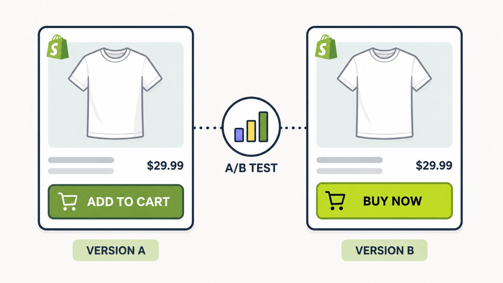
Choose the test type for the size of the question
Use A/B testing when the question is narrow and the page has enough traffic to isolate a clear outcome. That's the right choice for Shopify product pages, collection pages, and checkout-friction fixes because you usually want one change with one reading. Multivariate testing is more useful when the interface has several interacting components and you need to learn which combination performs best.
A common mistake is testing too much at once. When teams change the headline, hero image, CTA, and trust copy simultaneously, they may get a winner, but they won't know why it won. That makes the next test weaker because the insight is blurred.
Significance matters more than optimism
A test that looks promising after a few days can still be misleading. Early spikes often reflect traffic mix, device mix, or a temporary behavioural pattern rather than a real improvement. The discipline is to let the test run long enough to produce a credible result, then judge it against your success metric rather than a passing trend.
That's where testing tools matter. In a post-Google Optimize world, teams often use platforms such as Optimizely or VWO, with the choice shaped by traffic volume, implementation complexity, and whether the team needs deeper experiment management. The tool is less important than the discipline behind it, because the wrong interpretation can sink a good experiment.
End tests because the data is stable, not because the variant looks exciting.
If you want a more detailed framework for avoiding false wins, Grumspot's statistical significance testing guide is a useful reference for interpreting results without overreacting to noise.
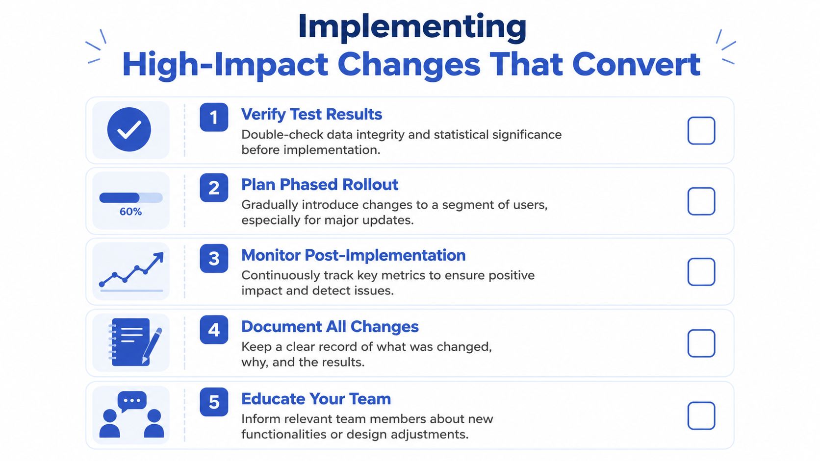
Implementing High-Impact Changes That Convert
A strong test only matters if the rollout preserves the lift. Weak implementation can wipe out gains, especially when a change touches layout, messaging, checkout flow, Shopify templates, apps, or localisation settings. Treat the move from experiment to production as a controlled release, not a copy-and-paste task.
Design changes should remove hesitation
Conversion design should make the next action obvious and reduce the mental effort needed to continue. A clear CTA, a visible hierarchy, useful product detail, and trust signals placed where doubt appears all help shoppers move forward.
Social proof works best at the point of uncertainty, not as decoration. Reviews, customer logos, and evidence of real use belong near product decisions and checkout-adjacent pages, where hesitation usually appears. If the page feels persuasive but still unclear, simplify the page before adding more elements.
A common mistake is adding more proof when competing priorities are the underlying problem. On a product page, one strong benefit statement near the price often does more work than a crowded block of badges and quotes.
Speed is a conversion feature
Site performance is part of the buying experience. UK guidance has linked a 1-second load-time improvement to a 7% conversion increase, which is why merchants should treat performance work as revenue work. Image compression, script reduction, and Core Web Vitals cleanup often produce better results than a visual refresh that leaves the page heavy.
Practical rule: Fix performance before you polish visuals. A prettier slow page still loses sales.
That applies across desktop and mobile, but mobile usually exposes the problem faster. Smaller screens, weaker connections, and less patience make speed and layout choices more visible to shoppers. If the page stutters during scroll or interaction, the shopper notices immediately.
Checkout should remove friction, not add persuasion
Checkout wins come from simplification. Baymard's research and UK ecommerce guidance point to the same core moves, guest checkout, fewer fields, upfront shipping and tax visibility, and coupon fields that do not interrupt payment completion (Baymard ecommerce CRO). These changes reduce the chance that a buyer stops at the finish line.
If the shopper has already decided to buy, do not make checkout feel like another sales page.
The same logic applies to payment options and mobile checkout. Shoppers need a path that feels safe, direct, and easy to complete on the device they are using. Extra form fields, forced account creation, and unclear delivery costs create avoidable drop-off.
Personalisation and internationalisation should be relevant, not gimmicky
Relevance improves when the store recognises returning customers, regional expectations, or different traffic sources. On Shopify Plus, that can mean tailoring product messaging by market, supporting local payment preferences, or adjusting copy so international visitors feel the store speaks their language. The goal is trust, not novelty.
One sensible option in this stack is Grumspot, which handles Shopify Plus builds, internationalisation, and CRO-led implementation for stores that need technical changes rolled into a proper release process. That matters because the strongest experiment still needs careful production work to keep the gain intact.
Building a Continuous Optimisation Programme
A strong CRO programme becomes part of the weekly operating rhythm. The stores that keep improving do not wait for a redesign cycle to remove friction. They keep a running record of what was tested, what won, what lost, and what the next highest-value hypothesis should be.
That loop matters because one fix often exposes the next bottleneck. A cleaner product page can move more shoppers into checkout, which then reveals payment friction that earlier drop-off had hidden. Good programmes use each result to narrow the next hypothesis, not to close the book.
A durable process also protects against false confidence. A lift in one week can fade if device mix changes, traffic quality shifts, or a promotion changes buyer behaviour. Post-implementation monitoring should check for side effects across the funnel, not just the one metric the test was built to move.
Documenting the work makes the programme smarter over time. Keep a simple knowledge base that records the problem, the hypothesis, the test setup, the result, and the implementation decision. That way, the next person who works on the page can see what has already been learned and avoid repeating the same experiment.
The answer to how to improve conversion rate optimisation is not a longer checklist. It is a repeatable way to find the biggest leak, prove the fix, and turn that insight into the next test. This systematic approach requires both strategic oversight and technical expertise. If you want help auditing the funnel, prioritising the highest-value pages, or implementing the changes on Shopify Plus, talk to Grumspot.
Let's build something together
If you like what you saw, let's jump on a quick call and discuss your project
Related posts
Check out some similar posts.
- conversion rate optimisation case studies
Explore 7 in-depth conversion rate optimization case studies. Learn from Grumspot, VWO, & more to fi...
Read more
- conversion rate optimisation ux
Learn our conversion rate optimization ux playbook. Transform your ecommerce store with expert strat...
Read more
- shopify conversion rate optimization
Unlock growth with our 2026 Shopify conversion rate optimization playbook. Learn data-driven strateg...
Read more
- shopify plus partner agency
Find the right Shopify Plus Partner Agency to scale your brand. Our 2026 guide covers services, eval...
Read more