Shopify Checkout Optimization: A 2026 Agency Playbook
- Shopify checkout optimisation
- Shopify Plus
- CRO
- Shopify conversion rate
- ecommerce checkout
Launched
April, 2026

Most Shopify stores don’t have a traffic problem at checkout. They have a friction problem.
In the UK, Shopify stores report an average checkout completion rate of 45.9% and a 70.2% cart abandonment rate, according to Uptek’s UK Shopify conversion data. That should reframe how you think about growth. The shopper has already found the product, added it to basket, and started buying. If they still don’t convert, the leak is usually in the final steps.
I treat Shopify checkout optimization as the most impactful CRO work on the store. It sits closer to revenue than almost anything else. Product page tweaks matter. Navigation matters. Paid acquisition matters. But checkout is where intent is strongest and excuses disappear. If that journey feels slow, confusing, demanding, or risky, buyers leave.
The merchants who win here usually don’t “redesign” checkout first. They strip out friction, prioritise speed, simplify decisions, and measure every drop-off point with discipline. On Shopify, that means knowing what you can improve with native settings, what requires Shopify Plus, and when legacy customisation is holding you back.
Why Checkout Optimisation Is Your Biggest Growth Lever
A small lift at checkout usually beats a much larger lift in traffic because checkout visitors are already close to revenue.
By the time a shopper reaches this stage, acquisition has done its job. Merchandising has done its job. The remaining question is whether the buying flow feels easy enough to finish. If it does not, you lose a customer you already paid to bring in.
That is why checkout work produces some of the cleanest returns in CRO. You are not persuading cold traffic. You are removing the last points of hesitation for people who have already chosen to buy.
Checkout improvements hit revenue faster than most CRO work
Teams often spend months testing hero banners, collection layouts, and promotional messages while the highest-intent part of the funnel stays untouched. In practice, I see bigger gains from reducing checkout friction than from another round of top-of-funnel design changes, especially on stores with healthy add-to-cart volume but weak checkout completion.
The reason is simple. Checkout problems are usually measurable and fixable.
A shopper drops because the form asks for too much, the shipping options are hard to compare, the payment mix does not match buyer preference, or the page creates doubt at the wrong moment. Those are operational issues, not abstract brand problems.
Rule I use with clients: if checkout completion is underperforming, fix that before increasing ad spend.
The biggest leaks come from friction you can audit
Most checkout losses are not dramatic. They are small pieces of effort and uncertainty that stack up until the customer leaves.
Common causes include:
- Decision overload: too many shipping choices, weak payment hierarchy, or a discount code field that pulls attention away from completion
- Form friction: unnecessary inputs, poor mobile spacing, slow validation, or error messages that appear too late
- Trust gaps: unclear delivery timing, limited payment reassurance, or forced account creation before the order is complete
These are the issues a good checkout audit should catch quickly. If you need a broader retention plan around this problem, this guide on how to reduce Shopify cart abandonment complements the checkout work.
On Shopify, the opportunity is not the same for every merchant
Many articles tend to be too generic. Shopify checkout optimisation depends on the plan you are on and the checkout architecture you are working with.
For standard Shopify merchants, the playbook starts with native settings, payment configuration, field reduction, and clearer shipping logic. For Shopify Plus brands, the ceiling is higher. The strategy changes again depending on whether the store is still carrying legacy checkout.liquid customisations or has moved to Checkout Extensibility, where app-based blocks, functions, and safer upgrade paths shape what is possible.
That distinction matters in real projects. Some stores need simple friction removal. Others need a migration plan that protects conversion while replacing brittle custom checkout code.
Expectations keep rising
Shoppers now expect checkout to feel fast on mobile, recognise their preferred payment method, and show clear delivery information before they commit. They compare your store against the best buying experience they used this week, not against a slower competitor in your category.
Treat checkout as a revenue system, not a final design layer. On Shopify, the brands that improve it consistently are usually the ones that know which wins are available out of the box, which require Plus, and which old customisations are now holding performance back.
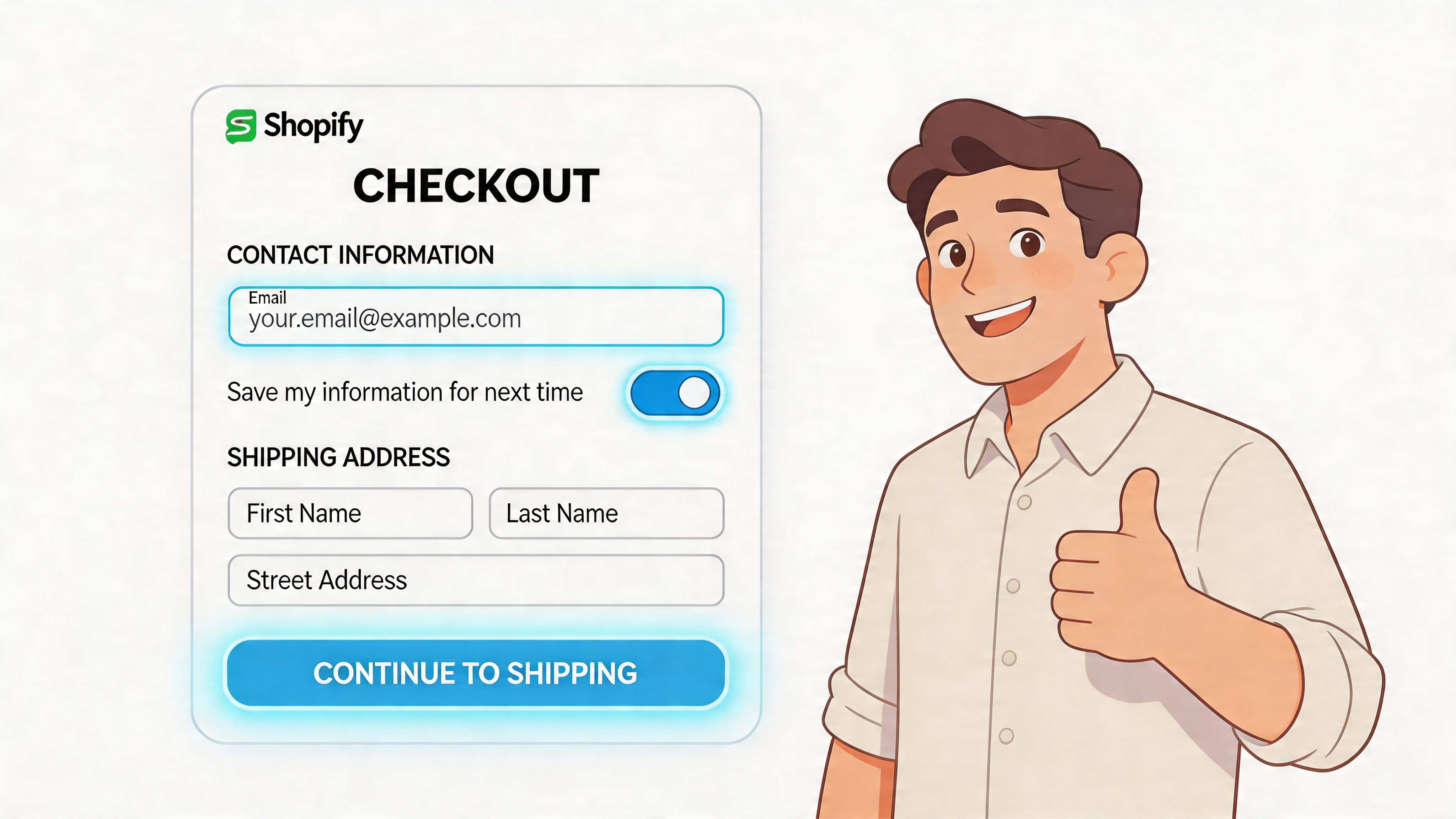
Foundational Wins to Streamline Your Default Checkout
Start with the settings that remove effort without custom development. These are the wins almost every Shopify merchant can implement quickly.
Turn on accelerated checkout first
The fastest improvement is usually enabling the payment methods that let shoppers skip manual entry.
In the UK, Shopify merchants that optimise checkout by enabling Shop Pay achieve a 72% higher checkout completion rate compared to guest checkout, with returning customers seeing up to 91% uplift and mobile sessions reaching 1.91x higher checkout-to-order rates, based on Shopify aggregate data cited by Analytics Agent’s checkout optimization write-up.
That tells you something important. Buyers don’t abandon because they hate your products. They abandon because typing cards, addresses, and shipping details is work.
What to enable
At minimum, review these in Shopify Admin > Settings > Payments:
- Shop Pay: best for repeat customers and mobile-heavy stores because saved details remove the slowest part of checkout.
- Apple Pay: strong for iPhone users who want a fast biometric payment flow.
- Google Pay: useful for Android users and Chrome-based checkout sessions.
- PayPal: still valuable for customers who prefer paying without entering card details on-site.
The point isn’t to add every possible logo. The point is to surface the fastest, most familiar options for your audience.
Don’t force account creation
Most stores shouldn’t require an account before purchase.
Account creation adds another decision at the worst moment. It asks buyers to do admin before you’ve earned the order. If your business has a legitimate reason to encourage accounts, do it after the sale or present it as an optional convenience.
Guest checkout should be easy to access. Not hidden. Not visually downgraded. Not framed like a second-class path.
A simple rule of thumb
Use this decision table when you’re debating account strategy:
| Store type | Better default |
|---|---|
| DTC, impulse, gift, mobile-heavy | Guest checkout |
| Repeat-purchase brands with subscriptions or account utilities | Guest checkout with post-purchase account invite |
| B2B or trade with pricing/login controls | Account-first may make sense |
Even in more complex models, you should test whether mandatory login is worth the friction cost.
Clean up the first visible impression
A checkout can be technically functional and still feel hard.
The first screen should look easy to finish. That means:
- Lead with express options: wallet buttons should appear early, not buried.
- Reduce visual clutter: remove anything that competes with completion.
- Keep the order summary legible: buyers want confidence in what they’re paying for.
- Use calm error handling: sharp, vague validation messages create doubt fast.
A shopper should know within seconds that this will be quick.
After the basics are live, it helps to look at a real walkthrough rather than guessing from settings screens alone.
Prioritise mobile convenience
Desktop checkout problems are obvious. Mobile checkout problems are expensive.
On phones, every extra tap matters. Wallet payments outperform because they shrink the interaction cost. Typing, correcting, switching keyboards, and hunting for card details all create abandonment pressure.
The fastest checkout usually wins, even when the product decision was already made.
If your mobile checkout still relies on full manual entry for most customers, fix that before you spend time on decorative changes.
Quick wins you can ship in under an hour
For most stores, this is the initial punch list:
- Enable Shop Pay and confirm it’s visible on supported flows.
- Turn on Apple Pay and Google Pay where eligible.
- Check guest checkout access and remove any forced-account friction.
- Review payment button order so express methods appear prominently.
- Run a mobile purchase test on iPhone and Android, not just desktop preview.
- Audit error messages by intentionally failing fields and payment inputs.
These changes aren’t glamorous. They work because they remove effort where effort is most dangerous.
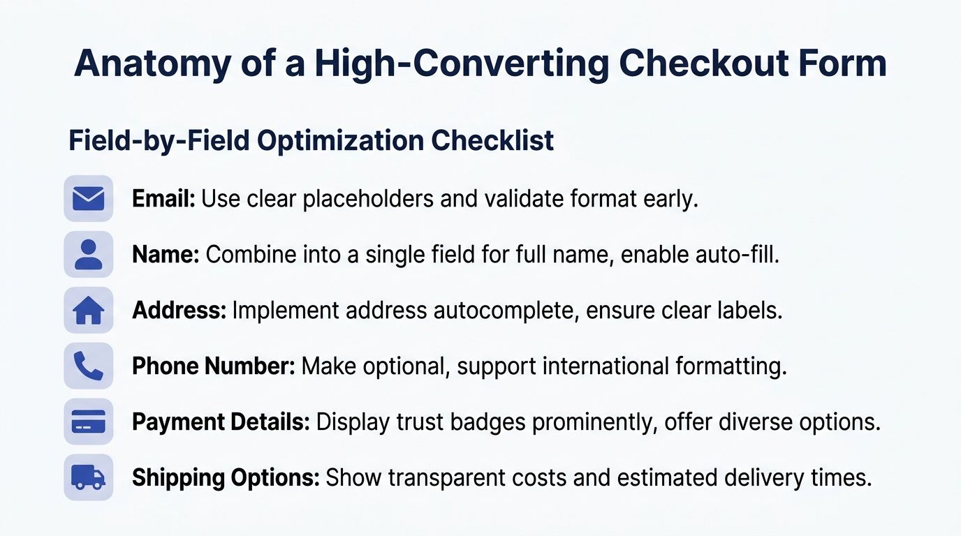
Anatomy of a High-Converting Form Field by Field
Most checkouts ask for more than they need.
Every field creates a tiny decision. Every decision adds cognitive load. On mobile, that cost rises again because the user is typing with less patience and less context.
For Shopify checkout optimization, the form itself deserves a hard audit. Not a design review. An actual challenge to every field: does this help fulfil the order, or does it only help the business collect more information?
Start by removing what isn’t essential
A practical methodology from Clean Canvas on Shopify checkout form optimization notes that removing or making optional 4 to 7 fields can boost conversion rates by up to 30%, and that browser autofill plus Shopify’s predictive address tools can cut completion time by 26% on mobile.
That’s why the first pass is subtraction.
Fields that usually deserve scrutiny
- Company name: often irrelevant in DTC and easy to make optional.
- Address line 2: useful for some orders, but it shouldn’t feel mandatory.
- Secondary phone collection: only ask when there’s a real fulfilment reason.
- Marketing extras disguised as checkout inputs: move them elsewhere.
If the field isn’t required to take payment, calculate shipping, or deliver accurately, question it.
Field by field judgement matters
Not all fields create the same type of friction. Some slow the user down. Others make them hesitate.
Email should come early because it supports order communication and allows recovery if the session breaks.
Keep the label plain. Don’t get clever with microcopy. Validate format early so buyers don’t reach the end and hit a preventable error.
Name
If your setup allows it, simpler name capture is usually better than over-structuring.
Separate first and last name fields can be fine, but they aren’t always necessary. What matters most is compatibility with fulfilment, fraud checks, and any downstream systems that consume the data.
Address
Here, many checkouts become frustrating.
Use address autocomplete where possible. Let the user select rather than type. Keep labels familiar. If the postcode and house number relationship matters for carrier accuracy, make that logic easy, not punitive.
Phone number
Phone collection often creates more hesitation than teams expect.
Customers don’t always want to share it. If it’s optional, say so clearly. If it’s required for courier reasons, explain why in a short line of helper text.
Ask for sensitive information only when you can justify it in the moment.
What a lean form actually looks like
A high-converting checkout form doesn’t mean “minimal at any cost”. It means lean, clear, and forgiving.
Here’s the standard I use:
| Field area | Keep, remove, or change |
|---|---|
| Keep, validate early | |
| Full name | Keep, simplify where operationally safe |
| Company | Usually optional |
| Address line 1 | Keep |
| Address line 2 | Optional |
| Phone | Optional unless fulfilment requires it |
| Discount code field | Present carefully so it doesn’t distract |
The right answer depends on your shipping setup, fraud exposure, and customer type. But most stores can simplify more than they think.
Make the form easier to complete, not just shorter
Reducing field count helps, but form usability matters just as much.
Focus on these details:
- Use browser autofill correctly: labels and input types should support native autofill behaviour.
- Prefer real-time validation: catch formatting issues while the buyer is still in the field.
- Match the right keyboard to the field: email keyboard for email, numeric for number-heavy inputs.
- Avoid unclear required states: don’t surprise users after they hit continue.
- Keep spacing generous on mobile: cramped fields drive mis-taps and correction loops.
Many merchants often falter with checkout optimization. They remove a field, then leave an awkward validation pattern, unclear label, or messy mobile tap target in place. The form is technically shorter but still annoying.
Don’t optimise yourself into fulfilment problems
There’s a bad version of simplification.
If you remove too much, you create downstream issues. Missing delivery details lead to support tickets, failed shipments, manual edits, and customer frustration after the order. Checkout conversion isn’t the only metric that matters.
The best form design respects both conversion and operations. That means working with fulfilment realities rather than pretending they don’t exist.
A useful test is this: if you removed the field, would the warehouse, courier, finance team, or support team immediately need it back? If yes, keep it, but reduce the burden around it.
Audit like a CRO team, not like a designer
Run through your own checkout and note every moment where you have to stop and think.
Then review recordings, funnel exits, and device-specific issues. Look for hesitation around address entry, invalid postcode patterns, discount-code distraction, and phone-number resistance. Those are often the hidden conversion drains.
A better form feels boring in the best possible way. The buyer doesn’t notice the UX. They just finish.
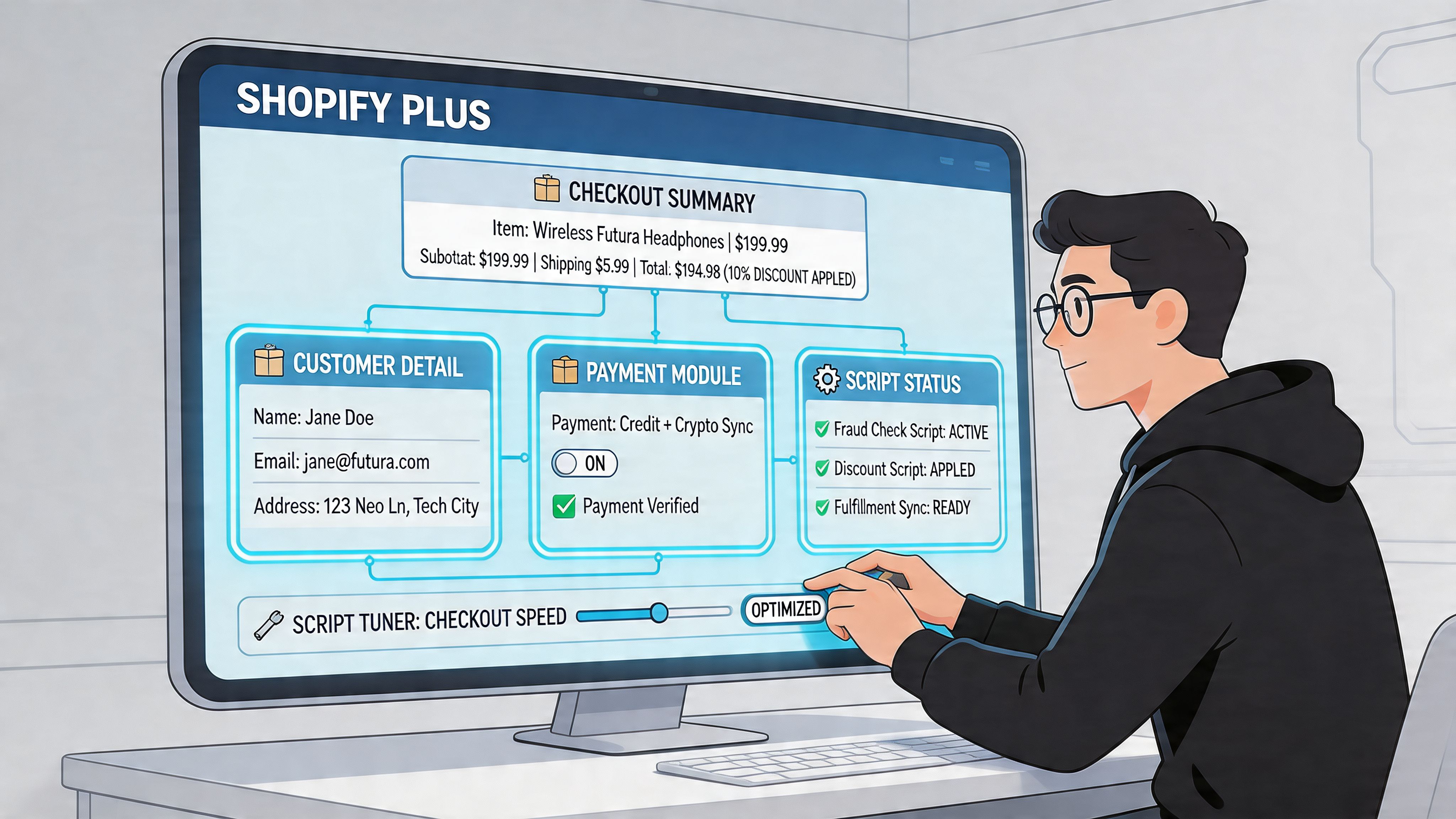
Shopify Plus Power Plays From Scripts to Extensibility
Shopify Plus changes the conversation because you move from configuration to control.
That doesn’t mean every checkout should be heavily customised. In fact, some Plus stores hurt conversion by adding too much logic, too many apps, or visual clutter that competes with completion. A key advantage of Plus is precision. You can adapt the checkout to fit the business instead of forcing the business to fit the default flow.
What legacy Plus customisation was good at
Historically, Plus merchants used checkout.liquid and Shopify Scripts to shape behaviour and presentation.
That model allowed teams to:
- adjust parts of the checkout layout
- add reassurance content or trust messaging
- create shipping logic
- tailor payment behaviour
- apply promotional or operational rules
For some brands, that flexibility was a major commercial advantage. It let them reflect B2B requirements, market-specific delivery logic, or bespoke promotional mechanics inside checkout itself.
Where Scripts still make commercial sense
Scripts were especially useful when a merchant needed rule-based checkout behaviour.
A common example is shipping logic. For UK Shopify Plus merchants, using checkout scripts for rules such as auto-selecting the cheapest shipping and integrating local payments can lead to a 35.26% CVR increase, while Shop Pay on Plus stores shows a 91% higher conversion versus guest checkout, according to Blackbelt Commerce’s Shopify checkout customisation guide.
That sort of logic matters when the buyer would otherwise face too many choices or confusing defaults.
Good use cases for rule-based logic
- Shipping simplification: auto-select the most sensible low-friction option instead of making the user interpret carrier jargon.
- Market-specific payment visibility: show methods that fit local behaviour and suppress irrelevant ones.
- Promotional handling: apply the right incentive without making the shopper hunt for a code.
- B2B edge cases: support structured requirements that the default flow can’t express cleanly.
The limitations of the old model
Legacy checkout customisation was powerful, but it came with baggage.
Custom code ages. Team knowledge disappears. Apps conflict. Upgrade paths get messy. And a checkout that has been “carefully customised” over several years often ends up full of inherited logic that nobody wants to touch before peak trading.
That’s usually where a proper Plus audit starts. Not with new ideas, but with a simple question: which parts of this checkout still earn their place?
The best Plus checkouts are opinionated. They remove choices the customer shouldn’t have to make.
Why Checkout Extensibility is the better long-term path
Shopify’s direction is clear. Checkout Extensibility is the safer, more maintainable model for modern checkout customisation.
Instead of treating checkout like a monolithic template, Extensibility uses approved extension points and app-based components. That matters for two reasons. First, it protects upgrade compatibility. Second, it forces cleaner implementation discipline.
How the two approaches differ
| Capability area | Legacy checkout.liquid and Scripts | Checkout Extensibility |
|---|---|---|
| Layout changes | Broad but fragile | Structured and upgrade-safe |
| Custom logic | Flexible but harder to maintain | Controlled through supported surfaces |
| App integration | Can become messy | Better aligned with Shopify’s roadmap |
| Long-term maintainability | Lower | Higher |
If you’re still on legacy customisation, migration planning should be part of your CRO roadmap, not just a technical housekeeping task.
When you need developers, use the right kind
Checkout Extensibility often intersects with storefront architecture, app behaviour, and front-end logic outside checkout itself.
If you’re building custom UI extensions, headless components, or integrated purchase flows, strong front-end engineering matters. Teams evaluating implementation partners often look for experienced React developers because modern Shopify customisation increasingly depends on systematic component thinking rather than one-off hacks.
That’s particularly relevant when checkout behaviour needs to align with product configurators, subscriptions, or custom cart experiences upstream.
A practical decision framework for Plus merchants
Use this as the short version.
Keep legacy customisation for now when
- it supports a mission-critical business rule
- it’s stable and documented
- there’s no supported Extensibility path yet for that exact use case
Prioritise Extensibility when
- you’re planning a broader platform clean-up
- your checkout has accumulated brittle custom code
- multiple apps are fighting for control
- your team wants safer iteration and easier maintenance
Rebuild the logic entirely when
- nobody can explain why a behaviour exists
- the customisation creates support issues
- the rule helps internal teams more than it helps the buyer
- mobile checkout feels worse because of desktop-first additions
For merchants planning a serious upgrade path, this overview of Shopify Plus development is a useful reference point for how custom architecture and maintainability fit together.
The strongest Plus strategy isn’t “customise everything”. It’s customise the moments that remove friction, protect margin, or simplify decisions, then leave the rest alone.
Optimising Payments and Shipping for a Frictionless Journey
A buyer can accept your product, your price, and your checkout form, then still abandon at shipping or payment.
That drop-off usually happens for simple reasons. The delivery cost appears too late. The shipping options are hard to compare. The payment method they trust is missing. The final total changes at the worst possible moment.
For Shopify merchants, checkout optimisation makes a shift from form design to transaction design. For Shopify Plus merchants, it also becomes an implementation question. Which improvements sit inside native checkout settings, and which ones need Checkout Extensibility, payment customisation, or a more advanced testing plan?
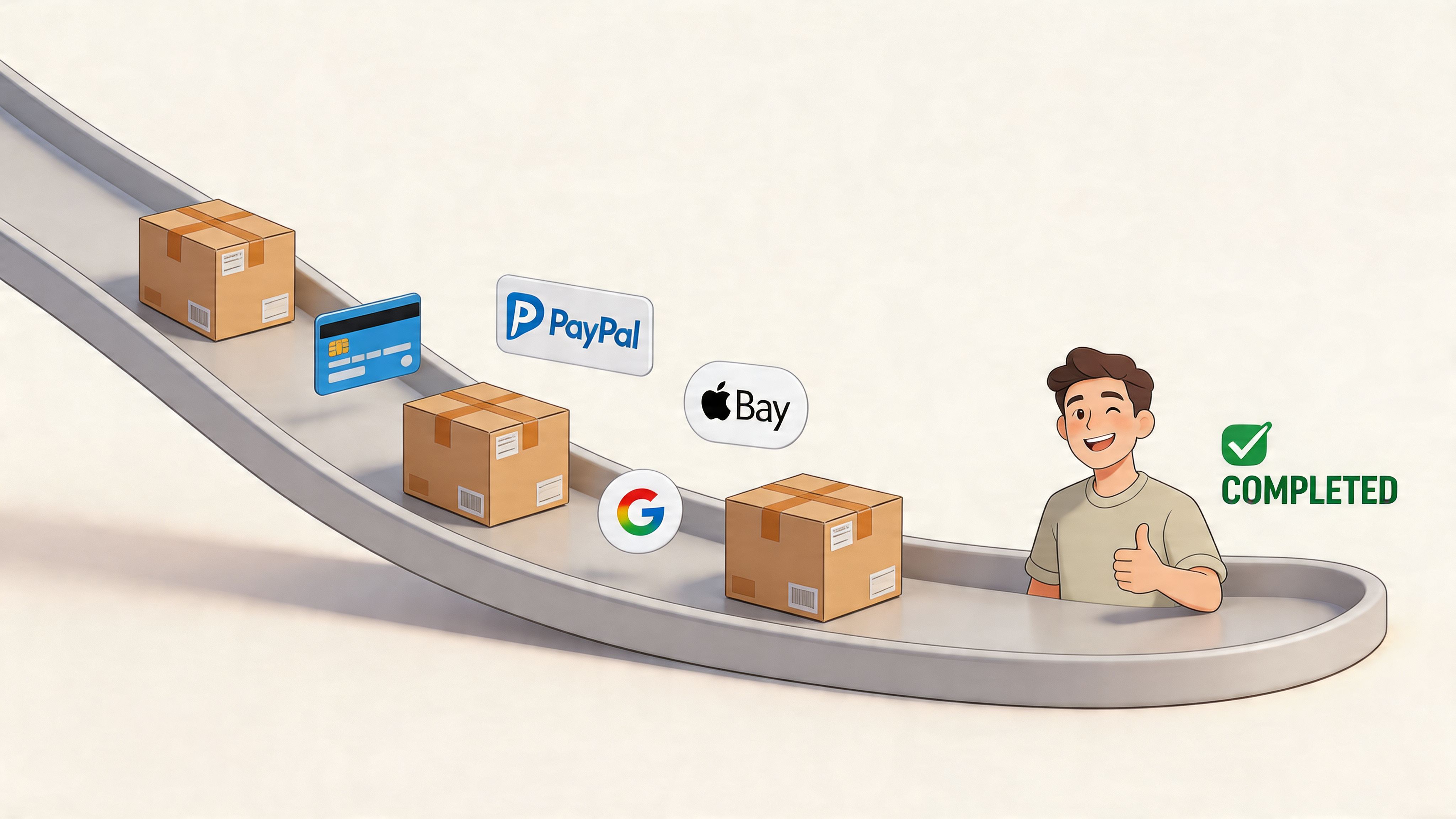
Payment choice should remove hesitation
Payment mix is not a box-ticking exercise. It should match how your customers already prefer to buy.
A practical baseline usually includes cards through Shopify Payments, accelerated wallets, and PayPal where the audience still uses it heavily. After that, the right additions depend on basket size, geography, and trust patterns. A fashion brand with mobile-heavy traffic may get more from wallets. A higher-AOV homeware store may see stronger returns from instalment options.
BNPL needs discipline. It can improve conversion on larger orders, but it also changes margin maths, refund handling, and support queries. I would rather see a merchant run one well-placed BNPL option with clear messaging than stack multiple providers that create clutter at the final step.
For Plus stores, payment customisation opens up more control over method display and logic. That matters when you need to reorder methods by market, hide irrelevant options, or align payment availability with business rules. Standard Shopify stores have less room to shape that experience, so prioritisation matters more.
Shipping clarity protects purchase intent
Shipping is often the last confidence check before purchase.
Buyers want three things fast. What will this cost? When will it arrive? Which option should I pick?
If the answer is buried in carrier labels like "Tracked 48" or "DPD Home 2", the customer has to interpret your operations language. That slows the decision and creates doubt. Better labels convert because they reduce mental effort. "Standard, 3 to 5 business days" beats internal fulfilment jargon every time.
Strong shipping presentation usually includes:
- Clear service names: written for customers, not warehouse teams
- Visible total cost: no surprise charges added late
- Plain delivery windows: specific enough to reassure
- A sensible default option: useful for buyers who want the best-value choice fast
A lot of stores lose sales here by offering too many rates. More choice is not automatically better. If two options look almost identical, remove one or rename them so the difference is obvious.
One-page checkout helps, but only if the commercial details are right
Shopify's one-page checkout can reduce step friction because buyers can scan shipping, payment, and totals in one view. The gain is practical, not magical. Fewer transitions mean fewer chances to second-guess the purchase.
I have seen this work best when merchants pair one-page checkout with cleaner shipping labels, earlier cost visibility, and a tighter payment mix. If those inputs are weak, one page exposes the confusion faster.
This is also where the Shopify plan matters. Standard merchants can improve a lot through native configuration and better offer design. Plus merchants can go further by testing checkout content, payment logic, and extensibility-based components around the decision points that create hesitation. If your team is planning structured experimentation, Shopify checkout A/B testing services give a useful framework for validating these changes properly.
Free shipping thresholds need margin discipline
Free shipping works when the threshold is believable and commercially sound.
Set it too high and buyers ignore it. Set it too low and you train customers to expect a subsidy that erodes contribution margin. The sweet spot depends on AOV, repeat rate, product weight, and fulfilment costs. There is no universal number worth copying from another store.
What usually works:
- a threshold message before checkout
- cart messaging when the shopper is close
- no messy exclusions revealed late
- market-specific thresholds if your shipping economics differ by region
That last point matters more than many teams expect. A threshold that works in one market can fail badly in another once duty, carrier costs, or delivery expectations change.
Payment and shipping should be planned as one conversion system
Customers do not separate these decisions the way internal teams do.
A checkout can offer every major payment method and still underperform because delivery feels vague or overpriced. It can also show clear shipping options and still lose the sale because the preferred payment method is missing. Both need to work together, and both need to reflect the economics of the business, not just UX theory.
For merchants looking beyond on-site tweaks, these shopping cart abandonment solutions from Rebus are useful for thinking through recovery tactics around the same drop-off points.
What usually works in practice
The stores that improve fastest make a small number of high-confidence changes and measure them hard.
| Area | Better approach |
|---|---|
| Payment mix | Prioritise familiar, fast, audience-fit methods |
| BNPL | Add it only when AOV, margin, and customer demand support it |
| Shipping labels | Replace carrier jargon with customer language |
| Delivery messaging | Show realistic windows, not vague promises |
| Rate presentation | Reduce overlapping options and make the trade-off clear |
The goal is simple. Make the final transaction feel predictable.
When payment and shipping are easy to compare, easy to trust, and easy to complete, more buyers finish the order.
The Measurement Playbook KPIs Analytics and A/B Testing
Checkout changes without measurement are just opinions in production.
The stores that get consistent gains from Shopify checkout optimization don’t rely on instinct alone. They instrument the funnel properly, isolate where buyers drop off, and test changes with enough discipline to know what moved the metric.
Track the right checkout KPIs
Start with a small set of decision-making metrics. If you track too much, teams end up staring at dashboards instead of fixing problems.
The core KPI set should include:
- Checkout completion rate: the top-line measure of how many started and finished.
- Step progression rate: where users move forward and where they stall.
- Abandonment by device: mobile and desktop usually tell different stories.
- Time to complete checkout: long completion time often signals friction even before abandonment rises.
- Payment method usage: tells you whether key options are visible and trusted.
- Error frequency by field or step: useful for spotting technical or UX faults quickly.
If a team can’t answer where the biggest checkout drop-off happens, they’re not ready to redesign anything.
Build a useful GA4 funnel
GA4 can help, but only if you configure it around real checkout behaviour.
A practical setup includes funnel visualisation for the main stages, segmentation by device, and event naming that distinguishes start, progression, payment selection, and purchase completion. If you’re testing checkout changes, annotate releases and experiments so the data tells a coherent story later.
A simple analysis pattern
- Check overall completion trend for the past period.
- Break it down by device to see where friction concentrates.
- Review step exits for unusual drop-off.
- Compare payment selection and success patterns for hidden blockers.
- Match quantitative drop-off with session evidence so you understand the why, not just the where.
For merchants running structured experimentation, this guide to Shopify A/B testing services is useful context for building a repeatable testing process.
What to test and what to leave alone
Not everything in checkout should be tested aggressively.
Good candidates include:
- field optionality
- helper text clarity
- shipping-option naming
- trust-message placement
- wallet-button prominence
- order-summary presentation
Be careful with changes that affect compliance, fulfilment integrity, or core payment reliability. Not every friction point is a creative opportunity.
Test the parts that shape confidence and effort. Don’t gamble with the parts that keep orders valid.
Read results like an operator
A “winning” test isn’t enough on its own.
Check what happened to support tickets, failed deliveries, payment issues, and post-purchase confusion. A variant that improves completion but creates operational noise may not be a real win.
The mature approach is simple. Improve the checkout, validate the effect, watch for side effects, and keep iterating. That cycle is what turns one-off gains into durable performance.
If your checkout feels harder than it should, Grumspot can help audit the friction, identify what’s fixable with native Shopify settings versus Shopify Plus customisation, and turn the findings into a practical CRO roadmap.
Let's build something together
If you like what you saw, let's jump on a quick call and discuss your project

Related posts
Check out some similar posts.

- outsource Shopify development
Ready to outsource Shopify development? Our 2026 playbook covers finding partners, vetting, pricing,...
Read more
- API-first ecommerce
Explore API-first ecommerce architecture. A practical guide for UK merchants on benefits, costs, Sho...
Read more
- composable commerce Shopify Plus
Unlock growth with composable commerce Shopify Plus. Learn architecture patterns and migration steps...
Read more
- headless commerce Shopify
Explore headless commerce Shopify for UK brands. This guide covers costs, benefits, SEO, and impleme...
Read more