Shopify Store Redesign for Conversions: Grow Sales
- Shopify store redesign
- Shopify CRO
- ecommerce conversions
- Shopify 2.0
- Shopify agency
Launched
April, 2026
You are probably in one of two situations right now.
Your Shopify store still works, but sales have flattened and the site feels dated. Or traffic is healthy enough, yet too many shoppers stall on product pages, disappear at cart, or abandon checkout after doing all the hard work of finding you.
Teams often start talking about a redesign then. The problem is that many redesigns are treated like a brand exercise when they should be treated like a conversion project. A prettier storefront can improve trust, but a beautiful store with broken merchandising logic, slow apps, confusing shipping rules, or fragile checkout flows still leaks revenue.
A serious Shopify store redesign for conversions starts somewhere less glamorous. It starts with friction. Not just visual friction, but technical debt, operational debt, and messy decisions accumulated over time. If you do not deal with those first, the new design becomes an expensive skin over the same old problems.
Your Redesign Foundation A Conversion-First Audit
A redesign usually gets approved after a visible problem shows up. Conversion stalls. Revenue per session slips. Paid traffic gets more expensive to recover. The mistake is treating that signal as a design brief before checking what is breaking underneath.
Poor conversion often starts earlier than the interface. Fulfilment rules, subscription setup, search logic, theme code, and merchandising choices can all interrupt the buying process long before a shopper reaches checkout. Shopify makes a similar point in its article on conversion-centred design. Stores that skip this diagnosis often pay for a cleaner front end and keep the same revenue leaks.
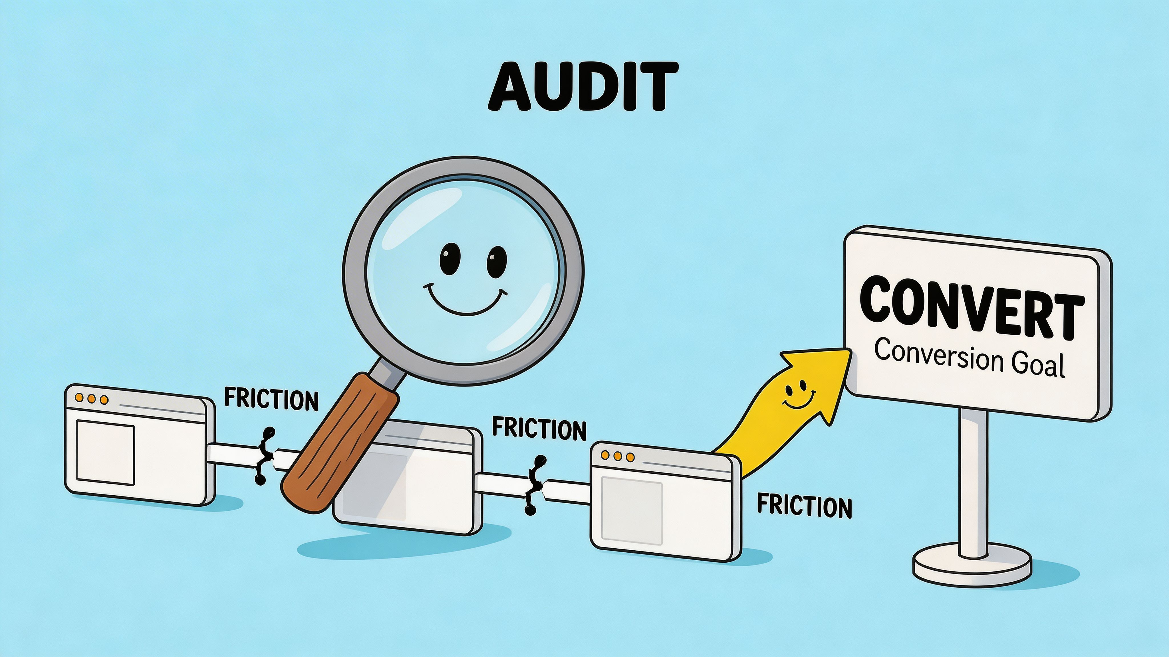
A conversion-first audit examines the store through four lenses: performance data, user friction, technical debt, and operational blockers.
Audit the data before the design
Start with behaviour, not internal preference.
Pull Shopify analytics, GA4, heatmaps, session recordings, on-site search terms, and support tickets into the same review. Patterns become clearer when those sources are read together. A spike in exits on mobile PDPs means more when recordings show users fighting variant selectors and support tickets show repeated sizing questions.
Use the baseline to judge the size of the problem. If your store sits below category expectations, avoid defaulting to a homepage redesign. Check where the leak starts and how concentrated it is.
Focus the audit on questions that affect revenue:
- Where does mobile drop-off start? Homepage, collection page, PDP, cart, or checkout.
- Which templates suppress conversion? One weak product template can drag down dozens of SKUs.
- What are shoppers searching for internally? Search queries often expose broken navigation or unclear naming.
- Which channels bounce fastest? Paid social, branded search, email, and organic often fail for different reasons.
Treat analytics as evidence. A redesign change should solve a defined problem, not defend a design opinion.
Review UX friction where revenue is made
Heatmaps and recordings help because they show attempted behaviour, not just pageviews.
The expensive issues are usually small on paper. Sticky add-to-cart bars hiding delivery details on smaller screens. Filters collapsed into vague labels. Size guides buried too low. Trust badges inserted in places that distract from the decision instead of supporting it.
Mobile deserves special scrutiny. For many Shopify stores, it drives the majority of sessions and still converts worse because the experience asks too much from a small screen. In practice, that means thumb reach, readable product information, clear variant selection, and fast rendering deserve more attention than desktop polish during the audit.
A useful review of key templates usually covers:
- Homepage: Does it orient new visitors and route them into the right categories quickly?
- Collection pages: Can shoppers filter, compare, and recover from a wrong click without friction?
- Product pages: Are price, delivery, returns, reviews, and product options clear at the moment of decision?
- Cart and checkout entry points: Are total cost, payment options, and delivery expectations clear enough to continue?
A structured Shopify CRO audit framework helps teams score those issues before they turn them into design requests.
Find the technical debt hidden behind the theme
A polished storefront can still sit on a fragile stack.
This is the blind spot in many redesign projects. The new design comp looks clean, but the live store still depends on overlapping apps, old snippets, patched custom code, and tracking that only works on some templates. That technical debt shows up as slower pages, broken edge cases, reporting gaps, and merchandising rules that the team no longer trusts.
Check for these warning signs:
- App sprawl: several apps handling upsells, bundles, reviews, or subscriptions with overlapping scripts
- Theme bloat: retired code, duplicated assets, and legacy sections still loading
- Fragile custom logic: bundles, subscriptions, or personalisation features that break under common edge cases
- Tracking gaps: events missing from key steps, duplicated conversions, or inconsistent attribution
This is also the stage to review product discovery and category logic. Strong visual design cannot rescue weak product organisation. Good category structure, product card content, and sorting logic often have more conversion impact than a homepage refresh. For teams reworking that layer, this guide to mastering merchandising e-commerce is a useful reference.
Surface operational blockers before launch
Operational debt rarely appears in the design file, but it changes buying behaviour fast.
Unclear shipping thresholds create hesitation. Buried returns information weakens trust. Inventory sync issues create out-of-stock frustration after intent is already high. Subscription rules that change between PDP, cart, and checkout make the offer feel unreliable.
These are not edge cases. They shape conversion, support volume, and repeat purchase performance. A serious audit flags them early, assigns an owner, and decides whether the fix belongs in operations, theme logic, app setup, or content.
The output should be a prioritised issue list tied to business impact, implementation effort, and dependency risk. That document gives the redesign its logic. Without it, the project tends to produce nicer pages and familiar problems.
Architecting the Customer Journey for Sales
Once the audit exposes the friction, the redesign becomes a planning exercise in removal.
You are not arranging pages to look cleaner. You are shaping a path to purchase that helps people decide faster, with less doubt and fewer wrong turns. That usually means changing information architecture, template priorities, and merchandising logic before debating visual style.
In the UK, cart abandonment averages over 70%, and redesigns that simplify checkout flows and improve product page clarity have been shown to reduce that leakage. The same source notes that some UK apparel brands achieved a 38% conversion boost after addressing outdated visuals and clutter, as reported in these Shopify redesign case studies.
Fix the structure before the styling
A common mistake is starting with homepage concepts when the core issue sits deeper in the journey.
If users land on collection pages from search or paid campaigns, those templates deserve more strategic effort than the homepage hero. If repeat customers go straight to category pages, your top navigation, filters, sort logic, and product card information may matter more than any top-level rebrand.
Good information architecture usually comes from behaviour patterns:
- Navigation should reflect buying intent. Customers rarely think in your internal catalogue structure.
- Collections should reduce decision load. Too many overlapping categories create hesitation.
- Product cards should answer the first screening questions. Price, variant cues, social proof, and delivery hints often matter more than decorative layout choices.
If your catalogue is broad or variant-heavy, it helps to study how stronger product data supports smarter browsing. This guide to mastering merchandising e-commerce is useful because it connects merchandising decisions to findability and conversion, not just visual presentation.
Build wireframes around objections, not aesthetics
Wireframes work best when each block earns its place.
On a product page, every section should help answer one of the questions a shopper is already asking. What is it. Is it right for me. Can I trust it. When will it arrive. What happens if I need to return it. Why should I buy this one instead of another option.
That changes layout decisions.
A stronger PDP often includes concise above-the-fold essentials, then a deliberate order of reassurance below the fold. Reviews too early can distract from decision-critical facts. Reviews too late can weaken trust. The right answer depends on product complexity and customer familiarity.
If a design element looks elegant but delays an answer the customer needs before adding to cart, it is harming conversion.
Simplify high-intent moments
Not every page deserves equal complexity.
Collection pages should help users narrow options with minimal effort. Product pages should remove hesitation. Cart should reinforce confidence and reduce exits. Trying to make every screen “immersive” usually backfires on the pages closest to purchase.
A practical planning exercise is to map each major template to one primary job:
| Template | Primary job | Common mistake |
|---|---|---|
| Homepage | Orient and route | Trying to sell everything at once |
| Collection | Help users shortlist | Over-designed product grids |
| Product page | Resolve objections | Hiding important details in tabs |
| Cart | Preserve purchase intent | Distracting upsells and clutter |
A useful benchmark for this stage is whether the new experience feels easier to use on a phone with one hand. If not, the journey still needs work.
For page-level planning and layout decisions, this primer on conversion-focused web design is a practical companion.
Building Your Store on Shopify 2.0
A redesign often looks finished in Figma and still falls apart in build.
The pattern is familiar. The new store looks cleaner, the UX plan makes sense, and the team signs off on polished mockups. Then significant constraints show up. The chosen theme cannot handle the merchandising logic, three apps fight over the cart, content editors can break layouts without meaning to, and page speed slips before launch. That is the hidden debt standard redesign guides skip. It is also why conversion gains disappear after a beautiful rebuild.
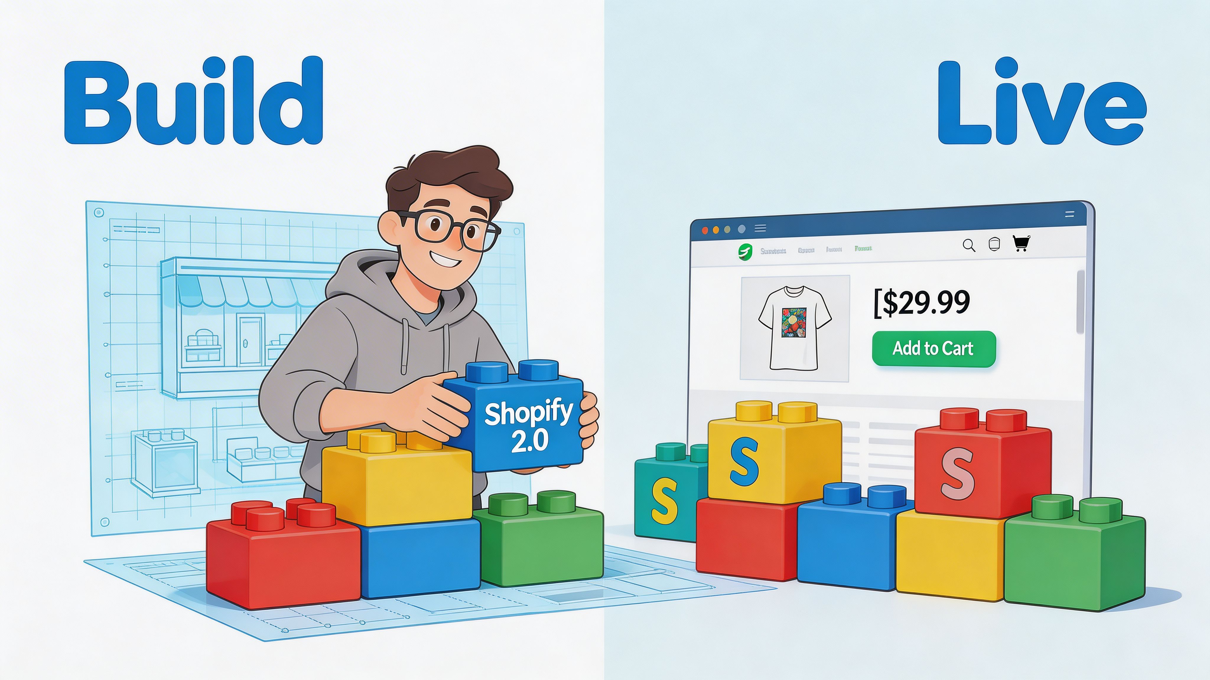
Shopify 2.0 gave merchants better theme architecture, more flexible sections, and cleaner content management than older setups. That matters, but the platform upgrade alone does not raise conversion. Results come from how the store is configured, how much custom logic is added, and whether the build stays manageable for the team running it day to day.
Choose the build approach that matches the business
The first build decision shapes everything that follows.
A theme-led build works well for stores with standard product structures, predictable merchandising, and a team that wants faster deployment with less developer dependence. A custom build makes more sense when the buying journey depends on product bundles, subscriptions, account-specific logic, advanced localisation, or content models that prebuilt themes handle awkwardly.
There is a trade-off here.
- Theme-led build: Faster launch, lower cost, simpler maintenance. Less freedom once requirements get unusual.
- Custom theme or heavy customisation: Better fit for the intended experience and business rules. Higher build cost, stricter QA needs, and more ways to create technical debt if scope is loose.
The right question is simpler than “theme or custom?”. Choose the lowest-complexity build that supports the sales journey without workarounds.
Use sections with rules, not just freedom
Sections everywhere gave Shopify merchants far more control over page building. It also made it easier to create inconsistent pages, duplicate messaging, and slow templates.
High-performing builds set limits early. Decide which sections are approved for homepage, landing pages, collection templates, and PDPs. Lock down the sections that tend to create clutter on high-intent pages. Document spacing, content length, and merchandising rules so the store does not drift a month after launch.
That discipline protects conversion and reduces admin risk.
A practical reference for theme setup, template planning, and implementation choices is this guide on how to build a Shopify store.
Audit every app for both performance and operational cost
Apps are often the biggest source of post-redesign problems.
An app can solve a legitimate business need and still hurt the store. We see it with review widgets loading on every template, upsell tools injecting duplicate offers, search apps overriding collection behaviour, and loyalty tools adding scripts that no one notices until Core Web Vitals decline. The problem is not the existence of apps. The problem is stacking them without checking how they affect speed, layout, analytics, and admin workflows together.
Review every app against three checks:
- Does it support a clear commercial or operational requirement?
- Does it fit the intended customer journey without forcing awkward UI?
- Does it add scripts, duplicated features, or maintenance burden the team will regret later?
This matters most for subscriptions, search, bundles, reviews, personalisation, loyalty, and upsells because these tools influence both conversion and store complexity.
A staging environment helps, but staging alone is not enough. Test app interactions as a system. Check cart logic, discount behaviour, event tracking, and mobile rendering under realistic conditions.
Here is a useful overview of Shopify 2.0 concepts in practice:
Build for the team that has to run the store
Launch day is only the first test. Week six matters more.
If the marketing team cannot safely add a campaign section, swap collection content, or update a landing page without asking a developer to clean it up later, the build is fragile. If section names are vague, theme settings are messy, and template logic is undocumented, the redesign has traded one kind of debt for another.
Good Shopify 2.0 builds include governance. Use clear naming conventions. Keep section options predictable. Remove settings no one should touch. Document reusable patterns. Give the team enough flexibility to move quickly, without turning every page into a custom project.
One practical option for merchants that need redesign, Shopify 2.0 migration, and deeper integration work is Grumspot, which handles bespoke storefronts, migrations, and app-level development within Shopify ecosystems. The important point is broader than any single provider. The build partner or internal team needs to connect UX decisions, theme architecture, app choices, and long-term maintainability. That is what keeps a redesign from becoming expensive technical clutter with a new coat of paint.
Finalising Your Launch with a Technical Checklist
Launch week is where avoidable mistakes become public.
At this stage, many teams are focused on polishing visuals. That is understandable, but the final pass should be technical, repetitive, and paranoid. A store can launch looking excellent and still lose traffic, misfire analytics, or leak orders because the basics were not verified properly.
Essential Pre-Launch Checklist
| Area | Check | Status |
|---|---|---|
| SEO | Map old URLs to new URLs and prepare 301 redirects | ☐ |
| SEO | Review page titles, meta descriptions, canonicals, and indexation settings | ☐ |
| Navigation | Check all menus, breadcrumbs, and footer links | ☐ |
| Product data | Confirm variants, pricing, compare-at pricing, and stock visibility | ☐ |
| Cart | Test discounts, shipping thresholds, cart notes, and upsell logic | ☐ |
| Checkout | Run test orders with multiple payment methods and shipping scenarios | ☐ |
| Tracking | Verify GA4, ad pixels, and key ecommerce events | ☐ |
| Email and SMS | Confirm order, shipping, and abandoned cart flows render correctly | ☐ |
| Performance | Test key templates on mobile and desktop under realistic conditions | ☐ |
| QA | Check browsers, devices, forms, pop-ups, and account flows | ☐ |
Redirects, metadata, and crawl control
Search traffic can drop after a redesign for reasons that have nothing to do with rankings.
If URLs change and redirects are missing, shoppers hit dead pages. If noindex tags remain on templates from staging, key pages disappear from search. If canonical tags point to the wrong version of a page, you send mixed signals to search engines.
This is not glamorous work, but it protects the visibility you have already earned.
Test checkout like a customer, not like a developer
Do not stop at one successful test order.
Run through the journey with different combinations of products, shipping locations, discount codes, payment methods, and edge cases. Subscription products, bundles, gifts, and preorder logic deserve extra attention because that is where hidden conflicts tend to sit.
Teams often test the ideal path. Customers do not. They apply codes, change quantities, switch devices, revisit carts, and click back and forth before committing.
Verify measurement before traffic hits
A redesign launch with broken tracking creates a second problem. You lose the ability to judge whether the redesign worked.
Check that product views, add-to-cart events, begin-checkout events, and purchase events fire consistently. Confirm attribution tools are receiving data. Validate consent-related behaviour if you use a cookie banner or region-specific compliance setup.
Also review operational notifications. Order emails, shipping confirmations, back-in-stock alerts, and support forms should all be tested in the live environment.
Perform a final friction sweep on mobile
The last review should happen on real phones, not just browser resizing tools.
Look for thumb reach issues, sticky elements covering buttons, oversized image blocks, awkward spacing above CTAs, and payment icons that push important content too far down. If the mobile journey feels even slightly cumbersome to your internal team, your customers will feel it more sharply.
Launches go more smoothly when someone owns this final checklist and signs off each item. Shared responsibility usually means gaps.
Measuring Success and Driving Continuous Optimisation
A redesign is not validated by applause inside the business. It is validated by what happens after launch. Following launch, many teams get stuck. They set goals before the project starts, then struggle to prove what changed once the new store is live. Blackbelt Commerce points to a real gap here: many redesign guides do not explain how to measure conversion lift properly or account for seasonality and external factors when judging results, as discussed in its Shopify redesign process guide.
Establish a clean post-launch baseline
The first rule is simple. Do not judge the redesign on day two.
The launch period is noisy. Traffic sources fluctuate, marketing campaigns change, and the team is still fixing minor issues. A better approach is to create a post-launch baseline using a consistent observation window, then compare like-for-like periods as much as possible.
Track a focused set of commercial and behavioural metrics:
- Conversion rate: At store and template level where possible.
- Average order value: Useful when redesign changes merchandising or bundles.
- Bounce rate and engagement patterns: Particularly on landing and product pages.
- Checkout progression: Add to cart, begin checkout, and purchase completion.
- Revenue by device: Especially important when mobile was a redesign priority.
If paid media is active, segment by channel. A redesign may improve organic product page engagement while paid landing traffic behaves differently because the ad-message match changed.
Attribute change to specific design decisions
The strongest redesign reviews do not stop at “conversion improved” or “conversion stayed flat”.
They ask which specific changes influenced the result. Did the new product page hierarchy improve add-to-cart behaviour. Did simplified collection filters help users reach products faster. Did surfacing delivery and returns information reduce hesitation.
That is why event tracking and annotation matter. Document what changed, when it changed, and why. Without that log, teams end up arguing from memory.
One area worth tightening early is attribution tooling around paid social. If your post-launch plan relies on Meta campaigns, this guide to Shopify Facebook Pixels is a useful technical reference for checking implementation and data flow.
A redesign should produce a learning system, not just a new interface. If you cannot connect outcomes to changes, future optimisation becomes guesswork.
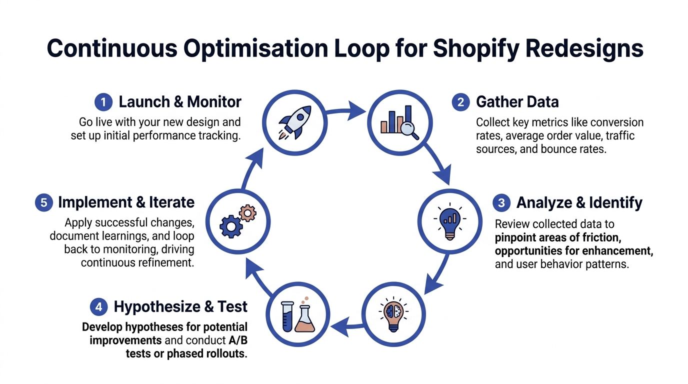
Build an optimisation loop, not a one-off project
The best stores keep improving because they treat launch as the start of a testing cycle.
A practical loop looks like this:
- Monitor the baseline. Check whether key paths are stable.
- Identify friction. Use analytics, recordings, support logs, and search queries.
- Write a hypothesis. Make it specific enough to test.
- Run controlled changes. Use A/B testing or phased rollouts where possible.
- Record outcomes and decide. Keep, revert, or iterate.
The hypothesis matters. “Make the PDP better” is not a hypothesis. “Moving shipping and returns reassurance above the add-to-cart area will reduce hesitation on mobile PDPs” is.
Know what not to test first
Merchants often test the most visible things first because they are easy to change. Button colour. Banner copy. Homepage layout.
Those can matter, but they are often less effective than structural friction points. Prioritise tests where intent is already high and uncertainty is the main barrier. Product pages, cart interactions, shipping visibility, bundle logic, and checkout-adjacent trust cues tend to provide better learning than broad cosmetic tweaks.
A redesign earns its return over time. The store launches with stronger foundations, then compounds gains through disciplined testing and faster decisions.
Shopify Redesign Frequently Asked Questions
How do I know whether I need a full redesign or targeted optimisation?
Start with the audit.
If conversion issues cluster around a few templates or one stage of the funnel, targeted optimisation is often the smarter move. If the store has structural problems across navigation, mobile usability, theme architecture, and app conflicts, a broader redesign makes more sense.
A full redesign is justified when the current store limits both customer experience and internal agility.
Will a redesign hurt SEO?
It can, if handled carelessly.
SEO problems usually come from URL changes without redirects, weak internal linking after the new navigation goes live, altered metadata, or accidental indexation errors. The design itself is not the threat. Poor migration discipline is.
That is why redirects, crawl controls, and metadata checks belong in the launch checklist rather than being treated as a final afterthought.
Should I redesign on a new theme or customise my current one?
That depends on how much debt the current theme carries.
If your existing theme is clean, reasonably fast, and structurally close to what you need, extending it may be efficient. If it has years of patches, app remnants, duplicated code, and hard-to-manage settings, rebuilding on a stronger foundation is often cheaper over time.
The wrong way to decide is by asking which path seems cheaper this month. The right way is to ask which path creates fewer compromises over the next year.
How much of conversion is really design versus operations?
Both matter. In some stores, operations matter more.
A polished PDP will not fix vague delivery windows, unreliable stock data, broken bundle logic, or return policies customers cannot understand. Design can reveal or conceal those issues, but it cannot solve them alone.
That is why redesign planning should include fulfilment, merchandising, support, and retention stakeholders, not only marketing and design.
How do I handle apps during a redesign?
Do not carry every app into the new store automatically.
Review each app against customer value, operational value, performance cost, and overlap with native Shopify functionality or other apps. If an app creates a key business outcome, keep it and design around it properly. If it adds clutter or duplicate scripts, remove it before launch.
A redesign is the best moment to clean the stack. It is much harder once the new store is already live.
What pages should get the most attention first?
Focus on templates closest to purchase intent.
For most stores, that means collection pages, product pages, cart behaviour, and the transition into checkout. Homepages matter, but they are often over-prioritised because they are brand-visible internally.
The best allocation of effort usually follows revenue risk, not internal politics.
How long should I wait before judging whether the redesign worked?
Long enough to get past launch noise, but not so long that obvious issues linger unaddressed.
Use a defined post-launch review window and compare like-for-like periods as carefully as possible. Also separate immediate QA fixes from strategic performance evaluation. If mobile PDP interaction is clearly broken, fix it at once. If overall conversion fluctuates during a promotional period, avoid drawing sweeping conclusions too early.
The key is disciplined measurement, not impatience.
Should I redesign the checkout too?
On Shopify, your control over checkout depends on your plan and setup.
Even when checkout customisation is limited, the path into checkout is still highly influential. Cart design, delivery messaging, express payment options, account expectations, discount handling, and trust cues all shape whether users proceed.
The earlier fact set is clear on this point. Accelerated checkout options and simplified checkout flows can make a significant difference when abandonment is high. The lesson is practical. Improve what you can control before assuming the problem sits inside checkout itself.
What does a strong product page include?
It includes the information a buyer needs in the order they need it.
That often means a clear title, price, variant selector, primary CTA, concise proof points, delivery and returns reassurance, visual evidence, product details, and reviews. For some products, ingredients, sizing, compatibility, or subscription terms are commercially critical and belong much higher than brands assume.
A weak PDP usually does not lack content. It lacks prioritisation.
Can I redesign gradually instead of relaunching the whole store at once?
Yes, and in many cases that is sensible.
A phased rollout lowers risk and helps isolate impact. You can update collection templates, then product pages, then cart logic, while tracking each phase more clearly. The trade-off is temporary inconsistency if the old and new experience do not align well.
Gradual redesigns work best when the brand system is stable and the main need is performance improvement rather than a complete repositioning.
What is the biggest mistake merchants make in a Shopify store redesign for conversions?
They approve solutions before agreeing on the actual problem.
That leads to expensive work on banners, typography, homepage storytelling, and visual polish while core blockers remain untouched. The second biggest mistake is measuring success too loosely after launch and then being unable to tell which changes helped.
A redesign should be evidence-led from the first audit through to post-launch optimisation. Otherwise it becomes a creative project with commercial hopes attached to it.
If your store needs more than a visual refresh, Grumspot helps merchants redesign Shopify storefronts around conversion, technical cleanup, Shopify 2.0 migrations, and the operational realities that affect sales after launch.
Let's build something together
If you like what you saw, let's jump on a quick call and discuss your project

Related posts
Check out some similar posts.

- outsource Shopify development
Ready to outsource Shopify development? Our 2026 playbook covers finding partners, vetting, pricing,...
Read more
- Shopify monthly development plan
Learn how a Shopify monthly development plan works to scale your store. Our 2026 guide covers pricin...
Read more
- Shopify performance optimization
Boost your Shopify store's speed & sales with our Shopify performance optimization guide. Audit, fix...
Read more
- ecommerce website design Shopify
Ecommerce website design Shopify - Master ecommerce website design Shopify with our 2026 playbook. G...
Read more