Conversion Rate Optimization for Luxury Ecommerce
- luxury ecommerce CRO
- premium UX
- A/B testing luxury
- AOV tactics
- trust signals
Launched
September, 2026
A 1.19% average conversion rate for UK luxury and jewellery ecommerce can be perfectly normal, even though the overall UK ecommerce average is reported at 3.4% and the Great Britain median at 2.35% in a UK-focused 2026 benchmark (Behaviour Digital's UK ecommerce benchmark). That gap changes the job completely.
If you manage a premium Shopify store and benchmark against mass-market apparel, you can end up “fixing” a storefront that's behaving rationally for a high-consideration purchase. Effective conversion rate optimization for luxury ecommerce isn't about forcing every visitor towards a rapid checkout. It's about identifying serious intent, removing uncertainty at the right moment, and preserving enough restraint to make the experience feel premium.
Why Luxury Ecommerce Converts Differently
Luxury conversion rates sit structurally below broad retail benchmarks. Shopify UK cites 0.6% for luxury apparel and 0.3% for luxury handbags, while wider benchmarks place luxury and jewellery around 0.72% to 0.95% globally (Shopify UK's CRO statistics). The latest UK-focused figures put luxury and jewellery at 1.19%, compared with the national ecommerce average of 3.4% (Behaviour Digital's benchmark).
Those figures aren't a permission slip for poor UX. They're a warning against using the wrong north star. A shopper buying a considered piece may arrive through editorial content, inspect materials, revisit from Instagram, compare service policies, speak with a client advisor, and only then purchase. A high-ticket product can create several valuable interactions before it creates an order.
Replace the mass-market mental model
Mid-market retail often benefits from tactics built around immediate action. Discounts, countdowns, broad promotional banners, and aggressive urgency can help shoppers justify a low-consideration purchase. On a luxury storefront, those same devices can reduce perceived scarcity and make the product feel more interchangeable.
The better question isn't “How do we reach the average ecommerce conversion rate?” It's “Which behaviours show that this visitor has moved from admiration to intent?”
Track:
- Qualified product engagement: Product video plays, gallery zooms, material-detail views, and meaningful scroll depth.
- Considered intent: Wishlist saves, repeat product views, size or specification interactions, and back-in-stock requests.
- Assisted sales: Concierge conversations, appointment requests, phone clicks, and email interactions that precede a purchase.
- Return behaviour: The path from first visit to branded search, direct return, and eventual checkout.
A UK benchmark from blubolt's ecommerce conversion guide reports 2.26% average session conversion across UK and Irish ecommerce in July 2026, while luxury and jewellery sat at 0.72% on a trailing-12-month basis. That contrast makes the operating principle clear: optimise purchase confidence and qualified-session quality, not just surface-level checkout usability.
Practical rule: A low blended rate can conceal a healthy luxury funnel if high-intent visitors engage deeply, return, and complete assisted or direct purchases.
Mapping the High-Intent Luxury Funnel
A luxury funnel shouldn't be treated as a straight line from advert to checkout. Buyers often move between paid social, editorial pages, email, brand search, and direct visits before they commit. Your analytics model needs to connect those behaviours rather than treating every session as an isolated attempt.
Start by defining events in GA4 and Shopify analytics that represent progress before purchase:
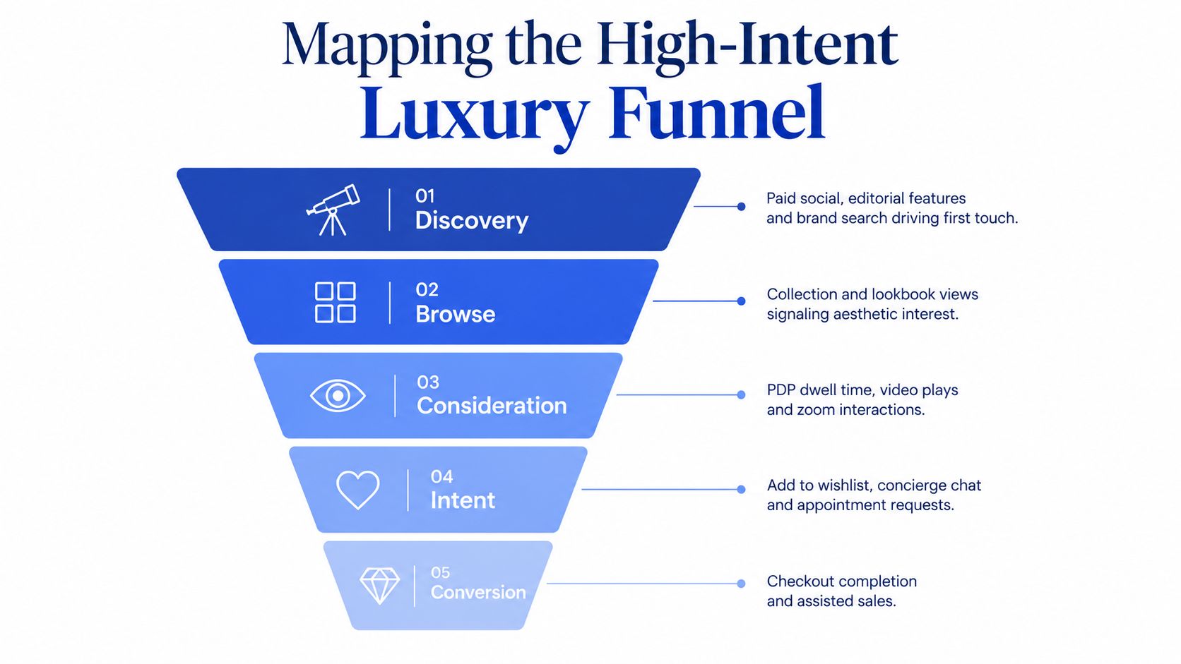
- Discovery: Record landing page, campaign, referring platform, brand-search entry, and editorial scroll depth. A visitor who reads a campaign story and reaches the key visual deserves a different interpretation from someone who exits immediately.
- Browse: Track collection views, lookbook interactions, filters, product-card clicks, and transitions from editorial content into product detail pages.
- Consideration: Fire events for product-detail-page dwell, video engagement, gallery zoom, material or sizing interactions, and returns to the same PDP.
- Intent: Measure wishlist additions, configurator completion, concierge chat starts, appointment requests, store-locator clicks, and qualified-lead form completion.
- Conversion and retention: Track checkout completion, assisted-sale status, delivery selection, post-purchase service requests, repeat visits, and repeat purchases.
Build a signal hierarchy
Not every event has equal value. A shallow scroll on a generic landing page is a weak signal. A completed configurator, a request for a private appointment, or a conversation about delivery is much closer to commercial intent.
Create an event dictionary with four fields: event name, trigger condition, traffic context, and business interpretation. Then separate behavioural signals from commercial outcomes. This prevents a team from celebrating video engagement without checking whether the video attracts the right visitors or assists later sales.
Your reports should also preserve journey context. Segment events by new versus returning visitor, device, landing-page type, traffic source, and product price tier. A mobile visitor arriving from social may need a faster path to provenance and delivery information, while a returning visitor from email may need a concise route back to a saved product.
The embedded walkthrough below offers a useful reference point for teams reviewing the customer journey and onsite experience.
Run a weekly funnel review that asks three practical questions: which signals correlate with eventual orders, where do qualified visitors hesitate, and which events are being overcounted because of duplicate firing or passive engagement? That discipline turns analytics from a dashboard of activity into a model of intent.
Premium UX Patterns That Lift Conversion
Luxury UX creates a deliberate tension. The store must feel curated and unhurried, but it still needs to help a serious buyer find information quickly. The answer isn't to strip away every moment of discovery. It's to distinguish intentional friction, which supports desirability, from accidental friction, which creates doubt.
An editorial-led homepage can give campaign imagery and brand world-building priority over a dense product grid. Navigation can remain compact, with clear routes into collections, designers, categories, and services instead of exposing every filter at the first click. Collection pages should feel selected rather than exhaustive, particularly when a large catalogue would dilute the visual hierarchy.
Product detail pages need more than polished photography. Use cinematic hero imagery, close-up detail shots, smooth zoom, material specifications, service information, and a clear route into the relevant story. A persistent storytelling rail or expandable content layer can keep craftsmanship visible without pushing the purchase controls below an endless block of copy.
Audit the trade-off, not just the outcome
A design can reduce immediate clicks while improving product understanding. That's why teams should review qualified adds-to-cart, repeat product views, wishlist activity, and assisted conversions alongside the session conversion rate.
| Pattern | Intentional Friction | Conversion Lever |
|---|---|---|
| Editorial-led homepage | Visitors explore before seeing a product grid | Brand comprehension and qualified discovery |
| Curatorial navigation | Fewer immediate category choices | Reduced cognitive load and stronger product hierarchy |
| Cinematic product gallery | Rich media asks for deeper interaction | Craftsmanship proof and product confidence |
| Storytelling rail on the PDP | Buyers can pause to read or watch | Provenance, materials, and perceived value |
| Lookbook-to-cart pathway | Inspiration comes before selection | Shorter route from aesthetic interest to product intent |
| Service-led product content | Information occupies valuable screen space | Delivery, returns, aftercare, and purchase reassurance |
Keep the interface quiet, but don't hide practical details behind a beautiful shell. Shipping timing, returns, duties, payment options, sizing, and availability should be discoverable without forcing a buyer to abandon the product page.
For implementation ideas that connect visual hierarchy with interaction design, the ecommerce UI and UX design guide is a useful reference. The important test is whether the pattern protects the brand while helping a motivated visitor answer the next question.
Trust Cues That Move High-Ticket Buyers
Trust signals work when they answer the uncertainty that exists at a specific decision moment. A first-time visitor needs evidence that the product and brand are real. A returning buyer may already believe in the brand but still need confidence about servicing, delivery, or payment before placing the order.
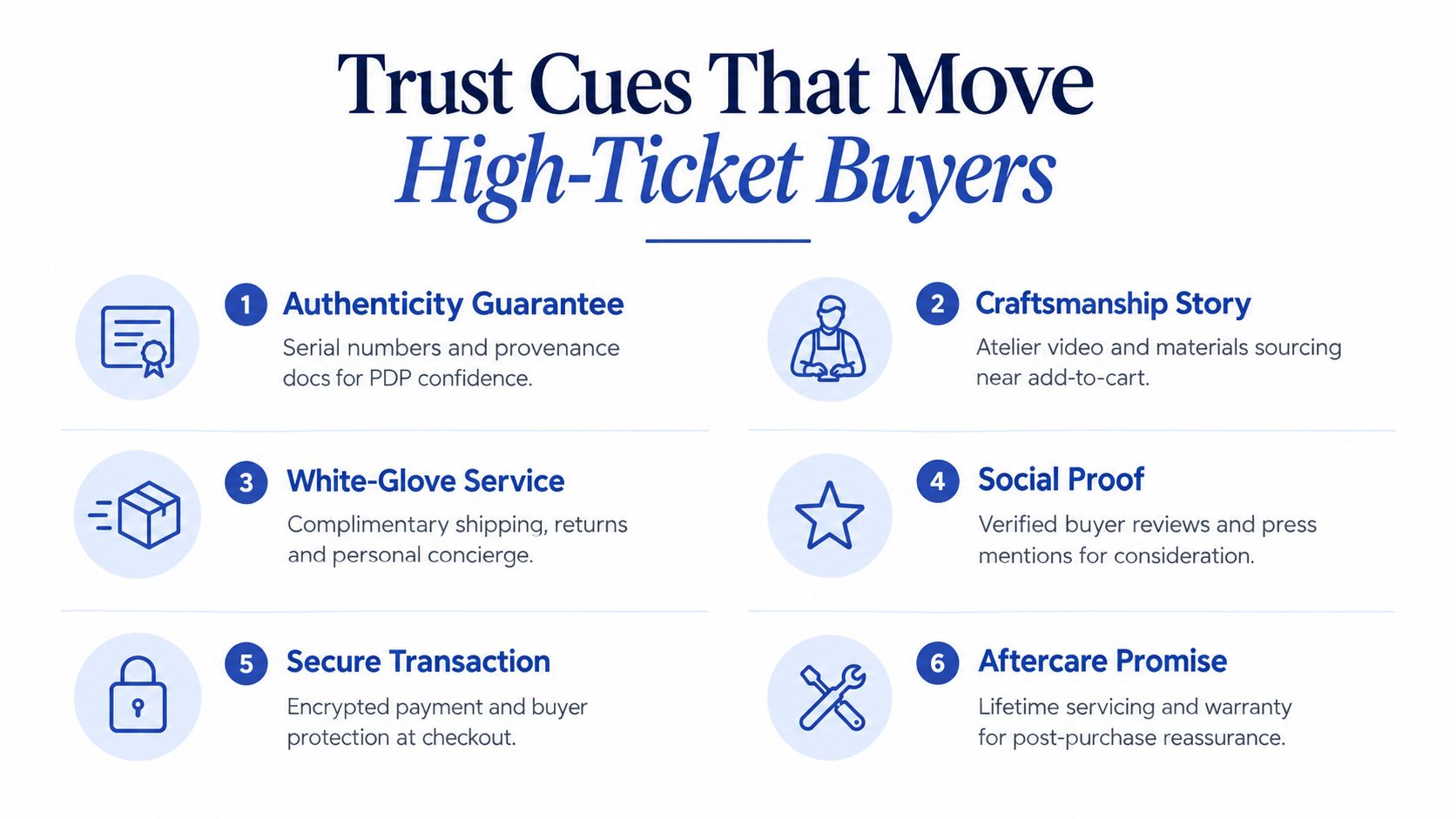
At the first PDP view, prioritise provenance, materials, craftsmanship, and product specificity. Serialisation, certificates, sourcing details, atelier footage, and close-up imagery can do more persuasive work than a generic security badge. The content should show what makes the item worth its price, not merely assert that the item is premium.
During consideration, introduce proof that helps a buyer compare risk. Verified reviews, editorial coverage, client-advisor conversations, servicing information, and a clearly framed returns process belong near the questions they answer. A returns policy presented as a white-glove service can preserve the premium tone, provided it remains plain enough to understand.
At checkout, reassurance must become operational. Show payment options, authenticity protection, named delivery partners where appropriate, delivery timing, duties or taxes, and aftercare commitments before the final payment step. UK cross-border research reports that shoppers value fast delivery and ease of access at 37% each, followed by more choice at 36% and lower prices at 33% (Landmark Global's UK ecommerce facts). The same source reports 48% of UK cross-border orders are placed on smartphones, which makes mobile reassurance a commercial requirement, not a footer detail.
Match proof to the decision stage
Use this launch checklist when introducing a collection:
- PDP confidence: Provenance, materials, authenticity documentation, craftsmanship imagery, and concise specifications.
- Consideration support: Verified reviews, relevant press mentions, service transcripts, and clear returns language.
- Checkout reassurance: Familiar payment methods, delivery promise, buyer protection, and named support contact.
- Aftercare evidence: Warranty terms, servicing route, repairs process, and long-term ownership support.
Norton, SSL, and payment badges still matter as baseline hygiene, but they rarely explain why a luxury product deserves trust. For placement and presentation ideas, the social proof widgets guide can help teams think beyond a badge stack and place evidence closer to the relevant hesitation.
Pricing, Merchandising, and AOV Tactics
Price presentation carries brand meaning. A prominent strikethrough discount, constant promotional banner, or bargain-led bundle can make a luxury product look like inventory that needs clearing. Premium merchandising should communicate selection, scarcity, and rationale without pretending that price is irrelevant.
Anchor the range through product architecture rather than discounting. A hero piece can establish the upper expression of the collection, while adjacent products give shoppers a coherent route into the category. Editorial modules can explain why a material, finish, provenance detail, or service level changes the price.
AOV growth also needs restraint. A small add-on that feels commercially arbitrary can damage perceived quality, while a curated set, monogramming option, engraving service, or complementary care product can increase value without turning the basket into a promotion.
| Tactic | Brand Equity Impact | Margin Risk | Best For |
|---|---|---|---|
| Curated product set | Strong when the story feels intentional | Moderate operational complexity | Complementary products with a clear use case |
| Engraving or monogramming | Often reinforces ownership and exclusivity | Service capacity and fulfilment complexity | Gifts and personal purchases |
| Gift with purchase | Can feel generous if proportionate and selective | Product cost and expectation management | Launches, gifting periods, and clienteling |
| Tiered loyalty access | Supports retention without public discounting | Benefits require careful cost control | Repeat customers and private access |
| Hero-product anchoring | Strengthens range perception | No direct discount cost | Collections with clear design progression |
| Blanket promotion | Usually weakens premium positioning | High margin and reference-price risk | Rare clearance situations, not everyday trade |
Merchandising should explain, not shout
Bundle products as a wardrobe, ritual, or ownership experience rather than a buy-one-get-one offer. A fragrance edit, jewellery layering story, or travel-care collection gives the shopper a reason for the combination. The same principle applies to video. A well-produced product film can show proportion, movement, texture, and use in context. Teams planning that asset can review Veo3 AI product video ads as one option for developing product-led creative concepts.
For a deeper framework on making combinations feel curated rather than promotional, use this product bundling strategy guide. Measure incremental revenue, margin contribution, attachment rate, and returns quality. A larger basket isn't a win if the add-on makes the purchase feel less considered or increases operational disappointment.
Personalization and A/B Testing for Premium Brands
Luxury teams should resist the pressure to run a new experiment every week. With category conversion rates often near the lower end of ecommerce benchmarks, a small number of completed orders can make noisy results look decisive. A rapid testing calendar creates activity, but not necessarily knowledge.
Personalisation can deliver value without changing the brand's visual language. Recognise returning visitors, surface recently viewed pieces, remember a preferred category, and use CRM notes to help client advisors continue a conversation. For cross-border visitors, make location-aware delivery, duties, currency, and service information clear, but don't create unexplained price changes that undermine trust.
Use a slower, defensible testing model
Start with a pre-period baseline. Record the performance of the current experience across traffic source, device, visitor status, landing page, and product tier. Then form a narrow hypothesis, change one meaningful variable, and define a primary outcome before launch.
Good test candidates include:
- The position and wording of delivery information on a PDP.
- The presence of a concierge route beside the purchase CTA.
- A craftsmanship video near the product decision point.
- A simplified payment selection step.
- A lookbook-to-product transition.
- A recently viewed module for returning visitors.
Interpret results with the purchase cycle in mind. A visitor may interact with the test experience, leave, return through branded search, and purchase later on another device. Read direct, email, social, and branded-search assists alongside the immediate session result.
The A/B testing best practices guide provides a useful reference for experiment structure and interpretation. In practice, the trade-off is clear: sequential, one-variable tests slow learning velocity, but they produce decisions a merchandising director can defend to a creative director.
Testing principle: In luxury, a test should explain a buyer decision, not merely declare a winning colour or button.
Use qualitative evidence to sharpen the next hypothesis. Session recordings, search terms, customer-service transcripts, wishlist behaviour, and concierge questions can reveal why a visitor hesitates. Personalisation should then respond to observed intent, not decorate the storefront with superficial “for you” labels.
Measuring What Actually Matters in Luxury CRO
The blended conversion rate is easy to report and often too blunt to guide a luxury roadmap. A store can appear weak against a national average while converting its most qualified visitors efficiently. It can also show healthy add-to-cart activity while losing buyers to unclear delivery terms, payment friction, or a lack of aftercare reassurance.
Start with a qualified conversion rate. Define a qualified session using your own engagement rules, such as a meaningful product interaction, a return visit, a wishlist save, a completed configurator, or a concierge exchange. The definition should be stable enough to compare over time and narrow enough to separate genuine product interest from incidental browsing.
Build a KPI swap
| Metric Category | Mass-Market Default | Luxury Replacement | Why It Matters |
|---|---|---|---|
| Conversion | Blended session conversion rate | Qualified conversion rate | Shows how serious visitors progress |
| Attribution | Last-click order | Assisted conversion by channel | Recognises discovery and research journeys |
| Basket value | Average order value alone | AOV with margin and attachment context | Separates healthy curation from forced upselling |
| Engagement | Page views and bounce rate | PDP interaction, video completion, and wishlist saves | Captures product confidence before checkout |
| Retention | Repeat order count | Repeat purchase rate and customer lifetime value | Reflects the value of ownership and service |
| Omnichannel intent | Checkout starts | Consultation, store-locator, and appointment activity | Connects digital research with assisted sales |
Segment every dashboard by traffic source, device class, new versus returning visitors, landing page, and price tier. A blended figure can hide meaningful differences between social referrals, brand search, direct traffic, and email. It can also conceal a mobile experience that earns strong engagement but loses buyers at payment.
Social deserves upstream measurement. Mintel's UK luxury consumer research reports that a majority of consumers research luxury items on social media before buying (Mintel's UK luxury consumer report). A separate UK luxury ecommerce report says 62% of consumers have interacted with luxury brands via social media on mobile and 9% have purchased through social platforms (Landmark Global's UK ecommerce facts). Review the handoff from social content to landing page, product detail, wishlist, email capture, and eventual purchase rather than judging social on last-click revenue alone.
Time-to-purchase matters too. Create cohorts based on first product interaction and observe how visitors return through email, branded search, direct traffic, and clienteling. Don't overinvest in the channel that happens to receive the final click. In luxury, the final click often records the conclusion of a longer sequence of trust-building interactions.
Grumspot helps Shopify and Shopify Plus teams audit luxury customer journeys, improve storefront UX, and build measurement-led CRO programmes without flattening the premium experience. Visit Grumspot to discuss a focused UX audit, platform improvement, or conversion roadmap for your luxury ecommerce store.
Let's build something together
If you like what you saw, let's jump on a quick call and discuss your project
Related posts
Check out some similar posts.