Ecommerce UI UX Design That Converts in 2026
- ecommerce ui ux design
- ecommerce conversion
- shopify design
- ux best practices
- accessibility
Launched
September, 2026

A UK ecommerce store can have strong traffic, healthy stock levels and a polished brand, yet still lose revenue through small interface decisions. The latest UK benchmark places the average ecommerce conversion rate at 3.4%, while the median site converts at 2.35%. The gap becomes sharper by device, with mobile converting at about 1.8% compared with 3.9% on desktop, according to UK ecommerce conversion benchmarks for 2026.
That difference changes how a senior Shopify Plus designer approaches ecommerce UI UX design. A misplaced mobile action, vague delivery promise, inaccessible form or slow product page isn't decoration gone slightly wrong. It can interrupt a buying journey at the exact moment a shopper is ready to pay.
Why Ecommerce UI UX Design Is a Revenue Problem
A £4m-a-year fashion store can lose one in three shoppers at checkout despite having strong traffic and available stock. The problem may sit in an apparently minor detail, such as delivery options that appear too late, a discount field that distracts from payment or a mobile form that rejects a valid UK phone number.
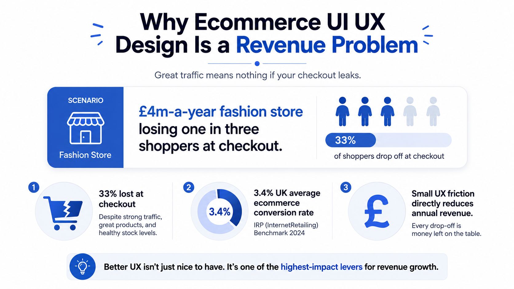
The 3.4% average UK ecommerce conversion rate is useful because it gives design teams a commercial baseline, not because every store should chase the same number. A site converting near the benchmark can still have serious leakage between product discovery, variant selection, cart review and payment. A store below the 2.35% median has an even clearer reason to inspect the journey before commissioning another campaign or homepage refresh. These benchmarks come from recent UK ecommerce performance data.
Design decisions have a measurable cost
A shopper who can't find the right size isn't merely experiencing poor usability. The store has failed to turn intent into a completed order. The same applies when a filter uses internal product language, when the thumb has to reach an awkward control or when delivery fees appear only after a customer has entered personal details.
I treat each major screen as a revenue surface:
- Navigation determines whether demand reaches a relevant product.
- Product-page hierarchy determines whether the shopper understands the offer.
- Interaction design determines whether the shopper can select, add and review.
- Checkout clarity determines whether intent survives payment and delivery decisions.
Commercial rule: If a design change can't be connected to a user action or a funnel stage, it probably hasn't been specified clearly enough.
The rest of the work should therefore focus on recoverable friction. Branding matters, but a refined typeface won't compensate for a confusing delivery selector. A premium animation won't rescue a product page that hides the price or makes variant selection error-prone. Ecommerce UI UX design earns its place in the profit centre when it makes the next action obvious, accessible and easy to complete.
The Two Halves of Ecommerce UI UX Design
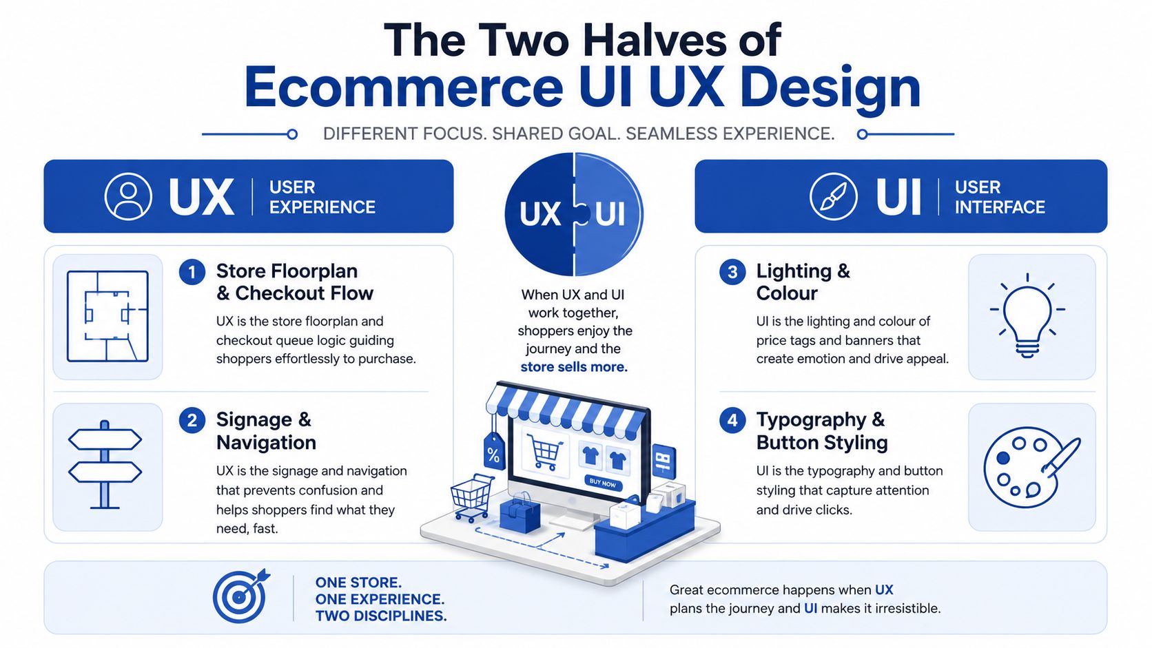
UX is the shop floorplan. It decides where departments sit, how shoppers move between them, how signs point towards products and how the queue reaches the till. UI is the physical expression of that plan, including lighting, colour, labels, spacing and the visual feedback that tells someone whether an action worked.
UX owns the journey
In a Shopify store, UX covers the information architecture, search behaviour, product discovery flow, checkout sequence and error recovery. It asks practical questions:
- Can a shopper understand the main categories without knowing the brand's internal catalogue structure?
- Can someone compare products without losing selected filters?
- Can a customer change delivery method without leaving checkout?
- Does an error explain exactly what needs correcting?
A beautiful interface with a weak UX structure still loses sales. A luxury fashion store can use perfect photography and elegant typography, yet fail if “occasion wear” is buried under an internal merchandising label that shoppers don't recognise.
UI makes the journey legible
UI design controls the component system that shoppers touch. That includes typography, colour tokens, button hierarchy, form states, spacing, image treatment, hover behaviour, loading states and focus indicators. It also defines whether the interface feels stable when a shopper changes a size, applies a filter or adds an item to the basket.
Good UI doesn't compete with the journey. It clarifies it. A primary button looks and behaves like the next step, a disabled state explains why an action isn't available and an error state appears close to the field that needs attention.
Working definition: Ecommerce UI UX design combines the structure of the buying journey with the visual and interactive language used across every surface a shopper touches.
That distinction helps teams diagnose problems accurately. If customers can't locate a category, investigate UX. If they locate it but can't read the filter controls on mobile, investigate UI. Most underperforming stores need both disciplines working from the same hypothesis rather than a visual redesign applied over an unchanged journey.
Information Architecture and Visual Hierarchy
Information architecture is the structural layer beneath every ecommerce interaction. It should reflect how shoppers think about products, not how a merchandising system stores SKUs.
Build categories around intent
A category page should help shoppers answer “Which type of product do I need?” before it asks them to inspect individual items. A fashion store may organise around gender, occasion, fit or price tier. A homeware brand may need room, material and use case. The correct choice depends on customer language, search behaviour and catalogue complexity.
Breadcrumbs provide orientation, particularly when a shopper arrives from search or a campaign landing page. Mega-menus work when they group products into recognisable clusters, but they become noisy when every collection and internal taxonomy appears at once. Curated ranges often need a simpler navigation pattern with fewer competing destinations.
Sub-categories should also preserve context. A filter that resets every time a shopper opens a product page forces unnecessary reconstruction of the journey. On mobile, collapsed controls should reveal the selected state clearly so a shopper knows why the current product list looks the way it does.
Direct attention on the product page
Shoppers scan product pages rather than reading every line. The first visual path should usually move from the main product image to the title, price, variant selector and add-to-cart control. Supporting information, reviews and cross-sell modules can follow once the core purchase decision is understandable.
A practical hierarchy checklist looks like this:
- One primary action per viewport: Don't give “Add to basket”, “Save”, “Compare” and “Find in store” identical visual weight.
- Price near the product identity: The shopper should understand the financial commitment before hunting through the page.
- Variants before purchase: Size, colour and pack options should be visible and recoverable before the main action.
- Persistent mobile action: A sticky add-to-cart control can keep the purchase action available while the shopper inspects details.
- Clear state changes: Selected swatches, unavailable sizes and quantity changes need unmistakable feedback.
The hierarchy must work for the thumb as well as the eye. Controls placed within comfortable reach, generous tap areas and stable sticky actions reduce the effort required to move from consideration to basket.
The following video provides a visual reference for how structure and hierarchy can shape an ecommerce shopping experience.
Conversion-Focused Interactions Across the Journey
A useful interaction removes a defined decision barrier. It should help a shopper find, evaluate, configure or buy a product. A floating widget or animated drawer earns its place only when it supports one of those jobs.
Search deserves focused attention on catalogue-heavy stores. Predictive suggestions can surface products, categories and useful queries while the shopper types. A broad range may need mega-navigation, while a tightly curated assortment can work better with a simple, visible menu. Choose the pattern according to whether shoppers need breadth or focus, not an arbitrary SKU threshold.
Product-page modules should build purchase confidence in a deliberate order. Lead with the gallery, product identity, price and variant choice. Put reviews where they answer evaluation questions, then place cross-sell content after the primary decision is clear. Social proof works best when it addresses a relevant concern instead of interrupting the page with generic praise. The Shopify social proof widget design reference shows why placement and context matter as much as the message.
Match the interaction to the device
A slide-out cart drawer can suit mobile because shoppers can review the basket without losing the current product context. Its value depends on execution. If the drawer conceals delivery details, traps focus or makes closing difficult, it adds friction instead of removing it. Include a clear subtotal, editable quantities, delivery information and a prominent route to checkout.
Checkout should avoid unnecessary commitment. Guest checkout, clear labels, inline validation and visible payment options reduce cognitive load. A multi-step flow works when each step has a clear purpose and preserves entered information. A single-page flow works when content is short and well grouped. The pattern matters less than the information structure and recovery options.
| Interaction | Best use case | Conversion effect |
|---|---|---|
| Predictive search | Broad catalogues and product-led queries | Reduces the distance between intent and a relevant product |
| Mega-navigation | Stores with many distinct categories | Groups destinations around shopper intent |
| Sticky add-to-cart | Long mobile product pages | Keeps the main action available during evaluation |
| Cart drawer | Mobile journeys with quick basket review | Preserves product context while exposing basket actions |
| Guest checkout | First-time or low-commitment purchases | Removes account creation as an avoidable barrier |
| Inline validation | Address, contact and payment forms | Helps shoppers recover before frustration becomes abandonment |
For merchants comparing storefront structures, Skup's ecommerce design blueprint for print-on-demand offers a useful reference for catalogue presentation, navigation and product-page composition. Treat examples as patterns to question, not layouts to copy.
Mobile interaction design needs stricter discipline. Small tap targets make selection errors more likely, while frequent modals interrupt the limited working space and can obscure the action a shopper needs next. On desktop, a modal may be easy to dismiss with a cursor. On mobile, the same interruption can require repositioning the hand, scrolling, or repeating a form step. Keep tap targets comfortable, reserve modals for decisions that need immediate attention, and test repeated interactions across the full journey. Every tap, modal, field and page transition should justify its place.
Accessibility Speed and Delivery Choice as Hidden Levers
Accessibility belongs in the revenue model, not at the end of a compliance checklist. The Equality Act 2010 created a legal duty for businesses to make reasonable adjustments for disabled users, and UK guidance commonly treats WCAG AA as the practical baseline for digital accessibility. UK ecommerce accessibility commentary explains why accessible websites and apps are part of responsible service delivery, not an optional layer.
Engineer for recovery, not just compliance
Accessible interactions often improve the experience for every shopper. Strong colour contrast helps people using a phone outdoors. Visible focus states support keyboard users and clarify the current interaction point. Explicit labels assist screen-reader users while reducing uncertainty in long forms.
Build these requirements into the component library:
- Contrast: Keep text, prices and controls distinct from their backgrounds.
- Keyboard operation: Let shoppers complete menus, drawers, selectors and payment steps without a pointer.
- Focus visibility: Keep the default outline or replace it with an equally clear state.
- Form labelling: Connect each label programmatically to its field.
- Error recovery: Identify the affected field, explain the problem and preserve entered information.
GOV.UK states that public-sector digital services must meet WCAG 2.2 AA and publish an accessibility statement. For ecommerce teams, the practical implication is to design accessibility into reusable components, test it throughout checkout and review it with every release. The GOV.UK accessibility requirements provide implementation context.
Speed and fulfilment are experience design
Historical context matters when using older benchmarks. A 2013 UK study found that 92% of 230 retailers missed the three-second page-load benchmark, while product pages averaged 5.20 seconds. It estimated that slow-loading experiences cost the UK online retail sector up to £8.5 billion, and linked a one-second response delay with lower conversions, fewer pages viewed and lower customer satisfaction. The Summit ecommerce performance report contains the underlying analysis. Treat these figures as historical evidence of the commercial cost of delay, not as current 2026 performance data.
For current optimisation work, compress product media, defer non-critical scripts, protect the critical rendering path and measure real mobile performance. The guide to Core Web Vitals optimisation helps translate those principles into technical tasks.
Delivery choice creates another abandonment point. UK research reports that 66% of frequent online shoppers abandon purchases at least monthly because of unsatisfactory delivery choices. Another finding puts abandonment at 22.3% when delivery expectations are not met, rising to 29% among high-value, high-frequency shoppers, according to GFS on delivery-driven basket abandonment.
Show delivery dates, fees, cut-off times and fulfilment methods before the final payment step. A loyalty pop-up cannot repair a checkout that makes shoppers guess when an order will arrive or whether the cheapest option is dependable. Availability, clarity and confidence should shape the delivery interface as deliberately as the payment form.
Real Store Examples Worth Studying
Live stores make useful patterns easier to understand because each choice solves a specific customer problem. The point isn't to reproduce a familiar homepage. It's to identify the relationship between interface decision, shopper uncertainty and commercial signal.
Allbirds and product-first entry
Allbirds is known for a product-first homepage that gives imagery and core products more attention than a dense navigation system. The pattern suits a focused range where the brand expects shoppers to understand the product proposition quickly. The problem it addresses is choice overload, and the signal to monitor is movement from the landing page into product discovery.
Gymshark and decision-ready product pages
Gymshark's product experience demonstrates the value of keeping product evaluation close to the purchase action. A sticky gallery and prominent size selection support shoppers who need to inspect fit and imagery before committing. The relevant measures include product-page engagement, size-selection completion, add-to-basket rate and returns-related feedback. The design isn't successful because it is sticky. It works when the persistent element remains useful without covering content or creating accidental taps.
Aesop and editorial information architecture
Aesop uses editorial presentation to make category discovery feel consistent with its brand voice. This approach turns information architecture into storytelling, which can help shoppers browse by concern, ritual or product family rather than by a bare SKU list. The trade-off is speed of scanning. Teams should watch whether editorial layers assist discovery or delay access to price and product detail.
Lush and trust inside the journey
Lush's persistent ingredient and product information modules address a trust question at the point of consideration. Shoppers don't need to leave the product journey to investigate what an item contains. For a store with strong ethical and formulation concerns, the useful signal is interaction with those details alongside add-to-basket behaviour, not page views alone.
BrewDog and progressive disclosure
BrewDog provides a useful pattern for handling age-related requirements without making the browse path carry every restriction upfront. Progressive disclosure keeps the initial journey focused, then asks for information when it becomes necessary. The design problem is legal and operational friction. The success measures include gate completion, browse continuation and checkout progression, with abandonment inspected at each reveal.
These patterns should be treated as hypotheses. The same sticky gallery can help one catalogue and obstruct another. The same editorial category page can strengthen a considered purchase and frustrate a shopper who already knows the exact product. Study the problem each pattern solves, then test the smallest version that answers it.
Measuring Whether Your Design Actually Works
A redesign earns approval through improved behaviour, not a cleaner stakeholder presentation. Set a specific hypothesis, one primary outcome and a guardrail that protects the rest of the customer journey.
Start with four commercial signals:
- Conversion rate: Shows whether sessions become completed orders.
- Add-to-cart rate: Indicates whether product discovery and product-page persuasion create intent.
- Checkout abandonment: Locates leakage after purchase intent is clear.
- Revenue per visitor: Connects conversion behaviour with order value.
Pageviews and session duration add context, but they rarely prove that ecommerce UI UX design created more value. A longer session can reflect careful consideration or confused navigation. More pageviews can mean useful discovery or difficulty finding the right product.
Structure a useful test
Write the hypothesis in behavioural terms: “Making delivery dates visible beside each option will help shoppers choose fulfilment without returning to the cart.” Define the primary metric before launch. Add a guardrail such as average order value, refund behaviour, payment errors or mobile completion.
Plan sample size and minimum detectable effect before interpreting results. A small movement can be noise, particularly with a low baseline or uneven device mix. Do not stop a test because the first few days look promising, and do not alter the design while the comparison is running.
| Metric | What it tells you | Guardrail metric |
|---|---|---|
| Conversion rate | Whether the complete journey produces more orders | Revenue per visitor |
| Add-to-cart rate | Whether product discovery and PDP content create intent | Checkout completion |
| Checkout abandonment | Where payment and fulfilment friction interrupts intent | Payment error rate |
| Revenue per visitor | Whether the change creates commercial value | Refund or cancellation rate |
Pair quantitative data with qualitative evidence. Session replays may show a shopper repeatedly opening a size selector, while funnel reporting shows whether that behaviour aligns with drop-off. Form-error logs can expose technical friction that surveys miss. Assess confidence intervals alongside practical commercial impact rather than treating p-values as the only decision rule. Statistical significance testing for ecommerce experiments provides guidance on interpreting ecommerce test results responsibly.
Before release, ask:
- What shopper problem does this change address?
- Which action should change?
- What is the primary metric?
- Which guardrail prevents hidden damage?
- Has the experience been checked on mobile, keyboard and assistive technology?
- Are delivery, price, variant and error states included in the test?
A disciplined process prevents a common failure: stakeholders approve an interface that feels more premium, while the added effort in a high-intent step reduces completed orders.
Grumspot helps Shopify Plus teams audit and rebuild ecommerce UI UX, covering mobile-first storefronts, Shopify 2.0 themes, CRO testing, performance work and complex fulfilment journeys. Visit Grumspot to discuss the friction points costing your store completed orders.
Let's build something together
If you like what you saw, let's jump on a quick call and discuss your project
Related posts
Check out some similar posts.
- conversion rate optimisation
Benefits of conversion rate optimization. Discover the real benefits of conversion rate optimisation...
Read more
- conversion rate optimisation
Looking for a conversion rate optimization consultant? This 2026 guide covers their role, process, K...
Read more
- reduce Shopify cart abandonment
Diagnose & reduce Shopify cart abandonment with our 2026 playbook. Get actionable strategies for UI,...
Read more
- conversion-focused web design
conversion-focused web design that converts visitors into customers. Learn proven tips to optimize y...
Read more