Social Proof Widgets: The Shopify Conversion Guide
- social proof widgets
- Shopify CRO
- ecommerce trust
- conversion optimisation
- UX design
Launched
August, 2026
You're on a product page, the add-to-cart button looks fine, the copy is solid, and the traffic is there. But the shopper still hesitates, scrolls back up, checks the reviews, and wonders whether this store is safe to trust. That's the exact gap social proof widgets are built to close, by making peer validation visible at the moment the buyer is deciding whether to move forward.
In the UK, that trust gap is not abstract. The CMA has treated online reviews as a major consumer-trust issue, and 82% of UK adults read online reviews when making purchase decisions, while 68% trust reviews from strangers online at least a little, according to Which? and the BuiltWith reference on social proof widgets. That's why placement matters so much. A widget near the primary CTA isn't decoration, it's a decision aid, and it works on the same behaviour shoppers already use when they compare brands and reduce risk. If you want a wider view of how peer evidence is used on social channels too, Instagram social proof strategies is a useful companion read.
Why Shoppers Need Proof Before They Click Buy
A first-time visitor rarely arrives ready to trust you. They may like the product, but they're still asking quiet questions about quality, delivery, returns, and whether your store looks credible enough to take their payment. That uncertainty is where the best social proof widgets earn their keep, because they surface signs that other people have already taken the same leap.
The trust gap is the real problem
On a Shopify Plus store, that gap shows up most clearly on product pages and in carts. A brand can spend heavily on polished photography and still lose the sale because the page never answers the customer's unspoken objection, “Has anyone else bought this and been happy?” Social proof turns that hidden doubt into something visible, which is why it often outperforms generic reassurance text.
Practical rule: place proof where hesitation happens, not where it merely looks busy.
That's also why simple trust badges alone are often underpowered. They suggest safety, but they don't show momentum, ownership, or real customer experience. A review snippet, a purchase notification, or a recent activity feed gives the shopper a social signal that feels tied to the exact product in front of them.
Proof works because it mirrors how shoppers already decide
On ecommerce sites, people rarely evaluate claims in isolation. They glance at ratings, scan testimonials, and look for cues that others have already validated the choice. That behaviour is exactly what makes the interface layer of social proof so effective, it doesn't try to replace judgment, it supports it.
If you've ever watched a shopper hover over a CTA, then go hunting for reassurance, you've seen the use case in real time. The widget only needs to answer one question: “Is this worth the risk?” When it does that cleanly, it reduces friction without adding more copy for the buyer to process.
The Main Types of Social Proof Widgets
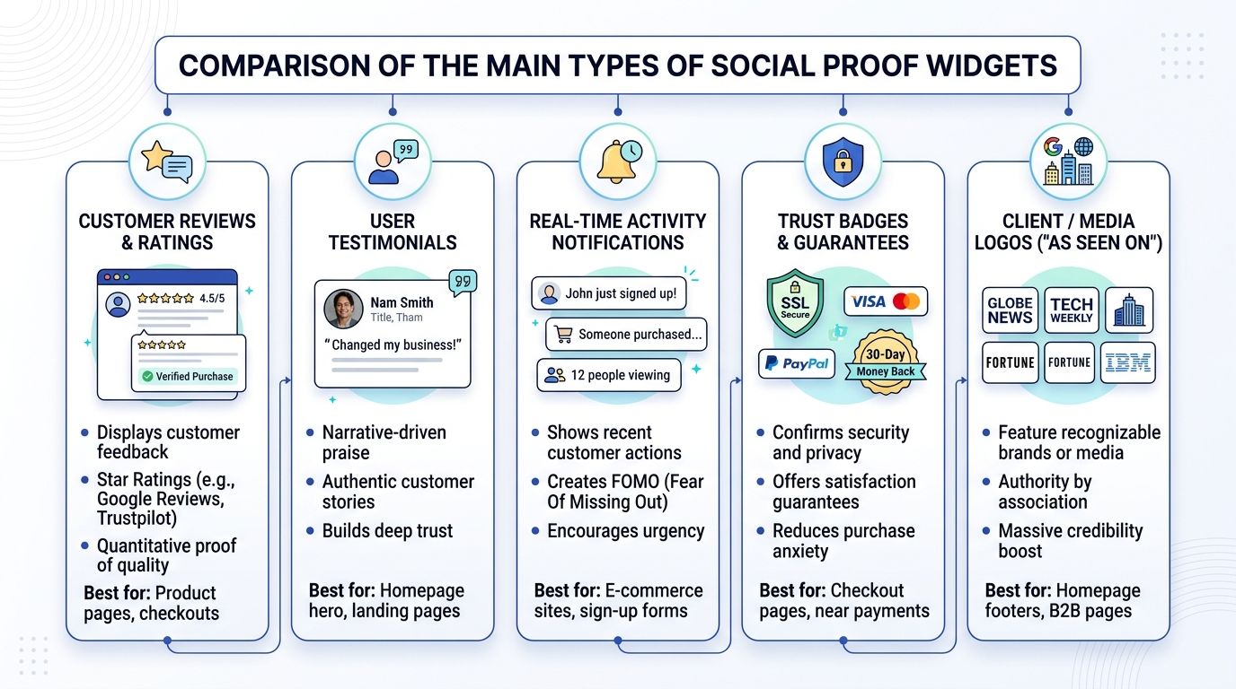
The category gets lumped together too often. In practice, each widget type solves a different problem, and each one can fail in a different way if you force it into the wrong page or product context. The most common implementations on Shopify stores fall into four buckets, recent activity notifications, review displays, UGC galleries, and live counters.
Recent activity notifications
These show that someone just bought, signed up, or viewed a product. They work best for products with low-to-mid consideration, where momentum matters and the purchase decision is quick. If the store sells a high-ticket or highly regulated item, though, these notifications can feel theatrical unless the underlying data is clean and the timing is restrained.
Review and star-rating widgets
This is the most familiar form of proof, and often the most useful for product pages and collection pages. A well-placed rating summary lets shoppers scan credibility without leaving the page, which matters when they're comparing several similar items. Testimonial displays such as display widgets are especially useful when the store wants to show structured customer feedback rather than a loose stream of comments.
A review widget should answer a question, not just add noise. If it doesn't speak to shipping, fit, durability, or service, it's probably too generic to carry much weight.
For keeping that review layer current and organised, the operational side matters too. A practical starting point is the approach in customer review management, because stale or poorly sorted reviews weaken the whole trust stack.
UGC galleries
Photo and video galleries work particularly well for fashion, beauty, homeware, and other products where appearance, texture, or real-world use matters. They make the store feel inhabited by real buyers rather than polished campaign assets. The catch is content depth. A sparse gallery can look unfinished, so it's better to use a smaller, well-curated set of strong images than a wall of weak ones.
Live visitor or viewer counts
These are the most fragile of the group. When they're credible, they create urgency and a sense of demand. When they're low, inconsistent, or clearly fabricated, they hurt trust fast. They're best used when the underlying traffic supports the signal and the message doesn't overreach.
Conversion and Trust Benefits Done Right
The value of social proof widgets comes from reducing cognitive load. They help shoppers decide faster because the page no longer asks them to rely only on brand claims. When the proof is specific, current, and visibly tied to the product, it can remove the final layer of hesitation before checkout.
What the widget should actually prove
The strongest implementations don't scream popularity, they remove uncertainty. A buyer looking at a jacket wants to know if the fit is accurate. A shopper considering a skincare product wants to know whether other people had a good experience with it. A proof widget that speaks to those objections works because it's answering the buyer's actual concern, not just broadcasting activity.
That's also where quality beats volume. A page packed with vague praise, old testimonials, or cherry-picked ratings can look busy and still fail the trust test. In a UK market shaped by scrutiny around reviews and consumer trust, that kind of shortcut tends to backfire because shoppers are already alert to manipulation.
What damages credibility
Generic praise is cheap. Specific proof feels earned.
That difference matters more than many teams realise. “Great product” tells the buyer almost nothing. A review that mentions sizing, delivery, support, or material quality gives the shopper something usable. The same applies to widgets that show current activity. If the data looks stale, disconnected from the page, or too polished to be real, the shopper stops reading the signal as proof and starts reading it as marketing.
The best practice is simple, though not always easy to enforce. Keep proof tied to the exact objection. Keep it fresh. Keep it honest about what it shows and what it doesn't. That's how a widget earns attention without becoming wallpaper.
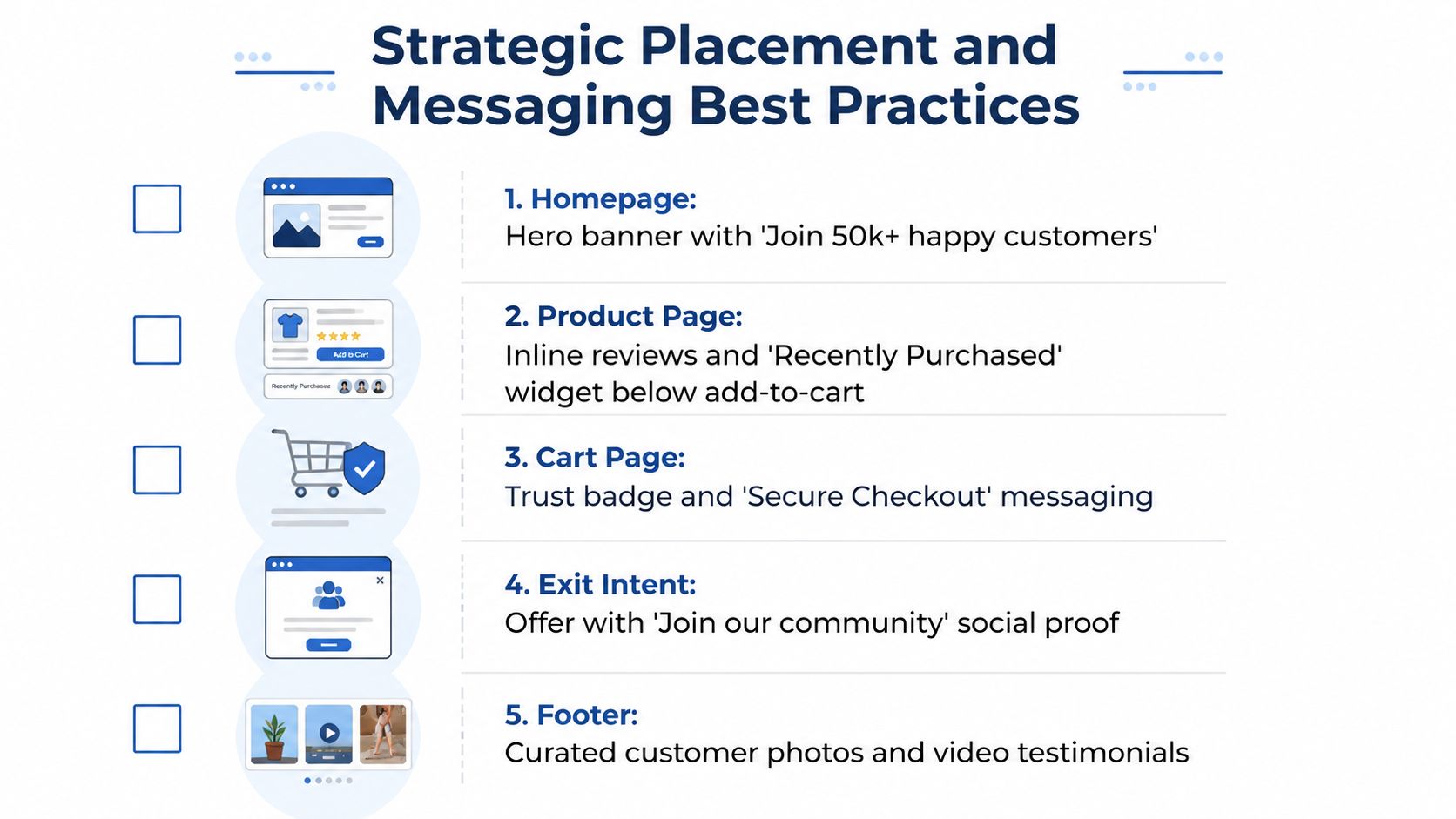
Strategic Placement and Messaging Best Practices
Placement decisions matter more than most app storefronts suggest. A widget in the wrong place can distract, inflate load time, or create the impression that the store is trying too hard. The same widget, positioned well, can smooth a decision at the exact point the shopper needs reassurance.
Put proof next to the decision point
On product pages, the strongest location is usually close to the primary CTA, where the shopper is deciding whether to add to basket. Review summaries and short testimonials work well there because they answer product-level objections without forcing the user to scroll away. Collection pages can use aggregate ratings to make comparison easier, especially when several similar products compete for attention.
Cart pages need a different tone. Shoppers there are not asking “Is this product good?”, they're asking “Is this checkout safe and worth finishing?” That's why trust signals in the cart should be calmer and more direct. Pushing urgency too hard at that stage can make the page feel needy.
Match the message to the actual evidence
A good rule is to avoid language the widget can't substantiate. If the data only shows a small number of recent purchases, don't dress it up as a massive wave of demand. If the proof comes from reviews, don't make it sound like live inventory pressure. Misalignment is what makes widgets feel fake.
The homepage and landing pages are different again. They need brand credibility, not product-specific pressure. UGC, customer photos, and broad testimonials fit there because they establish that real people use the store, but they don't interrupt the user with an overly aggressive sales cue.
Practical rule: if the message would feel embarrassing when a shopper clicks through and inspects it, don't ship it.
Shopify Implementation Without Sacrificing Performance
The technical mistake I see most often is treating widget apps like harmless add-ons. On a Shopify Plus build, every extra script competes with theme assets, app blocks, and third-party code. A proof layer that looks good in a demo can still harm the page if it blocks rendering, clashes with styles, or triggers layout shifts.
Keep the widget lightweight and isolated
High-performing widgets should load asynchronously, avoid blocking the main render path, and keep bundle size lean. Guidance for strong widget implementations calls out a bundle size under 30KB, plus Shadow DOM or scoped styles to prevent CSS collisions and preserve Core Web Vitals. That matters because a pretty widget that slows the page is still a bad widget.
Lazy-loading is the right default for anything non-critical. If the proof isn't needed above the fold, it shouldn't compete with product media or the primary CTA. The same goes for images or videos inside the widget. Load them only when they're likely to be seen.
If a widget app injects broad CSS, fights your theme, or reflows the page after load, it's not ready for production.
Get accessibility and data accuracy right
Accessibility isn't optional here. Screen readers need sensible labels, animated notifications should respect reduced-motion preferences, and any dismissible element needs to be keyboard-friendly. If the proof can't be understood without sight, it isn't finished.
Data-model accuracy is just as important. For product-page proof, AB Tasty's Social Proof widget depends on the exact page URL path, and purchase-based proof needs correctly implemented Item hit and transaction tags plus a matching product key or SKU. The same documentation shows configurable thresholds from 0 to 1,000, with defaults of 200 views or 50 purchases. If identifiers don't line up, the widget can show the wrong count or no relevant proof at all.
For Shopify teams reviewing app choices, a practical checklist is useful. The performance patterns in Shopify performance optimisation are the same ones worth applying here, especially when multiple apps are already active on the theme.
Measuring Impact Through CRO Testing
A widget that “looks active” isn't the same thing as a widget that improves revenue. The only useful test is whether it changes behaviour on the page you placed it on. That means tracking the right metrics and being honest when the data says a widget is decorative rather than persuasive.
Test the widget, not just the app
The cleanest approach is to compare variants of the same page with and without the widget. Then test position, message style, and trigger logic separately. A review summary under the CTA and a notification pop-up in the corner are not equivalent treatments, so don't bundle them into one experiment and hope the result is readable.
You should also segment by device and traffic source. Visitors arriving from paid social often behave differently from those coming through branded search or email. Mobile shoppers are more sensitive to layout crowding, especially if the widget pushes content around or competes with the sticky add-to-cart element.
Look beyond superficial engagement
Clicks on the widget itself can be misleading. What matters is whether the page improves downstream behaviour, especially add-to-cart, checkout progression, and completed purchases. Bounce rate and time on page can help, but only when you interpret them in the context of the page type. A collection page and a product page are not supposed to perform the same way.
For a more disciplined testing structure, Ecommerce Boost's CRO insights is a useful reference point alongside your own experiment design. If your team is running deeper Shopify experiments, the process in Shopify A/B testing services is the natural next layer.
Practical rule: remove the widget in at least one test. Sometimes the cleaner page wins because the proof was redundant, not persuasive.
Your Social Proof Widget Action Plan
Start with an audit. Check every existing widget for quality, freshness, placement, performance cost, and factual accuracy. If the proof is vague, stale, or obviously bolted on, remove it before you try to optimise it.
Then choose the widget type that matches the page intent. Reviews and ratings fit comparison-heavy pages. UGC fits visual products. Recent activity fits lower-friction buys when the underlying data is credible. Live counts only earn their place if the numbers are believable and the implementation is technically clean.
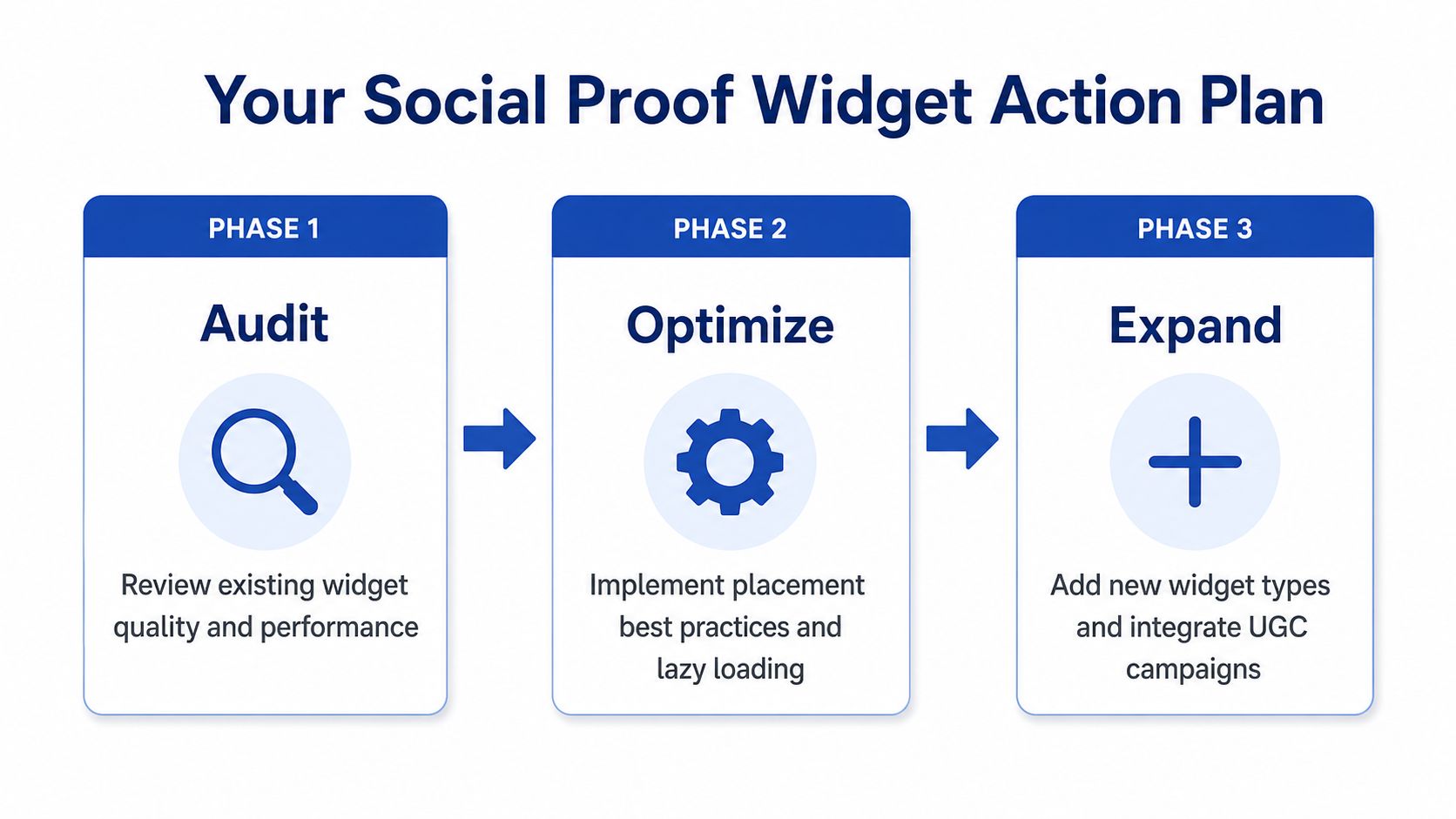
After that, implement with restraint. Load asynchronously, isolate styles, respect accessibility, and verify the data model before launch. Once the widget is live, test it like any other CRO change. Keep what helps, cut what distracts, and update anything that starts to look dated or unconvincing.
If you want a Shopify Plus team that thinks about proof widgets the way a conversion audit should, from data accuracy to Core Web Vitals to where the shopper hesitates, visit Grumspot. We build and tune storefronts so trust signals help sales instead of just filling space.
Let's build something together
If you like what you saw, let's jump on a quick call and discuss your project

Related posts
Check out some similar posts.

- shopify website examples
Explore 7 Shopify website examples and learn the UX, conversion features, and practical lessons merc...
Read more
- zero party data
Learn what zero party data is, why it matters for ecommerce, and how to collect and use it for perso...
Read more
- cro best practices
Apply cro best practices to Shopify stores with 10 actionable tactics for testing, product pages, ch...
Read more
- shopify plus stores
Explore 7 Shopify Plus stores, from Gymshark to Huel, and uncover design, UX, conversion and integra...
Read more