Heading and Subheadings That Convert: A Practical Guide
- heading and subheadings
- SEO headings
- subheading best practices
- content hierarchy
- heading structure
Launched
October, 2026
A Shopify product page can look polished, load quickly and still leave shoppers searching for the information that should help them decide. The product manager sees the problem in the numbers: the page isn't earning its place against competitors, and a quick content review reveals a familiar tangle of visual headings, skipped levels and vague labels. Changing the words alone won't fix that. The heading structure needs to help shoppers, search engines and assistive technology understand the page.
For Shopify teams, heading and subheadings are part of the storefront's navigation and conversion experience, not a finishing touch. They make product details easier to find, help people compare options and give you copy you can test against a clear business goal.
Why Headings Matter More Than Most Shopify Teams Realise
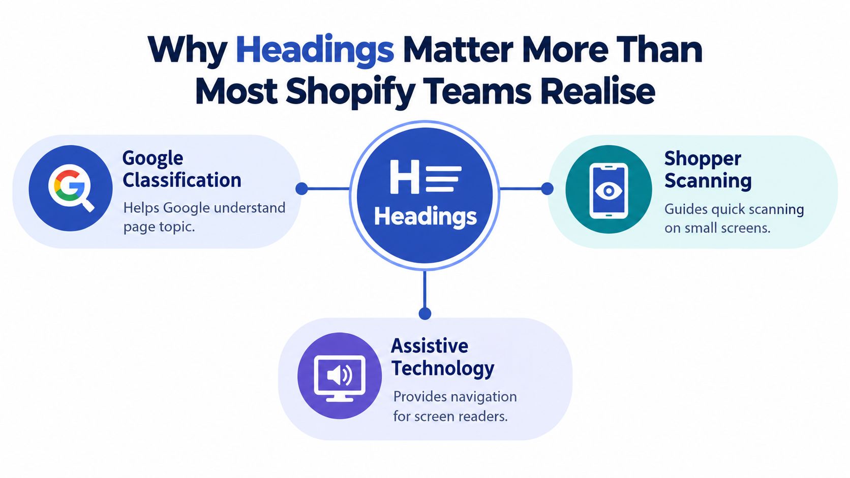
A shopper arrives on a product page with a task: check the material, find delivery information, compare sizes or confirm whether the item suits their needs. On a small screen, they're unlikely to read every paragraph in order. Clear headings help them spot the relevant section and move directly to it. Vague labels such as “More information” make that work harder.
Headings also give the page a programmatic structure. A bold line of text may look like a section title, but unless it's marked up as a heading in HTML, screen readers won't treat it as a navigational landmark. In a January 2024 WebAIM survey of 1,539 screen-reader users, 71.6% said they used headings to move through web pages (Imperial College London's accessibility guidance). For a retailer, that makes heading structure a practical part of helping customers find product information, not merely an SEO formatting choice.
Treat the page outline as infrastructure
A product page's H1 should identify the product or page topic. H2 headings can organise major sections such as “Product details”, “Delivery and returns” and “Customer reviews”. Use lower-level headings only when a section contains distinct subsections. This creates a clear outline that people can scan visually and assistive technologies can interpret.
Search engines can use headings as clues to a page's content and organisation, but an H2 isn't a ranking shortcut. A keyword pasted into every heading won't make a weak product page more useful. The page should answer the questions shoppers have, and the headings should accurately label those answers.
Connect structure to commercial intent
Think of a shopper looking for a specific fact before adding an item to their basket. If delivery costs are buried beneath a heading called "The details", the customer has to work harder to find them. A direct heading such as "Delivery and returns" makes the page easier to use and gives your team a concrete element to test.
That's the distinction between infrastructure and decoration. The heading's size and colour affect its appearance; its HTML level and wording affect how people find their way around. Teams that keep those roles separate can improve visual design without breaking the page's structure.
Building a Clean H1 to H4 Hierarchy That Scales
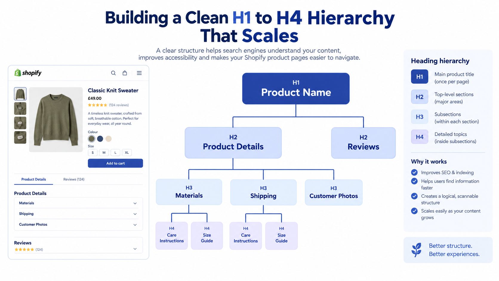
A heading outline should read like a nested map. The H1 names the page's main subject. H2s introduce the major sections beneath it, H3s divide a relevant H2 into smaller topics, and H4s sit beneath an H3 when that extra level makes the content easier to follow.
For a product page, a sensible outline could look like this:
- H1: Product name
- H2: Product details
- H3: Materials
- H4: Care instructions
- H3: Size guide
- H3: Materials
- H2: Delivery and returns
- H2: Reviews
- H3: Customer photos
- H2: Product details
Don't let edits scramble the outline
The hierarchy often breaks during routine updates. A contributor adds a visually small heading, selects H4 because it looks right, and places it directly under the H1. Another editor adds an H2 later, but the earlier mistake remains. The page may still look fine to a sighted shopper, while its programmatic outline becomes difficult to follow.
Compare these two patterns:
Before: H1 Product name → H4 Materials → H2 Delivery → H4 Returns
After: H1 Product name → H2 Product details → H3 Materials → H2 Delivery and returns
In the corrected version, each level follows its parent. Kirklees Council's guidance warns against skipping heading levels, such as moving directly from H1 to H3. The UK Statistics Authority also identifies correct headings and labels as part of WCAG 2.1 success criterion 2.4.6.
Use only the levels the content needs
One H1 is a reliable convention for a Shopify page because it gives editors a clear primary label. Themes may generate it automatically from the product or collection title, so check the rendered page before adding another title inside the content. Don't add H3 or H4 headings just to make a section look smaller. Use theme styling for appearance, and choose the HTML heading level that reflects the content relationship.
The same principle applies to long FAQs. Use an H2 for the FAQ section, then H3s for individual question groups if the content needs grouping. Avoid consecutive headings with no explanatory content between them. When teams work across different storefront templates, reference patterns from other publishing formats, such as these effective WordPress blog designs, for layout inspiration, but check Shopify's actual HTML structure independently.
Where Keywords Belong in Headings Without Sounding Spammy
Keywords belong in headings when they help name the content that follows. They don't belong there just because a keyword tool reports search demand. On a Shopify page, the H1 should identify the product or collection in language customers recognise. Supporting headings can include related terms when they accurately describe useful information, such as delivery, compatibility or subscription details.
Build a placement map, not a repetition rule
Consider a collection page for reusable water bottles. A clear H1 could be “Reusable water bottles”. Supporting H2s might be “Choose a bottle for everyday use” and “Insulated bottles for hot and cold drinks”, if those sections match the products shown. Repeating “reusable water bottles” at the start of every subheading makes the outline monotonous and can make the copy sound written for a crawler rather than a shopper.
The same applies to commercial phrases. "Free UK delivery" is helpful as a heading when the section explains the offer and its conditions. "Subscribe and save" works when a product or collection offers that option. If the heading promises something the page doesn't deliver, the keyword has become a trust problem.
For a quick placement check, ask what each heading is doing:
- H1: What product, collection or page is this?
- H2: What major need or topic does this section address?
- H3: What detail within that section helps the shopper decide?
- Meta title: Does the search result label the page clearly and accurately?
Keep search intent and page purpose aligned
A meta title and an H1 can share the main topic without being identical. The title can clarify the offer or product category, while the H1 makes the on-page subject obvious. Don't cram “best”, location terms and purchase modifiers into both unless each phrase accurately reflects the page and helps the user.
Before drafting, review the language customers use in search and on-site queries, then group terms by intent. Resources such as keyword fundamentals from maxijournal.com can help teams think through that process. For ecommerce-specific planning, use keyword research for ecommerce to connect search terms with product and collection pages.
A practical editorial test is to read only the headings in order. If they sound like a list of queries rather than a useful guide to the page, rewrite them. A keyword is well placed when it improves the label, not when it merely appears more often.
Writing Subheadings Shoppers Will Actually Scan
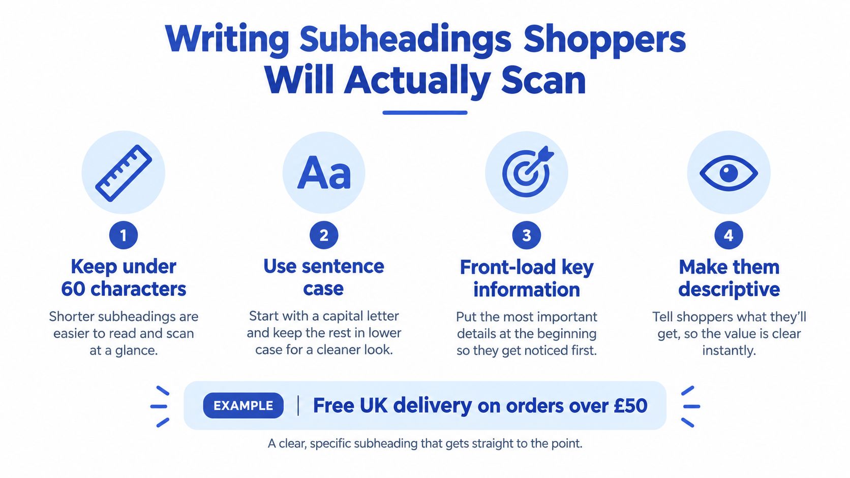
A good subheading tells shoppers what they'll find before they commit to reading the section. The UK Office for National Statistics recommends headings that are descriptive, plain-language, front-loaded with the most important information and preferably fewer than 60 characters (ONS guidance on titles and headings). That standard is especially useful on mobile, where long, abstract labels are harder to scan.
Put the answer before the flourish
These rewrites show how a heading can become more useful without turning into sales copy:
| Page type | Weak heading | More useful heading |
|---|---|---|
| Product page | Details | Materials and care instructions |
| FAQ | Questions | Delivery, returns and order help |
| Buying guide | What should you know? | Choose the right size for your space |
The improved versions name the information directly. They also help screen-reader users who rely on headings, because each label makes sense without relying on the surrounding paragraph.
Use sentence case for a consistent, readable style. Capitalise the first word and proper nouns, rather than styling every word like a title. Front-load the deciding detail: “Delivery costs and timings” is easier to understand at a glance than “Everything you need to know about how and when your order may arrive”.
Use question headings when the question helps
Questions can work well in an FAQ because shoppers may be looking for a specific answer. “Can I return a sale item?” is more useful than “Returns information” when the answer concerns that exact policy. But turning every section into a question can slow scanning, especially when a concise label would identify the content faster.
The useful distinction is whether the question makes the task clearer. “How do I cancel my subscription?” points to a specific answer. “What are the key benefits?” doesn't say which benefits the section covers. Be specific, and make sure the copy immediately answers the question.
Keep the wording aligned with the page's actual content. “Free UK delivery on orders over £50” is a strong heading only if that offer and threshold apply to the products in question. Clear headings support the broader interface too. Teams reviewing page structure and hierarchy can use this ecommerce UI and UX design guide alongside their content review.
A Practical A/B Test Plan for Heading Copy
A merchant notices that shoppers on a mobile collection page may not be reaching the product grid after landing. The team suspects the introductory heading and copy are taking up space without helping customers choose a category. Instead of arguing over whether a more promotional line “feels stronger”, they write a testable hypothesis.
Hypothesis: Replacing a broad collection heading with a clearer, task-led heading will help mobile shoppers understand the range and continue to the product listings.
The team changes one element at a time. The control keeps the existing heading; the variant uses a specific label that accurately describes the collection. Product order, imagery, navigation and introductory copy stay the same. That makes it easier to attribute any observed difference to the heading rather than to a bundle of simultaneous changes.
Choose a measure before you launch
The team selects a primary measure tied to the hypothesis, such as progression from the collection introduction to product interaction. They also watch guardrails, including add-to-cart activity, revenue per visitor and any technical or accessibility issue introduced by the variant. If the test is about scannability, a suitable engagement measure matters more than a change in search rankings, which can't be attributed confidently to a brief copy experiment.
ONS notes that the average reader reads only 20% to 28% of a web page, which makes scannable structure commercially relevant (ONS guidance on how people read online). That supports testing whether a heading helps people find their next step, but it doesn't predict a result for any individual store.
Run a controlled test, then interpret carefully
Before starting, define the audience, device segment, allocation method and a reasonable stopping rule based on the store's traffic and testing capability. Don't declare a winner after a brief fluctuation or change the variant mid-test. Record the exact heading, dates, audience conditions and any concurrent site changes so the result remains interpretable.
If the variant improves the primary measure without harming the guardrails, consider rolling it out and checking that the heading still works for assistive technology. If the result is unclear, keep the control or test a more meaningful alternative. A weak experiment isn't rescued by confident opinions.
Testing rule: Change one heading, name the user task, and decide in advance what evidence would justify keeping the new copy.
For a broader process covering experiment design and interpretation, use this ecommerce A/B testing guide. The same discipline applies to product pages: test a heading about sizing or delivery only when the page has enough relevant traffic and the outcome is measurable.
Headings Audit Checklist Before Publish
Headings are content, but they're also part of the software users interact with. A Shopify theme update, app insertion or editorial edit can change the page outline without changing how it looks. Run a heading audit on each important template, not just on the article or product description inside the editor.
UK public-sector accessibility monitoring reported 70% compliance in its latest simplified testing, up from 59% in the previous monitoring period (ONS guidance on structuring content). That's a reminder that accessibility remains practical work, not a box to tick once. Keep the audit simple enough that writers, designers and developers can all use it.
The pre-publish checklist
- Confirm the page topic: Check that the H1 describes the product, collection or article, and that the theme hasn't added a conflicting title.
- Review the outline: Make sure H2s introduce main sections and lower levels sit beneath the section they belong to. Don't jump from H1 to H3 or from H2 to H4.
- Check the rendered page: Inspect the live or preview template, including theme-generated headings, navigation components and app content. Visual styling alone doesn't confirm semantic markup.
- Read the headings in sequence: The outline should make sense without the body copy. Replace vague or duplicated labels with specific descriptions.
- Keep headings task-led: Use language that helps shoppers find details such as fit, ingredients, delivery, returns or compatibility.
- Review keywords in context: Keep relevant terms where they clarify the page. Remove repetitions that make headings awkward or misleading.
- Check heading presentation: Confirm that headings remain readable on mobile, don't get clipped and still make sense when content is collapsed or rearranged.
- Test assistive-technology navigation: Use a screen reader or accessibility inspection workflow to confirm that the heading structure is available and logical.
Track fixes like product changes
Keep a record of the template, heading change, reason and follow-up result. That history helps the team spot regressions after a theme or app update and prevents a well-tested improvement from disappearing during a redesign.
Treat the audit as shared work. Editors own the wording, designers own visual hierarchy, and developers own the rendered structure. When those roles check the same page against the same outline, headings become easier to maintain and more useful to customers.
For a Shopify storefront that needs a clearer structure, stronger accessibility and conversion-focused testing, Grumspot offers design, development and SEO audits for Shopify and Shopify Plus. Visit Grumspot to discuss a practical plan for improving your product and collection pages.
Let's build something together
If you like what you saw, let's jump on a quick call and discuss your project
Related posts
Check out some similar posts.