Screen Reader Compatibility Audit for Shopify Stores
- screen reader compatibility
- shopify accessibility
- aria ecommerce
- wcag audit
- assistive testing
Launched
August, 2026

A Shopify merchant usually notices the problem indirectly. A shopper selects a product, changes the size, adds it to the basket, and then disappears. Analytics show an abandoned session, but nothing explains that the variant change wasn't announced, the cart drawer opened without moving focus, or the updated total remained silent to a screen reader user.
That makes a screen reader compatibility audit more than a compliance exercise. It's a way to protect the buying journey for customers who shop without visual confirmation. On Shopify stores, the highest-risk moments aren't limited to page headings and image alternatives. They're the dynamic interactions that decide whether a shopper can understand a product, choose a variant, filter a collection, and confirm an order.
Why Screen Reader Compatibility Matters on Shopify Stores
A product page can look polished while remaining unusable with assistive technology. A colour selector may expose only “button”, a size change may update the price without announcing it, and a cart drawer may show a confirmation visually while a screen reader user receives no feedback. Each issue interrupts the same commercial path as a broken payment button, but it's much harder to spot through visual QA alone.
UK public-sector guidance treats compatibility with assistive technology as a practical requirement, not an optional enhancement. GOV.UK's accessibility statement guidance says digital services must work with commonly used assistive technologies, including screen readers, and meet WCAG 2.2 AA as a minimum. It also names combinations such as JAWS with Chrome or Edge, NVDA with Chrome, Firefox or Edge, VoiceOver on iOS with Safari, and TalkBack with Chrome.
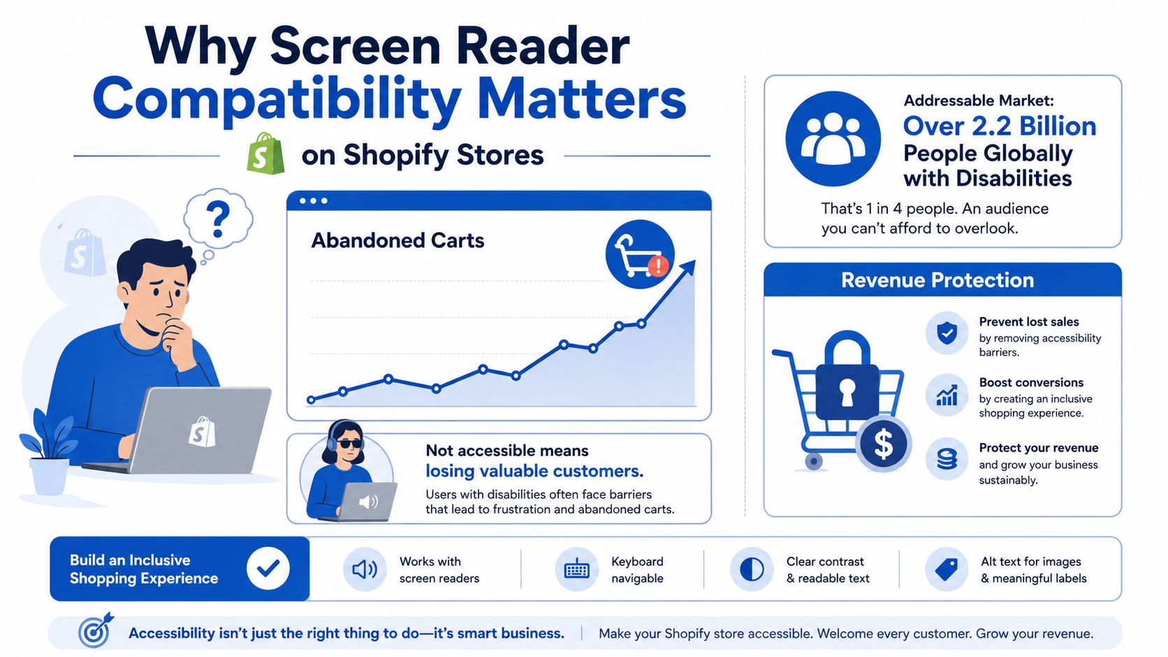
A 2016 GOV.UK assistive technology survey found that 29% of assistive-technology users accessed GOV.UK with a screen reader. Among screen-reader users in that research, JAWS represented 38.5%, VoiceOver 21.2%, and NVDA 12%. The figures aren't a Shopify conversion forecast, but they do show why testing one favourite setup isn't enough.
Commercial rule: If a shopper can't hear the state of a variant, filter, or cart update, the storefront hasn't completed that interaction.
The rest of this audit focuses on the places where ecommerce storefronts fail first: variant selectors, cart announcements, dynamic filters, and product detail pages. A Liquid-first approach fixes the underlying theme structure before adding JavaScript or ARIA to compensate for a component that was never semantically sound. For broader visual considerations, review this guide to colour contrast and accessibility.
Mapping Your Storefront Before You Change Anything
Start with an inventory, not a code edit. Export the store's sitemap from Shopify Admin, then crawl the rendered storefront rather than relying only on the server response. Sitebulb, Screaming Frog with JavaScript rendering enabled, or a Playwright script can reveal what shoppers receive after theme scripts and app blocks modify the DOM.
Group findings by template and interaction. At minimum, inspect product, collection, cart, and search templates, then record app-injected components such as review widgets, predictive search, filters, recommendation blocks, and promotional pop-ups. A product page with clean Liquid can still fail after an app adds a custom option control or replaces the cart drawer markup.
Build a component-level audit record
For every important template, capture:
- Landmarks: Confirm that the page exposes a sensible header, navigation, main content area, filters where relevant, and footer.
- Headings: Record the heading sequence and whether the product title, collection title, filter heading, and review heading describe the content that follows.
- Focus order: Tab through controls and note whether focus follows the visual and task order.
- Live regions: Identify cart counts, variant prices, stock messages, validation errors, and filter result updates that need to be communicated.
- Forms: Check labels, fieldsets, legends, required states, and error associations.
Store this in a shared spreadsheet with columns for template, URL, component, observed behaviour, expected behaviour, WCAG reference, owner, and release priority. Don't score a component solely because an automated tool reports no violation. UK guidance says automation finds only around 30% of likely accessibility problems, so the rest needs manual and screen-reader validation through GDS accessibility guidance.
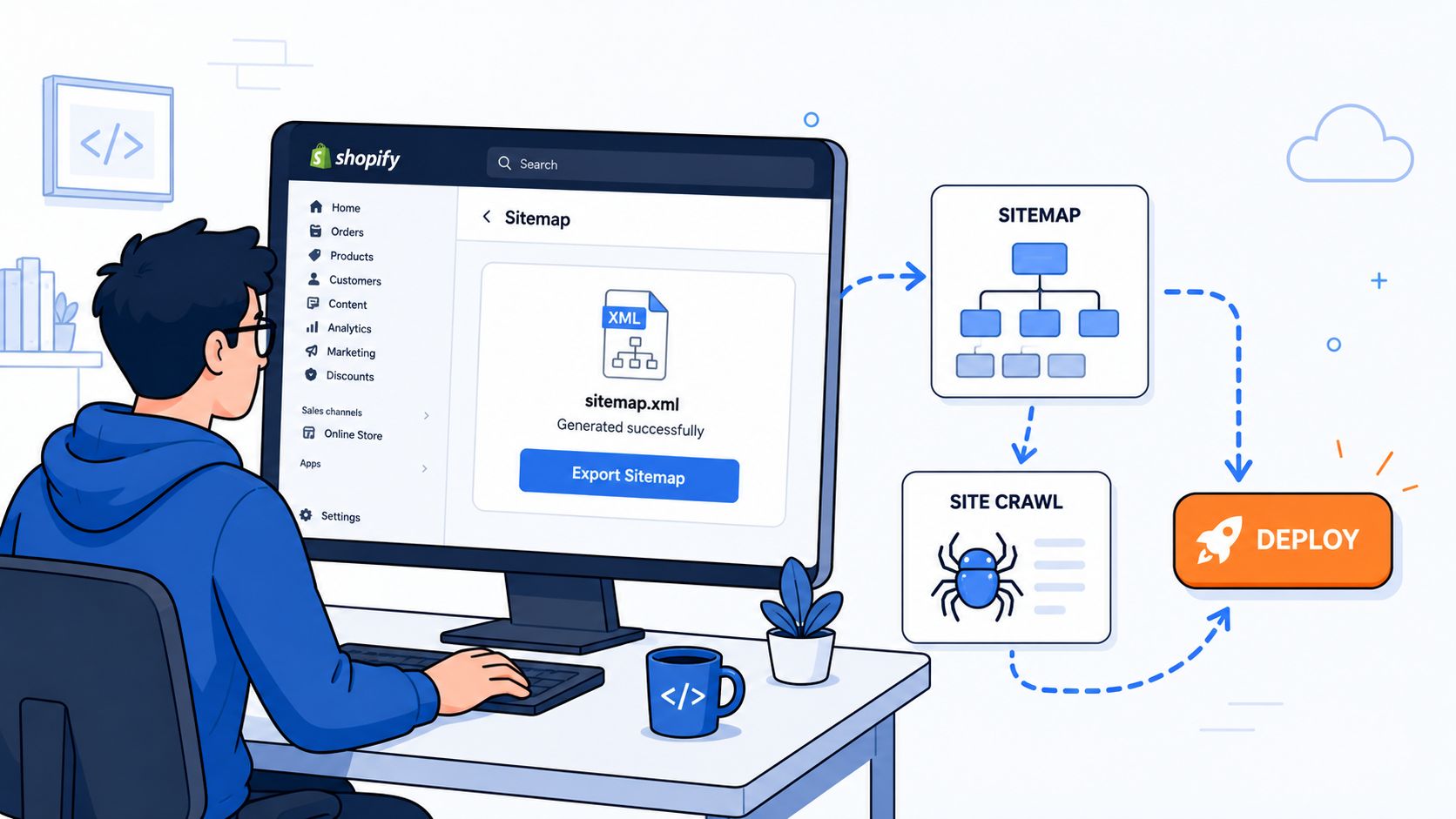
Prioritise by traffic, conversion risk, and remediation effort. A frequently visited product template with broken variant feedback belongs ahead of a low-traffic editorial page. A cart drawer that loses focus deserves immediate attention because it can block the final step for every affected shopper.
Markup Foundations for Accessible Shopify Templates
Good screen reader compatibility starts with native HTML. Use ARIA to communicate state or relationships that HTML can't express, not to turn generic div elements into pretend controls.
A product template should expose one clear main region and a predictable heading hierarchy. Put product.title in the page's h1, then use h2 headings for distinct blocks such as description, specifications, delivery information, and reviews. A collection page can place filters in an aside, while a navigation region should have a useful accessible name if the page contains more than one navigation landmark.
<main id="MainContent">
  <article>
    <h1>{{ product.title }}</h1>

    <section aria-labelledby="description-heading">
      <h2 id="description-heading">Description</h2>
      {{ product.description }}
    </section>

    {% if product.type != blank %}
      <p>Product type: {{ product.type }}</p>
    {% endif %}
  </article>
</main>
Variant choices need a relationship between the group and its purpose. A fieldset and legend work well for radio-style options because the screen reader receives the group context before the individual choice. Quantity controls in a cart drawer need a real label, even if the design uses a compact input.
<fieldset>
  <legend>Choose a size</legend>

  {% for value in product.options_with_values.first.values %}
    <label>
      <input
        type="radio"
        name="options[Size]"
        value="{{ value | escape }}"
      >
      {{ value }}
    </label>
  {% endfor %}
</fieldset>

<label for="Quantity-{{ section.id }}">Quantity</label>
<input id="Quantity-{{ section.id }}" name="quantity" type="number" min="1" value="1">
Visible focus styles also matter. Theme overrides often remove the browser outline without replacing it, leaving keyboard and screen-reader users unsure where they are. Preserve a strong :focus-visible treatment that remains visible against the store's background and button colours.
Liquid patterns worth standardising
| Pattern | Inaccessible Liquid | Accessible Liquid |
|---|---|---|
| Product title | <div class="product-title">{{ product.title }}</div> |
<h1>{{ product.title }}</h1> |
| Variant group | <div class="option">{{ value }}</div> |
<fieldset><legend>Choose a size</legend><label><input type="radio"> {{ value }}</label></fieldset> |
| Quantity input | <input type="number" placeholder="Qty"> |
<label for="Quantity-{{ section.id }}">Quantity</label><input id="Quantity-{{ section.id }}" name="quantity" type="number"> |
| Product image | <img src="{{ image | image_url }}"> |
<img src="{{ image | image_url }}" alt="{{ image.alt | default: product.title | escape }}"> |
For image alternatives, use product.image.alt when the merchant has supplied meaningful copy. Falling back to product.title is preferable to exposing a filename, but collection card images that are purely decorative should use an empty alt value rather than repeating the product name beside an already labelled link.
Theme structure is easier to maintain when these patterns live in reusable snippets and sections. A Shopify 2.0 implementation should keep accessibility decisions close to the component code, alongside schema settings and product data. See Shopify 2.0 theme development for the wider theme architecture context.
ARIA Patterns That Actually Work in Liquid
ARIA becomes useful when the interface changes without a full page load. It can expose the state of a custom selector, tell a screen reader that a cart update occurred, and connect a dynamic message to the action that caused it. It can't repair a control that has the wrong element, missing keyboard behaviour, or no reliable focus management.
A common Dawn-style failure uses a clickable element that looks like a button but behaves like a link or generic container. The safer starting point is a native button, then add state properties only when the component has state.
<button
  type="button"
  class="variant-button"
  aria-pressed="{% if value == selected_value %}true{% else %}false{% endif %}"
  data-option-value="{{ value | escape }}">
  {{ value }}
</button>
For a radio pattern, use aria-checked with role="radio" only when the component is implemented as a custom radio group, including keyboard interaction and roving focus. Don't add the role to a native radio input, because that can produce redundant or confusing announcements.
State communication for cart actions
An add-to-cart button can expose a busy state while the request is processing. A separate status node can announce success without replacing the button's visible name.
<button
  type="submit"
  class="product-form__submit"
  aria-describedby="ProductStatus-{{ section.id }}">
  Add to basket
</button>

<p
  id="ProductStatus-{{ section.id }}"
  class="visually-hidden"
  role="status"
  aria-live="polite"
  aria-atomic="true">
</p>
When JavaScript receives a successful response, update the status text, for example, “Product added to basket”. Keep the message concise. If the cart drawer opens, move focus deliberately to its heading or first meaningful control, then return focus to the trigger if the drawer closes. A role="status" region with aria-atomic="true" is useful for a complete cart update, but it shouldn't announce every internal DOM mutation.
| Component | Pattern That Works | Pattern That Breaks | Why It Matters |
|---|---|---|---|
| Variant button | Native button with aria-pressed for toggle state |
div with onclick and no keyboard support |
Native controls provide expected interaction behaviour |
| Custom radio group | role="radiogroup" with managed aria-checked states |
ARIA role added to a native radio input | Mixed models can create duplicate or inaccurate announcements |
| Cart confirmation | Separate role="status" with polite updates |
Replacing the whole drawer without an announcement | Users need to know what changed |
| Icon-only close button | Visible hidden text or a precise accessible name | aria-label that contradicts the visible purpose |
The name must communicate the same action |
| Product gallery | Descriptive image alternative and controlled state | aria-roledescription used to rename every image |
Extra roles can obscure familiar semantics |
Use aria-label sparingly. If a visible label already exists, prefer native text or aria-labelledby, because an unnecessary aria-label can override the text a sighted keyboard user sees. Avoid redundant role="button" on links and avoid adding landmark roles where native nav, main, aside, or footer already provides the correct semantics.
A Layered Screen Reader Testing Workflow
A dependable release process has three layers. Automation catches structural defects early, keyboard testing exposes focus problems, and a real screen reader pass confirms that the shopping task makes sense from the user's perspective.
Layer one covers repeatable code defects
Run axe-core against the preview theme URL in CI. A GitHub Action can launch a headless browser, load representative product, collection, search, and cart routes, inject axe, and fail the pull request when critical violations appear. Keep the route list in the repository so a new template doesn't slip past testing.
Lighthouse is useful for a fast secondary signal, but it shouldn't be treated as the release decision by itself. Automated tools can identify missing labels, invalid relationships, and some contrast problems. They won't tell you whether “Blue selected” is announced after a shopper activates a colour option.
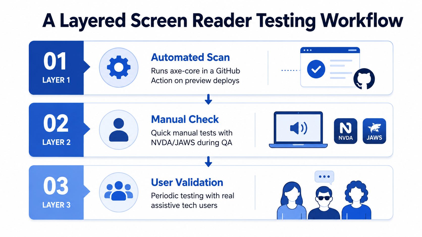
Layer two is a short keyboard pass
Use the keyboard without a mouse and test:
- Skip links: The first meaningful action should reach the main content.
- Focus visibility: Focus must remain visible through menus, filters, variant controls, and the cart drawer.
- Order: The sequence should match the shopping task, not the order in which app scripts inserted elements.
- Dialogs: Opening a drawer should manage focus, and closing it should return focus to the trigger.
- Dynamic controls: Filter buttons, quantity controls, and accordions must be reachable and operable.
Layer three tests the actual buying flow
UK government testing guidance recommends real assistive technology users and core browser combinations, including JAWS 2019 or later with Chrome or Edge, NVDA with Chrome, Firefox or Edge, VoiceOver on iOS with Safari, and TalkBack with Chrome. Its practical test method includes reading elements and headings, tabbing through links, checking landmarks and ARIA, and completing and editing forms. Follow the same principle on a Shopify release by recording two flows: choose a variant on a product detail page, then update the cart.
Log the screen reader, browser, route, action, announcement heard, expected announcement, and reproduction steps. Bring in an external auditor when a redesign changes navigation or checkout-adjacent flows, when several apps inject interactive UI, or when internal QA can't resolve conflicting assistive-technology behaviour. A structured Shopify accessibility audit can provide that independent review.
Embedding Accessibility in Your Build Process
A clean audit has a short shelf life if the next theme update replaces the accessible selector or an app injects an unlabeled modal. Screen reader compatibility needs ownership at the same points where teams already manage code quality: pull requests, component review, release QA, and post-install checks.
Create a small accessibility standard for the theme repository. It should define approved patterns for headings, form labels, variant controls, focus treatment, drawers, status messages, and image alternatives. Run HTML and accessibility checks through the Shopify CLI workflow, and make the result visible in the pull request rather than leaving it in a private audit document.
Keep proven components close to the theme
Place reusable patterns in snippets or sections with clear names, such as:
- Accessible variant picker: Owns the option group, selected state, unavailable state, and price or media update announcement.
- Cart status component: Provides one stable live region for additions, removals, quantity changes, and errors.
- Filter drawer: Manages the trigger, expanded state, focus movement, result count, and close behaviour.
- Product media component: Separates informative image alternatives from decorative assets.
The team should review app output as part of installation. Review widgets, chat tools, pop-ups, loyalty prompts, and recommendation carousels often introduce custom buttons, focus traps, or live regions that compete with the theme. A quarterly app review is a practical cadence, with an additional check whenever a high-impact app changes.
Accessibility belongs in the definition of done, not in the post-launch patch queue.
Give the team a clear escalation route. A shared channel or named Slack thread for accessibility defects prevents issues from being buried in general QA. For major redesigns, a lightweight retainer with an external auditor can provide independent testing, while the internal team retains ownership of day-to-day fixes. Grumspot is one option for Shopify Plus teams that need theme development, storefront audits, and ongoing technical support around ecommerce builds.
A 30-Day Screen Reader Compatibility Plan
A short, staged rollout keeps the work practical. Each sprint should produce a Shopify-specific artefact and a clear gate, so the team doesn't move on because a ticket was merely opened.
| Week | Owner | Deliverable | Exit Criterion |
|---|---|---|---|
| Week 1 | Merchant and QA | Sitemap crawl, rendered-template inventory, and priority spreadsheet | Product, collection, search, cart, filter, and app-injected risks have owners and priorities |
| Week 2 | Theme developer | Liquid fixes for headings, landmarks, labels, variant groups, images, and focus styles | Keyboard pass reaches every control and the highest-risk templates have reviewable theme PRs |
| Week 3 | Theme developer and QA | ARIA state properties, cart status region, variant announcements, and drawer focus behaviour | Variant selection, cart updates, and filter changes produce understandable feedback |
| Week 4 | QA and assistive-technology tester | axe checks, VoiceOver and NVDA flows, defect recordings, and regression notes | Critical defects are resolved or explicitly accepted with a documented follow-up owner |
The merchant supplies representative products and confirms which options, subscriptions, bundles, and delivery choices matter commercially. The developer fixes the theme layer before patching individual app symptoms. QA tests the same product and cart journeys after each significant change, not just the homepage.
After every theme update or app installation, run this compact checklist:
- Product detail page: The product title is the page heading, images have appropriate alternatives, and every option exposes its name, value, availability, and selected state.
- Variant changes: Price, media, stock, and purchase-state changes are announced when they change without navigation.
- Filters: The trigger, expanded state, selected filters, result changes, and reset action are understandable without visual confirmation.
- Cart drawer: Focus enters the drawer predictably, quantities have labels, errors are announced, and the updated basket state is communicated.
- Documents: Downloadable PDFs, reports, and forms have been checked separately. UK public-sector accessibility statements warn that PDFs may not be fully accessible to screen-reader software, as shown in Ofsted's accessibility statement.
- Release evidence: Record the browser, screen reader, route, action, observed announcement, and ticket reference.
A technically valid theme isn't enough if the shopper still can't tell what changed. Keep the workflow attached to real ecommerce tasks, and screen reader compatibility becomes a maintained storefront property rather than a one-off audit result.
If your Shopify store needs a practical screen reader compatibility audit, Grumspot can review the Liquid theme, variant selectors, cart drawer, filters, and app-injected interactions. Visit Grumspot to discuss a focused remediation sprint or ongoing Shopify Plus development support.
Let's build something together
If you like what you saw, let's jump on a quick call and discuss your project
Related posts
Check out some similar posts.
- color contrast accessibility
Master color contrast accessibility with our 2026 guide. Learn WCAG requirements, testing tools, & C...
Read more