Color Contrast Accessibility: Practical Guide 2026
- color contrast accessibility
- web accessibility
- wcag
- inclusive design
- shopify accessibility
Launched
July, 2026
79.1% of the top one million homepage URLs fail basic contrast requirements because of insufficient text contrast according to these website accessibility statistics. That should change how most store owners think about design.
Colour contrast isn't a finishing touch. It decides whether a customer can read your product title, spot your add-to-cart button, understand a price, or complete checkout without strain. On a Shopify store, poor contrast often hides in places teams overlook: sale badges, placeholder text, filters, image banners, app embeds, and low-contrast grey UI copied from a brand deck.
I look at this the same way I look at navigation or page speed. If people can't comfortably see what you've designed, the rest of the experience doesn't matter much. Good contrast supports people with sight loss, people with colour vision differences, and people using a phone in bright daylight. It also makes a storefront feel cleaner, sharper, and easier to trust.
Why Colour Contrast Is a Non-Negotiable
Most clients first hear about colour contrast as a compliance issue. That framing is too narrow. In ecommerce, contrast affects basic shopping behaviour: scanning collections, comparing products, reading delivery information, filling in forms, and noticing feedback states like errors or success messages.
When contrast is weak, the interface starts working against the customer. Pale grey text on white might look refined in a mock-up, but on a real device it can disappear. A soft pastel button might match the brand palette, yet fail to stand out enough for someone who just wants to buy quickly.
It affects more than disability use cases
Poor contrast doesn't only block users with permanent visual impairments. It also creates friction for people in temporary or situational conditions:
- Bright environments: Mobile shoppers outside or near a window often lose low-contrast text first.
- Small screens: Product meta, variant labels, and secondary actions become harder to distinguish.
- Tired eyes: Long product descriptions and checkout fields become more demanding than they need to be.
- Busy pages: Promo banners, upsells, sticky carts, and app widgets compete for attention.
That's why strong colour contrast accessibility sits inside broader customer experience work. If you want a useful companion read on that wider mindset, these Inclusive digital design strategies are worth reviewing.
Good contrast doesn't make a design boring. It makes the design usable under real conditions.
Why ecommerce teams miss it
Contrast issues usually don't come from carelessness. They come from process.
A brand team picks elegant muted colours. A designer applies them consistently. A developer builds what was approved. Then a merchandising team adds a promotional image with text overlay, installs an app, or tweaks a button state. The result is a storefront that looks polished in parts and inaccessible in key moments.
The fix is to treat colour contrast as a system rule, not a one-off visual preference. Once teams do that, the work becomes simpler. Decisions get faster. Reviews become clearer. And the store is easier for more people to use.
Understanding Colour Contrast Ratios
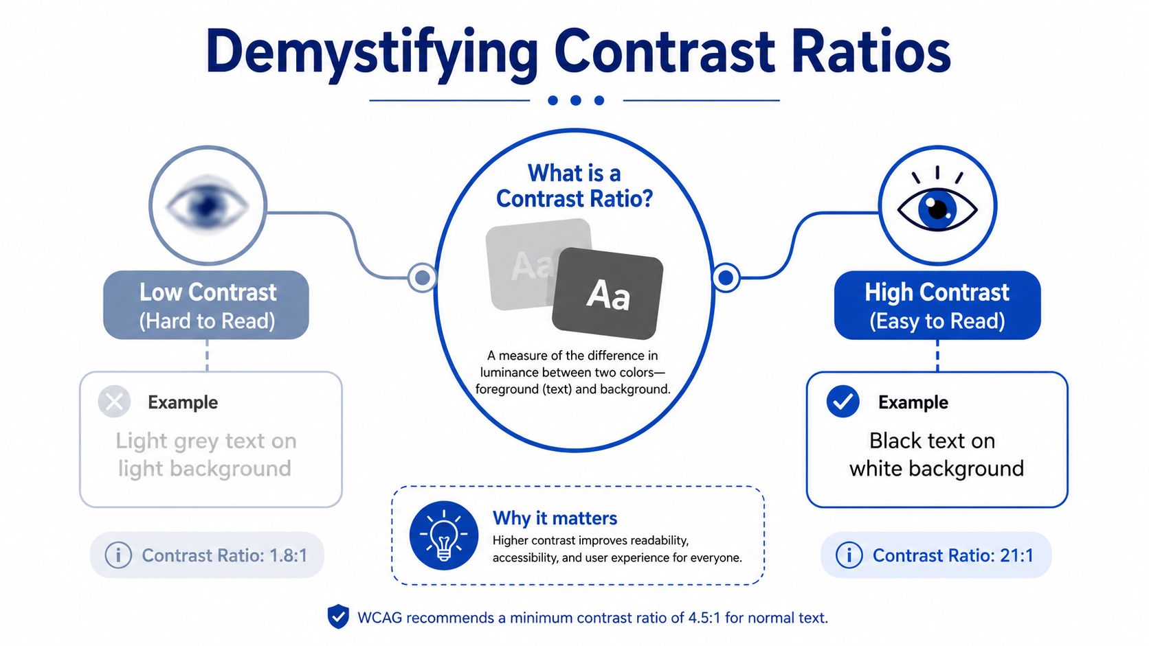
A contrast ratio measures the difference in perceived brightness between two colours. In practice, it tells you how easy it is to distinguish the foreground from the background.
If the numbers feel abstract, consider audio. A voice and background music can both be present, but if the volume gap is too small, you struggle to hear the words. Colour works the same way. If text and background are too similar in brightness, reading takes more effort.
What the numbers mean
A ratio such as 4.5:1 isn't a design style. It's a readability threshold.
The higher the ratio, the stronger the visual separation between foreground and background. Lower ratios mean the colours are closer together in luminance, so edges soften and characters become harder to recognise. That's why light grey text on a white card often looks elegant at first glance and exhausting after a few lines.
Here's the practical reading of common contrast situations:
- Low contrast: Hard to read, especially for body text, labels, and interface details.
- Moderate contrast: Often workable for larger elements, depending on size and weight.
- High contrast: Usually easier to read, though not always ideal in every context for every user.
Who benefits from stronger contrast
The obvious group is people with low vision. They often need clearer separation to read confidently.
But colour contrast accessibility also helps:
- Users with colour blindness: They may not perceive certain colour differences the way designers expect.
- Older shoppers: Subtle text and controls can become harder to distinguish over time.
- Everyone on mobile: Smaller type and variable lighting conditions amplify weak contrast.
- Customers moving quickly: Clear visual hierarchy supports faster scanning and fewer mistakes.
Practical rule: If you have to squint to read a label in your design file, your customers probably will too.
Why designers get confused
A common misunderstanding is thinking contrast is about hue alone. It isn't. You can choose two very different colours and still end up with poor readability if their brightness is too similar. Blue on purple can fail. So can green on orange. The issue is not just colour family. It's perceived lightness.
Another point that trips teams up is context. Text doesn't exist in isolation. A white headline that passes on a dark solid background may fail when placed over a product photo with highlights behind it. The actual background under the text is what matters.
That's why contrast checking needs to happen on real components, not just in a palette sheet.
Decoding WCAG Contrast Requirements
For UK businesses, the baseline is clear. WCAG 2.1 Level AA requires a minimum contrast ratio of 4.5:1 for normal text and 3:1 for large text and graphical objects according to Scope's guide to colour contrast and accessibility.
Those are the numbers practitioners need to know day to day. They're the practical rules behind compliant text, controls, icons, and visual components.
The quick reference table
| Element Type | Minimum Contrast Ratio |
|---|---|
| Normal text | 4.5:1 |
| Large text | 3:1 |
| Graphical objects and UI components | 3:1 |
How to read those categories
Normal text means the smaller text most Shopify stores rely on constantly. Product descriptions, menu items, form labels, policy links, price notes, and filter labels all usually fall into this category.
Large text gets a lower threshold because bigger, heavier characters are easier to identify. Think hero headings, oversized promotional statements, or large section titles.
Graphical objects and UI components covers things that aren't paragraphs of text but still communicate meaning. That includes icons, input borders, selected states, toggles, chart elements, and other interface parts customers need to perceive clearly.
AA and AAA are not the same thing
Level AA is the baseline most businesses work to first. It's the minimum standard discussed in legal and operational guidance.
Level AAA goes further. Scope notes that aiming for 7:1 for normal text is more inclusive because it makes text easier to read for a wider audience. That higher target can be useful for dense reading experiences, content-heavy pages, and critical information. But it shouldn't be applied blindly everywhere without considering actual user needs, which matters more in the final section on edge cases.
For teams working across platforms, not just Shopify, it can also help to look at how others approach designing accessible Sitecore platforms. The underlying accessibility logic is the same even when the CMS changes.
What this means on a Shopify storefront
These rules show up in ordinary places:
- Announcement bars: White text on a brand pastel often fails.
- Buttons: Text may pass while the button outline or disabled state doesn't.
- Forms: Placeholder text is commonly too faint.
- Badges: “Sale”, “Sold out”, or “New” labels can become unreadable.
- Icons: Search, account, wishlist, and close icons need enough contrast too.
Passing contrast for one state doesn't mean the component is accessible. Check default, hover, focus, disabled, and error states separately.
If you remember one thing, remember this: contrast requirements apply to the interface customers use, not the ideal version shown in a single static mock-up.
Tools and Workflows for Testing Contrast
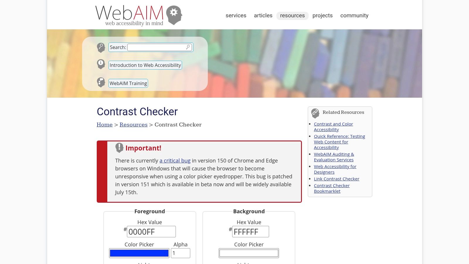
The fastest way to improve colour contrast accessibility is to make testing part of normal design and QA. Don't leave it for launch week. Check colours while the design is taking shape, and verify them again in the browser where real backgrounds, opacity, and theme settings can change the result.
A simple browser checker is still the easiest place to start.
A practical workflow that works
I usually recommend a three-layer workflow.
Check colours during design Use a contrast checker inside Figma or Adobe before approval. This catches obvious failures early, before the palette spreads across multiple templates.
Inspect real components in the browser Open Chrome or Firefox DevTools and inspect the live element. Gradients, overlays, transparency, inherited styles, and app content often alter the actual contrast.
Review the full customer journey Test collection pages, product pages, cart, and checkout-related interactions. A homepage can look fine while forms, filters, and app blocks fail badly.
What to test on a Shopify theme
If you're working through a theme refresh or a rebuild, include contrast in the same review cycle as responsive QA. This is especially useful during Shopify 2.0 theme development, where sections, app blocks, and reusable components can multiply contrast issues quickly.
Focus on these areas first:
- Typography: Body copy, legal text, labels, prices, compare-at prices, and breadcrumbs.
- Interactive states: Buttons, links, hovered links, keyboard focus states, toggles, tabs, and accordions.
- Transactional feedback: Error messages, stock warnings, success states, validation cues, and discount code feedback.
- Media overlays: Banner text, collection headers, image hotspots, and video captions.
Don't test only the hex codes
Teams waste time by testing #333333 on #FFFFFF in isolation, then assuming the whole component passes.
In the browser, the problem might be:
- a semi-transparent overlay
- text placed on top of an image
- a disabled opacity setting
- a theme setting changed by a merchant
- app-injected markup with its own styles
That's why live inspection matters. You want to test what the shopper sees, not what the design token suggests.
A short walkthrough can help teams who haven't done this before:
Build it into sign-off
Contrast testing works best when it becomes a release rule. Don't ask, “Does this look okay?” Ask, “Has this state been checked?” That tiny process change stops a lot of avoidable regressions.
Practical CSS for Accessible Colour Palettes
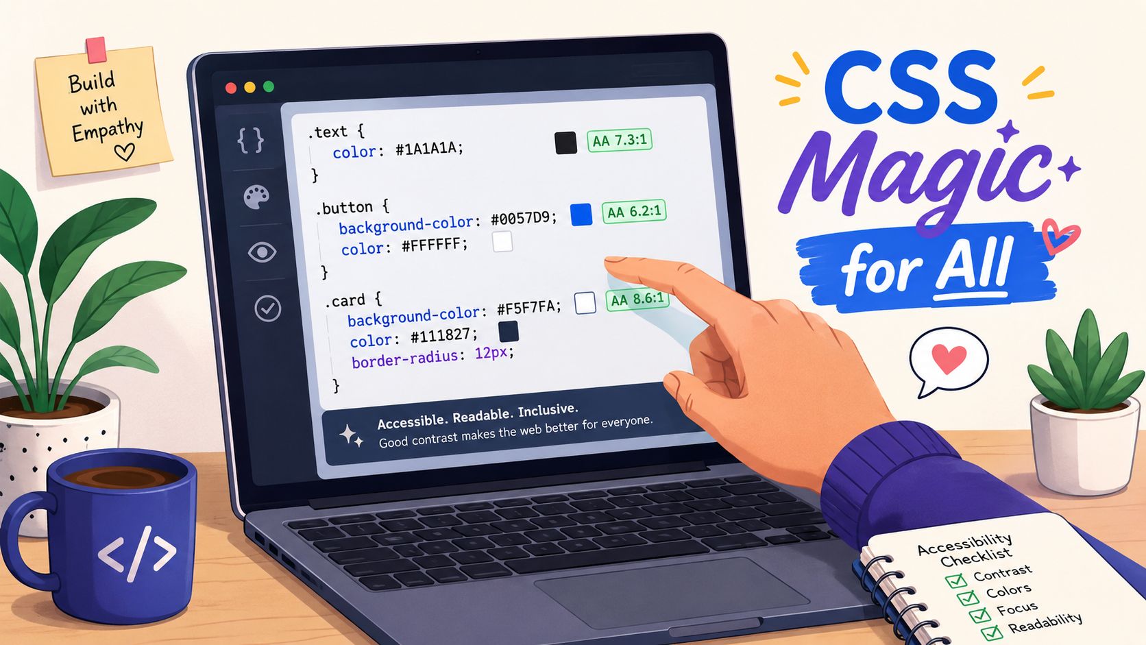
Most contrast issues become manageable once you stop styling colour ad hoc. The cleanest fix is to define an accessible palette in CSS variables, then reuse those tokens across components.
Start with design tokens
Instead of writing colours directly into every class, create a controlled set of variables.
:root {
  --color-text: #1f1f1f;
  --color-background: #ffffff;
  --color-surface: #f7f7f7;
  --color-link: #0f3d91;
  --color-button-bg: #111111;
  --color-button-text: #ffffff;
  --color-border: #5c5c5c;
  --color-focus: #0f62fe;
}
This does two useful things. It makes contrast decisions intentional, and it gives your team one place to adjust colours when a problem appears.
If you need help translating brand colours between formats while building a token set, a simple utility like this guide to build a privacy-first converter can speed up handoff work.
Apply colours at component level
Here's a simple baseline for body text, links, and buttons:
body {
  color: var(--color-text);
  background-color: var(--color-background);
}

a {
  color: var(--color-link);
  text-decoration: underline;
}

.button-primary {
  background-color: var(--color-button-bg);
  color: var(--color-button-text);
  border: 1px solid var(--color-button-bg);
}
The underline on links matters because colour alone shouldn't carry all the meaning. That's especially important in product descriptions, blog content, and policy pages.
For teams building admin-facing tools or embedded experiences, the same system thinking applies in Shopify Polaris app design, where component consistency matters just as much as brand expression.
Focus states need deliberate contrast
Keyboard users rely on visible focus indicators. If your focus ring is faint, they can lose track of where they are on the page.
a:focus-visible,
button:focus-visible,
input:focus-visible,
select:focus-visible,
textarea:focus-visible {
  outline: 3px solid var(--color-focus);
  outline-offset: 2px;
}
Don't remove outlines unless you're replacing them with something clearer. Invisible focus is one of the quickest ways to make a store frustrating to use.
A polished interface still needs obvious focus states. Subtle doesn't help if the customer can't find the active field.
Be careful with disabled styles
Disabled buttons often fail because teams lower opacity until text and background merge visually.
.button-primary:disabled {
  background-color: #767676;
  color: #ffffff;
  border-color: #767676;
  opacity: 1;
  cursor: not-allowed;
}
The important part is opacity: 1;. If you reduce opacity globally, you may accidentally weaken contrast below an accessible level. Use an intentional disabled colour instead.
A better palette strategy
When reviewing a brand palette, separate colours by function:
- Text colours: reserved for readable content
- Surface colours: cards, backgrounds, containers
- Action colours: buttons, links, active states
- Feedback colours: success, warning, error
- Utility colours: borders, dividers, icons
That structure prevents a common mistake on Shopify builds: using the same “brand grey” for text, borders, placeholders, and disabled states, even when it's too weak for half of those jobs.
Advanced Considerations and Common Pitfalls
The basic rules catch a lot, but real storefronts get messy fast. The hardest contrast problems usually happen where brand expression, merchandising, and accessibility collide.
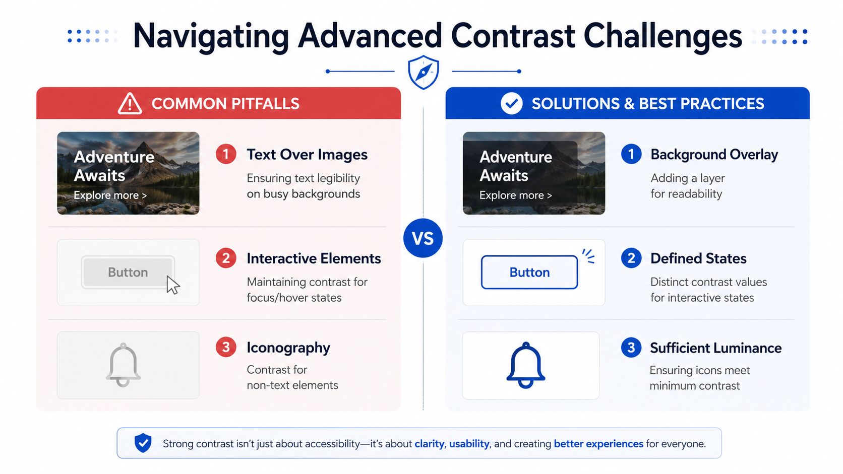
Text on images is often the first failure
A white headline over a lifestyle banner can work on one crop and fail on another. That's because the text isn't sitting on one background colour. It's sitting on a moving mix of highlights, shadows, skin tones, fabric, and product detail.
The safest fixes are practical, not fancy:
- Add a scrim: a dark or light overlay behind the text
- Use a text panel: place copy inside a solid container
- Control image positioning: avoid busy areas behind important text
- Provide a mobile-specific asset: crops change everything on smaller screens
If a campaign image won't support readable text, move the text outside the image. Merchandising goals don't trump legibility.
Charts and adjacent colours need their own check
This gets missed in dashboards, reports, loyalty views, and analytics blocks embedded in ecommerce tools. The UK Government Analysis Function states that chart elements should have at least a 3:1 contrast ratio with adjacent colours in data visualisation, as shown in its guidance on accessibility and colour palettes.
Grey-on-grey combinations are a common problem here. Two greys may look different to a design team but still be too close together to separate easily, especially when colour is the only cue.
If a customer has to rely on colour alone to decode a chart, the chart is doing too much work with too little signal.
Use labels, patterns, direct annotations, or distinct line styles so meaning doesn't depend on colour alone.
Maximum contrast isn't always the best reading experience
This is the nuance many guides skip. Research notes that “very high contrast color schemes can make reading more difficult” for people with dyslexia, according to Harvard's accessibility guidance on sufficient colour contrast.
That doesn't mean contrast rules stop mattering. It means accessibility isn't solved by pushing everything to pure black on pure white and calling it inclusive.
A better approach is to separate two questions:
- Can the content be perceived clearly?
- Is the reading experience comfortable for the audience?
For long-form reading, some teams choose dark charcoal on off-white rather than pure black on pure white. That can still support strong readability while reducing visual harshness for some users. The right answer depends on the component and the context. Product titles, buttons, and form labels need optimal visibility. A blog article or help page may benefit from a softer but still compliant reading palette.
Your Storefront Accessibility Checklist
A good contrast audit doesn't need to start with every page. Start with the elements customers touch most, then work outward. If you want a structured review process, a dedicated Shopify accessibility audit can help teams catch issues across theme code, content, and apps.
Use this checklist on your storefront:
- Body text: Check product descriptions, policy pages, blog copy, and footer text against their actual backgrounds.
- Headings and promo copy: Review banner text, collection headers, and sale messaging, especially where text sits on images or gradients.
- Links: Make sure links are distinguishable without relying only on colour. Underlines are usually the simplest fix.
- Buttons: Test primary, secondary, hover, focus, and disabled states. Don't assume one passing state covers the rest.
- Forms: Inspect labels, placeholders, borders, error text, helper text, checkboxes, and radio controls.
- Icons: Review search, account, cart, close, accordions, and status icons. Meaningful icons need enough contrast too.
- Notifications: Success, warning, and error messages must stay readable, not just visually themed.
- Charts and reports: If your store uses dashboards, loyalty widgets, or comparison graphics, check adjacent colours and add non-colour cues.
- App blocks: Third-party apps often introduce the weakest contrast on the page. Audit them like any other part of the storefront.
The big shift is simple. Don't treat colour contrast accessibility as a design restriction. Treat it as quality control for clarity. Stores that are easier to read are easier to shop.
If you want help turning an inconsistent Shopify storefront into a cleaner, more accessible buying experience, Grumspot can audit the friction points, refine the UX, and implement fixes without slowing down your team.
Let's build something together
If you like what you saw, let's jump on a quick call and discuss your project

Related posts
Check out some similar posts.

- screen reader compatibility
Practical steps to audit and improve screen reader compatibility on your Shopify storefront, with se...
Read more