One Page Checkout Shopify How to Build It Right
- one page checkout shopify
- shopify checkout optimization
- shopify plus checkout
- shopify CRO tips
- checkout extensibility
Launched
September, 2026
You're probably looking at a checkout that works well enough, but still leaks intent right at the finish line.
A shopper adds products, reaches checkout, sees shipping update late, gets asked for more than they expected, hesitates on mobile, and disappears. Nothing is broken in the technical sense. The problem is friction. That's why one page checkout on Shopify gets attention. It removes transitions, keeps totals visible, and shortens the path between “I want this” and “Pay now”.
That said, I wouldn't treat one page checkout Shopify as an automatic win for every store. For straightforward DTC journeys, it usually helps. For UK stores with B2B rules, VAT expectations, delivery complexity, purchase-order workflows, or mixed retail and procurement buyers, compressing the whole transaction into one screen can hide the very details a buyer needs to feel safe completing the order.
Why One Page Checkout Matters for Shopify Conversion
A shopper on a phone gets to checkout with real intent to buy. Then the page asks for contact details, reloads, asks for delivery details, reloads again, and only shows the final shipping cost late in the process. That is where a lot of otherwise healthy Shopify stores lose orders.
One-page checkout matters because it reduces reorientation. The buyer can see contact details, delivery information, shipping choices, payment, and the order summary in one continuous flow. They can correct mistakes without jumping between steps, and they get pricing context earlier, which lowers the chance of a last-minute second guess.
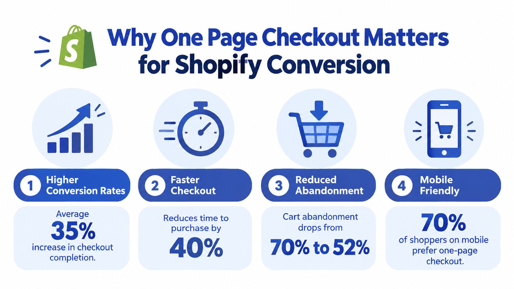
For UK merchants, that structure can produce a measurable lift. UK checkout benchmark data from IMRG and Ecommpay found single-page checkout converted at 61% versus 56% for multi-page checkout in the first half of 2024 (IMRG checkout benchmark study). In practice, that gap is large enough to justify testing, especially on mobile-heavy stores where every extra transition costs attention.
Where the lift usually comes from
The gain usually comes from a few boring but important improvements:
- Fewer page changes: less waiting, fewer chances to drop off between steps
- Earlier cost visibility: shipping, payment, and totals are easier to review before commitment hardens
- Better mobile flow: one long form often feels easier to finish than multiple reloads and step changes
- Stronger express checkout placement: Shop Pay, Apple Pay, and similar options sit closer to the buying decision
Shopify has also published merchant examples showing uplift after the switch, including Stellar Eats at 3.5% and Hemlock & Oak at 7% (Shopify UK checkout optimisation guidance).
That said, conversion improvement is conditional.
One-page checkout works best when the order is simple enough that compression increases clarity. If the journey depends on explaining VAT treatment, freight thresholds, delivery constraints, or internal approval details, putting everything on one screen can make the checkout feel denser rather than easier.
Why UK teams are paying attention now
Part of this is driven by platform reality. Shopify has pushed one-page checkout into the default experience across standard plans and Plus, so the question is less about availability and more about fit.
Researchers at Leeds Beckett's Retail Institute found around 74% of online shopping baskets were abandoned in late 2024, with recovery rates below 5%. They cited unexpected delivery costs, forced account creation, complicated checkout processes, and weak payment trust among the key causes (Leeds Beckett checkout abandonment research). One-page checkout can reduce process friction, but it will not fix poor shipping policy, unclear returns, or weak trust signals on its own.
If the leak starts earlier in the journey, practical ways to reduce Shopify cart abandonment will have as much impact as the checkout layout.
When not to force one-page checkout
This is the part a lot of articles skip. One-page checkout is not automatically the right answer for complex UK B2B or delivery-heavy stores.
I would usually keep the native one-page experience for straightforward DTC catalogues with predictable shipping and simple tax expectations. I would be more cautious if the store sells to trade buyers who need company names, VAT visibility, purchase order references, delivery instructions, or different fulfilment rules by postcode or basket mix. In those cases, speed is not the only job. Comprehension matters just as much.
A simple decision rule helps:
- Use native one-page checkout when fewer steps make the order easier to understand.
- Use apps or Checkout Extensibility when the buyer needs extra fields, logic, or reassurance inside checkout.
- Reconsider a one-page-first approach when the journey is carrying too much B2B, VAT, or delivery logic to present cleanly on one screen.
The practical takeaway is blunt. One-page checkout is a conversion tool, not a default to defend at all costs. It tends to win when it removes friction without hiding important information. It tends to lose when buyers need deliberate checkpoints before they pay.
Choosing Your Implementation Path on Shopify and Shopify Plus
Wasting time by starting with design before they've chosen the right implementation route is a common pitfall.
For Shopify checkout today, there are really three paths that matter. First, the native layout switch inside Shopify. Second, app-led enhancements that extend the native checkout. Third, Checkout Extensibility on Shopify Plus for deeper logic and interface control. The old checkout.liquid approach isn't a serious path for new work. It's legacy debt.
The short decision logic
If your store is a standard DTC build with uncomplicated delivery and no unusual checkout data requirements, stay native for as long as you can. Native is safer, quicker to maintain, and far less likely to break after platform changes.
If you need surface-level enhancements on a non-Plus plan, an app can help, but only if it works with Shopify's current checkout model and doesn't try to fight it.
If you're on Plus and need business logic, conditional behaviour, or B2B-specific inputs, use Checkout Extensibility. That's the proper route.
The best checkout customisation is the one your team can still understand six months later.
Which One Page Checkout Approach Fits Your Store
| Approach | Best For | Customisation Level | Maintenance Risk |
|---|---|---|---|
| Native one-page checkout toggle | Most DTC stores, simple UK shipping setups, teams wanting speed and stability | Low to moderate | Low |
| App-based checkout enhancements | Non-Plus stores needing targeted additions like fields or messaging | Moderate | Medium |
| Checkout Extensibility on Shopify Plus | B2B, VAT-sensitive flows, delivery-heavy rules, payment or shipping logic | High | Low to moderate when built properly |
| Legacy checkout.liquid | Existing legacy stores only | Historically high | High |
What each option gets right and wrong
Native one-page checkout
This is the cleanest option. Shopify supports it directly, the merchant experience is straightforward, and you avoid a lot of accidental complexity.
What it doesn't do well is handle edge-case workflows. If your buyers need purchase order references, customer-specific validation, delivery logic tied to account type, or checkout content that changes based on business rules, native alone often runs out of room.
Apps on non-Plus stores
Apps are useful when they extend checkout sensibly. They're less useful when they pile interface blocks onto an already compact page.
Use apps to solve a specific problem, not because the app store makes every feature look harmless. Each added block competes for buyer attention. On one-page checkout, clutter becomes visible very quickly.
For teams reviewing patterns before they commit, branded Shopify checkout tips from Quikly are worth reading because they frame checkout customisation around actual merchant use cases rather than decoration.
Checkout Extensibility on Plus
This is the serious option for serious complexity. It gives Plus merchants a supported way to add logic and interface customisations without editing checkout in brittle ways.
The critical operational point is this. Plus stores using checkout extensibility manage customisations inside the checkout editor, not the theme editor. That catches teams out all the time. Theme habits don't map cleanly to checkout work.
When not to default to one page
Shopify's one-page checkout documentation surfaces the unanswered question well: many merchants can switch between one-page and three-page layouts, but the harder question is which UK merchants should not default to one-page (Shopify UK one-page checkout article).
In practice, I'd be cautious about defaulting to one-page if your store has:
- Complex B2B purchasing: Buyers need PO references, approval context, or account-specific instructions.
- Delivery-heavy transactions: Freight rules, postcode constraints, or special handling need explanation.
- VAT-sensitive checkout expectations: Business buyers often want clear tax context before payment.
- Mixed audiences: If consumers and procurement teams use the same storefront, one layout may not suit both.
When those conditions are present, the question isn't “can Shopify do one page checkout?” It can. The question is whether a compressed experience helps the buyer complete the order without second-guessing.
Enabling and Configuring One Page Checkout Without Code
A merchant flips on one-page checkout on Friday, sees a cleaner layout in the editor, and assumes the work is done. By Monday, support is dealing with failed delivery expectations, confused VAT questions, and B2B buyers asking where to add a PO reference. The layout was not the problem. The setup was.
If your store is straightforward, native configuration is often enough. If your UK checkout has heavier B2B, tax, or delivery requirements, this step is also where you decide not to force one-page as the default until the journey is proven in testing.
Before you switch anything
Start in the admin, but think like an operator, not a designer. The question is not whether one-page checkout looks shorter. The question is whether the live journey still handles your actual order conditions cleanly.
Check these four points first:
- Permissions: Confirm the person making the change has the right checkout and settings access.
- Configuration target: Verify whether you are editing the live checkout configuration or a duplicate draft.
- Legacy dependencies: Review any older apps, scripts, or custom logic that may have shaped checkout behaviour in the past.
- Real test carts: Use products that trigger genuine shipping rates, tax treatment, and payment options.
That last point matters more than teams expect. A free sample SKU with simple shipping tells you very little about how checkout behaves for a heavy item going to the Highlands or a business order with VAT expectations.
Where to enable the layout
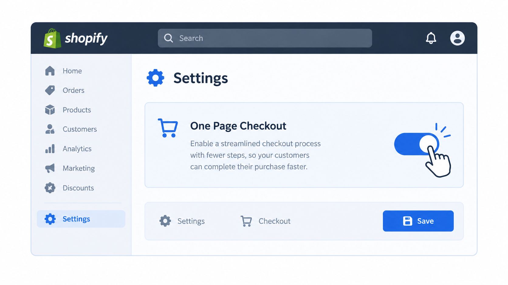
In Shopify admin, go to Settings and then Checkout. Open the checkout configuration you want to change, enter the checkout editor, and choose one-page or three-page in the layout settings.
Save it, then run the storefront checkout end to end.
Do not judge this from the editor alone. Preview screens are useful for layout checks, but they do not expose friction points, such as how shipping methods load, how taxes update, or whether payment options feel clear on mobile.
The settings that usually decide whether one-page works
The conversion gain from one-page checkout rarely comes from the layout alone. It usually comes from cleaner configuration, fewer surprises, and less buyer hesitation.
Delivery options and naming
Delivery confusion kills intent fast. Buyers will tolerate paying for shipping more often than they will tolerate not understanding it.
Review:
- when delivery costs appear
- how many services are shown
- whether service names make sense to a buyer
- whether postcode-based restrictions appear at the right moment
Plain labels work better than internal ops language. “Next working day” is clear. “Carrier service level 2” is not.
If your shipping setup needs a lot of explanation, one-page can start to feel cramped. That is common on UK stores with bulky goods, local delivery rules, or freight exceptions. In those cases, a three-step flow can still convert better because it gives delivery decisions more room.
Guest checkout and field discipline
Keep guest checkout on unless you have a hard operational reason to require accounts.
Then trim the form. Every extra field asks the buyer to pause, interpret, and comply. If the warehouse, finance team, or fraud process does not use that data, remove the field from the requirement set or avoid adding it in the first place.
This is also the point to be honest about B2B needs. If buyers need to add a PO reference, delivery instruction, or company identifier before paying, native one-page may be too tight on its own. That does not mean one-page is wrong. It means you may need app support or Checkout Extensibility, or you may decide the three-page layout gives business buyers a clearer path.
VAT and tax clarity
For UK stores, tax presentation needs to be obvious. Buyers should understand whether prices are tax-inclusive, whether VAT appears clearly in the order summary, and whether the checkout matches the invoice they expect to receive.
A lot of merchants treat this as a design issue. It is usually a configuration and wording issue first.
If a buyer stops to work out whether the total is right, friction is already in the checkout.
Shop Pay and accelerated methods
If Shop Pay is available on your store, enable it and test how it appears in the live flow. Faster payment methods usually help most on mobile, where typing and account creation create more drop-off.
Placement matters. Visibility matters. Payment choice also matters. If accelerated methods crowd the screen or make the standard card path feel secondary, test whether the presentation still feels clear for first-time buyers and business customers.
A simple decision check before launch
Use this rule of thumb before you publish the change:
- Use native one-page checkout if your catalog, shipping rules, and customer type are relatively simple.
- Stay on three-page for now if delivery explanation, VAT expectations, or B2B data capture are doing a lot of work in the journey.
- Use Checkout Extensibility or a compatible app if one-page is directionally right but you need supported ways to add missing logic or fields.
That decision is more useful than treating one-page as an automatic upgrade.
Quick QA before launch
Run a short test pass on the live storefront:
- Test on a real phone: Complete checkout on iPhone and Android if possible.
- Use multiple postcodes: Trigger different delivery services, exclusions, and timings.
- Check order summary updates: Confirm shipping and tax values refresh at the correct step.
- Run the guest path: Make sure checkout does not push account creation where it is not needed.
- Test business expectations: If B2B buyers use the store, confirm tax presentation, company details, and invoice expectations are clear.
- Validate trust signals: Payment methods, validation messages, and error handling should feel credible and easy to recover from.
A disciplined native setup often outperforms a customised checkout that has grown messy over time. It is also easier to test, easier to maintain, and much easier to roll back if the results are not there.
Customising with Checkout Extensibility and Apps Safely
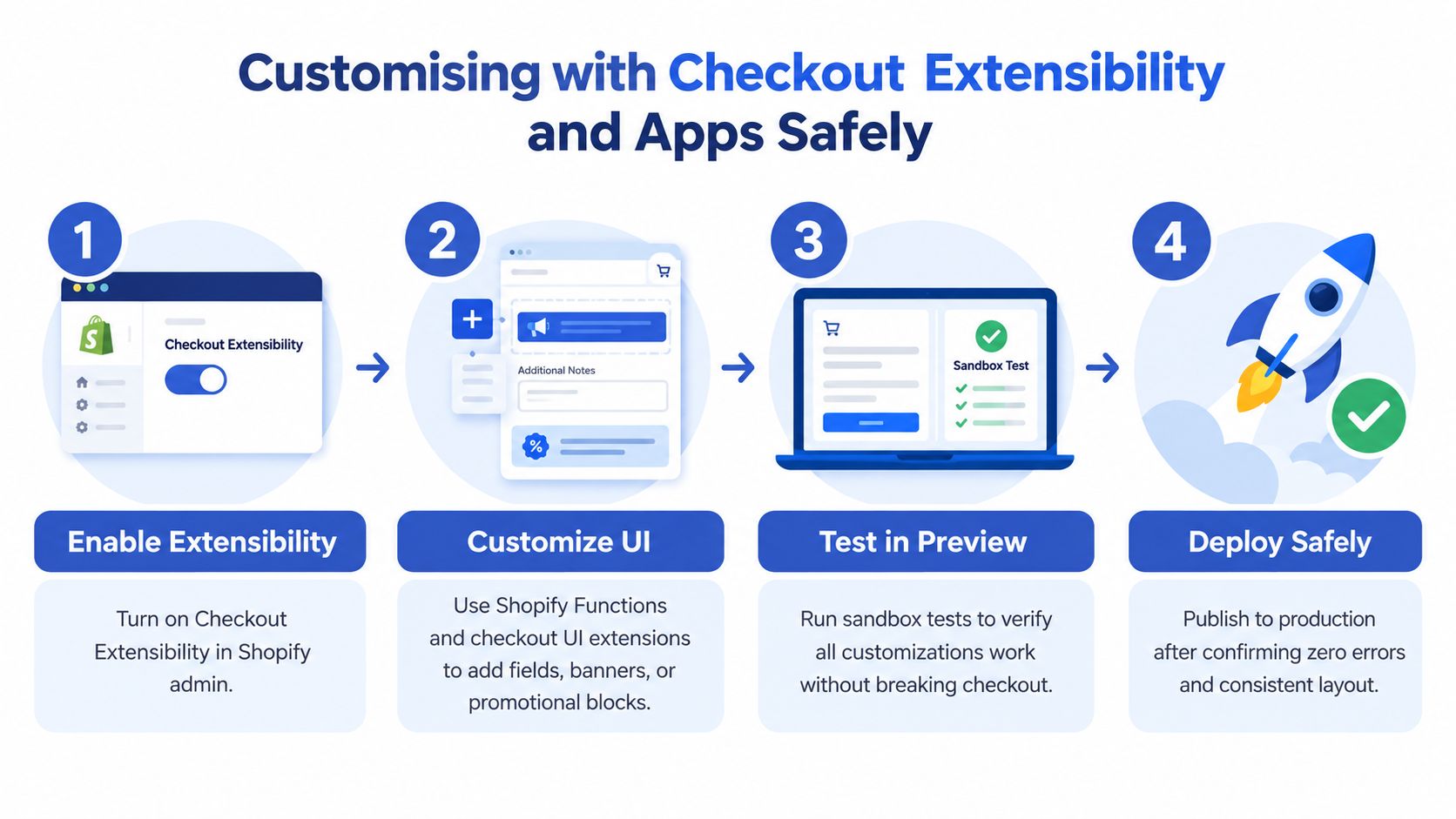
When native settings stop being enough, the next move isn't “hack the checkout”. It's to customise inside Shopify's supported model.
For Plus stores, that means Checkout Extensibility. For non-Plus stores, it means choosing apps that work with Shopify's current checkout framework instead of pretending the checkout is still fully theme-controlled.
What safe customisation actually looks like
Checkout Extensibility splits the work into sensible layers:
- Checkout UI extensions for visible interface components
- Shopify Functions for backend logic such as shipping, payment, or validation behaviour
- Branding controls for keeping checkout visually aligned with the storefront
That structure matters because it keeps custom work upgrade-safe. You're not stapling custom code onto a critical payment journey and hoping future platform changes are kind to you.
Good use cases for one-page customisation
The best checkout customisations solve buyer friction directly.
B2B fields that belong in checkout
A UK B2B checkout often needs data that a consumer store can ignore. Common examples include:
- VAT number capture
- Purchase order reference
- Delivery instructions tied to trade orders
- Company-specific messaging around invoicing or account terms
These can work well in one-page checkout if they're placed carefully and only shown when relevant. If every buyer sees every business field, the page turns into admin.
Delivery-specific enhancements
Stores with more operational complexity sometimes need:
- delivery date pickers
- restricted service messaging by location
- collection versus delivery logic
- checkout notices tied to fulfilment constraints
Those are valid use cases for customisation. They're also the fastest route to clutter if they're handled badly.
Build only what removes uncertainty. If a block exists mainly because an internal team wants reassurance, it probably doesn't belong in checkout.
Apps versus custom build
Non-Plus merchants often need a middle path. An app can be fine if it does one useful thing and does it within Shopify's supported checkout model.
The problem isn't apps in general. The problem is stacking too many of them on the most valuable page in the funnel. One app for a necessary input field may be justified. Several apps adding banners, upsells, badges, and notices usually aren't.
For teams exploring patterns beyond the obvious upsell widgets, MANDATE checkout use cases are useful because they show the range of workflows teams try to support in checkout, including approval-style and operational flows that look more like systems design than CRO decoration.
If you're reviewing what should stay native and what should move into extensions or apps, practical Shopify checkout optimisation patterns can help frame the trade-offs.
Safe workflow for Plus teams
Here's the build sequence I'd use:
- Define the buyer problem first: Don't start from a feature request. Start from friction you can point to.
- Prototype inside a development environment: Keep experiments away from live checkout.
- Use the checkout editor for placement: Don't treat checkout like a theme section.
- Test edge cases: Company accounts, guest flow, wallet flow, mobile flow, and unusual addresses.
- Publish narrowly: Launch the minimum useful change, then measure whether it helps.
What not to do
A lot of bad checkout work comes from the same mistakes:
- Don't rebuild the cart inside checkout.
- Don't add trust badges everywhere. One clear reassurance near payment beats visual noise.
- Don't expose business fields to consumer buyers unless necessary.
- Don't let app vendors define your checkout architecture.
If a customisation can't justify its place in a one-page layout, it shouldn't ship. Compact checkout punishes weak additions quickly.
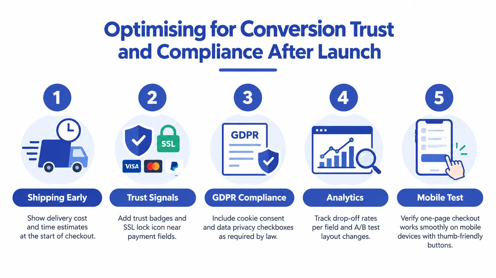
Optimising for Conversion Trust and Compliance After Launch
Going live is the start of the work, not the end of it.
A one-page checkout can improve flow, but it also concentrates more decision-making onto one screen. That means trust, compliance, and clarity need tighter execution after launch than many teams expect.
What to monitor first
Start with behaviour, not opinion.
Checkout initiation to completion
Measure conversion from the point checkout begins. That's the useful baseline for judging whether layout and checkout changes are helping or hurting. The IMRG and Ecommpay benchmark matters here because it compares checkout completion at the checkout stage, not just storewide performance.
Friction around delivery and payment
Review where people pause, where they trigger errors, and where they drop out after shipping options load or payment is shown. In one-page checkout, the biggest leaks often happen in view, not between pages.
A short post-purchase or exit survey can help too. For qualitative feedback, the Formbricks template for checkout UX is a practical way to gather direct responses without turning feedback collection into a project.
Trust signals that actually help
Trust elements matter most near the final action, not buried in a footer.
Use a restrained set of signals:
- Payment reassurance: Recognisable payment methods and clear payment wording near the pay button.
- Delivery clarity: Costs and timing should appear early enough that the customer doesn't feel trapped later.
- Returns confidence: A short, plain-language reminder often helps more than a long policy excerpt.
- Security confidence: Buyers need to feel the payment step is legitimate and expected.
If you're reviewing your wider payment and data-handling obligations, PCI compliance requirements for ecommerce teams are worth checking alongside checkout changes.
A trustworthy checkout feels predictable. Buyers shouldn't need to hunt for reassurance.
UK-specific compliance pressure points
For UK merchants, a few details matter more than teams sometimes realise:
- VAT communication: Business and consumer expectations differ. Make totals and tax treatment understandable.
- GDPR-related consent handling: Keep marketing consent deliberate and separate from transactional necessity.
- Payment security messaging: Reassure without overloading the page with generic security graphics.
- Address and delivery accuracy: If fulfilment depends on precise location data, the error handling must help rather than punish.
What to test after launch
Don't start by redesigning the whole checkout again. Test the small changes that influence confidence and speed:
- Field necessity: Remove or make optional anything non-essential.
- Field order: Put the easiest, highest-confidence actions first.
- Payment method visibility: Wallets and accelerated options should be prominent where relevant.
- Microcopy: Clarify confusing labels, especially around shipping, billing, and business details.
- Error recovery: Inline error handling usually preserves flow better than disruptive resets.
The stores that get the most from one-page checkout aren't the ones with the fanciest customisations. They're the ones that keep refining the buyer's final decisions until the checkout stops asking unnecessary questions.
Your Launch Plan and Next Steps to Keep Improving
If you've read this far, the decision probably isn't whether Shopify supports one-page checkout. It does. The decision is whether your store should stay native, add selective extensions, or deliberately avoid over-compressing a complex journey.
For a standard DTC store, the launch plan is straightforward. Enable the native layout, keep guest checkout visible, make delivery costs understandable, test Shop Pay, and QA the whole thing on mobile before touching custom code.
For a more involved UK setup, use a stricter filter. If your buyers need VAT context, PO references, delivery constraints, or account-specific logic, decide whether those requirements fit naturally into one-page checkout. If they do, implement them through supported extensions. If they don't, test the three-page layout rather than forcing a compact design to carry too much.
A practical migration checklist
- Confirm the right path: Native, app-assisted, or Checkout Extensibility.
- Audit current checkout behaviour: Note any fields, scripts, notices, or dependencies already in play.
- Switch or configure carefully: Make one meaningful change at a time.
- Test real scenarios: Guest, returning customer, mobile, different delivery locations, business buyer.
- Verify analytics: Make sure checkout-start and checkout-complete reporting still make sense.
- Prepare rollback: If completion quality drops, revert quickly and diagnose before changing more.
What to work on in the first month
The first month after launch should produce a small backlog, not a major rebuild.
Good candidates include:
- removing fields that aren't earning their place
- tightening shipping labels
- improving VAT and tax wording
- reducing visual noise from apps or reassurance blocks
- reviewing whether B2B-specific inputs should be conditional
When ongoing support makes sense
Some teams can handle this in-house. Others need a developer and CRO partner because checkout changes touch design, analytics, business logic, fulfilment, and payments all at once.
That's especially true if you're on Plus, running mixed B2B and DTC journeys, or migrating from Magento, WooCommerce, or a custom stack where checkout complexity has built up over time.
Ship the simplest version that supports the buyer properly. Measure it. Then improve the parts that create doubt. That's how one-page checkout becomes useful instead of just fashionable.
Grumspot helps Shopify and Shopify Plus teams plan, build, and refine checkout experiences that fit the way they sell, from straightforward DTC flows to more complex B2B and delivery-heavy setups. If you need help choosing between native checkout, apps, and Checkout Extensibility, or you want a practical audit before changing a live funnel, visit Grumspot.
Let's build something together
If you like what you saw, let's jump on a quick call and discuss your project

Related posts
Check out some similar posts.