Add to Cart Buttons That Convert on Shopify
- add to cart buttons
- shopify CRO
- mobile ecommerce
- UX best practices
- checkout optimisation
Launched
October, 2026
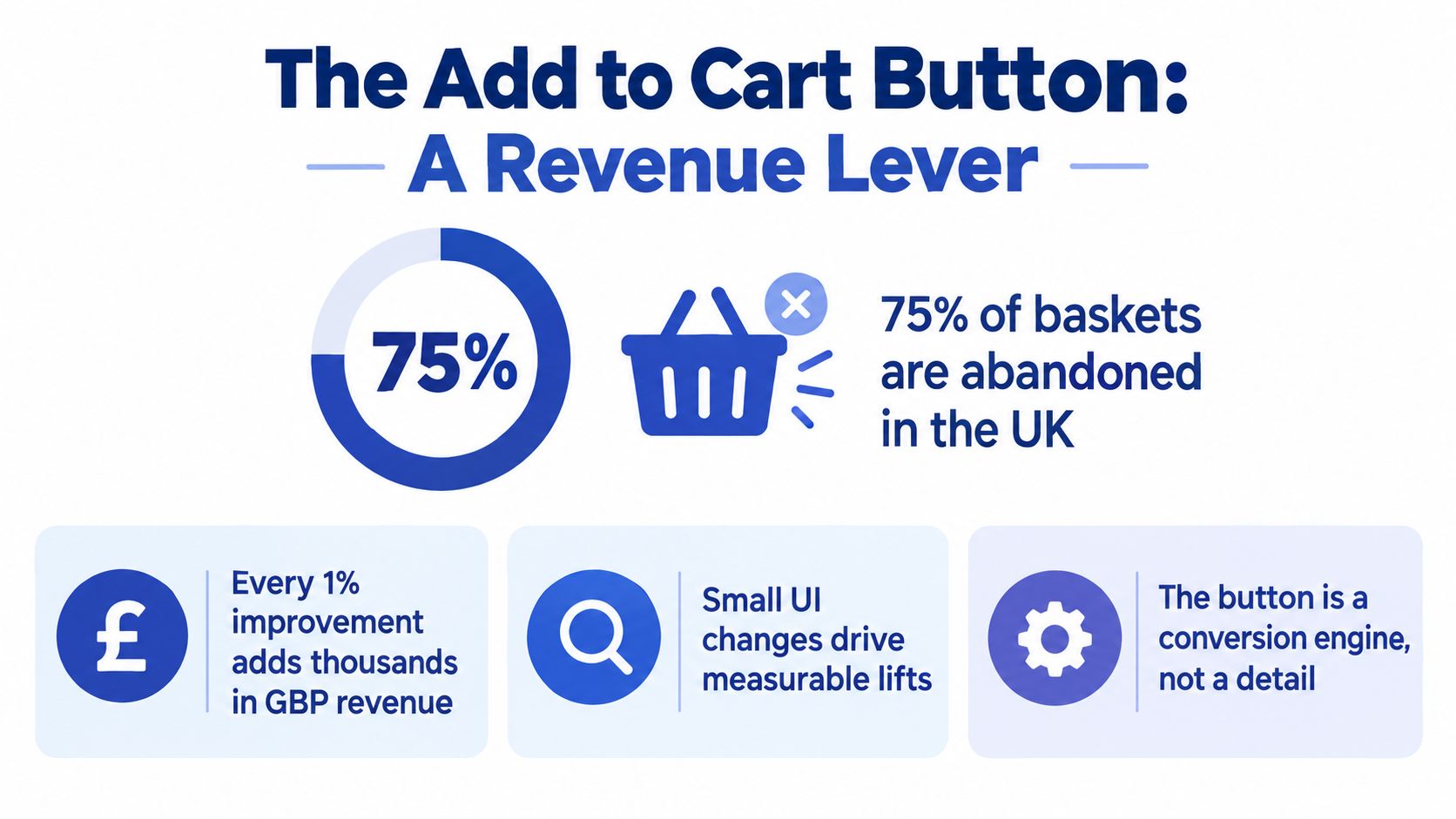
In late 2024, 74% of UK online shopping baskets were abandoned before an order was completed. On mobile, the figure rose to 76%, compared with 67% on computers, according to The Retail Institute at Leeds Beckett University. That makes the add to cart button more than a coloured rectangle beneath a product description. It's the first moment when browsing becomes measurable purchase intent, and a poorly designed interaction can lose the sale before checkout friction even gets a chance.
For Shopify and Shopify Plus brands, the best add to cart buttons reduce uncertainty at the point of commitment. They tell shoppers what happens next, preserve their chosen variant, make delivery and returns expectations visible, and behave reliably on a small screen. The strongest implementations don't chase clicks in isolation. They make the path from product page to completed order feel safe.
Why the Add to Cart Button Is a Revenue Lever, Not a UI Detail
A shopper who clicks Add to cart has crossed an important psychological threshold. They've selected, or at least considered, a product strongly enough to start the buying process. That click should therefore be tracked as an intent checkpoint between product discovery and checkout, not treated as a decorative component controlled by the theme editor.
The UK abandonment figures show why this matters upstream. If nearly three quarters of created baskets fail to become orders, improving only the final checkout screen leaves a large part of the revenue journey untouched. Product-page friction, unclear variant selection, hidden delivery costs, and weak confirmation states can all create baskets that were never likely to survive the next step.
Treat the click as the beginning of a funnel
Instrument the journey as a sequence:
- Product view, showing that the shopper reached a product page.
- Variant selection, confirming that size, colour, flavour, or configuration was understood.
- Add to cart click, recording the selected variant and interaction outcome.
- Cart view, distinguishing a visible basket from a successful AJAX request.
- Checkout start, showing that the shopper progressed.
- Purchase, proving that the interaction created revenue.
Segment each stage by device, product, traffic source, and new versus returning customer. A healthy click rate can hide broken variant validation, low-intent traffic, or a cart drawer that fails to expose delivery information. The metric that matters is not whether more people clicked. It's whether the change produced more completed orders and revenue per session.
Mobile deserves priority because the difference between mobile and computer abandonment is meaningful. A button that sits below a long gallery, shifts when the page loads, or responds slowly under thumb input creates friction precisely where shoppers are already more likely to leave. Keep the CTA close to the product decision, but don't detach it from the information needed to make that decision.
Practical rule: Optimise the add to cart interaction as a confidence checkpoint. The button should answer, directly or through nearby supporting content, what will be added, what it will cost to deliver, and what the shopper can do next.
Colour and copy tests still have a place, but they should follow basic reliability and clarity. Merchants looking for broader conversion principles can also use Skup's guide to boosting sales as a complementary resource. The priority remains the same: connect product-page behaviour to downstream revenue rather than celebrating an isolated interaction.
Placement, Size and Mobile Behaviour on Shopify Product Pages
Button placement should follow the shopper's decision, not the theme's default layout. Familiar, low-consideration products can place the CTA beside the title, price, variant controls, and main image. Technical products, bundles, and size-sensitive goods need the action visible early while keeping required choices in the same purchase path. A button that appears before a shopper can select a size or understand delivery creates a fast route to an error, not a faster purchase.
On image-led Shopify themes, keep the first CTA beside the purchase information. Do not let a gallery fill the opening screen while the action and delivery details sit below it. Long product pages can repeat the action after decision content such as materials, compatibility, sizing, or reviews. Each instance must carry the current variant, price, stock state, and delivery message. Repetition is useful only when it reflects the same product state and does not create competing actions.
Make the mobile CTA easy to reach
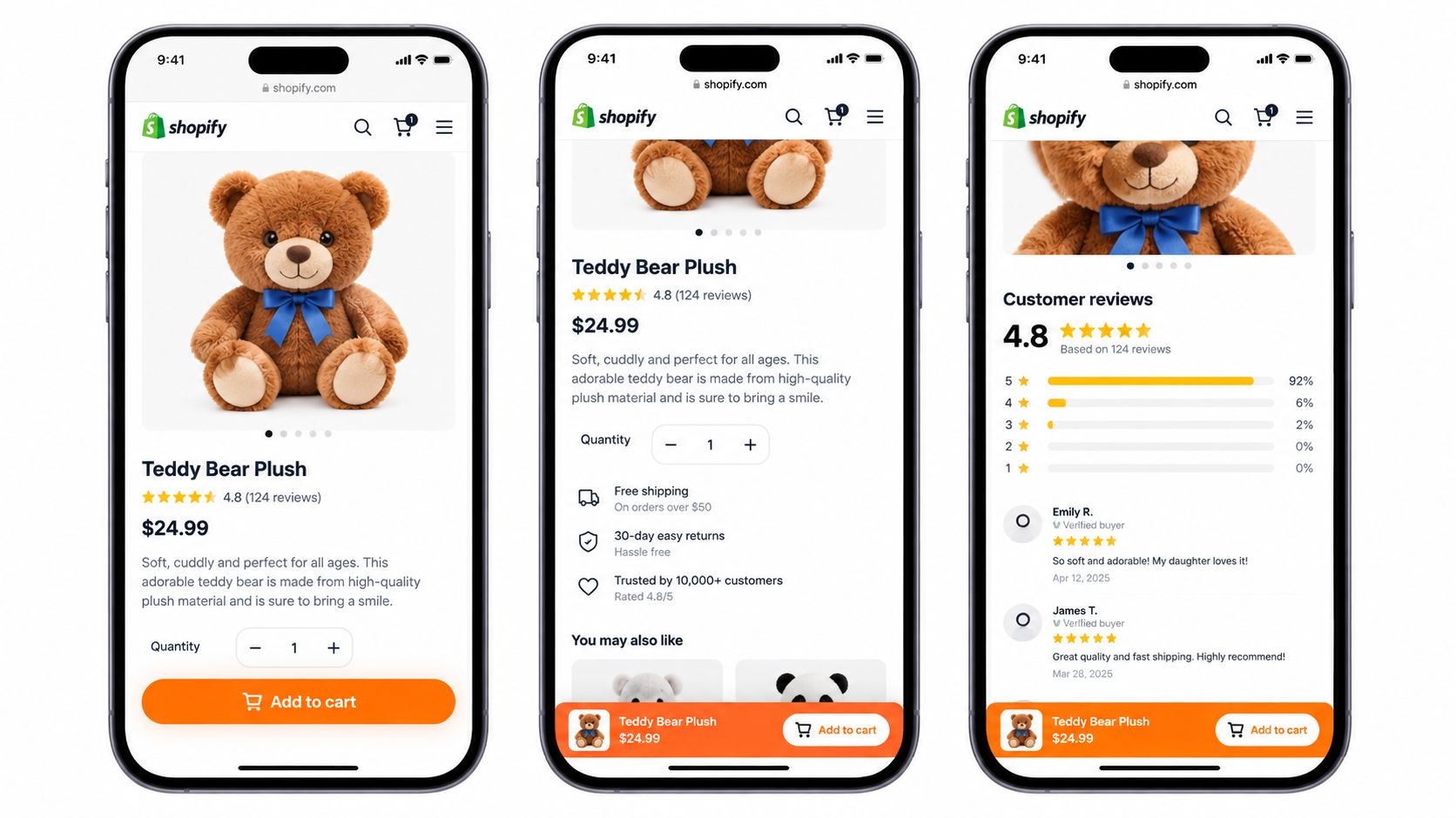
A mobile CTA needs a thumb-sized target, separation from neighbouring controls, and immediate feedback after the tap. Use a 44 by 44 CSS-pixel interactive target as the practical minimum. Size alone will not rescue a crowded purchase module. Leave usable space around quantity selectors, variant chips, consent controls, and accelerated checkout buttons.
A sticky CTA earns its space on pages that require substantial scrolling. It keeps the action available while shoppers read, yet it can obstruct content or invite a tap before configuration is complete. Show it after the main purchase module, or once the selected variant and price are known. The bar should also expose the certainty shoppers need before tapping, such as delivery timing, returns information, stock status, or payment availability.
Check these behaviours on real mobile devices:
- Variant visibility: Keep size, colour, and flavour controls clear of the sticky bar. Shoppers must be able to change a selection without dismissing the CTA.
- State accuracy: Refresh the sticky price, stock message, and selected variant whenever the primary form changes.
- Consent access: Cookie notices, age gates, and other required controls must remain usable.
- Keyboard access: Preserve a logical focus order and prevent the sticky element from trapping focus off-screen.
- Scroll stability: Avoid layout jumps when the bar appears, disappears, or changes height.
A fixed button that sends shoppers back to an incomplete form adds friction. For products with mandatory options, open a compact configuration panel or move the shopper to the relevant control with the selection state intact. For a straightforward product with no unresolved choices, adding directly to the cart may be appropriate.
Placement and behaviour should be tested as one purchase interaction. Review the tap, the resulting state, and the information available before the shopper commits.
Copy, Colour and the Case Against Urgency
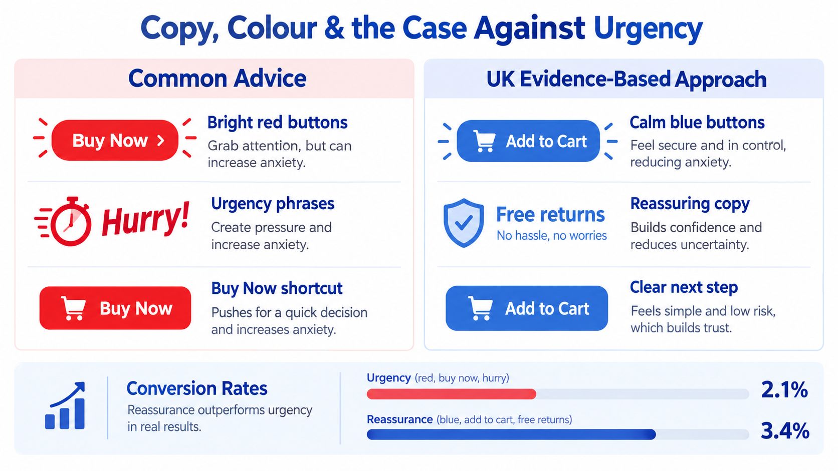
A brighter button can attract attention. It can't tell a shopper whether the item will arrive on time, whether returns are straightforward, or whether their preferred payment method will be available. That's why I'm cautious about treating colour as the main add to cart optimisation lever. If the button is hard to see, fix the contrast. If it's visible but shoppers still hesitate, adding more visual force may only make the uncertainty louder.
UK delivery research points towards reassurance as a stronger strategic direction. Retail Economics reports that 26.4% of attempted online purchases were abandoned because shoppers lacked a preferred delivery option, while 60.8% said broad delivery choice at checkout mattered. Those figures appear in its UK basket abandonment report. A red button labelled “Hurry” doesn't solve that concern.
Build a certainty-led purchase module
Keep the primary action familiar. Add to cart or Add to basket usually sets the right expectation because it doesn't imply an irreversible purchase. Place useful information beside or immediately beneath it, based on what the store can accurately calculate.
| Element | Conventional module | Certainty-led module |
|---|---|---|
| Primary label | Add to cart with little context | Add to cart with a clear confirmation outcome |
| Delivery | Hidden until the cart or checkout | Estimated delivery or eligibility near the CTA |
| Returns | Linked somewhere in the footer | Short returns reassurance beside the purchase control |
| Stock | Generic availability wording | Accurate stock state tied to the selected variant |
| Payment | Accelerated checkout dominates | Preferred payment methods remain visible without weakening the main CTA |
| Feedback | Spinner or silent page change | Clear loading, success, error, timeout, and retry states |
The adjacent message should be concise. Examples include “Delivery from Tuesday”, “Free returns”, “In stock for your selected size”, or “Pay with PayPal, Klarna, Apple Pay, or Google Pay”. Don't display a promise that depends on postcode, inventory location, or delivery service unless the logic can support it. A misleading reassurance is worse than a neutral message because it damages trust after the click.
Urgency has a legitimate role in a genuine low-stock release, a time-limited promotion, or a fulfilment deadline. It backfires when every product says “Hurry”, when the countdown resets on refresh, or when mobile shoppers see a pressure message before they've even found the variant selector. Urgency should describe a real condition, not compensate for missing product information.
Test colour without fooling yourself
Use a colour that is distinct from surrounding secondary actions and remains legible in all states. Test the colour as one primary variable, while holding placement, label, size, delivery messaging, and post-click behaviour constant. Otherwise, a result attributed to “green versus blue” may come from a spacing change or a different loading state.
Contrast should meet accessibility expectations, but compliant contrast isn't the same as a persuasive design. Check the default, hover, focus, disabled, loading, and error states. A button that looks excellent in its resting state can become unreadable once the label changes to “Adding…” or a validation message appears.
The useful question isn't “Which colour makes people click?” It's “What information does the shopper still need before clicking feels safe?”
Post-Click States, Cart Routing and Event Integrity
The click is where many Shopify implementations fail. The button changes colour, a spinner appears, or a drawer slides in, but the product wasn't added, the wrong variant was sent, or analytics recorded the event twice. Shoppers experience that as uncertainty. Teams experience it later as polluted funnel data.
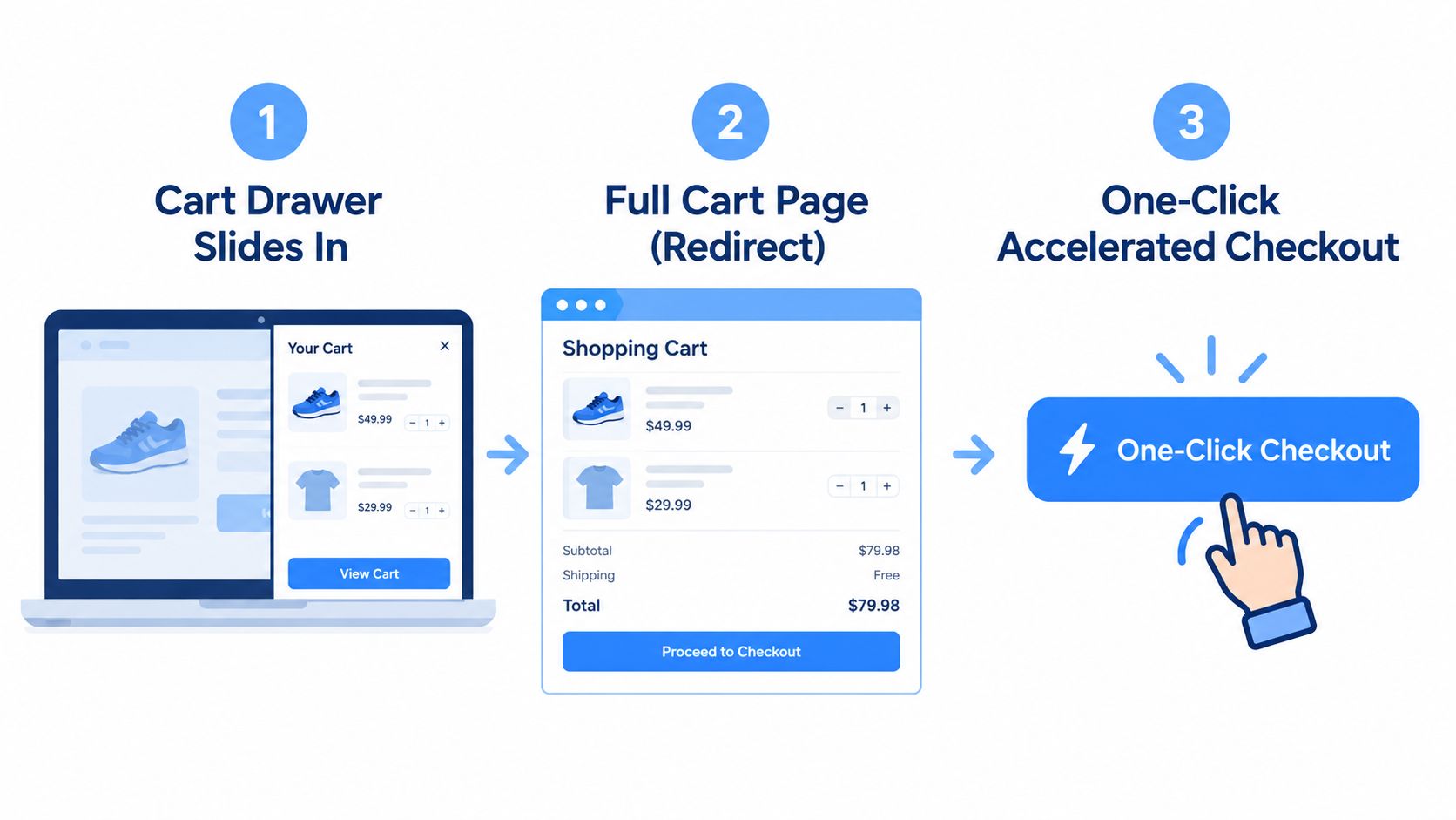
Choose the post-click destination according to the product and shopping context:
- A cart drawer keeps the shopper on the product page and can confirm the selected item without interrupting browsing. It works well when shoppers may add related products, but it must expose meaningful totals and a clear route to checkout.
- A cart page redirect gives more space for delivery messaging, quantities, discounts, and fulfilment choices. It can be safer for complex products or stores where the drawer becomes crowded.
- An accelerated checkout reduces steps for a shopper who already knows what they want, but it can bypass useful cart review and may not suit bundles, subscriptions, or mandatory option combinations.
A successful state needs more than a visual animation. Disable or debounce the button during the request so a rapid double tap doesn't create duplicate lines. If inventory validation fails, explain what happened and preserve the shopper's selections where possible. Never show “Added to basket” when Shopify has rejected the line item.
Design every state before writing the JavaScript
Define the full interaction contract:
- Ready: The button is enabled only when required selections are valid.
- Loading: The label or status communicates that the request is in progress.
- Success: The shopper can identify the product, quantity, and next action.
- Validation error: The interface identifies the missing or invalid selection.
- Inventory error: The message distinguishes stock failure from a technical failure.
- Timeout: The shopper gets a retry path rather than an indefinite spinner.
- Network failure: The product selection remains available for another attempt.
AJAX carts deserve special attention. Theme code, subscription applications, upsell tools, and tracking scripts can all listen for cart events. If each layer fires its own add-to-cart event, the platform may report more interactions than occurred. If a custom button bypasses the native form, it may record none at all.
Use one event contract, pass the variant ID and quantity consistently, and test both successful and rejected requests. Verify that cart drawers update their item count, line items, totals, discounts, and delivery messaging without forcing a full reload. For a deeper treatment of the next stage, see this Shopify checkout optimisation guide.
Accessibility and Payment Method Visibility as Conversion Features
Accessibility exposes whether an add-to-cart interface communicates clearly. A keyboard user needs visible focus, a screen-reader user needs more than the word “button”, and every shopper needs to understand why the CTA is unavailable. These are state and information problems, not colour problems.
Give the button a concise accessible name that identifies the action. Put the product and selected variant in nearby content, then announce success, failure, and loading changes through an appropriate status message. A visual spinner alone leaves some shoppers without feedback.
Test the full interaction path
Review the product page with keyboard navigation and assistive technology. Check these points:
- Focus order: Product options, quantity controls, add to cart, cart feedback, and checkout controls should follow a sensible sequence.
- Focus visibility: The indicator must remain clear against the button colour, including inside sticky purchase bars.
- Disabled states: Explain which selection or correction is required instead of showing a silent inactive control.
- Error association: Place validation text near the relevant field and connect it programmatically.
- Touch targets: Keep interactive controls at or above the practical 44 by 44 CSS-pixel minimum.
- Reduced motion: Success messages and cart drawers must remain understandable without animation.
- Double activation: Prevent rapid keyboard or touch input from creating duplicate requests.
Test the awkward cases, not only the successful tap. A shopper who changes a variant, loses network access, or returns to the page after an error should retain enough context to try again.
Payment visibility addresses a separate source of hesitation. UK shoppers place high importance on efficient checkout, with 89% saying an efficient checkout is important and 86% wanting access to their preferred payment methods, according to Mollie's UK ecommerce feature research. Show eligible payment options near the CTA so mobile shoppers can judge whether the purchase supports their preferred wallet or financing route before committing.
Keep Add to cart as the primary action. Present PayPal, Klarna, Apple Pay, or Google Pay in a restrained supporting row where those methods are available. An accelerated checkout button should not automatically replace the main CTA. Direct checkout can suit a simple product, yet it may bypass variant review, cart-level delivery information, or bundle logic.
Payment labels must match real eligibility. Apple Pay can depend on device, browser, merchant configuration, and market. A practical guide for Singapore retailers can help teams assess regional wallet expectations, while a UK storefront still needs testing across the devices and browsers its customers use.
Run a Shopify accessibility audit, then verify the result through real keyboard navigation and screen-reader checks. Measure checkout completion and error rates alongside button clicks. Accessibility belongs in the conversion work from the start because clear states and payment expectations reduce uncertainty for more shoppers.
Analytics, Benchmarks and a Sequenced CRO Test Plan
A button test is only useful when its measurement survives the implementation. In Shopify and Shopify Plus, record the path from product view → variant selection → add to cart click → cart view → checkout start → purchase. Pass product, variant, quantity, device, traffic source, customer status, and request outcome into the same reporting layer. If an app replaces the native product form, check that it preserves those events rather than creating a second, incomplete funnel.
UK benchmark evidence reports a 4.6% median add-to-cart rate and an 8.0% top-quartile rate, documented in the Retail Institute checkout abandonment study. Treat those figures as directional context. Product mix, traffic quality, price, merchandising, and delivery expectations can shift a store well outside that range. Establish a store-specific baseline before judging a button change.
Sequence tests around the purchase decision
Test the largest source of uncertainty first. A practical order is:
- Certainty content: Expose delivery timing, fees, returns, stock, fulfilment, and eligible payment information near the CTA. This tests whether shoppers need reassurance before committing, rather than treating the button as an isolated control.
- Placement: Compare the existing purchase position with a better-supported mobile location or a repeated CTA after decision-making content.
- Sticky behaviour: Test a sticky module against no sticky CTA. Preserve the selected variant and keep controls, errors, and product details usable.
- Post-click path: Compare reliable cart-drawer confirmation with cart-page routing. Measure checkout progression and purchases, not drawer openings alone.
- Label: Compare Add to cart with a contextually appropriate alternative while holding the surrounding certainty information steady.
- Payment visibility: Show eligible methods beside the primary action without changing the main path.
Run one primary variable per test where possible, and define guardrails before launch. Add-to-cart rate provides an early signal. Purchase rate, checkout completion, revenue per session, support contacts, inventory errors, and duplicate events determine commercial impact. More clicks with more abandoned baskets is a failed treatment.
Read results by device, traffic source, product, and customer status. A message that helps returning desktop shoppers can distract first-time mobile visitors, particularly when delivery or returns remain unclear. Keep an implementation log covering the hypothesis, affected templates, event changes, guardrails, and decision. It gives the team a usable record when a tracking regression resembles a CRO result or a test ends without a clear winner.
A Shopify Merchant Launch Checklist and Key Takeaways
Before publishing a new add to cart treatment, run this checklist against the live product template:
- Placement: The CTA sits beside price, variant controls, and the information needed to commit.
- Mobile reach: The target is easy to tap and remains usable near the thumb zone.
- Sticky behaviour: The bar doesn't obscure selectors, consent controls, focus indicators, or error messages.
- Certainty: Delivery, returns, stock, fulfilment, and eligible payment information appear before or immediately after the click.
- States: Ready, loading, success, validation error, inventory failure, timeout, and retry states are designed and tested.
- Routing: The cart drawer, cart page, and accelerated checkout each match the product's complexity.
- Analytics: One successful add produces one reliable event with the correct product and variant data.
- Accessibility: Keyboard navigation, screen-reader naming, focus visibility, contrast, reduced motion, and touch targets pass practical QA.
- Measurement: Add-to-cart and downstream purchase metrics are segmented by device, source, product, and customer type.
Avoid the familiar shortcuts: don't hide delivery costs until checkout, don't use urgency without a real condition, don't replace the native form without preserving event integrity, and don't judge success from clicks alone. The button is valuable because it influences the revenue path after the click.
Start this week with one high-traffic product template. Record the current funnel, fix silent failures, expose the most important fulfilment information, and test one controlled change. A reliable, confidence-building interaction will teach you more than another round of colour debates.
Grumspot helps Shopify and Shopify Plus brands audit, redesign, and build conversion-focused storefront experiences, including add to cart flows, mobile UX, analytics integrity, accessibility, and checkout integrations. Visit Grumspot to discuss a practical CRO and development plan for your store.
Let's build something together
If you like what you saw, let's jump on a quick call and discuss your project
Related posts
Check out some similar posts.

- shopify bundle builder
Learn how to build a Shopify bundle builder that lifts AOV without breaking inventory. App vs custom...
Read more
- opportunity prioritization matrix
Use this opportunity prioritization matrix to score and rank your Shopify growth ideas. Practical cr...
Read more
- reduce Shopify cart abandonment
Diagnose & reduce Shopify cart abandonment with our 2026 playbook. Get actionable strategies for UI,...
Read more