Recently Viewed Items: A Shopify Implementation Guide
- recently viewed items
- shopify development
- ecommerce UX
- product tracking
- conversion optimisation
Launched
August, 2026
You know the moment. A shopper has three tabs open, one product page gets lost in the noise, and the item they meant to come back to disappears into the browser's back button history. On Shopify stores, that's where recently viewed items earns its keep. Done well, it gives people a fast return path to products they already showed intent on, which is especially useful when browsing sessions stretch across mobile, desktop, and a dozen interruptions.
For UK merchants, this isn't a decorative widget. The Office for National Statistics reported that 26.6 million households in Great Britain had internet access in 2021, and online retail remains a huge part of the market, with internet sales as a share of all retail sales regularly sitting in the low-teens percentage range in recent years (ONS data and commerce context). That means the feature can reach a very large audience, but only if it's built with discipline, not slapped into every template without a plan.
Why Recently Viewed Items Matter for Shopify Stores
A common store pattern looks like this. A shopper opens a product page, compares it with two alternatives, checks delivery details, gets interrupted, and closes the tab. When they come back later, they don't remember the product name, the variant, or even the category path, so they start searching all over again. A recently viewed items module removes that friction by surfacing products the shopper has already demonstrated interest in, which makes it easier to resume the journey.
That matters because product recall isn't the same as intent loss. People often still want the item, they just don't want to rebuild the path to it. On mobile, that problem gets worse because backtracking through category pages is slower and easier to mess up. A well-placed widget turns a dead end into a shortcut, especially for stores with large catalogues or comparison-heavy products.
Practical rule: if the shopper has already spent time evaluating a product, make it easy to re-open that item without forcing another search.
The commercial angle is simple. This feature isn't a recommendation engine, and it shouldn't pretend to be one. It's a recovery tool for abandoned consideration, which is why it often fits better beside cart reminders, return-visitor modules, or product page carousels than in the global navigation.
If your merchandising strategy already includes retention and repeat-engagement tactics, it helps to see recently viewed items as part of that same system. Grumspot's retention-focused thinking lines up well with that approach, and their broader view of post-click engagement is covered in their retention marketing strategies guide.
One more practical point. The feature only pays off when the shopper recognises the item immediately, so the thumbnail, title, and product state need to be current. If the module is slow, stale, or visually noisy, it becomes another piece of clutter instead of a memory aid.
Choosing the Right Tracking Approach
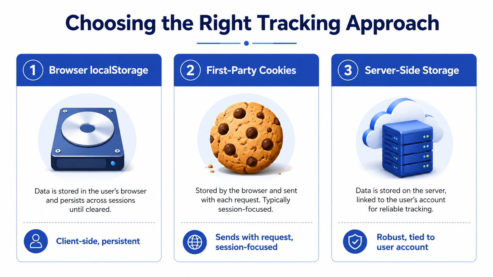
The first decision is where the history lives. I've shipped this feature with browser storage, cookie-based storage, and server-side history tied to customer accounts, and the trade-offs are real. The wrong choice usually doesn't fail in a clean way, it fails as missing items, duplicated items, or a widget that looks fine on your machine and breaks for logged-out shoppers in production.
Browser localStorage
For many Shopify builds, localStorage is the quickest path. It's client-side, it doesn't need a round trip to the server, and it works well for anonymous shoppers who just need a recent list on the same device. The downside is obvious. It stays on that browser profile, so it won't follow the customer to another device, and users can wipe it without warning.
That makes localStorage a strong fit for smaller catalogues, simpler themes, and stores that want a lightweight history list without identity stitching. It's also easier to keep fast, which matters if you're trying not to block the product page render.
First-party cookies
Cookies are more constrained, but they travel with requests and can support shorter-lived browsing memory. They're useful when you want session-oriented continuity and already have consent handling in place. The cost is that cookie-based storage can become awkward if you treat it like a permanent database, and under UK privacy expectations that's exactly the kind of overreach you want to avoid.
If you're also handling analytics or event tagging, it helps to read implementing GA4 snippets for WooCommerce alongside your tracking plan, because the same discipline applies. Keep the client-side payload small, keep the purpose narrow, and don't let tracking logic sprawl into unrelated data collection.
Server-side storage
Server-side storage wins when you need persistence across sessions, device changes, or logged-in accounts. Bloomreach's documentation for recently viewed products treats the history as an event-driven memory window over the last 90 days, sorted by recency, which is a good reminder that server-side history depends on accurate event timing, identity stitching, and stable IDs (Bloomreach docs). That's more powerful, but it's also more complex and easier to get wrong if your identity model is messy.
Best fit: use browser storage for anonymous, device-bound history, then promote it to server-side storage only when the shopper signs in or when your personalisation strategy genuinely needs cross-device recall.
For UK teams, the privacy angle matters as much as the technical one. First-party data collection guidance is useful here because this feature is a classic first-party pattern, but only if you keep the scope narrow and the consent story clear. The more you ask this widget to do, the more risk you create for yourself.
Implementing the Recently Viewed Widget
A recently viewed widget starts with the product detail page, where the shopper has already shown intent. Track a product-detail-page view as an event, store a stable product identifier, and write a timestamp with it. If the same product is viewed twice, the widget should refresh that item to the top of the list instead of creating a duplicate.
Capture the event at the PDP level
In Shopify, the safest place to fire the write is after the product data is already present in the page. On the theme side, that usually means reading the product handle or ID from Liquid and passing it into a small client-side script. In a headless build, the same logic sits in your page component after the product query resolves.
A practical payload usually needs only a few fields:
- product_id for stable identity
- timestamp for recency ordering
- title and image URL if you want faster rendering
- variant_id only if the widget needs variant-level recall
Keep the scope tight. If you store more than the widget needs, you make the write path harder to maintain and you create more room for consent and privacy mistakes.
Deduplicate before you write
Deduplication is the part most tutorials skip, and it is the part that fails first in production. Before inserting a new item, remove any existing record with the same product ID, then unshift the new record to the front. That keeps recency accurate and stops the same shirt from appearing five times because the shopper changed colour swatches.
If your list ever shows duplicates, the write path is wrong, not the render path.
Apply eviction logic
You also need a hard cap. Whether you store five items, ten items, or more, do not let the array grow unchecked. A bounded list keeps the UI light and avoids stale clutter, while a rolling window lets older items fall off naturally as the shopper moves through the catalogue.
For rendering, Liquid can output the container and the product card skeleton, while JavaScript hydrates the list from storage. In more customised builds, the widget can be rendered in a section file or injected into a reusable component. The important part is that the UI updates in real time without a page refresh, and that the state survives the cases your store supports.
If you are working inside a modern theme architecture, Shopify 2.0 theme development is the right mental model because sections, blocks, and reusable components make this kind of feature much easier to maintain.
Design Patterns and Placement Strategies
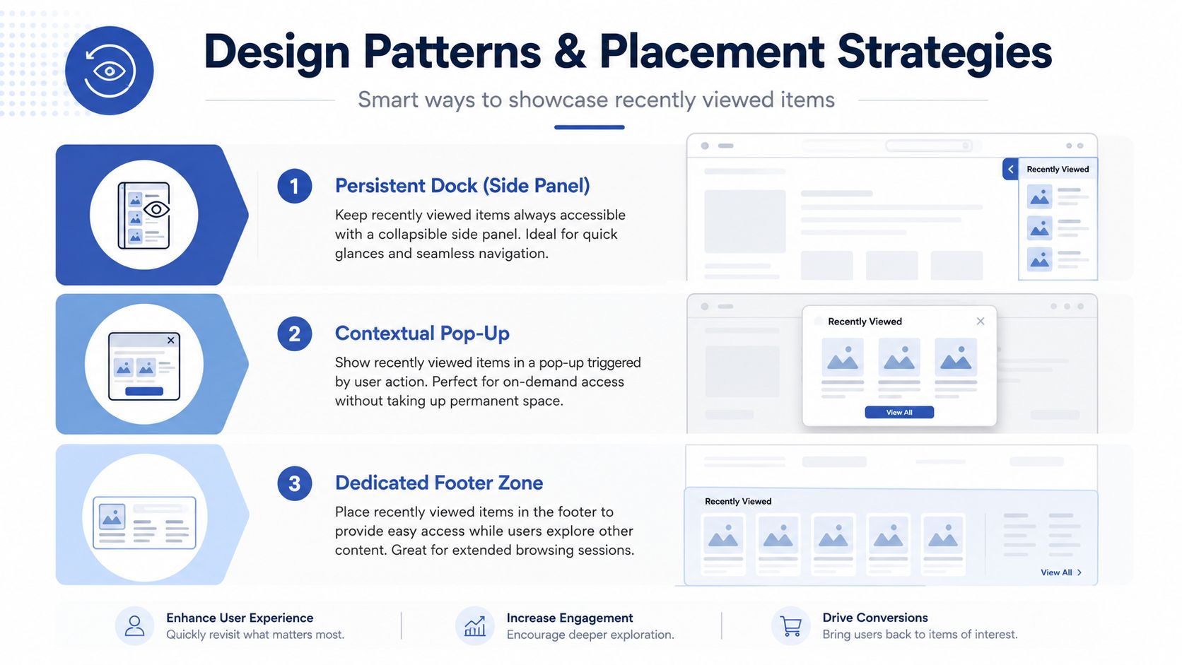
Placement decides whether the widget feels useful or just loud. The three patterns I see working most often are a product-page carousel, a cart-page reminder, and a dedicated area for returning visitors. Each serves a different job, and mixing them up usually leads to duplicated messaging or a page that looks like it can't decide what matters.
Product page carousel
This is the most natural placement because it matches the moment of intent. On a product page, the shopper is already evaluating, so a compact carousel can help them hop back to something they just compared. Keep it visually restrained, and don't let it compete with your core recommendation block.
Cart page reminder
Cart pages are useful for rescue journeys, but only if the module stays subordinate to checkout. If the widget is too large, it can pull attention away from the primary action. I've found that a slim list or a brief row of thumbnails works better than a full-width gallery here.
Returning visitor module
Homepage placement makes sense when you know the shopper is coming back after a gap. A recently viewed panel can act like a return path, especially if the visitor abandoned research on a previous session. The empty state matters more here than anywhere else, because showing a blank module to a first-time visitor wastes valuable space.
A few design choices make the difference:
- Short list, fast scan: keep the module tight enough that shoppers can recognise items instantly.
- Thumbnail-first layout: images matter more than text for fast recognition, especially on mobile.
- Clear empty state: if there's no history, show nothing or show a quiet prompt, not a fake placeholder.
Mobile deserves special treatment. Screen real estate is limited, and shoppers are less patient with clutter. The feature should support scrolling, not interrupt it.
Privacy, Personalisation, and User Trust
The common mistake is assuming personalisation always helps. That's not how shoppers behave. UK consumer research shows 56% of online shoppers expect a personalised experience, and 74% say they are more likely to buy when content is personalised, but the same research also points to privacy as a barrier and says trust affects willingness to share data (UK consumer research on personalisation and privacy). That's the tension every Shopify team has to manage.
Make history visible and controllable
If you store browsing history, give users a way to inspect it, remove individual items, and clear the whole list. The feature should feel lightweight and temporary, not like a hidden profile archive. Amazon's browsing history interface is a useful benchmark here because it lets users manage viewed items across multiple recent time ranges, including today, the last 3 days, 1 week, 2 weeks, or all history (Amazon browsing history interface via Salesforce help). That kind of bounded memory sets an expectation for control.
Respect consent and minimisation
Under UK ICO expectations, transparency and purpose limitation matter. If your implementation relies on cookies, tie it to the consent flow, and don't keep the data around longer than you need to. If the shopper hasn't consented, default to session-scoped behaviour or avoid persistence altogether.
Practical rule: if the shopper wouldn't expect a history trail to survive tomorrow, don't build it to survive for months.
Cross-device persistence is where teams get into trouble. Logged-in shoppers can benefit from it, but logged-out visitors create a consent and identity problem. If you can't justify the continuity cleanly, don't force it. A broken cross-device history is worse than no history because it surfaces the wrong products at the wrong time.
Relevance also decays. Out-of-stock products, seasonal items, and changed variants can make old entries misleading. The widget should be able to suppress stale items rather than proudly resurrect them.
Testing and Troubleshooting Common Issues
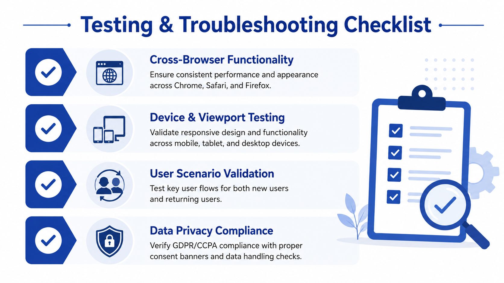
The fastest way to break a recently viewed widget is to test only your own browser, logged in, on Wi-Fi, after a fresh deploy. That tells you almost nothing. You need to test the writing path, the render path, and the consent path separately, because bugs usually hide in the handoff between them.
Check persistence and eviction
Open three or four product pages, refresh, close the tab, and return later. The list should stay bounded, order should reflect the newest view, and duplicates should never appear. If items disappear unexpectedly, inspect whether your write is overwriting the array or whether a timestamp comparison is sorting them the wrong way.
Test consent flows deliberately
Cookie consent is a common failure point. If the shopper declines tracking, the widget should fall back to a safe mode or stay empty, not half-load and leave broken placeholders behind. That's especially important in UK builds where transparency matters and accidental persistence can turn a nice UX feature into a trust problem.
Validate mobile and stale data scenarios
Use real devices if you can. Mobile screens expose spacing problems fast, and a widget that looks clean on desktop can feel cramped on a phone. Also test against updated catalogue data. If a product is deleted, renamed, or goes out of stock, the widget should stop showing misleading cards instead of hanging on to dead entries.
A few checks are worth making every time:
- Cross-browser behaviour: verify Chrome, Safari, and Firefox because storage and consent handling can vary.
- Returning vs new visitor flow: make sure first-time users don't get an empty broken shell.
- Lazy loading: load the widget after the main page content so it doesn't block the critical path.
- Storage size: keep the payload small so localStorage doesn't become a dumping ground.
A widget that only works in a clean demo environment isn't shipped. It's just previewed.
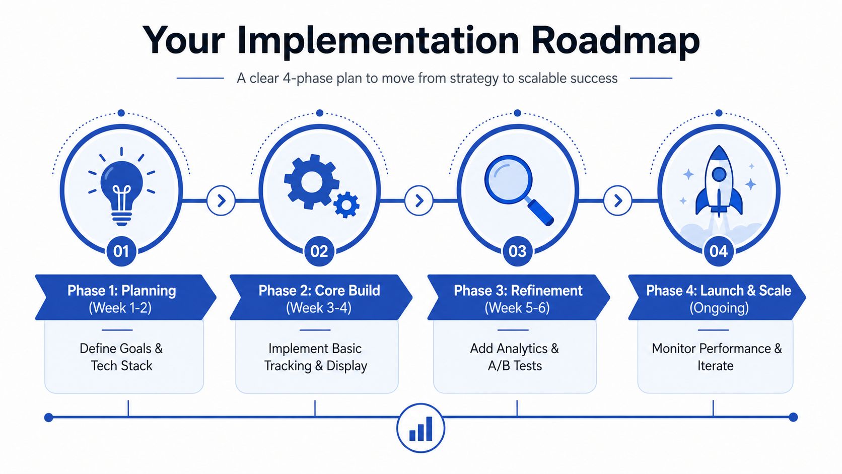
Your Implementation Roadmap and Next Steps
The right rollout depends on store size and technical appetite. A small Shopify store can start with browser storage, a short bounded list, and a simple product-level render. That gets you the behaviour quickly without inventing identity logic you don't need yet.
Larger operations should plan for account-aware persistence, consent-aware fallbacks, and clean identity stitching across sessions. Bloomreach's recency-based model over a defined window is a good reminder that the data should stay fresh and operationally bounded, not treated like a permanent log of everything a shopper ever glanced at (Bloomreach docs). If your catalogue changes often, stale history management should be part of the launch checklist, not a post-launch apology.
A practical sequence looks like this:
- Plan first: decide whether the widget is for rescue, repeat engagement, or both.
- Build second: implement event capture, deduplication, and a strict maximum list size.
- Refine third: add consent handling, empty states, and clean mobile placement.
- Scale last: bring in analytics, A/B testing, and account-level persistence only after the basics are stable.
That's also where a Shopify agency can help without turning the feature into a giant project. Grumspot is one option for teams that need Shopify 2.0 execution, custom app work, or CRO support around features like this, especially when the implementation has to fit into a broader merchandising and SEO stack.
If you want this kind of Shopify feature built without the usual storage, consent, and theme-architecture mistakes, talk to Grumspot. They handle conversion-focused Shopify builds, Shopify 2.0 migrations, and custom development work that needs to survive real traffic, real consent flows, and real merchandising pressure.
Let's build something together
If you like what you saw, let's jump on a quick call and discuss your project

Related posts
Check out some similar posts.

- social proof examples
Examples of social proof for ecommerce brands: case studies, client testimonials, Shopify badges and...
Read more
- cro best practices
Apply cro best practices to Shopify stores with 10 actionable tactics for testing, product pages, ch...
Read more
- best web design systems
Compare the best web design systems for Shopify teams, covering components, tokens, developer experi...
Read more
- shopify plus stores
Explore 7 Shopify Plus stores, from Gymshark to Huel, and uncover design, UX, conversion and integra...
Read more