10 Best Web Design Systems for Shopify Teams
- best web design systems
- Shopify design systems
- design tokens
- component libraries
- ecommerce UX
Launched
September, 2026
The most feature-complete design system isn't automatically the best choice for a Shopify team. A library can offer hundreds of polished components and still create more work if its assumptions belong to an admin console, a healthcare service, or a developer platform rather than a customer-facing storefront.
This comparison assesses ten established design systems against the factors that affect delivery: component quality, token structure, accessibility guidance, developer experience, customisation effort, and relevance to Shopify storefronts, apps, admin tools, and integrations. The practical distinction matters. Adopting a system means allowing its components, conventions, and release process to shape your product. Using it as a reference means borrowing its patterns, tokens, and accessibility decisions while building components that fit your own commerce model.
Shopify teams often need both approaches at once. Polaris can provide a strong foundation for an embedded app, while a bespoke theme may need a separate commerce language for merchandising, subscriptions, search, and checkout-adjacent journeys. The recommendations below explain where each system fits, where it creates friction, and when adaptation is more sensible than wholesale adoption.
1. Shopify Polaris
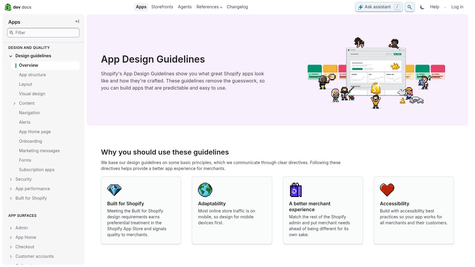
Shopify Polaris is the most direct choice for teams building Shopify admin apps, embedded experiences, and extension surfaces. Its patterns are designed to feel native inside Shopify, which reduces the visual and behavioural gap between your product and Admin. That matters for app teams seeking a consistent experience and for merchants who don't want to learn a second interface language.
Polaris now puts increasing emphasis on framework-agnostic Web Components, delivered through Shopify's CDN. For implementation teams, that changes the migration conversation. A React-first codebase cannot assume that the previous component model will remain the long-term path, so developers should evaluate Web Components, event handling, styling boundaries, and testing before starting a broad upgrade.
The system includes design tokens, admin-aligned components, previews, and guidance for newer surfaces such as Checkout and Customer Accounts. Its relationship with Shopify app design guidance is especially useful when a product needs to align its interface with Shopify's expectations rather than merely imitate its colours.
Where Polaris fits Shopify delivery
Polaris is strongest when the user is already operating inside Shopify. It can shorten design and implementation decisions for settings screens, resource lists, forms, filters, and operational workflows. Following established patterns can also make a Built for Shopify review more straightforward, although compliance still depends on the whole app experience, not just the component selection.
The trade-off is flexibility. A highly branded storefront, a complex merchandising canvas, or an unusual subscription builder may outgrow the available patterns. For those experiences, use Polaris tokens and accessibility principles as a reference, then create focused commerce components rather than forcing an admin-oriented library into the customer journey.
Practical rule: Adopt Polaris for Shopify-native app surfaces. Adapt its principles for storefronts unless the customer experience genuinely benefits from its administrative interaction model.
The React-based Polaris approach is being deprecated, and the component set continues to evolve. Teams should therefore document their dependency choices, isolate system components behind a small internal layer, and test extension surfaces in the live Shopify environment before fully committing.
2. Google Material Design
Google Material Design remains one of the strongest references for teams that need a broad, cross-platform design language. Its foundations cover colour, type, elevation, motion, layout, and theming, while Material 3 gives teams a structured way to express brand variation without discarding the underlying interaction model.
For a Shopify product team, Material is rarely a drop-in storefront choice. Its visual cues can feel recognisably Google-like, particularly when teams use default shapes, colour relationships, and motion without a deliberate brand layer. That doesn't make it unsuitable. It makes token mapping essential.
Material as a foundation, not a Shopify theme
Material works well for internal tools that connect Shopify with inventory, fulfilment, customer service, or analytics systems. Its adaptive guidance can also help teams plan interfaces across desktop, tablet, and mobile contexts. Developers benefit from a large ecosystem of implementations and examples, while designers can use its extensive guidance to resolve states that a small bespoke kit might leave undefined.
The cost appears when a team tries to carry Material directly into a premium DTC storefront. Product cards, promotional modules, collection filters, variant selectors, and merchandising content need a commerce-specific hierarchy. Material can supply the primitives, but it won't decide how a retailer should express urgency, editorial storytelling, or complex product availability.
A useful implementation sequence is:
- Map brand tokens first: Translate Material's colour, type, shape, and elevation foundations into the brand's semantic vocabulary before building Shopify sections.
- Keep commerce patterns bespoke: Design product cards, buying guides, bundles, and subscription controls around the store's customer journeys.
- Use adaptive guidance selectively: Apply responsive principles to layouts and navigation, but don't inherit every platform convention unchanged.
- Audit motion and density: Reduce decorative movement where it distracts from product choice, accessibility, or performance.
For teams working on ecommerce UI and UX, Material is best treated as a mature architectural reference. It offers depth and consistency, but Shopify teams still need to own the retail experience.
3. IBM Carbon Design System
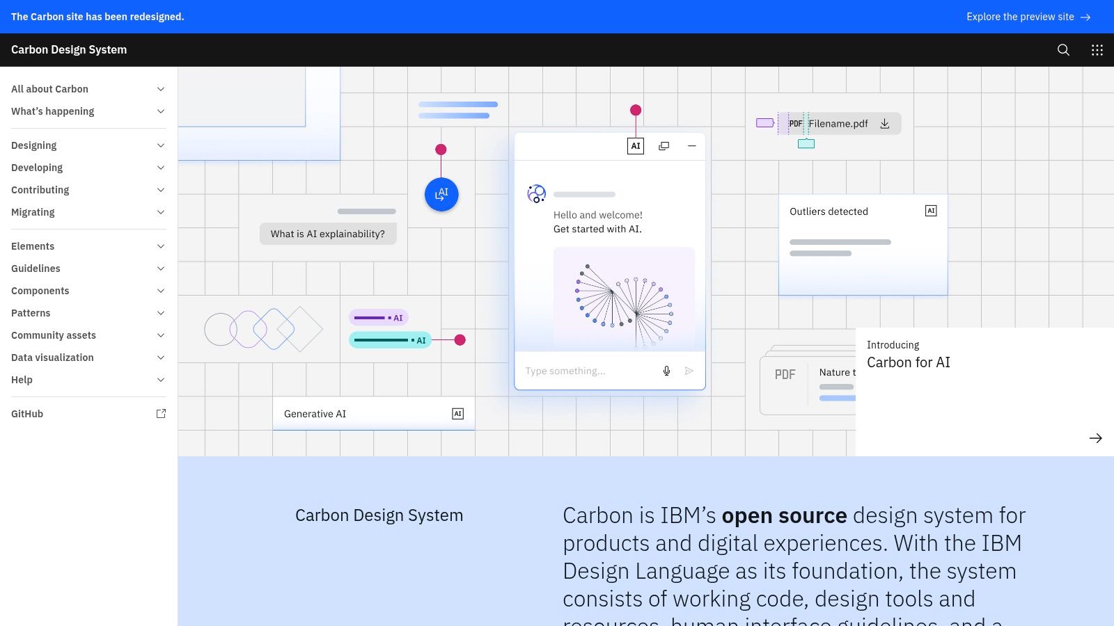
IBM Carbon is built for enterprise products, data-heavy workflows, and large organisations where consistency and accessibility need to survive across teams. Its components, tokens, theming model, typography, and implementation options make it a credible foundation for a Shopify operation with complex back-office tooling.
Carbon is particularly useful when a retailer's Shopify stack includes operational interfaces for catalogue management, wholesale pricing, order investigation, inventory exceptions, or customer-service workflows. Those screens often contain dense tables, filters, status indicators, forms, and data visualisations. Carbon gives teams established patterns for these structures instead of encouraging every squad to invent its own.
The enterprise trade-off
Carbon's strength can also make it feel heavy. Its visual language tends towards structured enterprise software, so a consumer-facing brand will need a deliberate theme rather than a light colour swap. IBM Plex typography and default component treatments may communicate operational clarity, but they won't automatically communicate a distinctive retail identity.
Developers should also assess bundle and rendering implications before using a broad implementation across a storefront. A Shopify theme usually benefits from loading only what the customer journey needs. Carbon is more compelling in a separate operational application, where its component breadth justifies the dependency, than in a lean product-detail page.
Carbon's accessibility documentation and testing culture make it valuable even when the team doesn't adopt its code. Designers can study its keyboard states, focus treatment, validation patterns, and content structure, then translate those decisions into Liquid, JavaScript, or a headless storefront implementation.
Carbon earns its place when the problem is operational complexity. It isn't the obvious choice for a visually expressive customer storefront.
For international teams, the system's scalable approach is useful during design governance. Still, ownership needs to be clear. A Carbon-based internal tool can drift if product teams override tokens locally, duplicate components, or treat accessibility guidance as optional during rapid integration work.
4. Microsoft Fluent
Microsoft Fluent suits Shopify organisations building B2B tools, internal applications, and cross-platform operational products. Fluent 2 provides foundations, design tokens, component libraries, guidance, and Figma resources that support interfaces spanning web, Windows, iOS, and Android.
Its familiar productivity-oriented character can help in a back-office setting. Users working with purchasing, sales, customer records, and fulfilment may already understand the general conventions of business software, so a Fluent-influenced interface can reduce unnecessary novelty. That benefit doesn't transfer automatically to a public storefront, where brand expression and shopping motivation matter more.
Token mapping matters more than component quantity
Fluent's token model gives teams a useful starting point for colour roles, typography, spacing, and state changes. Before implementation, map those roles to the Shopify product's semantic tokens. For example, define the difference between a promotional accent, an actionable control, a validation message, and a stock warning rather than scattering raw colour values through theme code.
The package ecosystem can be confusing at first. Teams may encounter multiple implementation choices, and the correct choice depends on whether the product is a React application, a web component surface, or a broader cross-platform system. Establishing that boundary early prevents designers and developers from building against different interpretations of the same component.
Fluent is also not ecommerce-specific. It won't provide a finished answer for variant selection, product comparison, gift messaging, subscription cadence, or merchandising campaigns. Those patterns should be designed around the store's data and conversion goals, then styled using a controlled subset of Fluent foundations if that remains useful.
A Shopify team can sensibly use Fluent for:
- Merchant operations: Order management, customer service, and reporting interfaces.
- B2B purchasing: Account-level permissions, approval flows, and repeat-order tools.
- Connected applications: Tools that need a consistent language across web and native environments.
For a consumer storefront, adaptation is usually safer than adoption. Keep the system's foundations where they improve coherence, but protect the brand's product discovery and buying patterns from becoming generic enterprise UI.
5. Atlassian Design System and Atlaskit
The Atlassian Design System, together with Atlaskit packages, is a strong reference for collaboration-heavy and data-dense interfaces. Jira and Confluence have to support navigation, tables, filtering, permissions, status, comments, and complex workflows. Those are also common requirements in the operational layer surrounding a growing Shopify business.
For example, a retailer's internal product may need to coordinate catalogue changes, campaign approvals, content production, market launches, and fulfilment exceptions. Atlassian's patterns can help teams think through how users move between objects, retain context, and understand work status without relying on decorative complexity.
Good for operational UX, less convincing for retail identity
Atlaskit packages offer React components, while Atlassian's guidance covers content, accessibility, foundations, and coding conventions. That combination helps larger teams establish a shared working method. Linting and standards can support consistency beyond the design file, especially when multiple developers contribute to an internal product.
The system's drawbacks are practical. Packages change, deprecations require monitoring, and the footprint can be more than a focused Shopify interface needs. A team that copies components without tracking the underlying release process can end up with a fragmented mixture of old and new patterns.
Use Atlassian as a reference when the interface involves:
- Complex navigation: Users move between products, orders, tasks, customers, and operational records.
- Collaboration: Multiple roles review, assign, approve, or comment on work.
- Dense information: Tables and status systems matter more than visual storytelling.
Don't assume that patterns designed for work management will improve a product page. Retail customers need clear value communication, confident selection, accessible buying controls, and useful reassurance. Atlassian can inform the structure of a merchant portal, but a storefront should retain its own content and commercial language.
A sensible implementation keeps Atlaskit behind a defined application boundary. Pin dependencies, review changelogs, and expose only the components the product supports. That discipline matters more than choosing the largest available component catalogue.
6. Salesforce Lightning Design System
Salesforce Lightning Design System is the logical option when Shopify experiences connect closely to Salesforce CRM, sales operations, service workflows, or partner applications. Its tokens, utilities, and base components align with Lightning Experience and implementations such as Lightning Web Components and Visualforce.
That context is important. SLDS is excellent at helping a team build an interface that feels coherent inside Salesforce-related work. It can support account records, opportunity workflows, service cases, and operational dashboards that draw on commerce data. It is far less compelling as the visual foundation for a public fashion, beauty, or lifestyle storefront.
Use SLDS where the business context is Salesforce
The strongest use case is a connected workflow. A sales representative might review a Shopify customer's purchasing history, investigate an order, or manage an account-level process. In that setting, consistency with Salesforce conventions may matter more than introducing a separate brand language.
SLDS documentation covers LWR and LWC usage, Visualforce, accessibility guidance, and conformance information. Teams should still validate the rendered result in their own application. A documented component isn't automatically accessible after custom wrappers, third-party scripts, dynamic data, and responsive changes have been added.
The system can also create documentation overhead. Information may be spread across platform-specific resources, so a project should nominate one implementation path and maintain an internal decision record. Otherwise, designers may use one version of a pattern while developers implement another.
For Shopify teams, the practical split looks like this:
- Public storefront: Use the brand's commerce system, with SLDS influencing connected account or service tooling only where appropriate.
- Sales workspace: Consider SLDS when the application needs to sit naturally beside Salesforce records and processes.
- Integration project: Reuse token concepts, not necessarily every component, when a shared data model crosses systems.
Adopting SLDS wholesale on a customer-facing store can make the experience feel like a CRM. Adapt it for Salesforce-native workflows, and keep the retail surface responsible for discovery, trust, and purchase decisions.
7. Adobe Spectrum
Adobe Spectrum is a strong candidate for teams working across content-rich, creative, and Adobe-connected experiences. Its component library, theming approach, visual standards, and iconography support products where users manage assets, content, campaigns, and detailed creative work.
A Shopify brand using Adobe Experience Cloud, Creative Cloud, or a complex content workflow may find Spectrum useful for internal tools and shared design principles. It can help create a clearer relationship between campaign production and the systems used to publish that campaign into commerce channels.
A polished reference with limited commerce specificity
Spectrum's strengths are most visible in dense creative interfaces. It gives designers a disciplined approach to controls, selection states, panels, menus, and asset-related workflows. Its visual quality also makes it a valuable benchmark when a team is defining iconography, interaction states, and themes for a premium product.
The gap appears on the storefront. Spectrum doesn't provide the same depth of ecommerce-specific patterns as Polaris or Material implementations commonly used in commerce applications. A product detail page still needs bespoke decisions about image galleries, variant selection, delivery messaging, reviews, bundles, and subscription choices.
Implementation details can also vary by Adobe product and delivery context. Before adopting code, confirm which packages, web components, tokens, and accessibility behaviours apply to the actual application. Treat Adobe alignment as a reason to investigate Spectrum, not as proof that every Spectrum component belongs in the Shopify theme.
Spectrum makes sense when:
- Creative operations dominate: Users organise assets, content, campaigns, or brand materials.
- Adobe connectivity matters: A shared language reduces friction between content production and commerce publication.
- The visual system needs rigour: Iconography, theming, and dense controls require careful governance.
For a DTC storefront, borrow the parts that improve visual discipline and content tooling. Build commerce components around the customer journey rather than asking a creative-product system to define retail behaviour.
8. GOV.UK Design System
The GOV.UK Design System is one of the clearest examples of a system built around accessibility, clarity, forms, and content quality. It is not a retail UI kit, but its service patterns are exceptionally useful for Shopify teams designing account areas, returns flows, delivery questions, checkout-adjacent forms, and support journeys for UK audiences.
Its historical importance is substantial. Launched in July 2018, its codebase is now used in more than 300 GOV.UK services, and GOV.UK says the system helped drive a 250% increase in website traffic since launch while saving an estimated £17 million annually. Those figures come from the UK public design evidence review, and they show what happens when reusable patterns receive sustained governance across a large service estate.
Accessibility should shape the system
At least 1 in 5 people in the UK report having a disability, according to the GOV.UK accessibility strategy. For Shopify teams, the lesson isn't to copy the GOV.UK visual style. It is to encode semantic structure, clear labels, useful error messages, keyboard support, and understandable content into the system itself.
GOV.UK guidance encourages teams to start with semantic HTML and make interfaces work without CSS or JavaScript where possible. That approach is especially valuable when a storefront includes progressive enhancement, third-party scripts, dynamic cart behaviour, or app blocks that can introduce inconsistent states.
The system's strict visual identity is a disadvantage for consumer brands. Its patterns also don't solve merchandising, product comparison, promotional storytelling, or subscription UX. Use it as a reference for inclusive content and service interactions, then adapt the visual layer and commerce components.
The best lesson from GOV.UK is not its typography or colour palette. It's the discipline of making accessibility and content decisions before decoration.
9. NHS.UK Design System
The NHS.UK Design System is designed for trust-heavy, information-dense public services. Its typography, navigation, headers, content patterns, and accessibility guidance make it a useful reference for Shopify journeys where customers need reassurance and clear decisions, such as health products, regulated goods, delivery exclusions, returns, or account support.
NHS patterns are intentionally readable and conservative. That can be an advantage when a retailer's current interface relies on small text, ambiguous controls, or visually aggressive promotional treatments. The system encourages teams to prioritise comprehension, especially on mobile layouts and content-led pages.
Borrow the behaviour, not the NHS identity
The brand connection is also the main constraint. NHS styling is strongly tied to public healthcare, so applying it directly to a retail store can create an unintended institutional tone. Product teams should extract principles about hierarchy, content order, form behaviour, focus states, and responsive structure rather than treating NHS components as a ready-made theme.
Teams reviewing an implementation should test with assistive technology rather than just checking whether a component looks correct. The screen-reader compatibility guidance is relevant when evaluating product filters, variant selectors, accordions, validation messages, and dynamically updated cart content.
NHS.UK can inform:
- Readable product education: Use clear hierarchy and predictable content structure for complex product information.
- Trust-building flows: Apply straightforward patterns to delivery, returns, safety, and support content.
- Mobile interactions: Test navigation, form controls, and error recovery at small viewport sizes.
- Governed accessibility: Document expected states rather than leaving behaviour to individual developers.
It is not a general ecommerce library, and its domain patterns are narrower than those of Material or a bespoke commerce system. Its value lies in showing how a large public-service site can make clarity and inclusion operational rather than aspirational.
10. GitHub Primer Design System
GitHub Primer is a pragmatic choice for developer tools, dashboards, and content-heavy interfaces. Primer Web and React implementations, utility classes, Figma libraries, tokens, and brand components support a modular approach that suits teams comfortable with systematic frontend work.
Its strongest Shopify use case is usually away from the storefront. A merchant portal, app dashboard, product operations tool, or integration console can benefit from Primer's restrained treatment of navigation, status, forms, tables, and utility content. Teams building a Shopify app for technical users may also find its developer-centric tone more appropriate than a consumer-oriented kit.
A modular system that still needs a brand layer
Primer has been battle-tested on GitHub, but its defaults can make an unrelated product feel like GitHub. That isn't a problem for a technical dashboard, yet it can be distracting for a retail brand. Map tokens and typography deliberately, and avoid importing the visual identity through default component choices.
The ecommerce pattern library is smaller than what teams may expect from a system designed around developer collaboration. Product cards, collection merchandising, reviews, bundles, and checkout messaging still need to be designed and tested separately. Primer can supply buttons, inputs, menus, alerts, layout utilities, and status conventions, but it won't define the commercial logic of a Shopify store.
A useful boundary is to use Primer for tools where users manage information, then create a separate storefront layer that shares only carefully chosen foundations. This reduces the risk of technical interfaces and customer experiences collapsing into the same visual language.
For developers, the system's modularity supports gradual adoption. Start with tokens and a small set of primitives, establish component ownership, and add patterns only when the product has a repeated need. That approach is more maintainable than importing a broad library and overriding most of its defaults.
Top 10 Web Design Systems Comparison
| Design System | Core focus / Key features ✨ | UX quality ★ | Strength / USP 🏆 | Best fit / Target audience 👥 | Value / Cost 💰 |
|---|---|---|---|---|---|
| Shopify Polaris | ✨ Shopify-aligned Web Components, design tokens, migration guides | ★★★★☆ | 🏆 Native admin parity & faster Built‑for‑Shopify reviews | 👥 Shopify app teams, merchants migrating to Shopify 2.0 | 💰 Free, reduces review friction |
| Google Material Design | ✨ Cross‑platform foundations, theming, motion & tokens | ★★★★★ | 🏆 Extremely broad pattern coverage & tooling | 👥 Cross‑platform brands, mobile & web apps | 💰 Free, huge ecosystem |
| IBM Carbon Design System | ✨ Enterprise components, data viz, accessibility-first tokens | ★★★★☆ | 🏆 Scalable, accessibility & internationalisation focus | 👥 Complex dashboards, large teams, B2B ecommerce ops | 💰 Free, enterprise‑grade (heavier bundles) |
| Microsoft Fluent (Fluent 2) | ✨ Design tokens, React/web libs, Figma resources | ★★★★☆ | 🏆 Familiar productivity/enterprise look for business tools | 👥 B2B ecommerce back‑office, Windows/iOS/Android apps | 💰 Free, requires theming for brand fit |
| Atlassian Design System + Atlaskit | ✨ Collaboration patterns, Atlaskit React, linting & guidelines | ★★★★☆ | 🏆 Proven at scale for collaboration & data‑dense UIs | 👥 Operational ecommerce UIs, internal collaboration tools | 💰 Free, robust but moderate footprint |
| Salesforce Lightning Design System (SLDS) | ✨ Tokens, utilities, LWC/LWR guidance, accessibility reports | ★★★★☆ | 🏆 Ideal for CRM‑integrated workflows and partner apps | 👥 Salesforce partners, sales/ops interfaces | 💰 Free, best inside Salesforce ecosystem |
| Adobe Spectrum | ✨ Themed component library for creative/content‑rich tools | ★★★★☆ | 🏆 High visual quality and iconography for creative apps | 👥 Creative Cloud/marketing tools, content‑heavy UIs | 💰 Free, fewer ecommerce patterns out‑of‑the‑box |
| GOV.UK Design System | ✨ WCAG‑aligned components, content style & service patterns | ★★★★★ | 🏆 Gold standard for accessibility, usability & plain language | 👥 Public services, UK‑facing accessible websites | 💰 Free, strict visual brand (needs customization) |
| NHS.UK Design System | ✨ Accessible, readable components optimized for health services | ★★★★★ | 🏆 Rigorous accessibility & trust‑focused design | 👥 Health services, information‑dense public sites | 💰 Free, brand‑specific look, strong a11y focus |
| GitHub Primer Design System | ✨ Developer‑centric utilities, Primer Web/React & Figma libs | ★★★★☆ | 🏆 Battle‑tested at massive scale; pragmatic building blocks | 👥 Developer tools, dashboards, technical content sites | 💰 Free, utilitarian aesthetic, modular |
Choose the System That Fits the Job
The right choice starts with the surface you're building, not with a leaderboard. Polaris should be the first option for Shopify app and extension-native work, particularly when an embedded app, Checkout extension, or Customer Accounts experience needs to feel consistent with Shopify. Its move towards Web Components means teams should plan the technical migration rather than treating the older React approach as a permanent foundation.
For broader cross-platform foundations, Material remains a strong candidate. It offers enough depth for web applications, internal tools, and multi-platform products, but Shopify teams should customise its tokens and keep commerce-specific components under their own control. Carbon, Fluent, and Atlaskit make more sense for enterprise and operational interfaces, where data density, workflow complexity, and cross-team governance matter more than storefront expression.
SLDS belongs primarily in Salesforce-connected workflows. It can provide a coherent language for CRM and service operations, but it shouldn't turn a public storefront into an extension of the CRM. Spectrum is a sensible reference for Adobe-connected creative workflows, especially where assets, content, and campaign production shape the product. Primer suits modular developer tools and dashboards, with a technical tone that needs theming before it represents a consumer brand.
GOV.UK and NHS.UK deserve special attention even when you won't adopt their visual styles. The GOV.UK accessibility strategy identifies accessibility as a system principle, and its broader guidance recognises users with low digital skills, English as an additional language, or limited internet access. That perspective matters for UK merchants serving mixed audiences, multilingual markets, and customers navigating complex service information.
A practical adoption sequence
Start by auditing the existing interface. Record repeated components, inconsistent states, accessibility defects, token exceptions, and the places where Shopify apps or integrations inject their own UI. Don't replace components before you understand which problems the current system is causing.
Then map tokens. Establish semantic roles for colour, type, spacing, borders, focus, surfaces, and feedback states. A library's raw values are less important than whether designers and developers can use the same meaning across a storefront, app, account area, and operational tool.
Test the selected system in the live Shopify environment. Responsive behaviour, theme constraints, app blocks, third-party scripts, checkout boundaries, performance, keyboard navigation, and screen-reader output can differ from the design file or component preview. Validate real flows, including errors, loading, empty states, unavailable products, and dynamic cart updates.
Finally, assign ownership and versioning. Someone needs to decide which components enter the system, how changes are reviewed, how deprecated packages are handled, and when a team may create a bespoke pattern. Without governance, even the best web design systems become collections of local overrides.
Shopify storefront teams often get the best result by combining a system's principles and tokens with bespoke commerce components. Don't force an admin-oriented library onto a customer experience because it has a polished component catalogue. Use Polaris where Shopify-native alignment matters, borrow GOV.UK and NHS.UK's accessibility discipline, and choose enterprise systems according to the connected workflows your organisation operates.
Grumspot is one relevant option for teams that need Shopify Plus design, migration, integration, CRO, or accessibility-aware storefront work. The useful question is not whether an agency uses a named design system. It is whether the team can translate system decisions into a maintainable Shopify implementation and measure the result in real customer journeys.
If your Shopify storefront, app, or operational tool has accumulated inconsistent components, Grumspot can audit the experience, define a practical design foundation, and implement bespoke Shopify Plus interfaces around your brand and integrations. Visit Grumspot to discuss a focused design, migration, development, or CRO project.
Let's build something together
If you like what you saw, let's jump on a quick call and discuss your project

Related posts
Check out some similar posts.

- shopify plus stores
Explore 7 Shopify Plus stores, from Gymshark to Huel, and uncover design, UX, conversion and integra...
Read more
- recently viewed items
Build and optimise recently viewed items on Shopify with code patterns, localStorage, server-side tr...
Read more
- breadcrumb navigation
Learn what breadcrumb navigation is, why it matters for UX and SEO, and how to implement it correctl...
Read more
- Shopify UX audit
Our complete guide to conducting a Shopify UX audit. Learn to identify friction, fix user experience...
Read more