7 Shopify Website Examples Worth Studying
- shopify website examples
- Shopify UX
- Shopify CRO
- Shopify Plus
- ecommerce inspiration
Launched
October, 2026

Attractive Shopify storefronts don't automatically provide useful guidance. A polished homepage can show you a colour palette, photography style, and layout direction, but it won't tell you whether the navigation helps shoppers find products, whether merchandising supports the buying journey, or whether the design survives real operational constraints. The best Shopify website examples make those questions easier to answer. You can identify the page pattern, infer its conversion objective, assess the evidence behind the recommendation, and translate the lesson into a testable action.
This comparison turns seven discovery resources into a practical benchmarking system. Each source is assessed for credibility, visual value, UX patterns, conversion relevance, and usefulness in a real project. Use the galleries for inspiration, then validate the underlying behaviour with analytics, user research, and CRO testing. If you need specialist support, find a Shopify SEO expert before copying a design that may not suit your search architecture. Grumspot's Shopify Plus design, development, audits, and CRO capabilities can also help turn validated ideas into a tested storefront strategy.
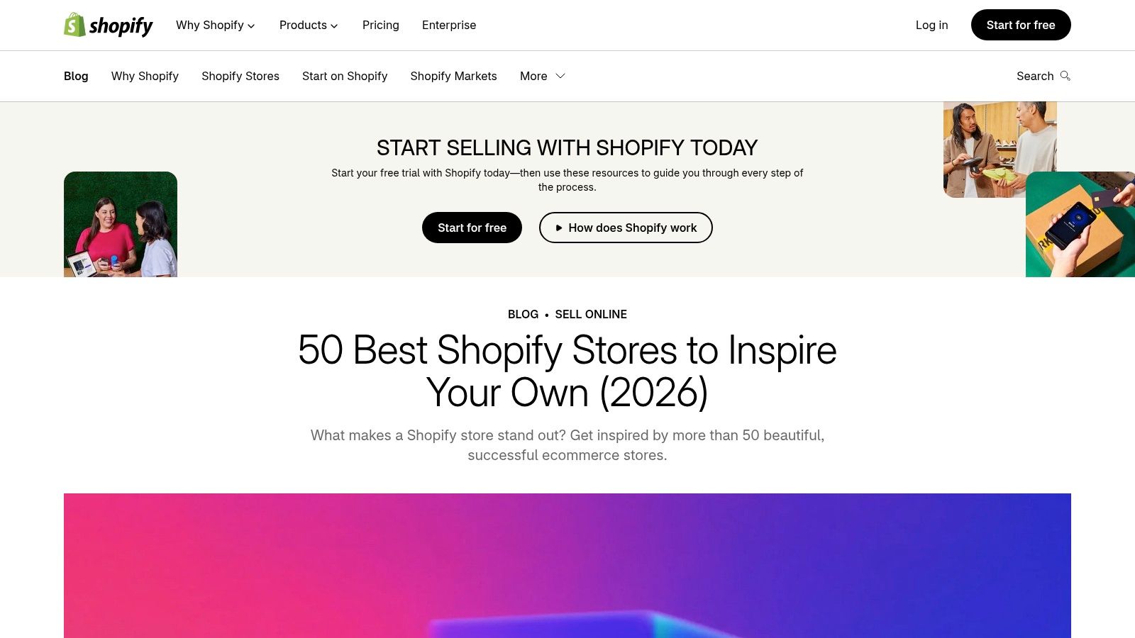
1. Shopify UK 50 Best Shopify Stores
Shopify UK's roundup of standout stores is the fastest place to establish a credible reference set. It's a first-party resource, so the featured merchants are presented as Shopify examples rather than unverified visual references. The entries span DTC and retail brands, with concise notes that explain what makes each storefront worth examining.
That brevity is both the strength and the limitation. You can scan several categories quickly and identify useful directions for photography, brand storytelling, product presentation, or editorial merchandising. You won't get a complete audit of a product detail page, checkout journey, app stack, or mobile experience. Treat each entry as a hypothesis generator, not as proof that a particular pattern converts.
What to extract
The UK context matters because the local Shopify ecosystem is substantial and concentrated in consumer categories. As of 18 September 2026, the UK had 231,464 live Shopify stores, with the total growing 8% year over year in 2026 Q2, according to Store Leads' UK Shopify store data. Apparel represented 25.1% of stores and Home & Garden represented 13.7%, which helps explain why many UK examples lean heavily on fashion and lifestyle merchandising.
Use the roundup to compare stores within the same commercial context, rather than copying the most visually distinctive brand on the page. Record the homepage promise, collection structure, product-card information, trust signals, and route to purchase. Then review Shopify Plus store examples from Grumspot for a deeper look at how larger storefronts handle more complex design and operational requirements.
Practical rule: Copy the customer task, not the surface treatment. A prominent category block may exist to speed product discovery, not merely to decorate the homepage.
2. Shopify Examples Official Gallery
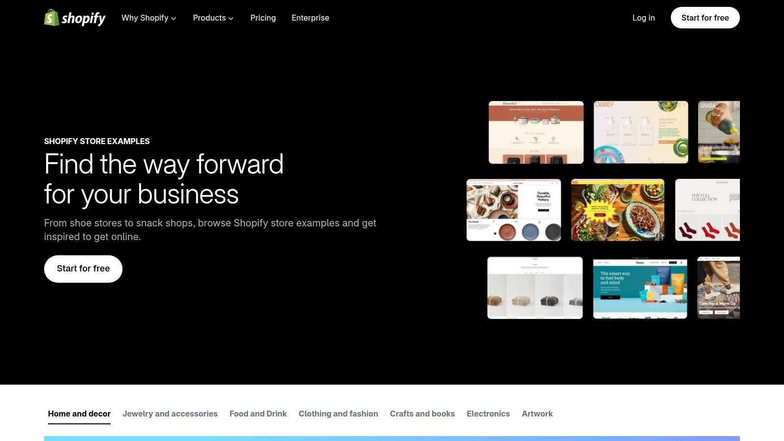
The official Shopify Examples gallery works best as a visual benchmarking tool. It presents live Shopify stores through clean, brand-first screenshots and connects some examples with resources or build guidance. That makes it useful when a founder, client, designer, or commercial stakeholder needs to compare possible directions without starting with technical documentation.
Its global scope also creates a useful counterweight to UK-only research. You can see how different product types handle bold art direction, editorial layouts, product-led homepages, and varied navigation models. The gallery is not designed to explain performance data or expose the reasoning behind every interface decision, however. A screenshot can show that a layout exists. It can't show whether shoppers understand it, use it, or abandon the journey after encountering it.
Turn visual references into questions
Choose a small group of examples that sell products with a similar consideration period, price logic, or purchase frequency. For each one, ask:
- Navigation: Can a first-time visitor identify the main product groups without relying on visual intuition?
- Merchandising: Does the page lead with bestsellers, newness, use cases, collections, or brand content?
- Purchase confidence: Where do the store's returns, delivery, reviews, materials, or guarantees appear?
- Mobile behaviour: Does the hierarchy still work when large imagery and horizontal layouts are reduced?
The gallery is particularly helpful at the start of a workshop, when teams need a shared vocabulary for discussing interfaces. It becomes less useful when someone says, “Build this exact site,” without defining the commercial problem the design is meant to solve. Record the intended action beside every screenshot, such as improving category discovery or clarifying product differentiation. That turns aesthetic preference into a reviewable UX brief.
3. WhyMatters 20 of the Best Shopify Stores in the UK
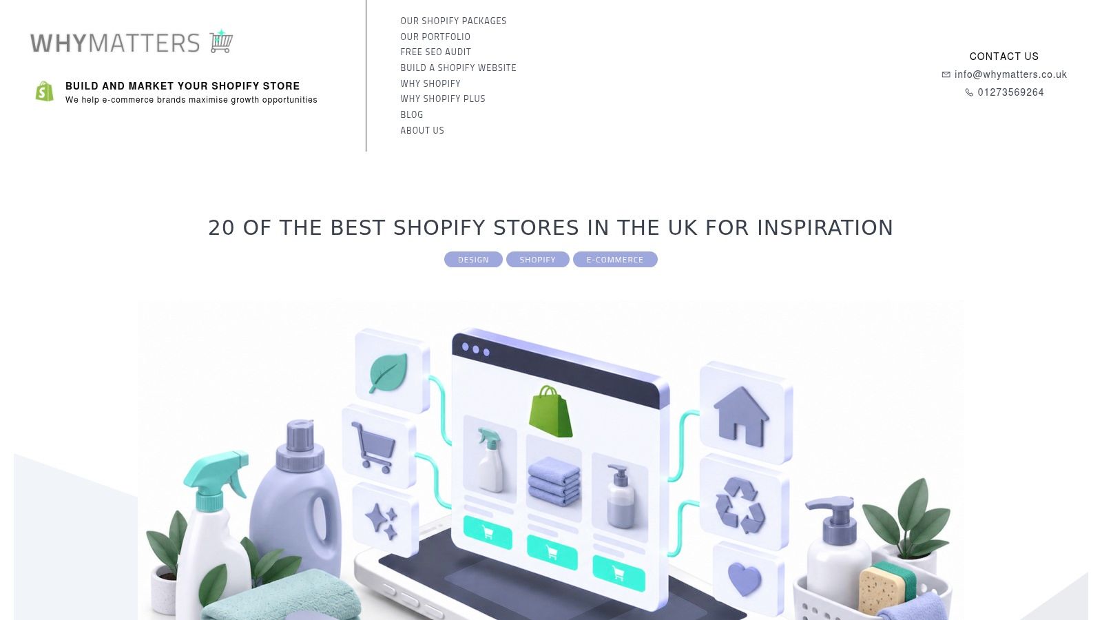
WhyMatters' UK Shopify store selection is more useful than a purely visual gallery when regional relevance and verification matter. The resource explains how its team checks Shopify assets, checkout behaviour, and partner statements before including examples. It also gives each store a clear lesson, which makes the page easier to use in CRO and UX discussions.
That methodology doesn't make every recommendation universally applicable. A lesson extracted from a fashion brand may not transfer cleanly to a merchant selling replenishable goods, complex bundles, or trade products. The value lies in having a more explicit starting point for investigation. You can ask whether the lesson relates to information architecture, brand positioning, product education, or purchase friction.
Use the regional filter intelligently
UK relevance should change the questions you ask, not just the examples you bookmark. Check whether a store handles local delivery expectations, currency presentation, returns messaging, payment methods, and regional brand language in a way your audience can understand. These details are often more replicable than a dramatic hero section.
The resource is also a useful cross-check against official Shopify curation. If the same UX pattern appears in both a first-party roundup and an independently explained UK selection, it deserves closer manual review. That still isn't evidence of conversion impact, but it increases confidence that the pattern is established enough to investigate.
A verified platform example tells you that a store exists on Shopify. It doesn't tell you why a buyer completed an order. Separate platform verification from conversion proof.
For each shortlisted merchant, save one desktop and one mobile journey. Review the homepage, a collection, a product page, search, cart, and any relevant editorial landing page. Note where the example is strong, then document the cost of adopting the pattern, such as content production, theme development, app dependency, or merchandising effort.
4. Sutton Commerce Shopify Store Inspiration Library
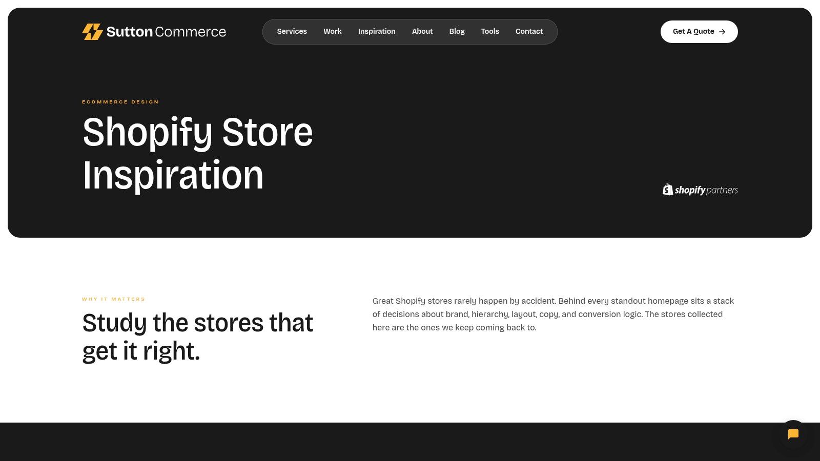
Sutton Commerce's Shopify inspiration library is the strongest of these resources for pattern-spotting. Its searchable collection contains 500+ screenshots of live Shopify stores, making it easier to investigate specific interface areas instead of browsing broad “best stores” lists. Search by navigation, product detail pages, bundles, subscriptions, promotional areas, or other page types when a redesign brief has already identified a problem.
The library is especially valuable in workshops. A team can compare several approaches to a product gallery, announcement bar, collection filter, or subscription explanation without opening many live sites. It can also expose recurring conventions, which helps distinguish a familiar usability pattern from a decorative one-off.
Don't confuse screenshots with outcomes
A screenshot removes context. It may not show how the interface behaves on smaller screens, what happens after a click, whether a filter returns useful results, or how quickly the page loads. It also doesn't reveal the store's analytics, testing history, operational constraints, or accessibility decisions.
Use the library as a research index, then inspect the live merchant before committing to a pattern. Grumspot's ecommerce website design guidance for Shopify is relevant when a reference needs to become a bespoke storefront rather than a theme-level imitation.
A practical capture sheet should include the screenshot, the page type, the visible interaction, the likely customer need, and the implementation risk. For example, a sticky product purchase panel may reduce the effort required to return to the call to action on a long product page. It may also compete with mobile content, overlap consent controls, or create a second source of variant-selection errors. Those trade-offs belong in the benchmark before the pattern reaches design review.
5. OnShopify United Kingdom Shopify Websites
OnShopify's UK directory is better for competitive discovery than polished inspiration. It gives you a broad list of UK Shopify stores, links directly to live websites, and orders listings using an internal ranking signal. That can help teams find less obvious merchants alongside familiar names from curated editorial roundups.
The ranking needs careful interpretation. Because the methodology isn't fully explained in the resource description, don't treat position as a quality score or conversion verdict. Use it as a discovery mechanism. A less celebrated store may contain a better solution for your category, audience, catalogue structure, or fulfilment model than a visually famous brand.
Build a comparable merchant set
Start with a commercial question, then use the directory to find relevant sites. If you're redesigning a multi-category homeware store, compare merchants with similar catalogue breadth and product discovery needs. If you're launching a subscription product, focus on stores that explain recurring value, cancellation terms, delivery timing, and first-order incentives clearly.
Review each live site against the same set of tasks:
- Findability: Locate a specific product through the main navigation and through search.
- Evaluation: Identify the information needed to decide whether the product is suitable.
- Merchandising: Check whether related products, bundles, or complementary items appear at a useful point.
- Confidence: Find delivery, returns, contact, and payment information without leaving the buying journey.
This directory is also useful for finding patterns that curated lists overlook. You may discover a strong collection taxonomy, a clearer trade account pathway, or a practical product comparison module that lacks dramatic visual appeal. Those are often better backlog candidates than a striking animation.
For UK operators, broader platform context reinforces the need to look beyond DTC polish. Shopify's UK B2B ecommerce examples says the UK B2B ecommerce market for physical goods is projected to exceed $150.9 billion in 2026. A benchmarking exercise that ignores account logic, wholesale pricing, invoices, and shared B2B and DTC storefront requirements may produce an attractive site that fails an important commercial use case.
6. FixMyStore Shopify Stores in the United Kingdom
FixMyStore's UK Shopify store library is useful when the goal is not inspiration alone, but a testable benchmark. It combines country filtering, category tags, short CRO and UX notes, and links to the live stores, so teams can compare patterns against the actual buying journey instead of a screenshot. That makes it a stronger starting point for hypothesis generation than a visual gallery.
The short commentary still needs validation. A note about weak navigation, unclear product information, or a distracting promotion can be accurate on one path and irrelevant on another. Recheck the same pattern on mobile and desktop, then compare it with your own analytics before treating it as a real issue.
Convert observations into test hypotheses
A useful hypothesis ties an interface change to a customer action. “Improve the product page” is too vague. “Move delivery timing beside the variant selector because uncertainty may delay add-to-cart decisions” is specific enough to test, and it also makes the expected outcome clear.
Use the library to sort observations into four practical buckets:
- Product discovery: Filters, search suggestions, collection sorting, and category labels.
- Product understanding: Images, comparison details, specifications, reviews, and usage guidance.
- Purchase confidence: Delivery, returns, stock status, payment options, and customer support.
- Basket development: Related products, bundles, subscriptions, and post-add-to-cart prompts.
The UK filter keeps the competitive set relevant, but it does not prove a pattern fits your business. A store may push upsells because its catalogue and margins support that choice. Another merchant may need to protect clarity and trust instead. Match the component to the commercial model before copying it.
Link each proposed change to a measurable event, such as search use, filter interaction, product-page engagement, add-to-cart, or checkout progression. Teams looking for a broader testing perspective can also review audits and A/B testing for Shopify.
7. SiteBuilderReport Shopify Stores 30+ Inspiring Examples
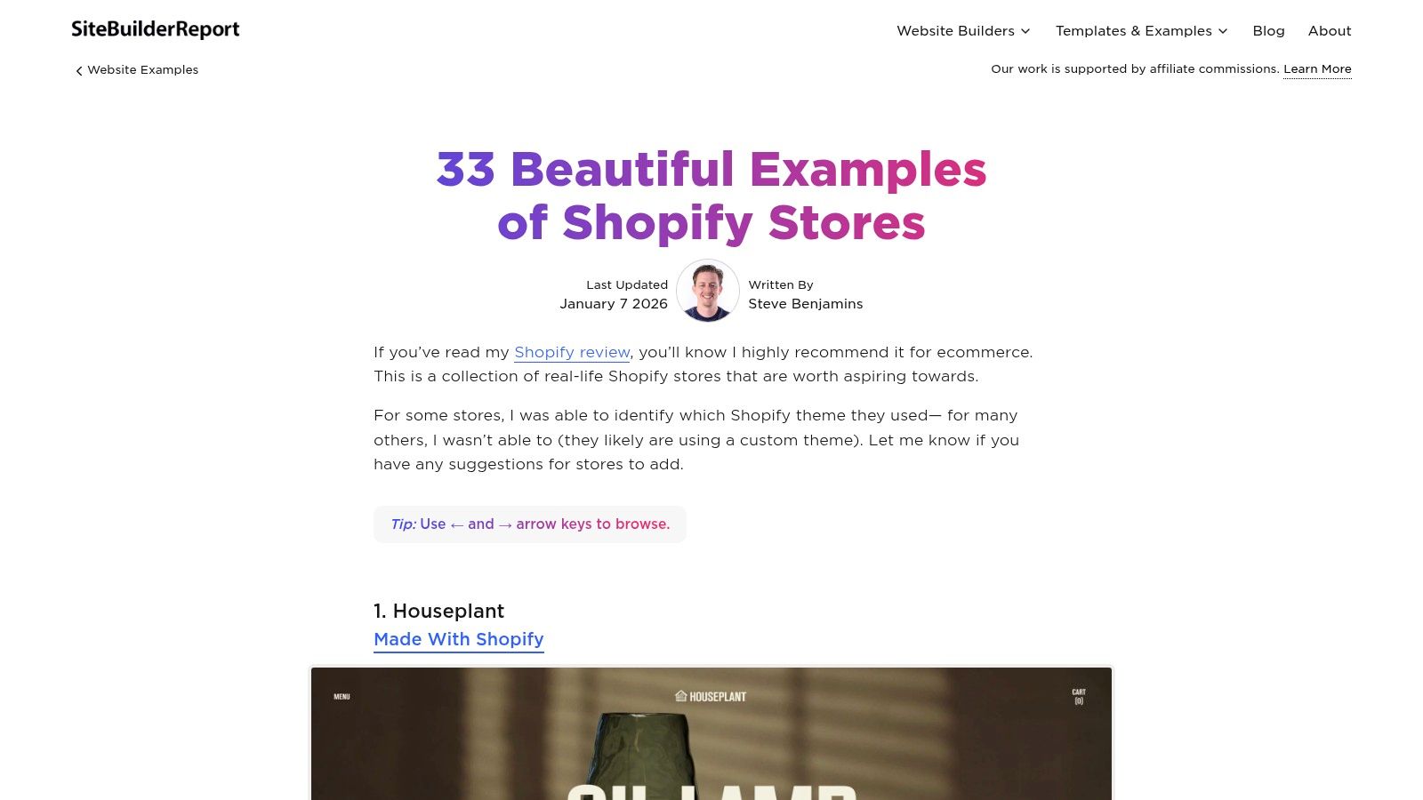
SiteBuilderReport's Shopify store examples for 2026 provides an independent, design-first counterpoint to Shopify's own galleries. Its screenshots and concise commentary are useful for critique sessions, mood boards, and early structural decisions. The global selection broadens the creative reference set beyond UK merchants and can surface different approaches to editorial commerce, visual identity, and product storytelling.
Design-led curation has a clear trade-off. It helps stakeholders see what a storefront could feel like, but it usually says less about technical architecture, app dependencies, performance, accessibility, inventory complexity, or the cost of maintaining the experience. A visual idea can be excellent while still being unsuitable for a merchant with a large catalogue, frequent promotions, or multiple markets.
Ask what the design demands
For every striking example, write down the operational requirements hidden behind the visual result. Does the homepage depend on bespoke photography, a large editorial team, complex content sections, custom product data, or a particular theme architecture? Does the design make promotions easy to update, or does every campaign require developer involvement?
That assessment is important for a UK brand migrating from another platform. A 2026 migration-focused analysis cites a projected 2.1% to 4.2% revenue decline for one to six months after migration for stores with more than 10,000 pages and 70% non-branded SEO traffic, based on its stated conditions and migration analysis on LinkedIn. The point isn't that every migration carries that outcome. It's that a visually impressive end state can't compensate for weak redirects, lost metadata, damaged internal links, or interrupted organic demand.
Use this source to challenge visual bias. Select one design pattern, identify the customer task it might support, and check whether your content, data, SEO, and development systems can sustain it. Grumspot's Shopify website design cost guidance can help frame the difference between a surface-level theme adjustment and a bespoke build when that distinction affects the project decision.
7-Source Shopify Examples Comparison
| Example | Implementation Complexity 🔄 | Resource Requirements ⚡ | Expected Outcomes ⭐📊 | Ideal Use Cases 💡 | Key Advantages |
|---|---|---|---|---|---|
| Shopify UK, 50 Best Shopify Stores | Low 🔄, curated list, easy to skim | Low ⚡, reading time, no tooling | ⭐⭐, broad inspiration; quick verification 📊 | UK-market benchmarking; quick stakeholder examples | First‑party authority; concise takeaways |
| Shopify Examples (Official Gallery) | Low 🔄, curated gallery, simple UI | Low ⚡, screenshots + build guides | ⭐⭐, visual benchmarking; onboarding 📊 | Stakeholder demos; visual scoping for projects | High‑quality screenshots; links to resources |
| WhyMatters, 20 of the Best Shopify Stores in the UK | Medium 🔄, includes verification steps | Medium ⚡, methodology review, recent updates | ⭐⭐⭐, trusted, actionable lessons; UK relevance 📊 | CRO/UX discussions; UK‑specific validation & examples | Transparent verification; one clear lesson per store |
| Sutton Commerce, Inspiration Library | Low–Medium 🔄, searchable library, many entries | Medium–High ⚡, large screenshot set, search tools | ⭐⭐, pattern spotting; mood‑board material 📊 | UX research, redesign planning, workshop mood boards | 500+ screenshots for spotting recurring patterns |
| OnShopify, United Kingdom Shopify Websites (Ranked Directory) | Low 🔄, directory with ranking signal | Low ⚡, broad links list, minimal tooling | ⭐⭐, discovery of high‑visibility & niche brands 📊 | Competitive landscaping; finding live UK stores quickly | Broad coverage; surfaces lesser‑known merchants |
| FixMyStore, Shopify Stores in United Kingdom | Medium 🔄, filterable library + CRO notes | Medium ⚡, country/category filters, quick notes | ⭐⭐, conversion‑focused insights; test ideas 📊 | Generating CRO hypotheses; quick UX checks | Snapshot CRO/UX commentary tied to examples |
| SiteBuilderReport, Shopify Stores: 30+ Inspiring Examples (2026) | Low 🔄, curated roundup, design‑first | Low ⚡, screenshots and succinct commentary | ⭐⭐, design inspiration; structural ideas 📊 | Design critiques; benchmarking beyond official lists | Neutral third‑party curation; recently updated (2026) |
Build a Benchmark, Then Test the Lesson
The seven resources work best together, not as competing lists of winners. Start with the source that matches the question. Use Shopify UK or WhyMatters for credible UK examples, OnShopify for broader competitor discovery, Sutton Commerce for a specific interface pattern, FixMyStore for CRO hypotheses, and the official or SiteBuilderReport galleries for visual direction.
Then shortlist comparable merchants. Similarity should mean more than selling to the same broad category. Look for comparable catalogue structure, purchase frequency, price consideration, fulfilment model, customer knowledge, and market coverage. A skincare store with guided product selection may offer more relevant lessons to another high-consideration category than a visually similar fashion store with a simpler purchase path.
Capture the exact pattern under review. Save the page, device context, visible content, interaction, and customer task. Record the likely conversion purpose in plain language, such as helping shoppers compare variants, clarifying delivery expectations, improving collection discovery, or connecting editorial advice to a relevant product. Avoid writing “make it more premium” or “copy the homepage,” because neither instruction can guide implementation or measurement.
Separate inspiration from proof. Screenshots and curated commentary can generate ideas, but your analytics, session research, customer service records, search data, and controlled CRO tests should decide whether a change deserves development priority. If a pattern appears across several examples, that makes it worth investigating. It doesn't establish that the pattern will improve your store.
For larger UK merchants, include operational and SEO risk in the benchmark. Shopify's B2B material points to the need for shared storefront architecture when wholesale and DTC buyers use the same platform. Migration analysis also demonstrates why redirects, page templates, internal links, metadata, and revenue continuity need attention alongside the visual redesign.
Use this backlog format:
- Pattern: Name the interface or merchandising behaviour.
- Customer task: State what the shopper is trying to do.
- Evidence: Add the relevant example, analytics signal, or research observation.
- Constraint: Note catalogue, content, integration, market, or technical limitations.
- Test: Define the change and the event that will indicate progress.
- Priority: Rank the work by customer impact, confidence, and implementation effort.
Grumspot is one relevant option for Shopify audits, bespoke redesigns, Shopify 2.0 migrations, integrations, internationalisation, and ongoing CRO support. Its team can help merchants move from visual references to a structured storefront plan, then build and refine the experience around the evidence. For further CRO context, review the guide to audits and A/B testing for Shopify before finalising the roadmap.
Grumspot offers bespoke Shopify and Shopify Plus storefront builds, Shopify 2.0 migrations, technical and SEO audits, integrations, and conversion-focused CRO support. If you've found promising Shopify website examples but need help validating or implementing the underlying patterns, visit Grumspot to discuss a practical storefront plan.
Let's build something together
If you like what you saw, let's jump on a quick call and discuss your project

Related posts
Check out some similar posts.
- ecommerce site search
Discover how ecommerce site search boosts conversion, UX, and SEO. Learn core features, implementati...
Read more
- Shopify Store Launch Checklist
Use this Shopify store launch checklist to cover design, payments, shipping, SEO, analytics, complia...
Read more
- black friday campaigns
Compare 7 tools for planning Black Friday campaigns on Shopify, covering email, SMS, personalisation...
Read more
- zero party data
Learn what zero party data is, why it matters for ecommerce, and how to collect and use it for perso...
Read more