Breadcrumb Navigation Explained for Ecommerce Stores
- breadcrumb navigation
- ecommerce UX
- Shopify SEO
- structured data
- site architecture
Launched
August, 2026
A shopper lands on a product page from Google, skims the title, and still can't tell whether they're in menswear, trail shoes, or a one-off landing page built for paid traffic. That's the moment breadcrumb navigation earns its keep, or proves it's just extra chrome. On a busy ecommerce store, the trail at the top of the page can do more than help people backtrack. It can clarify hierarchy, support crawlability, and give a developer or CRO lead a cleaner way to measure whether the structure of the store helps people move.
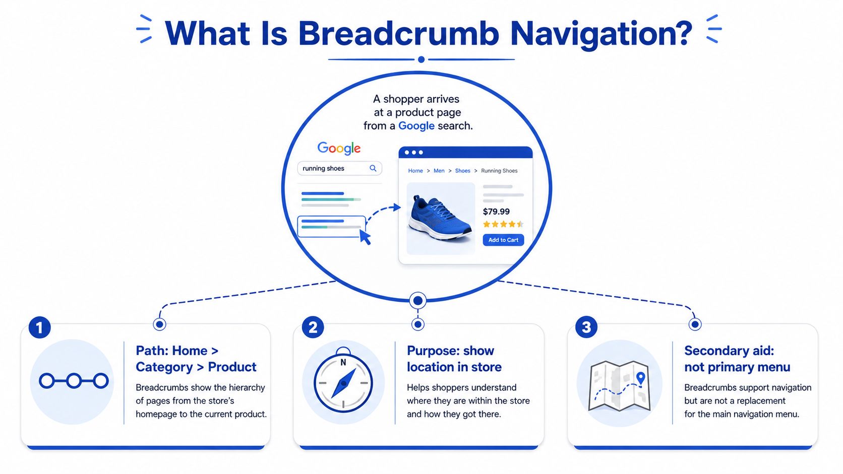
What Breadcrumb Navigation Is and Why It Moves the Needle
A shopper lands on a product page from search, scans the title, and still cannot tell whether they are inside menswear, trail shoes, or a one-off paid landing page. Breadcrumb navigation gives that page an orientation layer, and a well-placed trail can cut bounce rates on deep-entry product pages by making the hierarchy obvious within seconds.
Breadcrumb navigation is a secondary, hierarchical trail that shows where a page sits inside a site's structure. It is not the main menu, it is not a filter set, and it is not the browser back button. It is the small line of links that tells a shopper, in plain language, “you are here, and these are the broader sections above you.”
That matters because ecommerce users rarely need help going back one click. They need to know where a product belongs, what category it came from, and what nearby options sit in the same structure. Breadcrumbs answer that without replacing primary navigation. They support crawlability, they reduce orientation friction on mobile, and they give CRO teams a cleaner signal when a page is attracting traffic from outside the normal browsing path.
A simple bookstore example makes the pattern concrete. If a customer is standing in the “Hardback Fiction” aisle, they do not need every shelf in the building, they need a quick way to understand they are inside Fiction, inside Books, inside the store. Breadcrumb navigation does that online by surfacing the path from the homepage to the current page in a compact, scannable form.
If you want a practical, Shopify-friendly look at the pattern, Surnex breadcrumb implementation tips are a useful reference point because they frame breadcrumbs as navigation, not decoration.
The Three Types of Breadcrumb Trails
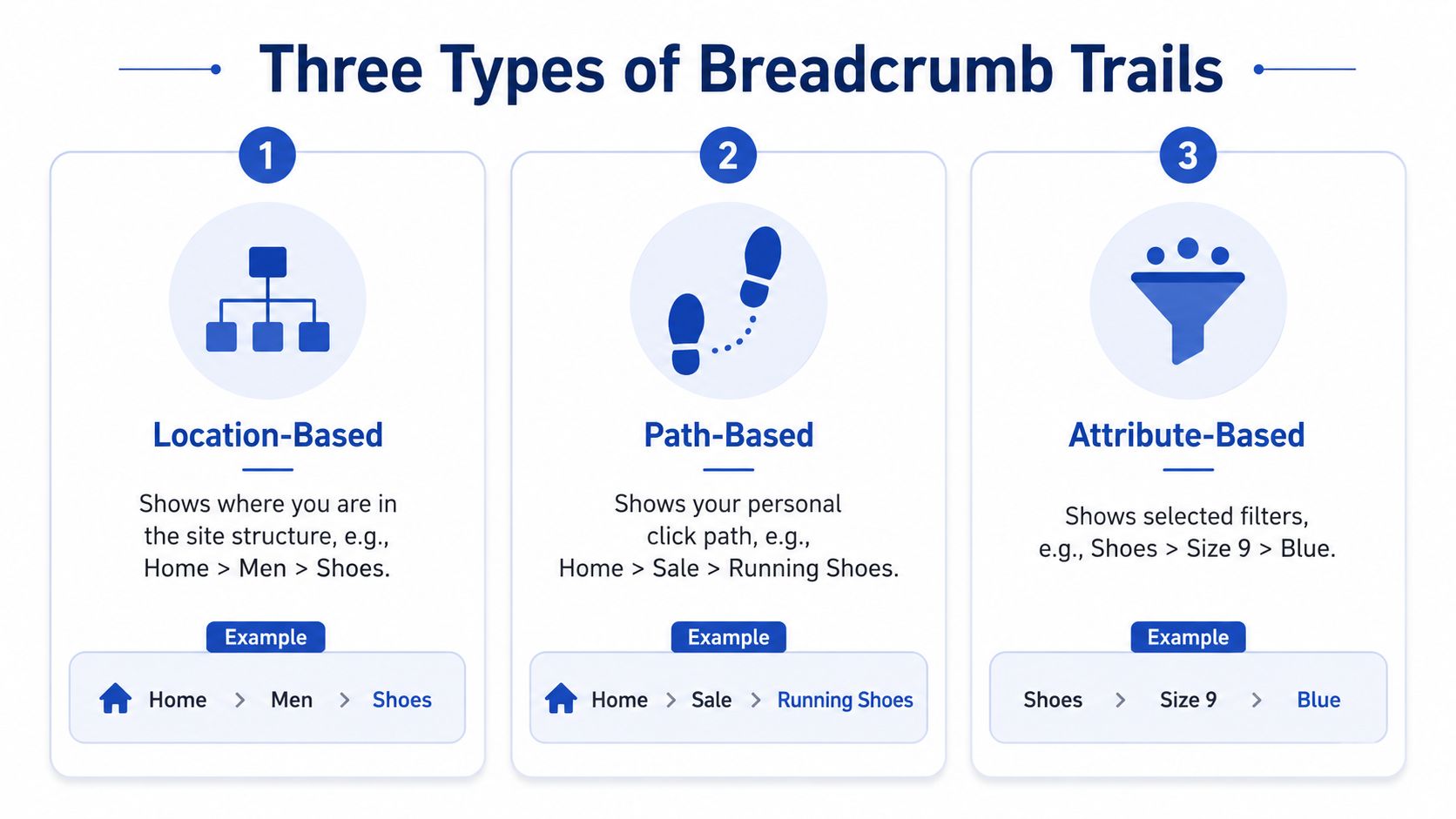
Breadcrumbs are not a single pattern, and most implementation errors start when teams treat them as interchangeable. The three classic patterns are location-based, path-based, and attribute-based. Each one answers a different user question, and each one can work in ecommerce if it matches the catalogue structure instead of the designer's preference.
Location-Based Trails
Location-based breadcrumbs show the page's place in the site hierarchy. Home > Men > Shoes > Trainers is the standard example. Most ecommerce teams should start here because it mirrors how collection structures are usually built, and it gives shoppers a clean route back to broader categories without adding extra cognitive load.
Path-Based Trails
Path-based breadcrumbs show the user's actual click path. A shopper might move from Home to Sale to Running Shoes, then into a product page, and the trail reflects that journey. That can be useful in narrow cases, but it often fits ecommerce poorly because users arrive from search, social, or ads, not a tidy in-site sequence.
Attribute-Based Trails
Attribute-based breadcrumbs show chosen facets, such as Shoes > Size 9 > Blue or Fragrance > Citrus > Summer. These are common on catalogues where a product can sit under several concepts, or where filtering is central to the shopping experience. They work best when the attributes themselves are meaningful browse paths, not just temporary filters.
Practical rule: Structure-first? Use location-based breadcrumbs. Filter-heavy? Consider attribute-based breadcrumbs carefully. History-only? Skip it unless the click path is genuinely useful to the shopper.
That distinction matters because breadcrumb usage has become more varied over time. The usability research summarised by Aery notes that more than 55% of breadcrumb deployments on product pages did not fit the classic taxonomy, which is a polite way of saying many stores mix patterns without deciding whether they are solving hierarchy, history, or filtering. The same source also reports a shift from 17% breadcrumb usage across 3,453 commercial websites to 75.9% on the top 100 online retailers, so the pattern is widespread, but not always applied with the same intent.
Why Breadcrumbs Matter for UX and SEO
A shopper lands on a product page from Google, paid media, or social, and the page may feel isolated from the rest of the store. Breadcrumbs solve that in a practical way. They give people a fast route back to a broader collection, and they help search engines read the page as part of a hierarchy instead of a dead end.
That UX value shows up most clearly on mobile. A breadcrumb gives a shopper one clean tap to move up a level when the product is close, but not quite right. I have seen that matter most on stores with deep catalogues, where the back button is a poor substitute for a clear path to a collection.
Search engines read the trail differently. Google's structured-data documentation treats breadcrumb markup as a trail, with position 1 marking the start of the path Google's breadcrumb structured data documentation. When the visible HTML and the structured data match the actual site structure, crawlers get a second signal about how pages relate to each other. If you are already thinking about broader implementation choices, a good reference on schema markup for ecommerce helps frame where breadcrumb data fits alongside the rest of your structured data.
The trade-offs matter. Breadcrumbs will not fix a broken category tree, and they do not replace a primary navigation that shoppers can rely on from any page. If collections are messy, the trail exposes that problem faster. That is why I treat breadcrumbs as one part of a CRO programme, not a standalone feature. They sit alongside navigation, filters, collection naming, template consistency, and the wider SEO strategies for online stores in SEO strategies for online stores.
Breadcrumbs help most when a store has depth, a clear hierarchy, and plenty of deep-entry traffic. They help least when the site is flat, vague, or arranged around internal convenience instead of shopper logic.
Building Accessible, Search-Friendly Markup
The cleanest implementation starts with semantic HTML, then adds structured data that matches it. A breadcrumb trail should use a <nav aria-label="Breadcrumb"> landmark, an ordered list, links for every crumb except the current page, and aria-current="page" on the final item, which is the accessibility baseline in W3C/WAI technique G65. That pattern gives assistive tech a stable navigation landmark and keeps the hierarchy usable for keyboard and screen reader users.
A solid HTML pattern looks like this:
<nav aria-label="Breadcrumb">
<ol>
<li><a href="/">Home</a></li>
<li><a href="/collections/shoes">Shoes</a></li>
<li aria-current="page">Trail Runners</li>
</ol>
</nav>
The last crumb should stay plain text. Making the current page a link adds noise, and on real storefronts it usually creates a repeated destination that helps nobody. I see that mistake often in theme edits, especially when teams copy a menu pattern into breadcrumb markup without checking the user experience.
For search visibility, pair the HTML with JSON-LD BreadcrumbList structured data. The visible trail and the structured data should tell the same story, in the same order, so crawlers do not have to reconcile two different hierarchies. If the HTML says Home > Shoes > Trail Runners, the JSON-LD should say the same thing.
If your theme already outputs other schema, keep the breadcrumb implementation aligned with that setup. A practical reference on schema markup for ecommerce helps when you are checking product, collection, and organisation data for overlap or contradictions. In audits, breadcrumb issues rarely show up alone, they usually sit next to other schema problems in the same template.
Mobile is where the trade-offs show up fast. A trail that looks tidy in desktop chrome can collapse into a cramped line of tiny links on a phone, which hurts both readability and tap accuracy. That is why I compress or shorten breadcrumbs on mobile when needed, rather than forcing the full path into a space that cannot support it.
If you want the breadcrumb work to fit into the rest of your technical setup, SEO strategies for online stores is a useful broader read because it places breadcrumbs inside a wider SEO workflow instead of treating them as an isolated markup task.
Choosing the Right Pattern for Your Store
The question isn't whether breadcrumb navigation is a good idea in general. The question is whether your store's structure is deep enough, meaningful enough, and stable enough to justify it. On a flat catalogue with a handful of pages, breadcrumbs often add visual clutter. On a deep catalogue with clear hierarchy, they do real work.
Nielsen Norman Group's guidance is the best practical test here, breadcrumbs should show site hierarchy, not user history, and on non-hierarchical sites they're only useful if they express a page's relation to broader concepts NN/g breadcrumb guidance. That's why so many mobile-first stores get this wrong. They add a trail because it feels “SEO-friendly”, but the trail doesn't help the shopper understand the catalogue.
Use the pattern that matches the browsing logic of the store. If people shop by collection depth, location-based breadcrumbs are usually the cleanest fit. If your product discovery leans on meaningful attributes, an attribute trail can help, but only when those attributes describe the way customers think. Path-based breadcrumbs are the hardest to justify because they reflect a single user journey, not the store structure.
| Pattern | Best For | Watch Out For |
|---|---|---|
| Location-based | Deep collection hierarchies, large catalogues, product pages | Can become redundant if category naming is weak |
| Attribute-based | Faceted catalogues, products that belong to multiple browse paths | Can blur into filter UI and confuse the current state |
| Path-based | Narrow journeys where the recent route matters more than hierarchy | Often mirrors accidental clicks rather than useful structure |
The deciding factor is simple. If the trail helps a shopper understand where they are, it earns space. If it only repeats information already sitting in the menu or filter bar, it's decoration.
Implementing Breadcrumbs in Shopify and Shopify Plus
On Shopify 2.0, breadcrumbs usually belong in the product and collection templates, plus any JSON templates that control the page output. In practice that means checking the theme files that render product pages, then deciding whether the breadcrumb should be driven by the collection object, a custom metafield, or a controlled hierarchy built into your theme logic. Shopify doesn't automatically give you a full category tree, so many merchants end up extending the theme or hard-coding the path where the catalogue needs it.
A simple Liquid pattern can look like this:
<nav aria-label="Breadcrumb">
<ol>
<li><a href="{{ routes.root_url }}">Home</a></li>
{% if collection %}
<li><a href="{{ collection.url }}">{{ collection.title }}</a></li>
{% endif %}
<li aria-current="page">{{ product.title }}</li>
</ol>
</nav>
That's the basic shape, but real stores often need more control. If a product belongs to multiple collections, you have to decide which path is canonical for the breadcrumb, because showing every possible route creates noise. That choice usually belongs in the theme architecture, not as a random app layer bolted on later.
For theme migration work, Shopify 2.0 theme development is where this kind of logic usually gets cleaned up, especially when the old theme mixed snippets, sections, and app output in ways that are hard to maintain. In a Shopify Plus build, the same principle applies whether you're working inside a custom storefront or a more traditional theme stack, the breadcrumb should be owned by the theme or extension layer that already controls navigation.
The schema block should mirror the visible trail and be injected through a snippet or theme app extension, not scattered across templates. If the HTML and JSON-LD drift apart, you end up with a trail that looks correct to users but doesn't match the machine-readable structure, which creates more maintenance than value.
Testing, Optimising, and Common Mistakes
Breadcrumbs are worth testing because they're not neutral. On the right pages, they can change how quickly users orient themselves, how often they move into broader categories, and whether they keep exploring after a deep landing. The metrics I watch most closely are bounce behaviour on deep-entry pages, pages per session, click-through on the trail itself, and assisted conversions from category paths.
A/B testing doesn't need to be overcomplicated. Use a controlled experiment in the platform you already trust, whether that's a testing tool like VWO or an internal Shopify experiment setup, then compare pages with breadcrumbs against the same pages without them. The point isn't to prove that breadcrumbs are universally “good”, it's to prove that they help on your catalogue, with your traffic mix, and on your templates.
Do this
- Keep the first crumb as the homepage. Shoppers recognise it instantly, and it anchors the rest of the trail.
- Validate JSON-LD before launch. Google's Rich Results Test is the fastest sanity check for breadcrumb schema.
- Compress on mobile when space gets tight. The trail should stay usable, not dominate the viewport.
- Use one clear breadcrumb type per page. Mixed signals make the pattern harder to scan.
Don't do this
- Don't duplicate the primary nav. If the trail just repeats the menu, it adds clutter.
- Don't link the current page. That final item should be plain text with
aria-current="page". - Don't stuff keywords into labels. Breadcrumbs are for orientation, not SEO gimmicks.
- Don't leave broken links in the trail. A breadcrumb with dead ends destroys trust fast.
If you want a practical audit before shipping changes, Grumspot's Shopify accessibility audit is the right adjacent reference because breadcrumb quality sits at the intersection of accessibility, template logic, and navigation clarity.
When breadcrumb navigation is built well, it earns its place. When it's built badly, it just adds another line of links for people to ignore.
If you want breadcrumb navigation implemented, audited, or rebuilt inside a Shopify or Shopify Plus theme, Grumspot can handle the theme work, structured data, and accessibility checks as part of a conversion-focused build. Visit Grumspot if you want a team that can turn your store's hierarchy into something shoppers and search engines can use.
Let's build something together
If you like what you saw, let's jump on a quick call and discuss your project

Related posts
Check out some similar posts.

- best web design systems
Compare the best web design systems for Shopify teams, covering components, tokens, developer experi...
Read more
- shopify plus stores
Explore 7 Shopify Plus stores, from Gymshark to Huel, and uncover design, UX, conversion and integra...
Read more
- seo technical audit checklist
Use this SEO technical audit checklist to find and fix 10 ecommerce issues across crawling, speed, i...
Read more
- structured data
Master structured data implementation for ecommerce in 2026. Practical JSON-LD, Microdata, schema se...
Read more