Image Optimization for Web That Actually Lifts Speed
- image optimization
- web performance
- Shopify SEO
- Core Web Vitals
- WebP AVIF
Launched
July, 2026
A merchant swaps in a polished new hero image, refreshes the homepage, and watches the PageSpeed score drop before the day's first sale. That's usually the moment image optimisation stops being a design detail and starts looking like a delivery problem. The fix isn't just “make it smaller”, it's to treat every image as something that has to be sized, compressed, prioritised, and served in the right format for the exact slot it fills on the page.
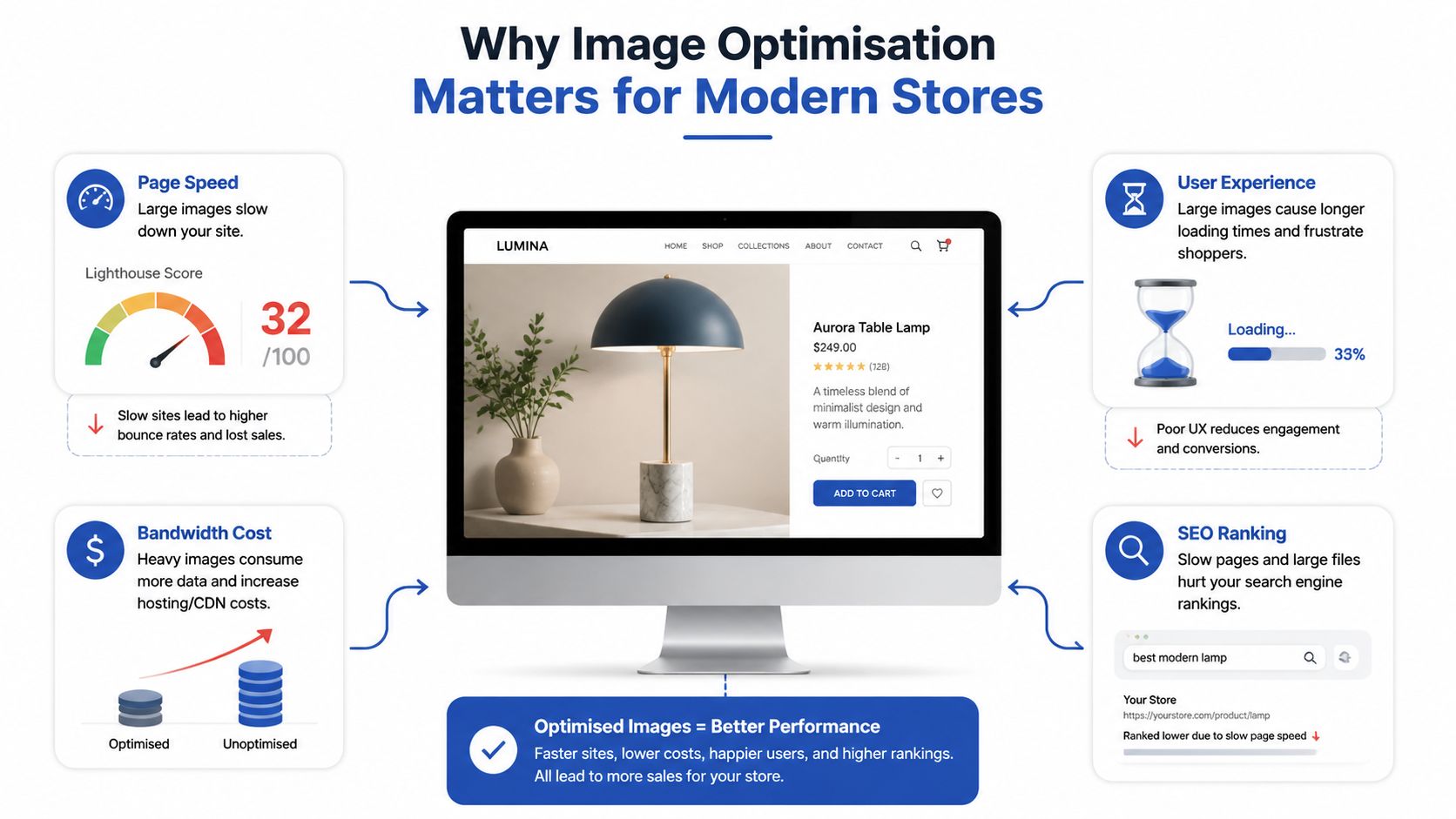
Why Image Optimisation Matters for Modern Stores
A polished image can still be the thing that drags a store down. On a Shopify product page, the hero shot usually carries the most visual weight and the most technical risk, because it is the first large asset the browser has to find, download, decode, and paint. If that asset is oversized, compressed poorly, or given the wrong priority, the page can feel slow or unstable even when the rest of the theme is clean.
The delivery problem, not taste
Google's performance guidance makes the practical trade-off clear. JPEG quality above 85 tends to make files grow quickly with little visible gain, 4:2:0 chroma subsampling suits photos, and a progressive JPEG is recommended for images over 10 KB because it can render incrementally while the rest of the file arrives (Google's image optimisation guidance). That matters because a slow hero image delays the first meaningful visual moment on the page, and that delay is something shoppers feel immediately.
There is also a merchandising cost. If the image appears late, shifts layout, or looks soft on mobile, shoppers notice before they notice the copy. That changes trust, and on commerce pages trust sits very close to conversion.
Practical rule: optimise images as part of the build and upload pipeline, not as a cleanup job after the page is live.
Adobe's UK guidance gives a useful planning baseline for file weight and display size. It points to a typical web-optimised image around 72 PPI, photos and graphics often around 1000 pixels wide, and website image files generally kept in the 200 KB to 500 KB range. It also notes that images as large as 2400×1600 px can still be acceptable for full-screen use (Adobe UK image optimisation guidance). Those figures matter because they keep the conversation focused on the slot the image fills, not on vanity resolution.
The same logic shows up in broader performance work. If you want the image pipeline to support the rest of the page, the full-stack optimization tips article is a useful reminder that asset weight is only one part of the delivery chain. On Shopify, the implementation details in Grumspot's Shopify performance guidance line up with what improves storefront speed.
Image weight also affects how fast the page feels on slower mobile connections, which is where many sessions begin. The job is not just to compress the picture, it is to ship the right pixels, at the right time, in the right format.
Choosing the Right Format for Every Image
A hero photo, a logo with transparency, and a decorative banner do not belong in the same export workflow. Format choice should follow the asset's job in the layout, because that is what decides whether you get sharp edges, unnecessary bytes, or both.
Match the format to the job
For photographic content, JPEG still has a place because it gives good compatibility and manageable file size. For transparent artwork, PNG is still the safer choice when the edge must stay clean. WebP is a strong default for many storefront assets, and AVIF can be smaller again, but only if the browser support and the visual result suit that specific image.
For Shopify stores, the format decision also depends on how the theme serves the file. Shopify can convert uploaded images into modern formats such as WebP in many delivery contexts, so the raw upload is not always the same as the format the shopper receives. That is useful, but it does not remove the need to start with the right source file. A clean JPEG, PNG, or SVG still gives the platform a better base to work from than a bloated export with hidden overhead.
| Asset type | Primary format | Fallback | Typical size budget |
|---|---|---|---|
| Product photography | WebP or JPEG | JPEG | Keep within the web range that matches the display slot |
| Lifestyle banner | AVIF or WebP | JPEG | Use a tighter budget than print exports would suggest |
| Logo with transparency | SVG or PNG | PNG | Keep the file crisp and lightweight |
| Icon set | SVG | PNG | Prefer vector files whenever possible |
For Shopify, the safest default is often WebP for photographs, with JPEG fallback where needed. Logos and icons should usually be SVG if the asset is vector-based, because the browser can scale them without the same raster overhead. In Liquid, that usually means using the theme image helpers so Shopify can output the right responsive variant instead of hard-coding a single file path.
A small but important trade-off, AVIF can produce a much smaller file than JPEG, but that does not mean every image should be forced into AVIF. Some assets do not gain enough to justify the extra processing, and decorative graphics with simple shapes may already be light enough in another format. If the image is already crisp, lightweight, and serving its slot well, format switching becomes theatre rather than performance work.
Keep transparency where it matters, do not keep PNG just because it feels familiar. If the asset has no transparency need, PNG is usually the wrong first choice for web delivery.
The right format choice is less about purity and more about avoiding waste on the exact page element the shopper sees.
Compressing Without Losing the Shot
A hero image can tank a PageSpeed score when the file is still larger than the slot it fills. The safer workflow starts before upload, because Shopify should not be asked to serve pixels the shopper never sees. Resize first, then compress, then check the asset in the actual theme context where it will load.
Start with the largest displayed size
Use the image slot in the theme as the reference point, not the camera file. If a homepage hero only renders at a fixed width in the layout, export for that width plus a modest retina buffer, not for the full shoot resolution. Adobe's UK guidance notes that many web photos and graphics sit around 1000 pixels wide, while some full-screen images can be larger when the design needs them.
For photos, 4:2:0 chroma subsampling and JPEG quality at 85 or lower are a practical baseline. That keeps file size under control without throwing away detail the shopper can still perceive, and it aligns with Google's guidance on avoiding wasteful quality settings (Google's image optimisation guidance).
A resized export can be as simple as this:
ffmpeg -i input.jpg -vf scale=1600:-1 -q:v 3 output.jpg
The point is control. Set dimensions first, then decide how much compression the image can take without breaking the shot. Product photography with smooth gradients, fabric texture, or skin tones deserves a quick visual check at the size it will display.
When a JPEG still needs to stay a JPEG, use a progressive file so the browser can show a usable version earlier while the rest downloads. Google recommends that approach for larger files, and it helps perceived speed without pretending that compression can rescue an oversized source image.
Practical rule: if the hero image carries the brand, stop before compression starts to introduce banding or muddy detail. A faster page that looks cheap is still a bad trade.
If you need a workflow reference for media-heavy optimisation, a separate cloud FFmpeg compression service from RenderIO can be useful as a pattern for batch processing assets before upload, even if your actual image pipeline uses different tooling.
Responsive Images with Srcset and the Picture Element
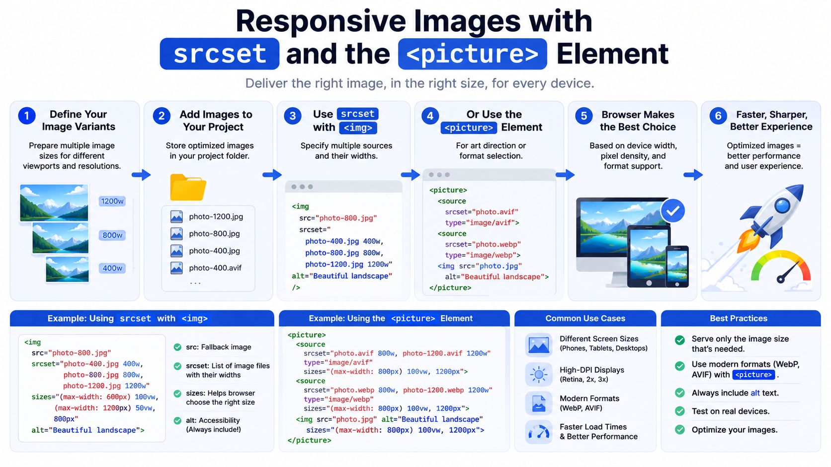
A single upload should rarely mean a single download. On Shopify, the browser can and should pick from several versions of the same image, so mobile shoppers aren't forced to fetch a desktop-sized asset just to see a narrow hero slot. That's the purpose of responsive images, matching the payload to the layout.
Use width descriptors for Shopify themes
Width descriptors are usually the right choice in Shopify because the same product image can render at many CSS widths across collection pages, PDP media galleries, and editorial templates. Density descriptors only make sense when the display size is fixed and predictable, which is less common in a responsive storefront.
A practical hero setup might look like this:
<picture>
<source type="image/avif" srcset="hero-800.avif 800w, hero-1200.avif 1200w, hero-1600.avif 1600w" sizes="(max-width: 749px) 100vw, (max-width: 1199px) 90vw, 1200px">
<source type="image/webp" srcset="hero-800.webp 800w, hero-1200.webp 1200w, hero-1600.webp 1600w" sizes="(max-width: 749px) 100vw, (max-width: 1199px) 90vw, 1200px">
<img src="hero-1200.jpg" width="1200" height="800" alt="Designer lamp on a walnut table">
</picture>
That sizes attribute matters just as much as srcset. If you leave it out, the browser may assume the image needs to be much larger than it really does and fetch the wrong file.
A clean developer checklist for a Shopify PDP looks like this.
- Map each breakpoint: Match the CSS grid, not a guess. A product media column and a full-width hero rarely need the same image width.
- Keep the aspect ratio explicit: Set width and height, or the equivalent ratio, so the layout doesn't jump when the asset loads.
- Serve the modern format first: Offer AVIF or WebP where supported, then fall back to JPEG.
- Use
picturewhen art direction changes: Different crops need different sources, not just different widths. - Test on real mobile hardware: A lab score is useful, but the browser on a mid-range phone is the judge.
For a visual walkthrough, the embedded guide below shows the flow from source asset to responsive delivery.
If a store sends the same oversized file to every screen, the browser has no chance to be clever. Responsive delivery gives it that chance.
Lazy Loading, Fetch Priority and CDN Delivery
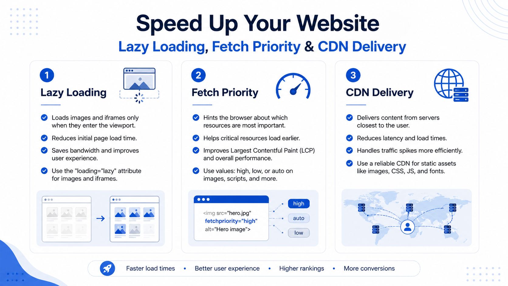
Lazy loading helps only when it is applied to the right assets. Shopify themes often apply it too broadly, and then the storefront tells the browser to delay the image that carries the page. Above-the-fold images should not use loading="lazy", and the image that has to appear immediately in the viewport should use fetchpriority="high" (Google's image optimisation guidance).
Treat loading hints as a priority system
A clean pattern for above-the-fold media is straightforward. Keep the hero visible, let it load immediately, and defer the assets that sit lower on the page. If an image is part of the initial viewport and drives the first impression, it needs priority, not delay.
fetchpriority="high" and the right loading behaviour work together here. A hero image that is lazily loaded can slow the visual moment that matters most, while a product gallery thumbnail lower on the page can wait without hurting the opening view. The browser already has enough to do on first paint, so do not make it guess which pixels matter.
Delivery still depends on where the file lives
Compression alone does not solve network distance. A well-optimised file that has to travel from a faraway origin still arrives slower than the same file delivered from a nearby edge cache. Shopify teams should treat image delivery as transformed variants cached close to the shopper, not just files saved smaller on disk.
A useful reference point for how CDNs fit into that speed stack is Grumspot's CDN explanation. The operational point is simple, image optimisation is not finished when export ends, it is finished when the browser gets the right variant from the right location quickly enough to matter.
Do not lazy load what the shopper needs to see immediately. Do lazy load what sits below the fold and will not affect the first interaction.
For monitoring, the performance monitoring workflow for image assets from PageSpeed Plus is a practical reminder that loading hints, cache behaviour, and image audits belong in the same review process.
The difference between a single-region fetch and a properly cached global delivery path is not theoretical. On mobile, it can be the difference between a page that feels responsive and a page that feels stuck on the opening image.
Automating the Pipeline with Build Tools and Shopify Apps
Manual optimisation breaks down as soon as a team starts shipping images regularly. Someone forgets to resize a banner, someone else uploads a 4 MB product shot, and the page speed regression arrives in production. A reliable pipeline removes that memory test from the process.
Build-time checks catch the easy misses
For theme code under version control, image processing should happen during build. That means resizing, converting, and compressing assets before they're committed to the final theme package. It also means setting a budget and failing the build, or at least flagging the asset, when a file exceeds the limit your storefront can tolerate.
The useful pattern is not complex. An image task runs in the pipeline, generates modern formats, creates width variants, and records the output size. If the new asset crosses the agreed threshold, the developer sees it before the change goes live.
Shopify stores with a heavier merchandising workflow often need help inside the platform too. That's where apps and automation hooks come in, especially when merchants upload new product imagery directly. In that setup, the platform handles the repetitive conversion work so the people adding products don't need to remember which format to choose.
Grumspot also publishes Shopify-specific implementation guidance and speed services, so it sits in the same ecosystem as the technical options a store might use for this workflow. The principle stays the same whether you use a build step, an app, or both, the optimisation task belongs to the pipeline, not the content editor.
Pick the automation model that matches your team
If the team ships only a few images a week, build-time automation is usually enough. If merchants upload lots of product photography themselves, platform-level automation is the safer place to enforce the rules. The wrong choice is leaving the process to manual exports and ad hoc compression tools.
A good pipeline typically covers three things.
- Conversion: Create WebP or AVIF versions automatically.
- Resizing: Generate only the widths the theme uses.
- Validation: Warn when a file exceeds the budget or lacks required metadata.
That last point matters because it keeps the team honest. A beautiful image that slips in oversized still hurts speed, no matter how good the design intent was.
A pipeline is working when nobody has to ask whether an asset was optimised. It's just the default path.
Measuring Impact and Rolling Out in 30 Days
Speed work only matters if it shows up in the numbers you already trust. For Shopify, that means checking Lighthouse, PageSpeed Insights, and CrUX together rather than treating any single score as gospel. A page can look fine in a synthetic test and still feel slow to a real shopper if the hero image is misprioritised or the gallery is too heavy.
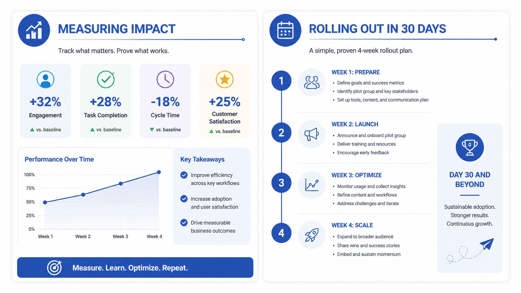
What to measure on a real storefront
The first thing to inspect is whether the image that matters most is the one the browser loads first. The second is whether the page keeps its layout stable while that image arrives. Those are the two places where image changes tend to show up as conversion friction, and they're easy to miss if the team only looks at file size.
A practical 30-day rollout looks like this.
- Week 1, audit the worst offenders. Check the homepage hero, top PDP images, and any collection banners that sit above the fold.
- Week 2, fix the visible assets. Resize them, convert the right ones, and remove lazy loading from the first viewport.
- Week 3, automate the repeat work. Add build checks, app rules, or both, depending on how the store publishes content.
- Week 4, lock the policy. Decide which formats, widths, and budgets are now standard.
For a general speed baseline and broader audit discipline, Grumspot's site loading guide is a useful companion to the image-specific workflow. It's especially helpful when image work is only one part of the problem.
Google's image SEO documentation still matters after all the performance tuning is done. Images should be relevant and representative, with descriptive filenames, alt text, structured data, and supported formats, because those signals still drive discoverability even when compression and responsive delivery are in place (Google's image SEO guidance). No amount of WebP will rescue a product page that doesn't tell search engines what the image shows.
Practical rule: if the image helps the shopper decide, it also needs to help the crawler understand the page.
A solid rollout ends with policy, not a one-off cleanup. Once the team agrees on the image budget, the formats, and the loading rules, performance stops depending on memory and starts depending on process.
If your store just took a hit after a hero image change, Grumspot can help you turn image optimisation into a repeatable storefront workflow, from file strategy and responsive delivery to Shopify implementation and performance audits.
Let's build something together
If you like what you saw, let's jump on a quick call and discuss your project

Related posts
Check out some similar posts.

- seo technical audit checklist
Use this SEO technical audit checklist to find and fix 10 ecommerce issues across crawling, speed, i...
Read more
- critical rendering path
Master the critical rendering path with practical optimisation tactics, DevTools measurement, and Sh...
Read more
- internal linking strategy
Build a high-impact internal linking strategy that boosts rankings and conversions. Learn auditing, ...
Read more
- breadcrumb navigation
Learn what breadcrumb navigation is, why it matters for UX and SEO, and how to implement it correctl...
Read more