Product Configurator Ecommerce Guide for 2026
- product configurator ecommerce
- Shopify configurator
- custom product options
- headless commerce
- conversion UX
Only 16% of consumers who knew customisation existed had ever purchased a customised product or service, according to Deloitte's UK Consumer Review on mass personalisation, despite 36% of consumers expressing interest on average. Those are different respondent groups, not a conversion funnel, but the contrast challenges a familiar assumption: offering personalisation isn't the same as making it easy to buy.
For Shopify and Shopify Plus brands, the useful question isn't how much freedom a configurator can offer. It's how confidently a shopper can reach checkout with a product the business can price, manufacture and deliver correctly.
What a Product Configurator Changes on a Product Page
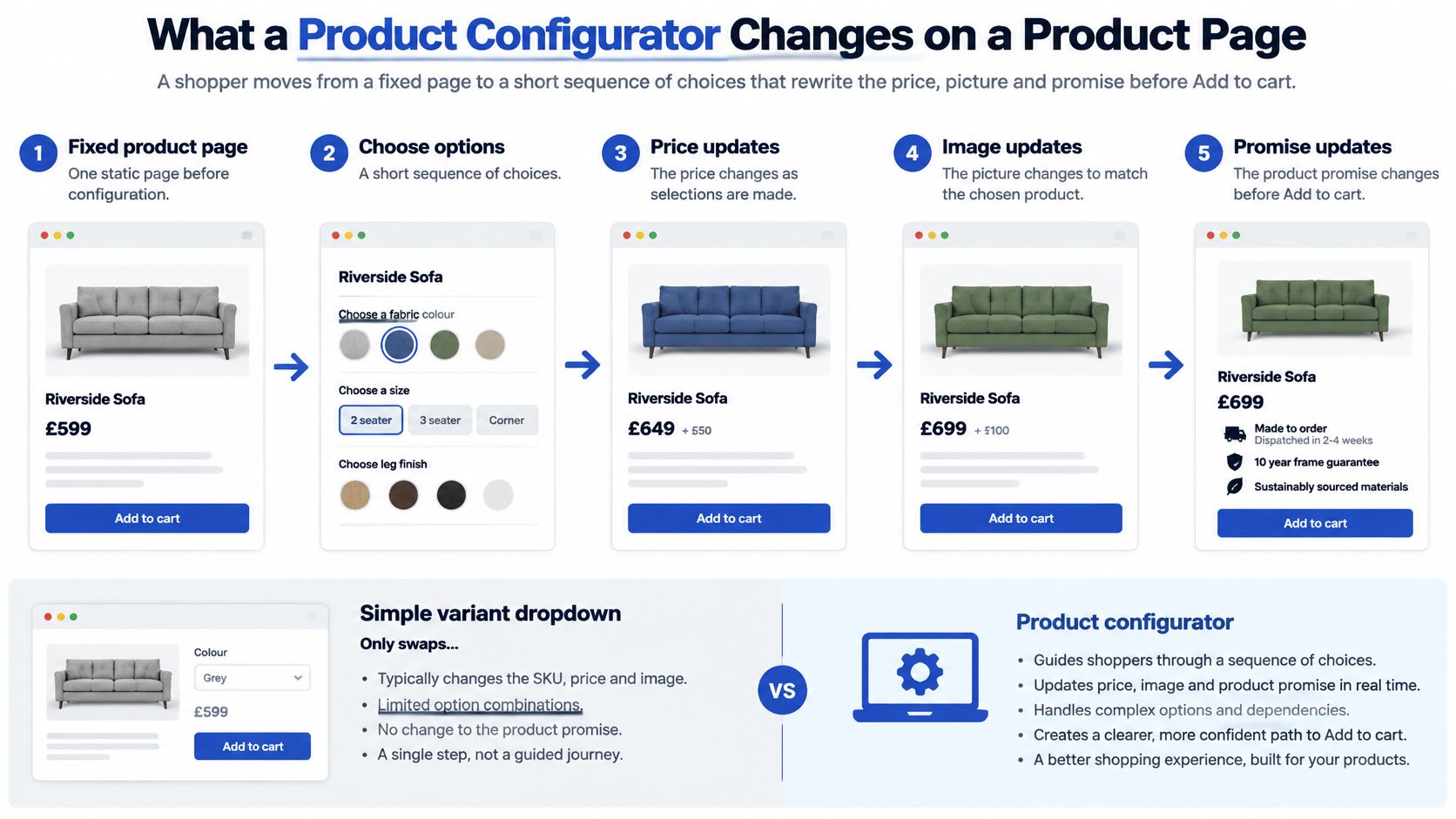
A shopper buying an engraved gift starts with a recognisable product. They select a finish, enter a name, choose gift packaging and see what those decisions mean before adding it to their basket. The product page becomes a short sequence of decisions that changes the price, picture and delivery promise.
A product configurator connects those decisions. It determines which combinations are allowed, calculates the resulting offer and preserves the selected specification on the order. The customer shouldn't need to explain their choices again by email.
From selecting a product to specifying it
A simple variant dropdown usually selects an existing stock-keeping unit, such as a shirt in a particular size and colour. A configurator can combine stocked choices with instructions that don't represent a separate stocked product, including engraving, uploaded artwork, custom dimensions or compatible accessories.
Consider these different buying tasks:
- Personalised gift: The customer chooses a frame, uploads a photograph and approves a message. The merchant needs the correct image file and exact text.
- Made-to-fit furniture: The customer specifies dimensions, fabric and feet. The merchant must validate that the selected construction is possible before accepting payment.
- Coordinated bundle: The customer builds a bedding set. The merchant needs component-level selections so stock and fulfilment remain accurate.
Choosing a frame for a photograph is a bounded task. Asking the shopper to design the entire room is a different proposition. Don't turn the former into the latter just because the software allows it.
The diagram shows how the buying task changes when the page responds to customer choices.
Define the purchase promise
Start by distinguishing what the customer can change from what the business promises to supply. A fabric selector is only useful if it also produces a valid specification, an accurate price and a meaningful production estimate.
For a made-to-fit bench, width might affect construction, price and dispatch timing. For a gift, entering a message might trigger a character limit and an approval requirement. Those relationships matter more than whether the preview rotates.
Practical rule: Give shoppers enough control to make the product theirs, but not enough unsupported freedom to create an unfulfillable order.
A useful product configurator ecommerce brief therefore describes the whole transaction, not just the interactive image. It identifies the decisions shoppers need help making and the information the workshop or warehouse must receive.
Apps Custom Builds and Headless Side by Side
Start with catalogue rules, not rendering technology. List incompatible combinations, identify how prices are calculated and decide whether the preview needs photography, layered images or interactive 3D. Then establish who will maintain those rules after launch.
A striking demonstration can conceal a poor operational fit. A furniture configurator might look convincing while failing to pass component selections to fulfilment. A simpler interface can be the better implementation if it produces a reliable order.
App, custom and headless configurator builds
The timing descriptions below are planning categories, not delivery commitments. Asset preparation, integrations and acceptance testing determine the actual schedule.
| Approach | Fits when | Time to a usable flow | What you control | Main risk |
|---|---|---|---|---|
| Shopify app | Bounded colours, text or simple bundles on an existing theme | After app setup, catalogue mapping and theme testing | Option labels, swatches and rules inside the app | Theme conflicts and slow third-party scripts |
| Custom on Shopify or Plus | Illegal combinations, live pricing, line-item data, B2B or checkout fields | After rule modelling, implementation and order-flow testing | UX, validation and how the order stores the configuration | Build cost and rule maintenance |
| Headless storefront | Heavy 3D, multi-brand design systems or an owned front end | After storefront integration and end-to-end commerce testing | Full interface and API contracts | Duplicated cart, inventory and promotion logic |
An app is a sensible starting point for a bounded task. Check whether it supports your actual dependencies, not merely swatches and text fields. Test it against the live theme's cart drawer, discounts, translations and analytics before committing the catalogue.
Pay particular attention to duplicated logic. If both the theme and app calculate the selected variant, they can disagree about availability or price. Assign one authoritative owner to each decision.
When deeper ownership is justified
A custom Shopify build fits products whose rules define the purchase. Say a customer orders a bench whose dimensions determine material usage and eligible supports. The interface must reject impossible dimensions and send a structured specification downstream, not just display a surcharge.
Separate product configuration from checkout customisation. Capturing product instructions doesn't automatically require a custom checkout. Where checkout extensions or B2B requirements are involved, confirm the platform capabilities before designing the flow.
Headless means your team owns the storefront separately from Shopify's theme layer. It can suit an established front-end architecture, but heavy visuals alone don't prove it's necessary. The headless Shopify Plus implementation guide provides context for assessing that broader commitment.
For a concrete furniture-selection reference, Giorgi Bros. Furniture's tailored bed sets for your space is a useful starting point for thinking about coordinated choices. Use catalogue examples to identify what customers need to specify, rather than assuming a particular underlying architecture.
Before designing screens, select the table row that matches your operational constraints. Document who can change a rule, how changes are tested and what happens to saved configurations when a product option disappears.
UX Patterns Shoppers Can Finish
Treat the configurator as a short purchasing form, not a design studio. The customer needs to understand the next decision, its consequences and how to continue.
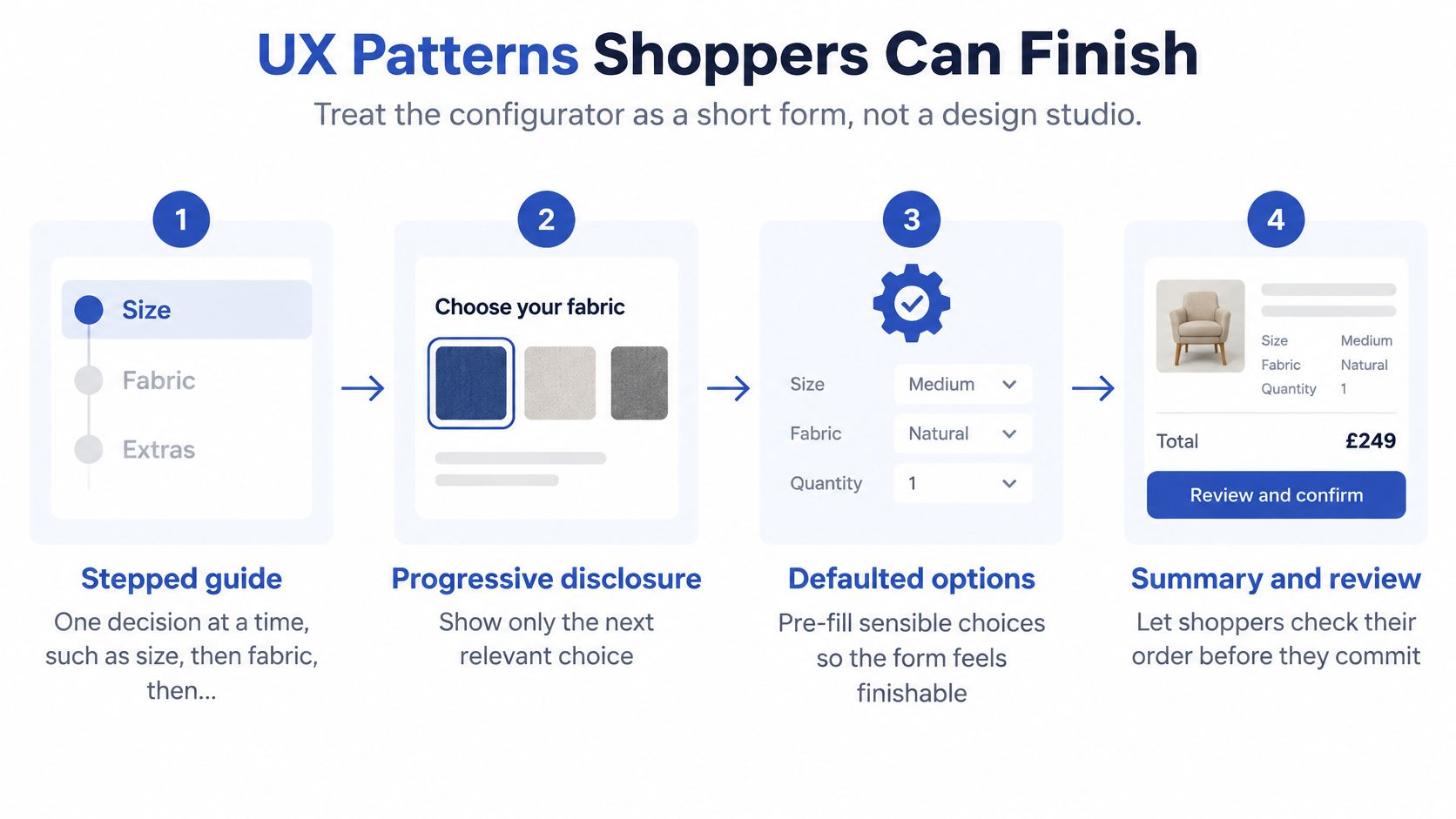
The visual below summarises a finishable flow, including sensible defaults and a review stage.
Make each choice understandable
- Stepped guidance: For an upholstered stool, ask for size before fabric and embroidery. Show progress in words so the shopper understands what remains.
- Live swatches and thumbnails: For a leather bag, show labelled material samples beside the product. Keep the current selection visible rather than making the customer remember it.
- Explained dependencies: If a narrow shoe construction can't accommodate a selected fit, explain the conflict and offer a valid alternative. Do not erase another choice without notice.
- Persistent price and timing: For made-to-order curtains, show the revised total and production estimate beside the controls. A shopper shouldn't have to advance to discover the consequences.
Use progressive disclosure to reveal relevant fields. Selecting embroidery can reveal the text input; declining it should remove the task. Defaults should represent valid, understandable choices, not add paid extras.
Some decisions need guidance outside the control itself. A graduation-apparel shopper may need context before choosing wording or symbols, so Stoles.com®’s commencement etiquette for Greek stoles illustrates the kind of supporting resource to place near a relevant choice.
Keep interaction responsive
A UK-focused Designstack performance summary reports median load times of approximately 1.8 seconds on mobile and 1.6 seconds on desktop. These are contextual benchmarks, not configurator-specific targets.
Large previews, synchronous calculations and third-party scripts can delay the moment a shopper can act. Build the usable purchase path before loading optional visual detail:
- Render the baseline: Deliver the base product and starting price with the initial page.
- Load previews selectively: Use responsive WebP or AVIF images and defer detailed assets until needed.
- Separate calculations: Debounce non-critical recalculation, meaning wait briefly for input to settle rather than repeating work on every keystroke.
- Validate authoritatively: Keep stock, eligibility and final pricing checks on the server.
Measure time to first selectable option, response delay after a tap and time to confirmed price. If a preview fails, preserve the customer's choices and provide a text-based route forward.
Use the accompanying video as a visual reference alongside your own device testing.
KPI Moves Worth Tracking After Launch
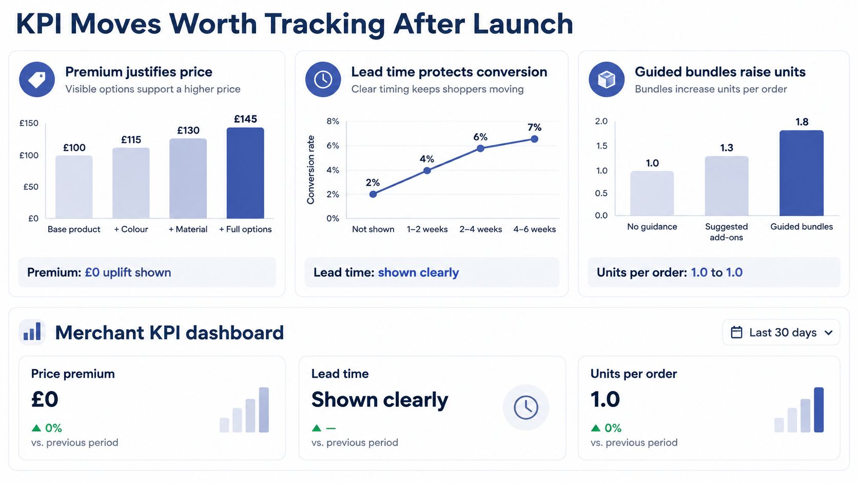
A configurator can support revenue when customers understand why an option costs more, trust the delivery promise and find useful complementary products. Interaction alone isn't commercial success. A shopper can spend a long time experimenting without producing a purchasable configuration.
The historical premium case is useful but limited: in a 2020 survey of UK consumers, the average shopper surveyed was willing to spend an additional 7% on a gift containing personalisation, according to Image Reports' account of the Roland poll. That measures stated willingness, not a guaranteed uplift for your store.
Configurator KPIs and the leak each one diagnoses
| Metric | What it measures | Leak it diagnoses |
|---|---|---|
| Configuration start rate | Share of product-page visits that open the configurator | Entry control buried or unclear |
| Completion rate | Share of started configurations reaching a final summary | Confusing steps or illegal-pair dead ends |
| Add-to-cart from completed configuration | Share of completed configurations added to cart | Price or lead-time reveal arriving too late |
| Conversion rate | Share of configurator sessions that purchase | Trust gap at checkout or in the delivery promise |
| Average order value | Mean spend per order that used the configurator | Missing guided bundles or paid options |
| Attach rate of paid options | Share of orders that include a paid option | Options presented without clear value |
| Share of orders with a premium | Share of orders priced above the base product | Premium options not visible on the product page |
These are diagnostic hypotheses, not automatic explanations. Low conversion might also reflect traffic quality, unavailable stock or payment problems.
The dashboard illustration groups the commercial questions; its displayed values are illustrative, not performance benchmarks.
Read the funnel before changing options
If starts are low, examine the entry control and whether the page explains the benefit of configuring. If shoppers start but don't finish, inspect abandonment by step and the validation messages they encountered.
High completion with weak add-to-cart performance calls for a different investigation. Check whether the final total, dispatch estimate or delivery charge introduces an unexpected condition. Don't respond by adding more fabric choices.
Instrument events such as configuration_started, option_selected, validation_failed and configuration_completed. Carry a configuration identifier through cart and order events so analysts can connect activity without collecting personalisation text unnecessarily.
More time spent configuring can mean engagement, confusion or repeated failure. Completion and purchase distinguish them.
Compare performance within similar product families, devices and acquisition channels. Customers who choose personalisation may already have different intent from those buying standard products, so a simple comparison between those groups doesn't establish causation.
Give every new option a measurable purpose before launch. Define the expected customer benefit, the event that confirms successful use and the operational cost of fulfilling it.
Accessibility Defects That Lose the Sale
The UK Click-Away Pound survey found that 69% of disabled internet users with access needs abandon websites they find difficult to use, as summarised by Emulent's ecommerce accessibility guide. That makes accessibility a purchasing requirement, not a finishing touch.
A configurator concentrates several potential obstacles in one journey. A shopper may need to interpret an image, operate swatches, complete conditional fields and understand a changing price before the cart button becomes available. If those interactions aren't accessible, a polished preview won't compensate.
Build controls people can operate
Use native form controls wherever possible. A fabric option should expose its name, selected state and availability to assistive technology, rather than behaving like an unlabelled clickable square.
- Label every option: Give swatches names such as navy wool, not colour alone. Associate instructions and errors with their controls.
- Preserve keyboard movement: Maintain a predictable focus order and a visible focus indicator. Opening a preview mustn't trap someone away from the purchase controls.
- Announce meaningful updates: Make price, availability and delivery changes available to screen readers without interrupting every keystroke.
- Describe the selected product: Provide a useful text alternative for the current configuration, including meaningful changes that a visual preview communicates.
A disabled option also needs an explanation. If an accessory is incompatible with the chosen frame, make the reason discoverable without requiring a mouse hover.
Use the screen-reader compatibility guide to inform implementation and testing. Automated checks help identify defects, but they won't establish whether someone can understand and complete the purchase.
Test changing states, not just the opening screen
Run the journey with keyboard-only navigation, screen readers and touch input. Include unavailable combinations, back navigation, quantity changes, upload failures and restoring a basket after leaving the site.
When validation fails, retain valid selections and move attention to an actionable explanation. Don't reset the entire form because an uploaded image has the wrong format.
Keep the displayed choices consistent with the stored order. On Shopify or Plus, line-item properties or a validated configuration record can carry the specification, but customer-editable properties shouldn't be trusted as authority for price or eligibility.
Assess completion through consented usability testing across interaction modes. Don't try to infer a visitor's disability from analytics. Prioritise defects using observed task failures, affected sessions and commercial impact alongside technical audit findings.
Proof Steps That Cut Disputes and Returns
A configured product isn't automatically exempt from ordinary cancellation rules. UK guidance distinguishes goods made to a customer's specifications from ordinary online purchases, while faulty or misdescribed goods remain protected, as discussed in MRM's review of ecommerce returns. Get product-specific legal wording reviewed rather than treating every selectable colour as bespoke.
The practical distinction is uncertainty. A configurator can help customers order accurately, but adding options without fit guidance or approval can create more opportunities for disagreement.
Turn the specification into an approved record
Say a shopper orders a personalised upholstered bench. Before payment, show the dimensions, fabric name, leg finish, exact inscription and delivery estimate together. Let them edit a choice without losing the rest.
The approval flow should make these responsibilities explicit:
- Customer confirmation: Ask the shopper to check spelling, measurements and selected compatibility.
- Merchant disclosure: Explain applicable cancellation conditions and distinguish them from rights concerning faults or misdescription.
- Recorded specification: Store the approved configuration, asset versions and approval status with the order.
- Production handoff: Send the customer and workshop matching summaries, with a defined process for later changes.
The checklist illustrates how guidance and approval reduce uncertainty before production.
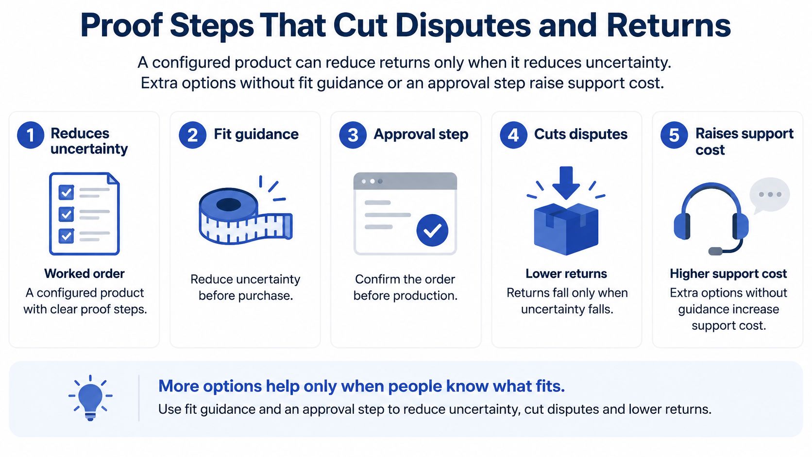
Don't rely on a screenshot alone. Store structured dimensions, material identifiers and text alongside the approved visual so fulfilment doesn't have to interpret pixels.
Different products need different proof
For an engraved gift, the likely dispute concerns spelling or placement. Display the exact text prominently and explain whether production reproduces it as entered.
A made-to-measure garment needs measurement instructions that distinguish body measurements from finished garment dimensions. An approval checkbox can't repair an ambiguous diagram or an unexplained fit allowance.
For furniture finishes, the risk is a misleading preview. Explain what the render represents, offer physical samples where appropriate and avoid implying exact colour matching across screens. The augmented reality product visualisation guide is relevant when assessing how shoppers judge scale and appearance.
An approval step records an informed choice. It doesn't remove the merchant's responsibility to supply what was described.
Create support and refund reason codes for incorrect text, measurement confusion, incompatible components and preview mismatch. Connect those cases to the relevant configuration step, then revise the instruction, validation or visual that contributed to the mistake.
Choose the Configurator Build That Fits Your Catalogue
Pilot an app for bounded choices, commission a custom flow for product-defining rules, and choose headless when your business already needs to own the front end. Keep the architecture proportionate to the specification.
Start with a product family that exposes real constraints without rebuilding the entire catalogue. Include a representative exception, such as an unavailable combination or a price-changing dimension, so the pilot tests more than the simplest path.
Write a buildable brief
- Allowed combinations: Record valid choices, incompatible pairs and the explanation customers should receive.
- Commercial rules: Define how selections affect price, discounts, stock and production timing.
- Order evidence: Specify the fields, uploaded assets and approved configuration record required downstream.
- Acceptance journeys: Name the devices, browsers and assistive technologies used for testing, including failure and recovery scenarios.
- Post-purchase signals: Define support and refund reason codes that identify configuration mistakes.
Assign a named owner to catalogue rules. Merchandising staff should know which changes they can publish themselves and which need development or regression testing.
Judge the pilot by whether customers can complete a purchase and your team can fulfil it. A visual flourish does not pass acceptance if the basket drops an inscription or the workshop receives an unclear specification.
Match delivery support to the work
Grumspot is a Shopify Plus design and development agency. Its Shopify Plus custom-made bundle creator for emma&noah boosted average order value by 61%. That result belongs to that project, not a forecast for another catalogue.
For a focused MVP or upgrade, Grumspot's One-Off Project service includes a dedicated Shopify Partner who handles the work end to end. For ongoing iteration, the Monthly Shopify Development plan gives access to a UX designer, a senior Shopify developer and a CRO specialist.
Choose an architecture, nominate the first product family and write its acceptance criteria. Start with a configuration customers can finish and your team can fulfil without clarification.
Grumspot offers Shopify and Shopify Plus design and development, including custom bundle creators and integrations with ERP, CRM and fulfilment systems. Bring your catalogue rules, current purchase journey and fulfilment requirements to Grumspot to discuss a focused build or an improvement plan for an existing configurator.
Want this kind of work on your store?
Send us the URL and what is slowing it down. We look at the store before we reply.
Related posts
Check out some similar posts.
- composable commerce platform
Learn what a composable commerce platform is, how it differs from monoliths, and how UK Shopify Plus...
Read more
- b2b ecommerce platform
Discover how a B2B ecommerce platform helps scaling brands streamline operations, boost sales, and g...
Read more
- headless shopify plus
Master your headless Shopify Plus implementation with our 2026 guide. Expert tips on building high-p...
Read more
- composable commerce Shopify Plus
Unlock growth with composable commerce Shopify Plus. Learn architecture patterns and migration steps...
Read more