Shopify Subscription Theme: A Practical Guide for UK Brands
- shopify subscription theme
- shopify plus
- os 2.0
- subscription ux
- shopify uk
Launched
September, 2026
Most advice about a Shopify subscription theme starts in the wrong place. It treats the theme like a shortcut to recurring revenue, as if picking the right storefront skin will solve subscription logic, mixed carts, account management, localisation, and checkout consistency. It won't.
The better question is architectural. A UK brand doesn't need the “best” theme for subscriptions. It needs a theme architecture that can carry recurring purchase flows without piling up custom code debt. That matters even more in a market where Shopify has become one of its largest markets, with more than 208,000 Shopify stores in Britain and year over year growth of 18%, while UK-based Shopify Plus stores are projected to expand from about 1,000 in 2023 to over 5,700 in 2026 according to the UK Shopify migration market report. More merchants means more generic theme advice. Most of it ignores what breaks.
Subscriptions are now mainstream in Shopify's own UK commerce positioning, and one featured merchant derives about 70% of its orders from subscriptions according to Shopify's UK subscriptions page. That makes storefront implementation a commercial issue, not a cosmetic one. If the theme can't support the widget properly, render selling plans cleanly, and stay stable through updates, the recurring model gets undermined before checkout even begins.
Why the Theme Matters Less Than You Think
A subscription storefront usually fails at the joins, not in the styling. Theme demos hide that well.
The deciding factor is the architecture underneath the UI. A polished theme can still create expensive subscription work if it makes rigid assumptions about product forms, cart logic, customer accounts, or app blocks. I see the same pattern on UK Shopify Plus rebuilds. The team spends weeks comparing presets, then hits problems once selling plans, mixed baskets, and localisation requirements meet the live theme.
A shopper does not care whether the PDP came from a premium theme or a custom OS 2.0 build. They care that the frequency selector updates properly, the one-time and subscription options stay clear, the cart keeps the right line item state, and checkout still feels coherent in GBP with the expected delivery and pricing context. If any of that slips, recurring revenue drops before retention ever becomes the issue.
The underlying problem sits beneath the design
Subscription complexity sits below the visual layer. Shopify's own guidance makes that plain. The subscription widget is added in the theme editor as a block under Product information, and Shopify only lists Online Store 2.0 themes, plus limited vintage support for Debut 15.0+ and Brooklyn 17.0+, in its subscription compatibility guidance.
That changes the buying question.
If a merchant is still running an older legacy storefront, the problem is not that the theme is slightly dated. The theme may be structurally misaligned with how subscriptions are meant to be rendered and maintained. In practice, that shows up as app embeds forced into brittle snippets, product templates that cannot expose the right block areas, and update cycles that break custom fixes without warning.
Practical rule: if the theme cannot accept subscription blocks cleanly, the subscription programme starts with code debt.
That matters more in the UK because storefront requirements stack up quickly. VAT-inclusive pricing, local delivery promises, subscription messaging that reads clearly on mobile, and localisation across UK and international markets all have to survive the same product and cart flow. On Shopify Plus, that often becomes the difference between a tidy OS 2.0 rebuild and six months of patching a theme that was never shaped for recurring commerce in the first place.
The better question is not which theme is best for subscriptions. Ask which theme architecture can support recurring flows without repeated template edits, app conflicts, and checkout inconsistency. If you are weighing that in broader platform terms, Grumspot's guide to Shopify for subscription services is a useful companion.
What teams usually underestimate
Teams comparing theme demos often skip the decisions that govern the build. They have not mapped which products need selling plans, how mixed carts should behave, whether subscription messaging changes by market, or how the customer account experience will handle upcoming orders and edits.
Those decisions drive theme suitability more than the theme catalogue ever will.
A fast custom build on a clean OS 2.0 foundation often ages better than a feature-heavy theme with hard-coded logic. That is not because custom is always better. It is because recurring commerce punishes hidden assumptions. The wrong theme does not just look inconvenient. It creates extra QA, fragile app integrations, and rework at the point where subscriptions should already be scaling.
What a Subscription-Ready Theme Actually Needs
A subscription-ready theme isn't the one that says “works with subscriptions” in its sales copy. It's the one that gives the app and the merchant enough structured surface area to render recurring purchase flows without hacks.
Product and cart support
Start with the product template. Shopify's own setup documentation shows that a theme may need a selling-plan selector, JavaScript variant handling, cart messaging, and order-page display to work properly, which is why the “install and switch it on” narrative is incomplete, as noted in Shopify's subscription setup documentation.
That means the product page needs:
- A proper Product information block area where the subscription widget can sit natively, not inside a hard-coded snippet.
- Variant handling that respects selling plans so a frequency change doesn't break option selection or disable add-to-cart states.
- Theme-native messaging for one-time versus recurring purchase choices, instead of bolted-on script output.
The cart has its own standards. A good Shopify subscription theme must render mixed carts cleanly. One-time products and subscription products need distinct cadence messaging, predictable line item handling, and no assumptions that every line item behaves like a standard variant-only purchase.
Account, metafields, and app surfaces
Customer accounts are where weak themes expose themselves. If the theme has no sensible place for app blocks or customer account extensions, shoppers end up bounced into disconnected management screens that don't feel part of the store.
What I look for:
- Customer account templates with app block support so subscription management can appear in a controlled storefront context.
- Theme settings that can read metafields for delivery notes, cut-off messaging, cadence summaries, or subscriber perks.
- App embeds that can replace legacy script-tag behaviour without relying on brittle front-end injections.
A lot of merchants miss the file-structure issue too. On a strong Online Store 2.0 build, subscription logic belongs in sections and blocks, tied to JSON templates. If it lives in old snippets with hard-coded placement rules, merchandising teams lose editor flexibility and developers inherit every small visual tweak.
For stores planning a rebuild, Shopify 2.0 theme development is the baseline competency, not an optional extra.
A theme can be visually excellent and still be a poor subscription theme if its product, cart, and account architecture assumes a simple one-time purchase path.
Performance still matters
The slowest part of many subscription launches isn't the app. It's the theme JavaScript wrapped around it.
When the main bundle blocks app scripts, the frequency selector arrives late, shifts layout, or behaves differently on mobile. Shoppers interpret that as uncertainty. They don't wait around to diagnose it. They leave.
OS 2.0 vs Vintage Theme Compatibility
This is the cleanest technical divide in subscription storefronts. Online Store 2.0 themes are built for modern app surfaces. Vintage themes can still work, but only within narrower limits.
Why OS 2.0 is the practical default
Shopify's own guidance makes the compatibility boundary explicit. The subscription widget is supported on Online Store 2.0 themes, with only a narrow fallback for Debut 15.0+ and Brooklyn 17.0+ in vintage land, according to Shopify's subscription theme considerations. For any UK brand migrating from Magento, WooCommerce, or a custom stack, that should end the debate quickly.
OS 2.0 gives you app blocks, sections across more templates, cleaner JSON-based composition, and a much better editing model for non-developers. It also reduces the amount of custom Liquid branching needed to place and style selling-plan UI.
Vintage themes can host a subscription widget. That's not the same as being operationally suitable for subscription commerce.
Where vintage themes become expensive
The issue isn't whether the widget appears. It's what happens after the first design request, the first cadence change, or the first account portal requirement.
On a vintage build, teams often hit these friction points:
- Hard-coded cart markup that doesn't render subscription messaging consistently
- Page-specific Liquid templates that make product-level testing slower
- Legacy app injection patterns that clash with theme updates
- Developer dependency for routine merchandising changes
By contrast, OS 2.0 lets merchandising teams move blocks, test ordering, and adjust layout in the editor without reopening template logic every time.
| Dimension | OS 2.0 Theme | Vintage Theme |
|---|---|---|
| Subscription widget support | Native app block workflow | Limited fallback support on specific versions |
| Product template flexibility | JSON templates and block placement | Hard-coded Liquid templates |
| Cart and account extensibility | Better aligned with modern app surfaces | More likely to require custom workarounds |
| Merchandising iteration | Editor-friendly | Developer-heavy |
| Long-term maintenance | Lower code debt when structured well | Higher risk of brittle changes |
The UK Plus angle
For UK Plus merchants, this isn't just about product page convenience. Shopify states that Shopify Plus merchants can use the Checkout Branding API for advanced visual customisations in the UK checkout stack, as described on Shopify UK checkout. In practice, the cleaner your storefront architecture, the easier it is to keep subscription messaging coherent as shoppers move from PDP to checkout.
If the store is still anchored to a vintage theme, I'd usually treat subscriptions as a rebuild project, not a plugin project.
Subscription UX Patterns That Convert
Most subscription UX fails in ordinary places. The selector is hidden. The one-time and recurring options are split across different modules. The cart forgets the cadence. The account area makes skip and swap feel like support requests instead of self-service actions.
A strong Shopify subscription theme turns the recurring choice into a normal buying path.
On the product page
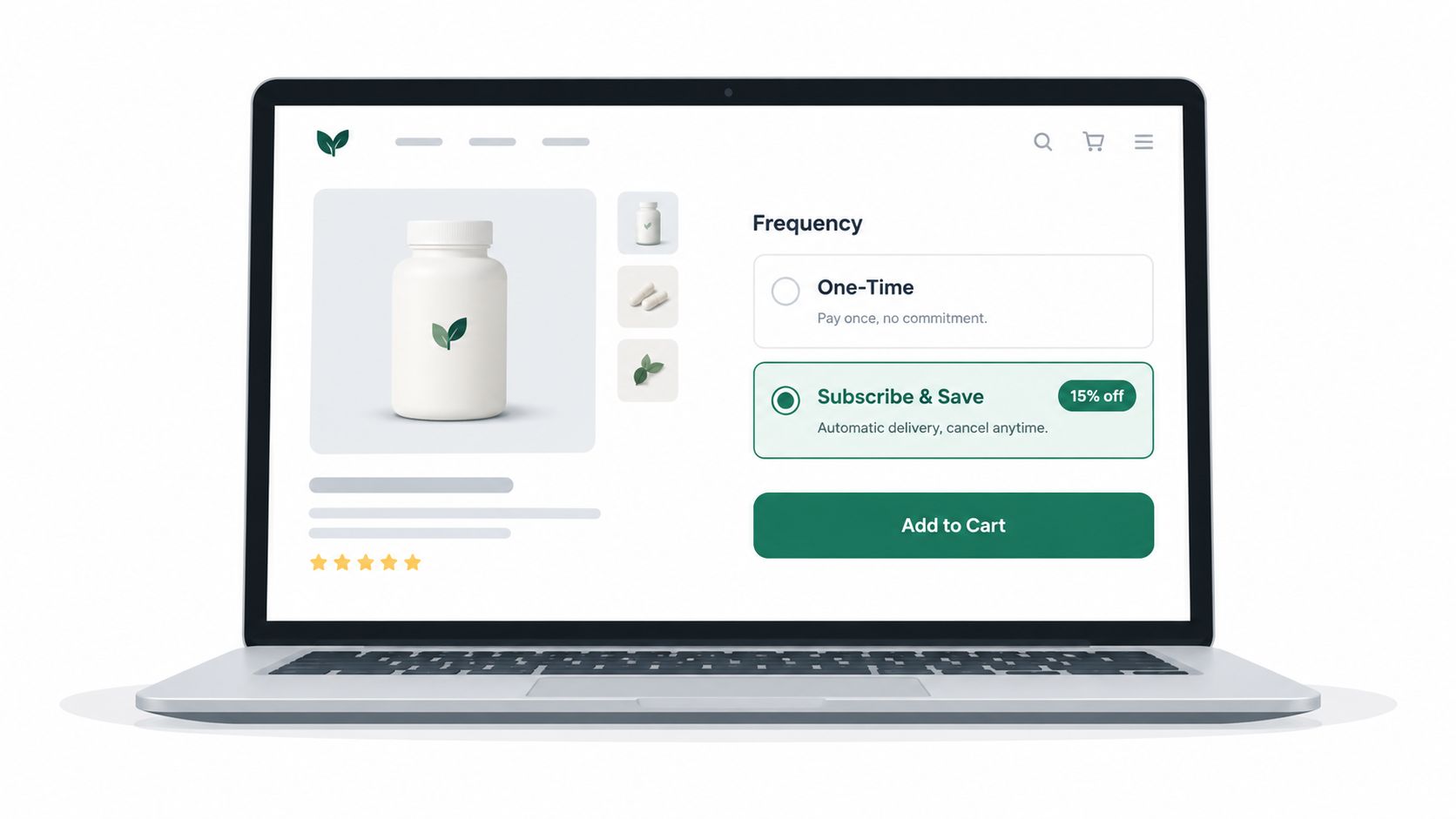
The best product pages keep one-time and subscribe options in the same decision block. The shopper shouldn't have to scan the page to understand the trade-off. Price, cadence, and delivery framing need to sit together.
What works well in practice:
- Stacked purchase options where “buy once” and “subscribe” are visually grouped.
- A visible frequency selector directly under the subscription option, not hidden in a later accordion.
- Clear delivery language that updates with the chosen cadence and doesn't rely on static theme copy.
- One add-to-cart action that respects the current selling plan selection.
What doesn't work is duplicating logic. I still see themes with a custom Liquid radio group on top of an app-generated widget underneath. That creates mismatched states, especially on mobile, and guarantees maintenance problems later.
In the cart and after purchase
The cart should confirm that the shopper is buying a subscription, show the cadence clearly, and preserve that information through edits. If a customer switches from one-time to subscribe in the cart, the theme needs to handle the line item transition properly instead of adding a second conflicting product line.
A better flow looks like this:
- Browse a replenishable SKU and see the recurring option without scrolling past the main purchase module.
- Configure frequency in the same block, with delivery messaging updating live.
- Add to cart and see cadence reflected in the line item and cart summary.
- Manage later through an account or portal experience where skip, swap, and change-frequency actions are close to the upcoming order.
The account side is where retention often lives or dies. If a customer has to contact support to make a simple cadence change, the storefront has already failed them.
Keep skip, swap, and pause actions close to the order itself. Every extra click raises cancellation risk.
There's also a content issue. Cadence previews should come from the subscription system's current data, not hard-coded Liquid snippets that drift as intervals or wording change.
Setting Up and Auditing Your Theme
A subscription setup goes wrong when teams install the app first, drop a widget onto the page, and assume the storefront is ready. The safer path is to audit the theme before you style anything.
The correct order
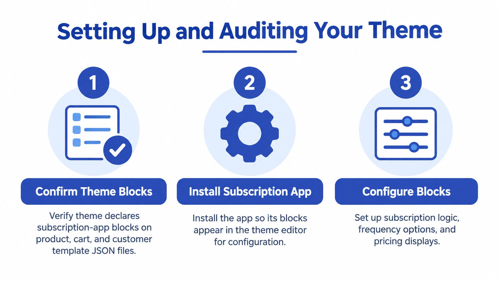
Shopify's own implementation pattern is straightforward in principle. Verify compatibility, add the subscription widget block to the product template, customise styling if needed, and confirm the app embed is enabled for the same theme, based on Shopify's subscription considerations guidance.
In practice, I'd tighten that into a working sequence:
- Check theme compatibility first. If the store is on an incompatible or older theme, stop there and scope the rebuild.
- Configure selling plans in the subscription app. The storefront can't display what hasn't been structured properly.
- Add the widget block inside Product information. Don't hard-code placement if the app block already exists.
- Enable the matching app embed. A common mistake is activating the app on one theme while editing another unpublished one.
- Run a full checkout test for each plan. Mixed carts, variant changes, and selling plan IDs need validating before launch.
What to verify in the audit
An audit should be uncomfortable. It needs to catch the small technical assumptions that later become expensive bugs.
Use a checklist like this:
- Product template JSON: confirm subscription app blocks are declared and visible in the editor.
- Cart behaviour: verify frequency data reads from the actual line item state, not from static variant assumptions.
- Theme JavaScript: check whether any bundle blocks app rendering or causes layout shift around the widget.
- Customer account templates: confirm there's a clean route to expose subscription management.
- Theme overrides: remove or refactor any custom cart or pseudo-checkout flows that bypass Shopify's current checkout path.
If you need a specialist implementation partner, options include app vendors, independent Shopify Plus developers, or agencies that handle native Subscription API work and theme integration, such as Grumspot.
The audit point many teams skip
Webhook and order-state validation often gets ignored because it sits outside visible theme work. That's a mistake.
A subscription theme isn't ready just because the selector appears on the PDP. The order has to pass through correctly, the subscription platform has to receive the right state, and the customer account area has to reflect the live subscription without Liquid hacks.
Accessibility and Checkout Branding for UK Stores
A subscription storefront that looks polished but fails accessibility checks is still broken. The recurring offer is part of the purchase path, so every selector, modal, and account action needs the same rigour as the rest of the store.
Accessibility is not a finishing pass
Shopify states that shoppers can buy with assistive technologies on its UK checkout stack, which makes accessibility testing a practical benchmark for any subscription flow built on Shopify in the United Kingdom, as noted on Shopify UK checkout. That should shape how the theme is audited before launch.
The recurring choice needs:
- Labelled controls for frequency, one-time versus subscribe, and account actions
- Visible keyboard focus states across widget elements and cart interactions
- Clear price communication so recurring charges aren't ambiguous
- Announcements for dynamic changes when cadence or pricing updates after a selection
The weak point is often the widget itself. Theme accessibility can be solid while the embedded subscription UI fails contrast, focus, or screen-reader clarity.
Accessibility testing should cover the full journey, not just the parent theme. Product page, cart, checkout, and subscription management all need checking.
For teams that haven't audited that properly, Grumspot's guide to a Shopify accessibility audit is worth reviewing before any redesign or theme switch.
Checkout branding needs discipline
Plus merchants get more room to align checkout visually. That doesn't mean every branding flourish is useful.
The best checkout branding work for subscriptions keeps attention on clarity. Recurring pricing should be easy to identify. Order summaries should make cadence obvious. Any trust-building content needs to support completion, not compete with it.
One of the most common UK mistakes is burying the recurring selector too low on the product page or placing it in a non-theme-native embed that behaves inconsistently across mobile devices. Shopify explicitly flags product page placement, subscription widget placement, contrast, keyboard navigation, and clear pricing as practical implementation concerns in the UK checkout context, according to Shopify UK checkout guidance.
If the selector is hard to find, shoppers won't “discover” the offer. They'll buy once, or leave.
When to Move Beyond a Theme
At some point, theme work stops being efficient. The storefront can still be technically functional, but every new subscription requirement starts to feel like a workaround.
Three signs the theme has reached its limit
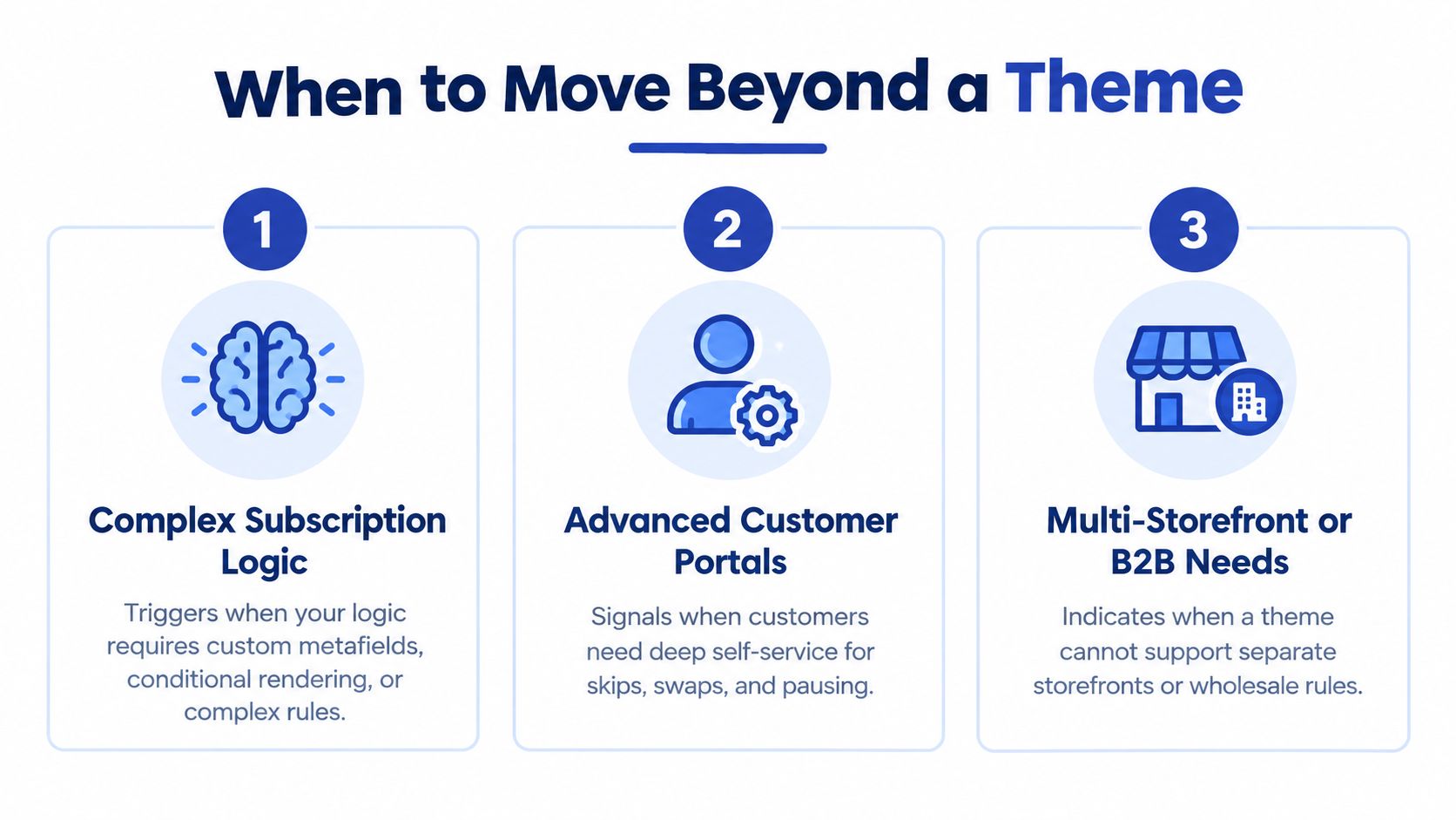
The first sign is conditional subscription logic the cart can't render cleanly. That usually shows up when the business wants mixed incentives, bundle-specific cadence rules, or line-item behaviour that the theme's cart drawer was never built to support.
The second is multi-market complexity. Localisation sounds manageable until subscription wording, account actions, checkout content, and market-specific offer rules all need to stay aligned. That challenge is increasingly relevant because Shopify's subscription direction now points toward more integrated builds, and many guides still ignore how theme content, checkout language, and localisation interact for UK merchants, as discussed in this UK Shopify pricing and subscriptions analysis.
The third is customer account depth. Once the roadmap depends on richer self-service actions, order edits, or portal behaviour that fits specific needs, the theme is no longer the main system. Customer account extensibility and app architecture become the product surface.
The escalation paths
Not every brand needs headless. Most don't.
A sensible progression usually looks like this:
- Stay within theme architecture if the recurring model is straightforward and the main issue is compatibility or UX polish.
- Add a stronger subscription app or custom app layer when logic, account management, or data handling exceeds what a standard setup can carry.
- Move toward a more application-like build when subscription management starts behaving more like a product than a page. For founders thinking through that broader shift, this founder's guide to web apps in 2026 is useful context because it frames when a standard website stops being enough for the customer experience you're trying to deliver.
- Consider Shopify Plus and deeper customisation when checkout branding, account extensibility, and operational control are now central to the subscription business.
A five-minute decision check
If you answer yes to two or more of these, the theme probably isn't enough anymore:
- Your cart needs custom subscription rules that current templates can't represent clearly.
- Your UK store needs cleaner localisation control across subscription wording and account journeys.
- Your team is making frequent developer edits for basic merchandising changes.
- Your customer portal requirements are expanding beyond what the current app embed can present naturally.
- Theme updates feel risky because subscription UI has been patched in too many places.
A Shopify subscription theme should buy you speed and flexibility. Once it starts charging that back in maintenance, it's time to escalate.
Grumspot helps brands rebuild or refine Shopify subscription storefronts without turning every recurring flow into a patchwork of app embeds and theme hacks. If you need a cleaner OS 2.0 migration, subscription UX implementation, or a technical audit of what's breaking between PDP, cart, checkout, and customer accounts, visit Grumspot.
Let's build something together
If you like what you saw, let's jump on a quick call and discuss your project

Related posts
Check out some similar posts.
- shopify store credit
Learn how to set up Shopify store credit with built-in tools or apps. Covers policy design, refund w...
Read more
- unified commerce platform
Learn how a unified commerce platform connects channels, ERPs, and CRMs to drive growth. Practical g...
Read more
- composable commerce platform
Learn what a composable commerce platform is, how it differs from monoliths, and how UK Shopify Plus...
Read more
- b2b ecommerce platform
Discover how a B2B ecommerce platform helps scaling brands streamline operations, boost sales, and g...
Read more